DJ MAPE - Fonte Gótica Text Effect


Usa BytePlus Seedream 5.0, o modelo desta obra · 15 créditos
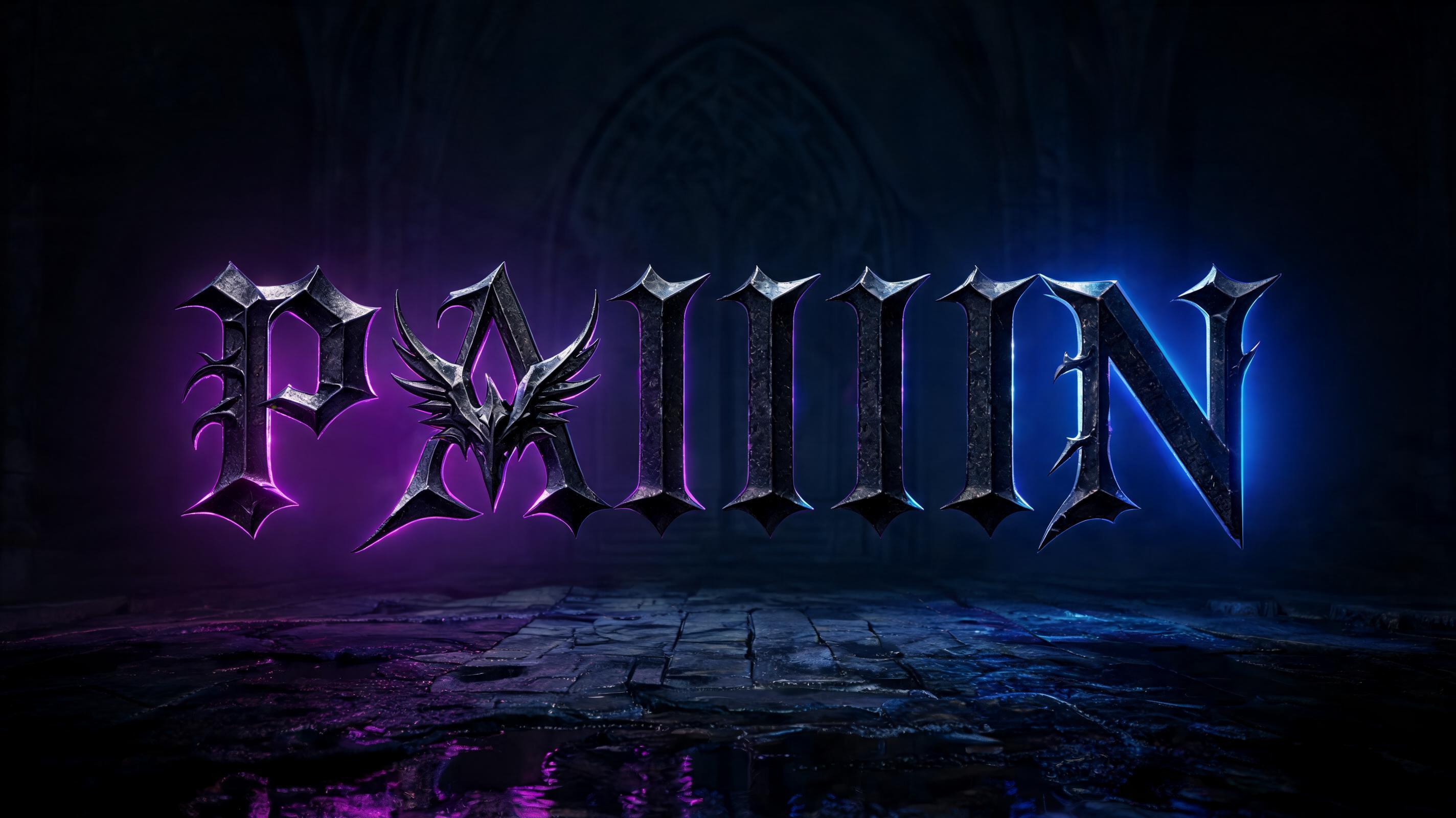
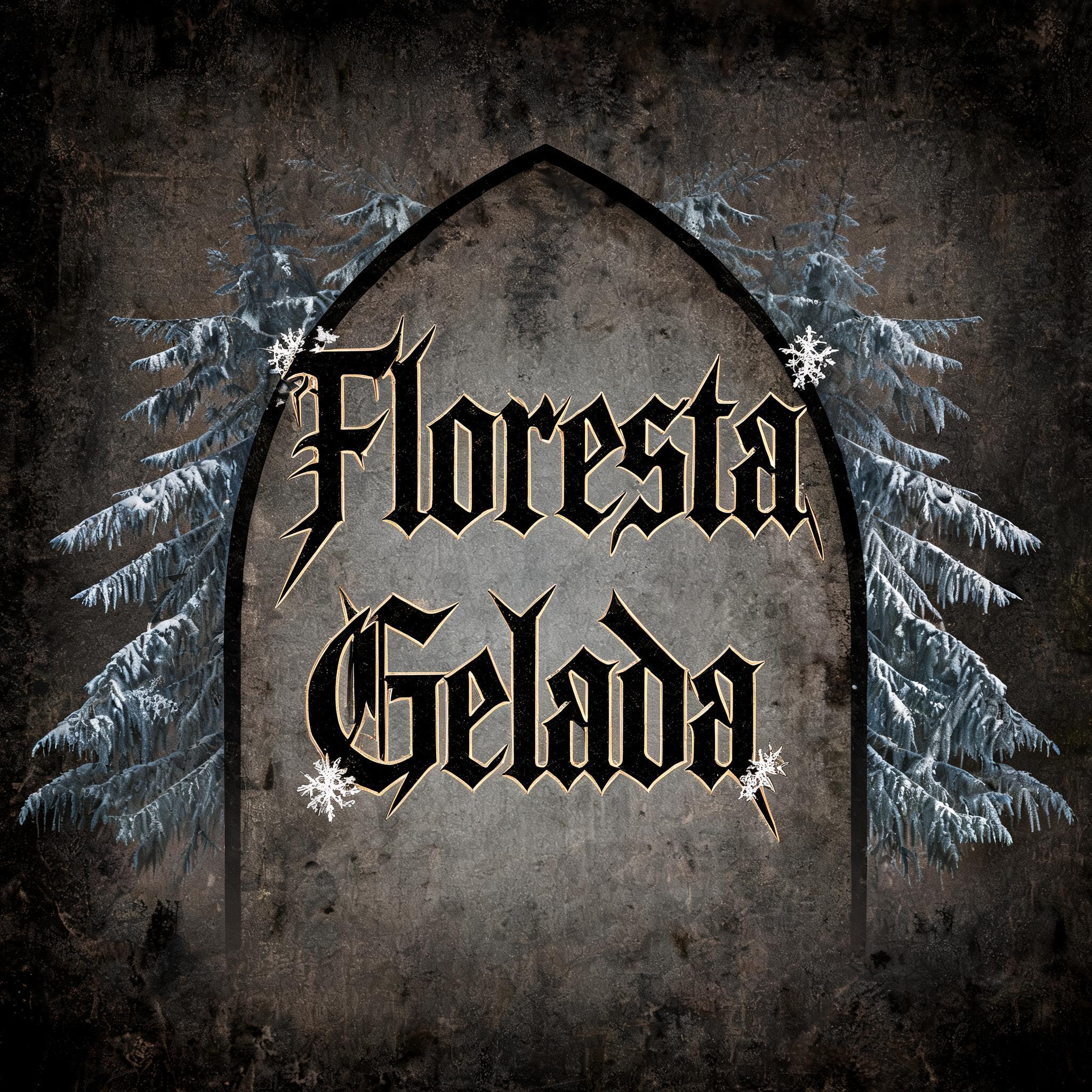
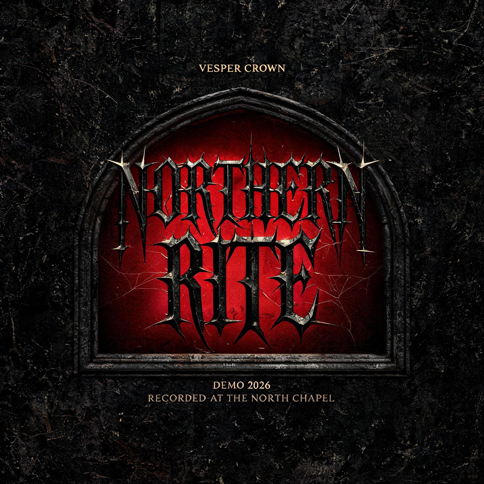

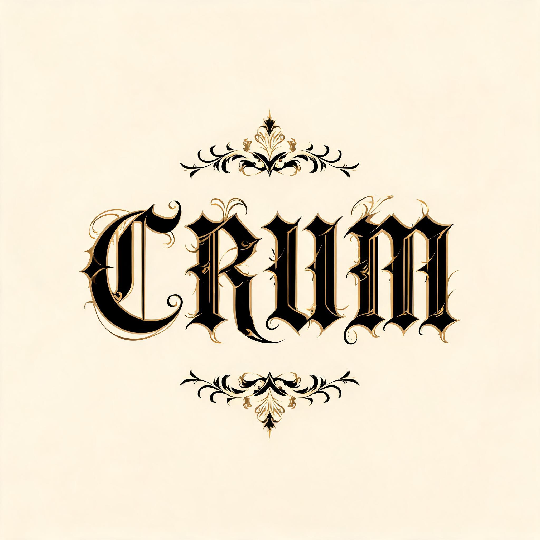

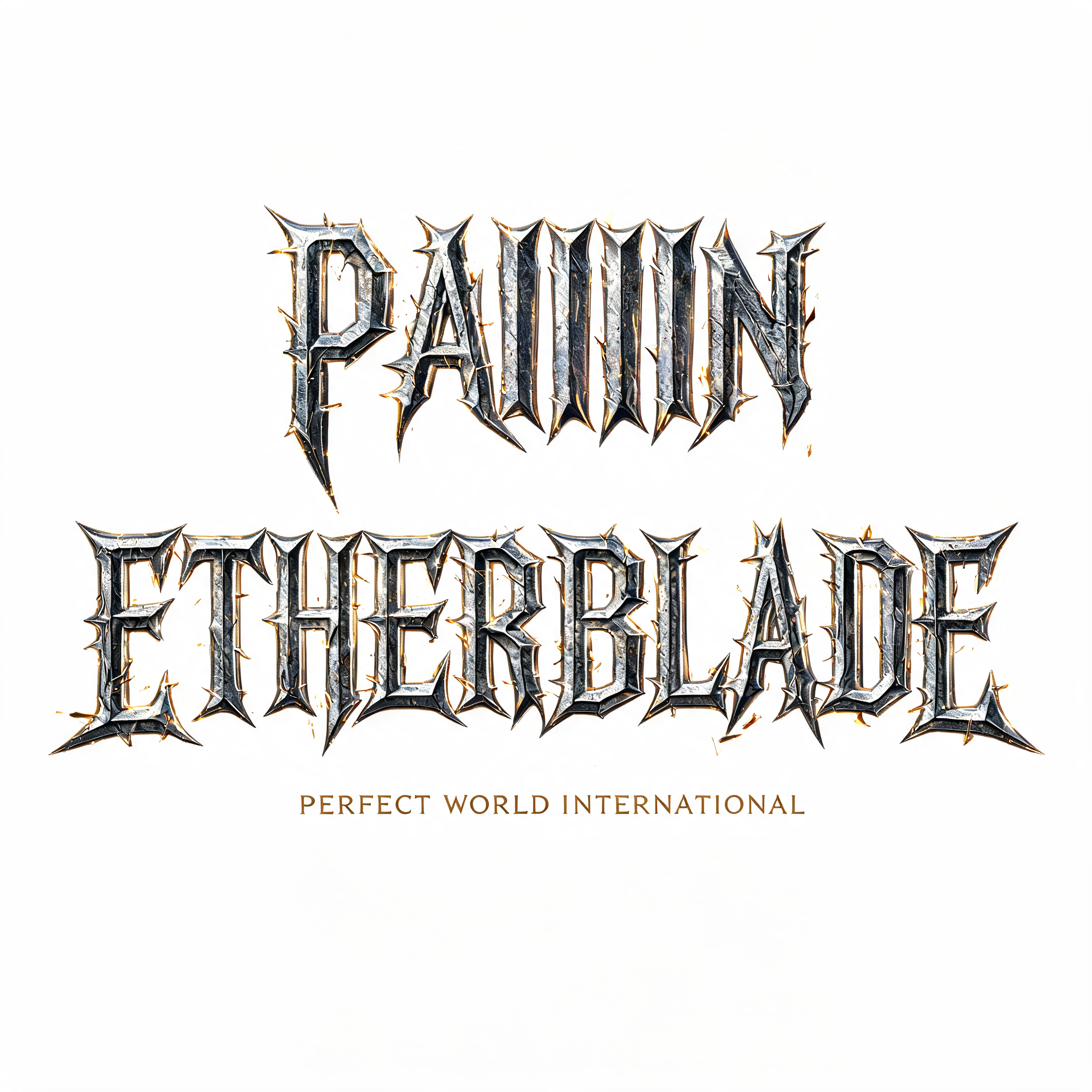
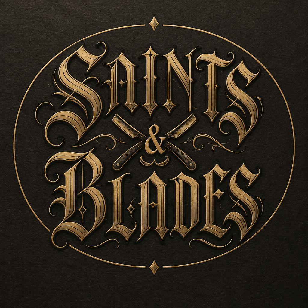
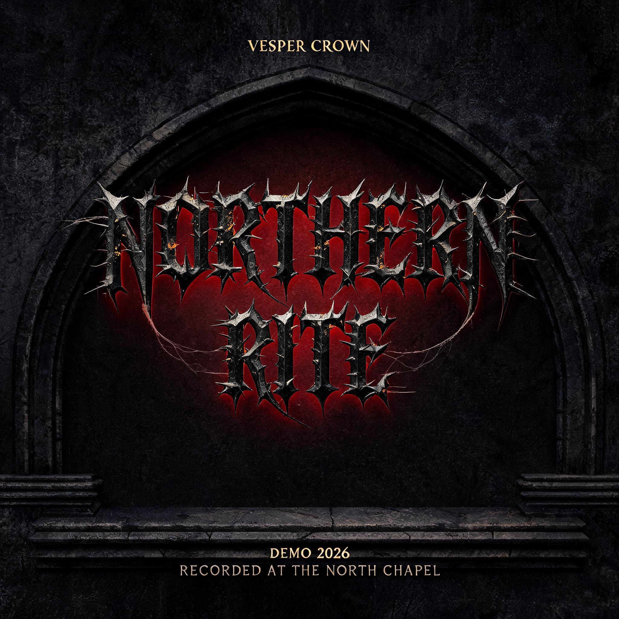
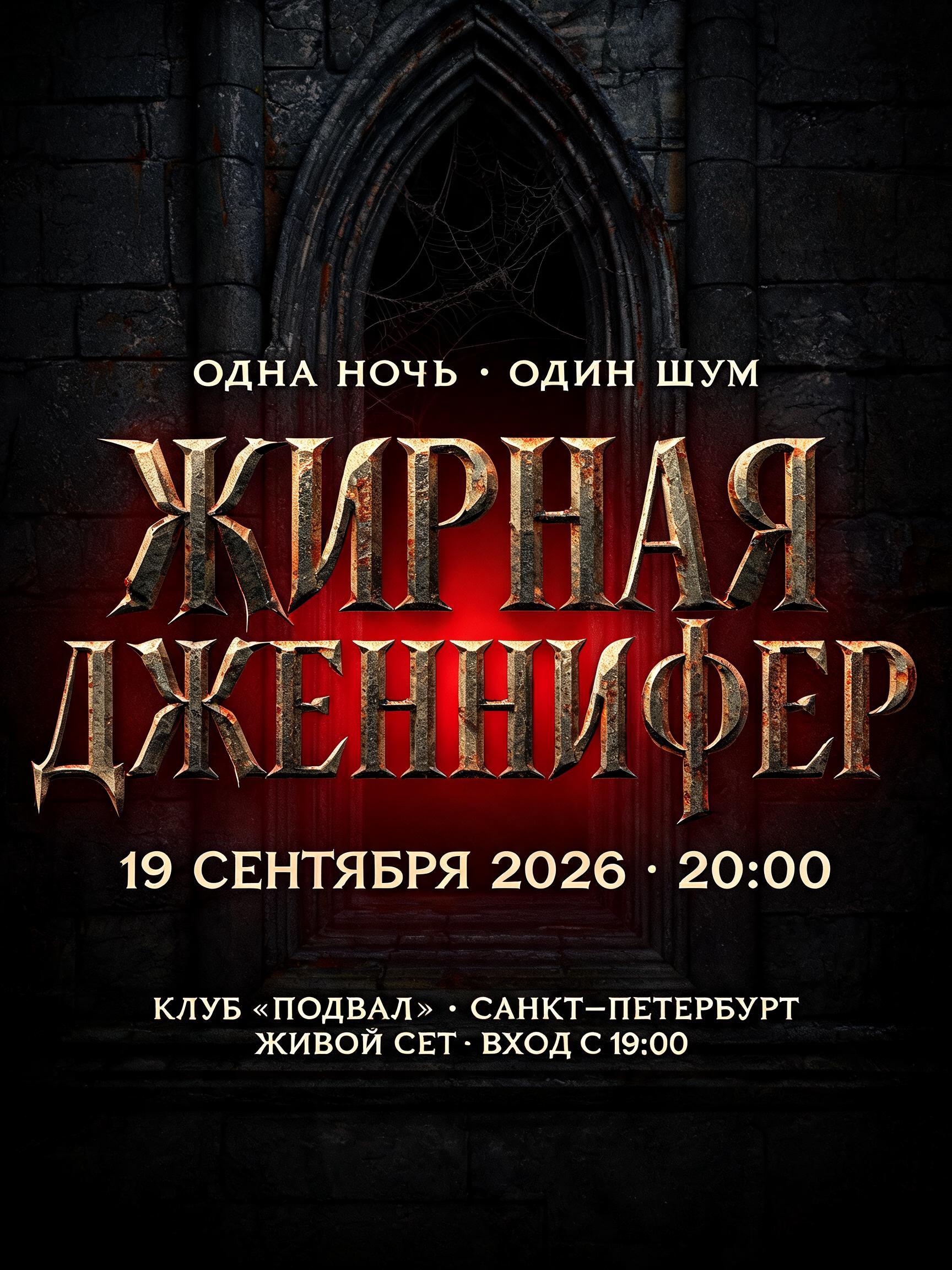




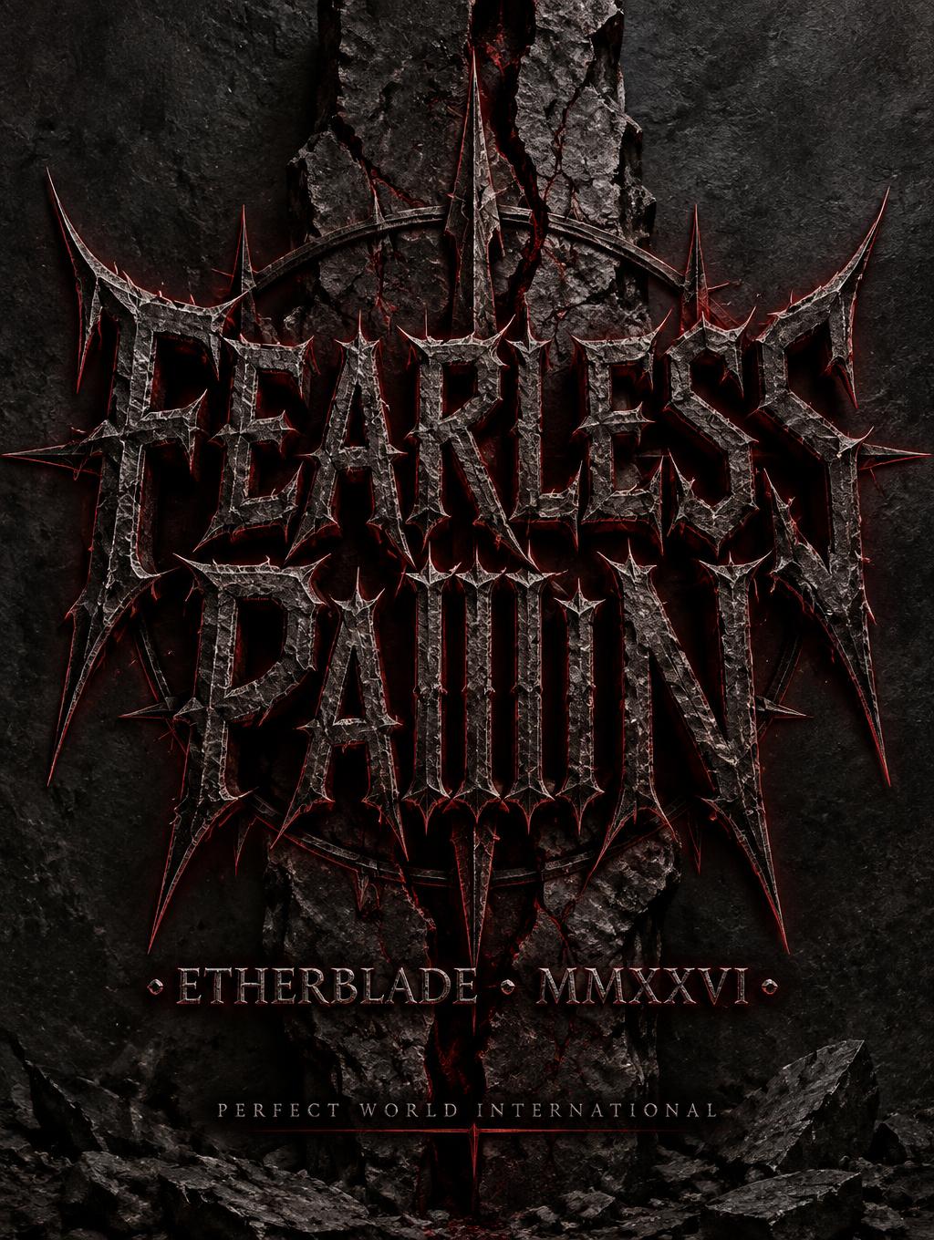
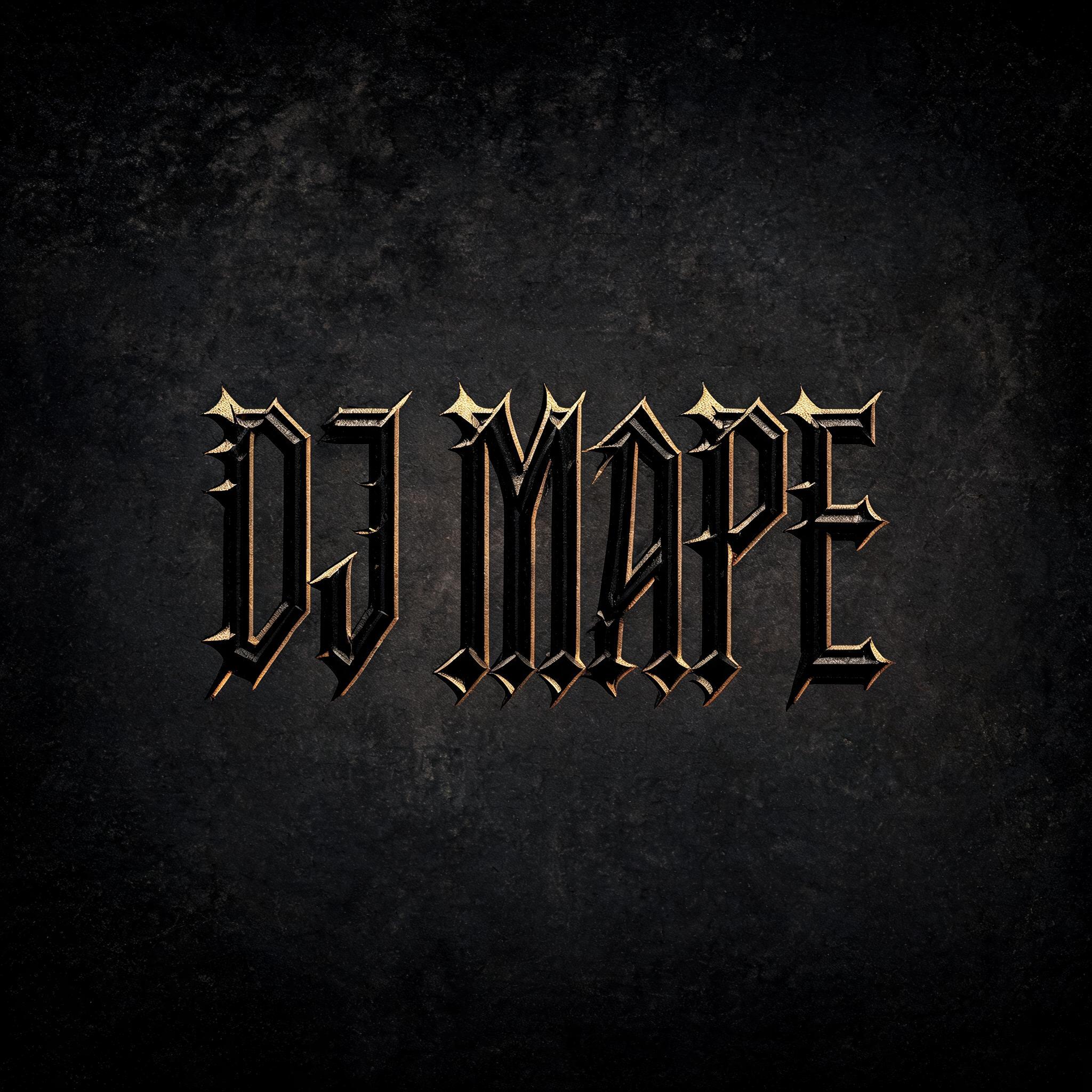
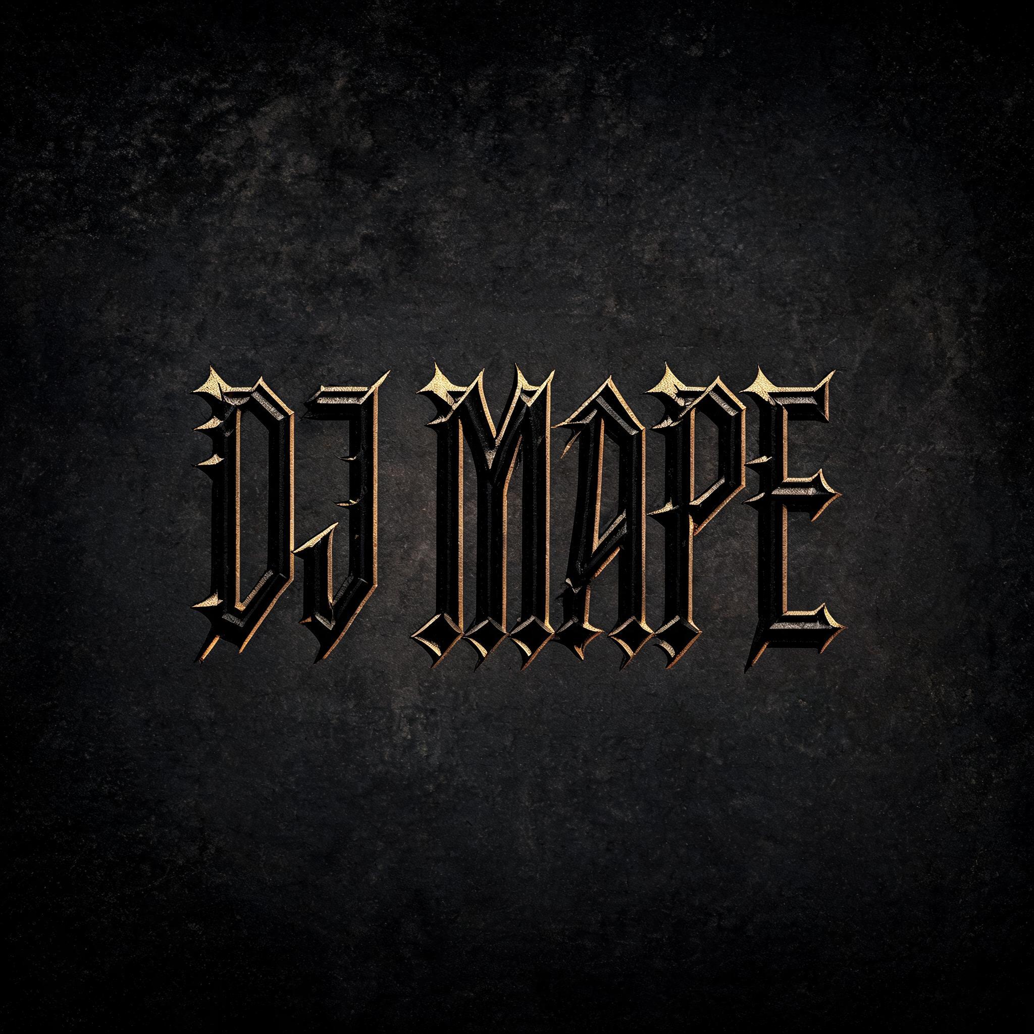
“DJ MAPE ” is a Gothic Font text effect efeito de texto criado com a IA da FontVibe. Blackletter Textura precisa: traços estreitos e quebrados, terminais em losango e forte contraste grosso-fino, em tinta preta com toques dourados sobre pergaminho escuro e envelhecido.
rendered in precise gothic blackletter letterforms with authentic calligraphic construction — diamond-shaped stroke terminals, strong thick-thin contrast, pointed arch counters. Rich black ink with warm depth on dark parchment or deep charcoal background. Subtle gold ink highlights on serifs and capitals. Medieval scribal precision. No cobwebs, no rust, no atmospheric fog — pure typographic craft. LETTERFORM PRIORITY: when the chosen font carries its own treatment, that font's letterform shapes take priority and own the letters; this style governs the rich ink, the parchment ground and the subtle gold highlights. FALLBACK MATERIAL: if the font carries no material of its own, render the letters as precise gothic blackletter in rich black ink with subtle gold highlights on dark parchment — pure typographic craft, no cobwebs, rust or fog. COLOR PRIORITY: keep the font's own colors if specified; otherwise black ink with warm gold accents. DJ MAPE rendered in rich black gothic blackletter ink with authentic calligraphic construction — diamond-shaped stroke terminals, pronounced thick-thin contrast, pointed arch counters built with medieval scribal precision. The letterforms sit on deep charcoal-black parchment ground, the surface carrying subtle tooth and aged fiber texture visible under raking light. Each capital and serif catches a warm amber key light from the upper-left, revealing fine ink layering and slight ink-bleed into the parchment grain — the hallmark of hand-pressed medieval type. A cool blue-grey fill light counters from the lower-right, deepening the shadow valleys between strokes and widening the perceived thick-thin contrast to near-maximum. Subtle gold ink highlights trace the terminal diamonds and the arched caps — not gilded foil but a muted warm-gold ink wash that glints only where the key light strikes at the sharpest angle. The parchment background grades from deep charcoal at the outer edges to a warmer near-black at the core, giving the composition a natural vignette that draws the eye inward. No cobwebs, no atmospheric haze, no rust — pure typographic material craft: ink weight, parchment grain, and gold accent in precise measure. The overall palette is black ink, aged parchment dark ground, and restrained warm gold — the visual language of an illuminated manuscript initial scaled to title-card weight.
Gerada em 3 de agosto de 2026 · 2048 × 2048 · JPEG · BytePlus Seedream 5.0 · Compartilhada pelo criador · Uso comercial gratuito (CC BY 4.0)