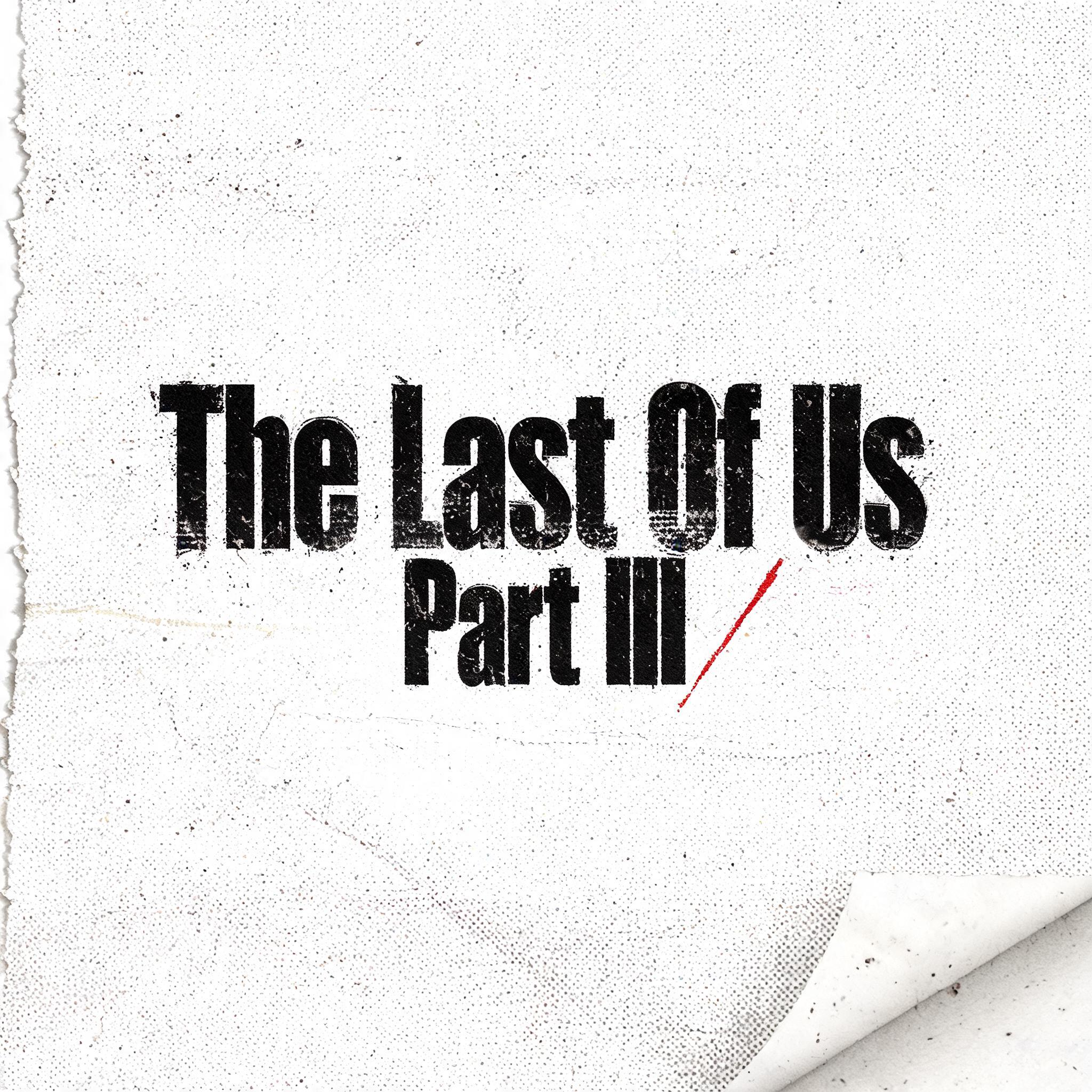
The Last Of Us Part II - Grunge Text Effect


Usa BytePlus Seedream 5.0, o modelo desta obra · 15 créditos

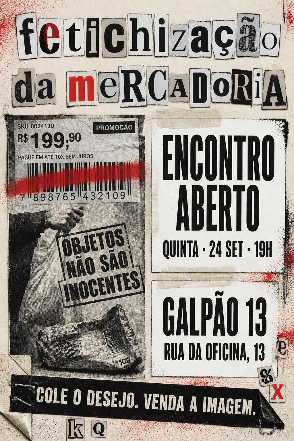
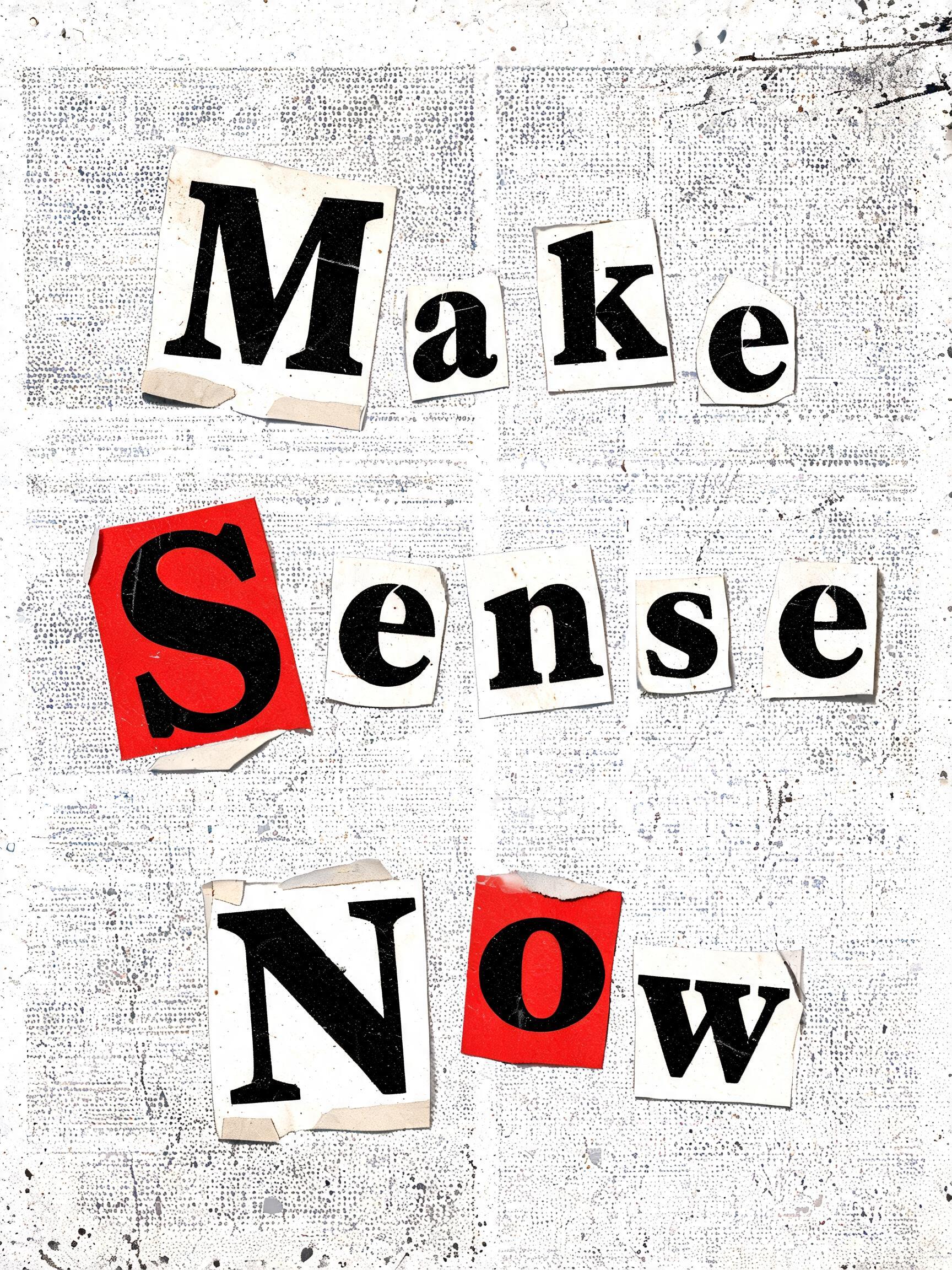
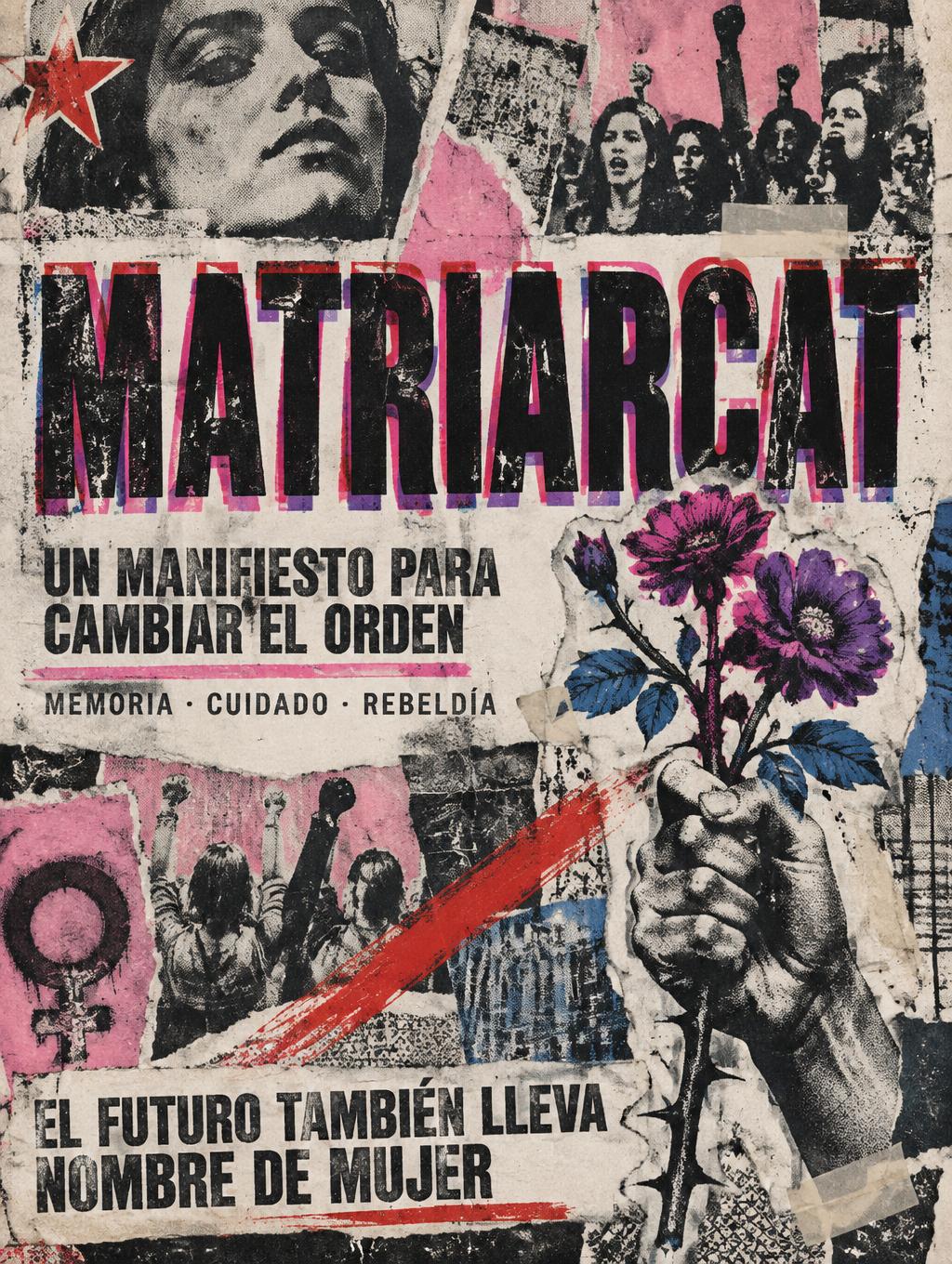
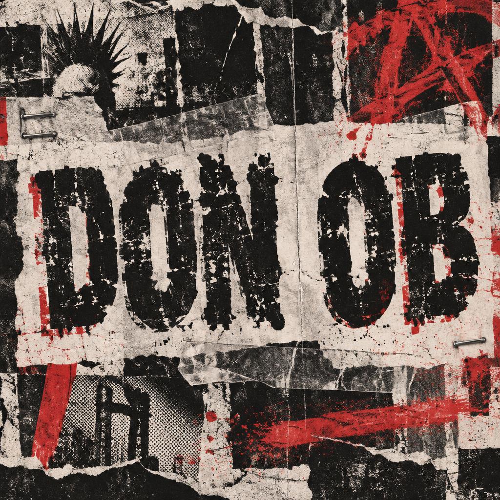

“The Last Of Us Part II” is a Grunge text effect efeito de texto criado com a IA da FontVibe. Letras de bilhete de resgate recortadas de vários jornais, coladas com fita sobre papel fotocopiado áspero com pontilhado de meio-tom, bordas rasgadas e um único toque vermelho punk.
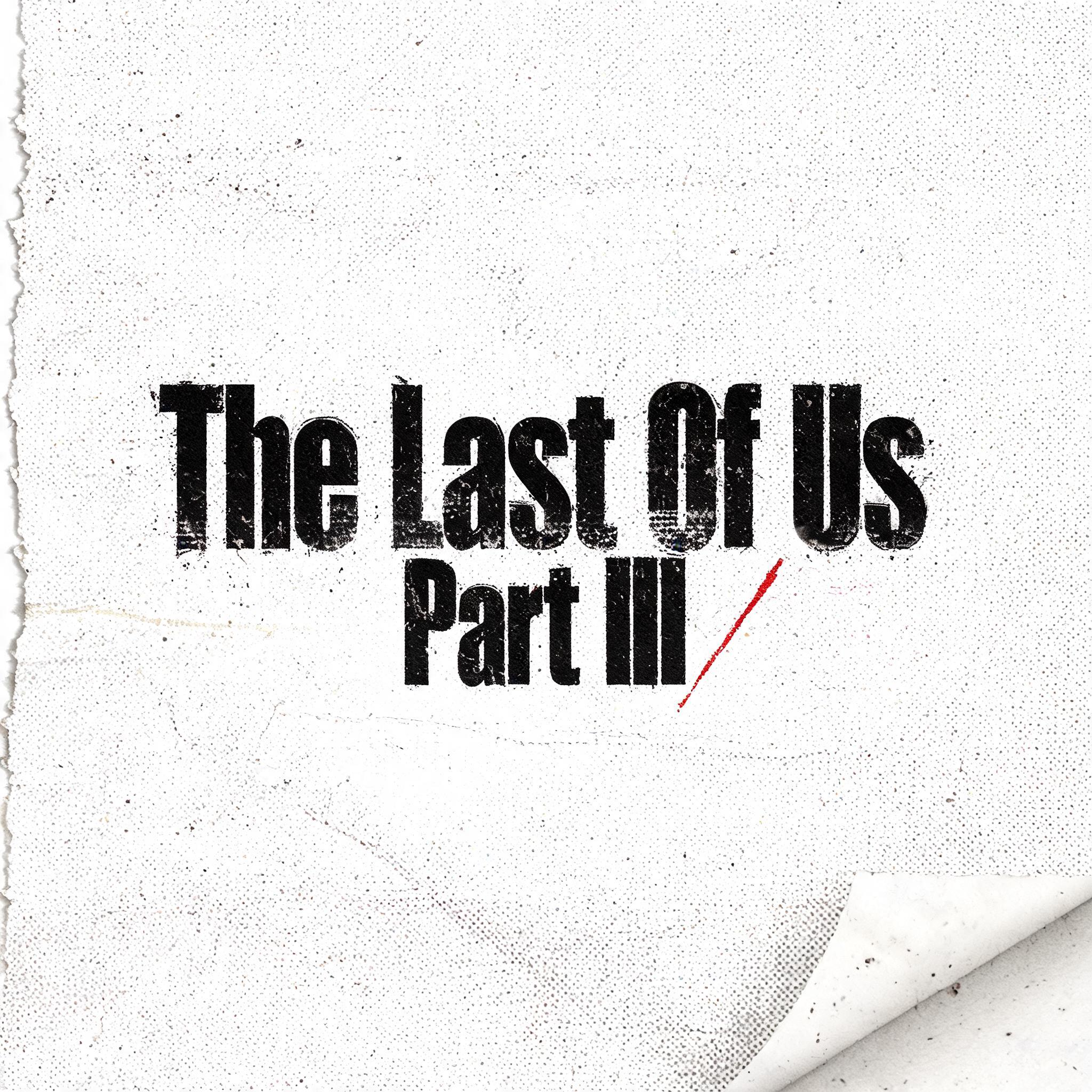
a photocopied punk-zine world. PRINT: everything looks run through a cheap copier and pasted up by hand — coarse halftone dot screens, heavy black ink that bleeds and clogs, low-ink dropout and roller streaks, Xerox speckle and nth-generation blur on raw off-white newsprint and photocopy paper. TEXTURE: torn and scissor-cut paper edges, strips of tape, lifted corners, creases, scratches, smears and spray-paint overspray — the evidence of a hand working under pressure. LIMITED PALETTE: the cheap two-color reproduction palette — high-contrast black ink and raw off-white paper, with one punchy punk RED as the accent (occasionally a hit of acid yellow), printed slightly off-register. ENERGY: a layered cut-and-paste collage grammar, asymmetric and disrupted like a stapled zine. LETTERFORM PRIORITY: when the chosen font carries its own material or treatment (ransom-note collage, riso halftone, distressed, spray, stamp, ink-bleed), that font treatment takes absolute priority and owns the letters; this style governs the paper, print degradation, palette and surrounding collage. FALLBACK MATERIAL: if the font carries no material of its own, print the letters in heavy high-contrast black ink on raw off-white paper with photocopy grain, ink bleed and torn edges, so the grunge zine feel always reads. A square raw off-white photocopied zine field, 'The Last Of Us Part II' rendered with deliberate restraint — stacked as a quiet three-line title block: 'The Last Of Us' on the first line, 'Part II' on the second, the lower line smaller in scale, sitting with withdrawn weight beneath the first — its letterforms soaked in heavy black ink with visible bleed into the coarse paper grain, halftone dot screen breaking up the ink density unevenly, low-ink dropout causing patches of faint near-disappearance as if the words are retreating into themselves. Xerox speckle and nth-generation photocopy blur dust the surrounding negative space. A muted slash of punk red — narrow, accidental-looking, slightly off-register — cuts somewhere near the text like a wound barely visible. Torn paper edge along one border, a crease running through the field, faint roller streak from a cheap drum. The overall surface feels compressed and introspective — the copier pressed too hard, the ink pushed too deep — cut-and-paste zine grammar stripped down to almost nothing, anti-grid and asymmetric, as if someone folded and unfolded the page twice before printing.
Gerada em 5 de agosto de 2026 · 2048 × 2048 · JPEG · BytePlus Seedream 5.0 · Compartilhada pelo criador · Uso comercial gratuito (CC BY 4.0)


