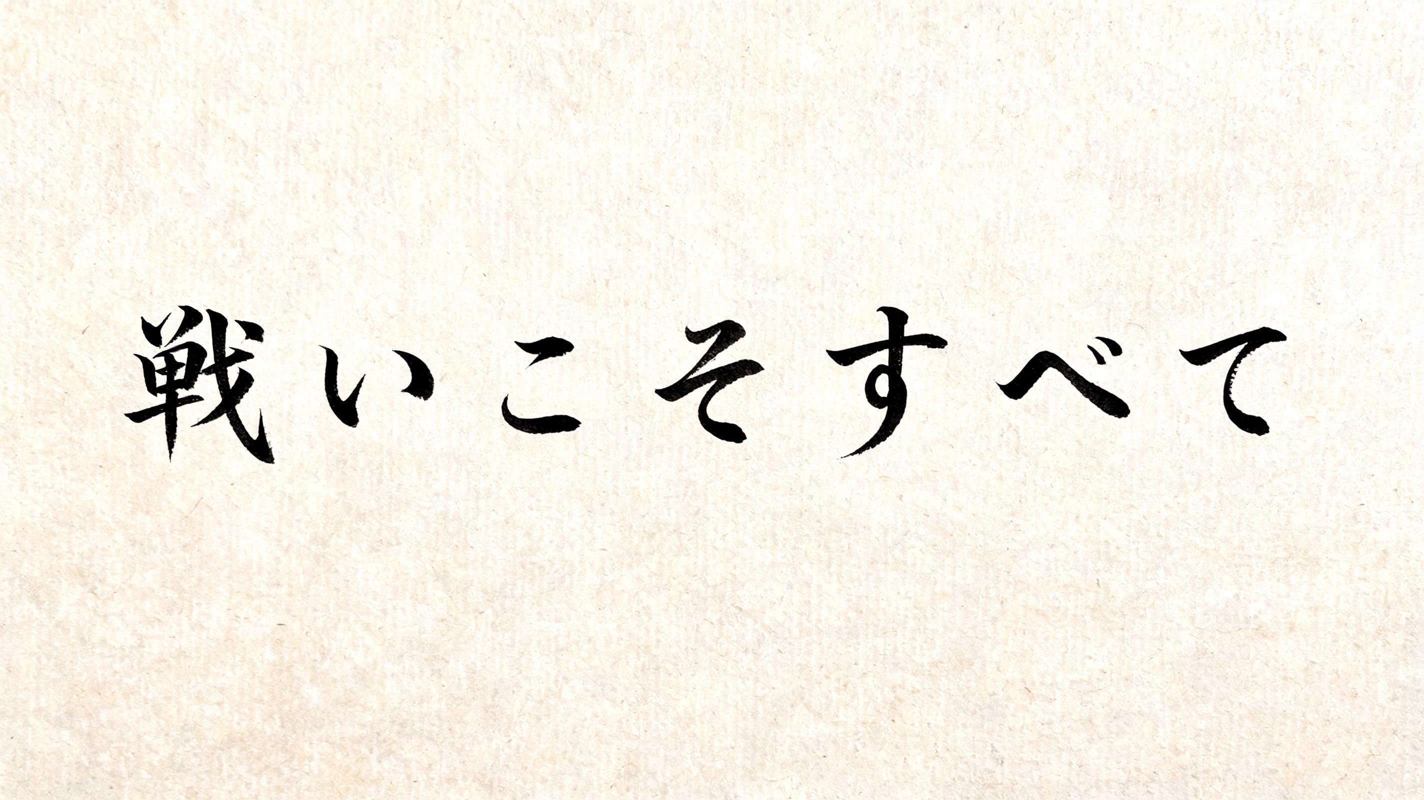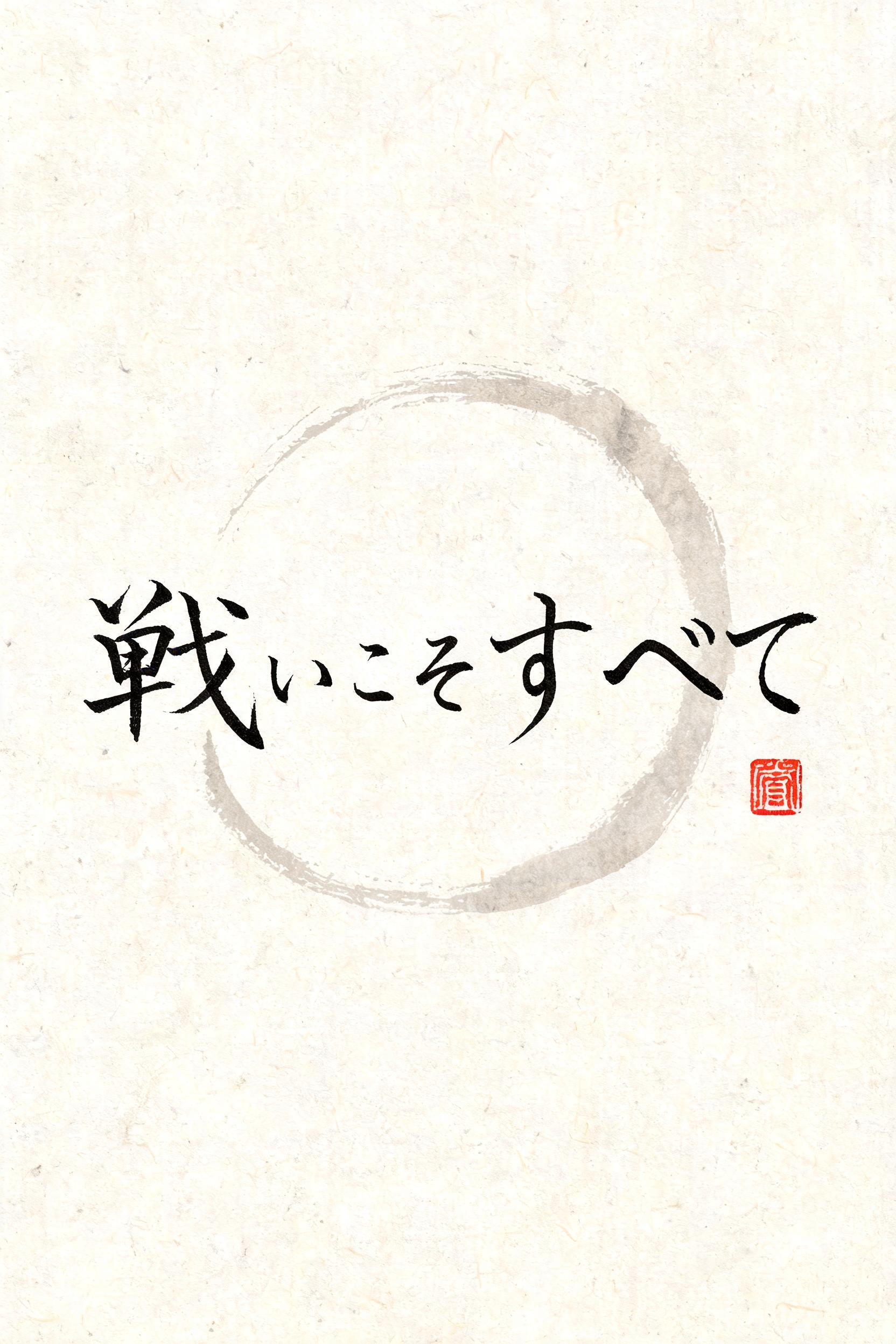
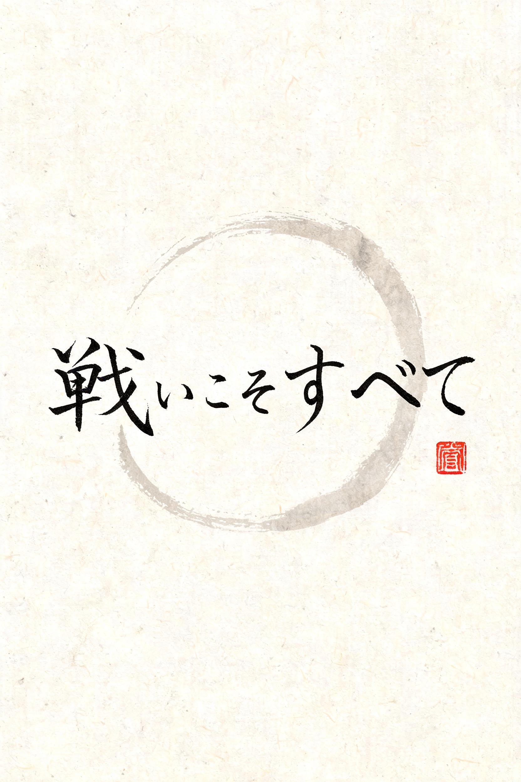
戦いこそすべて - Pincel de Tinta Japonês Text Effect


Usa BytePlus Seedream 5.0, o modelo desta obra · 15 créditos











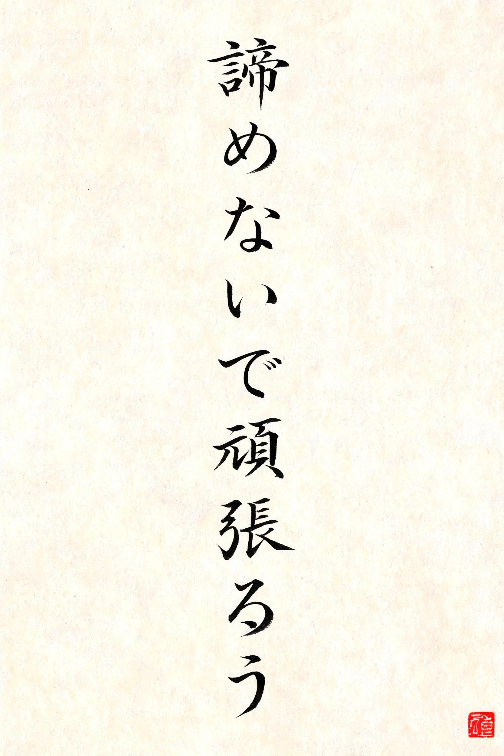
“戦いこそすべて” is a Brush Japanese Ink text effect efeito de texto criado com a IA da FontVibe. O estilo de caligrafia com pincel de tinta do shodo japonês aplicado às letras latinas. Tinta sumi preta e profunda com a energia autêntica do pincel fude, traços controlados numa única direção e atmosfera de papel washi. Perfeito para marcas de restaurantes japoneses, design de tatuagem, anime, artes marciais e projetos culturais.
Japanese ink brush aesthetic — the visual language of sumi calligraphy on washi paper. INK MEDIUM: sumi pigment in deep black to charcoal range — richest density at mark centers, naturally transitioning outward as ink supply depletes. Fully matte, absorbed into paper surface, producing a tonal range from dense opaque black to transparent grey depending on dilution and brush load. PAPER SURFACE: natural washi — warm cream-white base with visible paper fiber structure giving slight texture. The absorbent surface creates the characteristic soft border quality of East Asian brush work at all mark edges. LIGHT ATMOSPHERE: soft diffuse north-facing studio light — the traditional calligrapher's light source. Even, shadowless, allowing the full tonal range of ink marks to read clearly. Warm cream paper tone contrasts against deep sumi black. AESTHETIC REGISTER: the ma principle — the space between and around marks is as considered as the marks themselves. Compositions have breathing room and deliberate quietness. When no specific material is defined by the font: default environment — deep sumi black marks on warm cream washi paper, soft diffuse overhead light, meditative studio atmosphere. Japanese sumi ink calligraphy rendering the exact text "戦いこそすべて" on warm cream handmade washi paper. The characters carry decisive, high-pressure brush entries in saturated near-black pigment, with dense pools of ink at stroke origins and dry-brush drag revealing individual paper fibers along accelerating edges. Long pulls break naturally into charcoal gray, then translucent smoky washes as the brush runs low; controlled feathering and soft absorption spread into the washi grain without losing the force of each mark. Sparse, irregular ink droplets appear only near the strongest directional sweeps, like pigment released from a loaded brush. The paper remains largely untouched, preserving broad intervals of cream negative space around the calligraphy. A faint pale-gray circular ink wash sits behind portions of the marks, formed from a single diluted brush rotation and visibly uneven at its rim. One small square vermilion hanko seal, slightly imperfect and matte, provides a restrained accent. Soft diffuse north-facing studio light, no cast shadows, full visibility of fibrous paper texture, flat archival print surface, deep black-to-gray tonal range, no decorative ornaments, no digital gloss.
Feito para Letras de Caligrafia Japonesa
Gerada em 11 de setembro de 2026 · 1664 × 2496 · JPEG · BytePlus Seedream 5.0 · Compartilhada pelo criador · Uso comercial gratuito (CC BY 4.0)