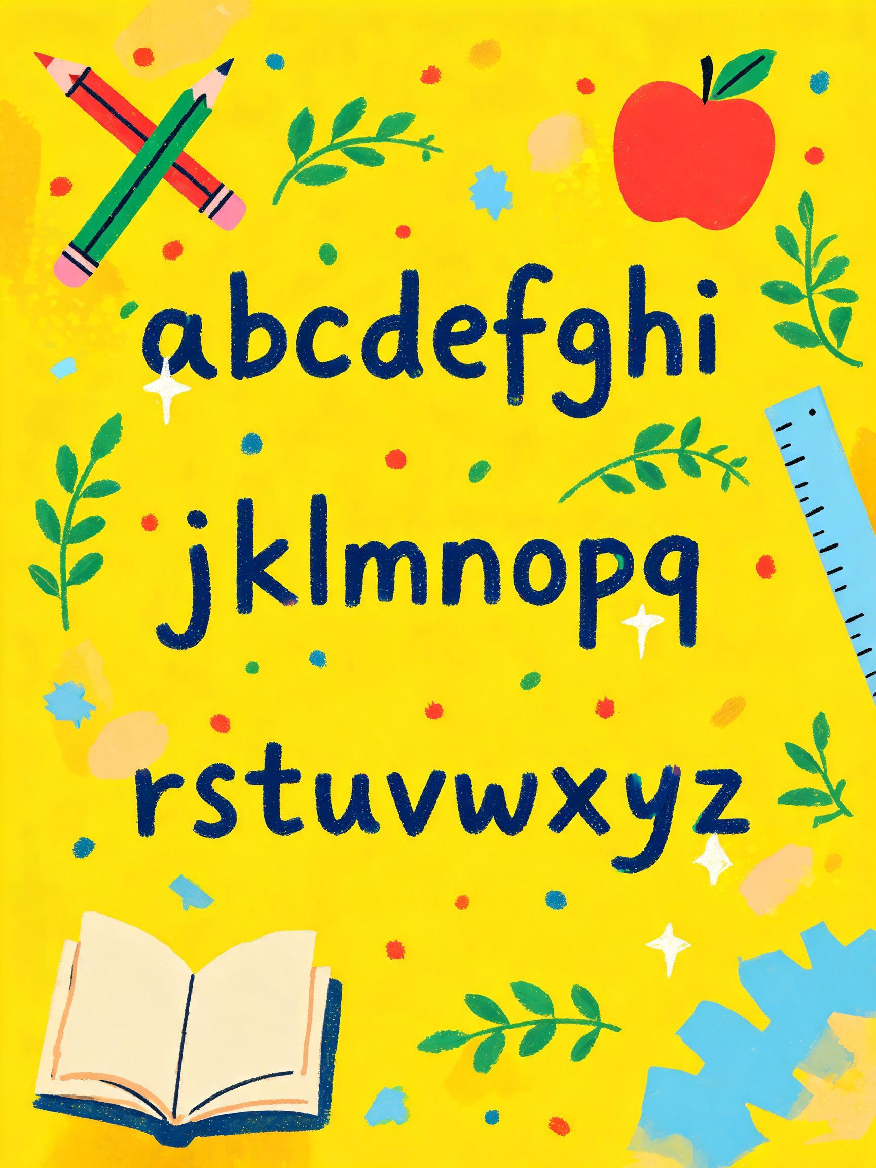
a b c d e f g h i j k l m n o p q r s t u v w x y z - Dia dos Professores Text Effect

Usa BytePlus Seedream 5.0, o modelo desta obra · 15 créditos

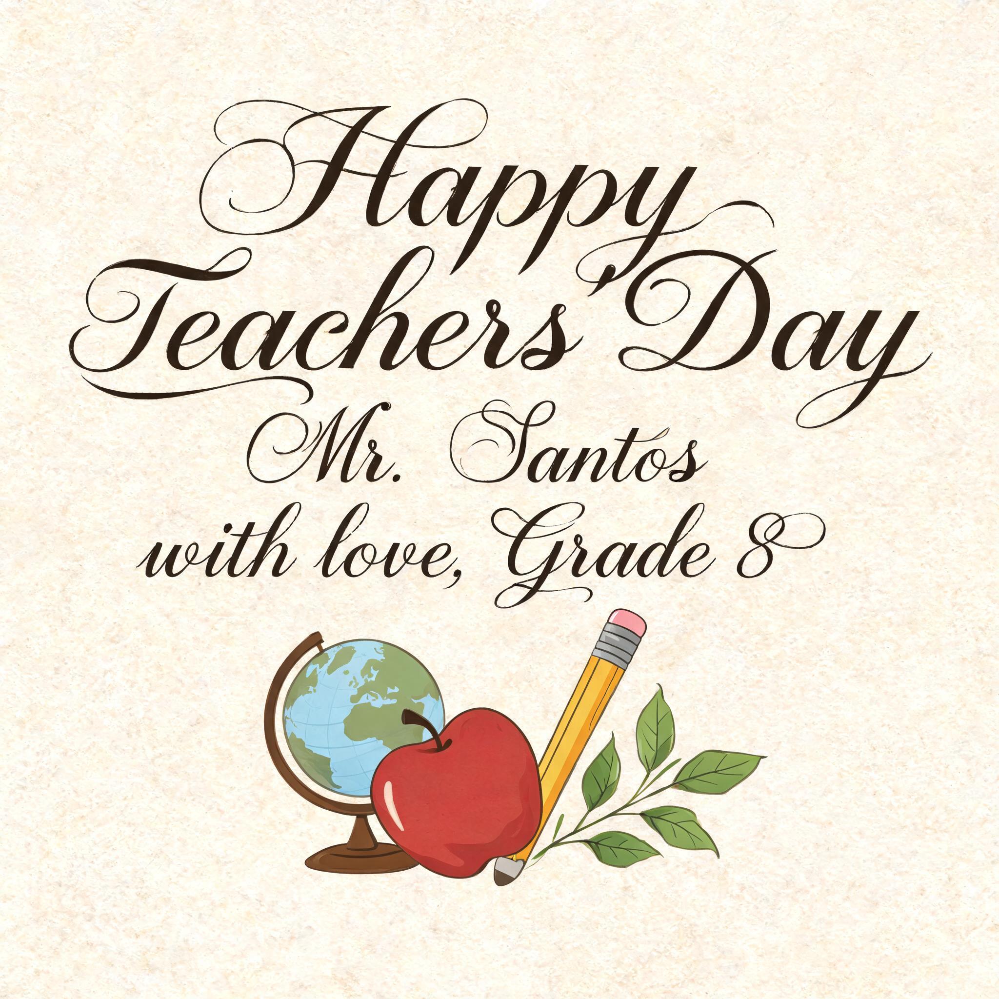
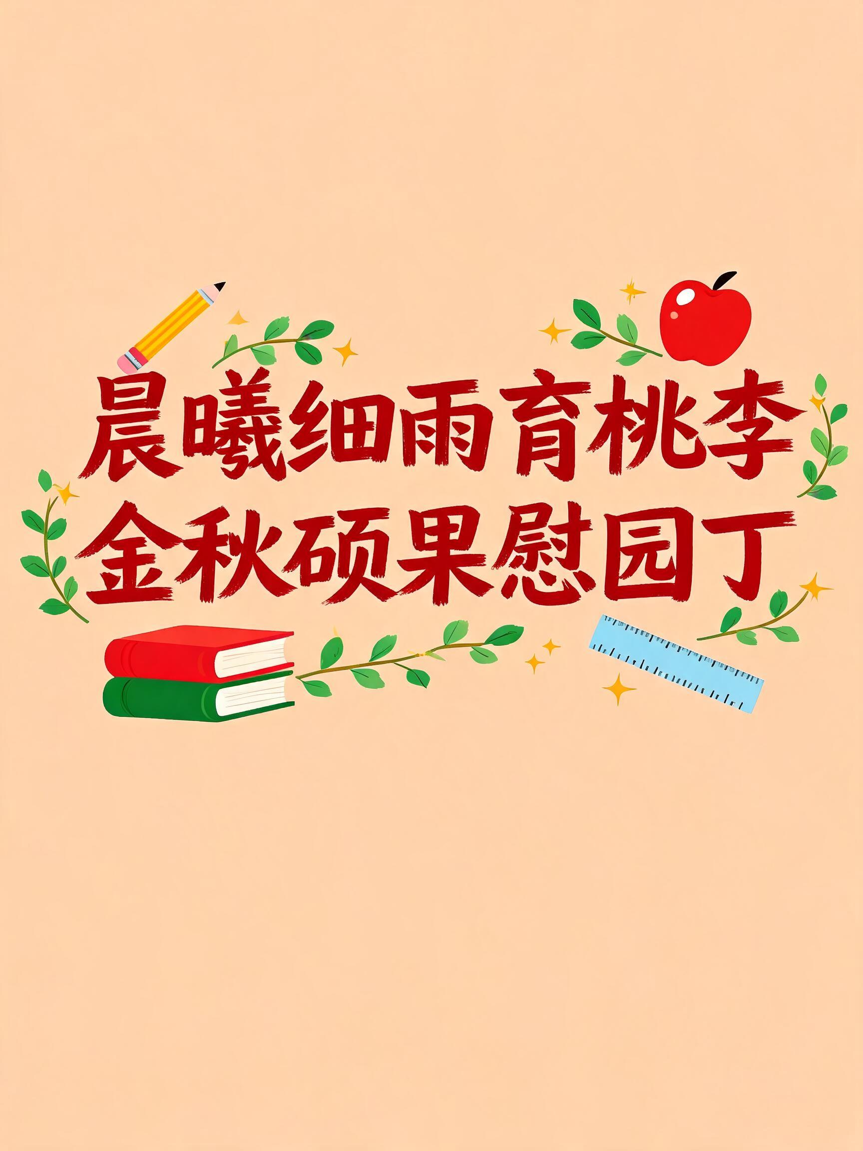

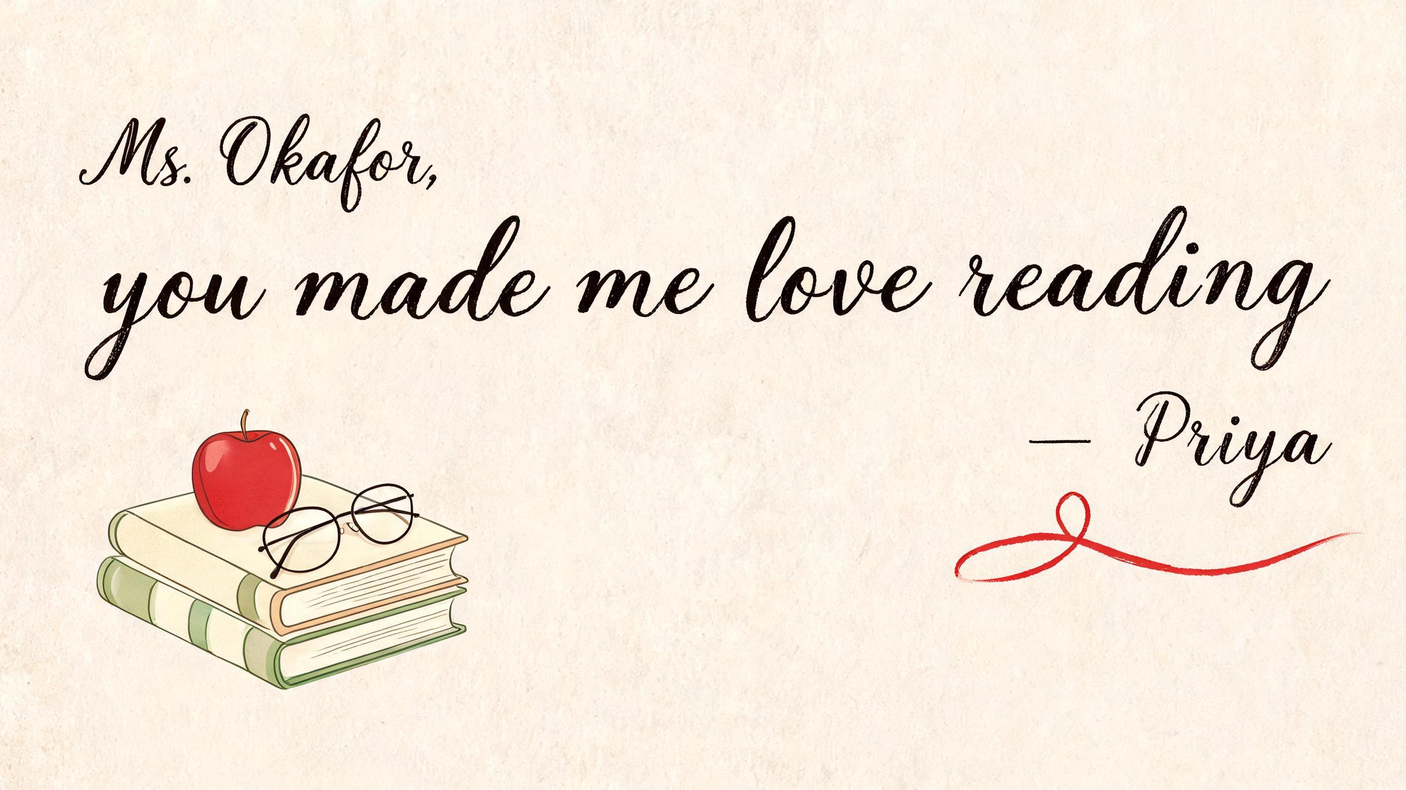
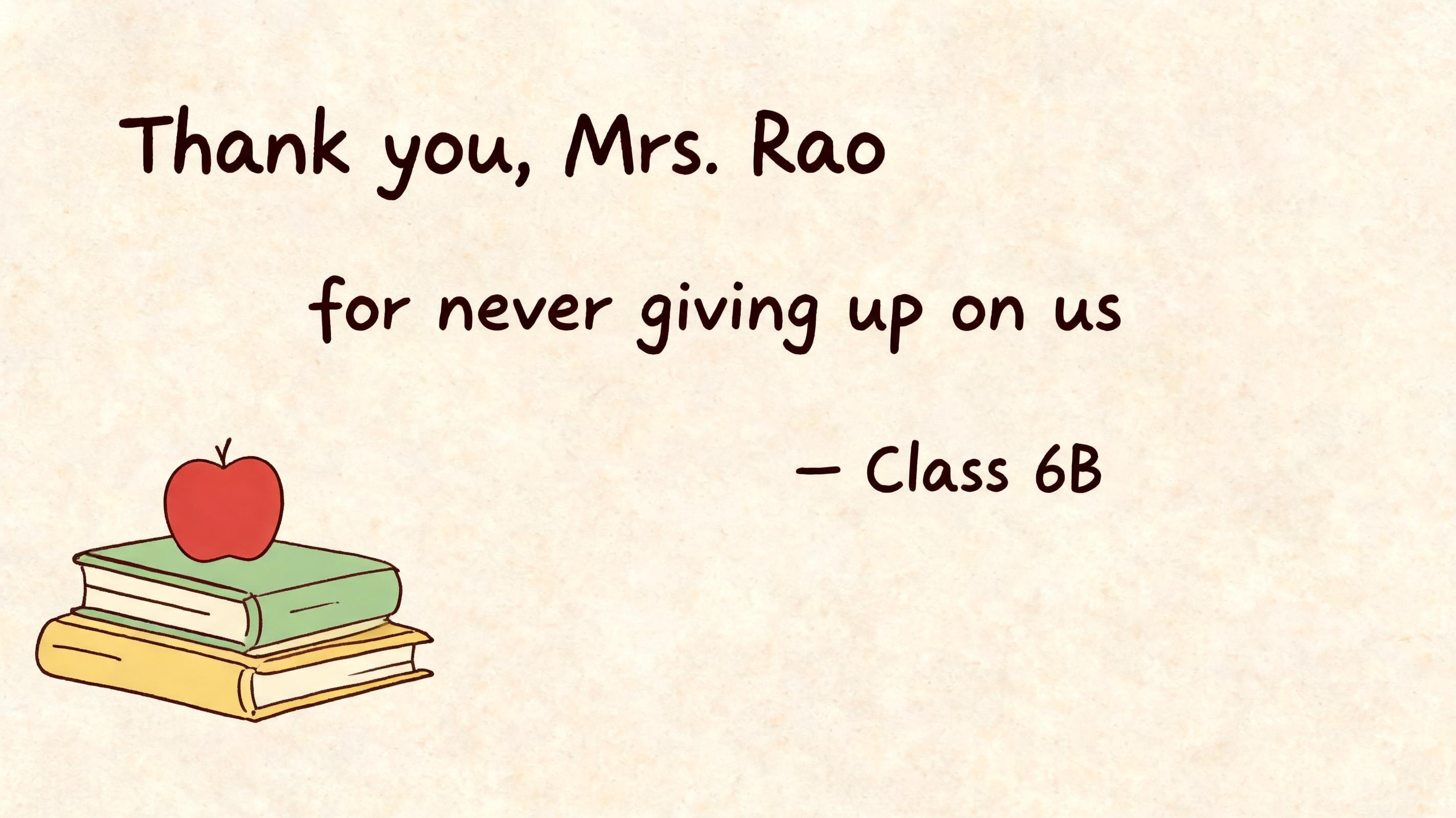
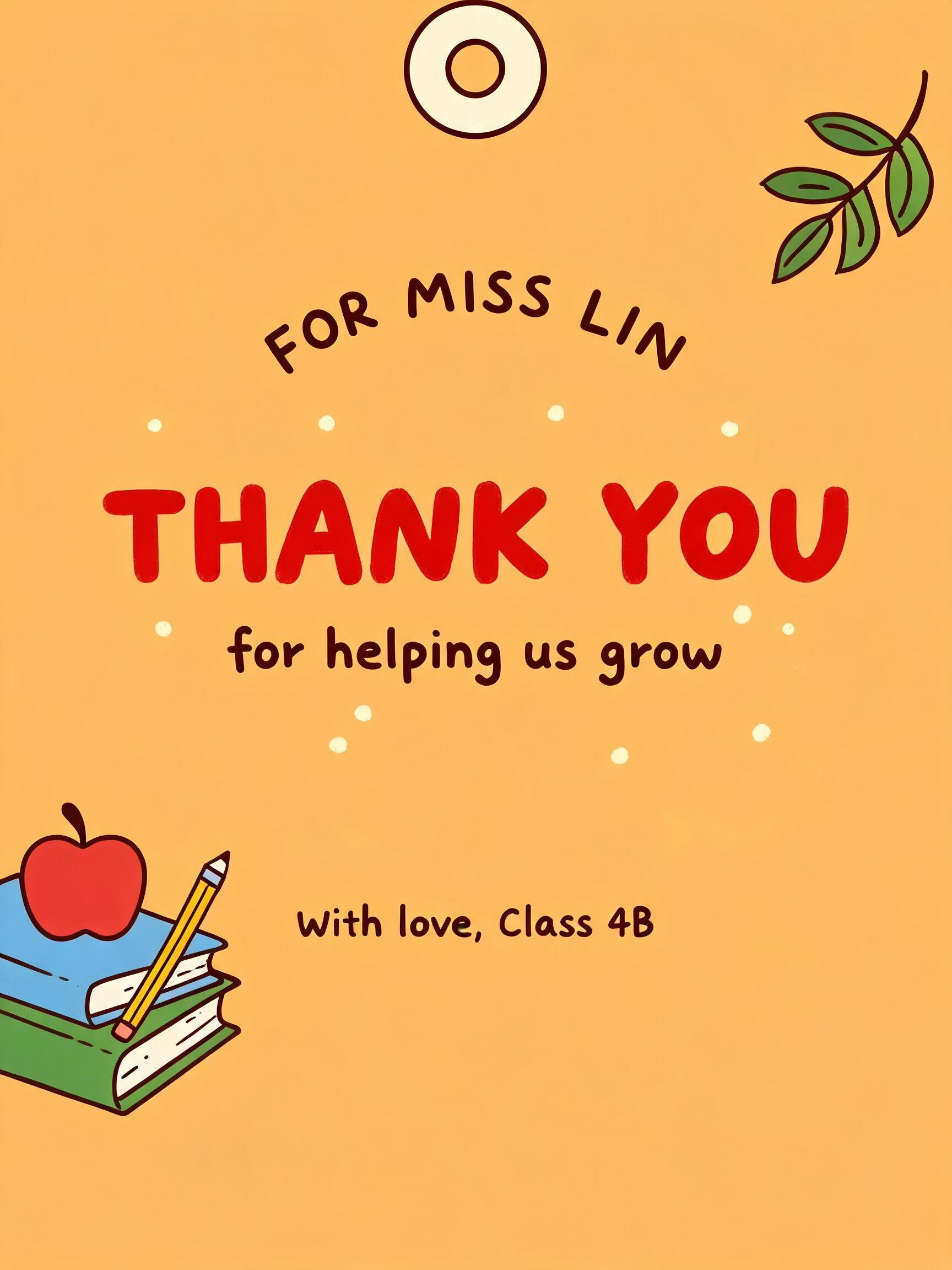
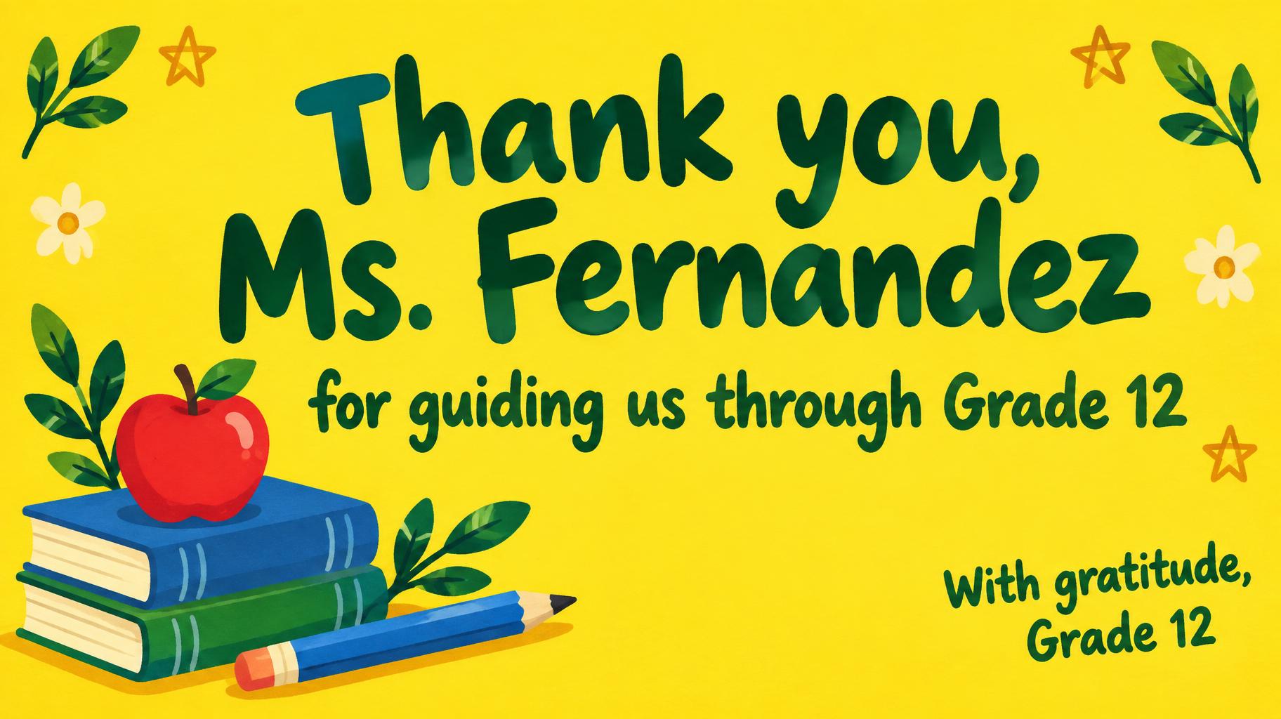


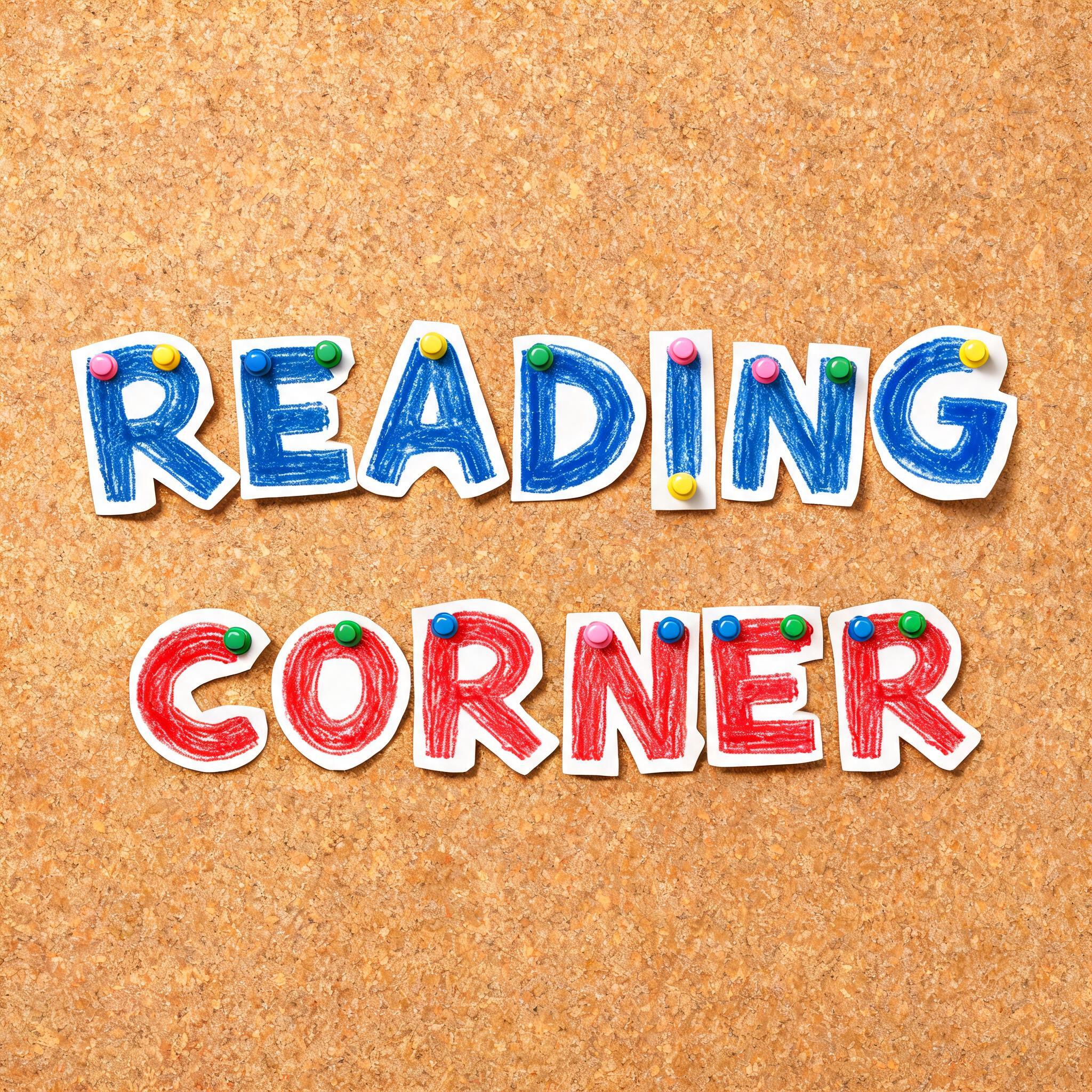
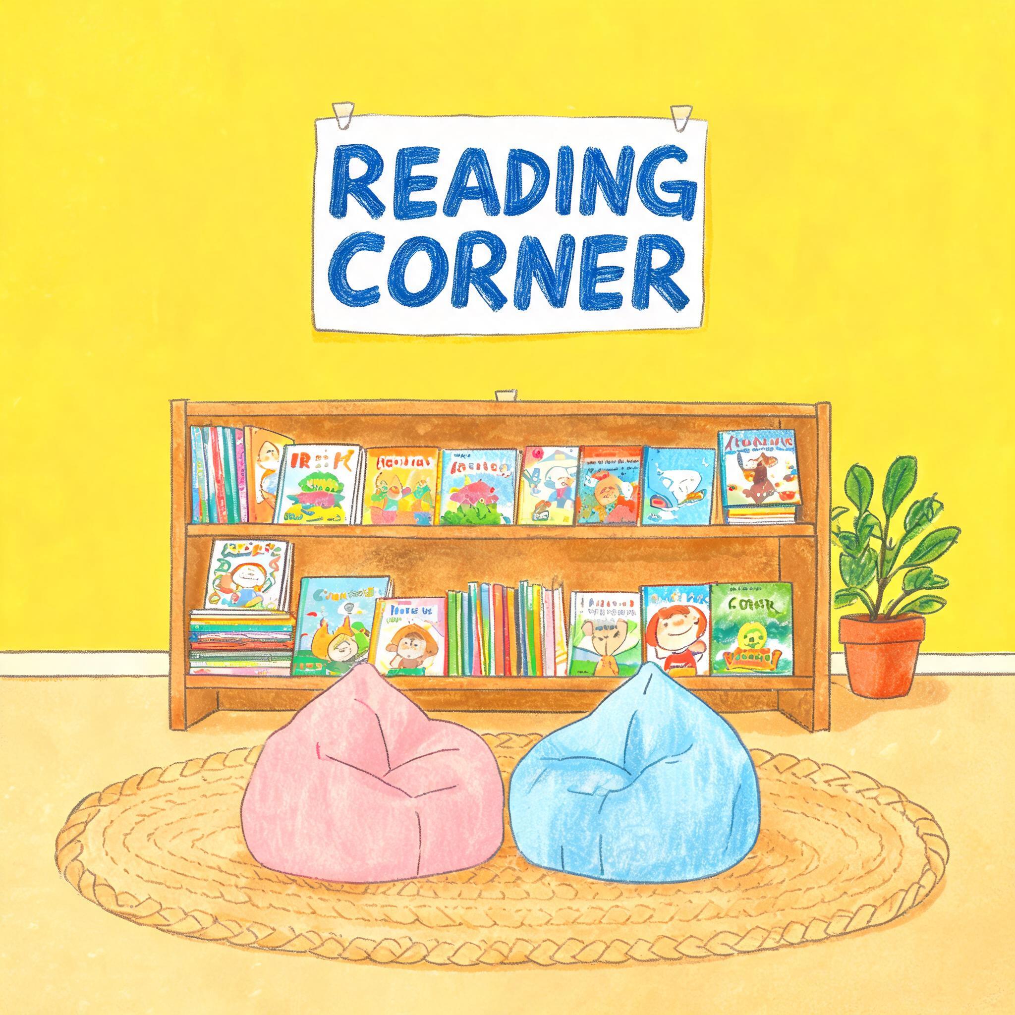
“a b c d e f g h i j k l m n o p q r s t u v w x y z” is a Teachers Day text effect efeito de texto criado com a IA da FontVibe. Cartões de Dia dos Professores com um toque artesanal — livros, globo, maçã vermelha e flores no papel, com uma mensagem de coração para o professor. Perfeito para o Dia dos Professores e para agradecer o ano todo.
a warm hand-lettered Teachers' Day greeting card — a complete flat illustrated card design filling the entire frame, not a photograph of a card. GROUND (suggested default, not fixed): lean toward a warm, saturated color filling the frame edge to edge as the card's own ground — a solid sunny yellow, blush pink, sky blue or warm apricot wash. A paler neutral (oat cream, chalk white, pale sage) is acceptable when a scene calls for a quieter register, but is not the automatic default — an all-neutral ground with no other color reads as thin and unfinished. LEGIBILITY (mandatory): unless the chosen font's own treatment names a specific ink color (gold foil, rose gold, chrome, a named color), the lettering must render in a deep tone with strong, clearly readable contrast against whichever ground color is chosen — never a pale or washed-out ink close to the ground's own value. PALETTE: warm and generously saturated — sunny yellow, blush pink, sky blue, apple red, leaf green, warm apricot — used freely across the ground, any illustrated elements and the lettering itself, never confined to one small accent zone and never washed-out or muddy. LETTERFORM PRIORITY: when the chosen font carries its own named material or color (gold foil, rose-gold, chrome, engraved metal), that treatment takes absolute priority and owns the letters; this style governs only the ground, the palette and the legibility requirement above. FALLBACK MATERIAL: if the font carries no material of its own, render the letters in a warm hand-lettered ink or marker finish, in a deep tone with strong contrast against the ground, so the handmade card feel always reads clearly. A complete flat illustrated Teachers’ Day card design filling the entire frame edge to edge, printed directly on a saturated sunny-yellow ground with broad warm-apricot brush shapes and small sky-blue paper-cut panels. Render the exact text "a b c d e f g h i\nj k l m n o p q\nr s t u v w x y z" as the dominant educational lettering, preserving the three-line sequence and generous rhythm between each lowercase character. Use deep navy hand-painted marker ink with subtly uneven pigment edges, crisp high contrast against the yellow ground, and tiny red, leaf-green, and sky-blue highlight strokes around selected letters. Build an overlapping cluster of flat classroom illustrations around the alphabet: an open picture book, a red apple with a leaf, two crossed pencils, a ruler, a small chalk star, and curved leaf sprigs. Add scattered hand-drawn dots, miniature spark marks, and short underline swashes as printed graphic details. Every object uses clean flat vector-like color fields, dark outline accents, and slight screen-print texture. No photo, no physical card, no desk, no shadows from photographed props; the full frame is a finished cheerful educational greeting-card illustration.
Gerada em 13 de setembro de 2026 · 1728 × 2304 · JPEG · BytePlus Seedream 5.0 · Compartilhada pelo criador · Uso comercial gratuito (CC BY 4.0)