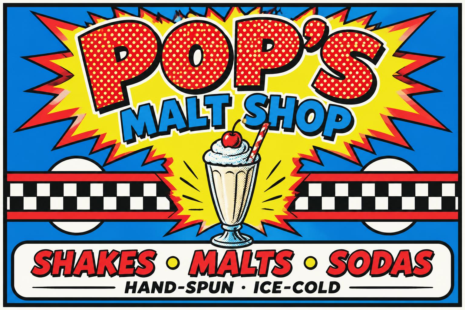
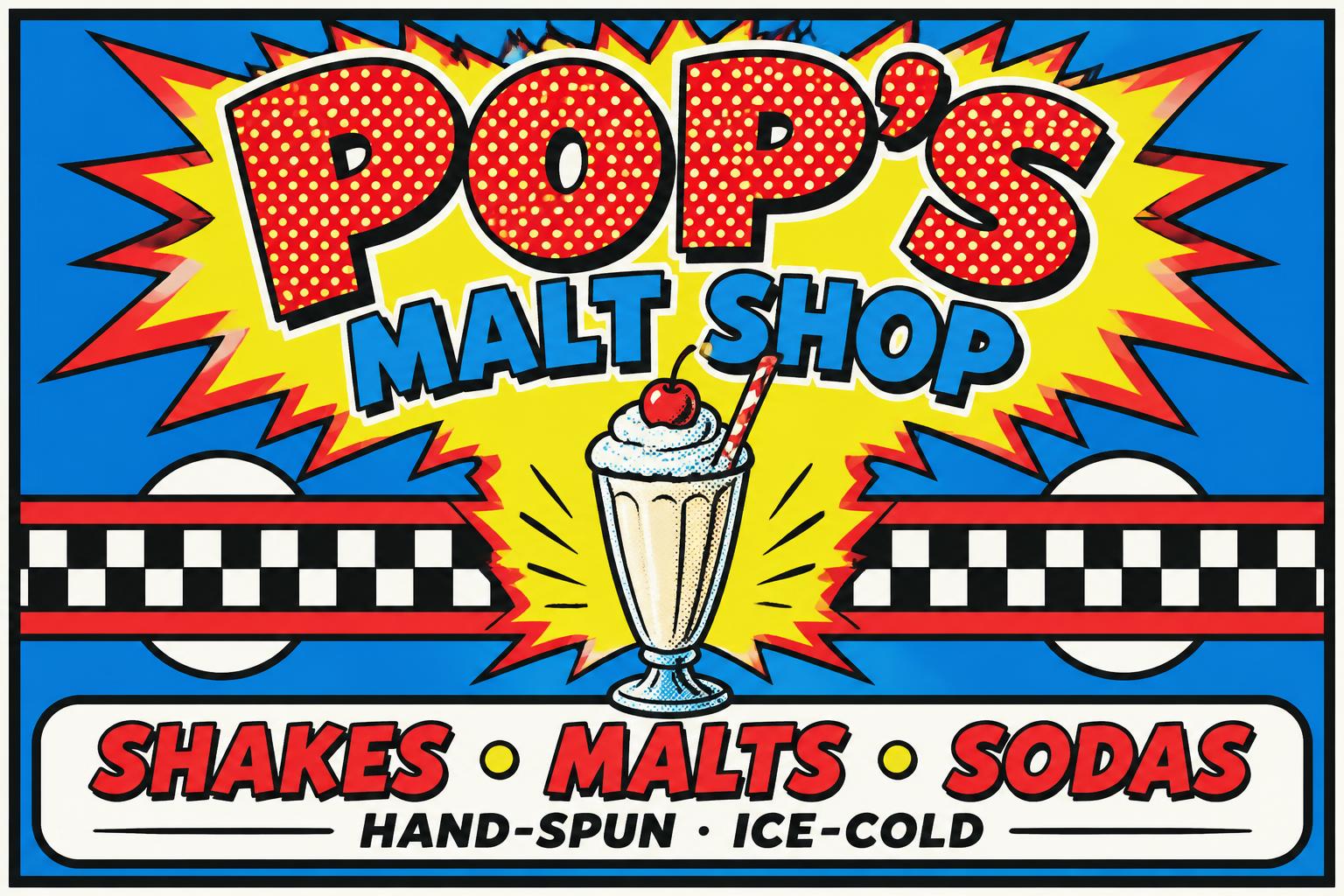
POP'S MALT SHOP SHAKES • MALTS • SODAS HAND-SPUN · ICE-COLD - Pop Art Text Effect


Usa OpenAI GPT-Image-2.5 Sunburst, o modelo desta obra · 15 créditos
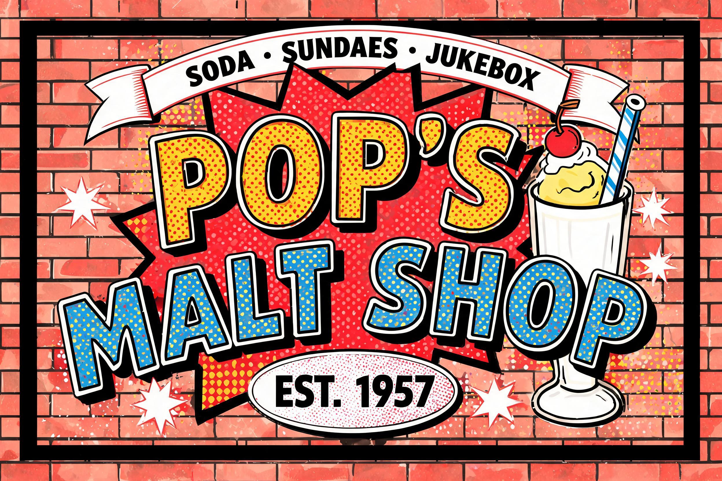








“POP'S MALT SHOP SHAKES • MALTS • SODAS HAND-SPUN · ICE-COLD” is a Pop Art text effect efeito de texto criado com a IA da FontVibe. Maiúsculas de quadrinhos à la Lichtenstein preenchidas com pontos Ben-Day em vermelho e amarelo chapados, contornos pretos grossos e sombra dura, saindo de uma explosão sobre fundo azul de bolinhas.
Create a finished, wide 3:2 mural sign for the diner Pop's Malt Shop. Build a complete sign composition, not isolated lettering. Render the exact text, spelled and punctuated exactly as follows: headline “POP'S”; second line “MALT SHOP”; supporting line “SHAKES • MALTS • SODAS”; small finishing line “HAND-SPUN · ICE-COLD”. Set “POP'S” as the largest text across the upper center, with “MALT SHOP” directly beneath it. Place the supporting line in a clearly separated lower band and the finishing line as the smallest line beneath it. Keep all text crisp, correctly spelled, and fully legible. Design the letterforms as hand-traced comic display lettering: broad, compact strokes, sturdy counters, slightly irregular brush-drawn contours, with a thick, absolutely consistent black outline. Fill the headline letters with flat primary red and yellow Ben-Day dots, each dot individually visible and arranged on a precise 45° offset grid. Leave a slim bare white gap between dots and the inner edge of each black outline. Use flat primary-color fills for the remaining lettering, with solid black hard-edge shadows offset 45° lower-right. No gradients, soft shadows, metallics, pastels, blended colors, or photographic realism. Behind the title, use a large jagged red-and-yellow comic starburst with crisp black contour lines. Add a central illustrated soda-fountain milkshake glass as its own visual block: tall fluted glass, vanilla shake, red-and-white striped paper straw, a single cherry, bold black outlines, and flat blue, red, yellow, and white Ben-Day fills. Keep the glass below the title and above the bottom text band; it must not obscure lettering. Use flat blue and yellow comic-print fields, primary-color accents, and a bold black outer panel border. Maintain clear white gaps around all lettering contours. Uniform dot scale, hard edges, high contrast, flat vintage offset-print appearance; no extra text, logos, or realistic surfaces.
Gerada em 24 de setembro de 2026 · 1536 × 1024 · JPEG · OpenAI GPT-Image-2.5 Sunburst · Layout: Pôster · Compartilhada pelo criador · Uso comercial gratuito (CC BY 4.0)


