

Serena - Viking Text Effect


Usa BytePlus Seedream 5.0, o modelo desta obra · 15 créditos

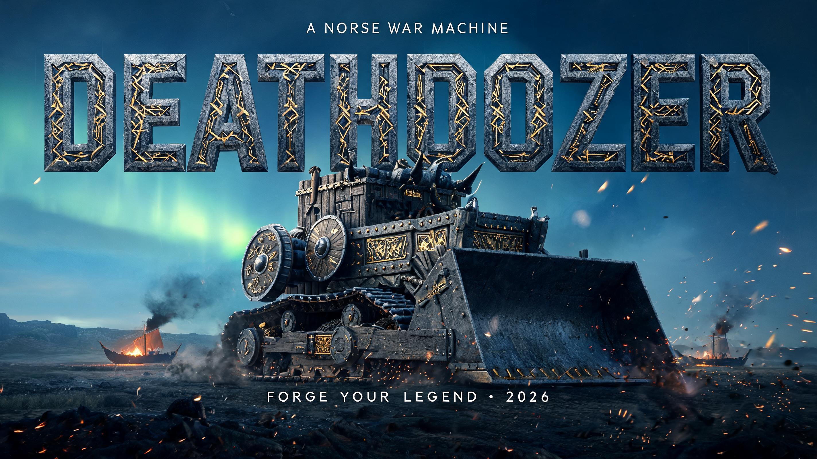
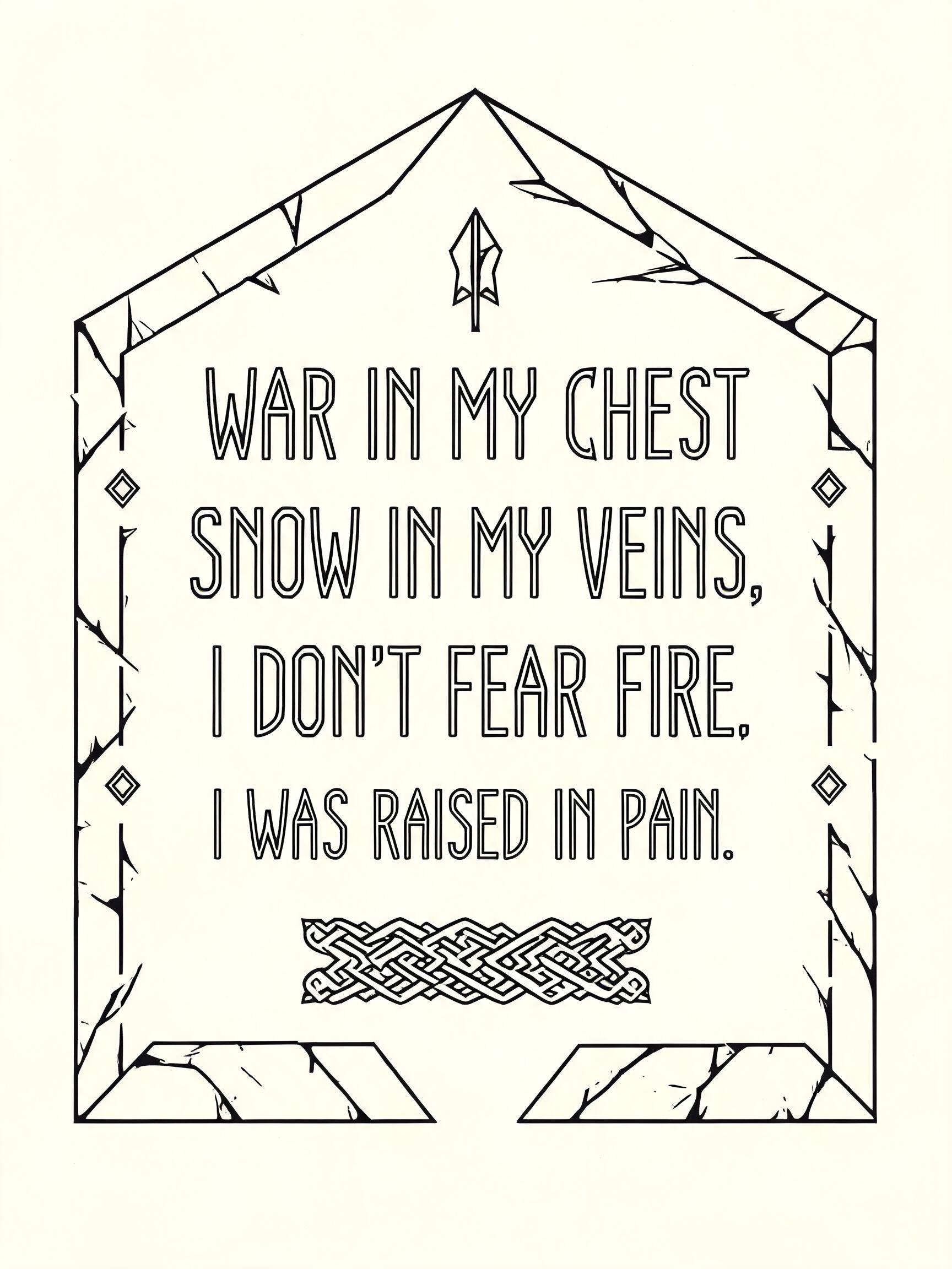

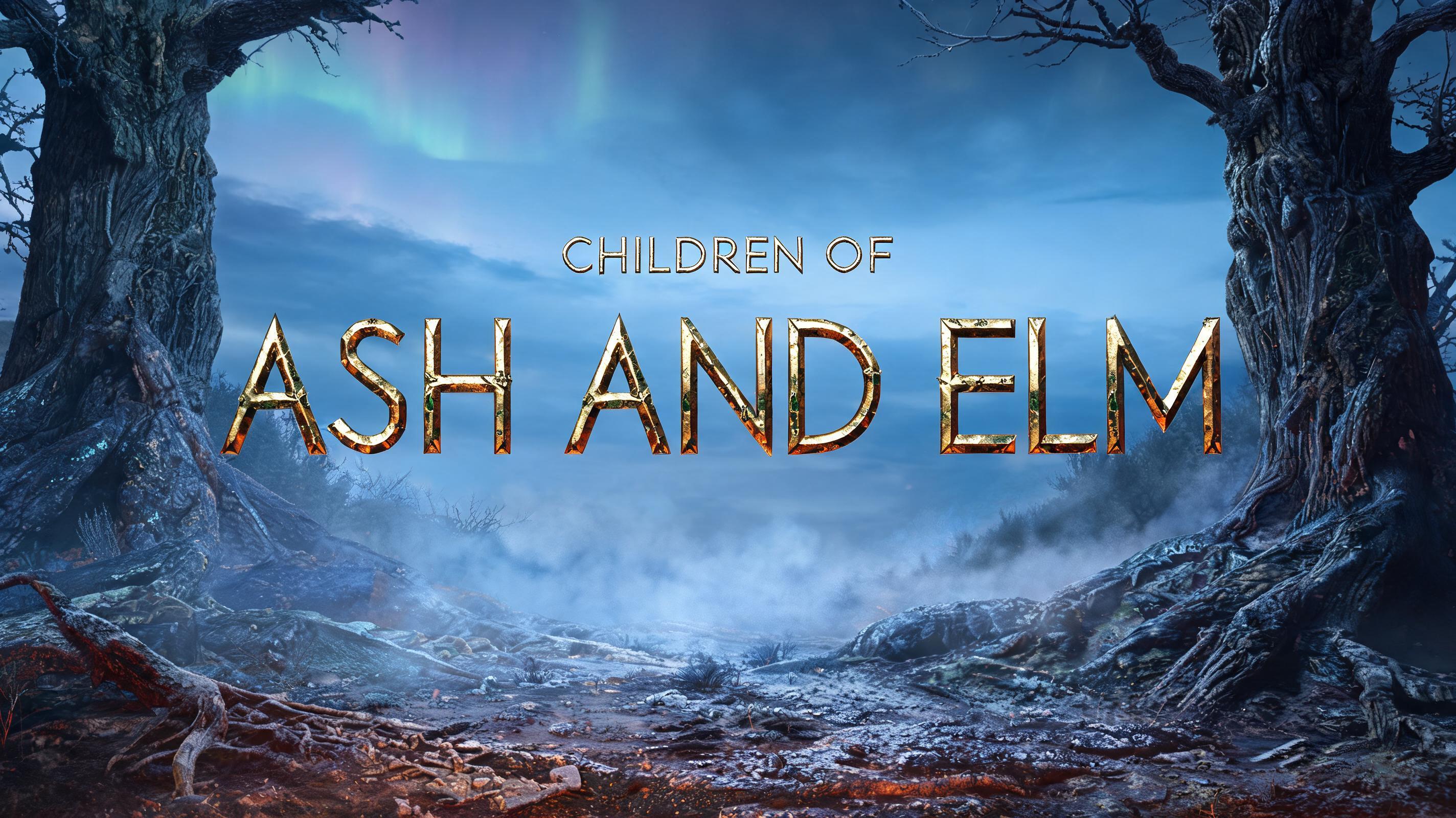
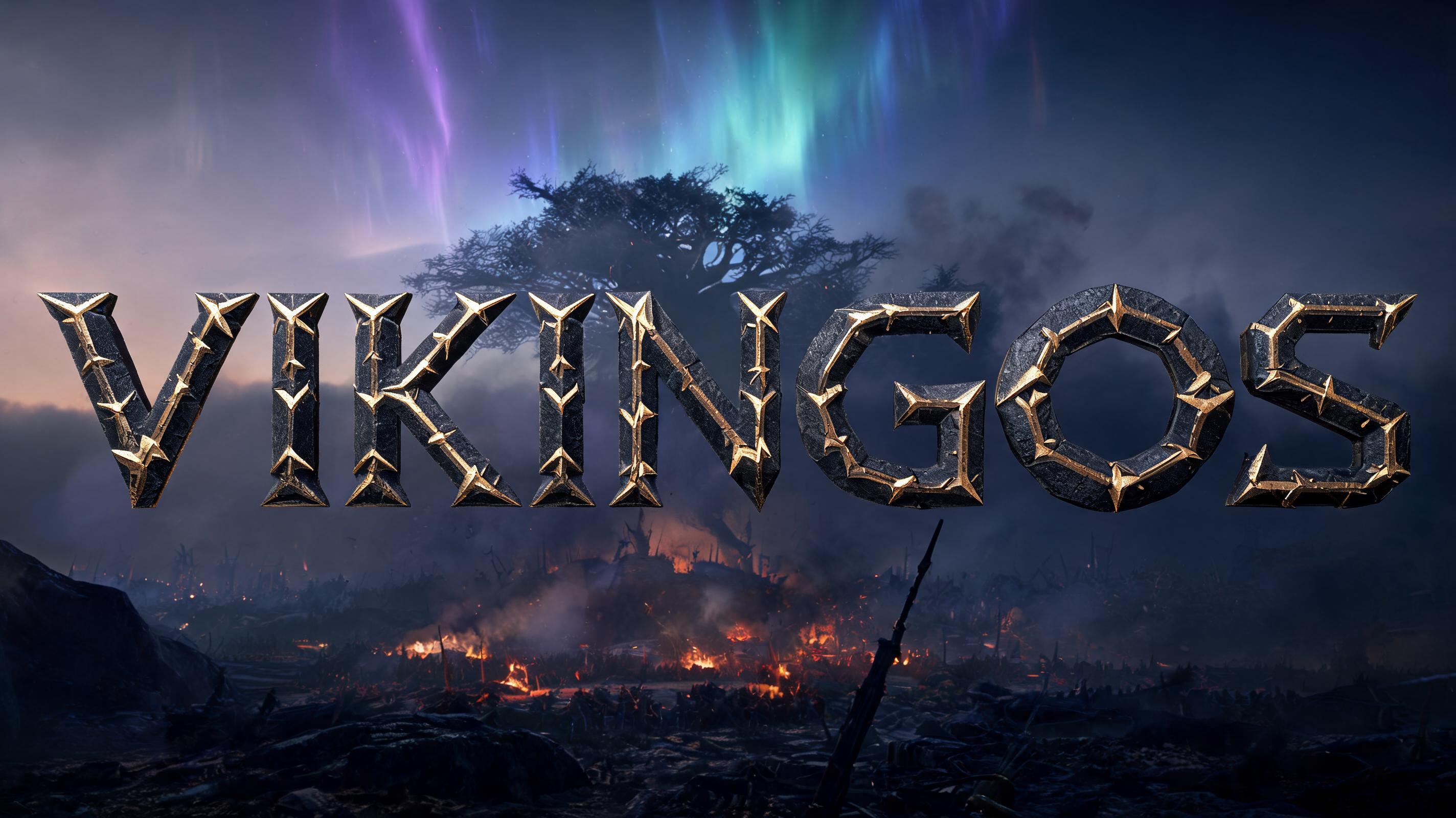

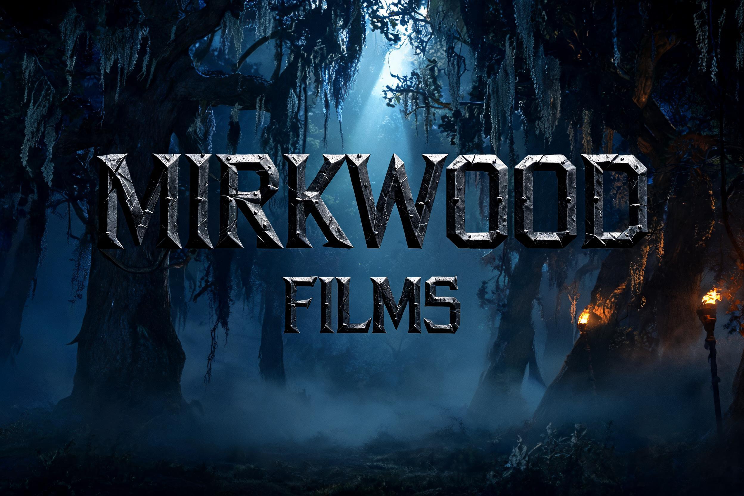
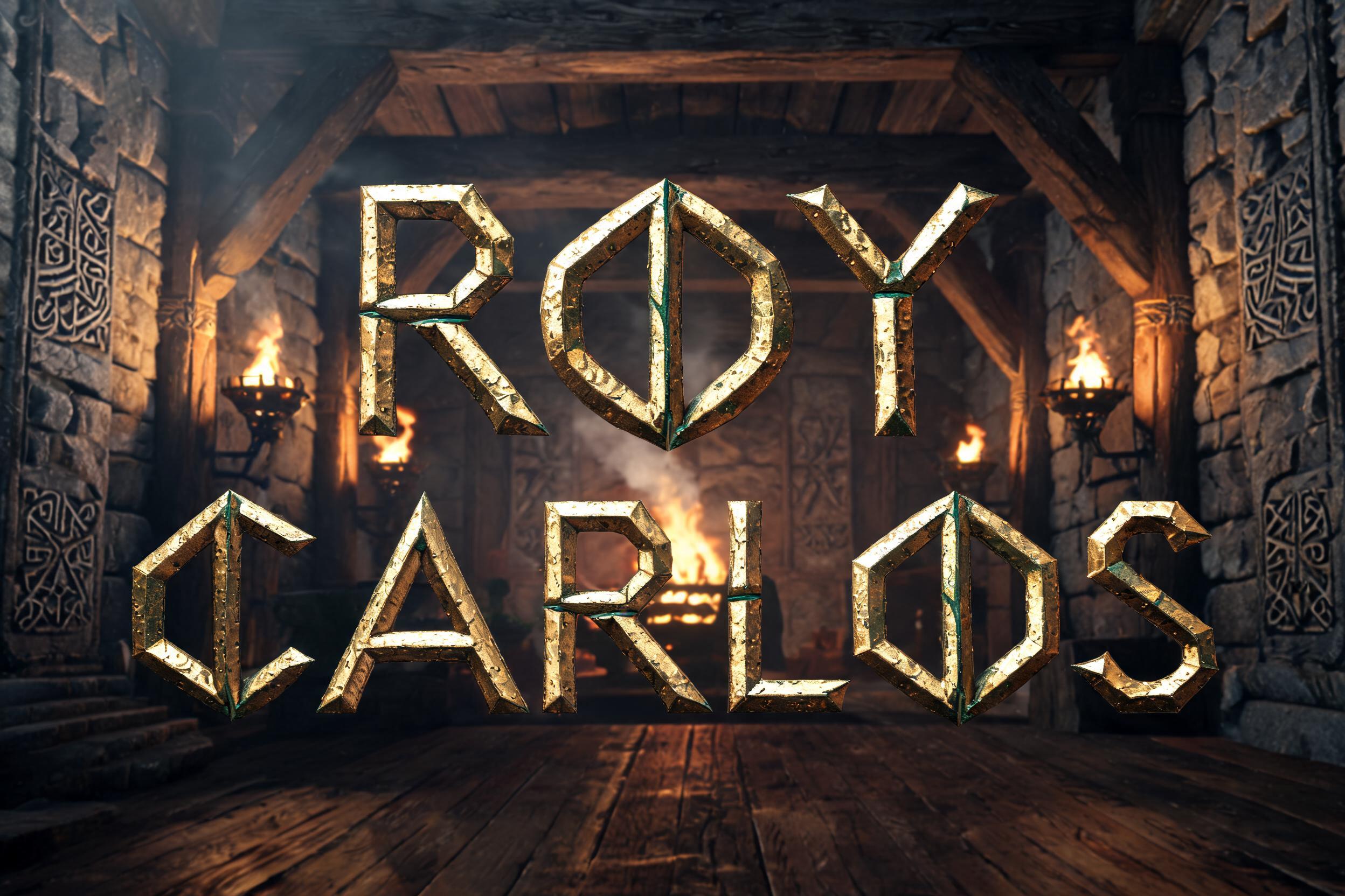

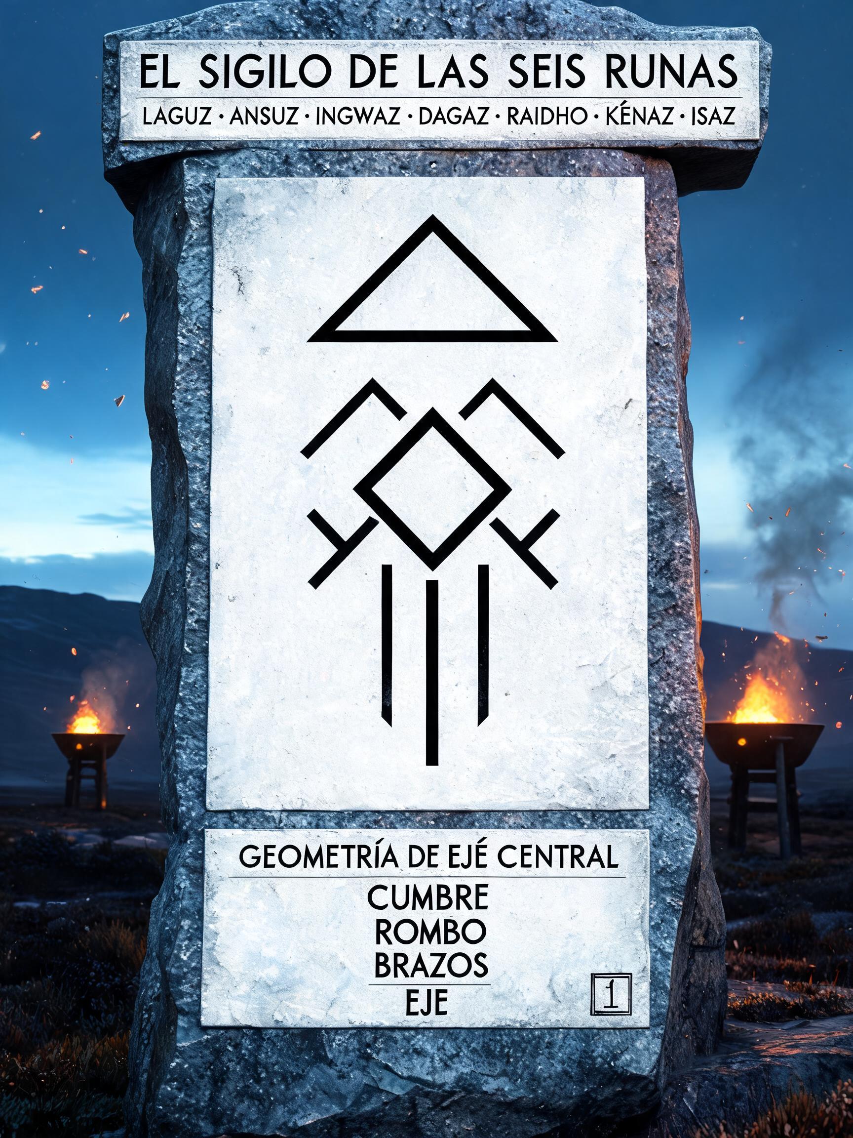

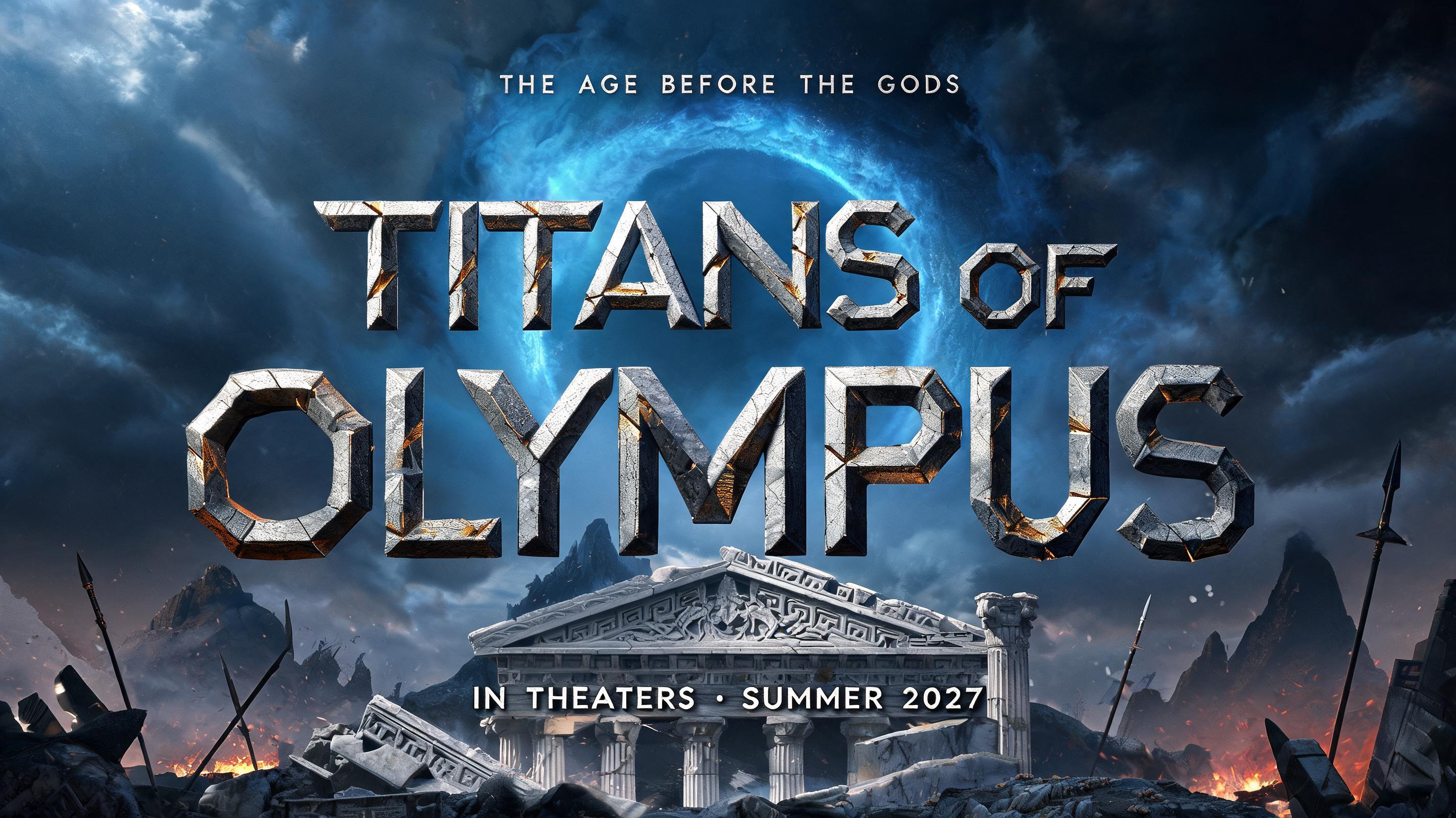


“Serena” is a Viking text effect efeito de texto criado com a IA da FontVibe. Tipografia rúnica viking nórdica com texturas de pedra entalhada, padrões de nós nórdicos, acabamentos metálicos marcados pela batalha e uma estética escandinava ancestral.
ancient Norse warrior aesthetic — stark angular geometry, battle-forged weight, the material permanence of things built to outlast kingdoms. Directional forge-light or cold torch-light that sculpts every letterform face into high relief. Color palette: iron-grey, aged bronze, cold granite, dark amber — no soft pastels, no unmotivated gradients. Every letter reads as an object with real physical mass. When no specific material is defined by the font: default to battle-worn dark iron — cold charcoal-grey letter body with visible forge-hammer surface texture, narrow cold specular highlight on the upper stroke edge, deep iron shadow on the underside, hairline stress-fracture lines along diagonal strokes. The Norse blacksmith's iron: heavy, angular, built for war. SERENA as 6 angular runic letters forged in cold dark iron, each stroke cut at strict 0°/45°/90° angles with blade-flat terminals, hammer-textured surface catching a single cold specular highlight along the upper stroke edge, deep shadow pooling on the underside. Letter bodies in charcoal-grey iron with hairline stress-fracture lines tracing the diagonal strokes — raw, heavy, built to last. Background: Norse winter moorland at last light — dark granite runestone terrain receding into a cold horizon, sparse leafless birch silhouettes, a pale steel-blue and ash-grey sky fading at the edges to near-black. Distant amber longfire glow barely visible at the horizon line, sending a warm underedge of firelight up against the cold blue atmosphere. Foreground: frost-dusted dark stone surface, barely visible texture. Key light: cold blue-white from above-left casting deep angular shadows beneath every stroke. Secondary light: faint amber torch-warmth from far lower-right edging the letterforms with a thin bronze rim. The contrast between glacial cold-iron body and faint warm rim light gives each letter physical mass and battlefield permanence. Octane render, ray-traced high-contrast chiaroscuro, 8k, no gradients in letterforms.
Gerada em 1 de julho de 2026 · 2496 × 1664 · JPEG · BytePlus Seedream 5.0 · Compartilhada pelo criador · Uso comercial gratuito (CC BY 4.0)


