K - Fonte Gótica Text Effect


Usa BytePlus Seedream 5.0, o modelo desta obra · 15 créditos
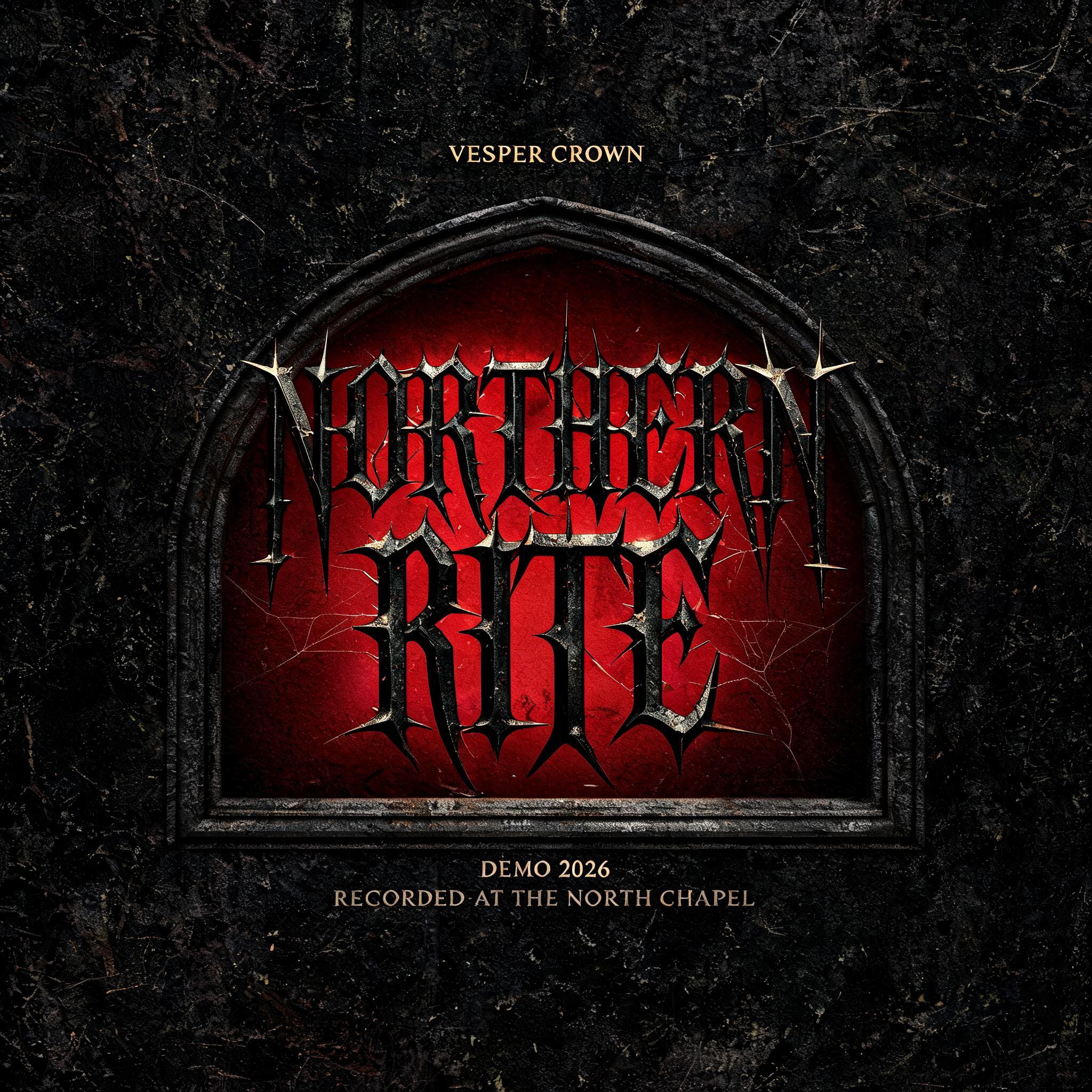

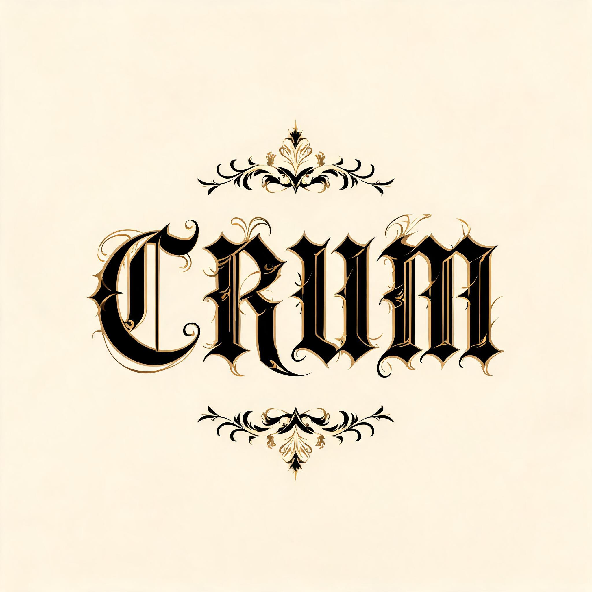

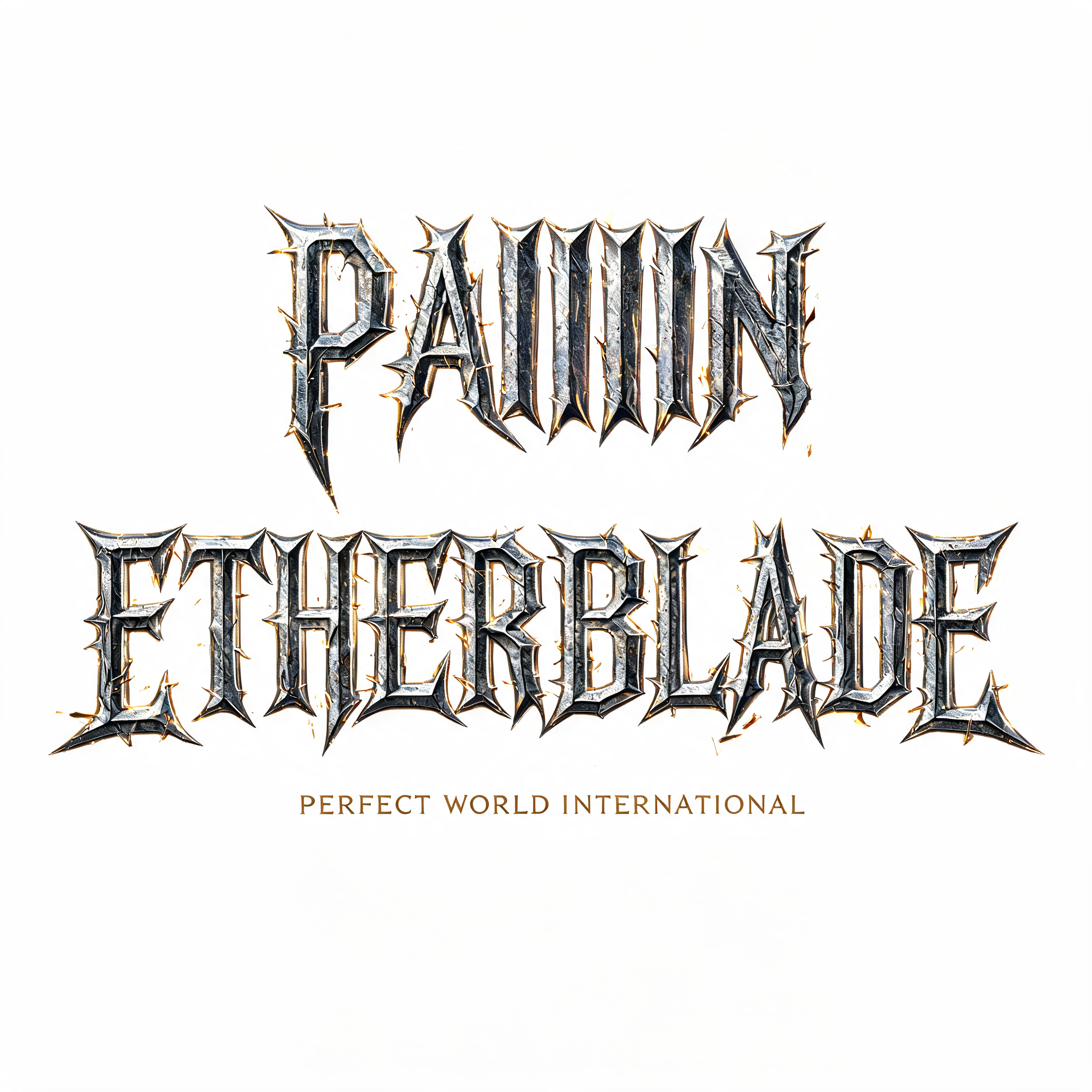
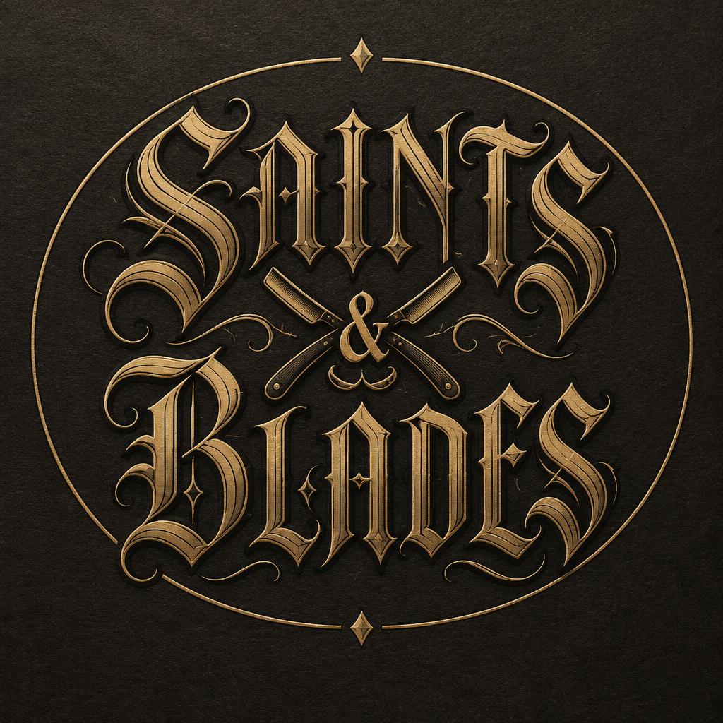
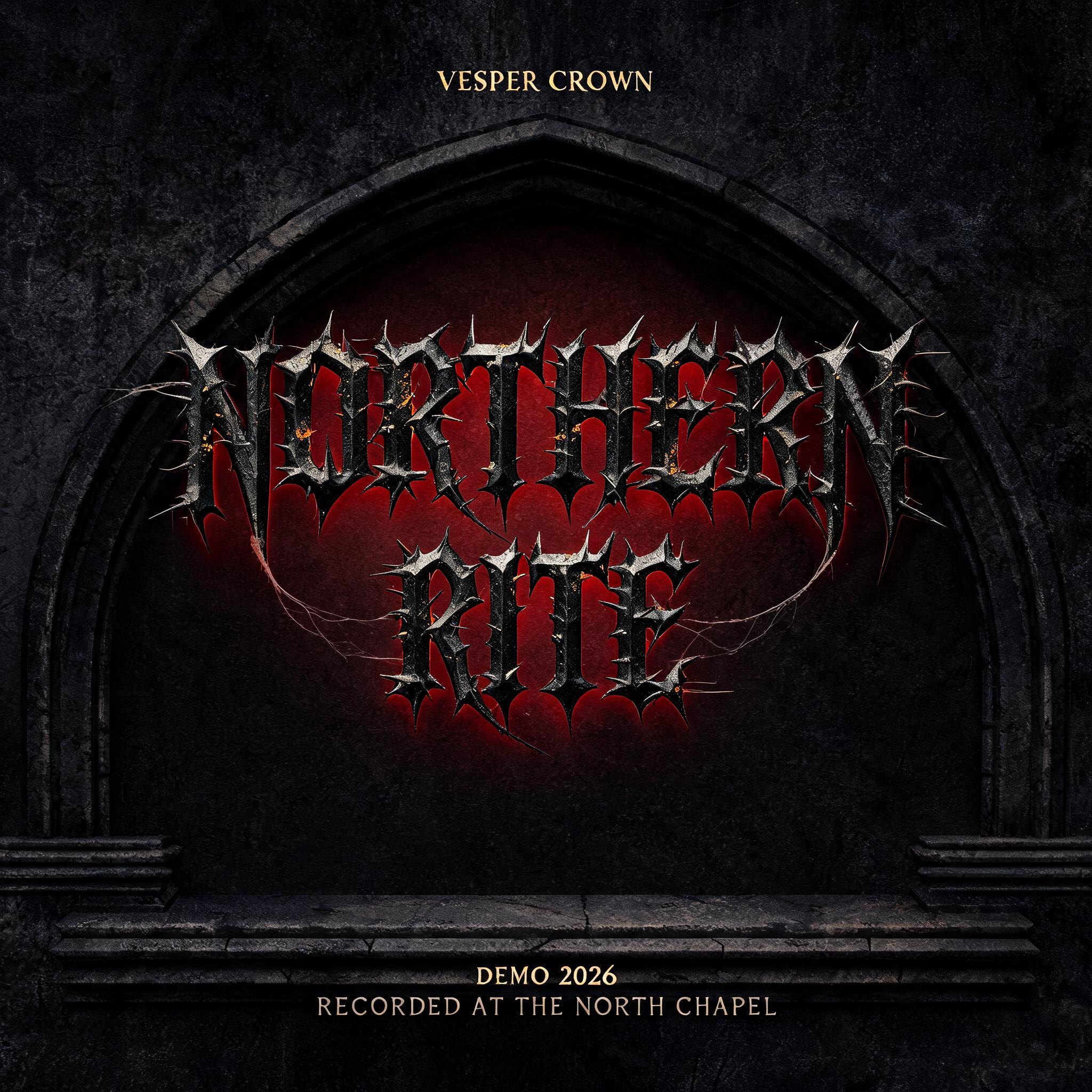
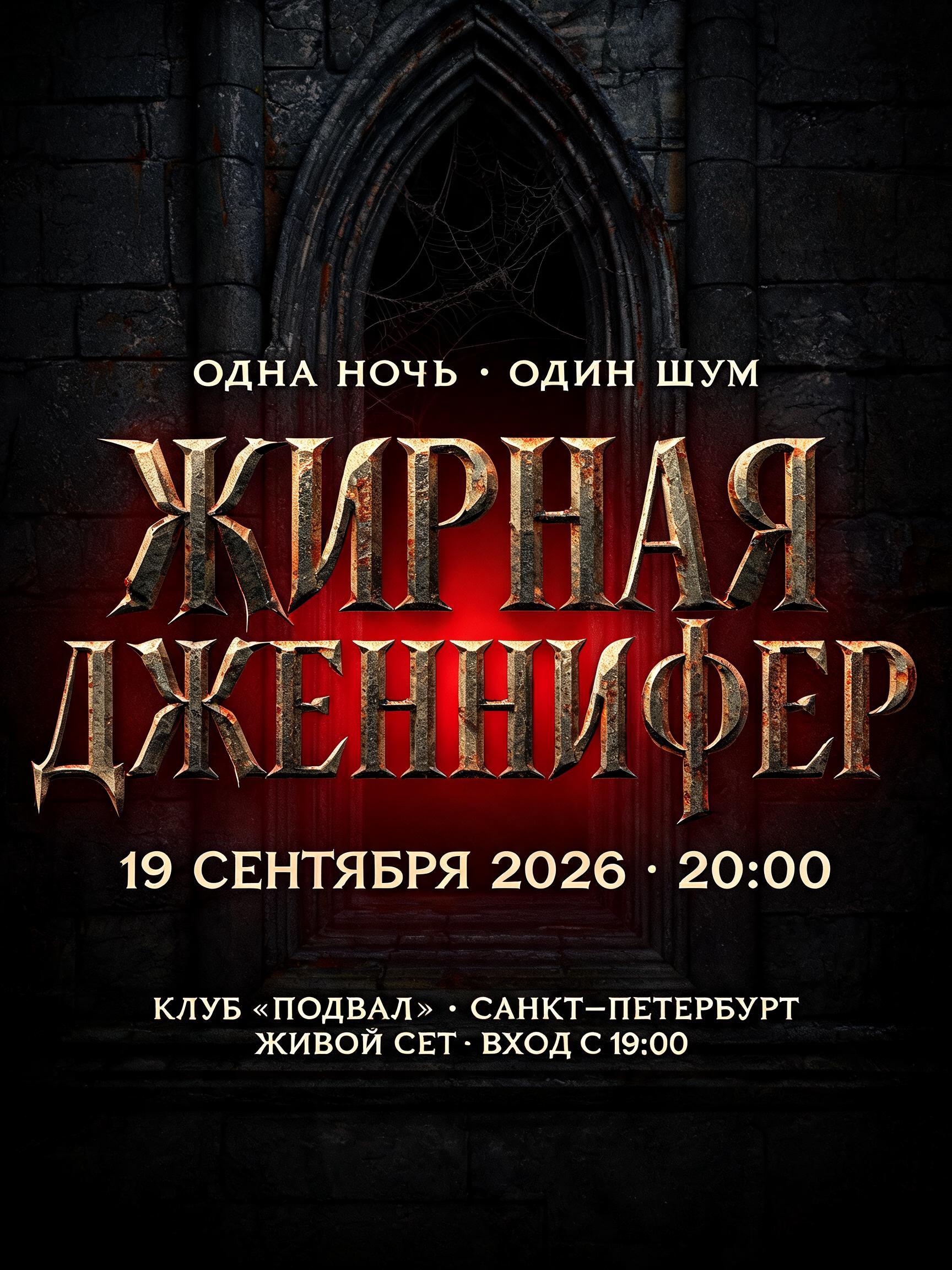
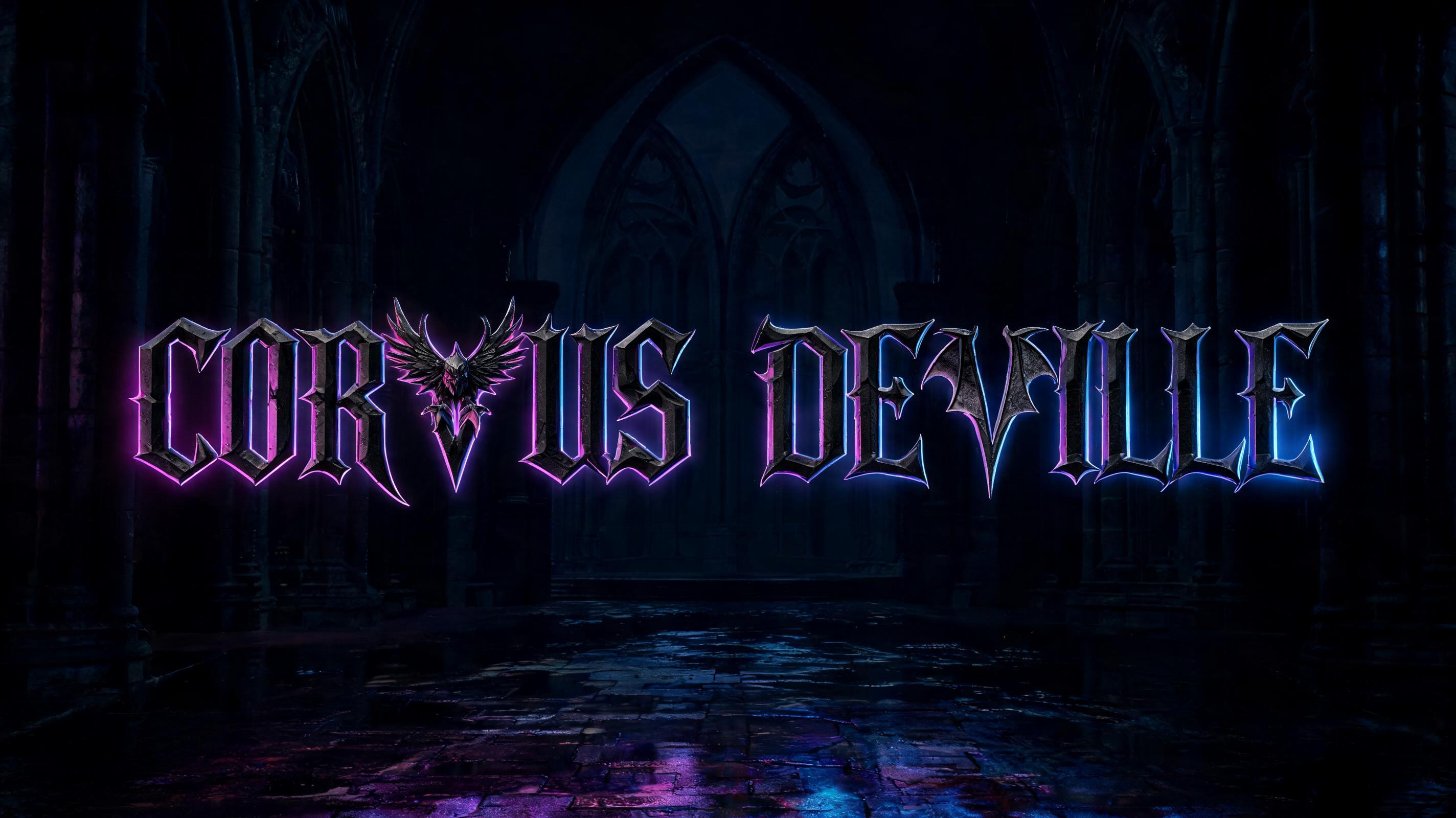


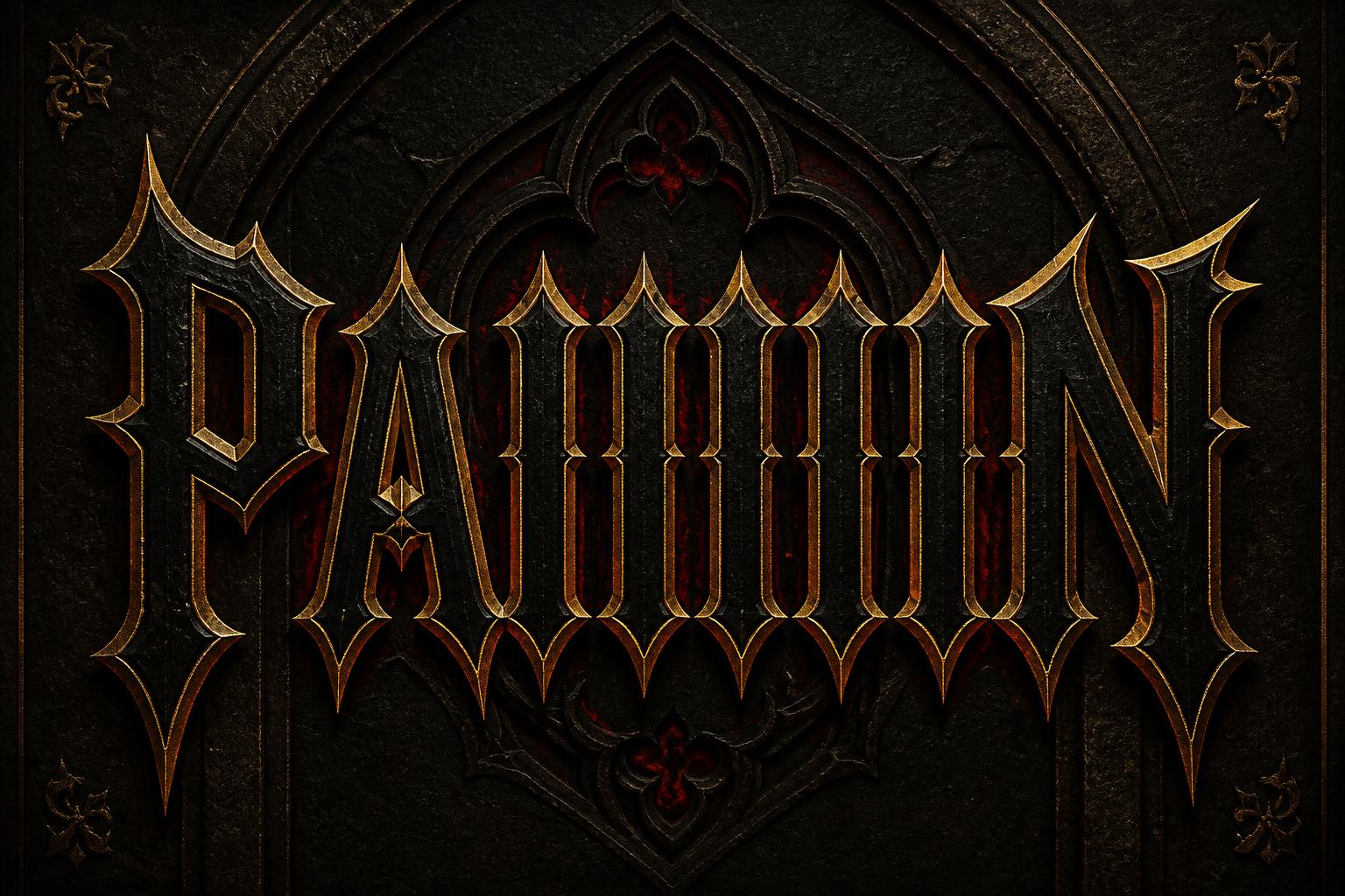
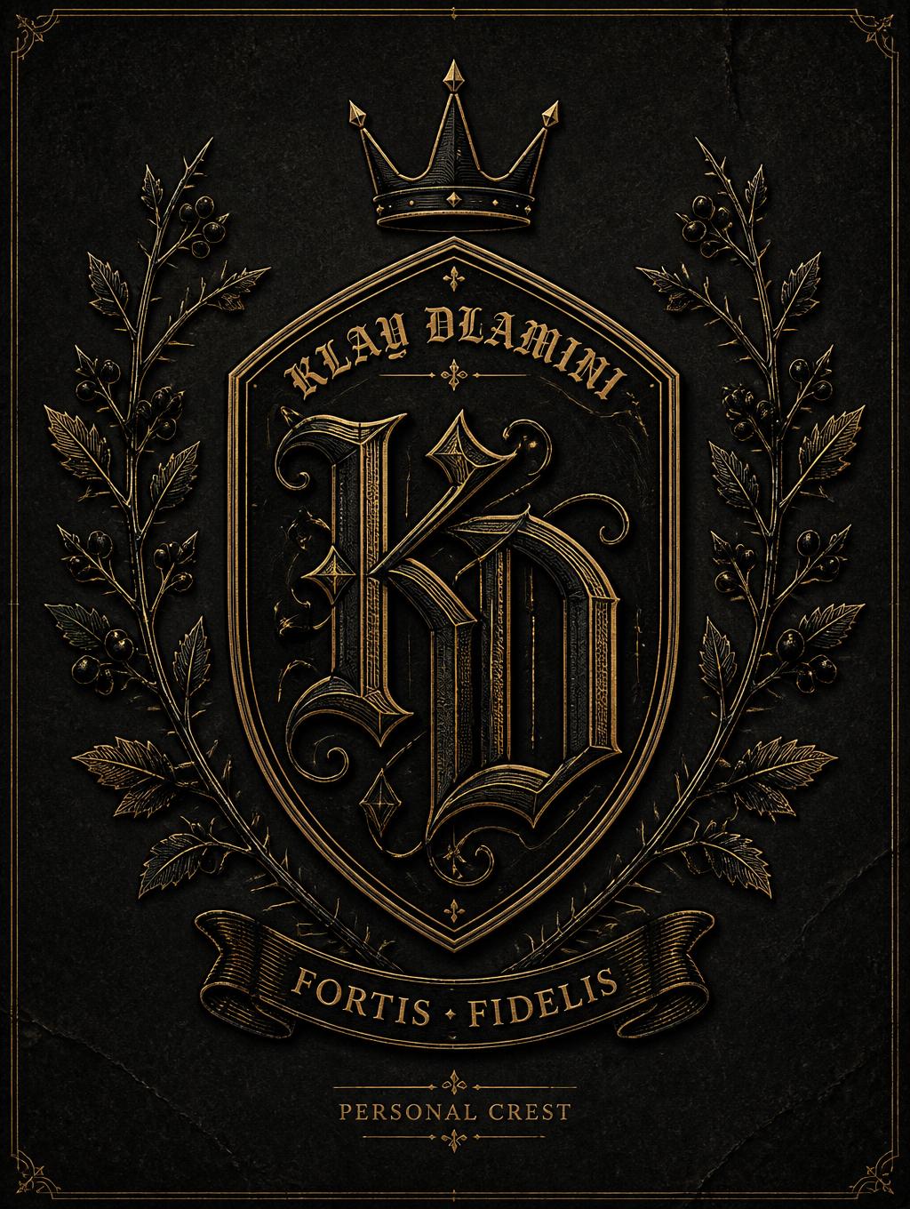


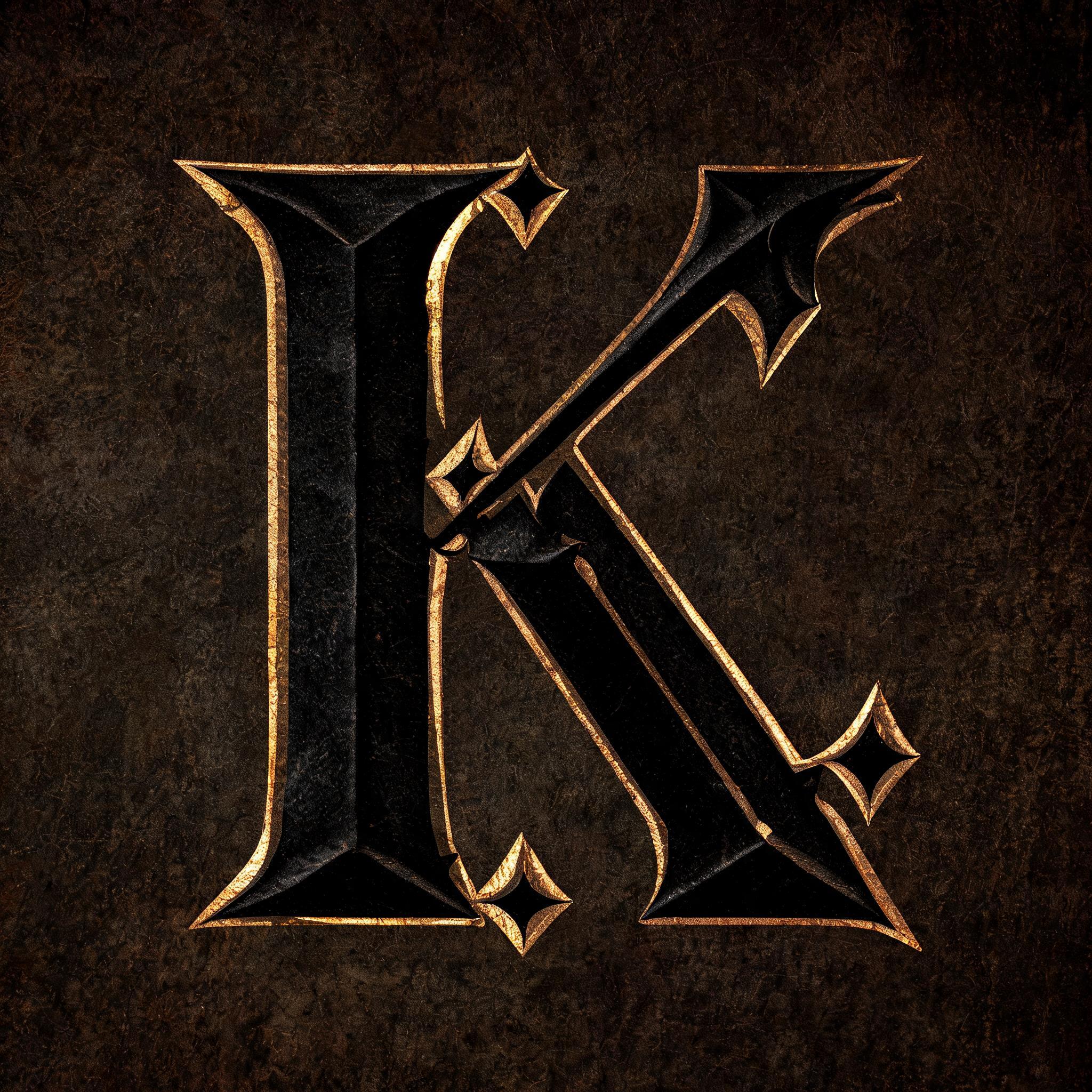
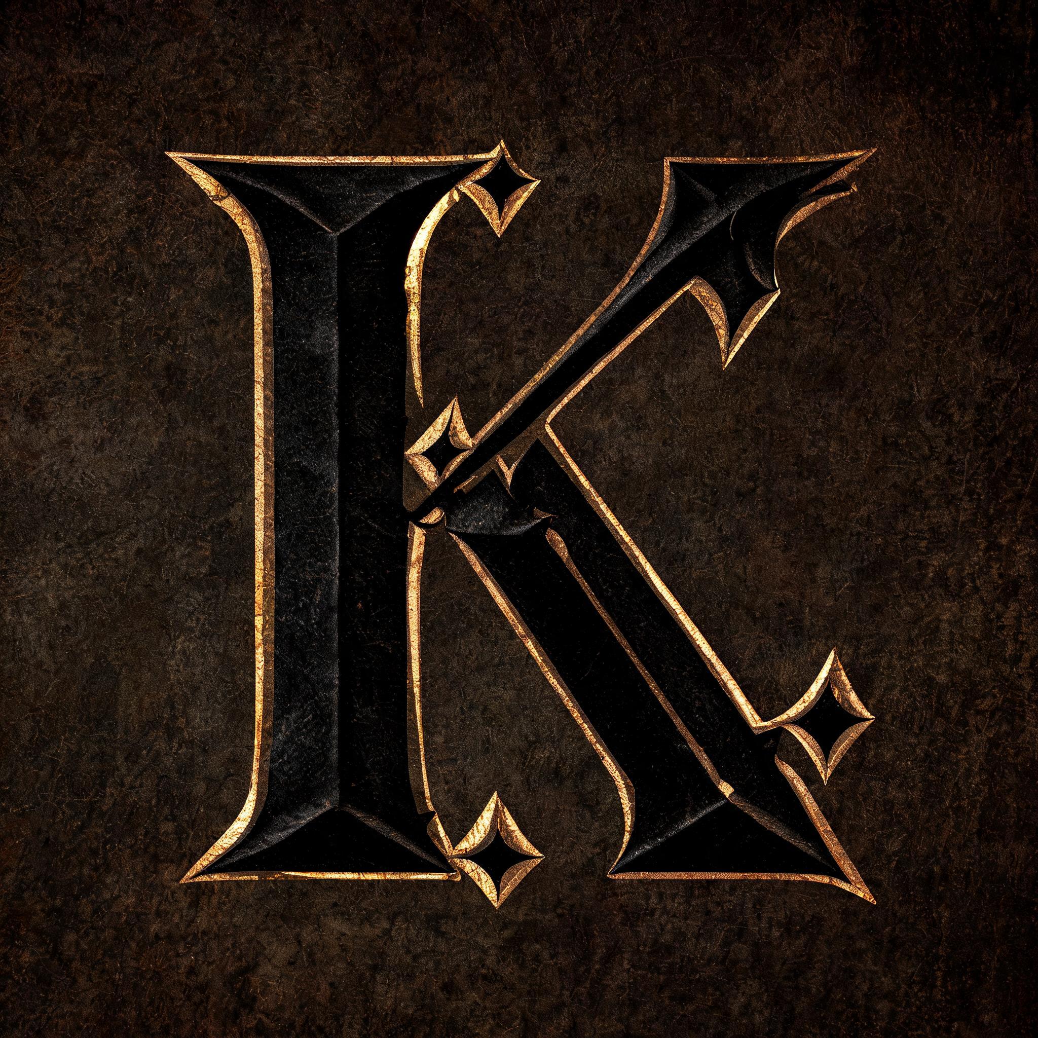
“K” is a Gothic Font text effect efeito de texto criado com a IA da FontVibe. Blackletter Textura precisa: traços estreitos e quebrados, terminais em losango e forte contraste grosso-fino, em tinta preta com toques dourados sobre pergaminho escuro e envelhecido.
rendered in precise gothic blackletter letterforms with authentic calligraphic construction — diamond-shaped stroke terminals, strong thick-thin contrast, pointed arch counters. Rich black ink with warm depth on dark parchment or deep charcoal background. Subtle gold ink highlights on serifs and capitals. Medieval scribal precision. No cobwebs, no rust, no atmospheric fog — pure typographic craft. LETTERFORM PRIORITY: when the chosen font carries its own treatment, that font's letterform shapes take priority and own the letters; this style governs the rich ink, the parchment ground and the subtle gold highlights. FALLBACK MATERIAL: if the font carries no material of its own, render the letters as precise gothic blackletter in rich black ink with subtle gold highlights on dark parchment — pure typographic craft, no cobwebs, rust or fog. COLOR PRIORITY: keep the font's own colors if specified; otherwise black ink with warm gold accents. Single massive capital K rendered in rich black ink with authentic calligraphic construction — diamond-shaped stroke terminals, heavy thick-thin contrast, pointed arch counter interior. The letterform commands the frame with monumental scale, ink surface carrying warm depth and micro-texture suggesting hand-pressed vellum absorption. Subtle gold ink highlights trace the serif terminals and the diagonal arm intersections, catching a low raking candlelight from the left side. Background is dark aged parchment with deep charcoal undertones, fibrous surface grain visible under close scrutiny. A faint warm amber glow emanates from within the thickest stroke, suggesting lampblack ink of extraordinary density. Ink bleeds are crisp and intentional, edges razor-defined. Medieval scribal precision governs every stroke junction. The negative space within the letter's open counters is deep shadow with barely perceptible warm ochre reflected fill. Pure typographic craft — no cobwebs, no rust, no atmospheric haze. The overall material language: iron-dense ink, gold-leaf foil accent on cap serifs, dark parchment ground lit by a single warm candle source off to one side.
Gerada em 21 de julho de 2026 · 2048 × 2048 · JPEG · BytePlus Seedream 5.0 · Compartilhada pelo criador · Uso comercial gratuito (CC BY 4.0)


