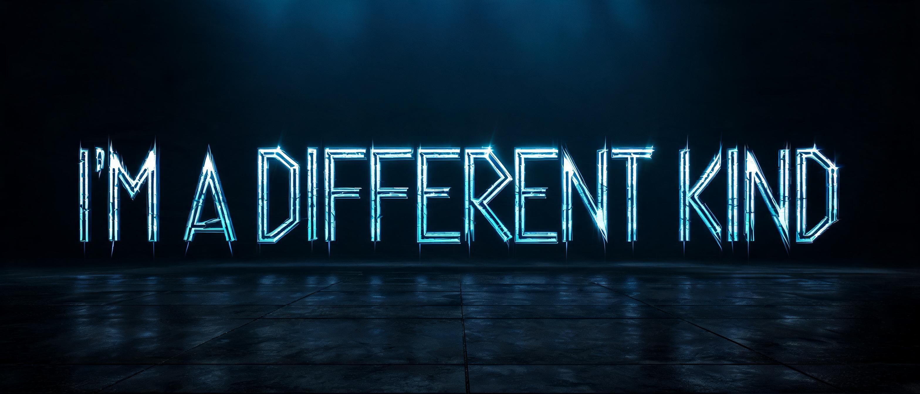
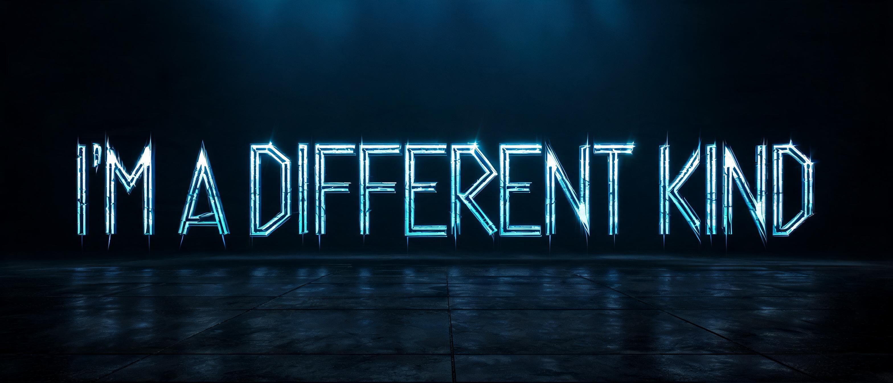
I’M A DIFFERENT KIND - Runas Vikings Text Effect


Usa BytePlus Seedream 5.0, o modelo desta obra · 15 créditos

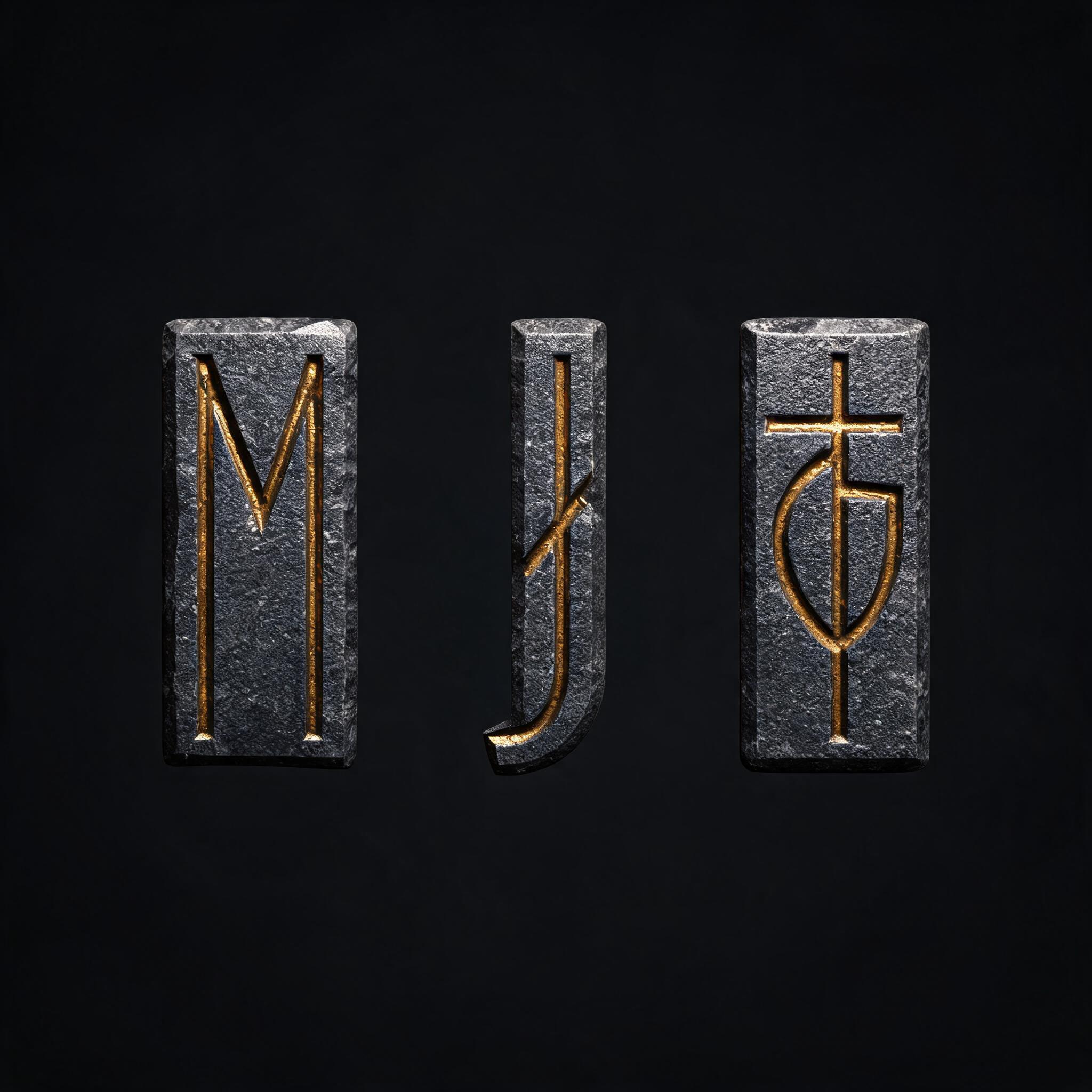
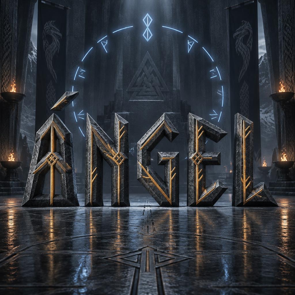
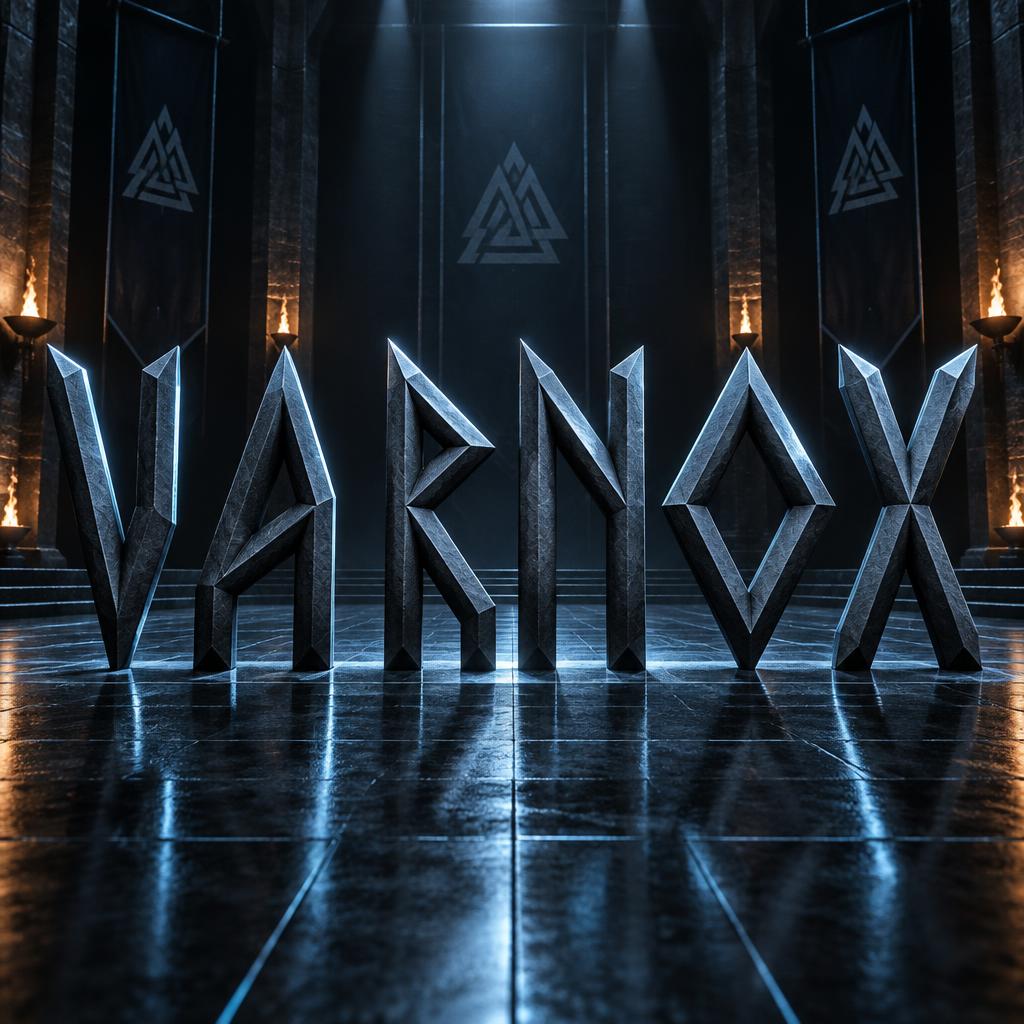

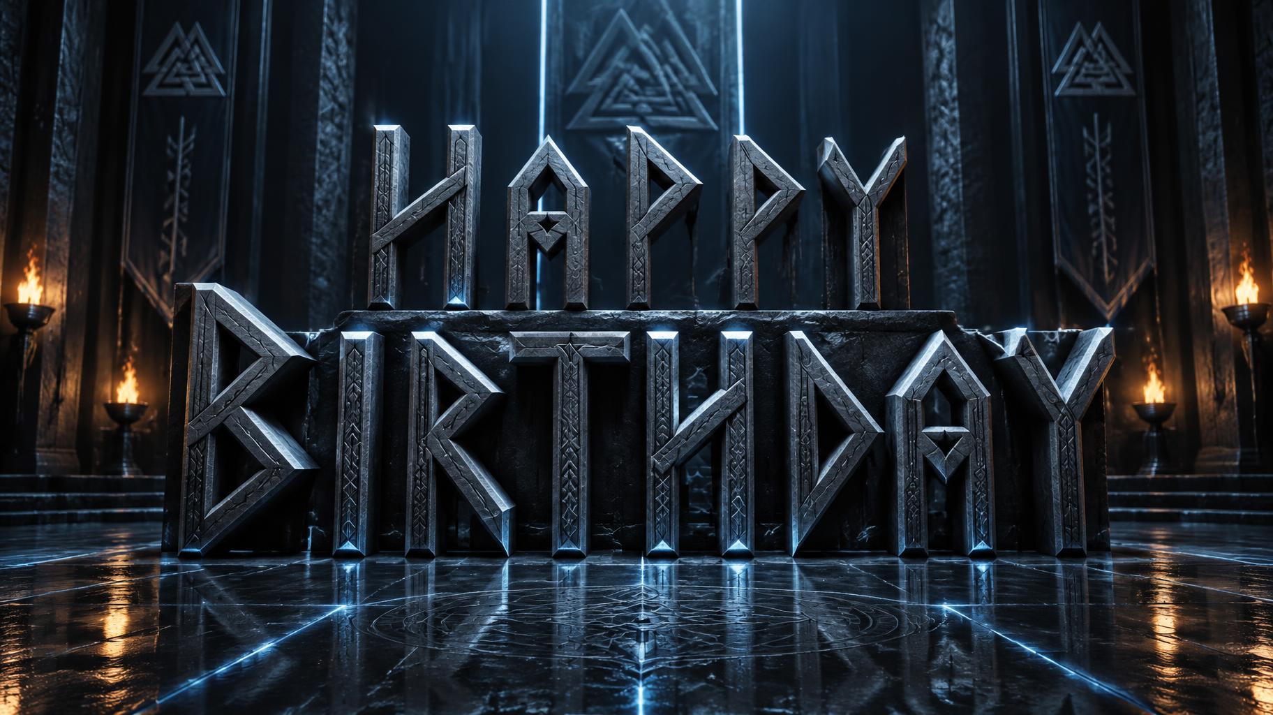
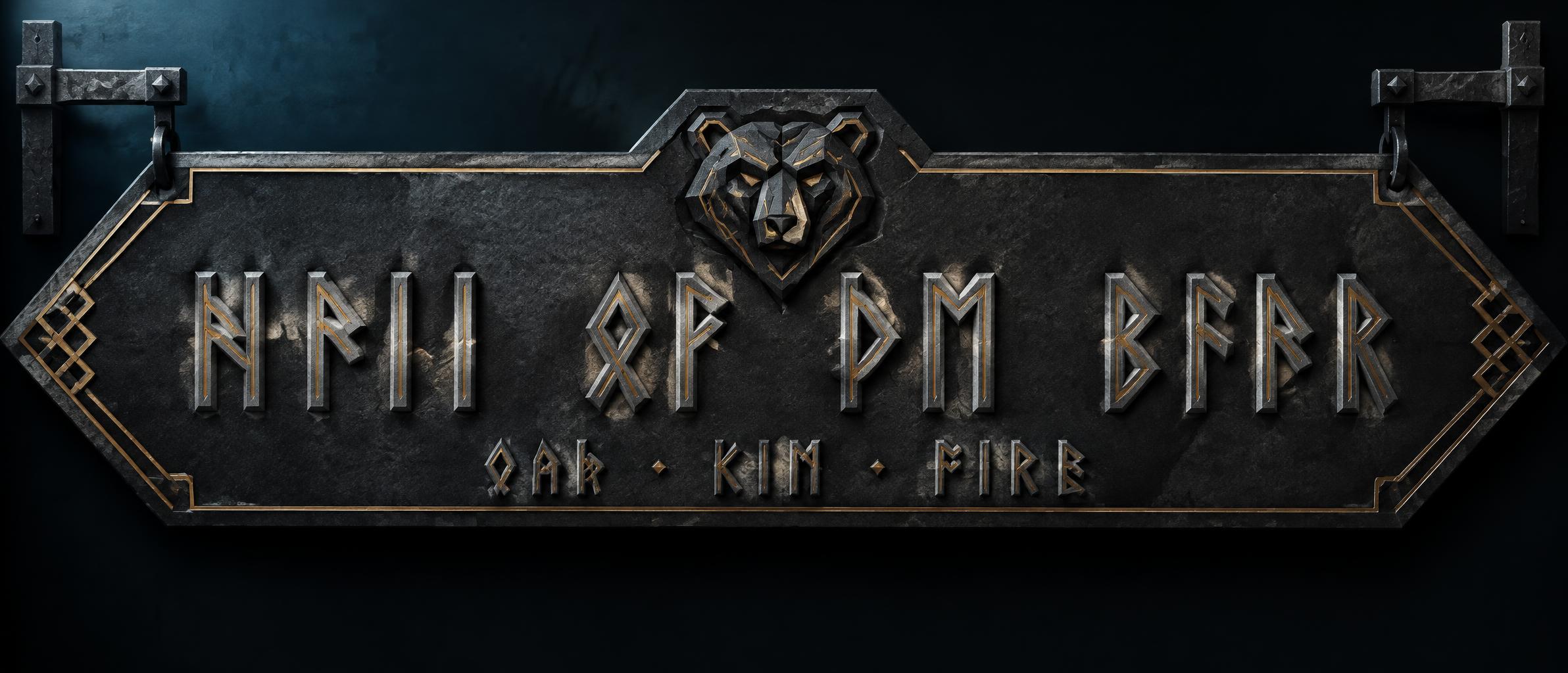



“I’M A DIFFERENT KIND” is a Viking Runic text effect efeito de texto criado com a IA da FontVibe. Maiúsculas angulares de estilo rúnico feitas só com traços retos e a 45 graus, entalhadas em pedra cinza-aço fria sob um céu noturno com aurora.
rendered in Elder Futhark runic letterforms — all strokes constructed from straight segments at horizontal, vertical, and 45-degree diagonal angles only; no curves anywhere, angular geometry derived from the physical constraint of carving into stone with a straight blade. Tall narrow proportions, strong vertical emphasis, sharp pointed terminals where strokes meet. Each stroke presents a flat angular face — illuminated and shadow faces alternate across the word creating the faceted highlight pattern of hand-carved letters. Pure runic geometry, powerfully ancient. I'M A DIFFERENT KIND rendered in massive bold angular runic letterforms, the four-word declaration given strong typographic hierarchy — primary words carrying dominant weight, secondary connector words in slightly reduced scale, creating visual rhythm across the phrase. All strokes constructed from pure straight segments: horizontal, vertical, 45-degree diagonals, zero curves, the geometric discipline of blade-carved stone applied to every terminal and junction. Background: deep obsidian-black environment with a single cold directional key light raking across the letterforms from upper-left — each carved face catches hard light on one plane, falls into sharp shadow on the opposing plane, producing the faceted highlight pattern of hand-chiseled runes. No moss, no rust, no organic decay — clean geometric precision only. Floor plane: dark polished black slate with faint specular reflection of the letter bases, razor-thin. Atmosphere: faint cold blue-teal chromatic haze along the upper field suggesting northern latitude, minimal and non-competitive with the type. The phrase reads as a declaration — a statement of identity carved into permanence. Tournament-stage authority meets Norse inscription gravity. Ultra-high-contrast, 8k render quality, the letterforms as the sole visual statement.
Gerada em 22 de julho de 2026 · 3136 × 1344 · JPEG · BytePlus Seedream 5.0 · Compartilhada pelo criador · Uso comercial gratuito (CC BY 4.0)


