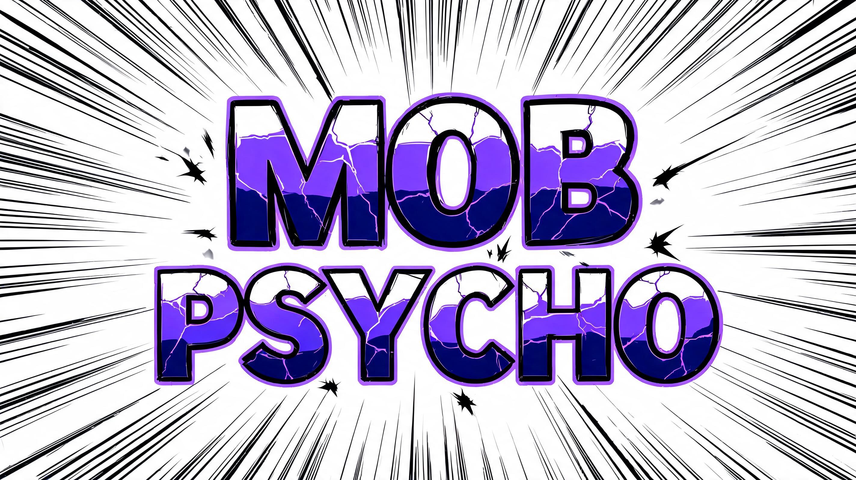
mob psycho - Anime Text Effect


Usa BytePlus Seedream 5.0, o modelo desta obra · 15 créditos

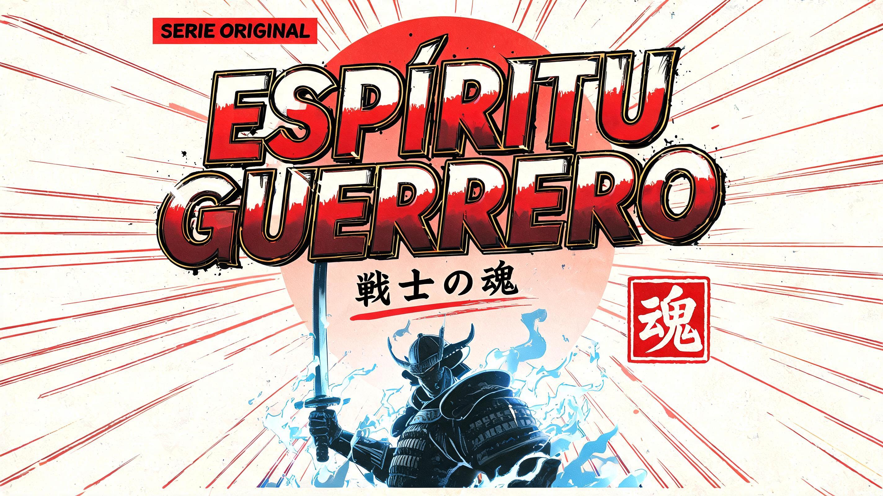

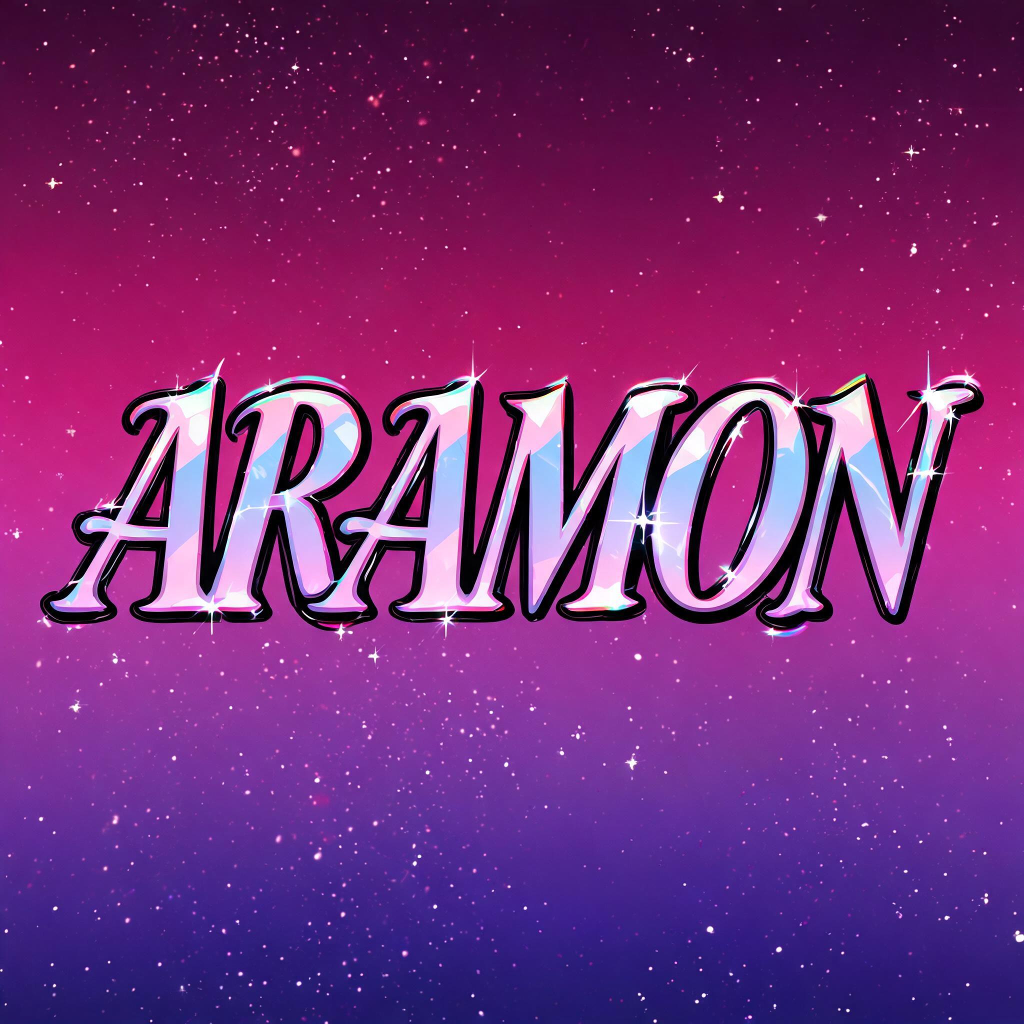

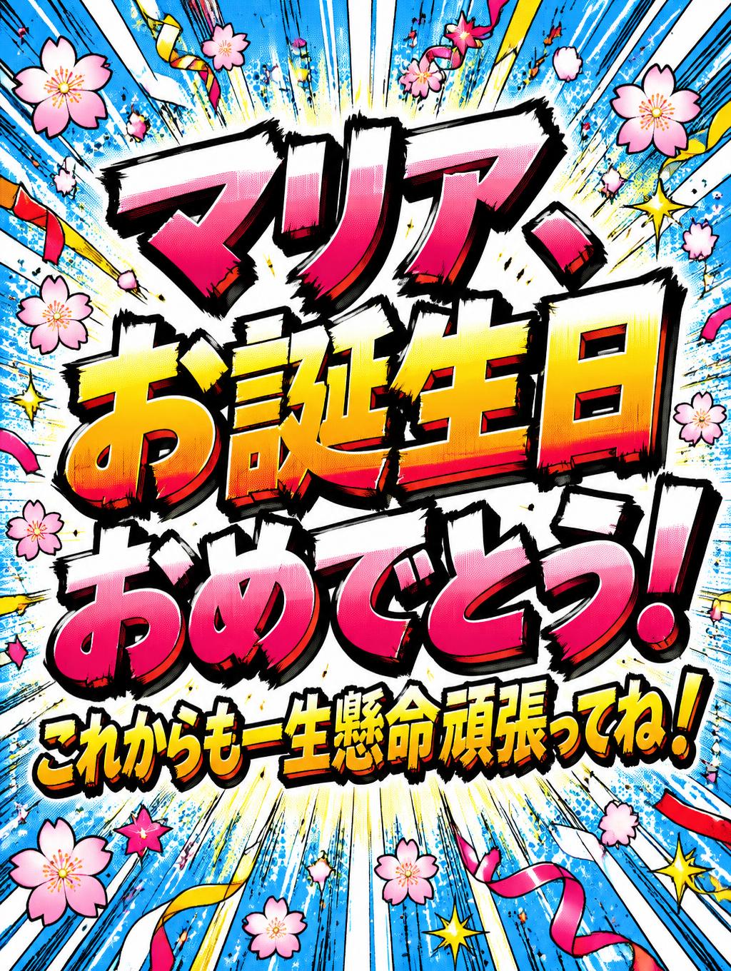
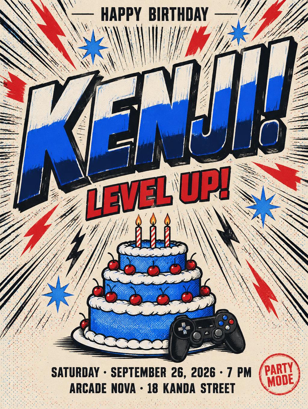


“mob psycho” is a Anime text effect efeito de texto criado com a IA da FontVibe. Letreiramento de título shōnen: contornos pretos grossos feitos à mão, sombreamento cel chapado em faixas duras de luz e sombra, letras inclinadas e dinâmicas sobre branco com linhas de velocidade radiais.
rendered as Japanese shounen anime title treatment — bold hand-inked manga lettering with authentic cel-shaded visual energy. Letter construction follows classic Shonen Jump title card standards: thick black ink outline with natural brush-weight variation defining each letter boundary; flat cel-shading fill with three hard-edge zones — bright highlight zone on upper letter face, highly saturated primary color zone at center, deep shadow zone at lower edge; all zone boundaries knife-edge hard, zero gradient blur, pure flat offset-print ink physics. Energy signature: high-contrast color + thick ink outline = letters that look physically printed on manga paper. The typographic language of Dragon Ball, Naruto, One Piece, Demon Slayer, Jujutsu Kaisen title cards — maximum manga kinetic energy, iconic and immediately recognizable as Japanese anime title typography. LETTERFORM PRIORITY: when the chosen font carries its own treatment, that font's letterform shapes take priority and own the letters; this style governs the inked manga outline, the three-zone cel-shading and the kinetic energy. FALLBACK MATERIAL: if the font carries no material of its own, render the letters as bold hand-inked shounen title lettering with a thick black brush outline and hard three-zone cel-shading. COLOR PRIORITY: keep the font's own colors if specified; otherwise a high-saturation primary fill with hard highlight and shadow zones. mob psycho rendered as dual-line Japanese shounen anime title treatment — 'mob' commanding the upper register with oversized visual dominance, 'psycho' as a bold secondary line carrying full kinetic impact. Pure white impact panel background with radial manga speed lines bursting outward from behind the letter cluster in dense radiating strokes, classic Shonen Jump chapter-title energy. Each letter bears thick black ink outline with natural brush-weight variation at stroke terminals and corners; flat cel-shaded three-zone fill — sharp white highlight band across upper letter faces, vivid electric violet and deep cobalt saturated primary fill at center body, dense near-black indigo shadow zone at lower edge; all zone boundaries knife-edge hard, zero gradient blur, pure flat offset-print ink physics. Scattered impact marks and tension bursts punctuate the negative space between the two words, amplifying the psychic-energy visual charge. The full text cluster reads as one unified manga title card graphic, maximum kinetic density, the exact typographic weight and tactile print quality of a Shonen Jump series title, 8k render, sharp edges, no anti-aliasing blur on zone transitions.
Gerada em 23 de julho de 2026 · 2848 × 1600 · JPEG · BytePlus Seedream 5.0 · Compartilhada pelo criador · Uso comercial gratuito (CC BY 4.0)


