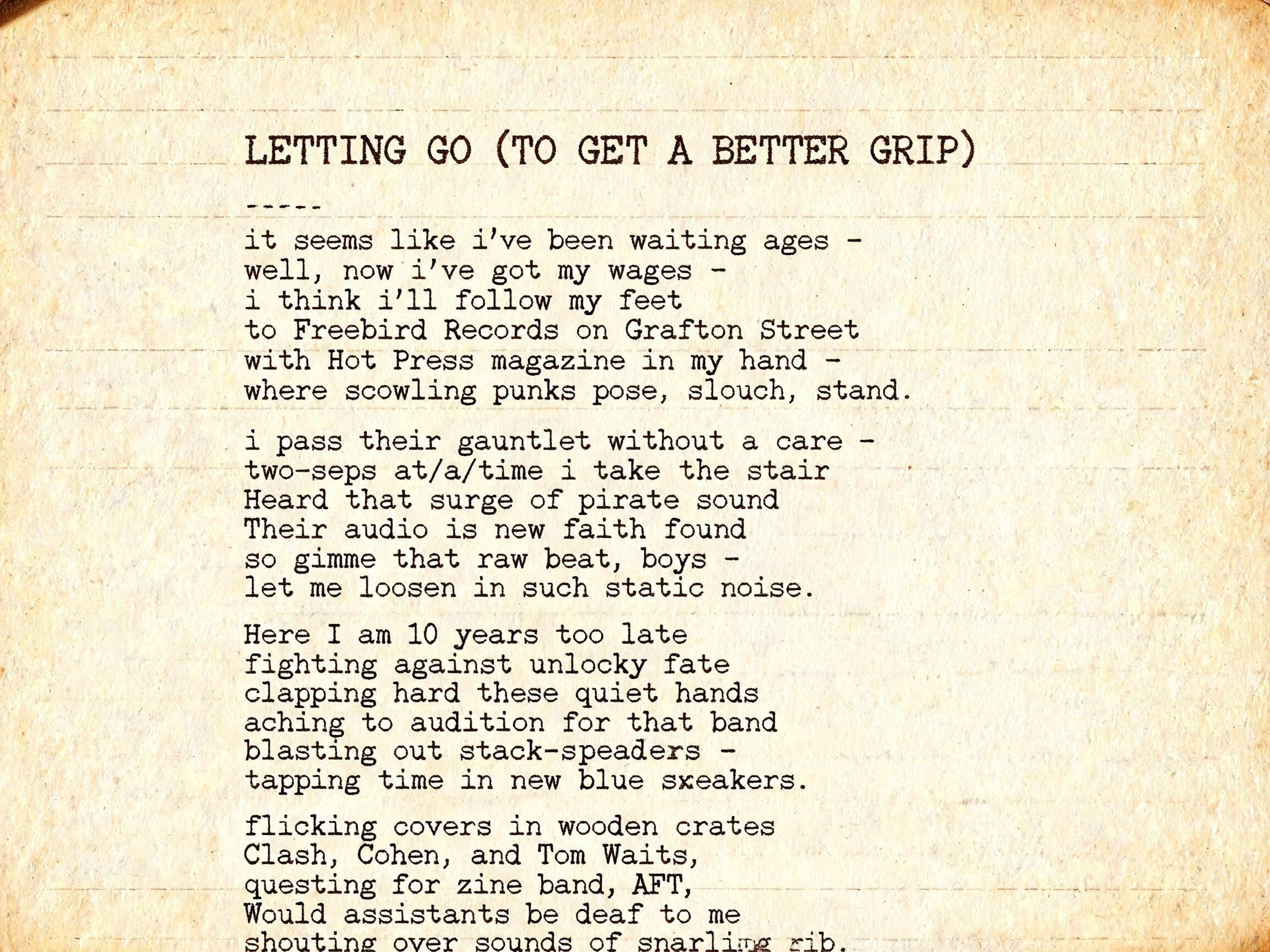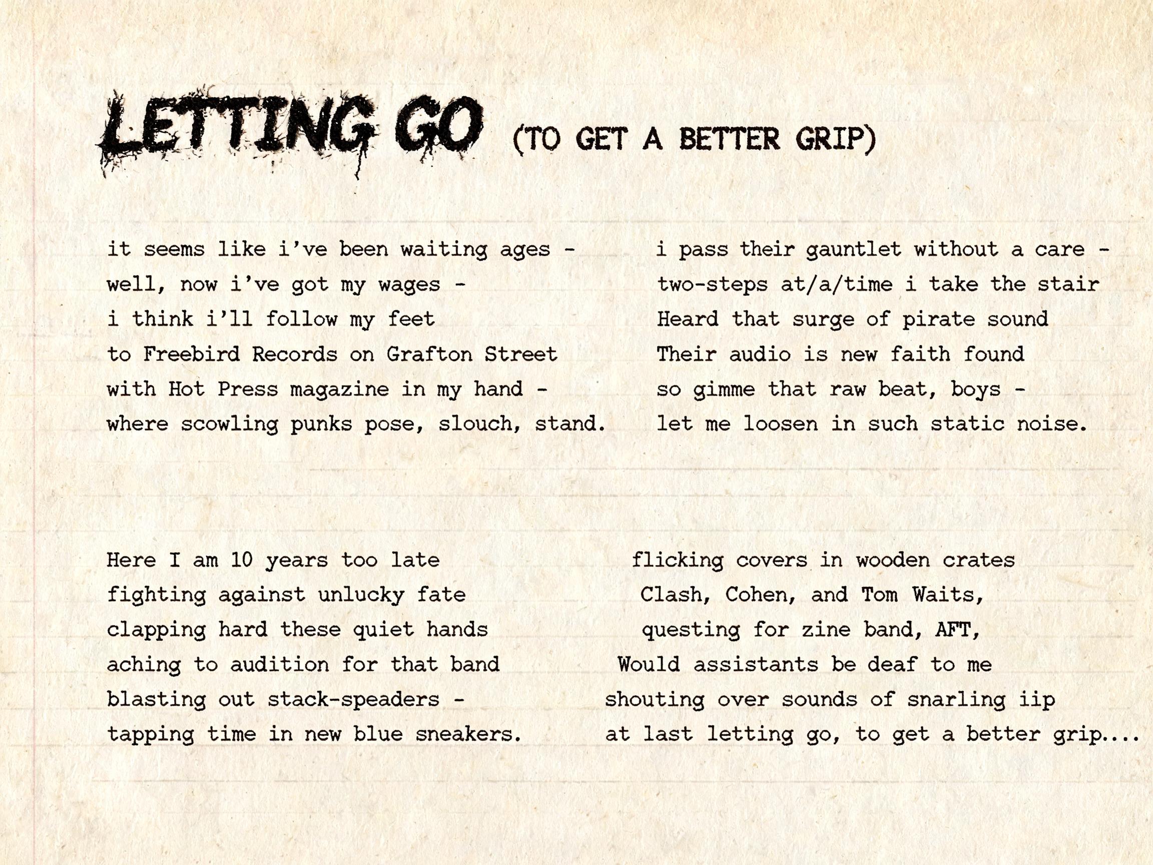
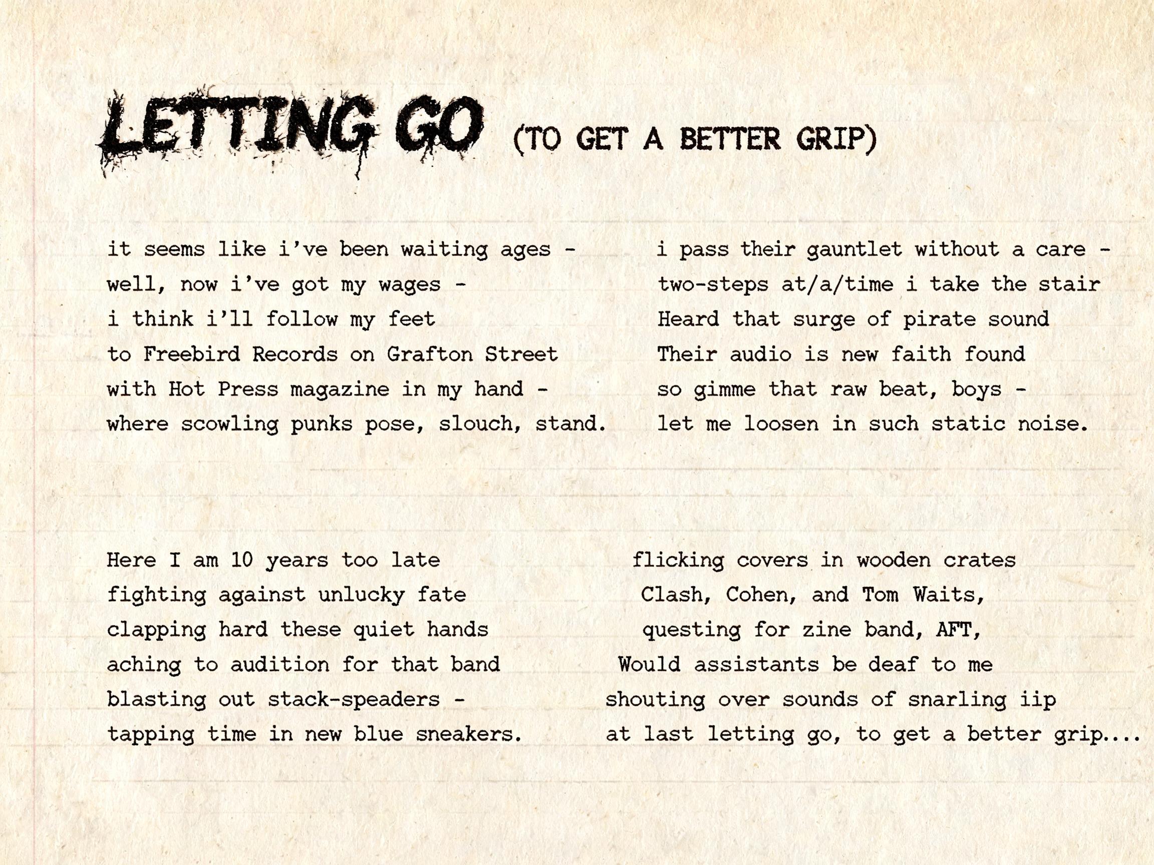
LETTING GO (TO GET A BETTER GRIP) it seems like i've been waiting ages - well, now i've got my wages - i think i'll follow my feet to Freebird Records on Grafton Street with Hot Press magazine in my hand - where scowling punks pose, slouch, - Máquina de Escrever Text Effect


Usa BytePlus Seedream 5.0, o modelo desta obra · 15 créditos
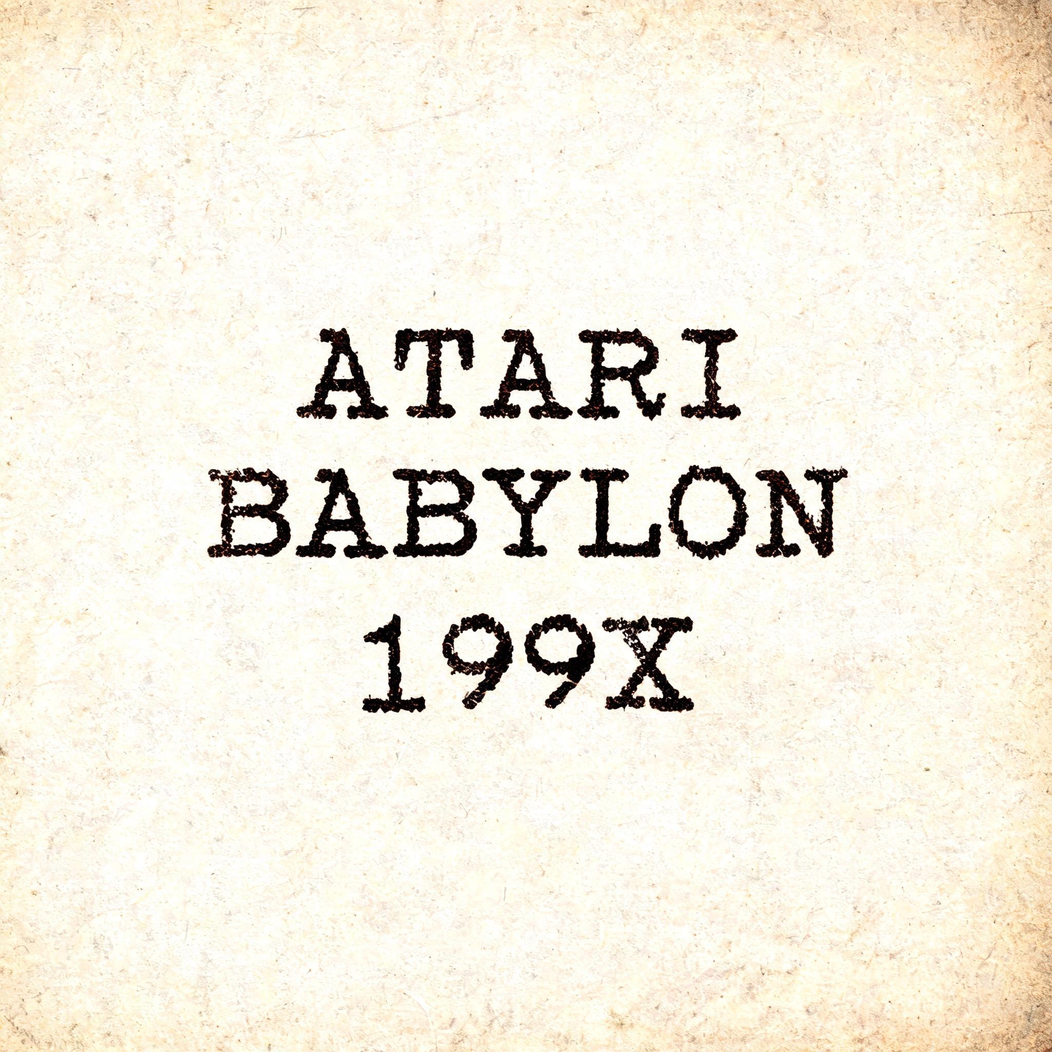
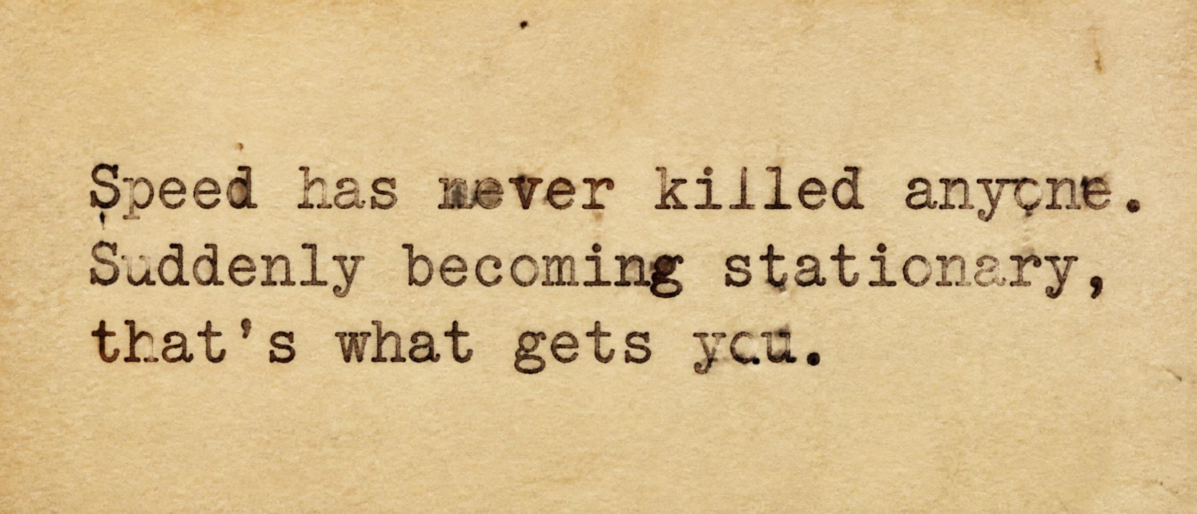
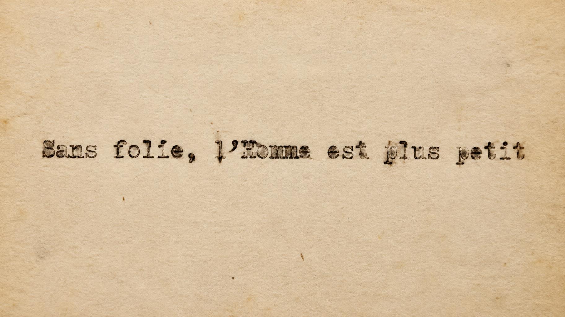
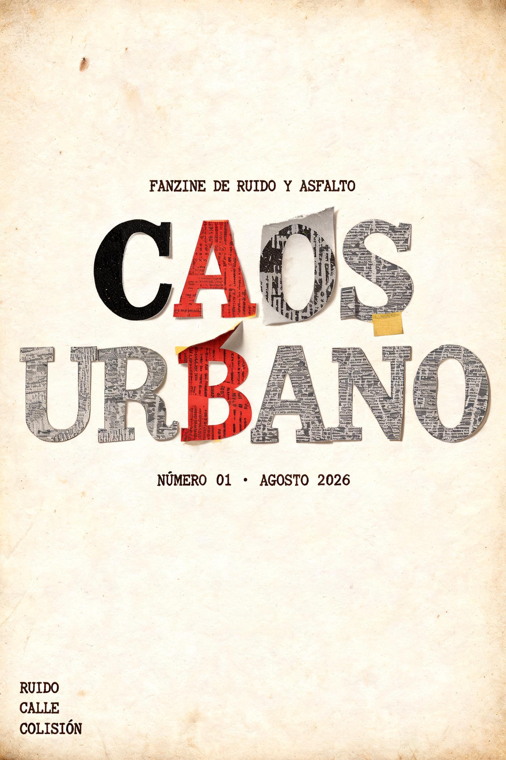
“ LETTING GO (TO GET A BETTER GRIP) it seems like i've been waiting ages - well, now i've got my wages - i think i'll follow my feet to Freebird Records on Grafton Street with Hot Press magazine in my hand - where scowling punks pose, slouch, ” is a Typewriter text effect efeito de texto criado com a IA da FontVibe. Tipos slab monoespaçados batidos em papel creme, com densidade de tinta irregular, textura de fita, leve desalinhamento e fibras de papel suaves.
LETTING GO (TO GET A BETTER GRIP) it seems like i've been waiting ages - well, now i've got my wages - i think i'll follow my feet to Freebird Records on Grafton Street with Hot Press magazine in my hand - where scowling punks pose, slouch, stand. i pass their gauntlet without a care - two-steps at/a/time i take the stair Heard that surge of pirate sound Their audio is new faith found so gimme that raw beat, boys - let me loosen in such static noise. Here I am 10 years too late fighting against unlucky fate clapping hard these quiet hands aching to audition for that band blasting out stack-speakers - tapping time in new blue sneakers. flicking covers in wooden crates Clash, Cohen, and Tom Waits, questing for zine band, AFT, Would assistants be deaf to me shouting over sounds of snarling lip at last letting go, to get a better grip…. Full poem text rendered in authentic monospaced typewriter letterforms on aged cream bond paper. LETTING GO (TO GET A BETTER GRIP) as dominant header line with heavier ink strike, followed by stanza lines in smaller uniform typewriter type — each line carrying subtle baseline wobble as if the carriage shifted slightly between keystrokes. Ink distribution authentically uneven: terminals bleed into paper fibers, mid-strokes run thin where the ribbon dried, occasional double-strike ghosts doubling a letter's shadow. The parenthetical (TO GET A BETTER GRIP) pressed slightly harder, ink pooling at bracket corners. Lowercase stanza text shows the casual rhythm of someone typing fast — dashes rendered as two hyphens with honest inter-character spacing gaps. Warm sepia-tinted black ink soaking into cream fiber paper whose surface grain is visible under raking side light — soft directional illumination from upper left casting micro-shadows in each key-strike impression, giving the text physical depth. Paper background carries faint horizontal platen-roll lines, a ghost crease near one edge, and subtle yellowing toward the margins suggesting age. No ornament, no border — only the typed words on paper, exactly as pulled from a 1970s office typewriter, the whole surface feeling like a found manuscript page from a Dublin record shop back room.
Gerada em 27 de julho de 2026 · 2304 × 1728 · JPEG · BytePlus Seedream 5.0 · Compartilhada pelo criador · Uso comercial gratuito (CC BY 4.0)