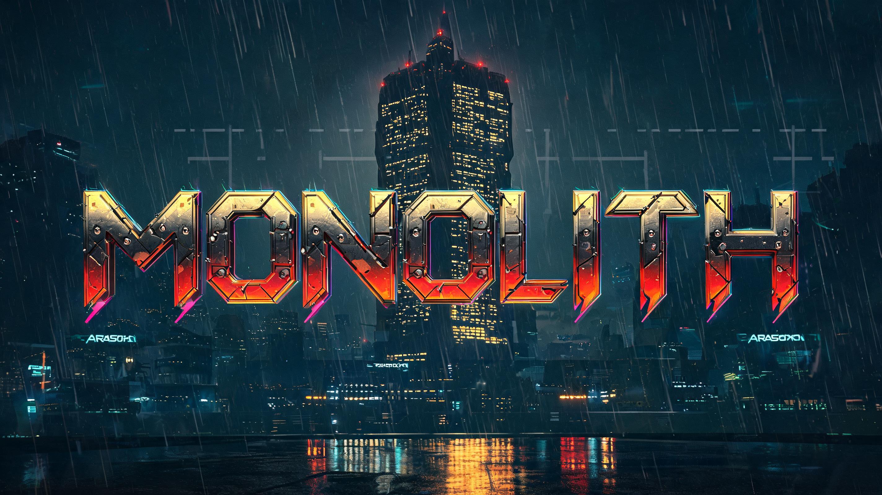
MONOLITH - Cyberpunk 2077 Text Effect


Usa BytePlus Seedream 5.0, o modelo desta obra · 15 créditos
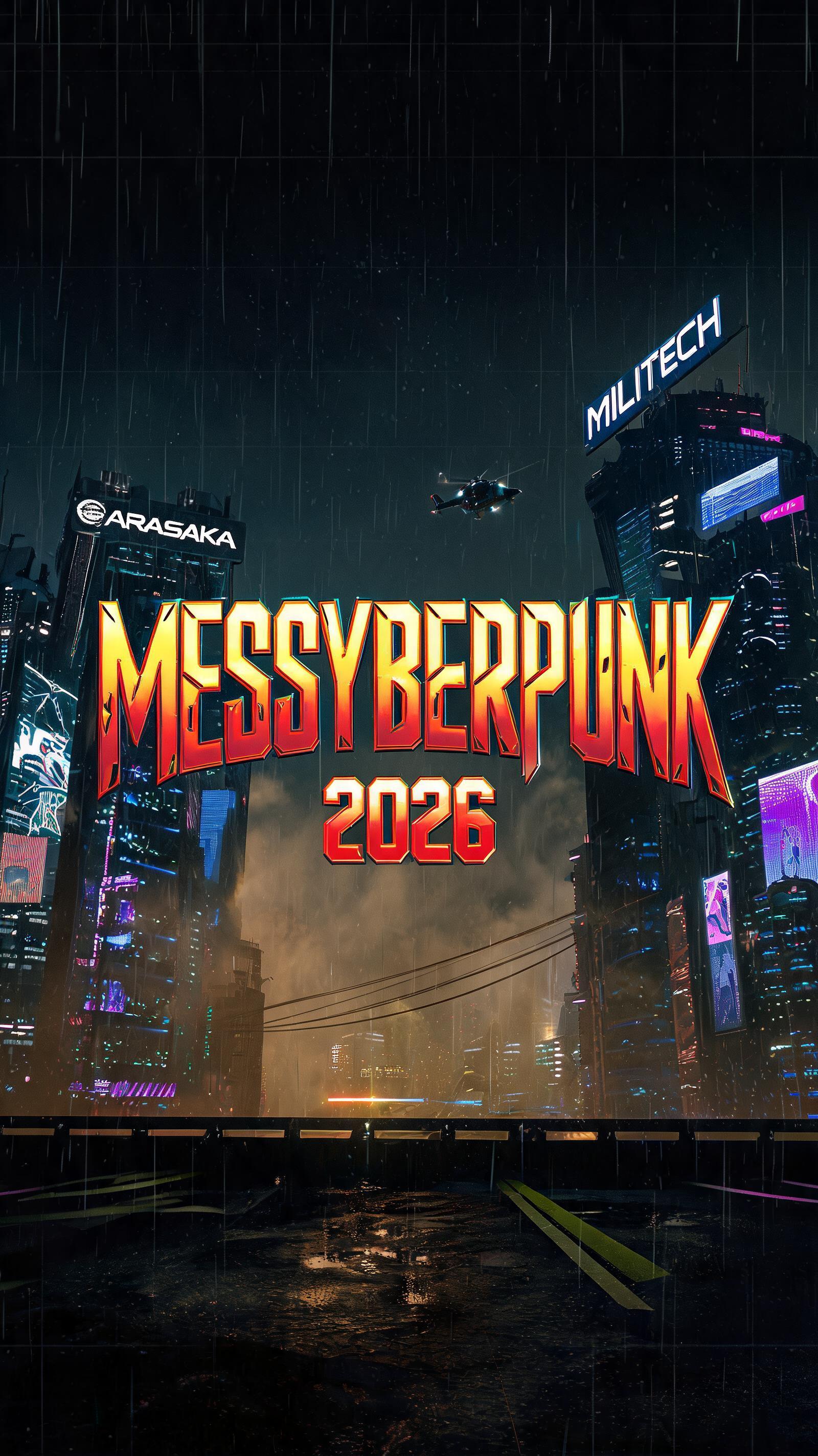


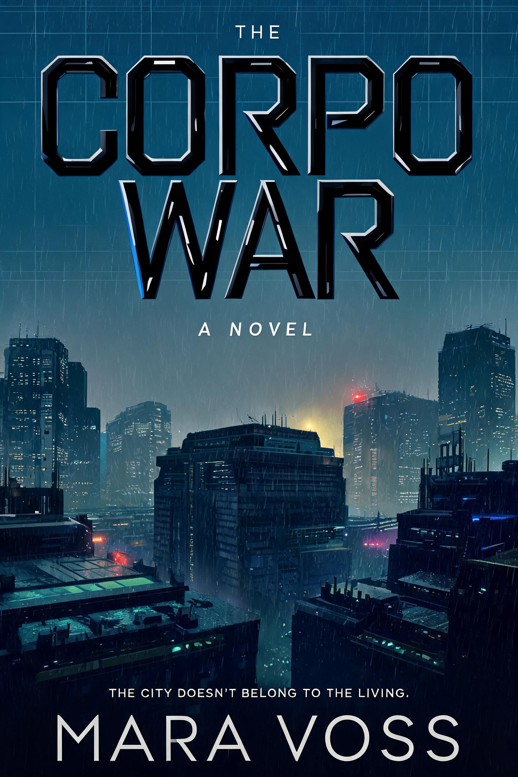
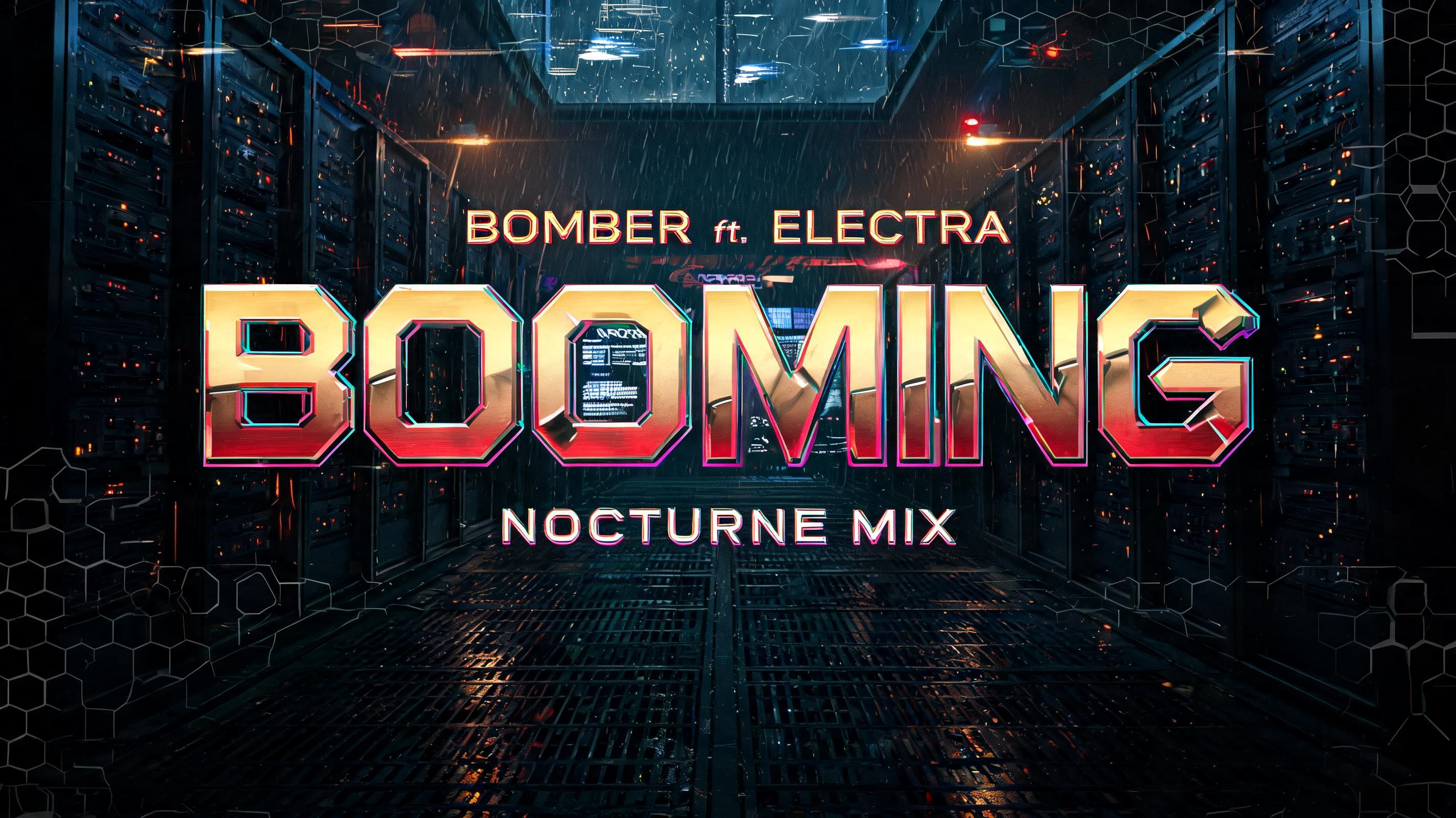


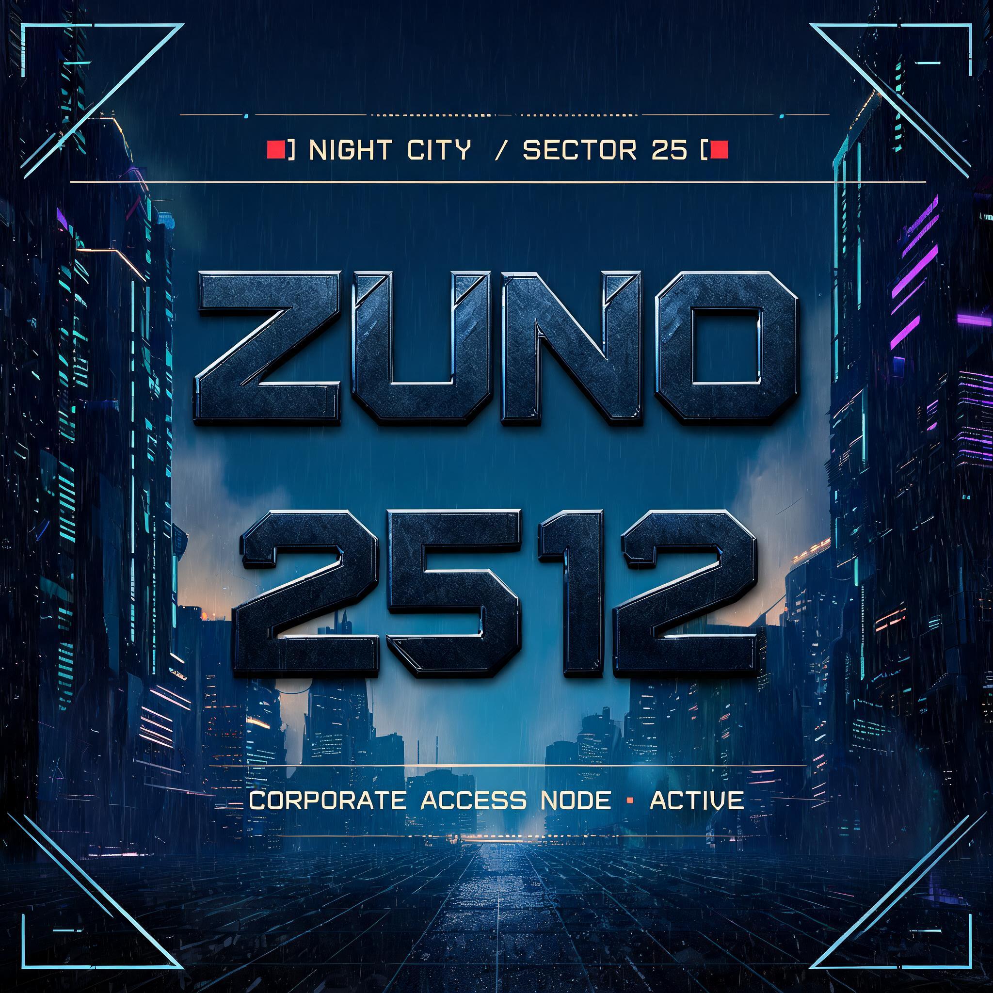
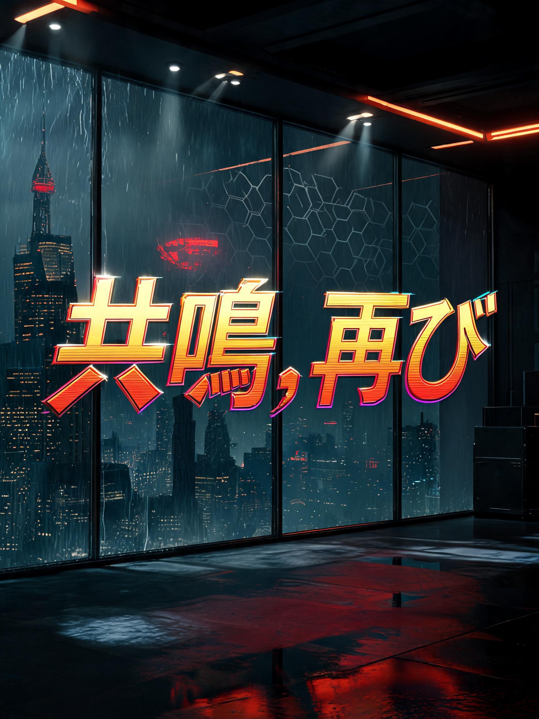


“MONOLITH” is a Cyberpunk 2077 text effect efeito de texto criado com a IA da FontVibe. Inspiradas na estética icônica de Night City: letras cromadas em amarelo e vermelho, com cortes angulares e uma atmosfera encharcada de neon.
Yellow-gold to hot-red gradient saturating every letterform face — the signature Night City commercial palette, running from chrome-bright gold at stroke tops to deep ember-red at stroke bases. Angular geometric cuts interrupt each letter: deliberate diagonal notches, beveled corner slices, and corporate logo incisions that follow the same design logic as Arasaka and Militech branding. Holographic edge fringe: a thin 1–2px chromatic aberration line along every letter edge — cyan on the upper-right, magenta on the lower-left — suggesting the text is projected by corporate UI rather than printed on any surface. Letter surfaces carry a polished hard-chrome quality: specular highlight razor-thin along the top plane of each stroke, deep shadow on the under-plane, zero diffuse scatter. The overall material read is: machined corporate hardware, not hand-crafted. When no specific material is defined by the font: default environment — yellow-gold to red gradient fill, angular geometric notch cuts, 1px holographic edge fringe, deep black background, faint corporate grid pattern at 8% opacity behind the letters. Night City megabuilding canyon at 3am — a single monolithic corporate tower dominates the background, its glass-and-steel face gridded with thousands of amber-lit windows ascending into a smog-choked sky, emergency red beacon lights pulsing at its crown. Heavy rain streaks diagonally across the scene; wet asphalt far below catches long gold-red reflections. 'MONOLITH' blazes across the frame in angular corporate letterforms — each character massive, occupying the full vertical weight of the composition, filling roughly 75% of frame width. Letter faces carry the signature yellow-gold to hot-red gradient: chrome-bright gold at every stroke apex, deep ember-red pooling at the base, specular highlight razor-thin along each top plane, hard shadow beneath. Deliberate geometric notch cuts interrupt the letterforms at precisely calculated angles — diagonal slices and beveled corner incisions following Arasaka corporate logo logic, sharp and machined, never soft. Holographic edge fringe: 1–2px chromatic aberration tracing every letter edge, cyan offset on the upper-right, magenta bleeding lower-left, projecting as corporate UI hologram rather than physical surface. The single monolithic tower behind the text is mirrored in the wet ground plane as a vertical streak of amber gold. Background carries a faint corporate grid at 8% opacity. Cool teal and blue neon from distant district signage contrasts against the warm gold-red text. Deep near-black background. Cinematic 16:9 wide frame — the sheer width amplifies the monolithic scale of both letterform and architecture.
Gerada em 28 de julho de 2026 · 2848 × 1600 · JPEG · BytePlus Seedream 5.0 · Compartilhada pelo criador · Uso comercial gratuito (CC BY 4.0)


