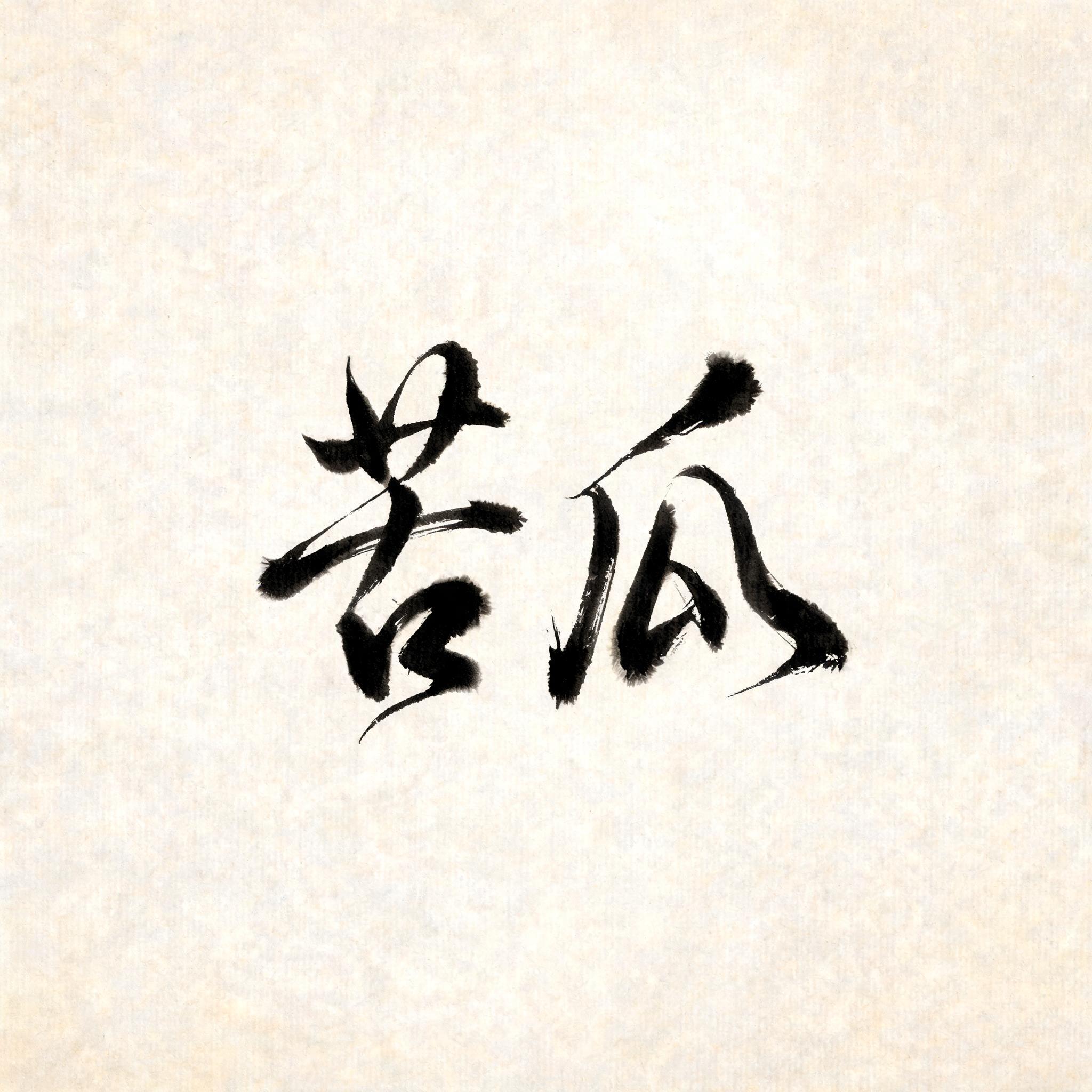
苦瓜 - Cursiva Text Effect


Usa BytePlus Seedream 5.0, o modelo desta obra · 15 créditos
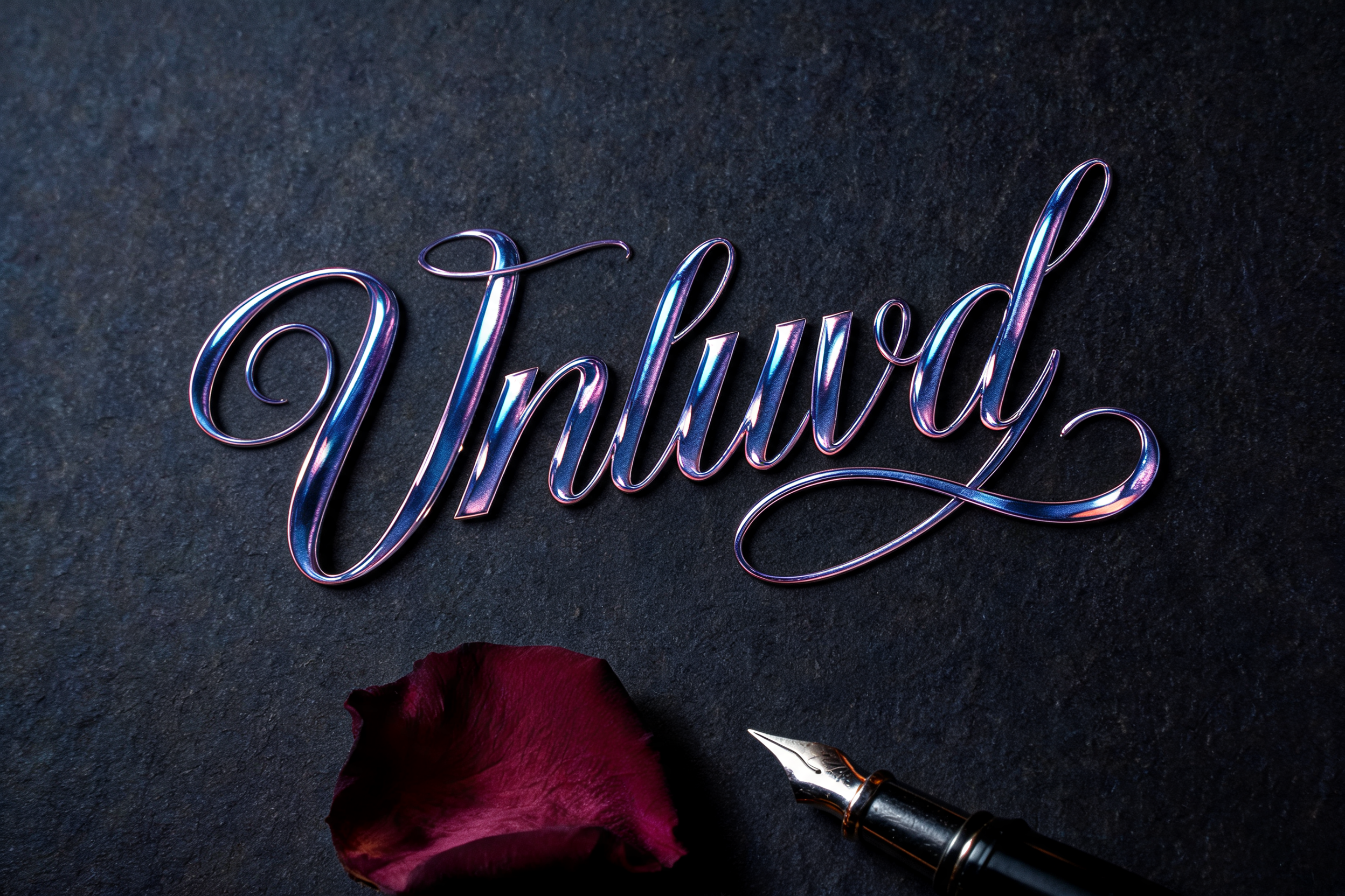
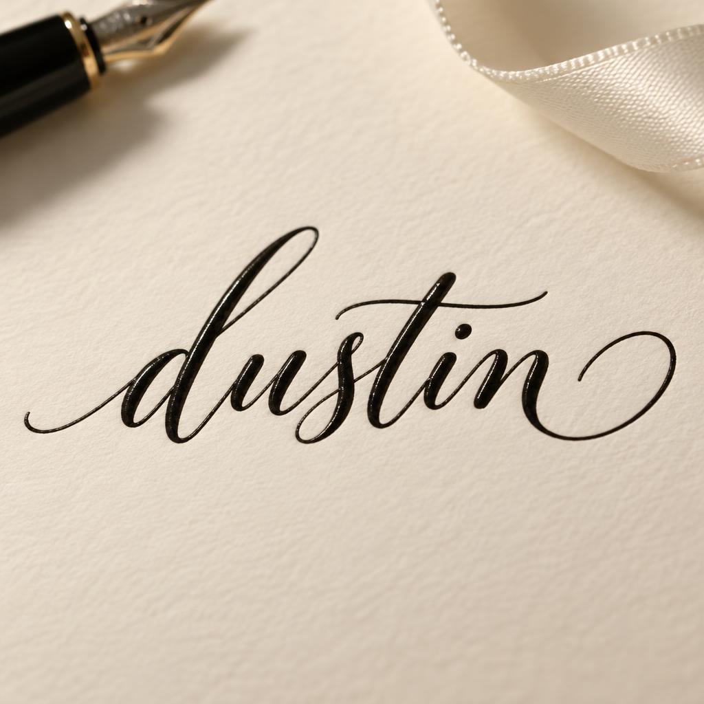
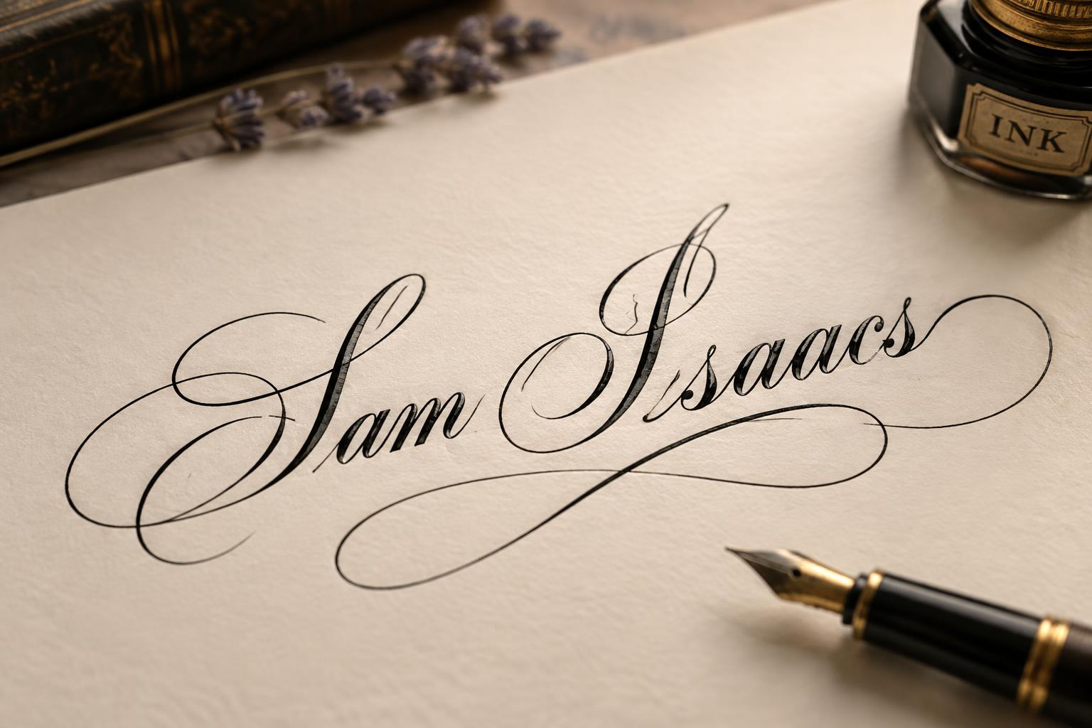
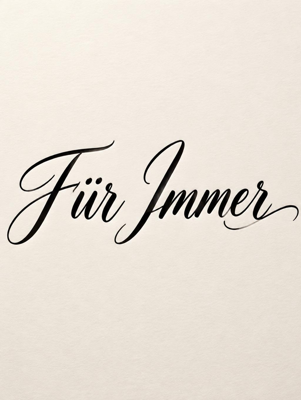
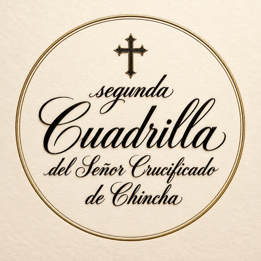
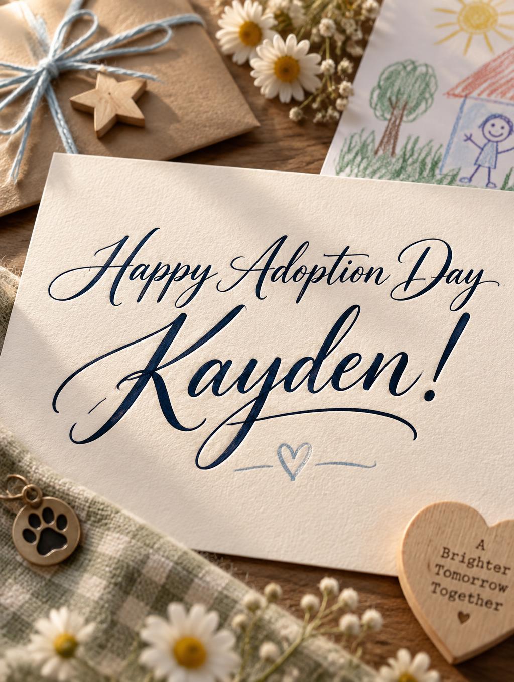

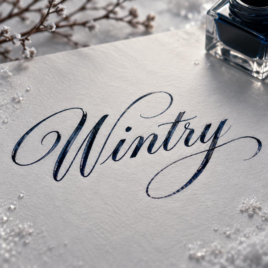
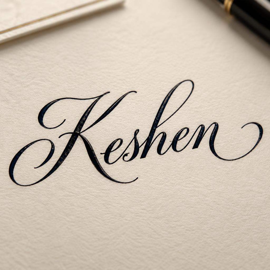
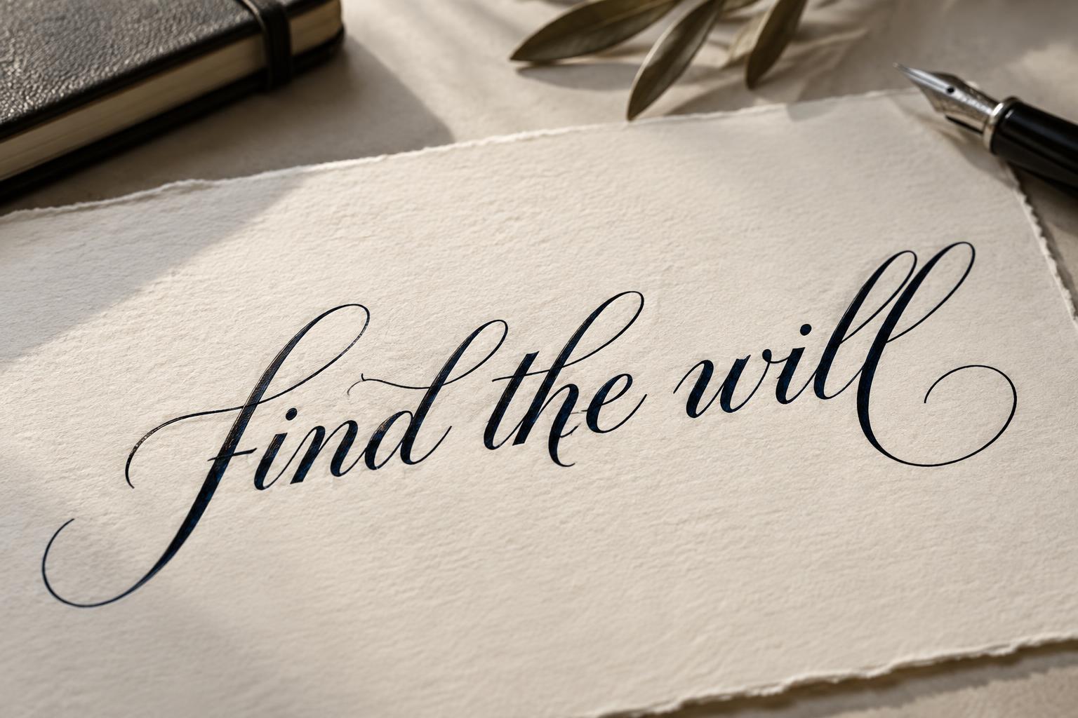

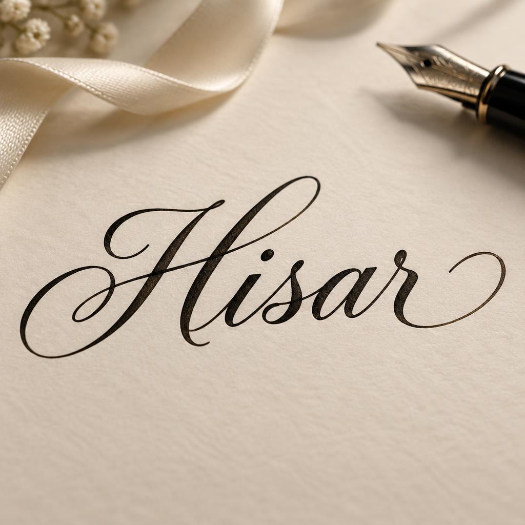
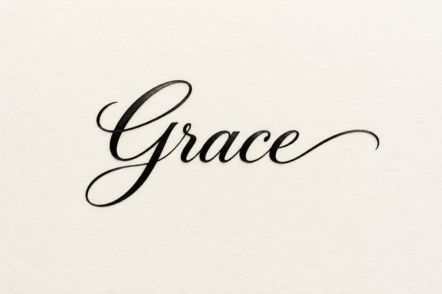
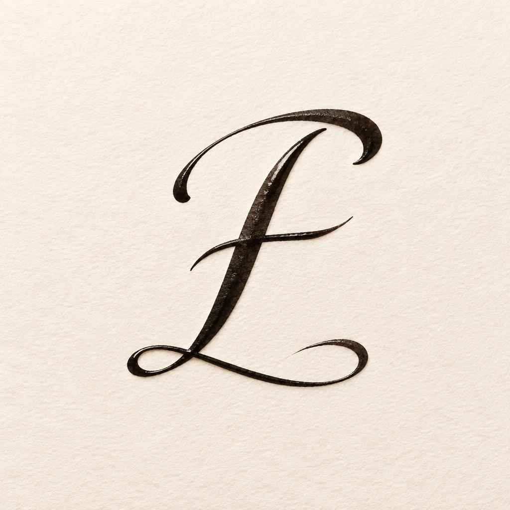
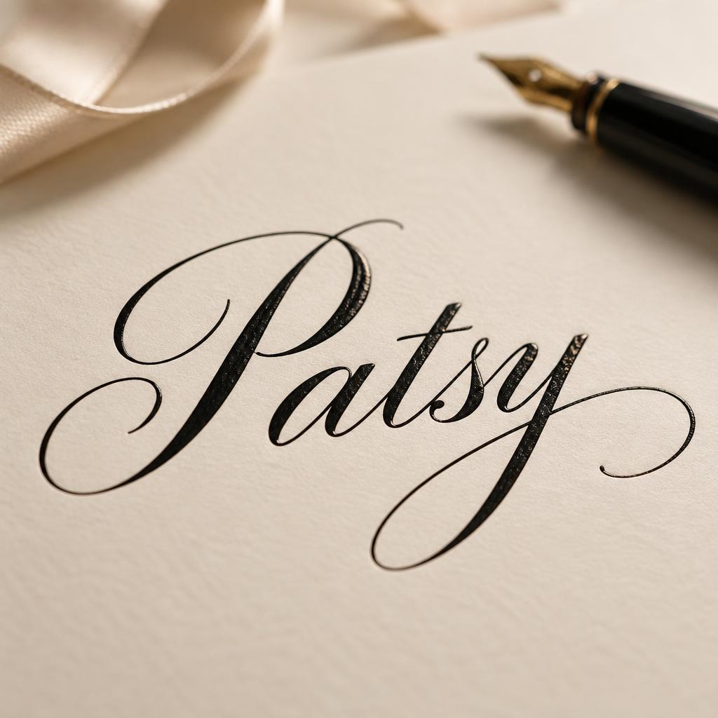
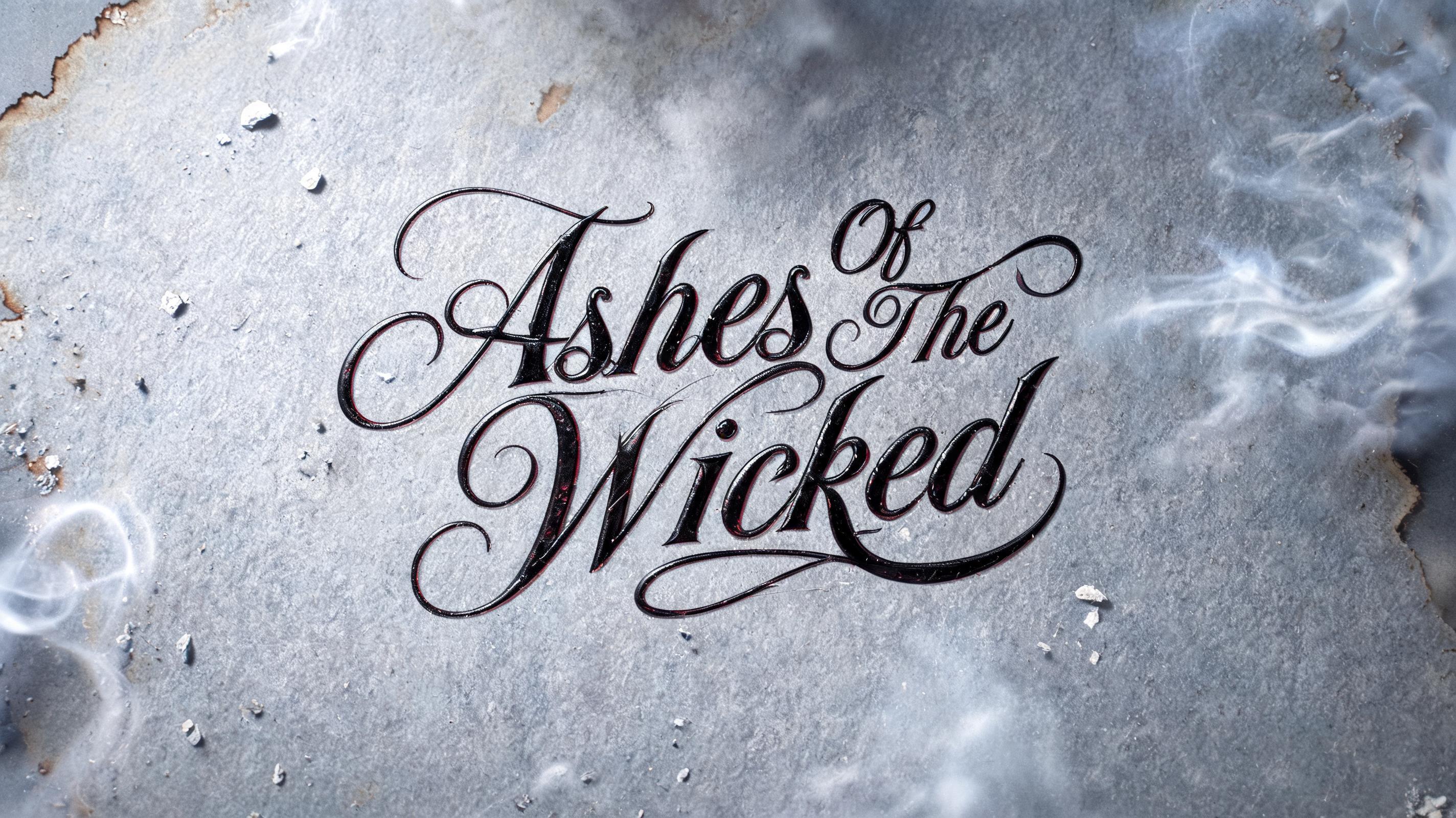
“苦瓜” is a Cursive text effect efeito de texto criado com a IA da FontVibe. Cursiva fluida de pena e tinta: letras ligadas, ascendentes em laço e longos floreios de entrada e saída, escrita em tinta preta sobre papel branco fino com luz rasante suave.
placed in a soft, refined calligraphy light field — a gentle directional light rakes across the surface from an upper angle, grazing the strokes so their natural ink body and subtle sheen read with depth, while a soft fill keeps shadows intimate rather than harsh. GROUND: a clean elegant art surface — fine hot-press cotton paper, smooth cream card, a soft neutral or a quiet dark editorial ground — with generous negative space so the lettering breathes. ATMOSPHERE: the timeless, romantic feel of masterful pen calligraphy — poised and versatile, at home on a name, a quote, a bio or a card. LETTERFORM PRIORITY: when the chosen font carries its own treatment, that font's letterform shapes and built-in flourishes take priority and own the letters; this style governs only the surrounding light, ground and finish, never the letter shapes. When no specific material is defined by the font: rich flowing ink with a soft natural sheen and a fine wet-edge glisten where strokes catch the light, on the clean paper ground. COLOR: if the font declares its own color keep it; otherwise the ink reads as a deep elegant tone — classic near-black or a soft romantic ink hue — on the light ground. '苦瓜' rendered in flowing ink calligraphy, two dense CJK characters filling the full canvas edge-to-edge, centered dead center, occupying at least 85% of frame width with strokes nearly touching the left and right borders. The characters are brushed in deep near-black sumi ink with a fine wet-edge glisten where the loaded brush releases — thick downstrokes tapering into hairline exits, the natural ink body showing slight tonal variation from dense black cores to translucent grey feathered edges. Ground: a sheet of smooth hot-press washi paper in warm ivory-white, the faint laid texture just barely visible under raking light. A single soft directional light from upper-left grazes the surface at a low angle, catching the ink's subtle sheen and the paper grain without harsh shadow. No secondary text, no props, no background elements — the two characters ARE the entire composition. The cursive calligraphic energy of the strokes — fluid, deliberate, each character resolved in a single breath — gives the bitter gourd's name a quietly poetic, unhurried presence. Shallow focal plane keeps everything else dissolved into the warm pale ground. Square format maximizes the visual weight of the two-character pairing.
Gerada em 31 de julho de 2026 · 2048 × 2048 · JPEG · BytePlus Seedream 5.0 · Layout: Gigante · Compartilhada pelo criador · Uso comercial gratuito (CC BY 4.0)


