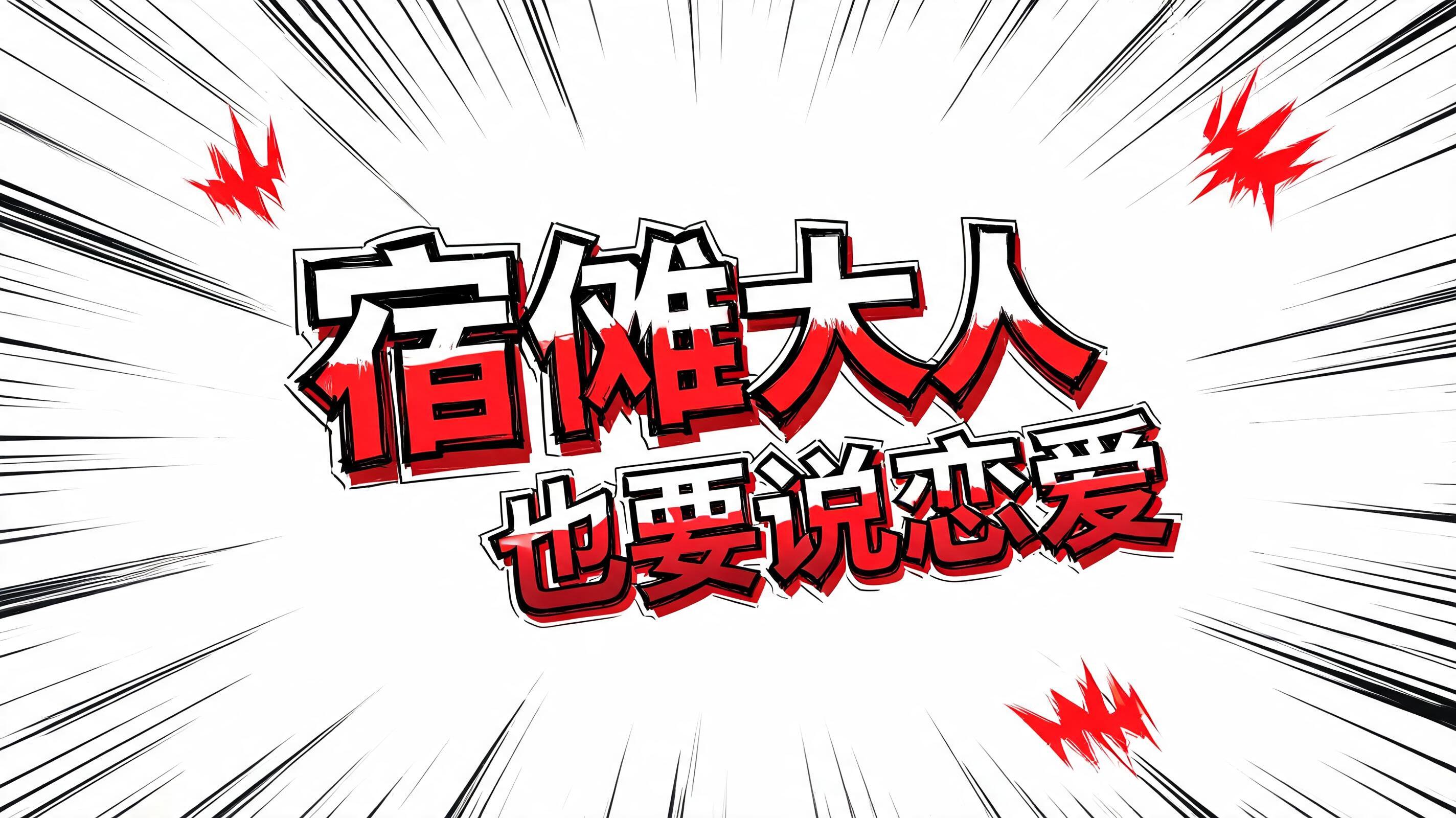
宿傩大人也要谈恋爱 - Anime Text Effect


Usa BytePlus Seedream 5.0, o modelo desta obra · 15 créditos

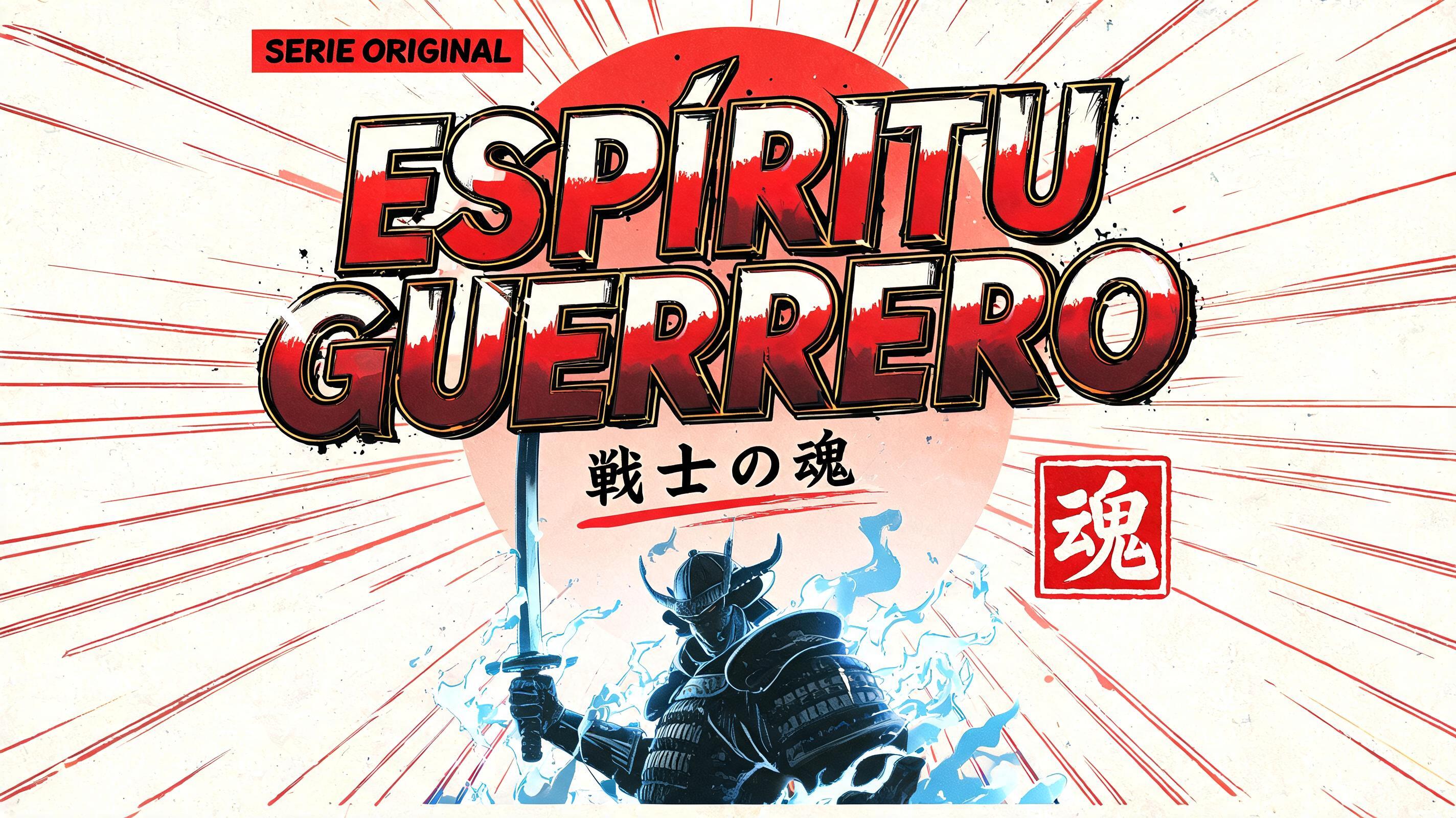
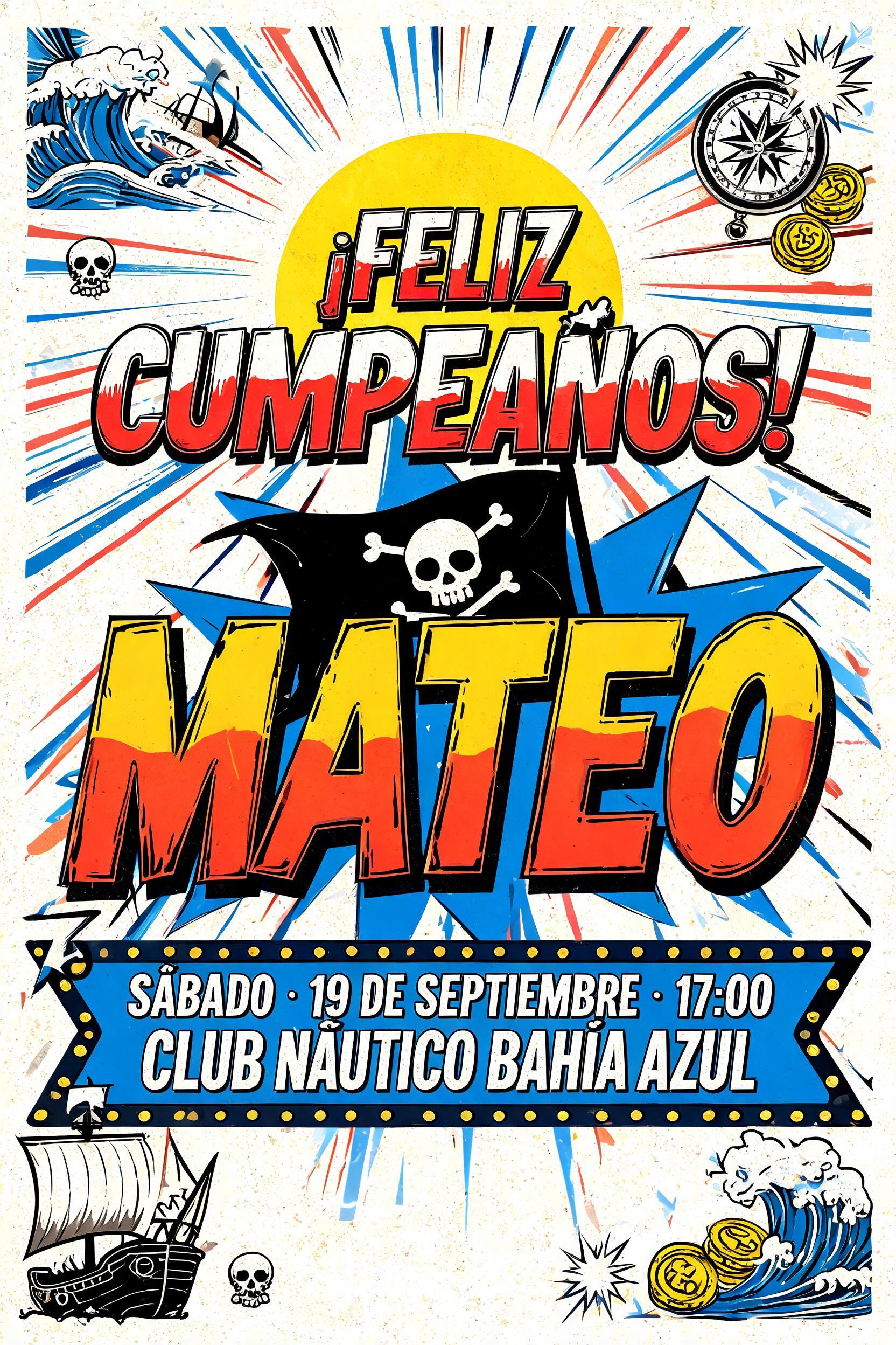
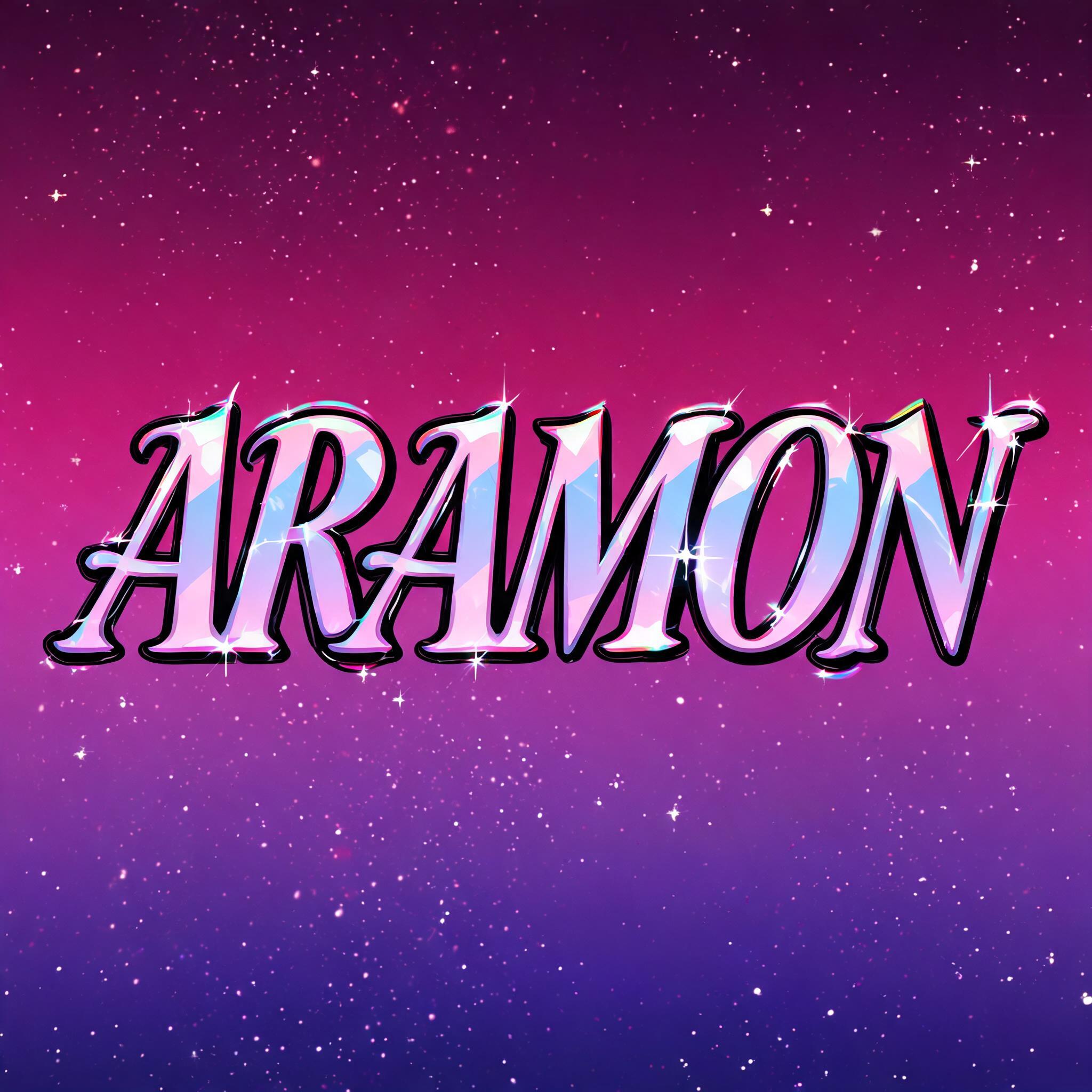

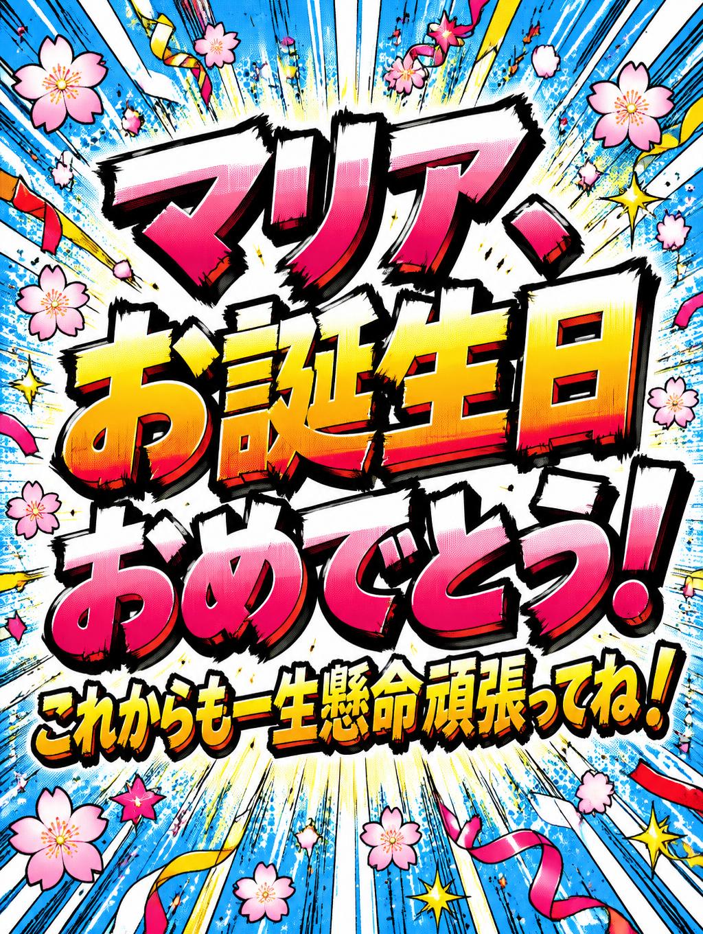
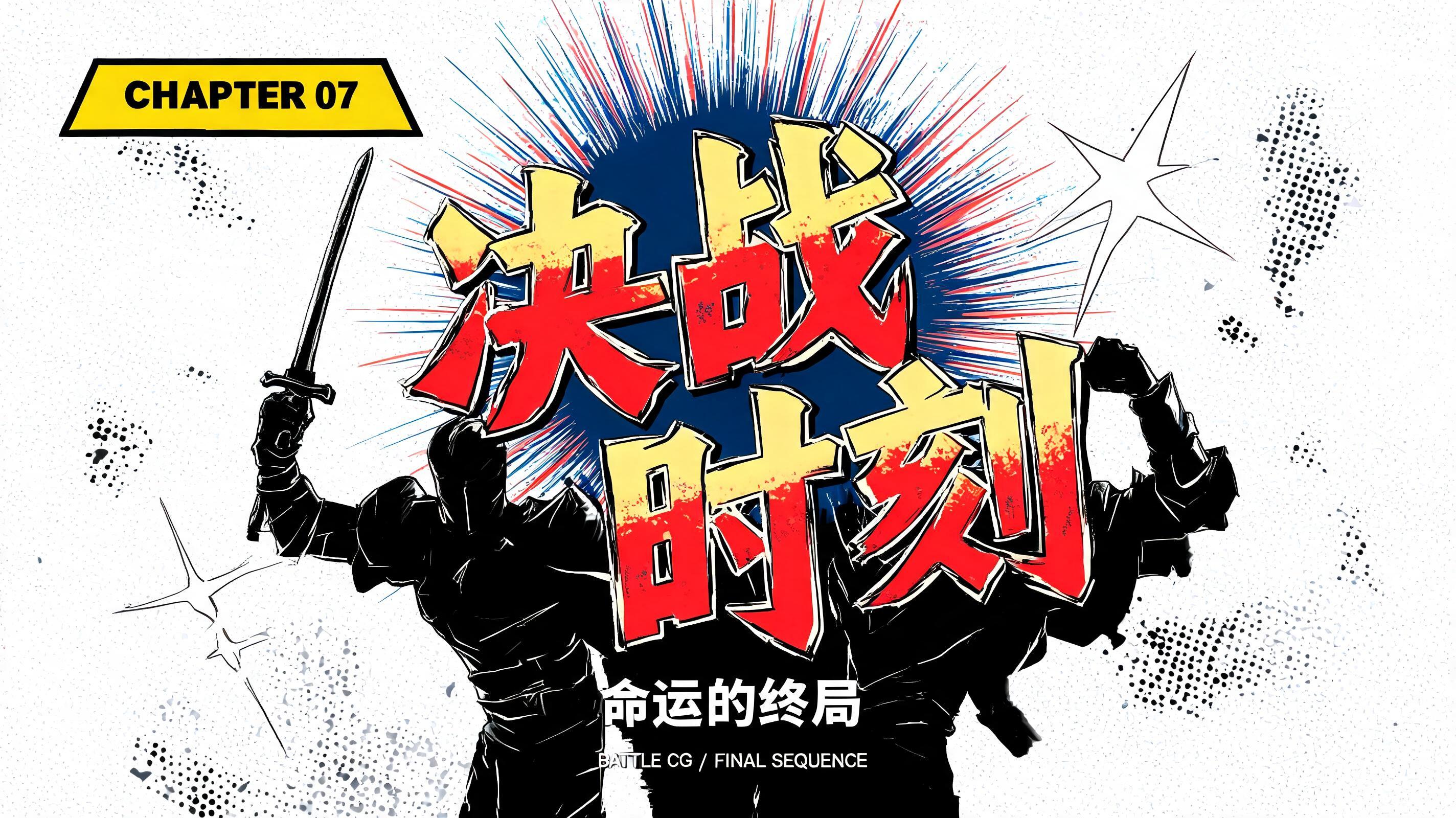



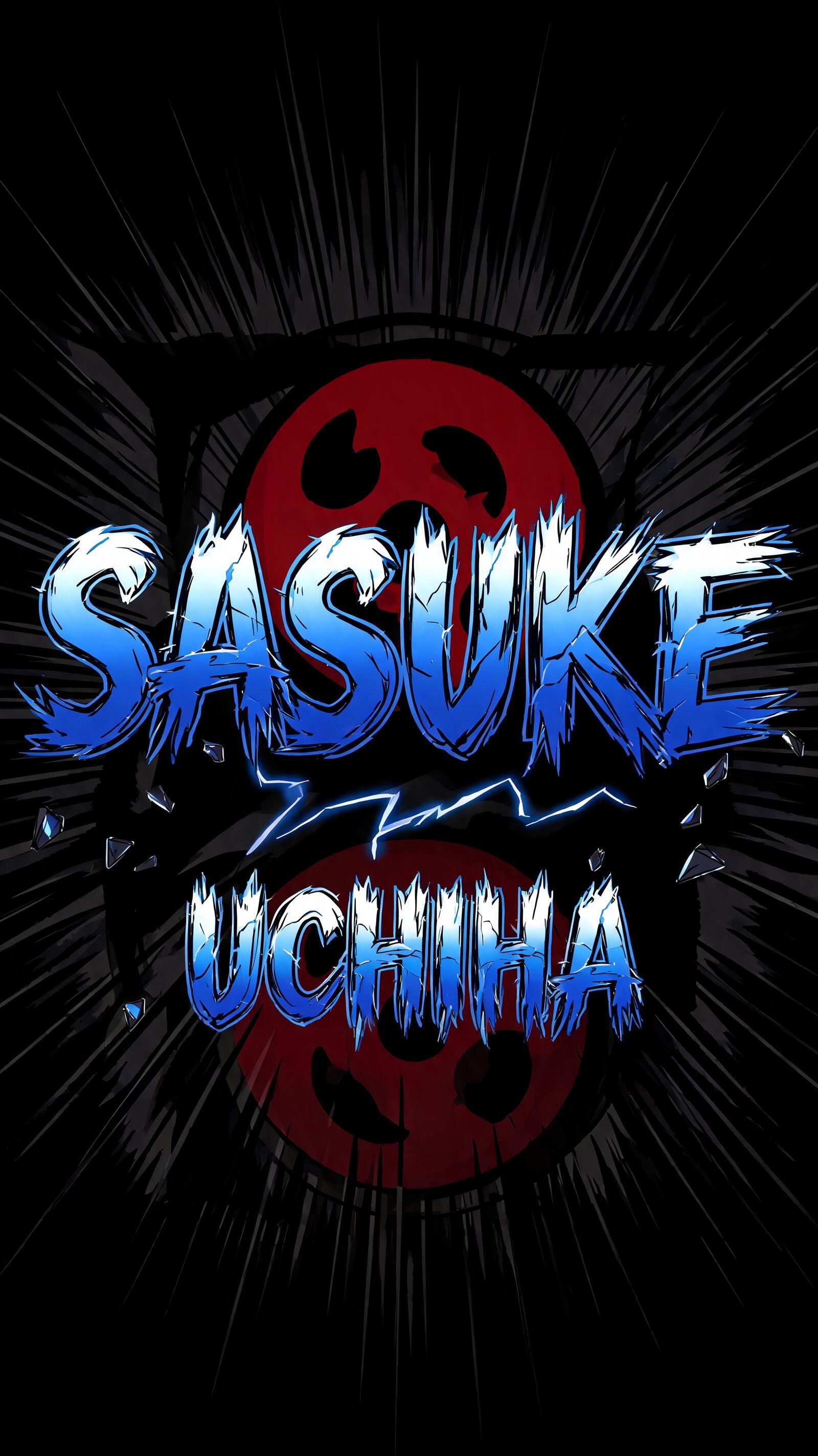
“宿傩大人也要谈恋爱” is a Anime text effect efeito de texto criado com a IA da FontVibe. Letreiramento de título shōnen: contornos pretos grossos feitos à mão, sombreamento cel chapado em faixas duras de luz e sombra, letras inclinadas e dinâmicas sobre branco com linhas de velocidade radiais.
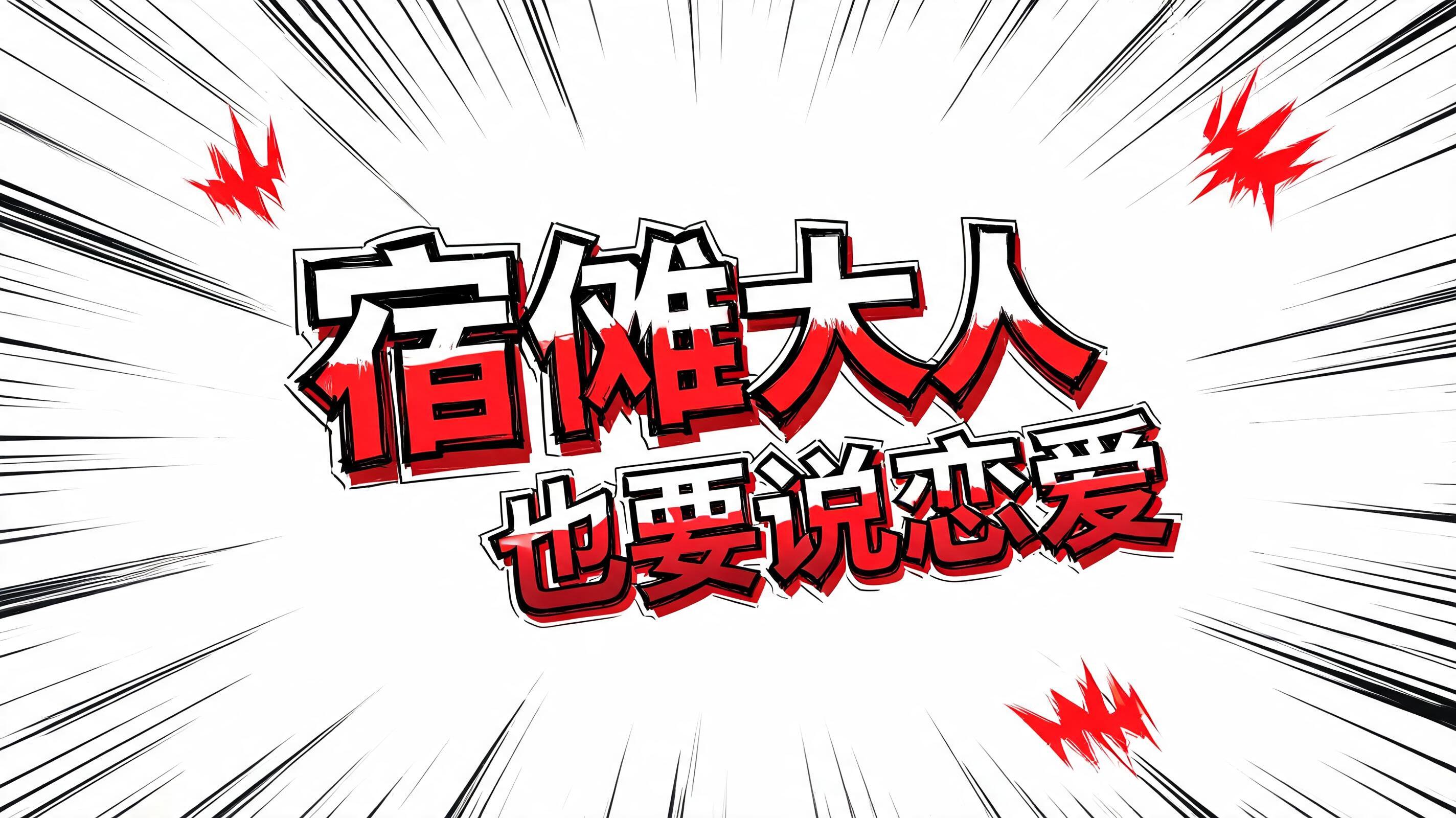
rendered as Japanese shounen anime title treatment — bold hand-inked manga lettering with authentic cel-shaded visual energy. Letter construction follows classic Shonen Jump title card standards: thick black ink outline with natural brush-weight variation defining each letter boundary; flat cel-shading fill with three hard-edge zones — bright highlight zone on upper letter face, highly saturated primary color zone at center, deep shadow zone at lower edge; all zone boundaries knife-edge hard, zero gradient blur, pure flat offset-print ink physics. Energy signature: high-contrast color + thick ink outline = letters that look physically printed on manga paper. The typographic language of Dragon Ball, Naruto, One Piece, Demon Slayer, Jujutsu Kaisen title cards — maximum manga kinetic energy, iconic and immediately recognizable as Japanese anime title typography. LETTERFORM PRIORITY: when the chosen font carries its own treatment, that font's letterform shapes take priority and own the letters; this style governs the inked manga outline, the three-zone cel-shading and the kinetic energy. FALLBACK MATERIAL: if the font carries no material of its own, render the letters as bold hand-inked shounen title lettering with a thick black brush outline and hard three-zone cel-shading. COLOR PRIORITY: keep the font's own colors if specified; otherwise a high-saturation primary fill with hard highlight and shadow zones. 以少年漫画标题卡风格呈现「宿傩大人也要谈恋爱」——画面背景为纯白底面,密集放射状速度线从字群后方爆发而出,带有强烈冲击格感,仿佛呪術廻戦剧场版宣传海报。字群作为视觉主体占据画面核心区域,字幅宽度约占整体帧面的80%。每个汉字均采用浓重手绘墨线描边,线宽随笔压自然变化,呈现真实毛笔落墨质感;字身内部执行三区硬边CELL渲染:上段约25%为纯白高光区,中段55%为高饱和度朱红主色调填充区,下段20%为深暗赤焦阴影区,三区边界刀割般锐利,零渐变模糊,完全符合偏版印刷油墨物理质感。「宿傩大人」四字作为核心英雄文字,尺寸显著主导画面,「也要谈恋爱」作为副级文字在视觉层级上形成大小对比,制造节奏张力。字体轮廓外侧附加白色安全描边以增强冲击底衬。画面四角散布红色冲击标记(集中线、爆炸效果符号),强化少年Jump章节标题的动能语言。整体输出标准为octane render级别8K清晰度,色彩为高对比度平涂油墨物理感,完全契合《呪術廻戦》《鬼滅の刃》标题卡的视觉识别系统.
Gerada em 12 de agosto de 2026 · 2848 × 1600 · JPEG · BytePlus Seedream 5.0 · Compartilhada pelo criador · Uso comercial gratuito (CC BY 4.0)


