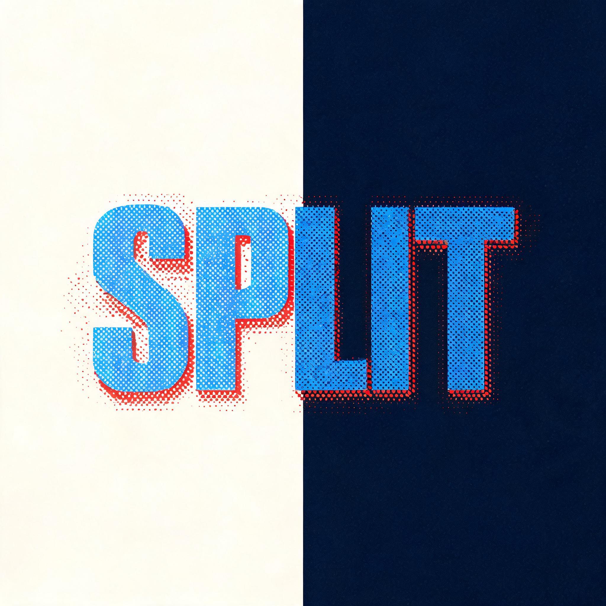
Split - Duotone Text Effect


Usa BytePlus Seedream 5.0, o modelo desta obra · 15 créditos

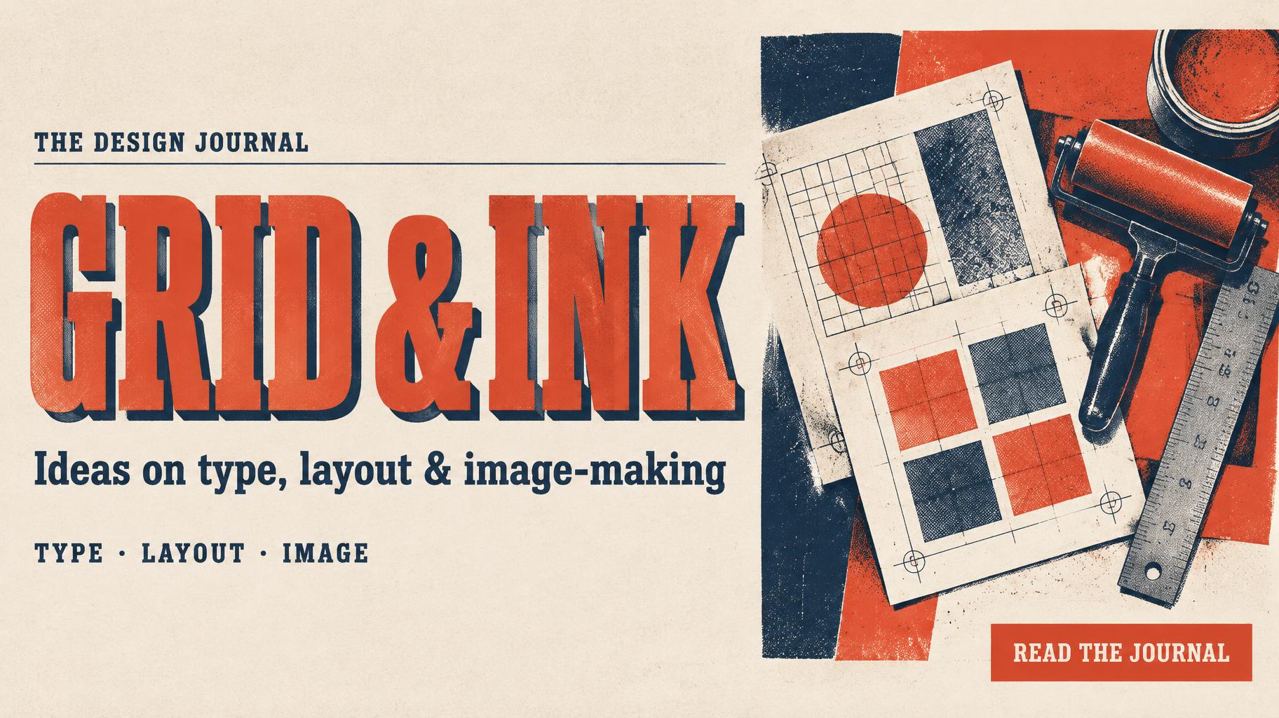
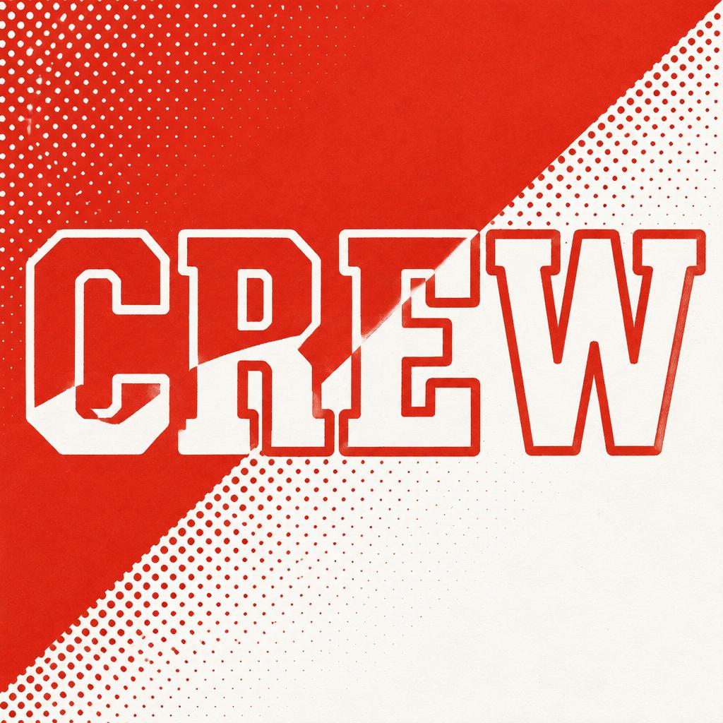
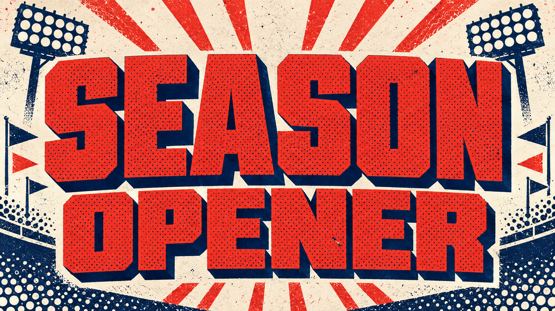
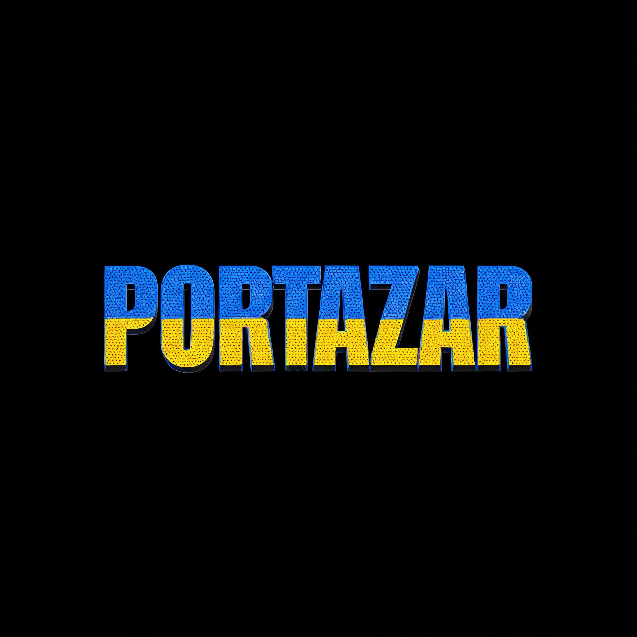
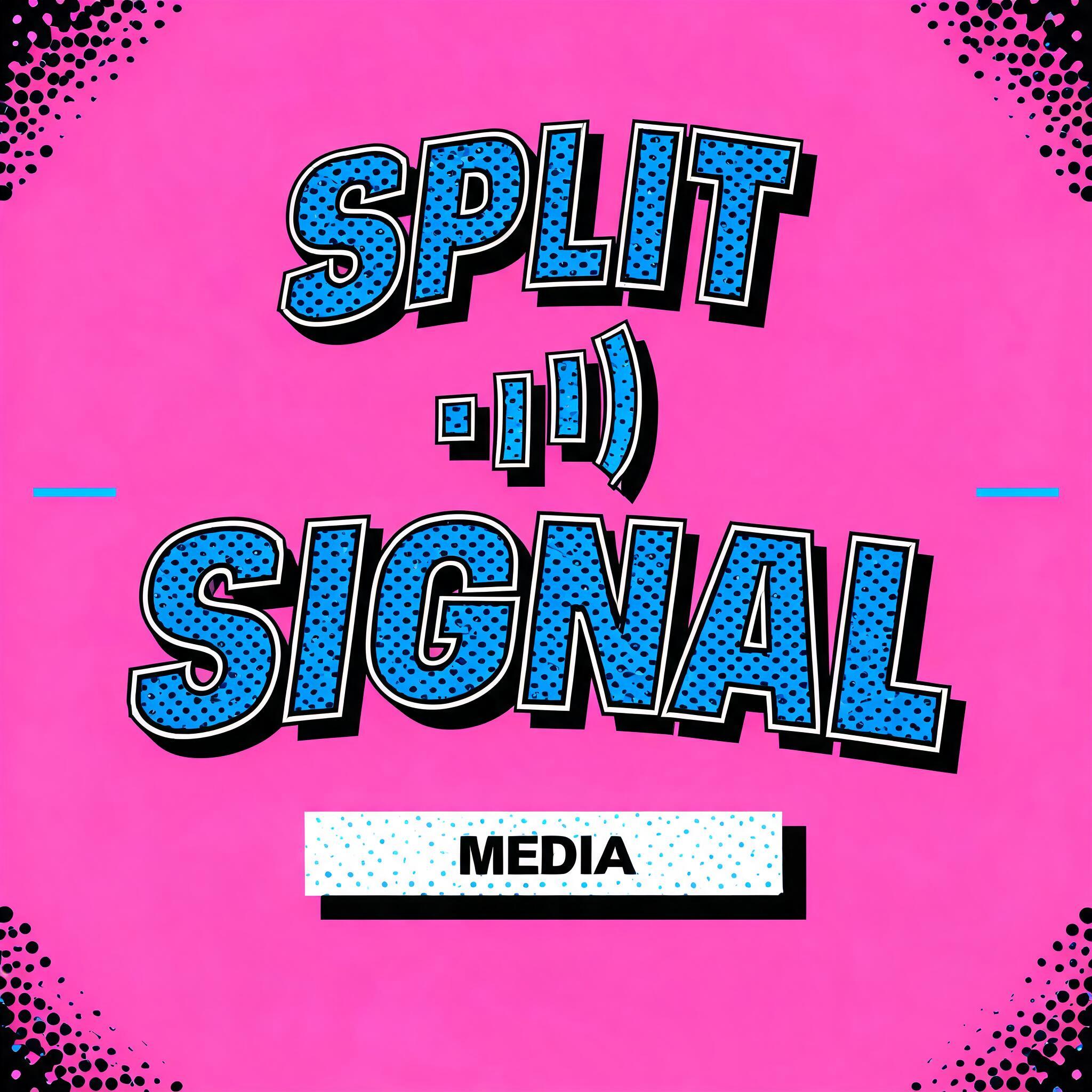
“Split” is a Duotone text effect efeito de texto criado com a IA da FontVibe. Maiúsculas slab condensadas e grossas numa cor viva com textura de meio-tom e uma sombra sólida deslocada numa segunda cor, sobre um fundo chapado contrastante.
a bold duotone piece — graphic, punchy and print-like. SURFACE / STYLE: the lettering is rendered in a striking two-color treatment — one bright color dominating the letter face, a second deep contrasting color filling the drop shadow, bevel inset or offset layer — with a visible halftone screen-dot pattern in the dominant color and a crisp hard-edged graphic finish. SCENE ATMOSPHERE: a flat bold poster setting — clean two-tone ground, simple geometric or halftone accents, high-contrast graphic energy. PALETTE: any high-contrast two-color pair — vermillion red + midnight navy, electric blue + hot pink, black + bright accent — flat, saturated and bold, never gradient-soft or muddy. LETTERFORM PRIORITY: when the chosen font carries its own treatment (retro or Clarendon slab, condensed or geo sans, halftone comic, 3D shadow, sticker outline), that font's letterform takes priority and owns the letters; this style governs the two-color split, the halftone dots and the graphic poster finish. FALLBACK MATERIAL: if the font carries no material of its own, render the letters in a bold duotone — bright face with a deep contrasting offset shadow and a halftone dot pattern — so the punchy two-color graphic always reads. A single word 'Split' rendered as a bold duotone graphic mark — one bright electric blue dominating the letter face, a deep contrasting vermillion red filling a hard offset shadow layer beneath, with a visible halftone screen-dot pattern pressed across the blue face, each dot crisp and mechanical, evoking classic two-color letterpress print. The ground is a flat clean two-tone field — raw off-white facing a dense navy block — with no gradients, no soft edges, all geometry razor-cut. A loose halftone dot scatter bleeds past the letterforms into the surrounding ground, reinforcing the screen-print graphic energy. The offset shadow drops at a consistent angle, giving the word a punchy dimensional punch without any true 3D softness. High-contrast, fully saturated, zero mud — the kind of duotone that jumps off a poster at ten feet.
Gerada em 17 de agosto de 2026 · 2048 × 2048 · JPEG · BytePlus Seedream 5.0 · Compartilhada pelo criador · Uso comercial gratuito (CC BY 4.0)


