ZAFURA - Pincel de Tinta Japonês Text Effect


Usa BytePlus Seedream 5.0, o modelo desta obra · 15 créditos











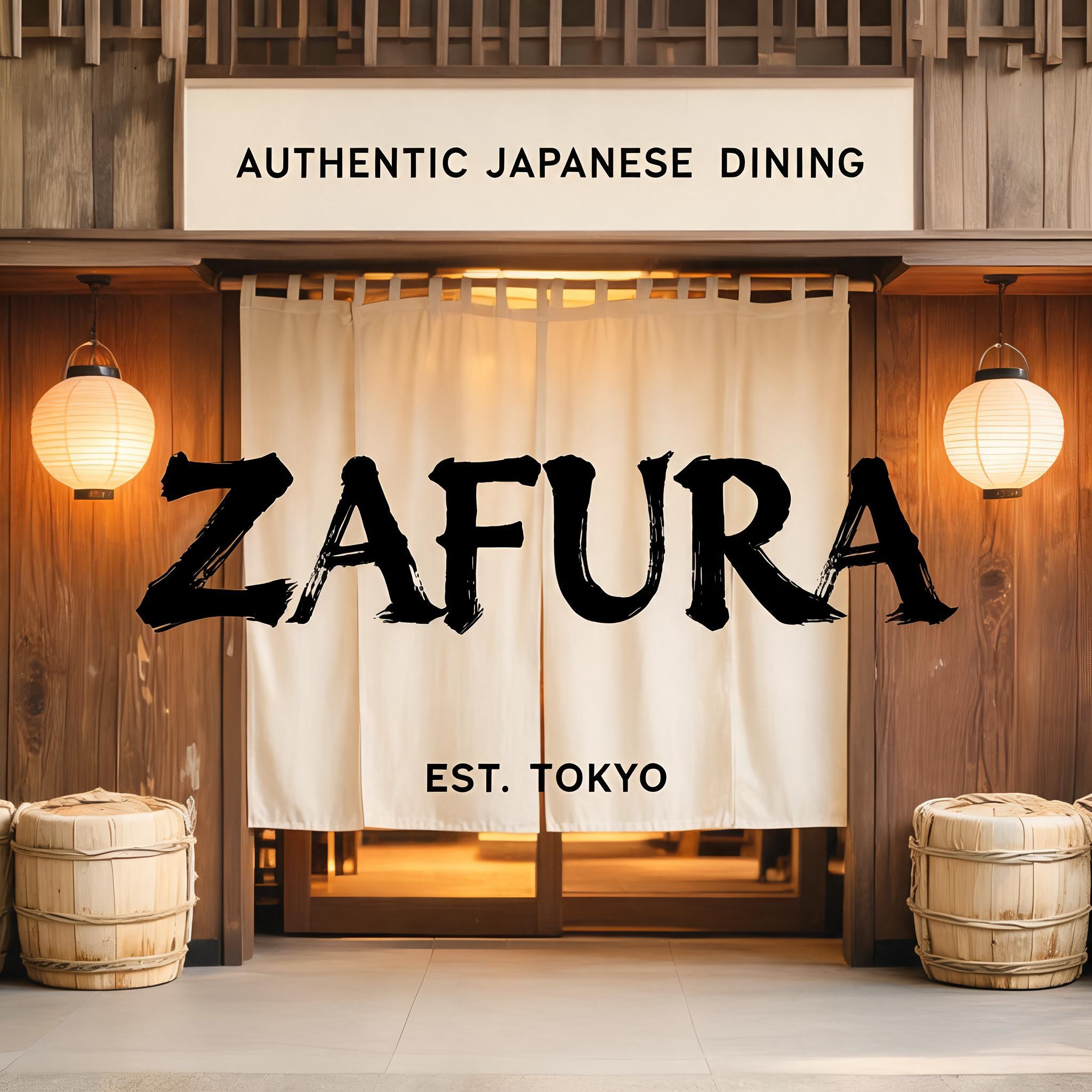
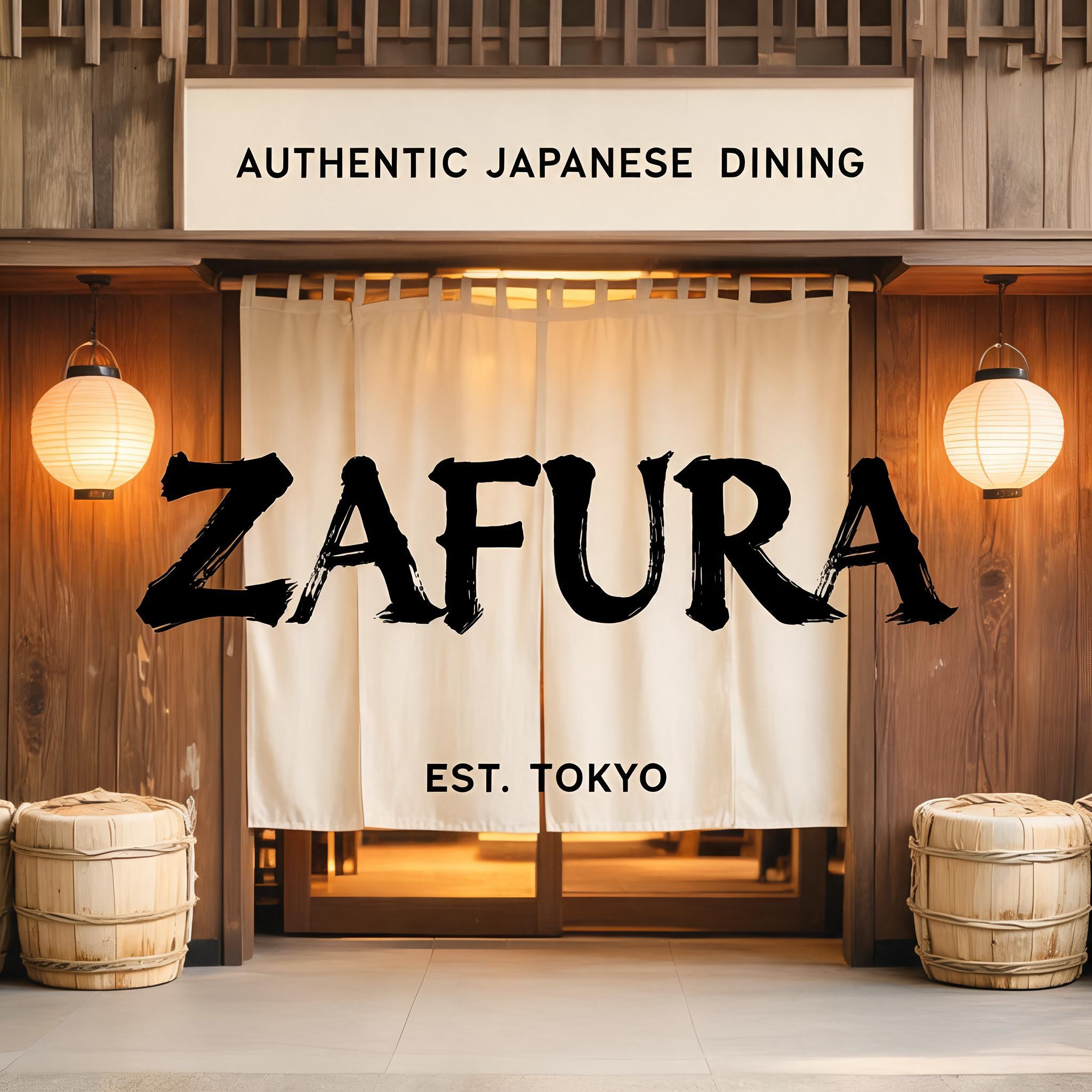
“ZAFURA” is a Brush Japanese Ink text effect efeito de texto criado com a IA da FontVibe. O estilo de caligrafia com pincel de tinta do shodo japonês aplicado às letras latinas. Tinta sumi preta e profunda com a energia autêntica do pincel fude, traços controlados numa única direção e atmosfera de papel washi. Perfeito para marcas de restaurantes japoneses, design de tatuagem, anime, artes marciais e projetos culturais.
Japanese Shodo ink brush style optimized for restaurant and commercial hospitality branding. Letterforms balanced between traditional dignity and modern commercial legibility — not as heavy as warrior styles, not as delicate as geisha. Strokes confident and clear, ink consistent and professional, with just enough brush texture to feel authentic rather than digital. Background: neutral warm white or pale cream, clean enough for professional use. The aesthetic: the typographic equivalent of a respected Japanese restaurant's facade — welcoming, quality-signaling, trustworthy. Formal enough for a high-end kaiseki restaurant; approachable enough for a neighborhood sushi bar. Premium Japanese izakaya entrance — a welcoming noren curtain doorway, warm interior glow behind. Aged wood paneling, paper lanterns on either side, subtle sake barrel decorations. The restaurant name "ZAFURA" rendered in the commercial hospitality ink brush style — balanced between traditional dignity and modern commercial legibility. Top-center: tiny restaurant category label "AUTHENTIC JAPANESE DINING" at 45% canvas width, clean commercial caps, inviting. Center: "ZAFURA" as massive dominant brush letters at 65% canvas width, centered — strokes confident and clear, ink balances brush authenticity with commercial readability, the kind of brushwork seen on a premium Tokyo restaurant signboard. Bottom-center: "EST. TOKYO" at 20% canvas width, small establishment marker. Vertical spacing ratio approximately 1:5:1.5. The composition reads as the exterior signage of a premium Japanese restaurant — authentic, commercial, warm, welcoming.
Feito para Fonte para Restaurante Japonês
Gerada em 21 de agosto de 2026 · 2048 × 2048 · JPEG · BytePlus Seedream 5.0 · Compartilhada pelo criador · Uso comercial gratuito (CC BY 4.0)


