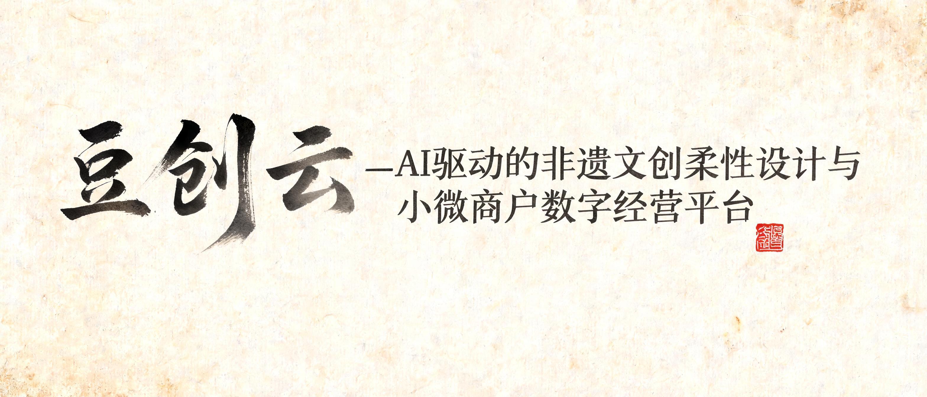
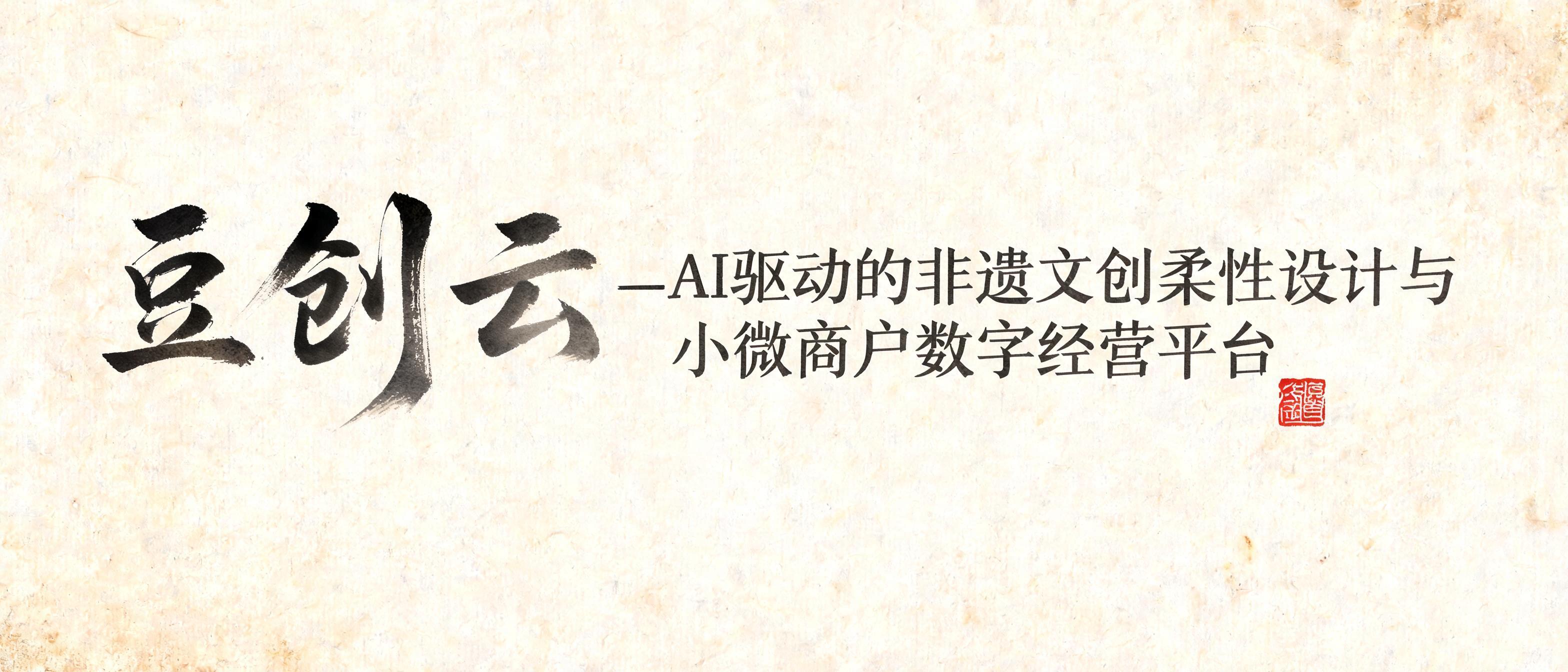
豆创云—AI驱动的非遗文创柔性设计与小微商户数字经营平台 - Pincel de Tinta Chinesa Text Effect


Usa BytePlus Seedream 5.0, o modelo desta obra · 15 créditos






“豆创云—AI驱动的非遗文创柔性设计与小微商户数字经营平台” is a Brush Chinese Ink text effect efeito de texto criado com a IA da FontVibe. O estilo da caligrafia chinesa com pincel de tinta sumi aplicado às letras latinas. Preto profundo com textura autêntica de cerdas, traços que vão do grosso ao fino e aquele ar de papel de arroz. Perfeito para marcas de restaurantes chineses, artes marciais, bem-estar e design cultural.
rendered in Chinese ink brush calligraphy style. Letterforms painted with a fully loaded sumi ink brush — deep black ink, visible bristle marks along stroke edges, wet ink pooling at stroke starts, feathered dry-brush trailing ends. Authentic ink density variation: thick rich black cores fading to grey at thin passages. Rice paper texture visible behind. Traditional Chinese calligraphy energy — each stroke confident, intentional, irreversible. LETTERFORM PRIORITY: when the chosen font carries its own treatment, that font's letterform shapes take priority and own the letters; this style governs the sumi ink medium, the bristle and ink-density behavior and the rice-paper ground. FALLBACK MATERIAL: if the font carries no material of its own, render the letters as deep black sumi brush strokes with visible bristle marks, wet ink pooling at stroke starts and feathered dry-brush trails on rice paper. COLOR PRIORITY: keep the font's own colors if specified; otherwise rich black ink fading to grey at thin passages. A horizontal expanse of aged xuan paper, warm ivory with subtle fiber grain and faint foxing at the edges, forms the ground. The primary text 豆创云—AI驱动的非遗文创柔性设计与小微商户数字经营平台 is painted across the composition with a fully loaded sumi ink brush. Strokes erupt from deep, pooling wet-black ink at each entry point — bristle splays visible at pressure peaks — then taper through dense charcoal mid-tones into feathered dry-brush filaments at trailing ends. Ink bleeds fractionally into the xuan paper fibers, creating soft halation around the thickest passages and a luminous translucent grey at the thinnest. The character sequence breaks naturally into a two-tier typographic rhythm: 豆创云 reads with size dominance and heavier ink saturation as the brand anchor, while the descriptive clause AI驱动的非遗文创柔性设计与小微商户数字经营平台 follows in a reduced weight register, ink slightly lighter and more fluid, creating clear visual hierarchy without breaking the single calligraphic breath. A small vermilion seal chop impression — carved square, cinnabar-red, slightly uneven ink transfer — marks the composition as a finishing accent. Faint diluted ink-wash strokes ghost softly behind the main text column, adding atmospheric depth. Ink density varies organically: no stroke shares the same weight. The rice paper texture shows luminously through every thin passage. High-fidelity macro render, 8k detail, no digital uniformity, no clean vector edges.
Gerada em 22 de agosto de 2026 · 3136 × 1344 · JPEG · BytePlus Seedream 5.0 · Compartilhada pelo criador · Uso comercial gratuito (CC BY 4.0)


