JP - Cursiva Text Effect


Usa BytePlus Seedream 5.0, o modelo desta obra · 15 créditos
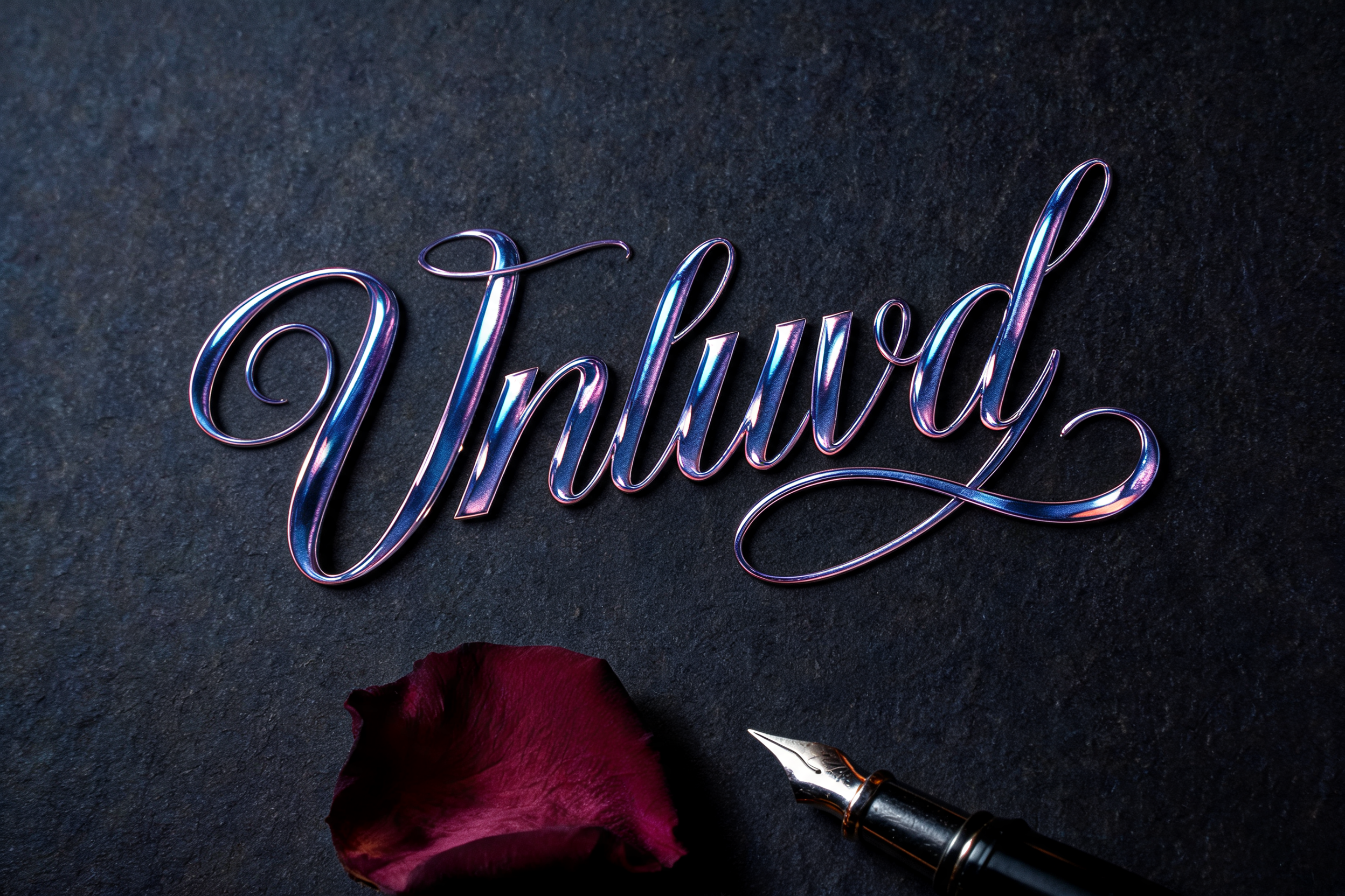
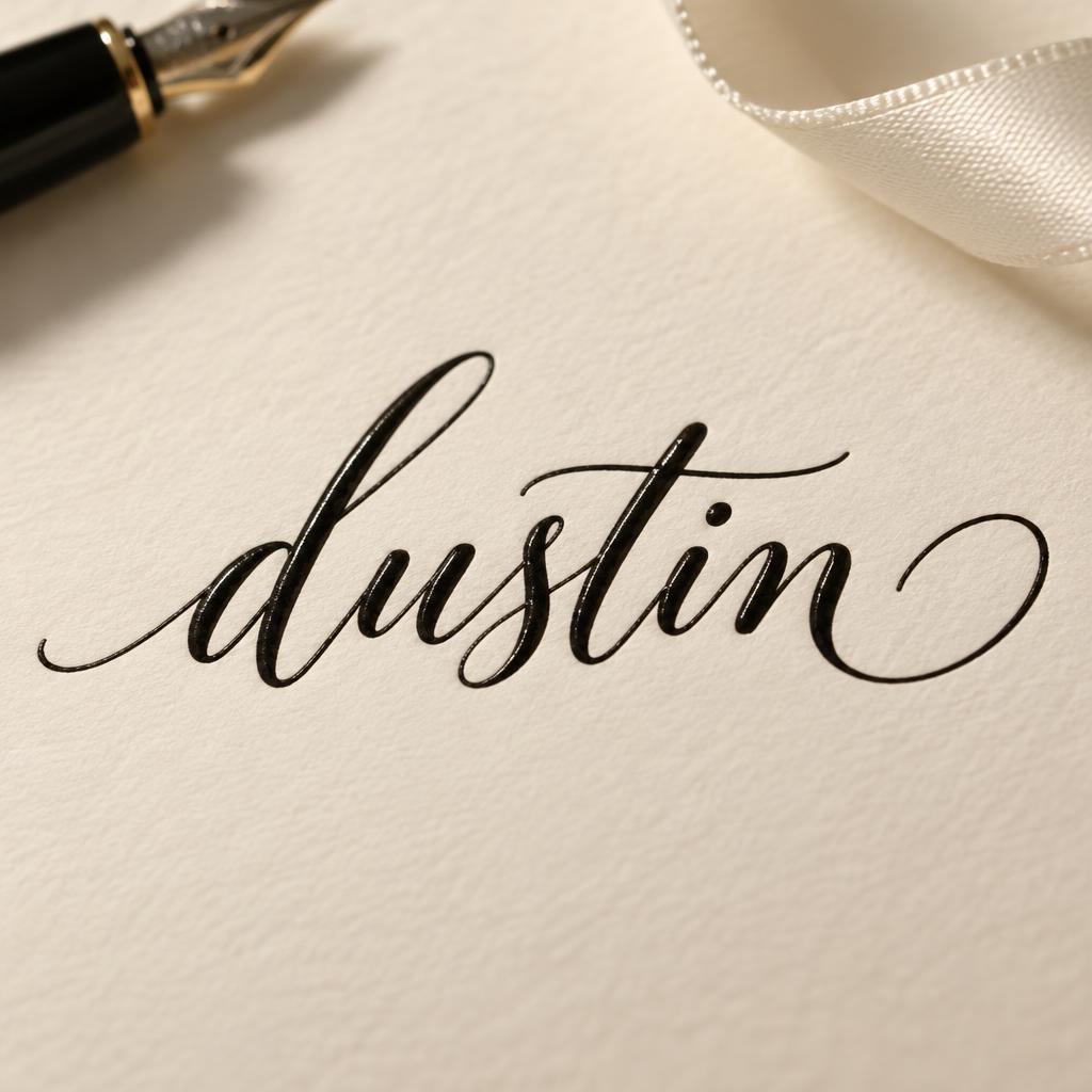
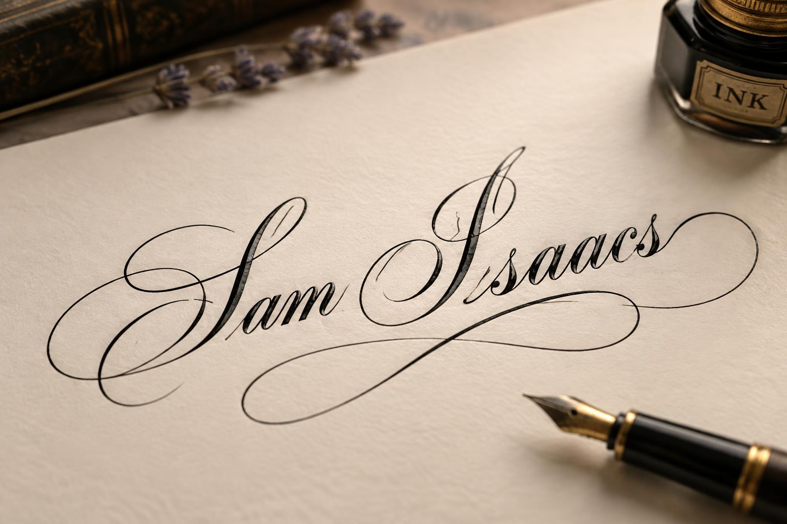
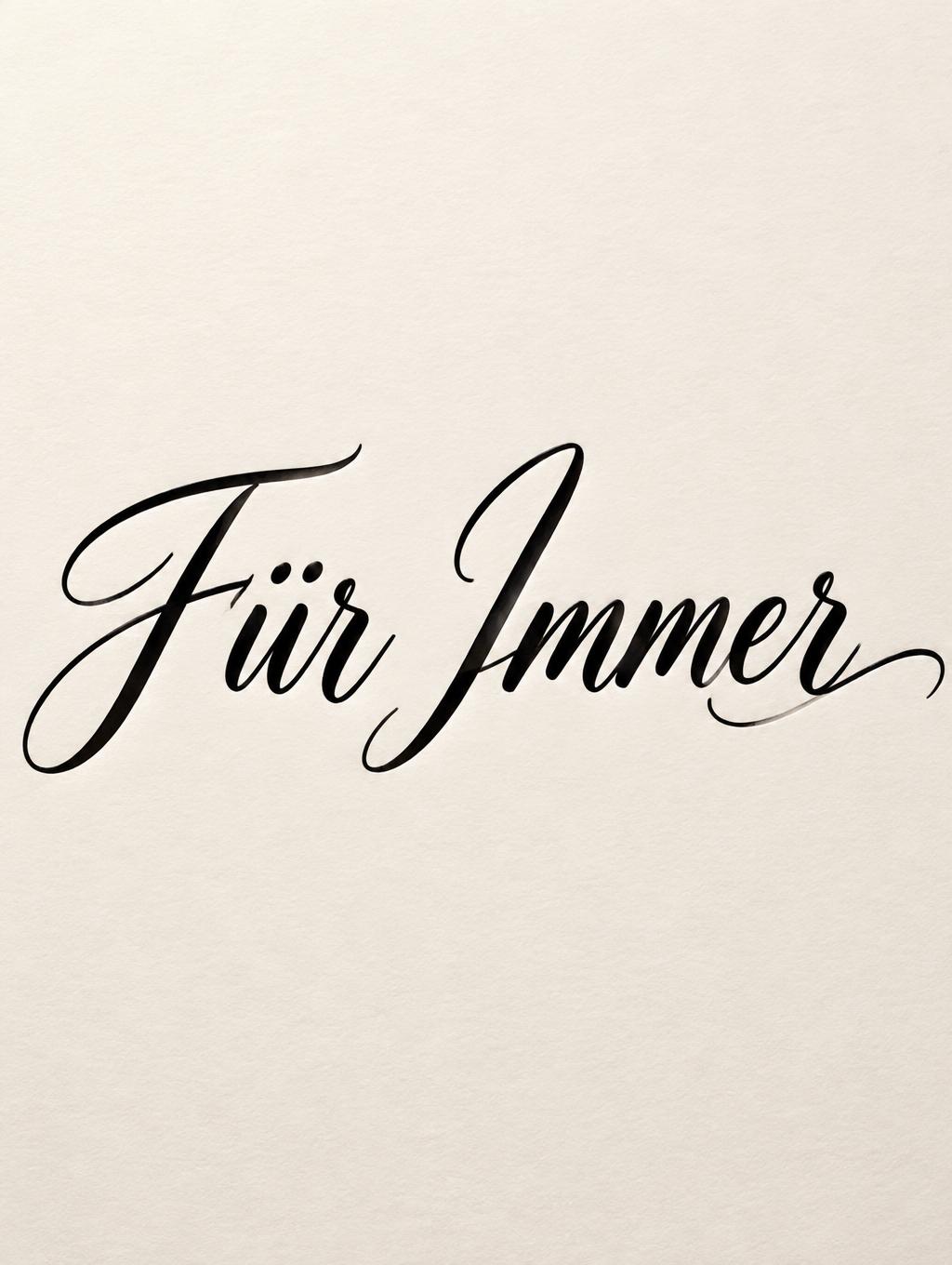

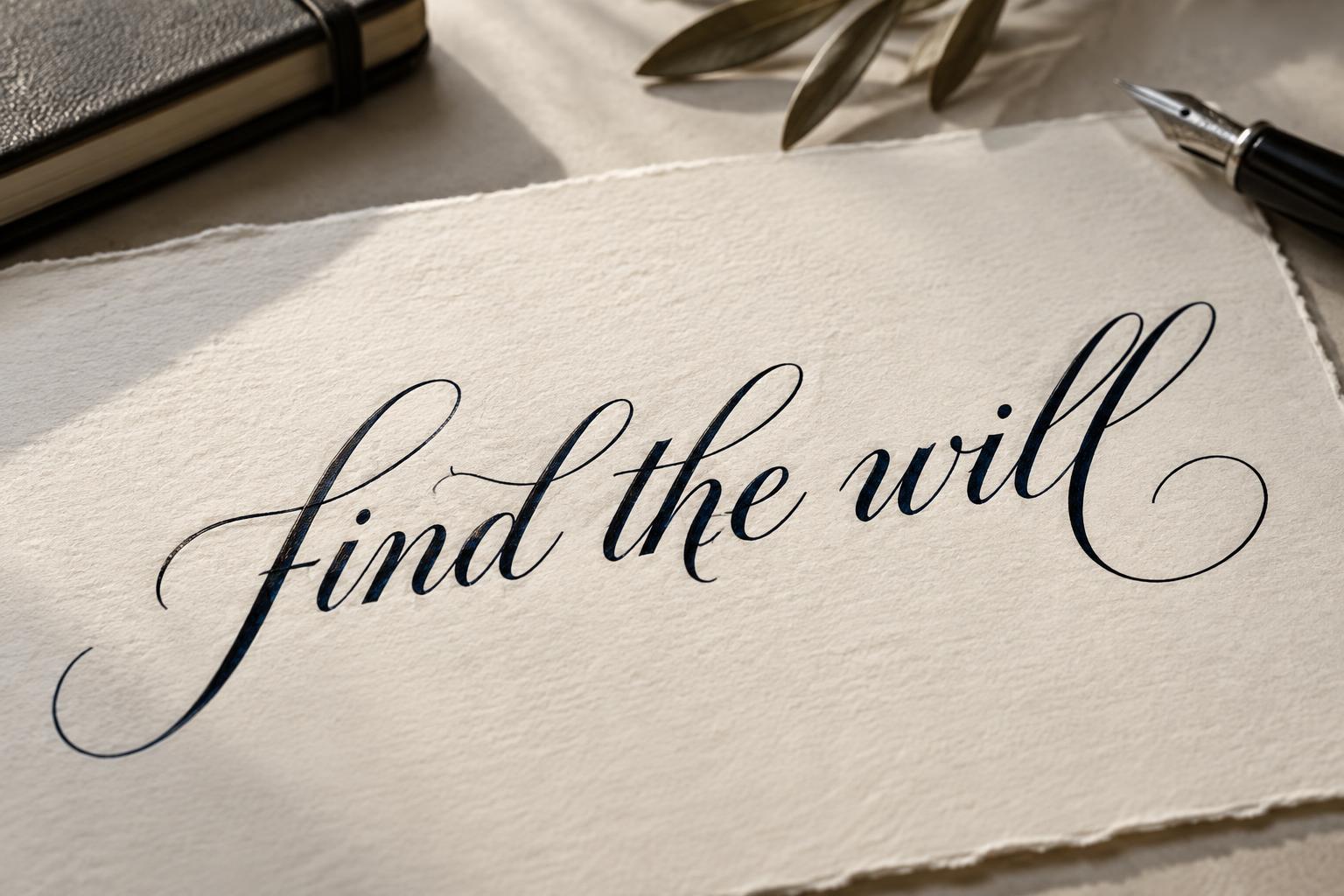

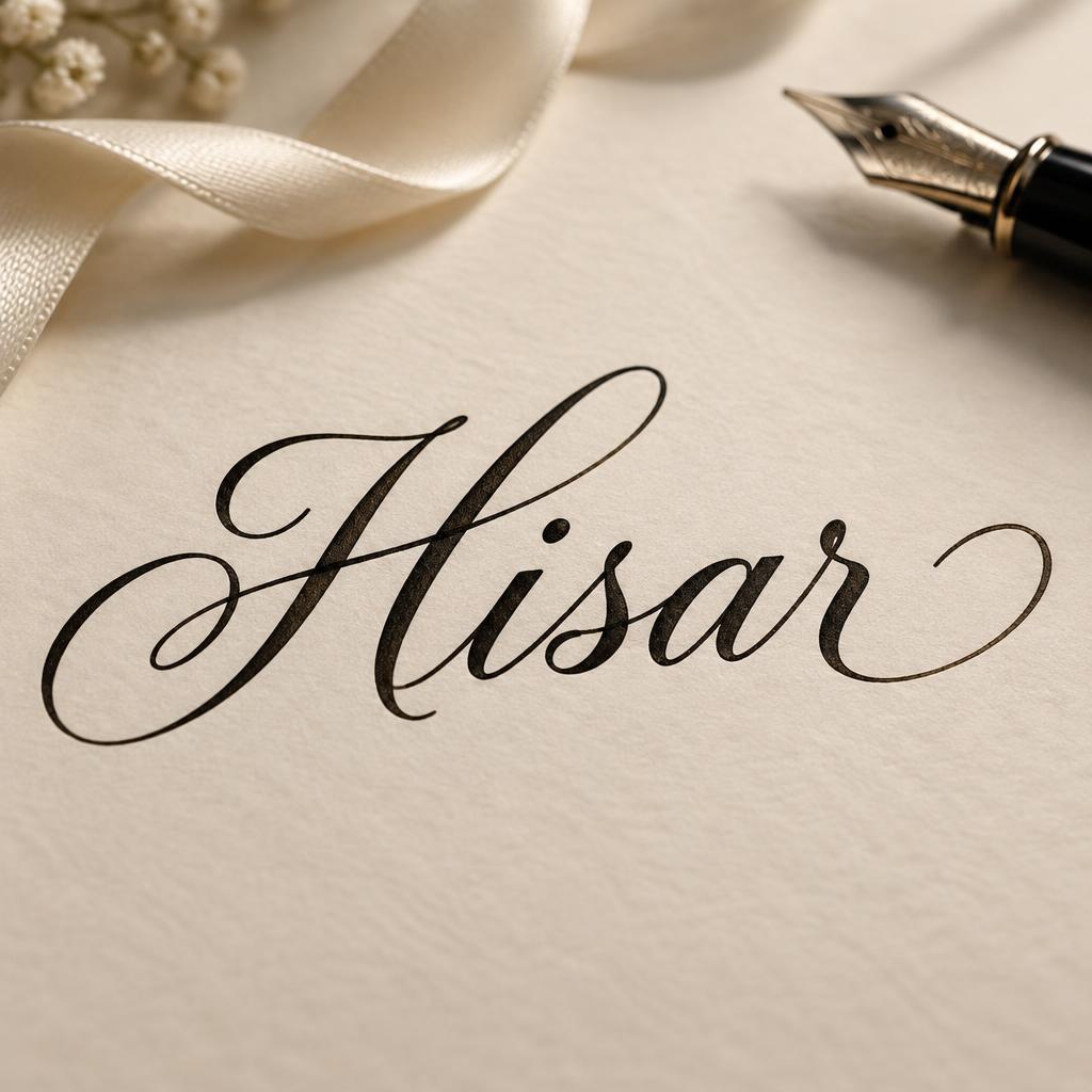
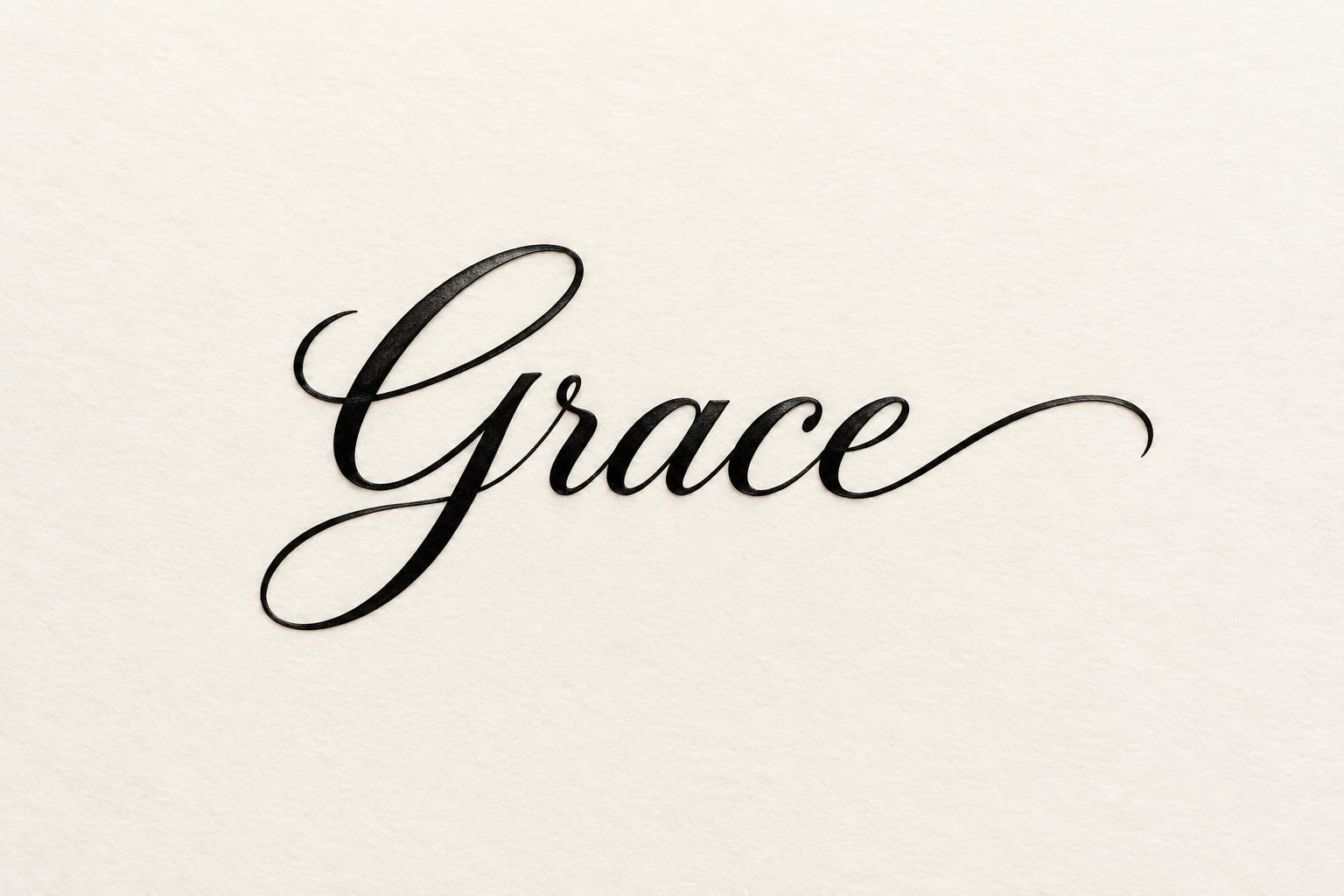
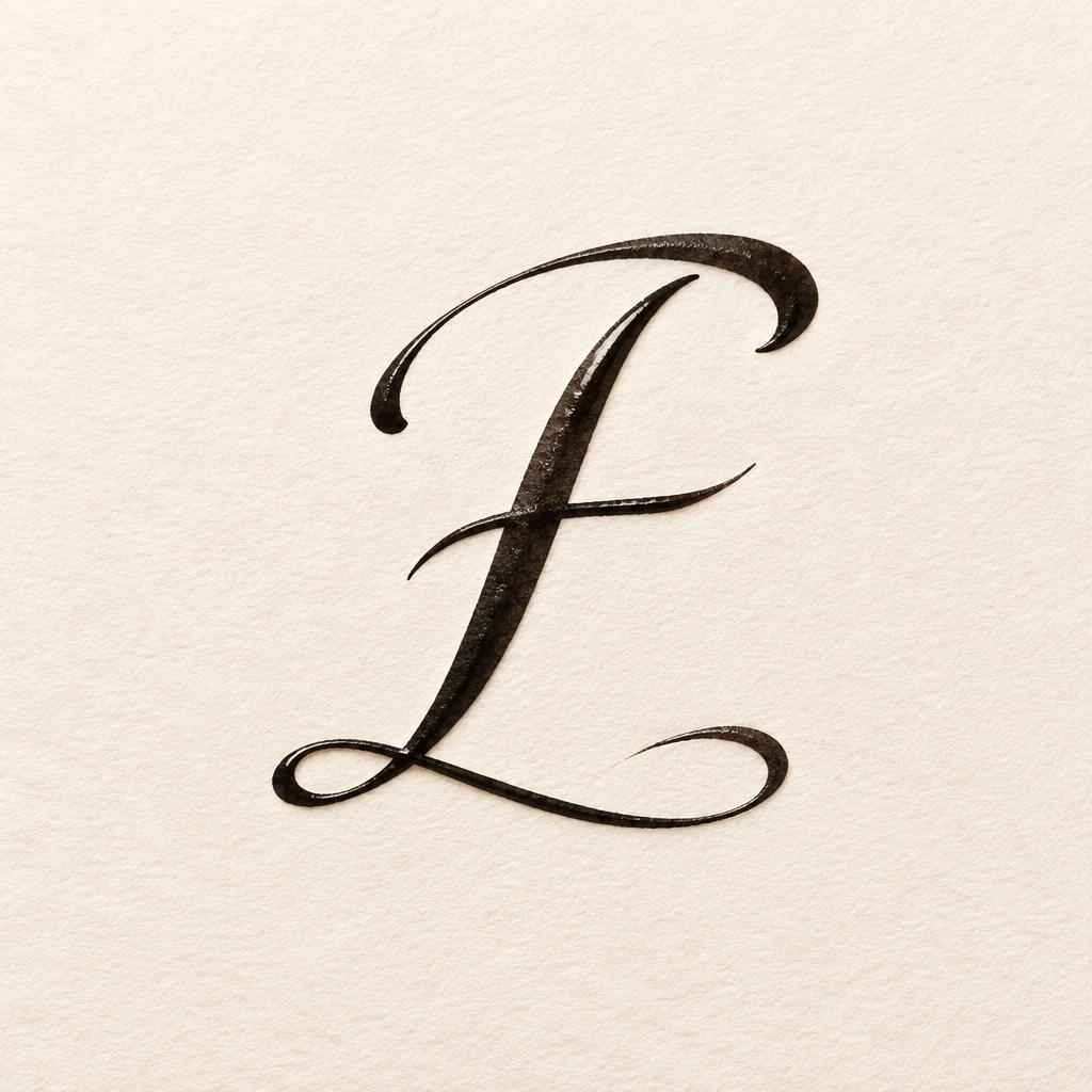
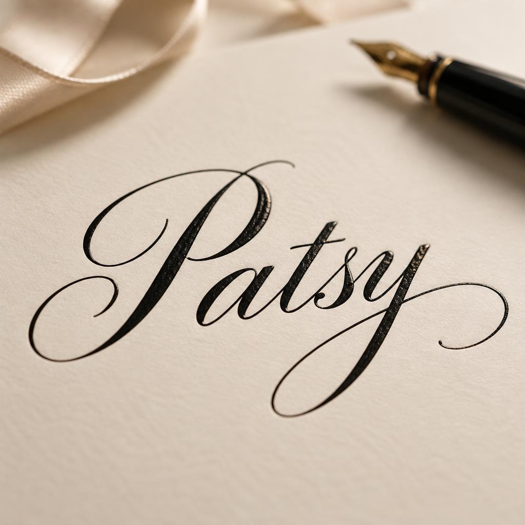
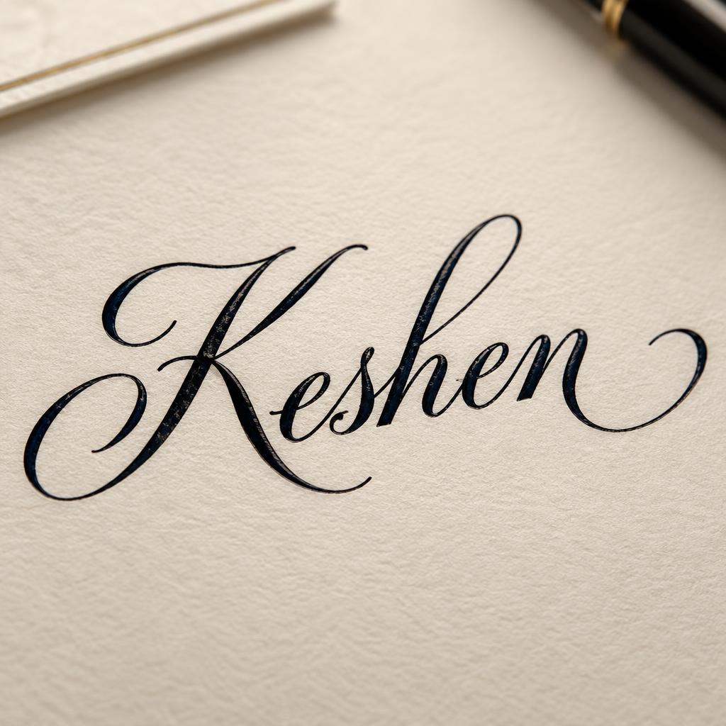
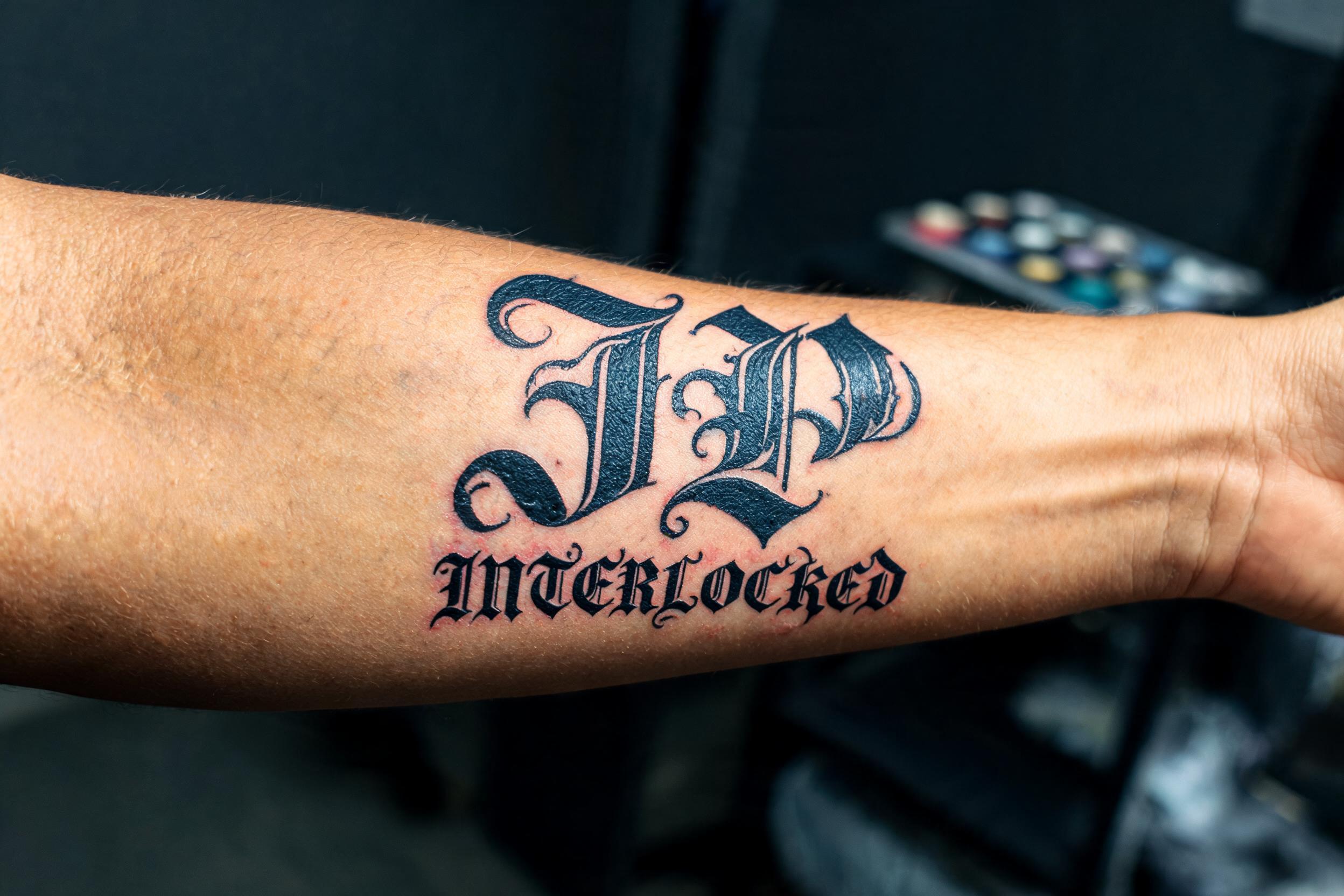
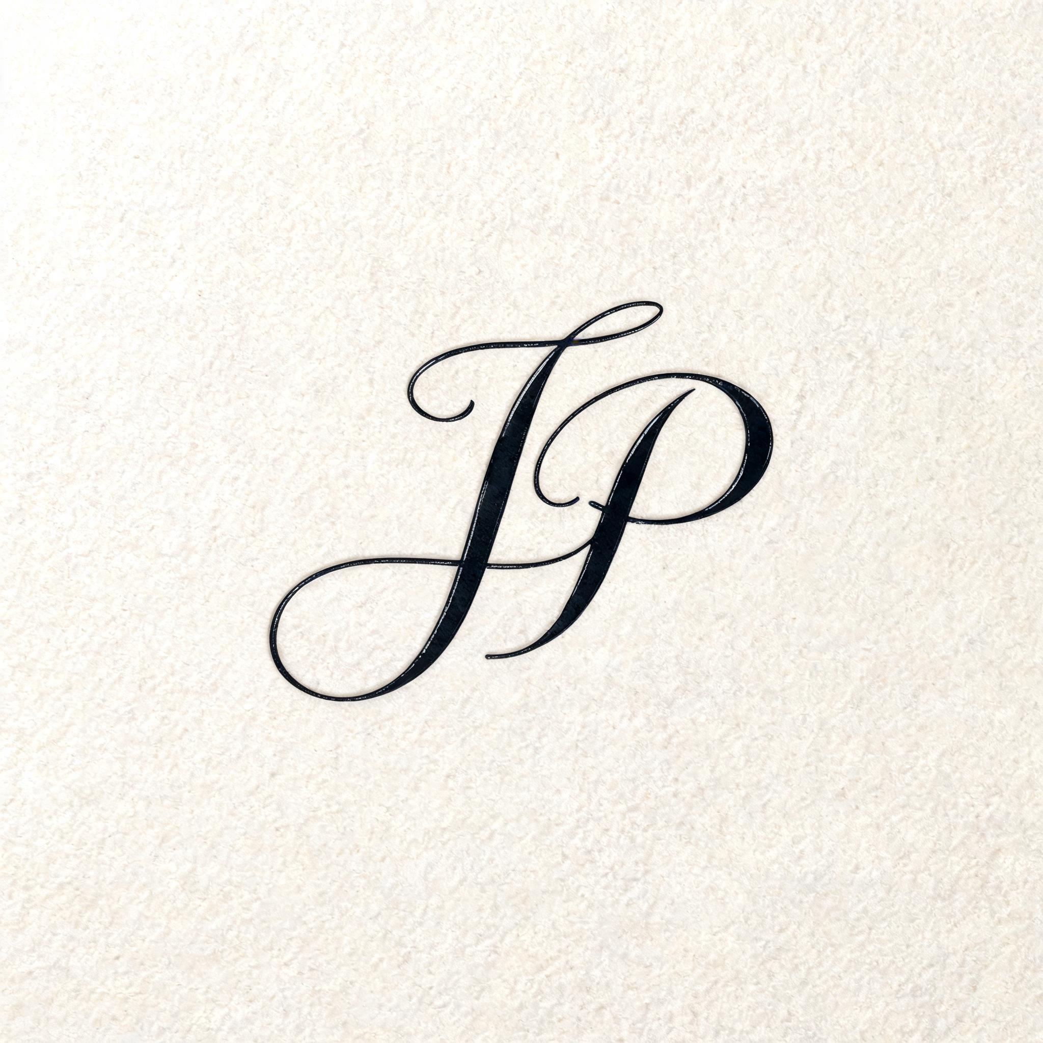
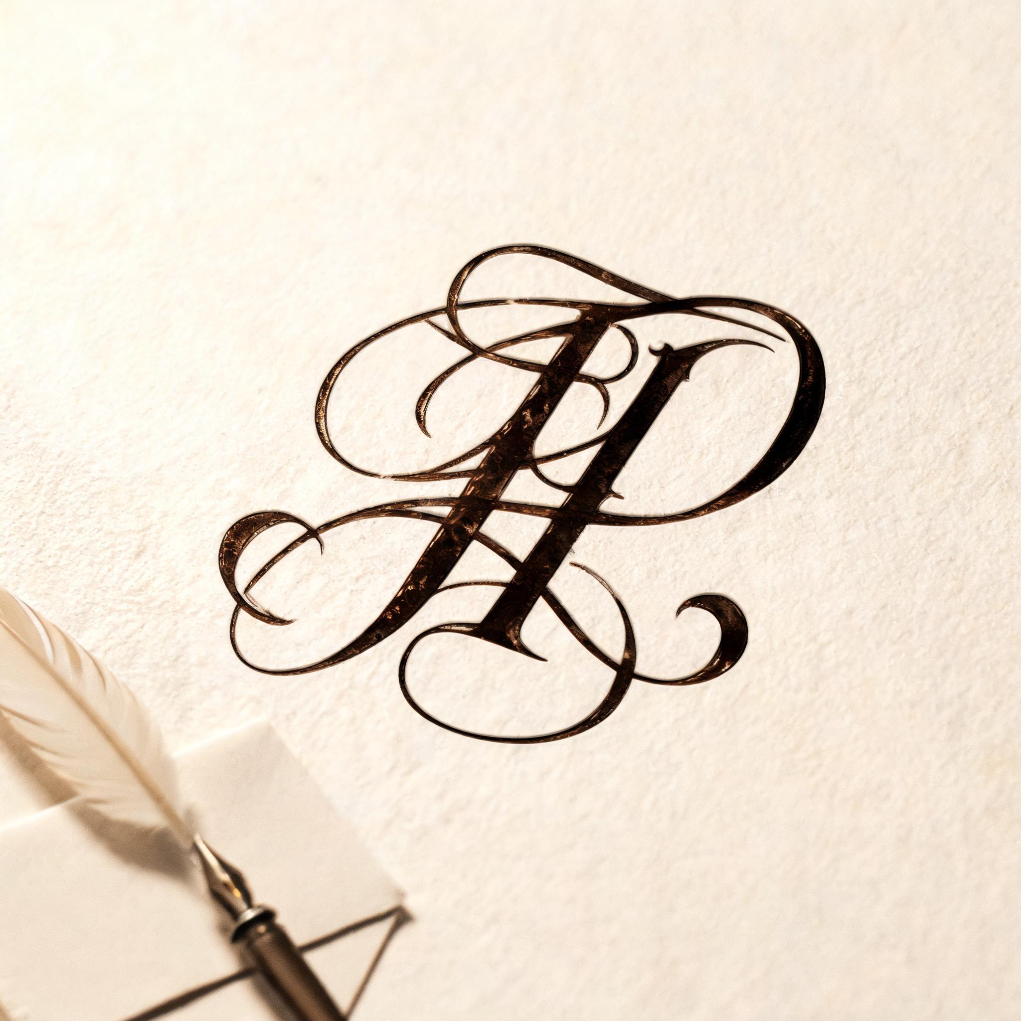
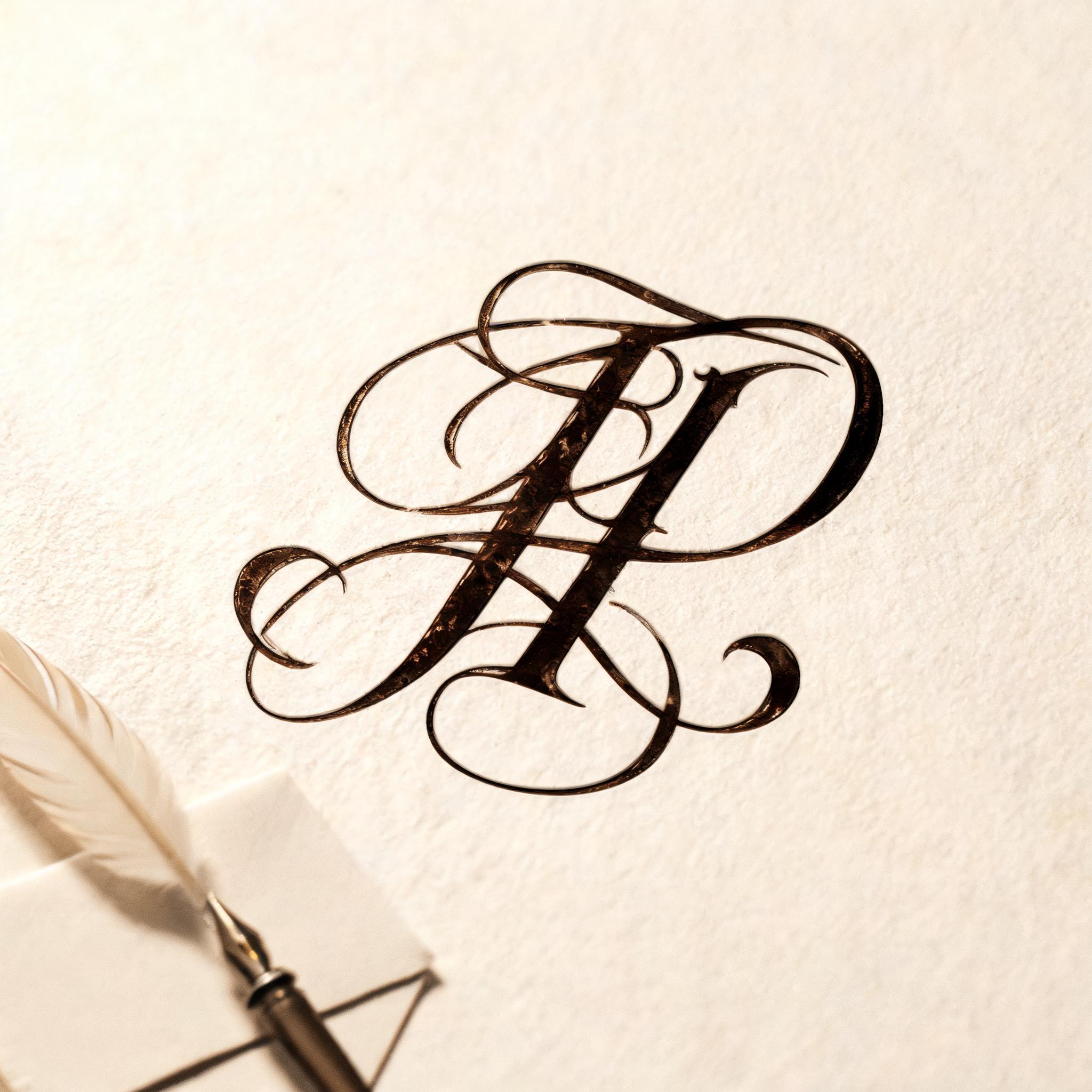
“JP” is a Cursive text effect efeito de texto criado com a IA da FontVibe. Cursiva fluida de pena e tinta: letras ligadas, ascendentes em laço e longos floreios de entrada e saída, escrita em tinta preta sobre papel branco fino com luz rasante suave.
placed in a soft, refined calligraphy light field — a gentle directional light rakes across the surface from an upper angle, grazing the strokes so their natural ink body and subtle sheen read with depth, while a soft fill keeps shadows intimate rather than harsh. GROUND: a clean elegant art surface — fine hot-press cotton paper, smooth cream card, a soft neutral or a quiet dark editorial ground — with generous negative space so the lettering breathes. ATMOSPHERE: the timeless, romantic feel of masterful pen calligraphy — poised and versatile, at home on a name, a quote, a bio or a card. LETTERFORM PRIORITY: when the chosen font carries its own treatment, that font's letterform shapes and built-in flourishes take priority and own the letters; this style governs only the surrounding light, ground and finish, never the letter shapes. When no specific material is defined by the font: rich flowing ink with a soft natural sheen and a fine wet-edge glisten where strokes catch the light, on the clean paper ground. COLOR: if the font declares its own color keep it; otherwise the ink reads as a deep elegant tone — classic near-black or a soft romantic ink hue — on the light ground. 'JP' as two bold flowing initials, filling the focal frame as a close-up monogram study. Scene: the letters rest as rich deep-black ink on a sheet of fine hot-press cotton paper, the paper surface showing a faint natural tooth and warm cream undertone, a single soft directional light grazing from an upper angle so the wet-ink body catches a fine glisten along the thickest stroke swells and hairline upstrokes read with crisp contrast against the quiet ground, gentle fill shadow keeping depth intimate. A dry quill nib and a folded linen card rest softly out of focus at the periphery, adding a writing-studio atmosphere without competing with the initials. The surrounding negative space is generous, letting the connected loops and flourishing entry and exit strokes breathe completely. Ink tone is a saturated near-black with the faintest warm brown undertone where the stroke thins, on the pale cream ground. Shallow depth of field, soft bokeh on background elements, high detail on ink texture and paper grain, 8k.
Gerada em 24 de agosto de 2026 · 2048 × 2048 · JPEG · BytePlus Seedream 5.0 · Compartilhada pelo criador · Uso comercial gratuito (CC BY 4.0)