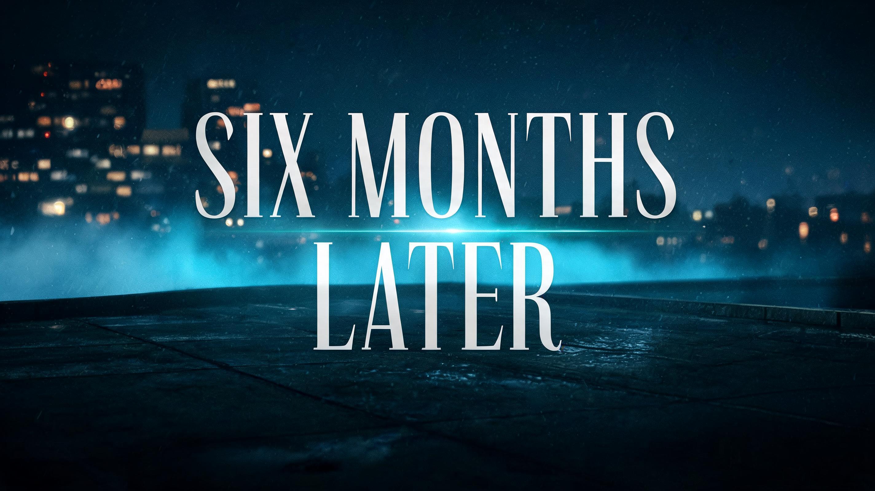
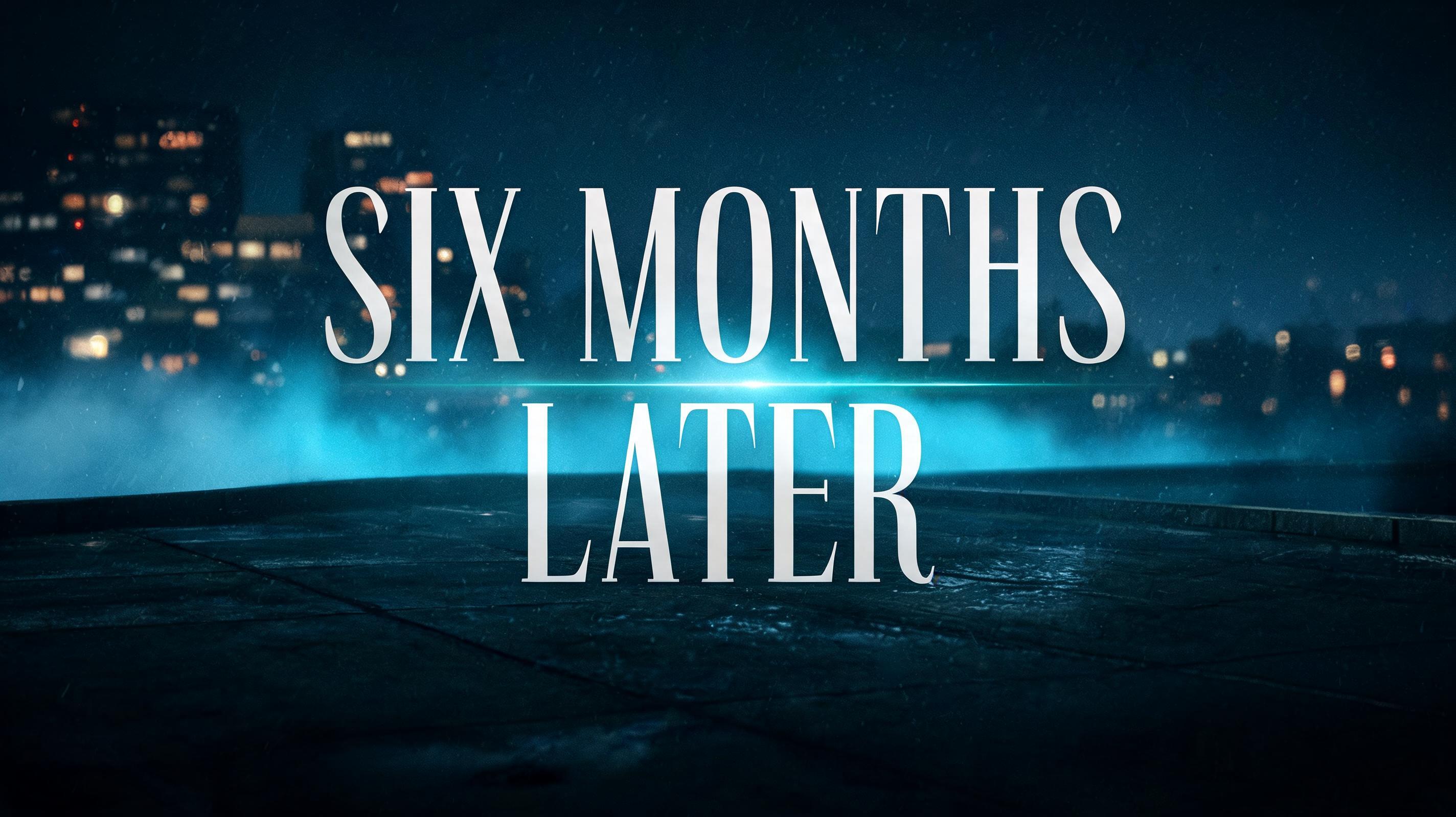
Design a title card reading Six Months Later for my edit - Netflix e Streaming Text Effect


Usa BytePlus Seedream 5.0, o modelo desta obra · 15 créditos





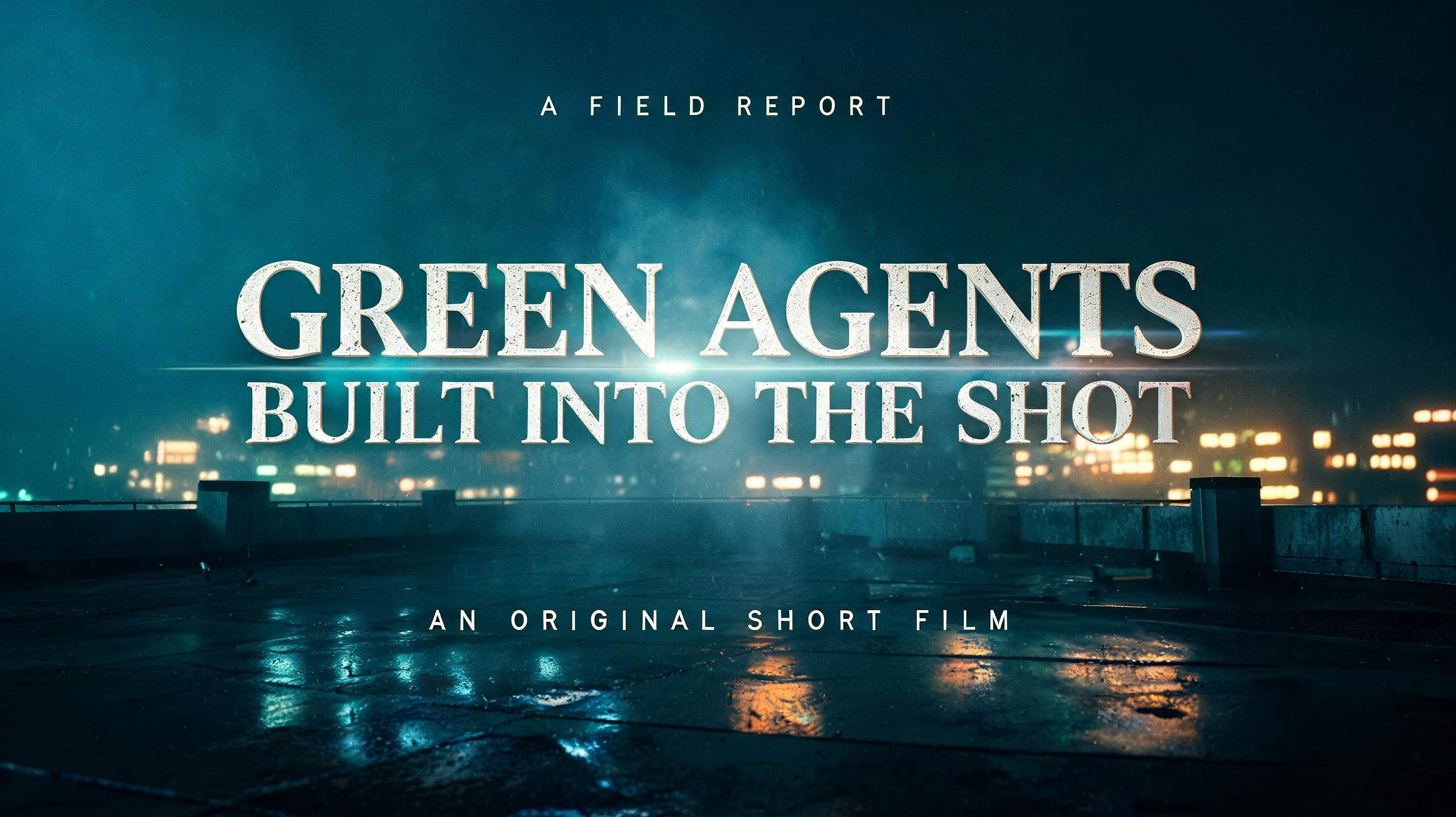


“Design a title card reading Six Months Later for my edit” is a Cinematic Netflix text effect efeito de texto criado com a IA da FontVibe. Títulos de série em sans serif grossa com brilho verde-azulado frio e reflexo anamórfico, sobre uma cidade noturna molhada de chuva com um pequeno slogan e o número da temporada.
Create a 16:9 prestige crime-drama title card for an edit. Render only the exact text “SIX MONTHS LATER”. Center it in two stacked lines: “SIX MONTHS” above “LATER”, occupying 78% of the frame width and 34% of the frame height. Custom high-contrast condensed serif lettering: tall narrow capitals, heavy vertical stems, near-hairline crossbars, razor-sharp unbracketed serifs, tight controlled tracking; clean pale silver-white ink with no texture, bevel, outline, or 3D effect. Place the text against an atmospheric blue-black nighttime city seen from a rain-wet rooftop: distant building windows dissolve into soft defocus, wet concrete catches thin reflections, a low band of fog crosses behind the words. A narrow cool-teal anamorphic horizontal lens flare passes through the center gap between the two lines. Hard side light makes the thick stems crisp while the fine strokes fade slightly into shadow. Teal-to-black cinematic grade, deep navy edge vignette, subtle 35mm film grain, faint rain haze, shallow depth of field at the outer edges. Keep the central lettering perfectly legible, with generous negative space, controlled editorial hierarchy, and no additional words, logos, people, symbols, borders, or UI.
Feito para Criador de cartelas de título cinematográficas
Gerada em 27 de agosto de 2026 · 2848 × 1600 · JPEG · BytePlus Seedream 5.0 · Compartilhada pelo criador · Uso comercial gratuito (CC BY 4.0)


