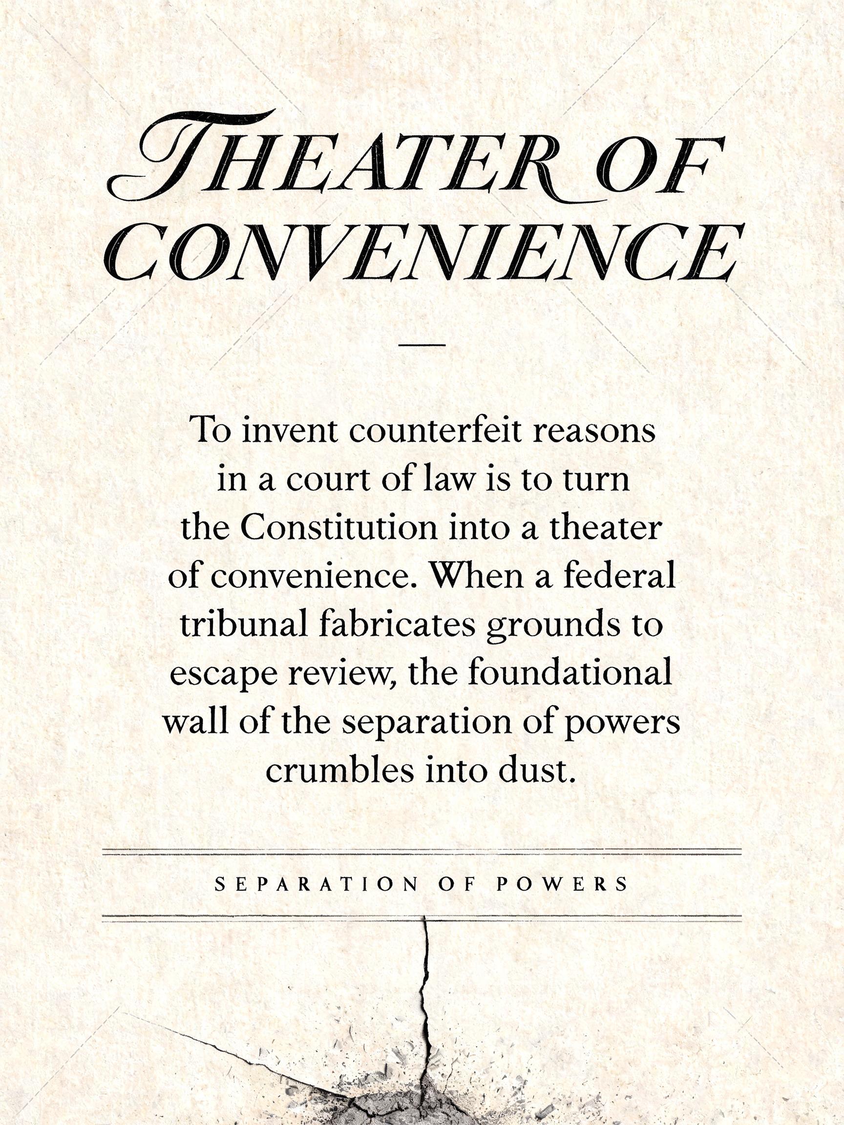
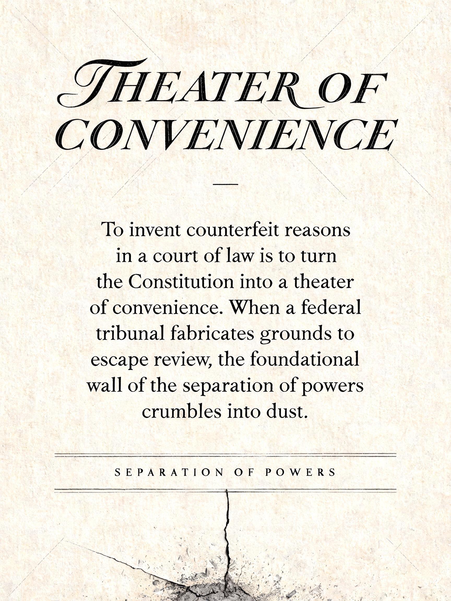
THEATER OF CONVENIENCE — To invent counterfeit reasons in a court of law is to turn the Constitution into a theater of convenience. When a federal tribunal fabricates grounds to escape review, the foundational wall of the separation of powers crumbles into dust. SEPARATION OF POWERS - Caligrafia Script Text Effect


Usa BytePlus Seedream 5.0, o modelo desta obra · 15 créditos
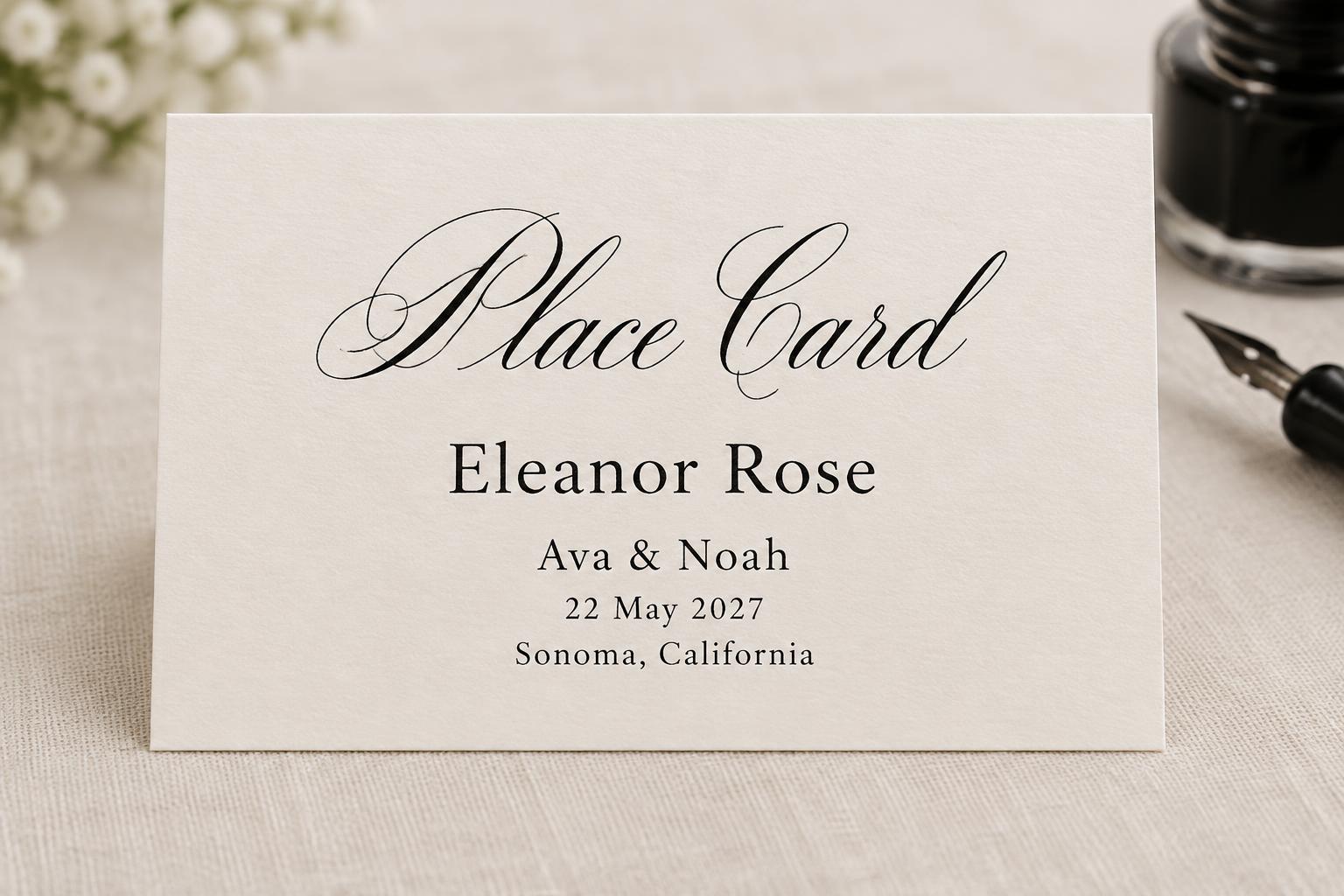
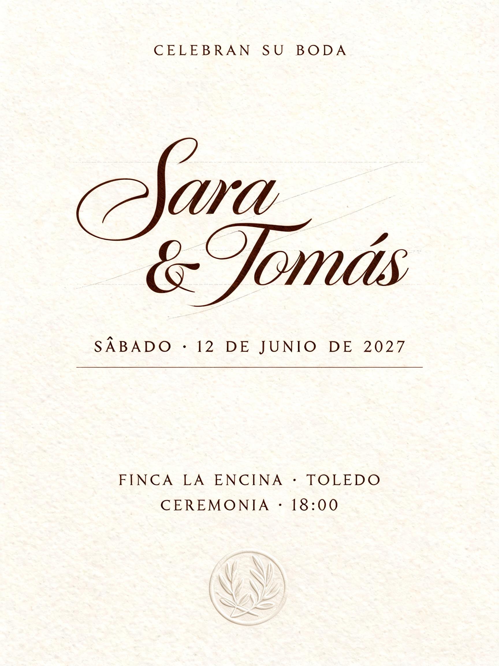
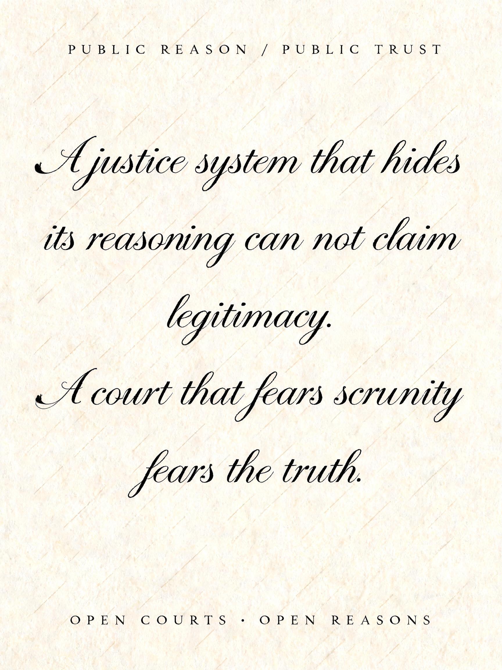
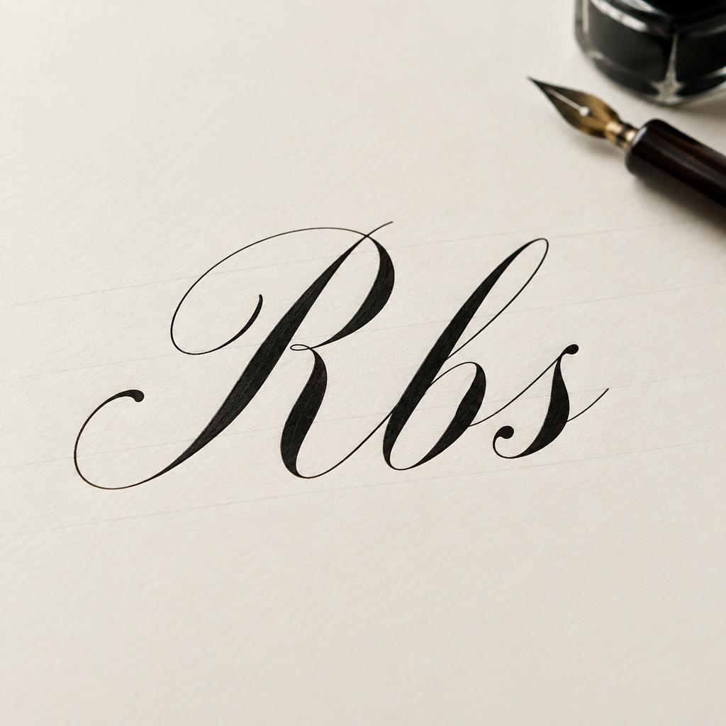

“THEATER OF CONVENIENCE — To invent counterfeit reasons in a court of law is to turn the Constitution into a theater of convenience. When a federal tribunal fabricates grounds to escape review, the foundational wall of the separation of powers crumbles into dust. SEPARATION OF POWERS” is a Cursive Calligraphy text effect efeito de texto criado com a IA da FontVibe. Copperplate formal de pena pontiaguda: forte contraste grosso-fino, letras ovais inclinadas e maiúsculas com floreios, tinta preta nítida sobre papel creme com linhas-guia leves.
Create a vertical 3:4 civic-argument poster on warm ivory hot-press cotton paper, with faint 55-degree calligraphy guideline slants visible only in the open margins. Exact rendered text, preserving punctuation and spelling: Primary headline, large across upper third: “THEATER OF CONVENIENCE” Small centered divider: “—” Body quote, centered in six disciplined lines: “To invent counterfeit reasons / in a court of law is to turn / the Constitution into a theater / of convenience. When a federal / tribunal fabricates grounds to / escape review, the foundational / wall of the separation of powers / crumbles into dust.” Footer label: “SEPARATION OF POWERS” Draw the headline as bespoke formal pointed-pen copperplate lettering: consistent 55-degree oval slant, extreme contrast between filament-thin upstrokes and broad pressure-built downstrokes, restrained entry swash on the first T and a precise exit hairline on the final E. Use deep black ink with crisp wet edges and a pinpoint satin sheen. Set the body in tightly controlled, highly legible engraved serif capitals and small caps, ink-black, with measured line spacing; no distorted or misspelled letters. Footer in narrow spaced small caps. Composition: generous unprinted margins; headline centered at x 12% y 13%, body centered from y 35% to 73%, footer centered at y 85%. A thin black hairline rule above and below the footer. At the bottom edge, a restrained charcoal-gray dust fracture spreads outward from a single vertical hairline crack, stopping well below the typography; it visually echoes “crumbles into dust” without obscuring text. Even clean studio light, flat and precise, revealing paper grain, ink edges, and the shallow embossed impression left by the pen. No people, flags, seals, gavels, courtroom imagery, logos, or extra words.
Feito para Caligrafia Copperplate
Gerada em 28 de agosto de 2026 · 1728 × 2304 · JPEG · BytePlus Seedream 5.0 · Compartilhada pelo criador · Uso comercial gratuito (CC BY 4.0)