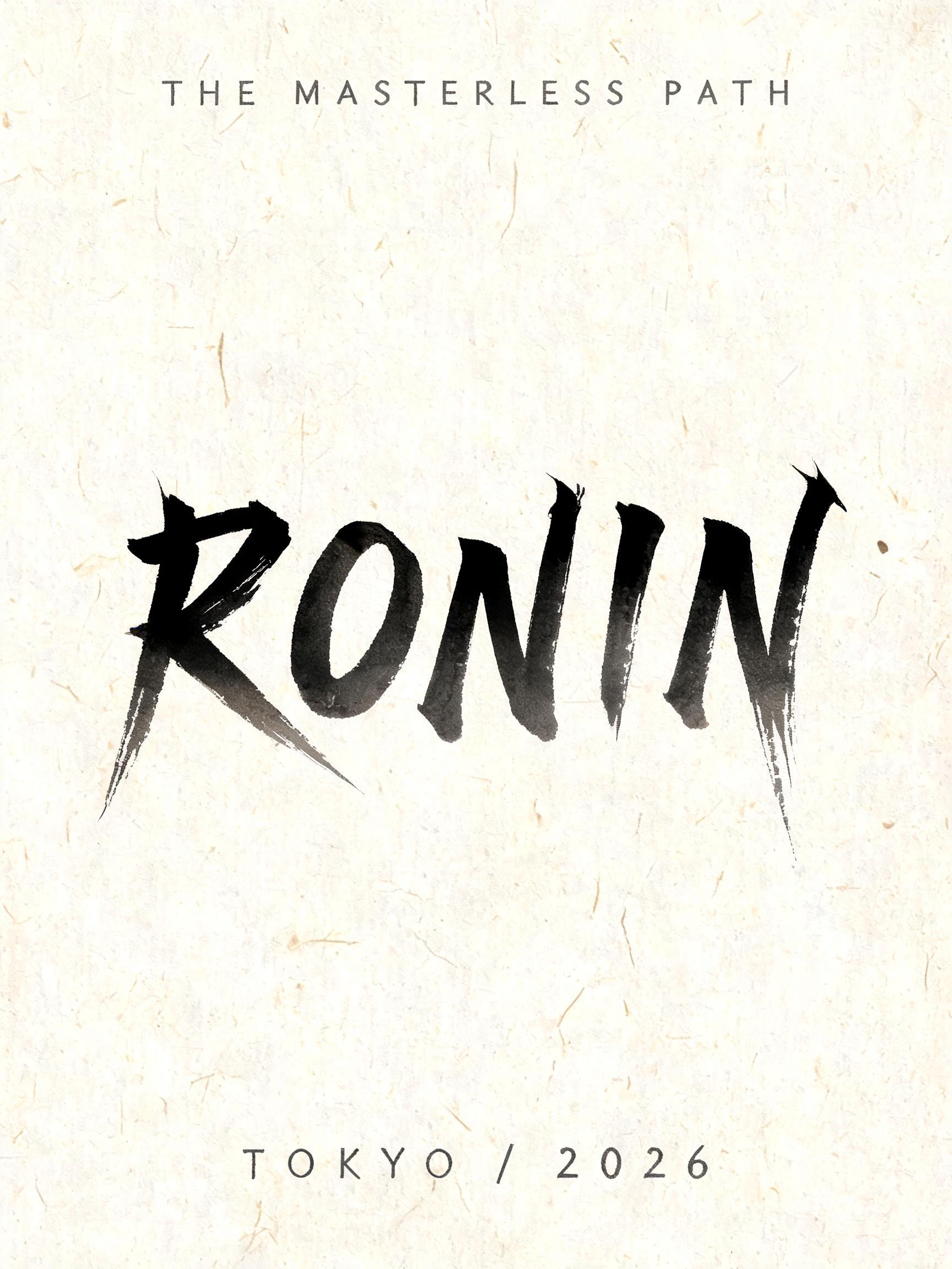
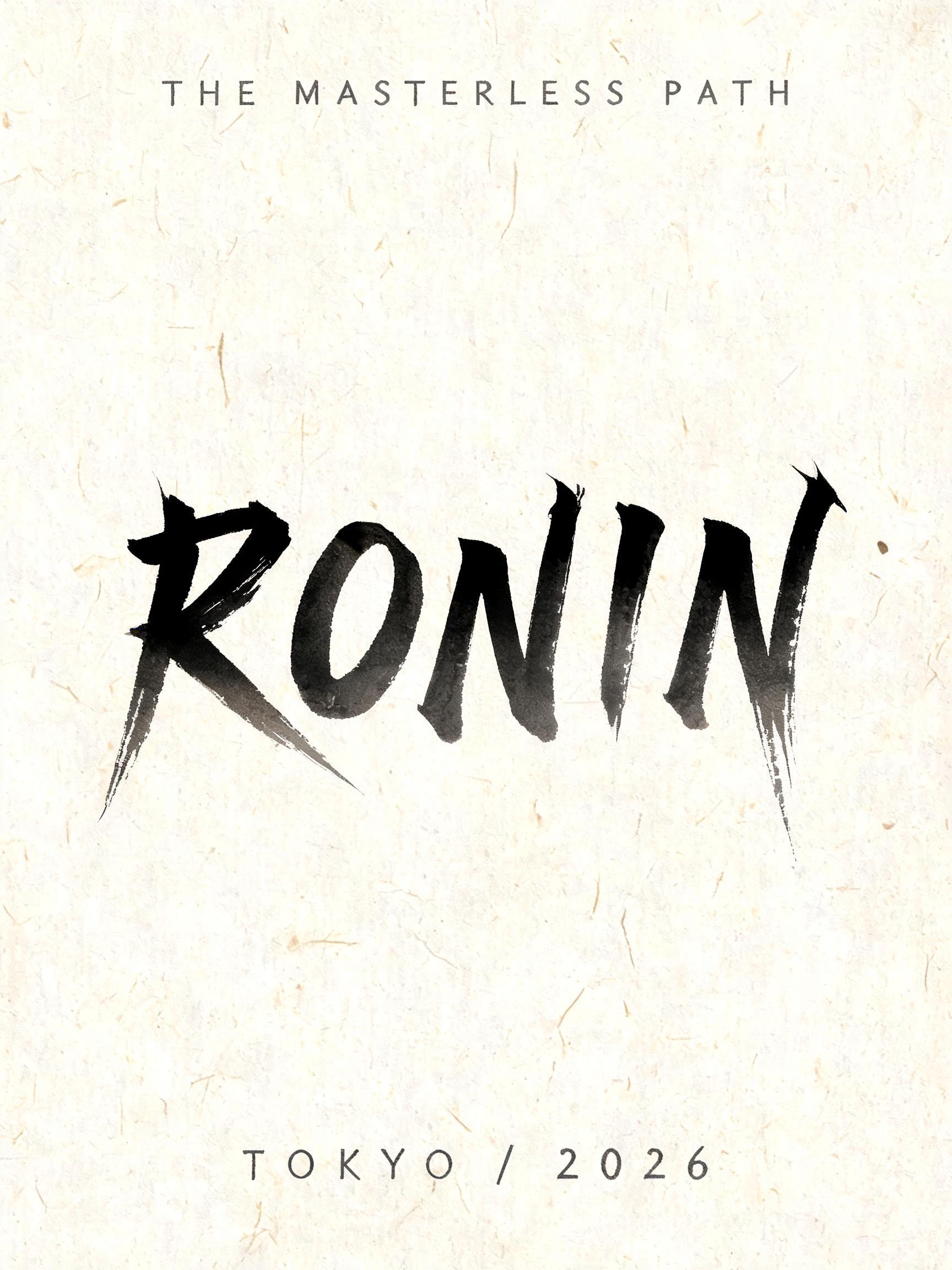
RONIN THE MASTERLESS PATH TOKYO / 2026 - Pincel de Tinta Japonês Text Effect


Usa BytePlus Seedream 5.0, o modelo desta obra · 15 créditos











“RONIN THE MASTERLESS PATH TOKYO / 2026” is a Brush Japanese Ink text effect efeito de texto criado com a IA da FontVibe. O estilo de caligrafia com pincel de tinta do shodo japonês aplicado às letras latinas. Tinta sumi preta e profunda com a energia autêntica do pincel fude, traços controlados numa única direção e atmosfera de papel washi. Perfeito para marcas de restaurantes japoneses, design de tatuagem, anime, artes marciais e projetos culturais.
Create a finished vertical typographic art poster, 3:4, not a logo sheet. Natural warm cream Japanese washi paper fills the canvas, clearly visible irregular fibers and subtle absorbent grain, flat paper surface under soft diffuse north-facing studio light with no cast shadows. Exact rendered text, preserve spelling and punctuation: Small top line: “THE MASTERLESS PATH” Dominant headline: “RONIN” Small bottom line: “TOKYO / 2026” Composition: vast quiet margins. Set “THE MASTERLESS PATH” at upper center, small, widely spaced, thin hand-brushed Roman capitals in diluted charcoal-gray ink. Center “RONIN” across the middle 62% of the page width, the largest element. Each western letter is custom-drawn as a definitive classical Japanese shodo calligraphy form: upright harmonic posture, bold 5:1 thick-to-thin stroke ratio, loaded-brush entry compressed into near-black cores, deliberate stable mid-strokes, a single uncorrected stroke per mark. Dense black sumi pigment transitions through charcoal gray at the edges as it sinks into the washi. Let the R leg and N diagonal end in sharp, long harai pull-away tails; let the I finish with a concise upward hane hook; let the final N exit into the longest fine-pointed rightward ink tail. The tails must be controlled and blade-sharp, not chaotic; only two or three tiny ink flecks appear at the heaviest stroke entries. Place “TOKYO / 2026” at lower center in small restrained charcoal-gray brush capitals, with generous tracking. No icons, no warrior illustration, no red sun, no seals, no border, no digital glow, no glossy ink, no ornamental pattern. Preserve strong ma negative space around every line. Fully matte absorbed ink, uneven tonal gradation from near-black to transparent gray, soft feathering where pigment meets paper fibers. Crisp legible Latin text, editorial Japanese calligraphy poster, high-resolution print texture.
Feito para Letras de Pincel Japonês
Gerada em 9 de setembro de 2026 · 1728 × 2304 · JPEG · BytePlus Seedream 5.0 · Compartilhada pelo criador · Uso comercial gratuito (CC BY 4.0)


