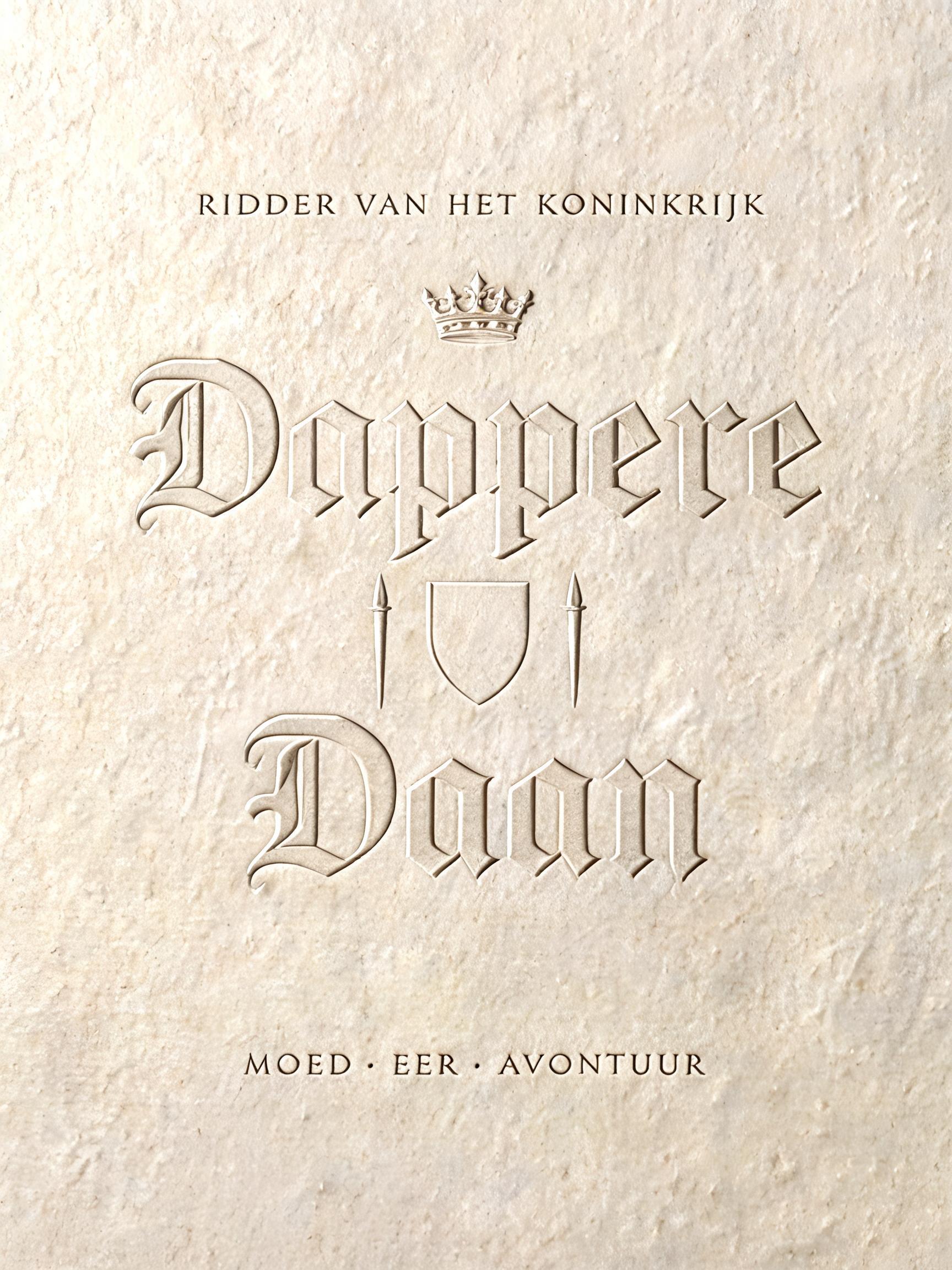
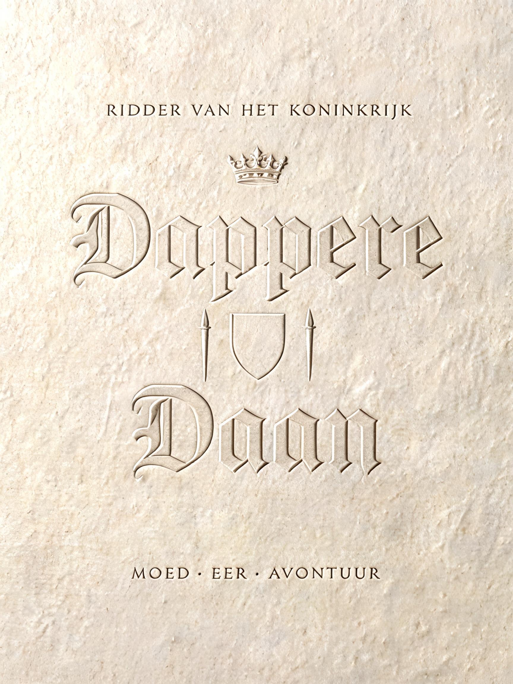
Dappere Daan RIDDER VAN HET KONINKRIJK MOED · EER · AVONTUUR - Relevo Text Effect


Usa BytePlus Seedream 5.0, o modelo desta obra · 15 créditos


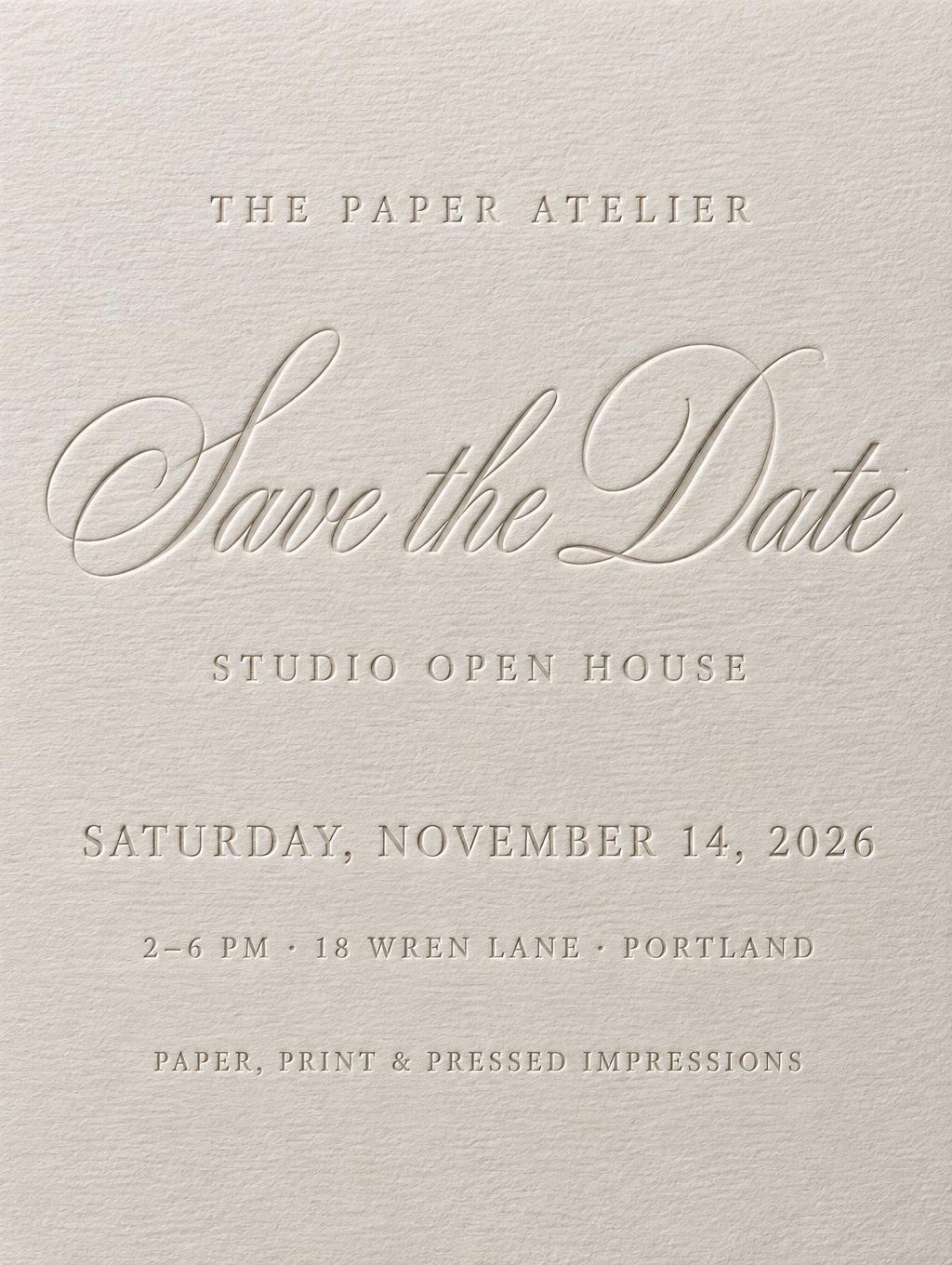
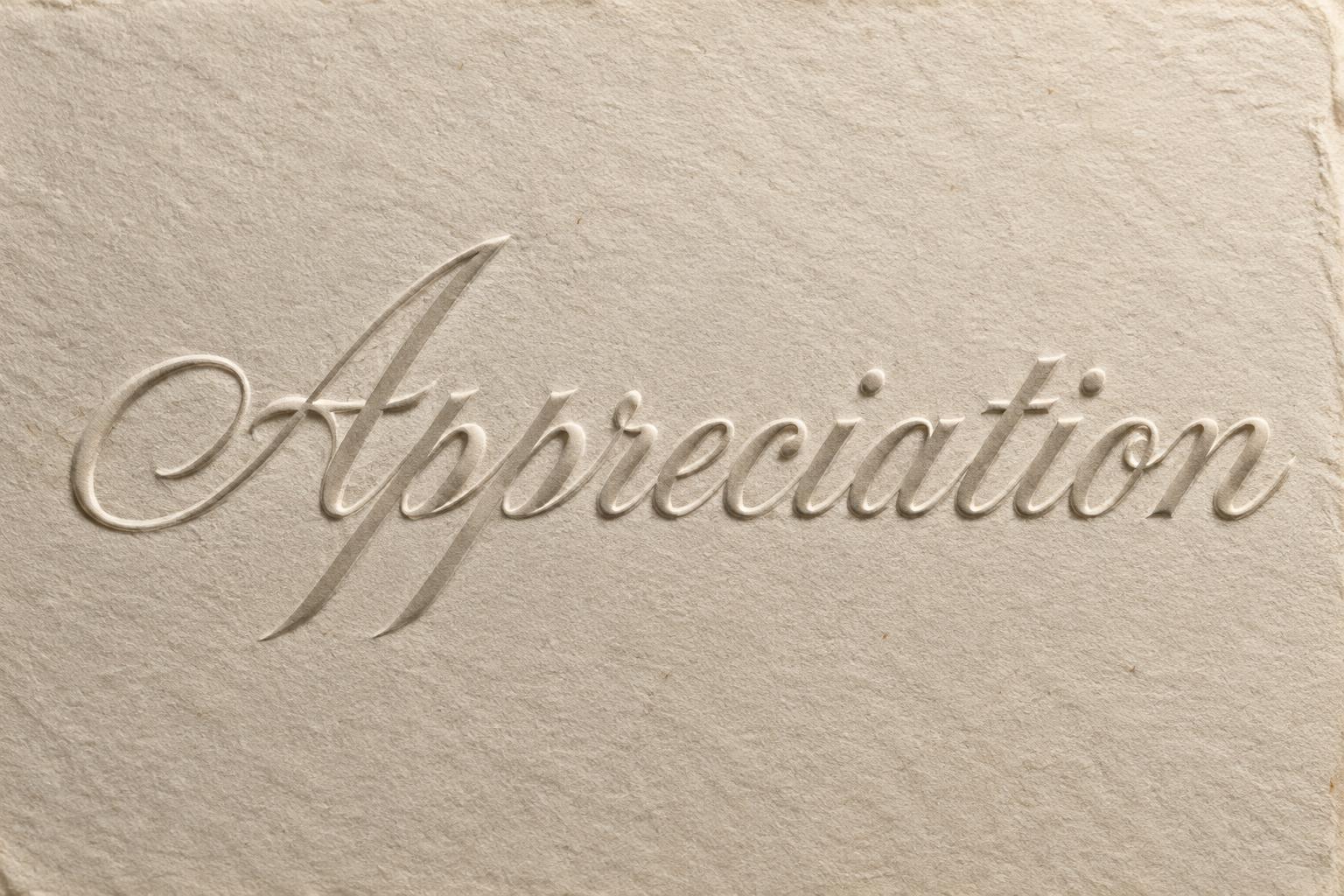






“Dappere Daan RIDDER VAN HET KONINKRIJK MOED · EER · AVONTUUR” is a Emboss text effect efeito de texto criado com a IA da FontVibe. Maiúsculas serifadas gravadas em relevo seco sobre papel de algodão marfim: sem tinta, apenas um relevo com aresta de luz nítida e sombra suave sob luz rasante baixa.
Create a finished vertical 3:4 children’s heraldic title poster, entirely as blind embossing on one sheet of warm aged-ivory heavy cotton rag paper. No ink, no added color, no glow, no outline, no props. Fine laid-line weave and irregular paper fibers are visible throughout the full frame. Exact rendered typography, Dutch, centered: small top line: “RIDDER VAN HET KONINKRIJK” main headline on two lines: “Dappere” / “Daan” small bottom line: “MOED · EER · AVONTUUR” Composition: generous empty paper margin. The top line sits at 18% height in small widely tracked uppercase. “Dappere” spans 75% width at 34% height; “Daan” is larger, spans 62% width at 51% height. Bottom motto sits at 80% height. Behind the headline, emboss a restrained medieval heraldic composition: a small crown above the word, a centered shield silhouette behind the gap between headline lines, and two narrow upright lances flanking it. These are shallow tonal relief only, never decorative ink illustration. Custom medieval knight lettering for “Dappere Daan”: formal heraldic blackletter-meets-engraved-roman construction, tall vertical stems, pointed wedge serifs, angular broken shoulders, cut-in notches, narrow counters, subtly flared bases, disciplined symmetry. Preserve crisp high-contrast thick verticals and fine incised hairlines, but do not use ball terminals. Every letter is physically raised from the paper by 1.2 mm, with sharply pressed edges; paper fibers visibly compress at the relief boundary. Lighting is the defining mechanism: one hard studio source from upper-left at a 15-degree raking angle. Thin near-white highlight ridges trace top-left letter edges; soft graphite-gray shadow valleys fall lower-right. Letter faces remain flat natural paper tone with no gradients. Photographic macro paper detail, controlled clean studio exposure, high resolution, precise legibility. Ensure all text is spelled exactly as supplied.
Gerada em 9 de setembro de 2026 · 1728 × 2304 · JPEG · BytePlus Seedream 5.0 · Compartilhada pelo criador · Uso comercial gratuito (CC BY 4.0)


