Yusfi - Anime Text Effect


Usa BytePlus Seedream 5.0, o modelo desta obra · 15 créditos



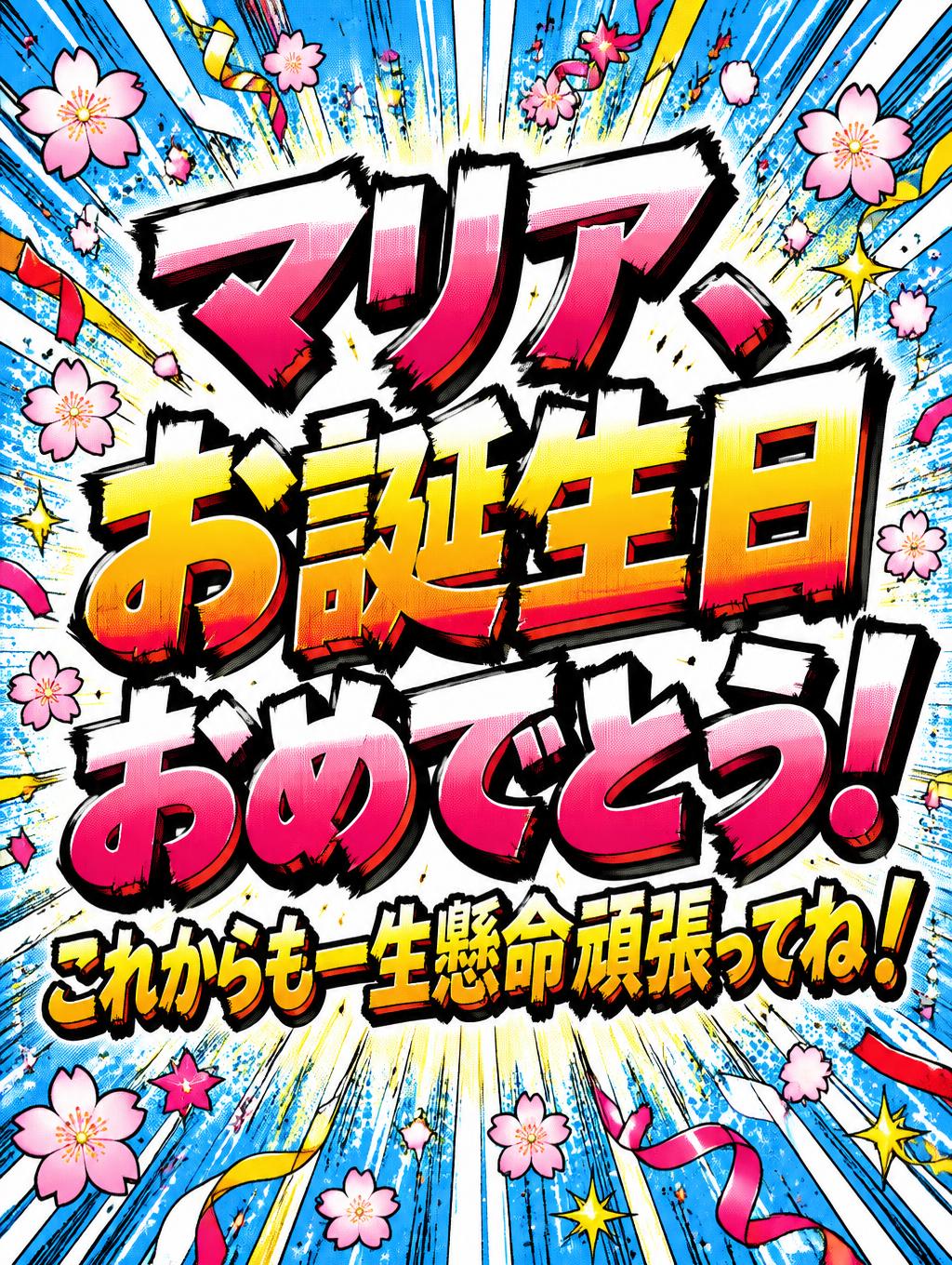
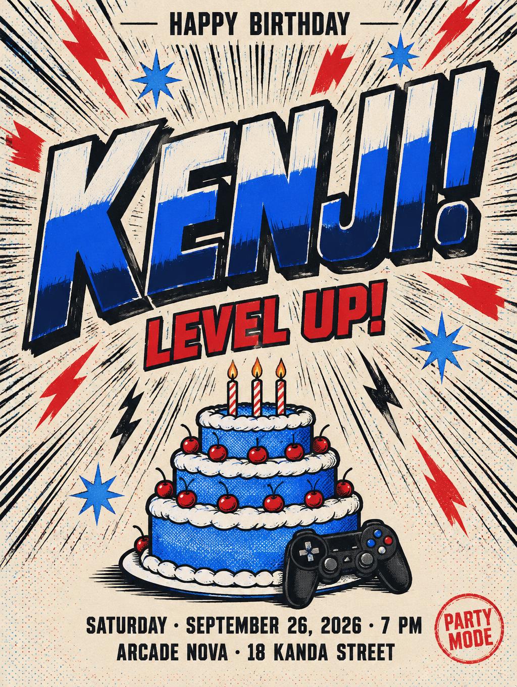
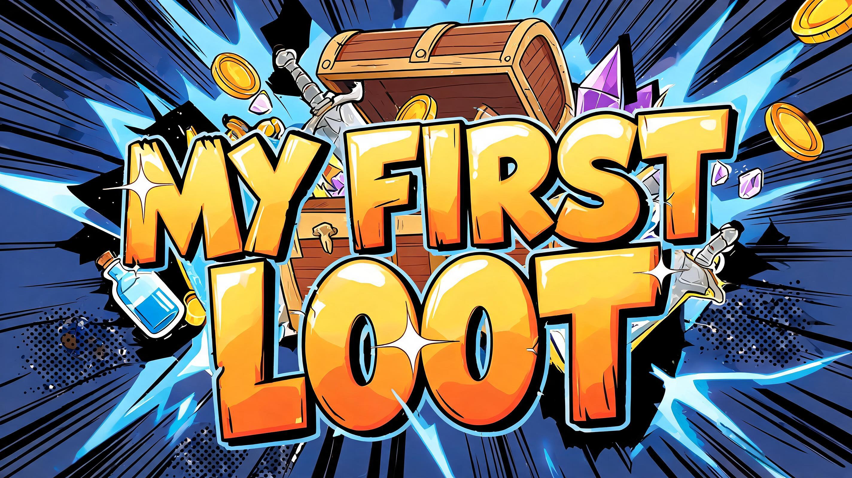
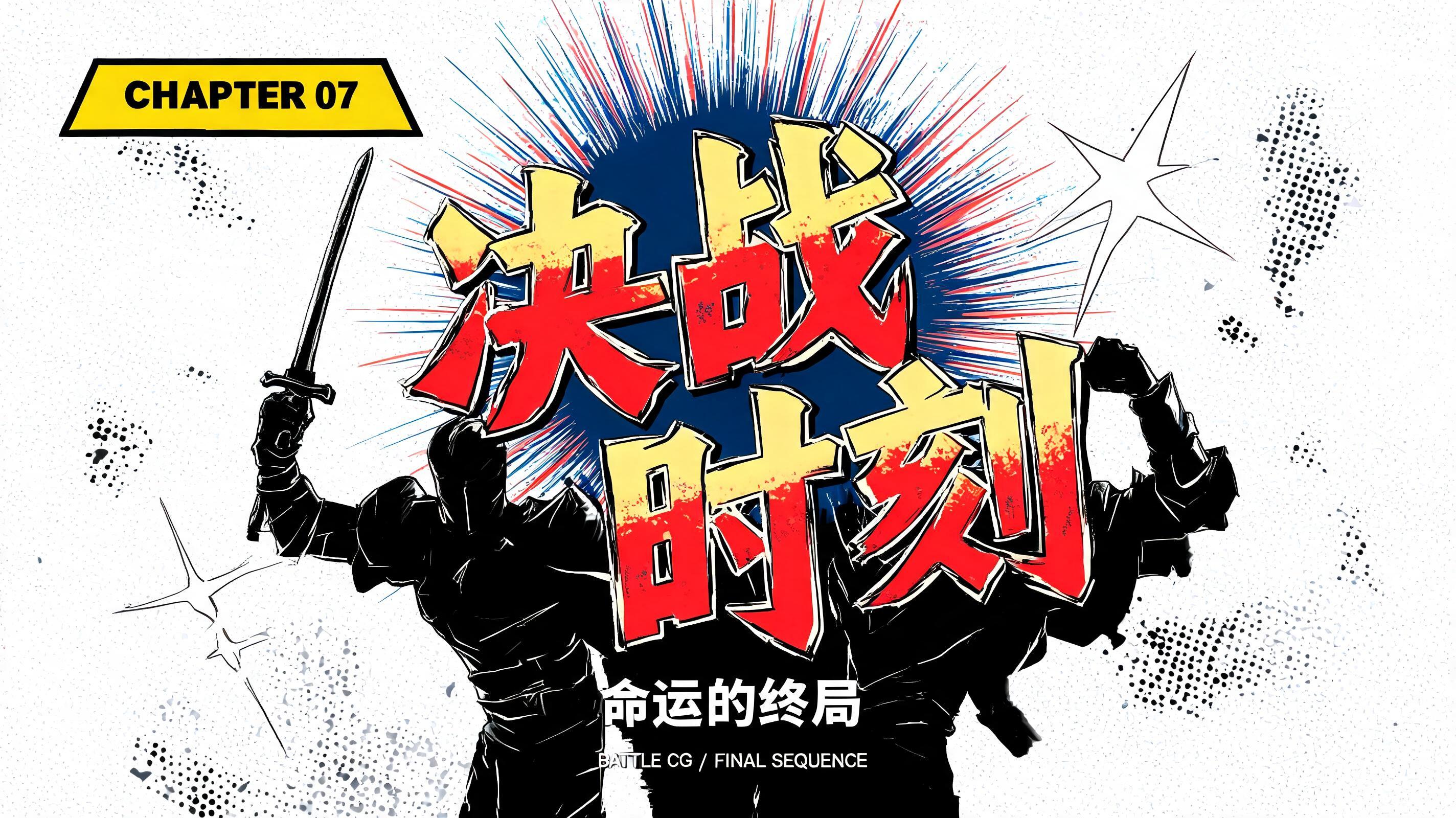



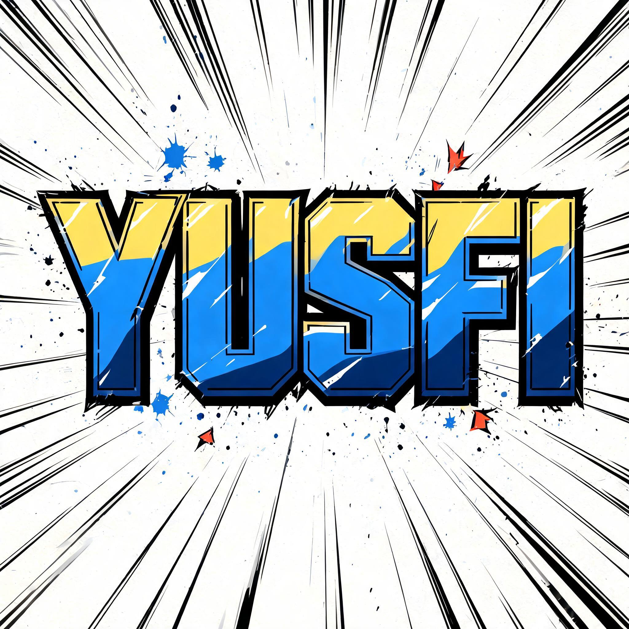
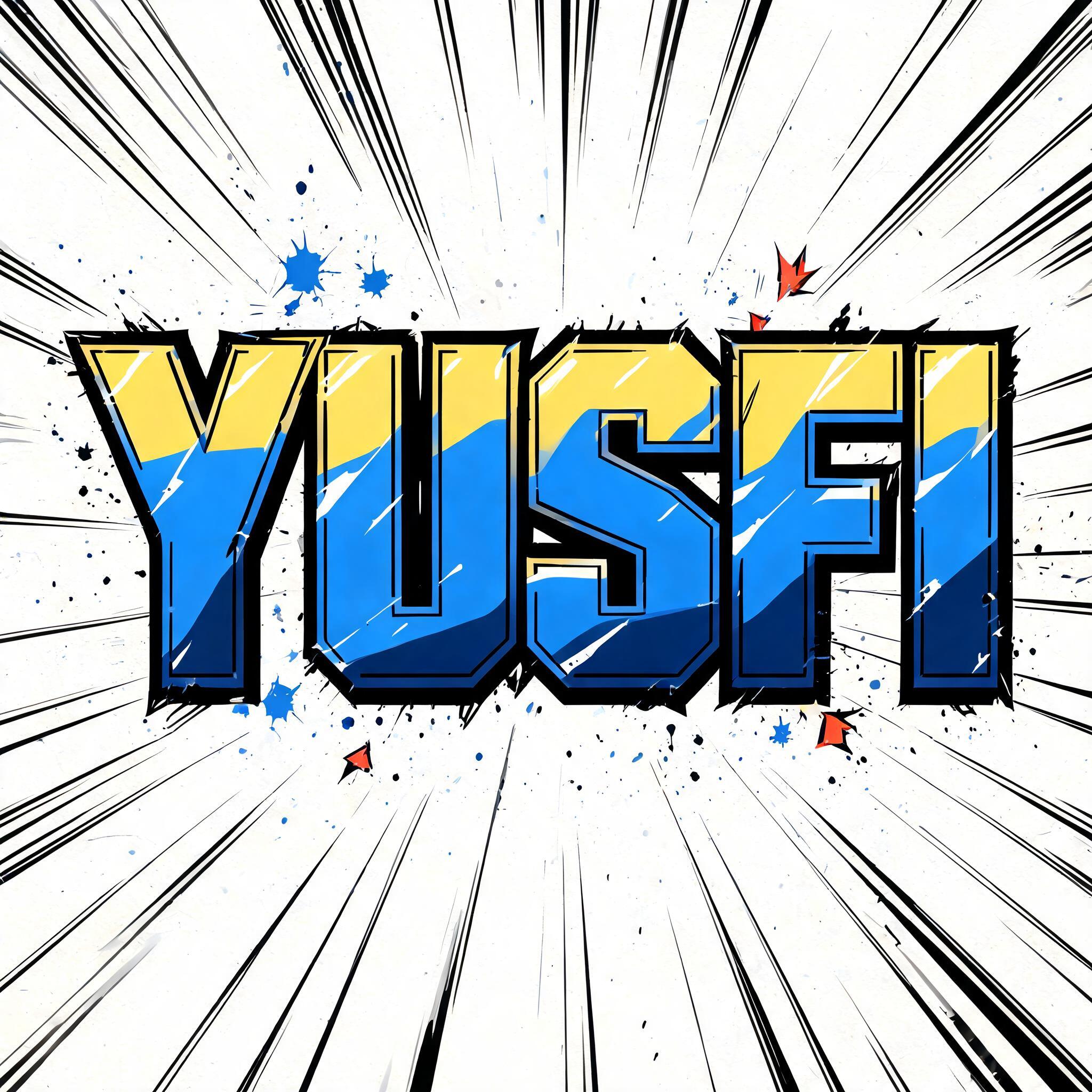
“Yusfi” is a Anime text effect efeito de texto criado com a IA da FontVibe. Letreiramento de título shōnen: contornos pretos grossos feitos à mão, sombreamento cel chapado em faixas duras de luz e sombra, letras inclinadas e dinâmicas sobre branco com linhas de velocidade radiais.
rendered as Japanese shounen anime title treatment — bold hand-inked manga lettering with authentic cel-shaded visual energy. Letter construction follows classic Shonen Jump title card standards: thick black ink outline with natural brush-weight variation defining each letter boundary; flat cel-shading fill with three hard-edge zones — bright highlight zone on upper letter face, highly saturated primary color zone at center, deep shadow zone at lower edge; all zone boundaries knife-edge hard, zero gradient blur, pure flat offset-print ink physics. Energy signature: high-contrast color + thick ink outline = letters that look physically printed on manga paper. The typographic language of Dragon Ball, Naruto, One Piece, Demon Slayer, Jujutsu Kaisen title cards — maximum manga kinetic energy, iconic and immediately recognizable as Japanese anime title typography. LETTERFORM PRIORITY: when the chosen font carries its own treatment, that font's letterform shapes take priority and own the letters; this style governs the inked manga outline, the three-zone cel-shading and the kinetic energy. FALLBACK MATERIAL: if the font carries no material of its own, render the letters as bold hand-inked shounen title lettering with a thick black brush outline and hard three-zone cel-shading. COLOR PRIORITY: keep the font's own colors if specified; otherwise a high-saturation primary fill with hard highlight and shadow zones. "Yusfi" rendered as a Japanese shounen anime title card with the supplied hero letterforms preserved, transformed through thick black brush-ink contours with slight organic weight variation. Build a hard three-zone cel-shaded surface across every character: sharp pale-yellow highlight planes along upper faces, saturated cobalt-blue main ink across the body, and deep ultramarine shadow planes at the lower edges; each boundary is crisp and offset-print flat, with no gradients. Add narrow white specular slashes, tiny black hatch accents, and a few chipped-ink edge breaks to create a printed manga-cover finish. Behind the title, a pale ivory manga-paper field carries dense radial speed lines, black impact rays, scattered blue ink flecks, and red-orange starburst fragments emerging from the letter mass. Use heavy black shadow shapes and irregular ink splatters to reinforce depth without obscuring readability. High-contrast cel animation rendering, flat screenprint pigments, clean graphic separation, sharp silhouette, chapter-title impact, crisp 8k poster finish.
Gerada em 14 de setembro de 2026 · 2048 × 2048 · JPEG · BytePlus Seedream 5.0 · Compartilhada pelo criador · Uso comercial gratuito (CC BY 4.0)