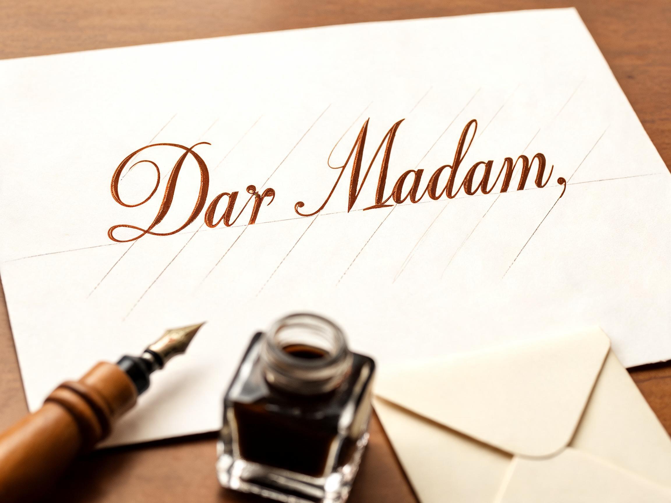
Dar Madam, - Caligrafia Script Text Effect


Usa BytePlus Seedream 5.0, o modelo desta obra · 15 créditos
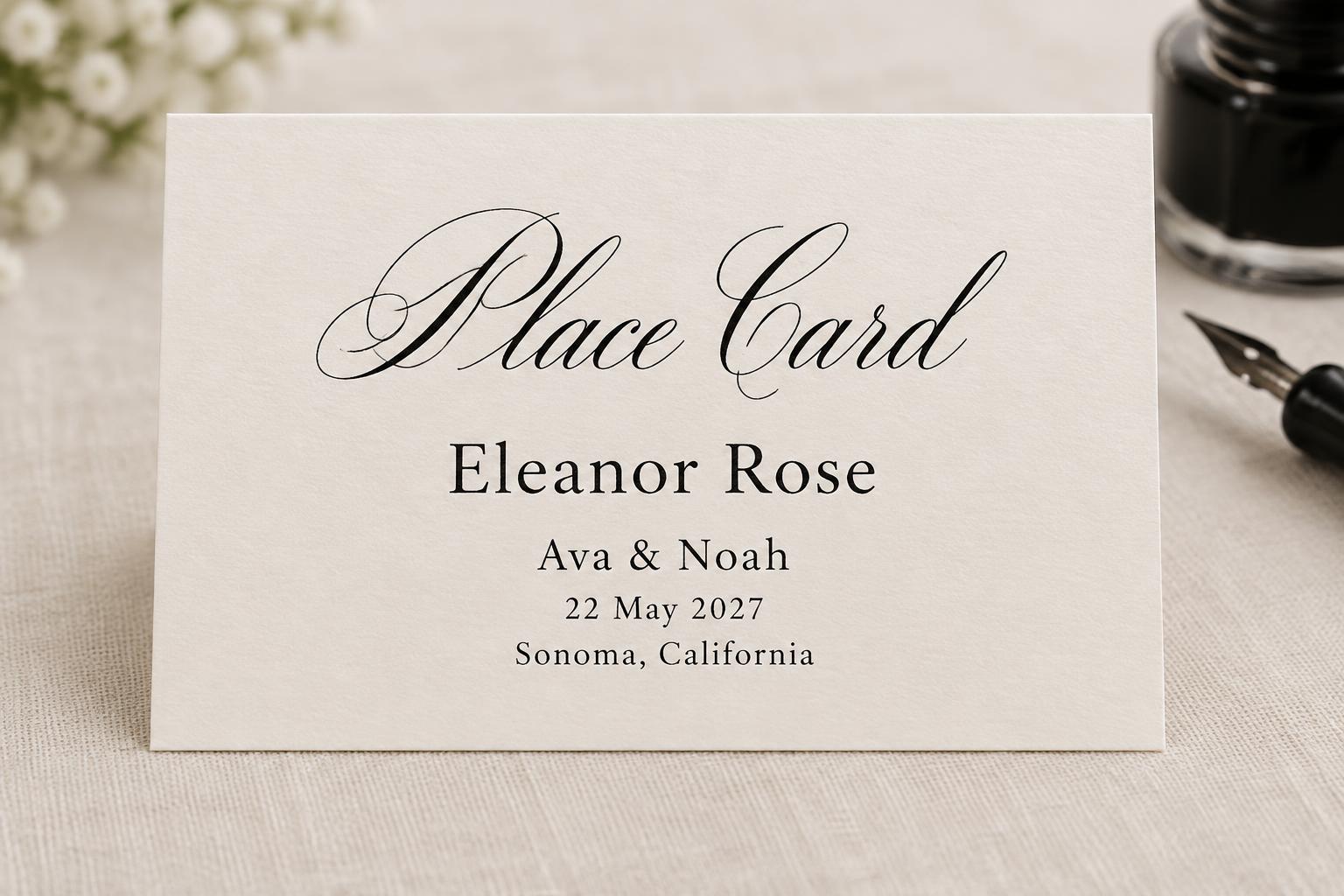
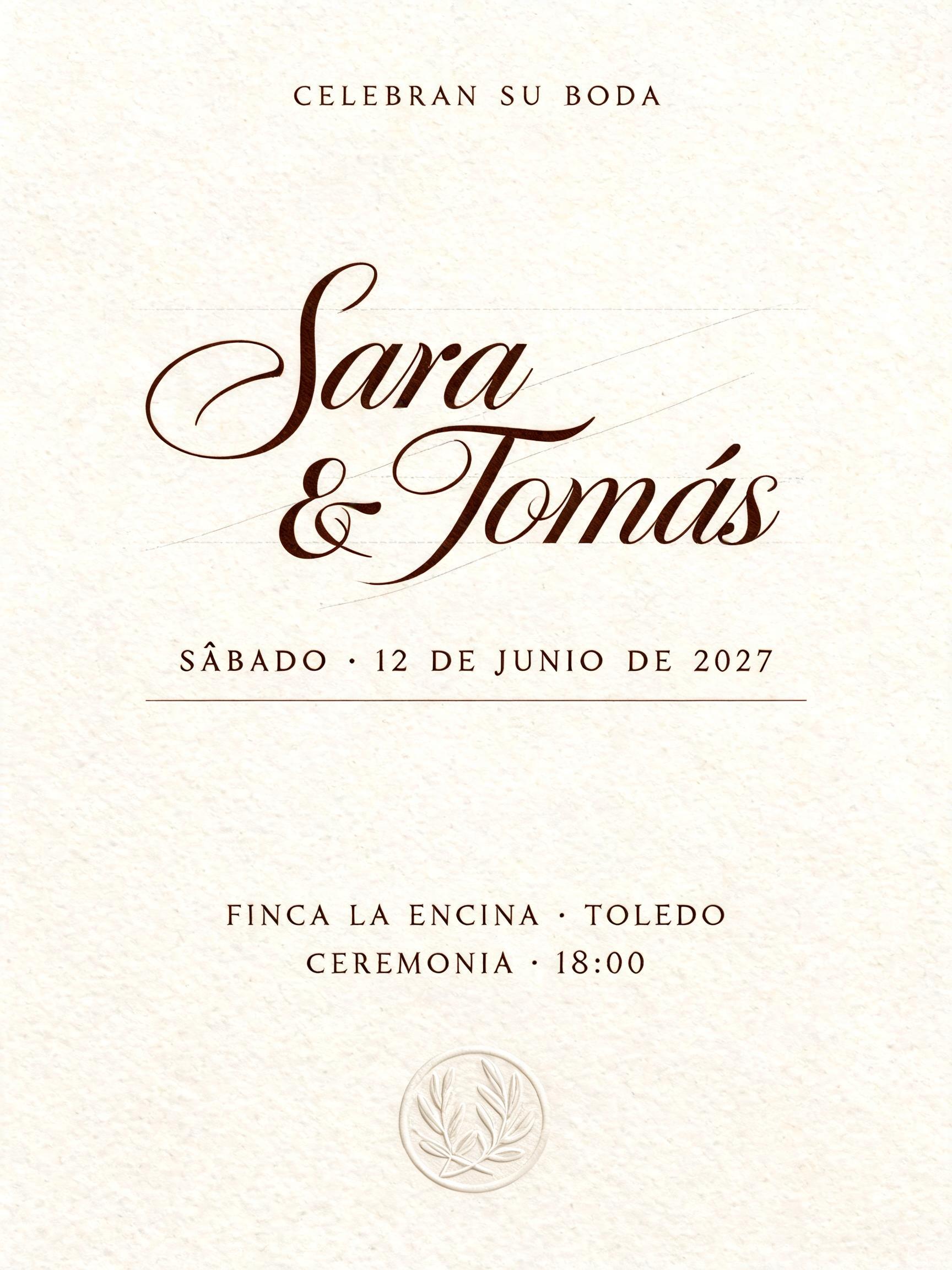
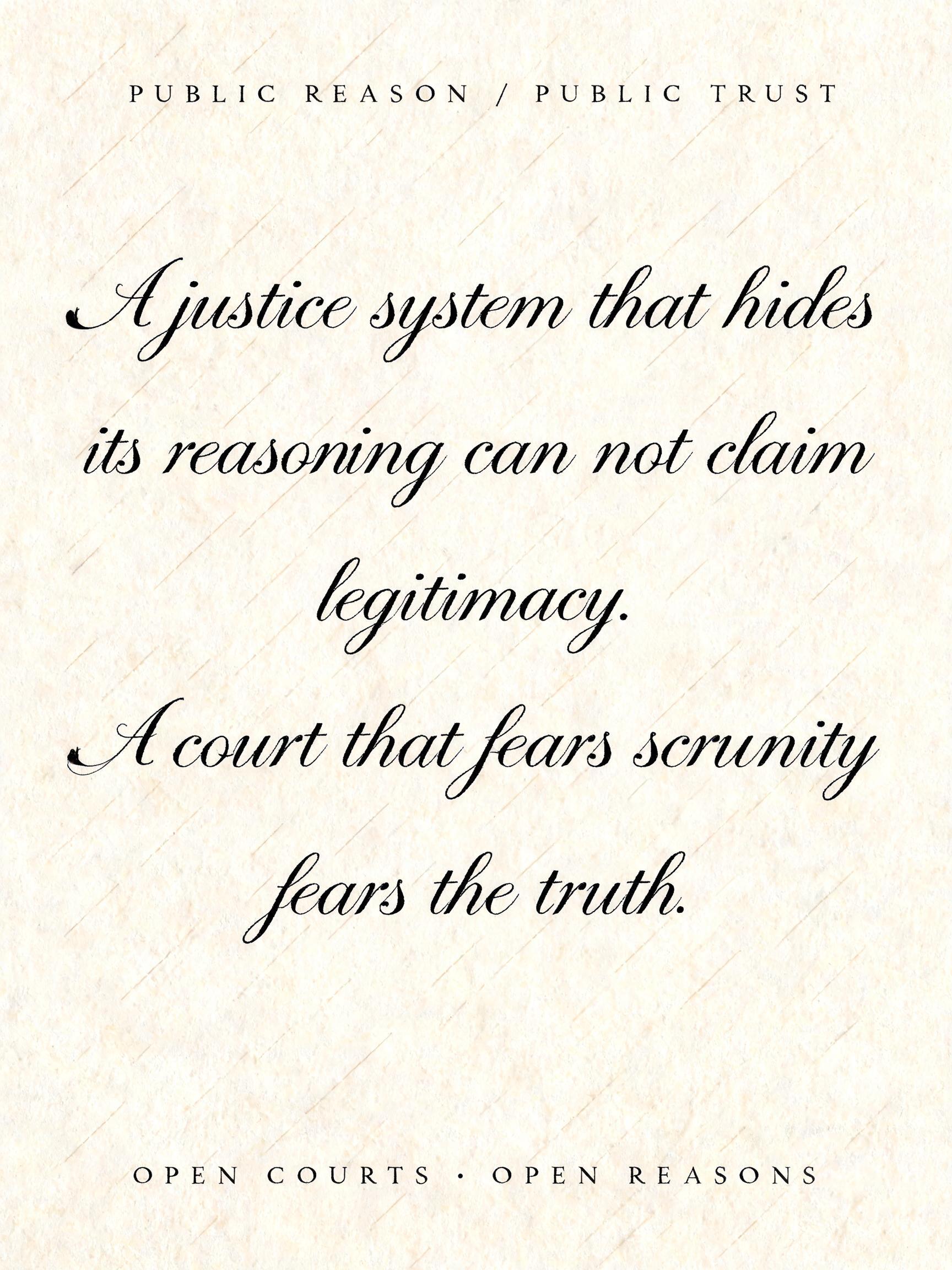
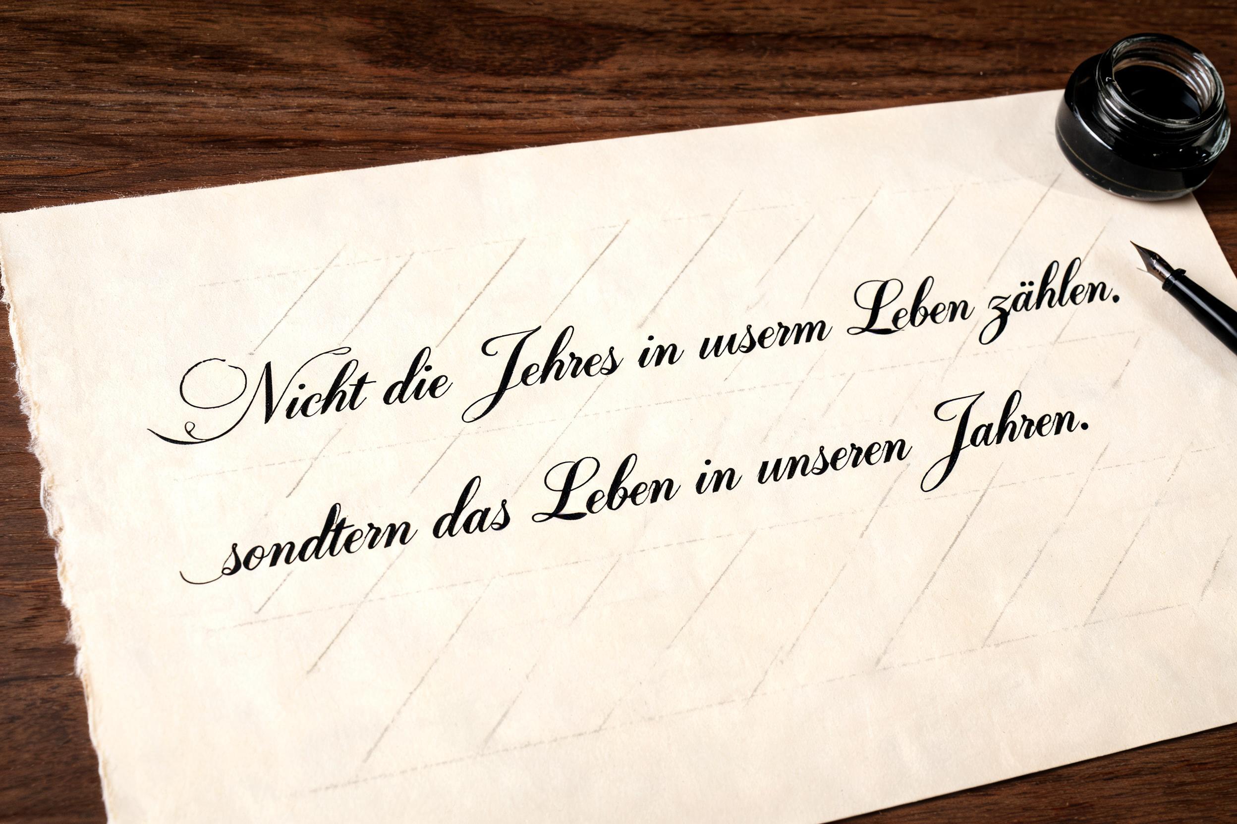
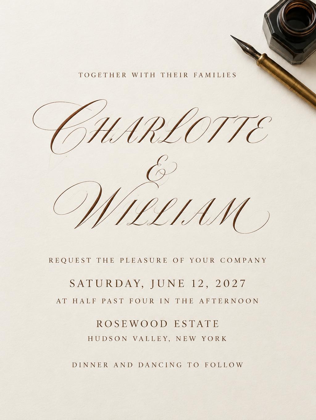
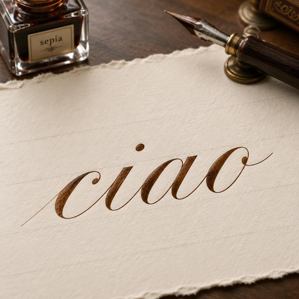
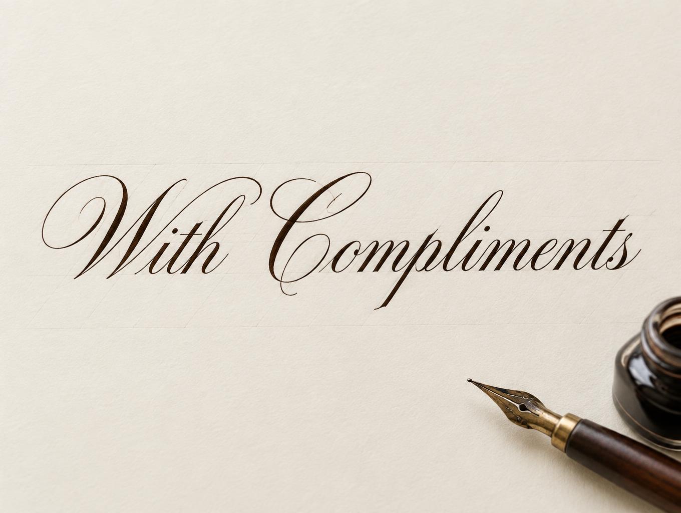
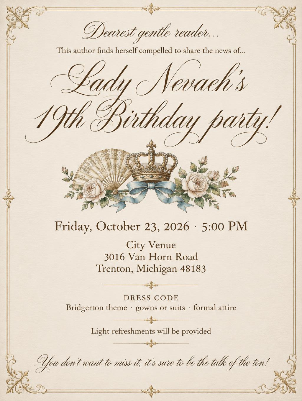
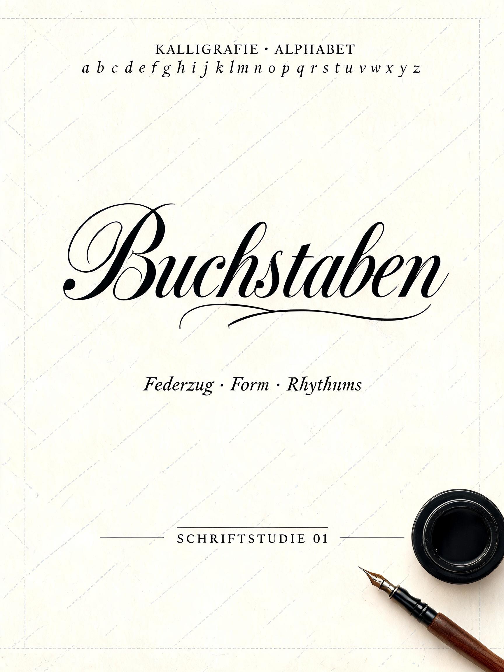
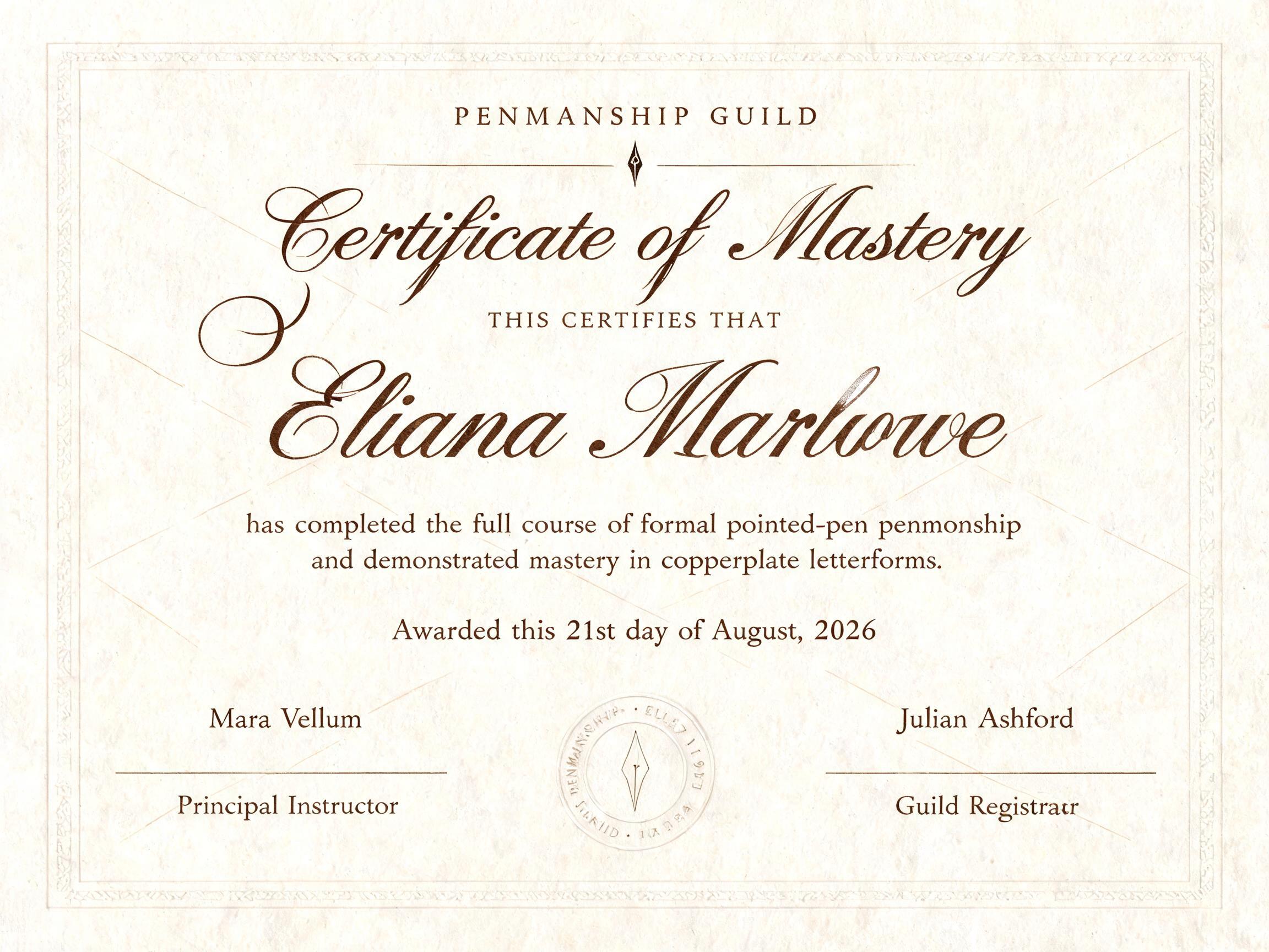
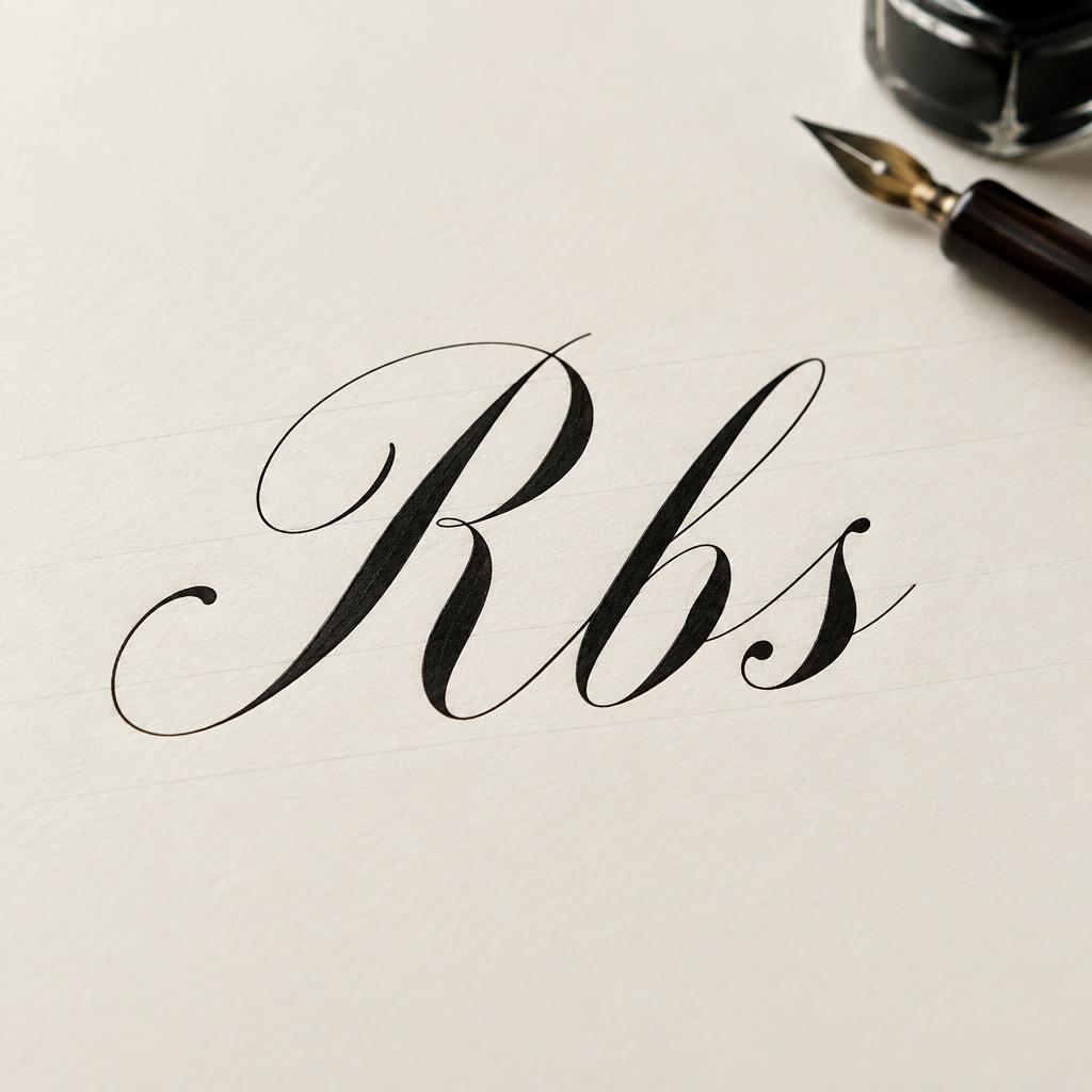
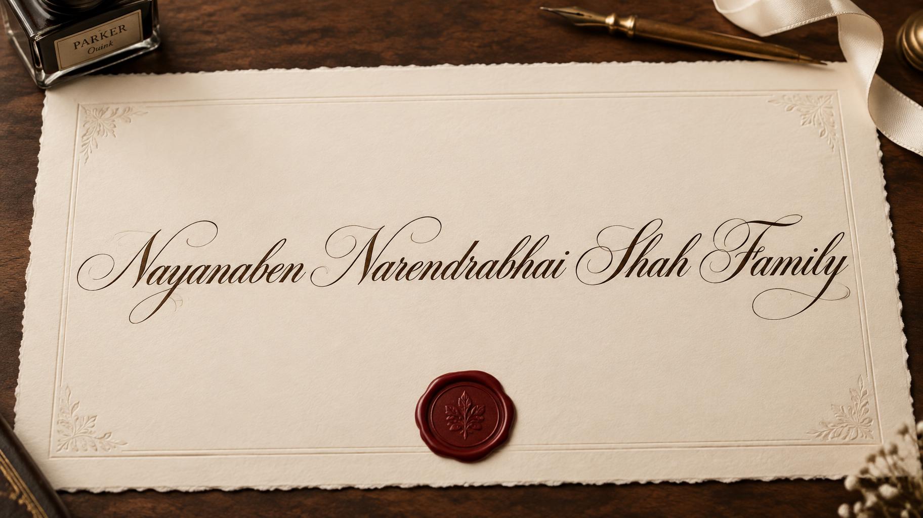
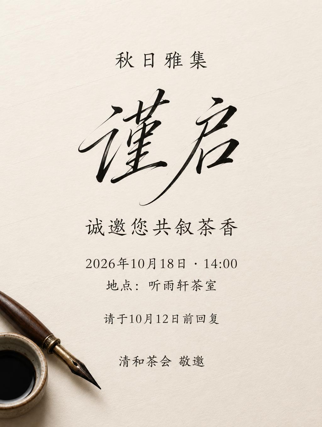
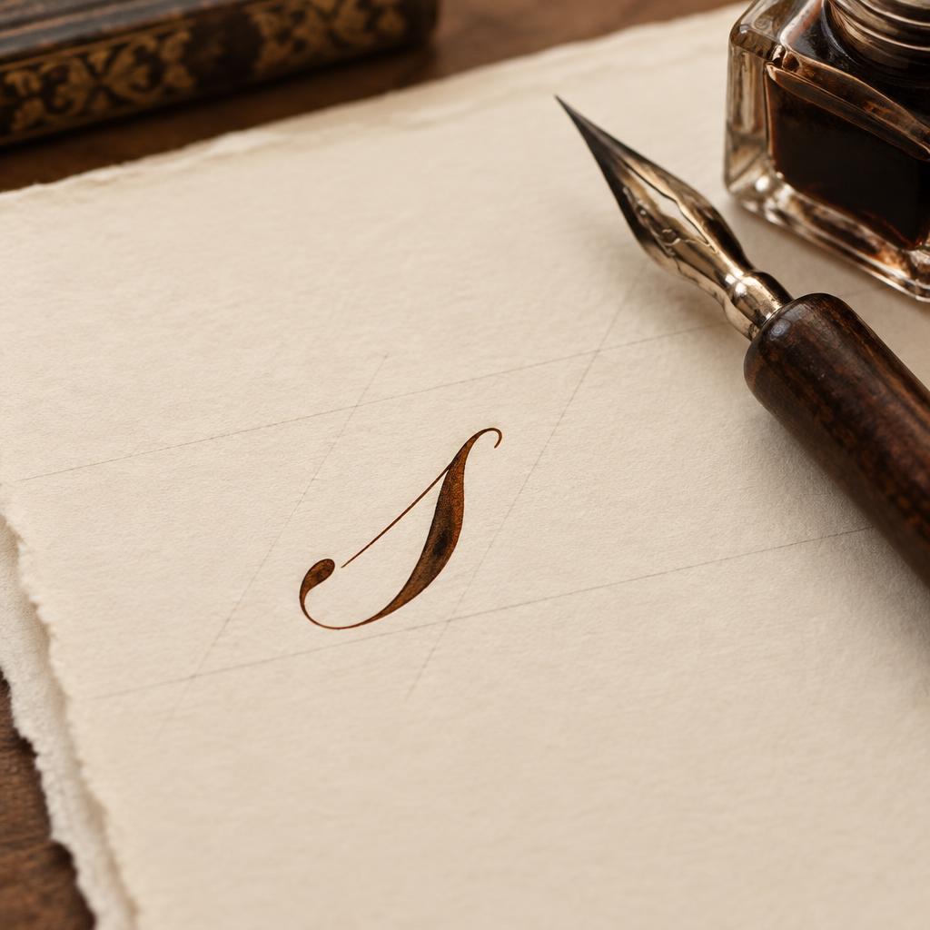
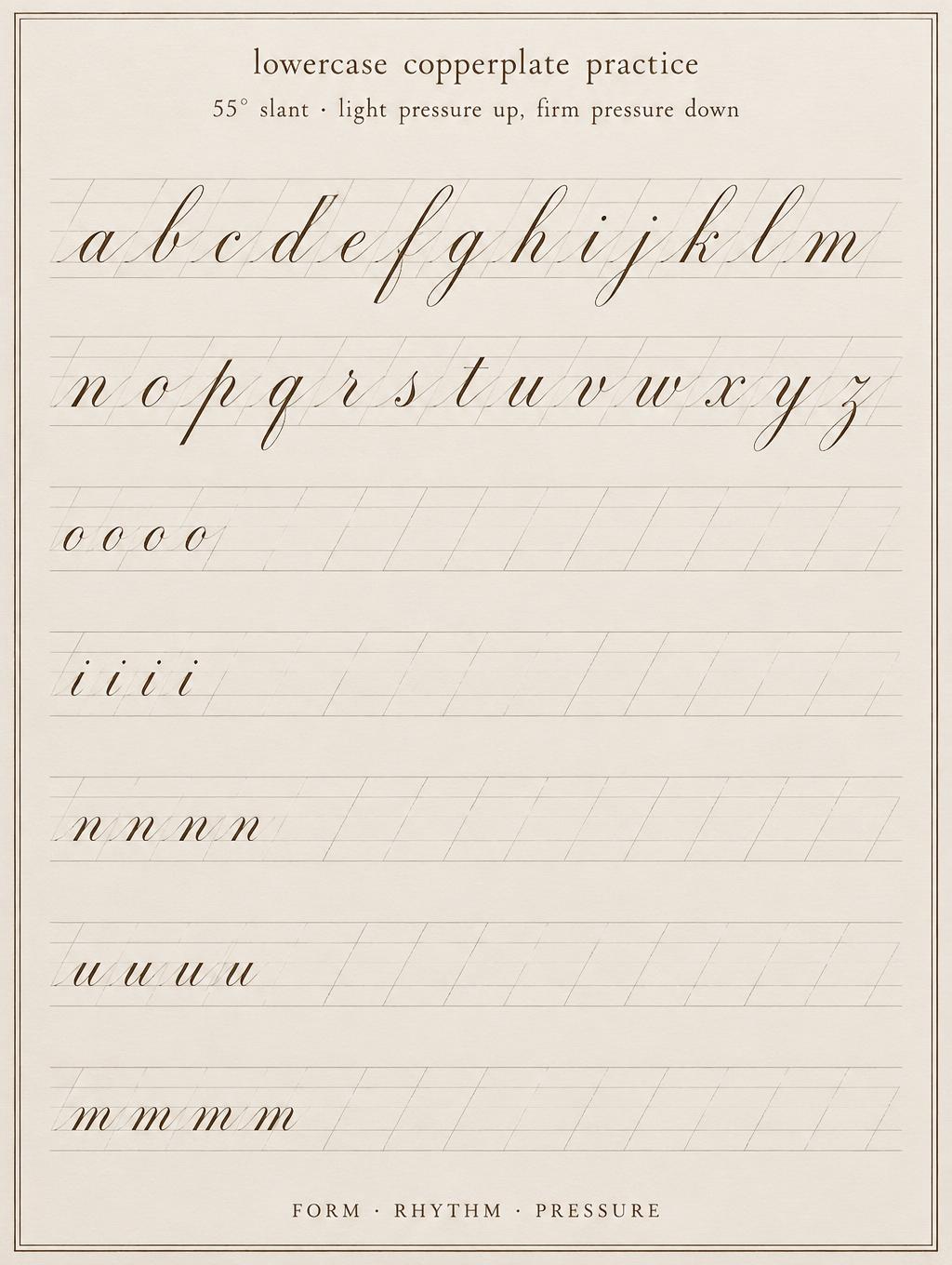
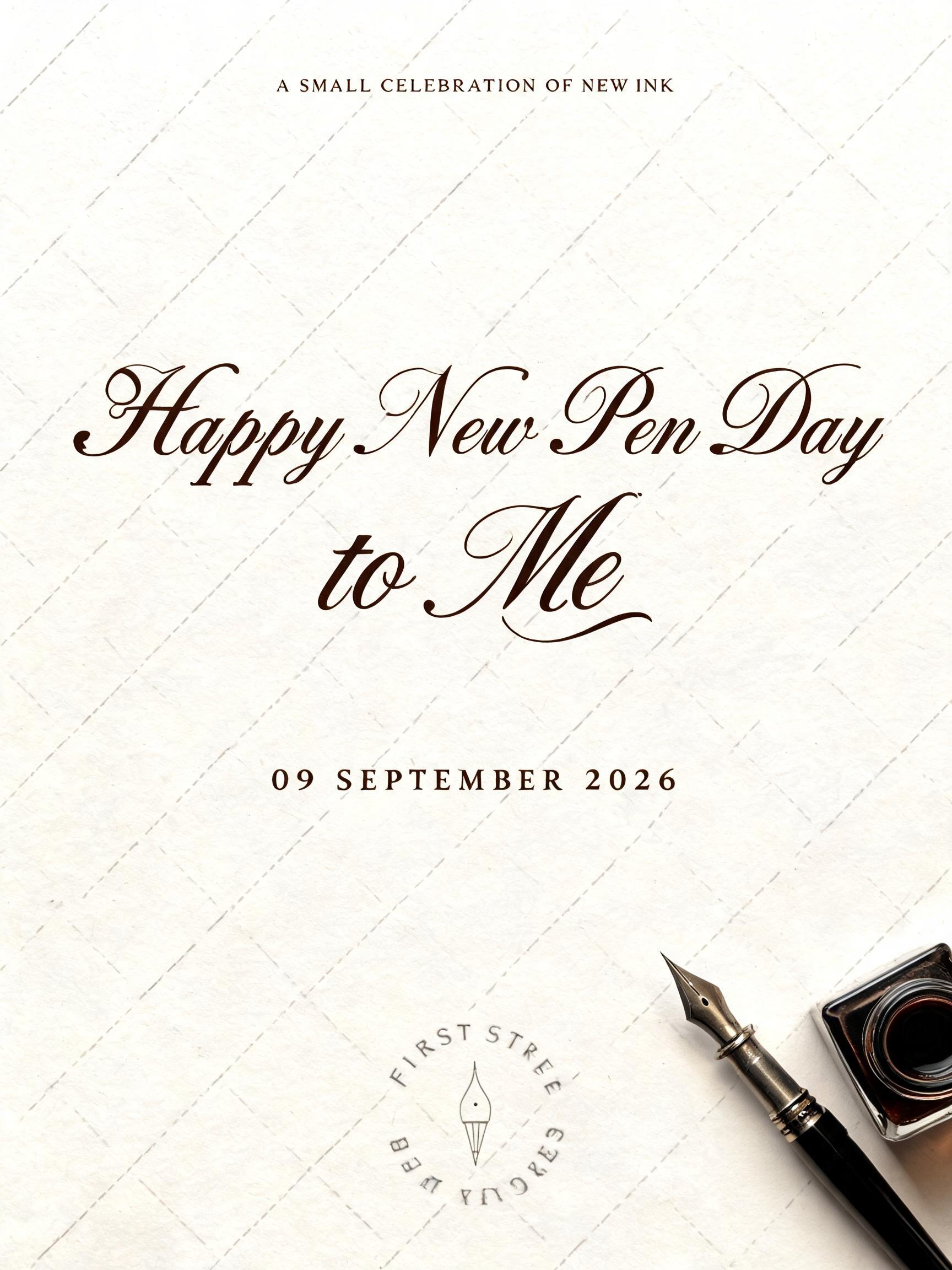
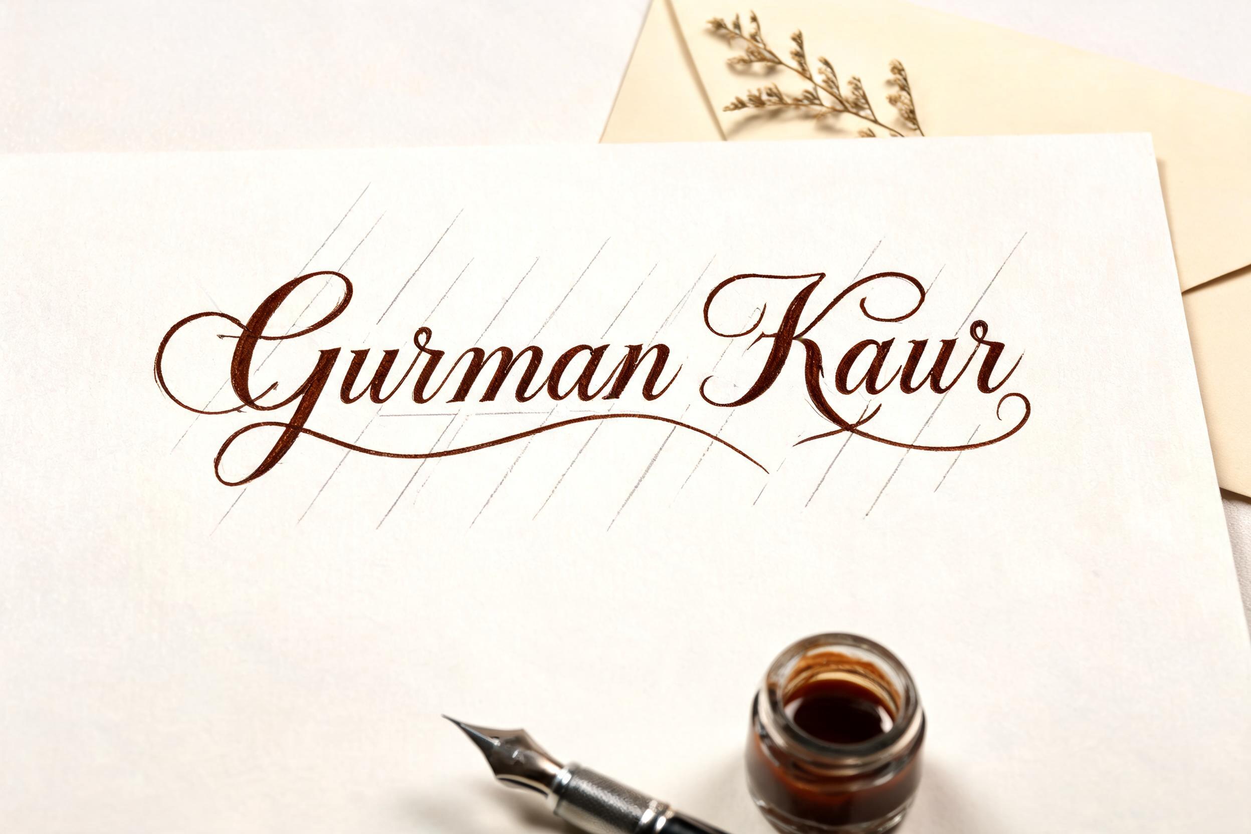
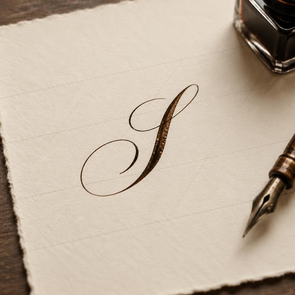
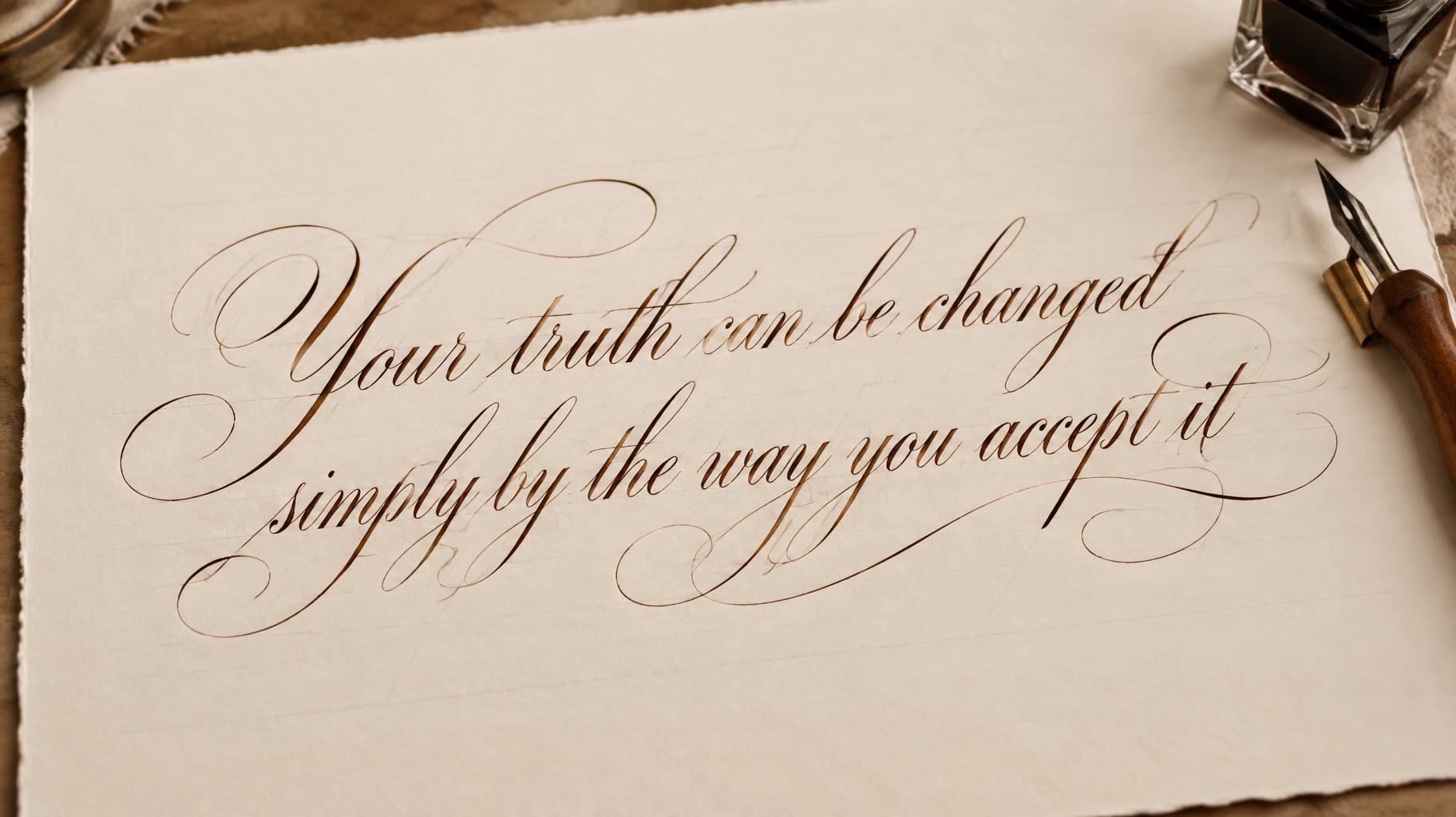
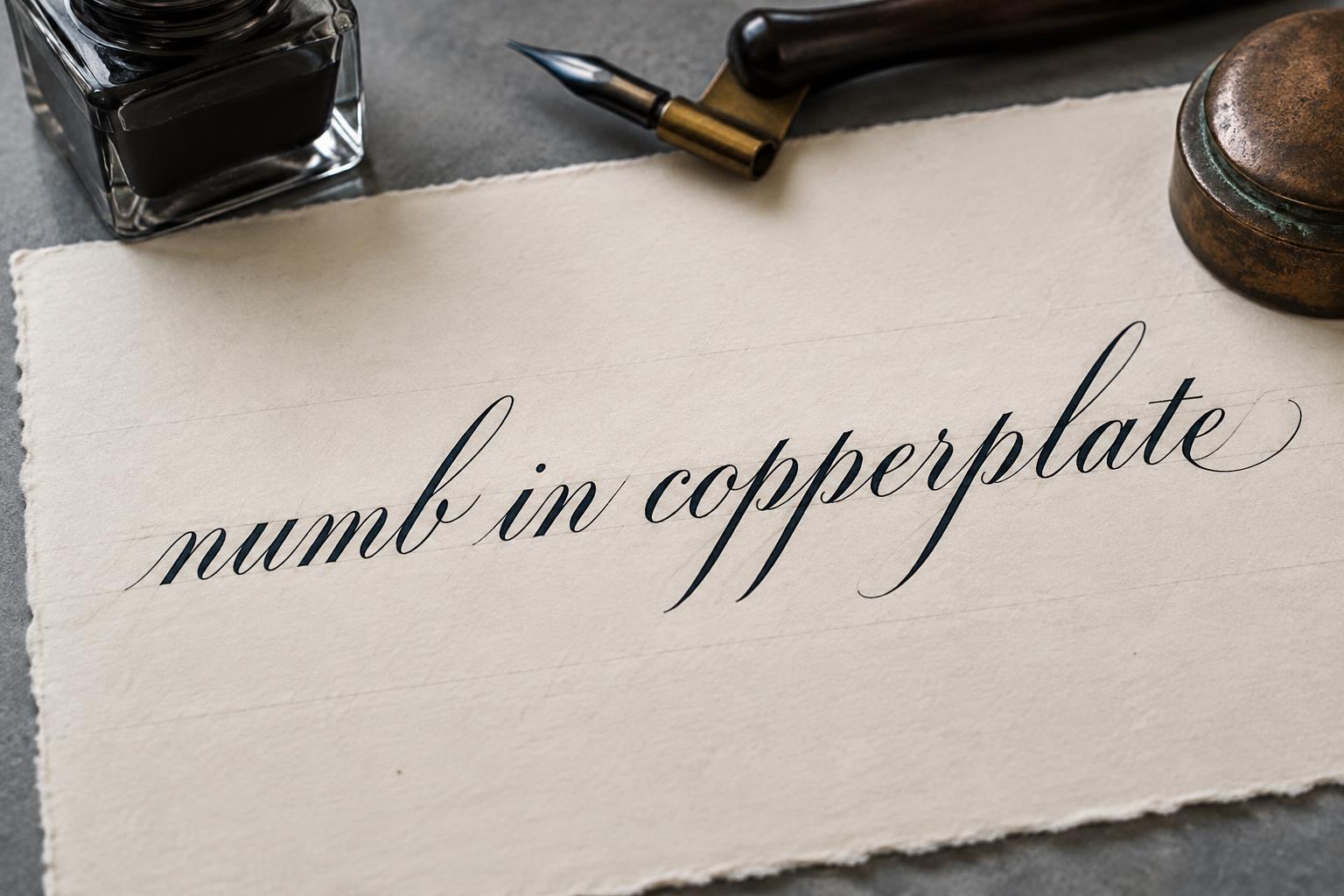
“Dar Madam,” is a Cursive Calligraphy text effect efeito de texto criado com a IA da FontVibe. Copperplate formal de pena pontiaguda: forte contraste grosso-fino, letras ovais inclinadas e maiúsculas com floreios, tinta preta nítida sobre papel creme com linhas-guia leves.
laid down as the exacting art of formal pointed-pen calligraphy. SURFACE / INK: crisp, controlled ink — deep black or warm sepia — sitting cleanly on the page with fine wet-ink edges and a faint natural sheen where it catches the light, precise and disciplined rather than loose, the exacting hand of a master penman. GROUND: fine calligraphy paper — smooth hot-press cotton, cream or ivory practice stock, sometimes with faint ruled guideline slants, or a formal certificate or invitation ground — with generous margins so the lettering reads. LIGHT: even, clean studio light — soft and flat — showing the crisp ink edges and fine wet-ink detail, minimal drama. ATMOSPHERE: formal, timeless and disciplined — the tradition of copperplate and Spencerian penmanship, wedding invitations, diplomas and certificates, the poised craft of the calligrapher's desk. LETTERFORM PRIORITY: when the chosen font carries its own treatment, that font's letterform shapes and built-in flourishes take priority and own the letters; this style governs only the ink surface, ground and light, never the letter shapes. When no specific material is defined by the font: crisp controlled pointed-pen ink with fine wet edges and a faint sheen, in a single deep tone, on the calligraphy-paper ground. COLOR: if the font declares its own color keep it; otherwise the ink reads as a classic penmanship tone — deep black or warm sepia — on the pale paper ground. Render the exact text "Dar Madam," as the dominant ink inscription on a formal handwritten correspondence sheet of smooth ivory hot-press cotton paper. Use crisp, controlled warm sepia pointed-pen ink with clean hairline-to-broad-stroke contrast dictated by the supplied lettering, fine wet-ink edges, tiny reflective sheen along the freshest curves, and no smeared or distressed marks. The paper carries faint pale-gray diagonal calligraphy guideline slants, barely visible beneath the inscription, with a wide untouched paper field and a subtle deckled edge. Include the restrained details of a penman’s writing desk: a polished wooden oblique nib holder, a small square glass inkwell containing dark sepia ink, and a folded cream envelope, all softened by shallow depth of field so the rendered text remains perfectly sharp. Even diffused studio daylight reveals the paper’s pressed cotton grain, ink density, and precise edges without hard shadows. Use a quiet parchment, sepia, charcoal, and muted brass palette, with restrained formal correspondence atmosphere and certificate-grade finish. No extra words, initials, dates, postage, signatures, flourishes, or illegible background writing.
Feito para Caligrafia Copperplate
Gerada em 15 de setembro de 2026 · 2304 × 1728 · JPEG · BytePlus Seedream 5.0 · Compartilhada pelo criador · Uso comercial gratuito (CC BY 4.0)


