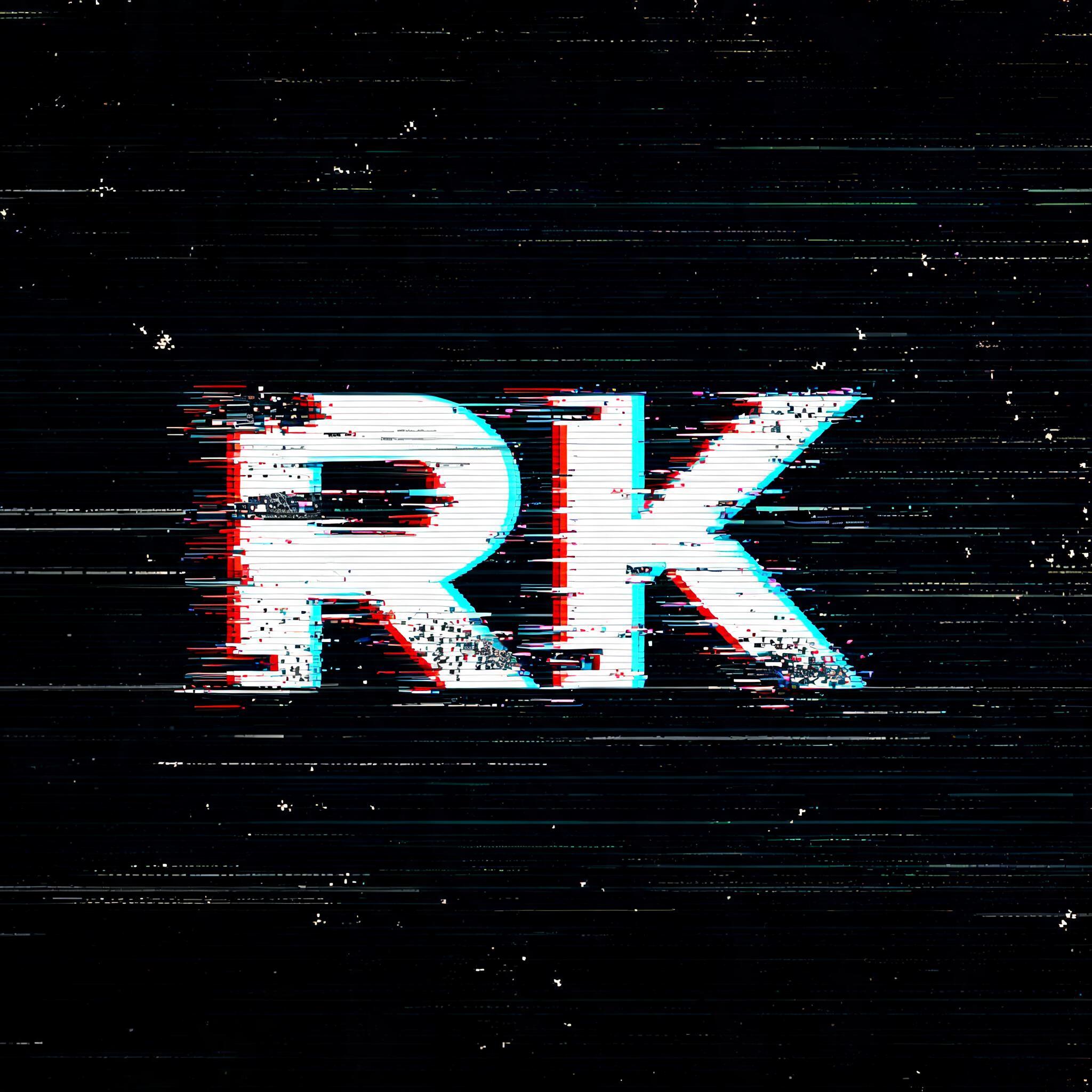
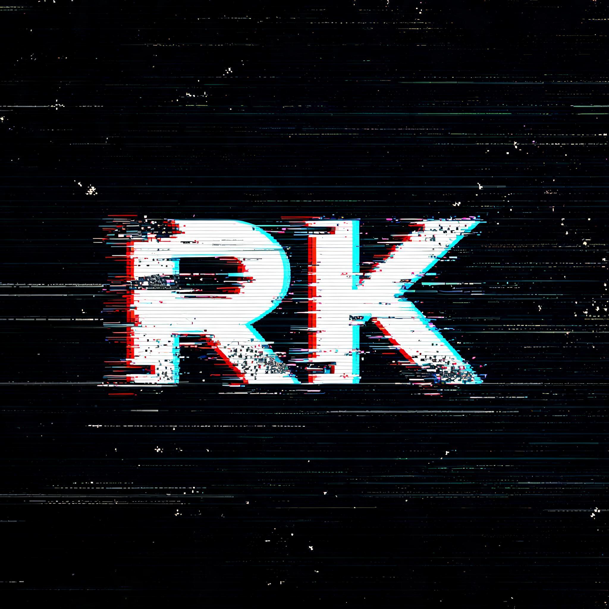
RK - Glitch Text Effect


Usa BytePlus Seedream 5.0, o modelo desta obra · 15 créditos
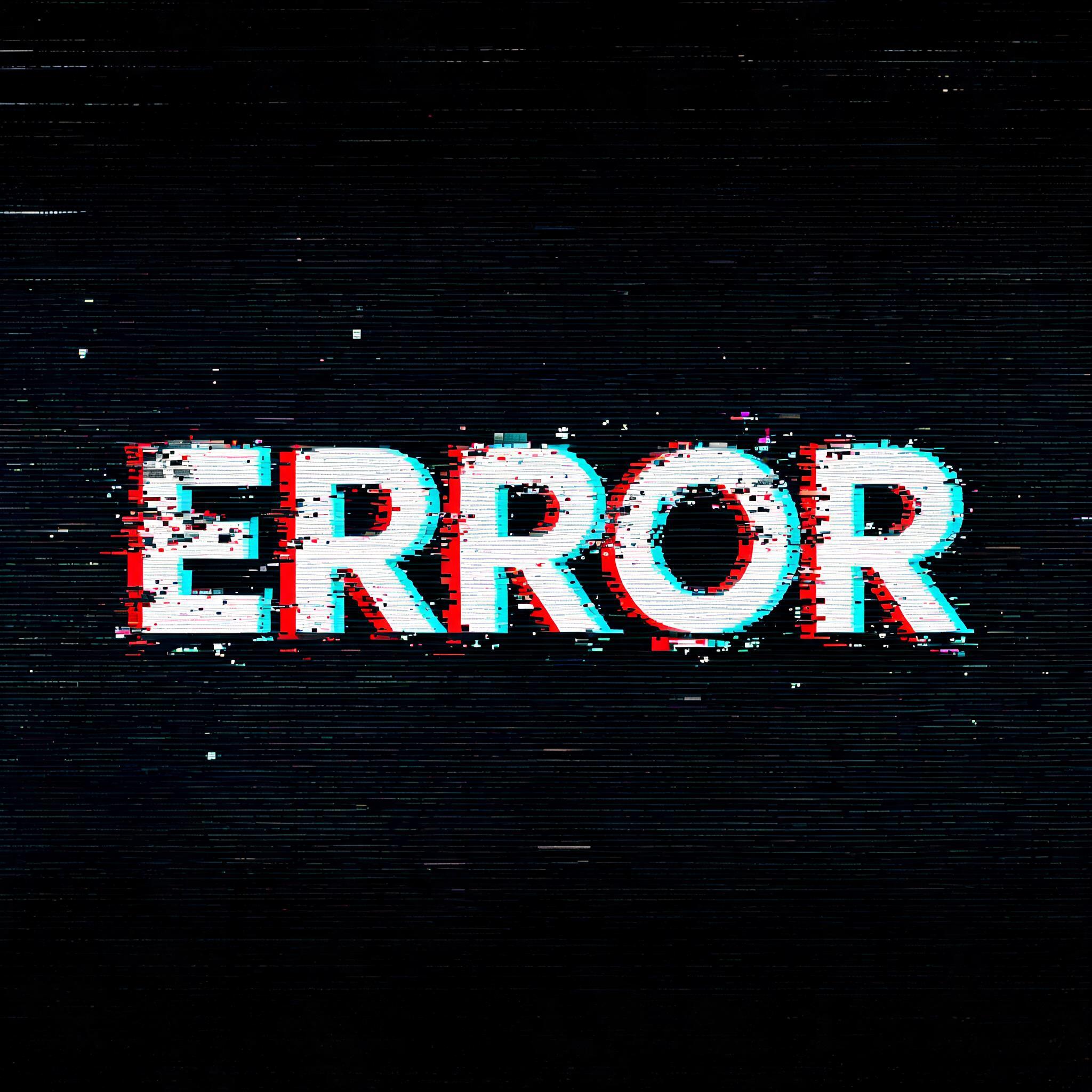
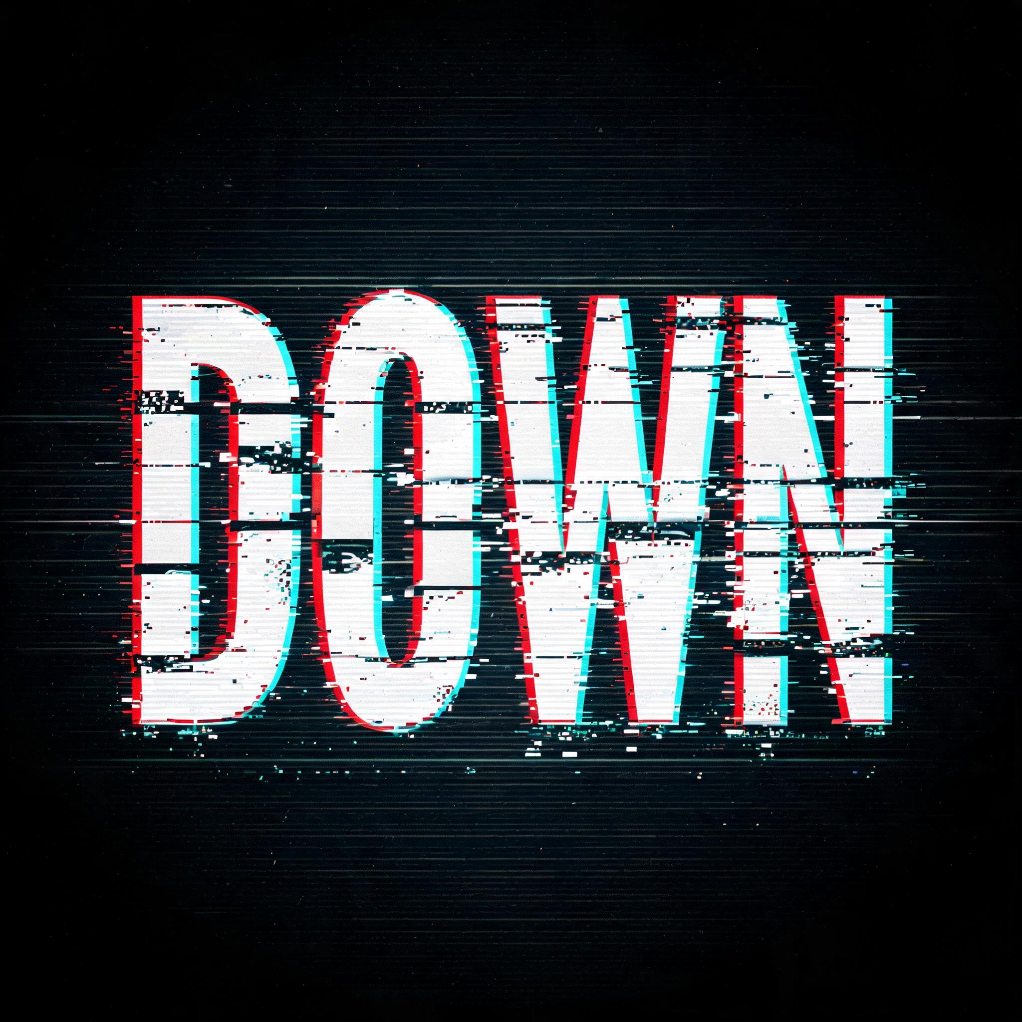
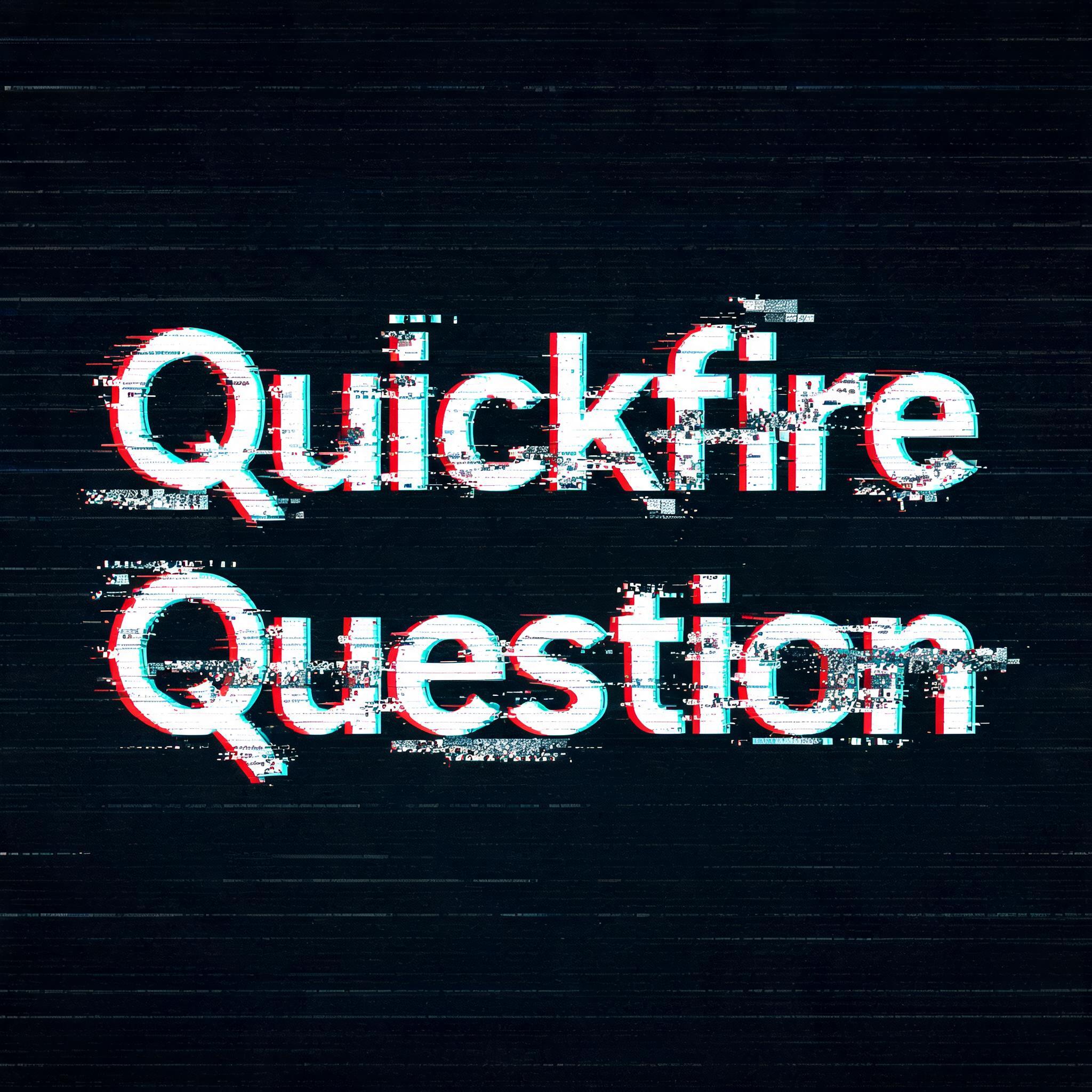
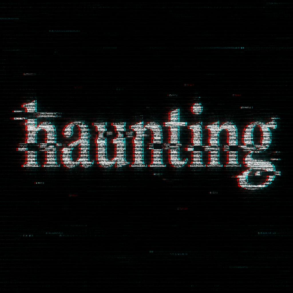
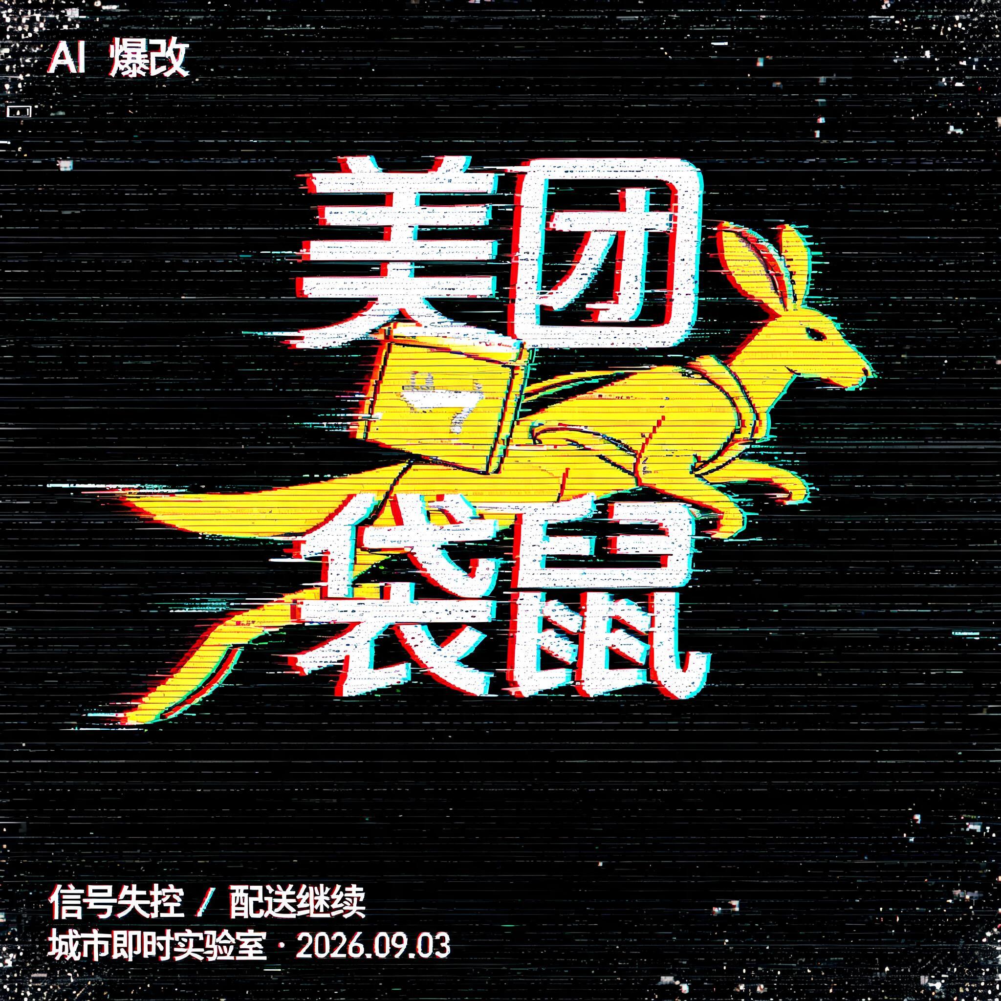

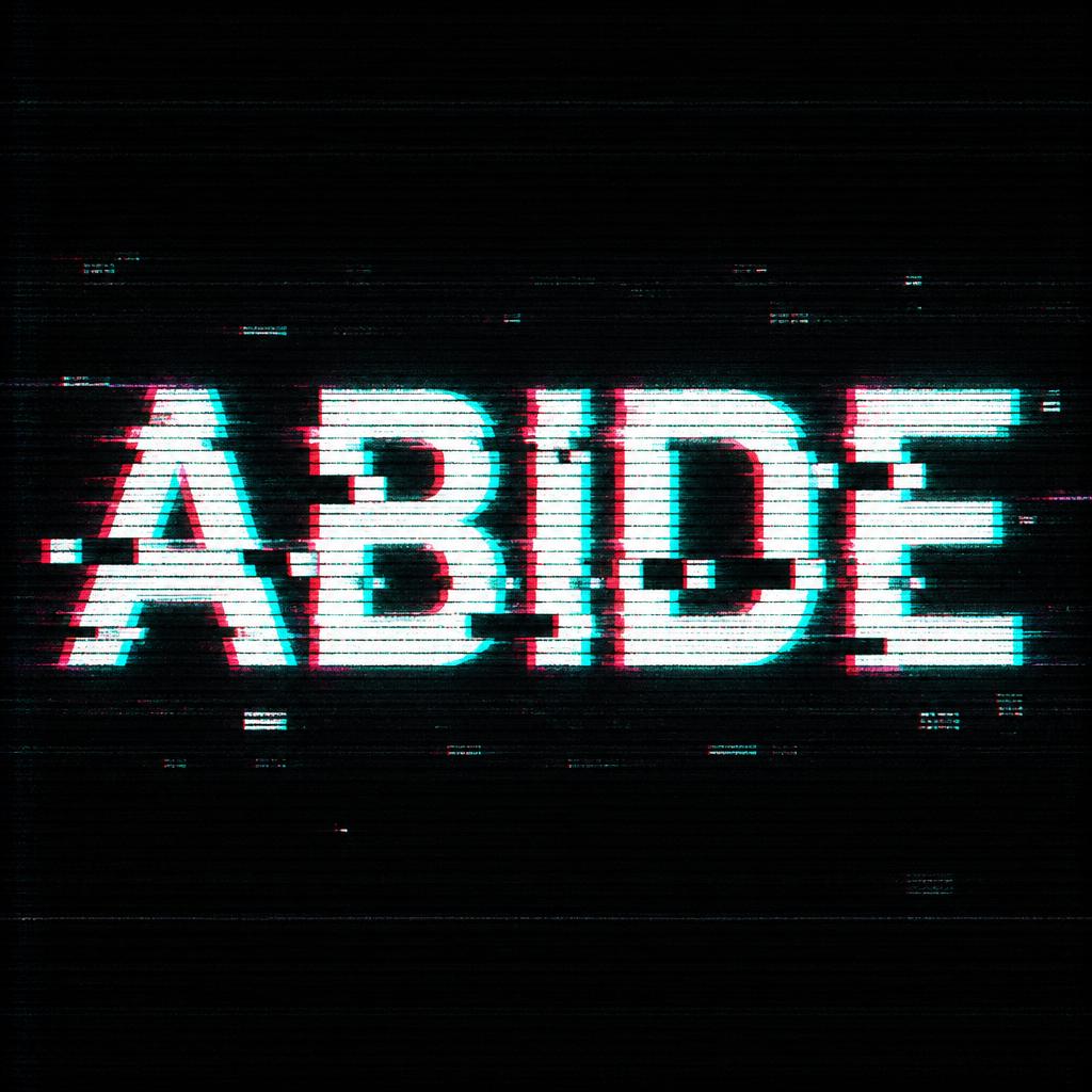
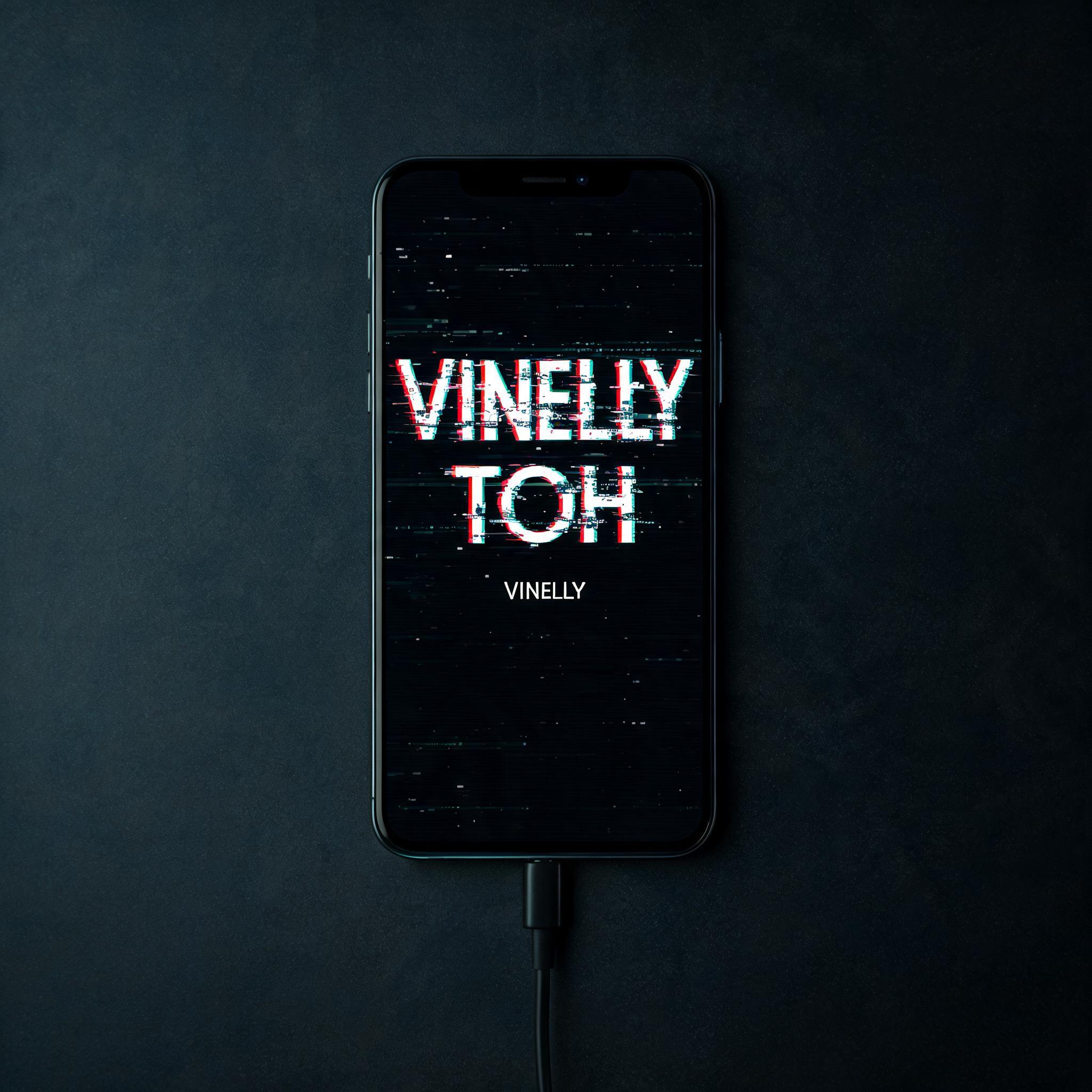
“RK” is a Glitch text effect efeito de texto criado com a IA da FontVibe. Maiúsculas sans serif brancas partidas por deslocamentos de canal vermelho e ciano, cortadas por faixas horizontais e linhas de varredura, refletidas numa rua de neon molhada à noite.
Core glitch effect: authentic RGB chromatic aberration — red channel shifted 5–8px to the left, cyan channel shifted 5–8px to the right, creating the classic double-vision color split on every letter edge. CRT scan lines: dense horizontal parallel lines across the entire text surface, spacing 3–4px, semi-transparent, rhythmic — simulating a real CRT phosphor screen. Pixel block artifacts: 3–5 sharp-edged rectangular chunks of letter pixels displaced horizontally by 10–25px at random vertical positions along the text. Edge glow: subtle cyan-white phosphor bloom emanating from letter boundaries. The glitch distortion is controlled and deliberate — text remains clearly readable. No random noise flood. No cartoon effects. Professional digital corruption aesthetic. LETTERFORM PRIORITY: when the chosen font carries its own treatment, that font's letterform shapes take priority and own the letters; this style governs the RGB chromatic aberration, the scan lines and the pixel-displacement corruption. FALLBACK MATERIAL: if the font carries no material of its own, render the letters with a red/cyan channel split, dense CRT scan lines and displaced pixel blocks, kept clearly readable. COLOR PRIORITY: keep the font's own colors if specified; otherwise the red-and-cyan split with cyan-white phosphor glow on a dark digital void. A compact digital title treatment for the exact text “RK”, with the letters kept crisp and immediately readable against a near-black CRT void. Apply authentic RGB chromatic aberration to every letter boundary: red channel shifted 6px left, cyan-blue channel shifted 7px right, with the main luminance layer retained sharply between them. Dense semi-transparent horizontal CRT phosphor scanlines run across the full letter surface at 3–4px spacing, creating fine striped interruption without obscuring the glyphs. Introduce four sharp rectangular pixel-displacement cuts through selected portions of the letters, each block shifted laterally 12–22px, exposing offset fragments of red, cyan, and white signal data. Add restrained cyan-white phosphor bloom around the outer contours and fractured pixel seams, with a few tiny magenta and electric-blue data flecks nearby. The surrounding field is matte black with faint dark navy monitor falloff, sparse horizontal static streaks, and isolated white pixel flickers. Preserve clean negative space and controlled digital corruption; no grain flood, no melting shapes, no illegible distortion. High-resolution CRT display simulation, precise pixel edges, subtle screen luminance, professional broadcast-signal failure artifacting.
Gerada em 16 de setembro de 2026 · 2048 × 2048 · JPEG · BytePlus Seedream 5.0 · Compartilhada pelo criador · Uso comercial gratuito (CC BY 4.0)


