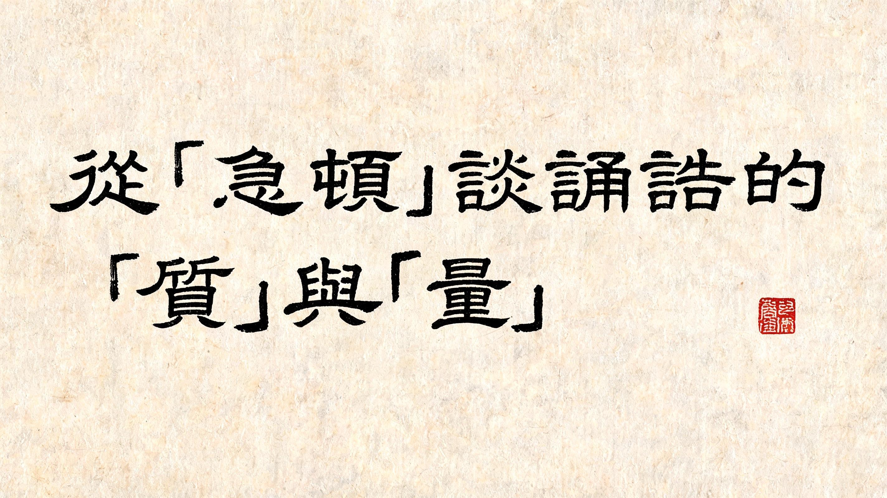
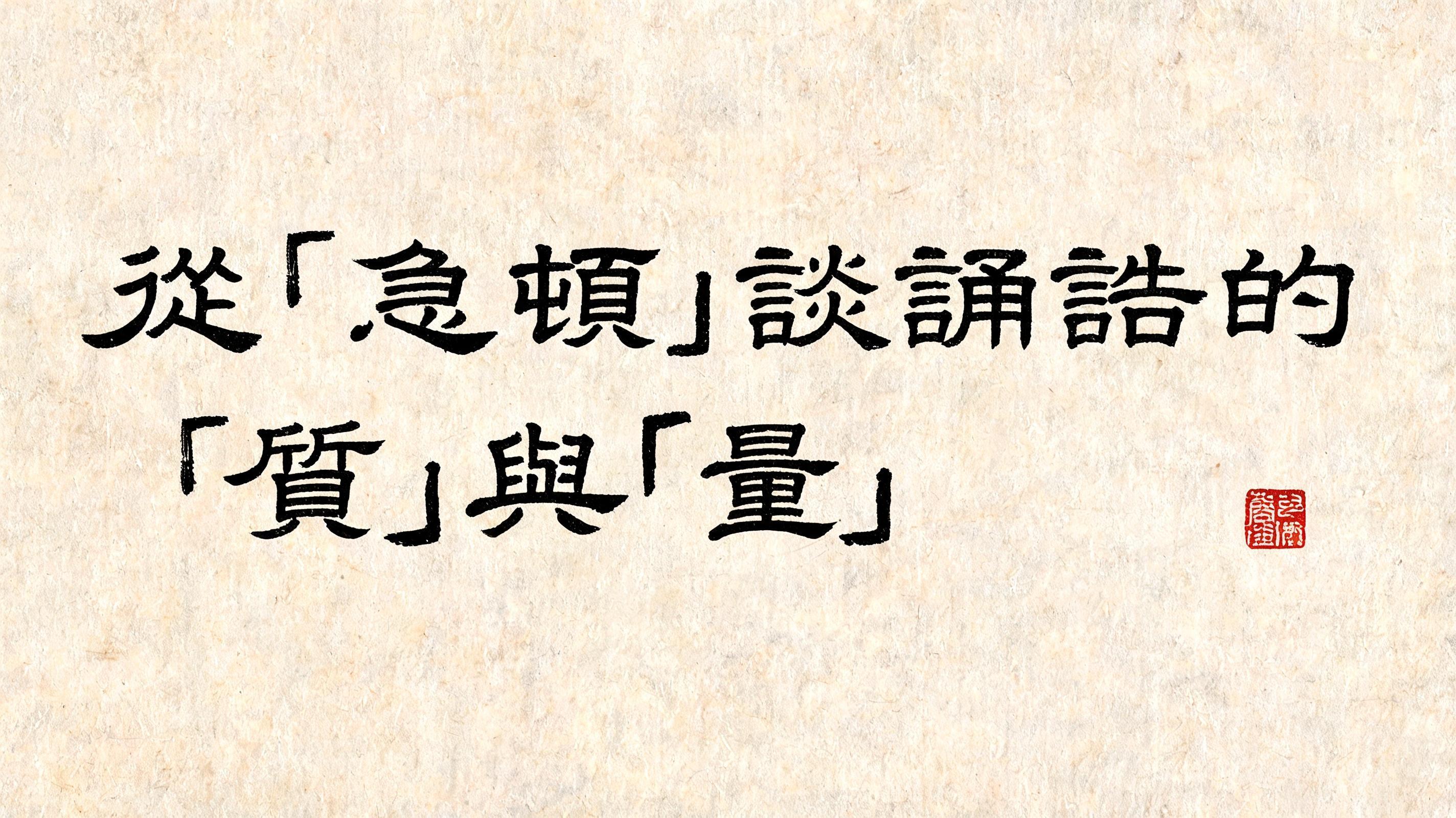
從「急頓」談誦誥的「質」與「量」 - Pincel de Tinta Chinesa Text Effect


Usa BytePlus Seedream 5.0, o modelo desta obra · 15 créditos
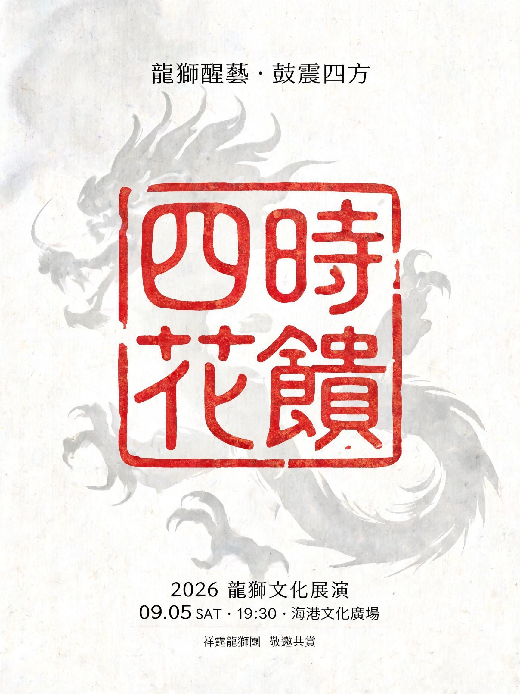
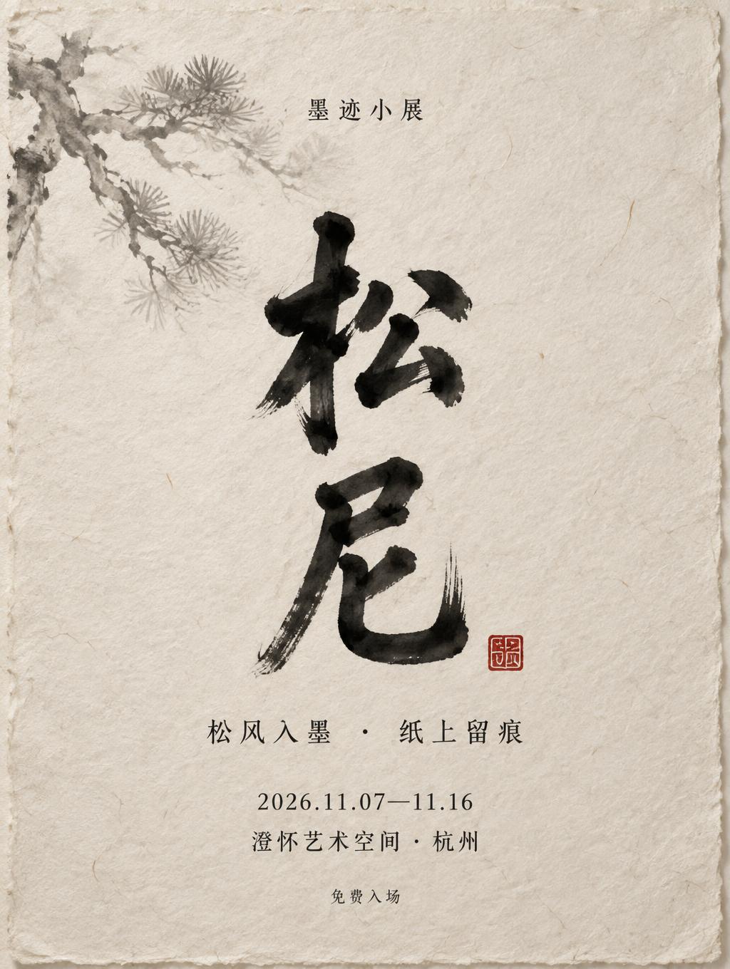
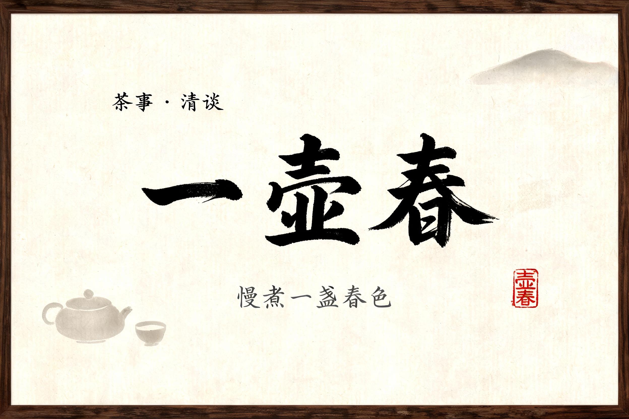


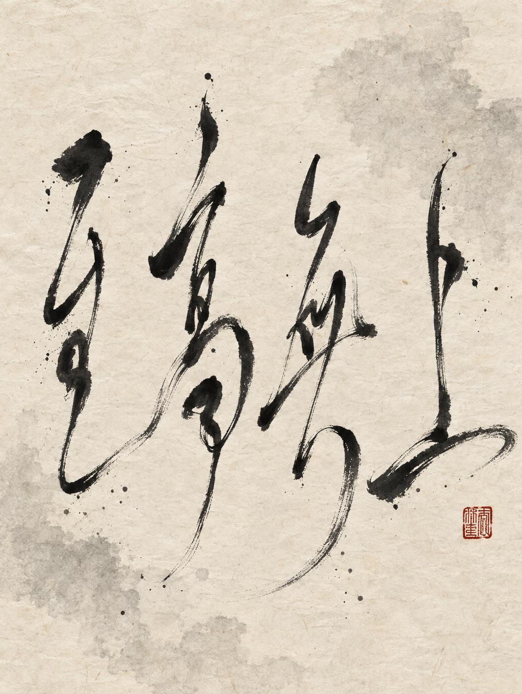

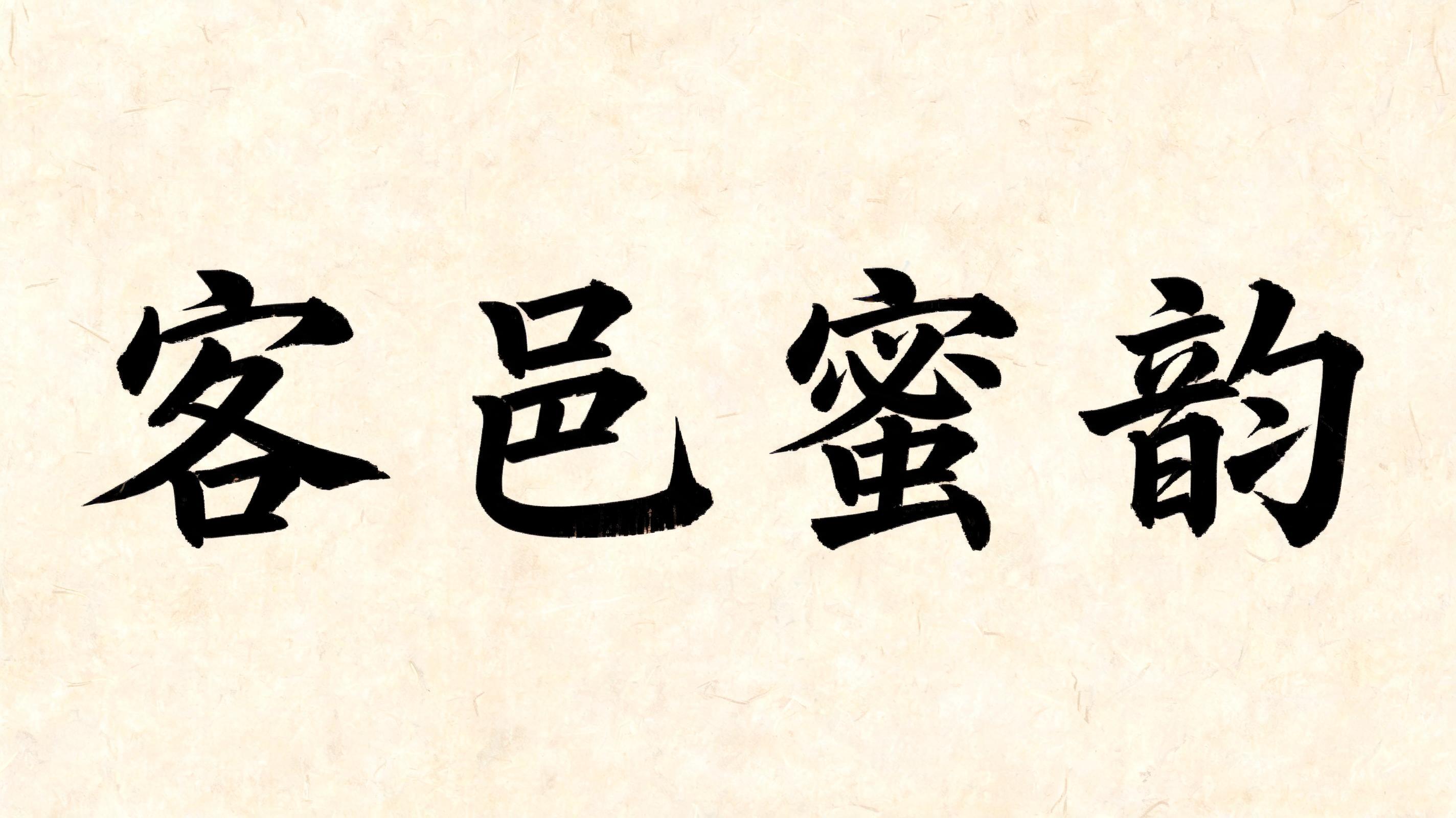

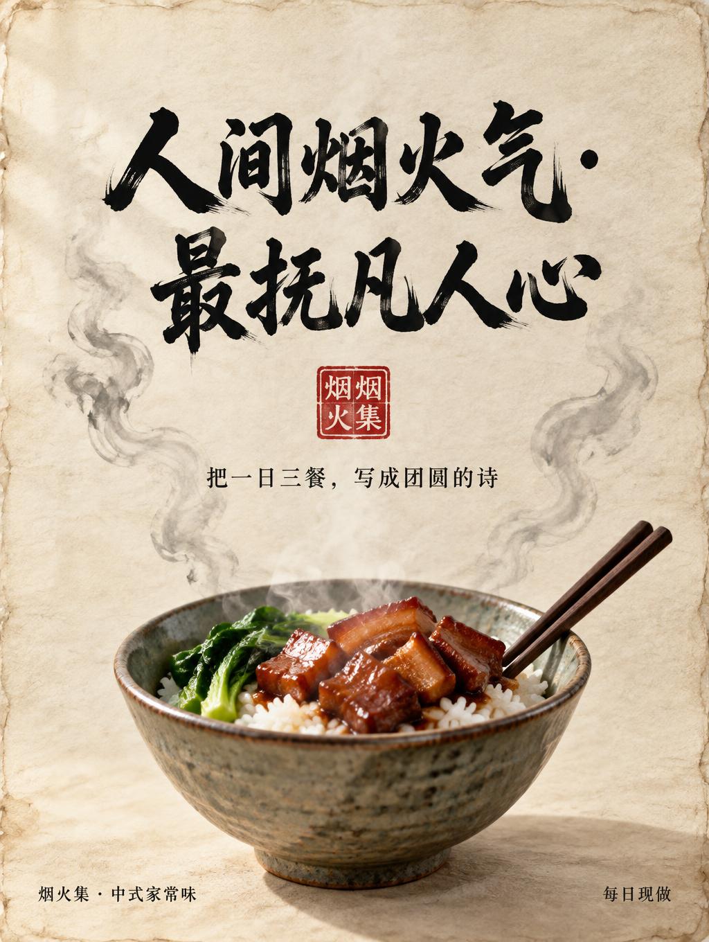
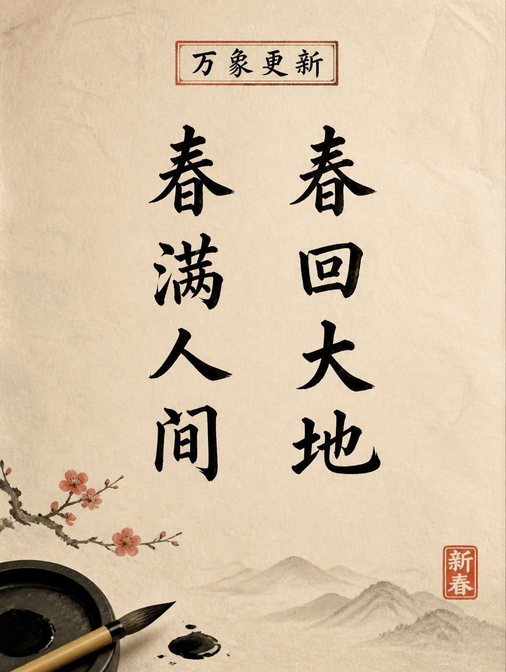
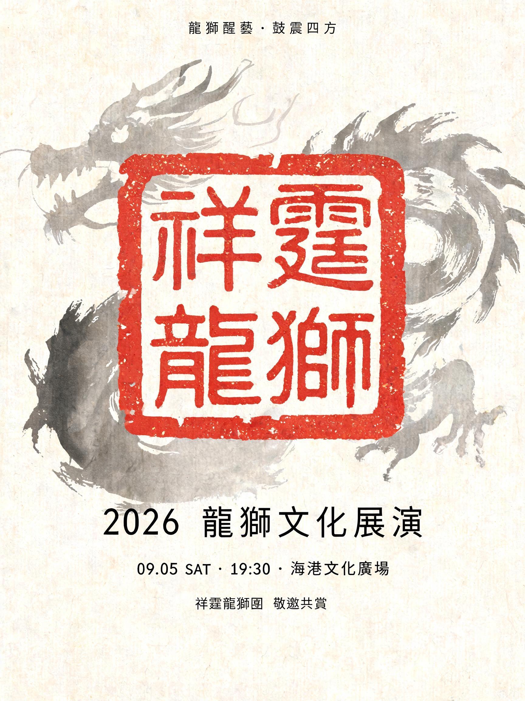


“從「急頓」談誦誥的「質」與「量」” is a Brush Chinese Ink text effect efeito de texto criado com a IA da FontVibe. O estilo da caligrafia chinesa com pincel de tinta sumi aplicado às letras latinas. Preto profundo com textura autêntica de cerdas, traços que vão do grosso ao fino e aquele ar de papel de arroz. Perfeito para marcas de restaurantes chineses, artes marciais, bem-estar e design cultural.
rendered in Chinese ink brush calligraphy style. Letterforms painted with a fully loaded sumi ink brush — deep black ink, visible bristle marks along stroke edges, wet ink pooling at stroke starts, feathered dry-brush trailing ends. Authentic ink density variation: thick rich black cores fading to grey at thin passages. Rice paper texture visible behind. Traditional Chinese calligraphy energy — each stroke confident, intentional, irreversible. LETTERFORM PRIORITY: when the chosen font carries its own treatment, that font's letterform shapes take priority and own the letters; this style governs the sumi ink medium, the bristle and ink-density behavior and the rice-paper ground. FALLBACK MATERIAL: if the font carries no material of its own, render the letters as deep black sumi brush strokes with visible bristle marks, wet ink pooling at stroke starts and feathered dry-brush trails on rice paper. COLOR PRIORITY: keep the font's own colors if specified; otherwise rich black ink fading to grey at thin passages. Render the exact Traditional Chinese text “從「急頓」談誦誥的「質」與「量」” as the dominant calligraphic title on raw warm-ivory xuan paper. Use fully loaded sumi ink with dense carbon-black cores, wet pooling at stroke origins, granular paper-fiber absorption, and translucent charcoal-grey dry-brush passages where individual bristles separate. Preserve decisive, historically grounded brush energy; broad horizontal ink passages carry subtle undulation, while tapered terminals break into feathered filaments and tiny satellite droplets. The quotation marks and punctuation are visibly inked, integrated with the same wet-to-dry behavior. Let thin ink areas reveal luminous rice-paper fibers and irregular deckle-like grain beneath. Add a restrained pale-grey ink wash, softly blooming outward behind selected areas of the title without obscuring legibility. A small square cinnabar-red carved seal impression appears as a secondary archival mark, with imperfect pigment gaps and slightly softened paper bleed. No digital-clean contours, no uniform black fill, no glossy effects, no modern graphic gradients. Museum-documentary print surface, diffuse daylight across textured paper, high-resolution macro detail in ink edges and absorbent fibers.
Gerada em 16 de setembro de 2026 · 2848 × 1600 · JPEG · BytePlus Seedream 5.0 · Compartilhada pelo criador · Uso comercial gratuito (CC BY 4.0)