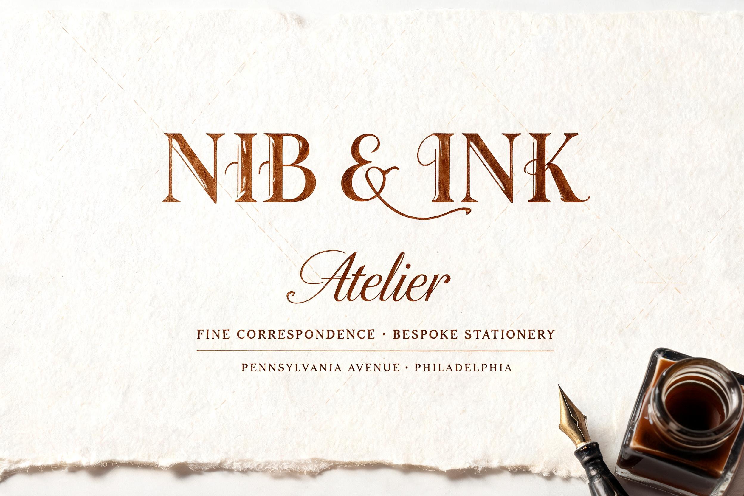
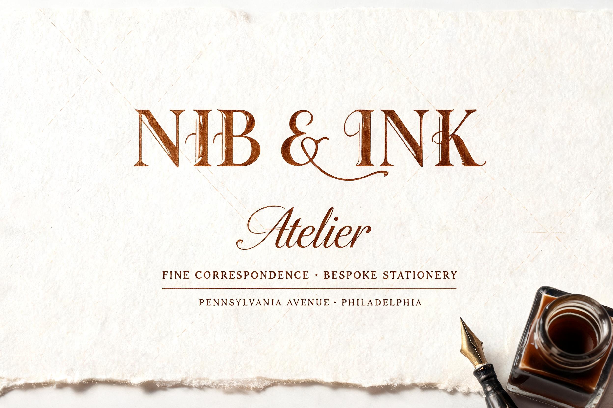
NIB & INK Atelier FINE CORRESPONDENCE · BESPOKE STATIONERY PENNSYLVANIA AVENUE · PHILADELPHIA - Caligrafia Script Text Effect


Usa BytePlus Seedream 5.0, o modelo desta obra · 15 créditos
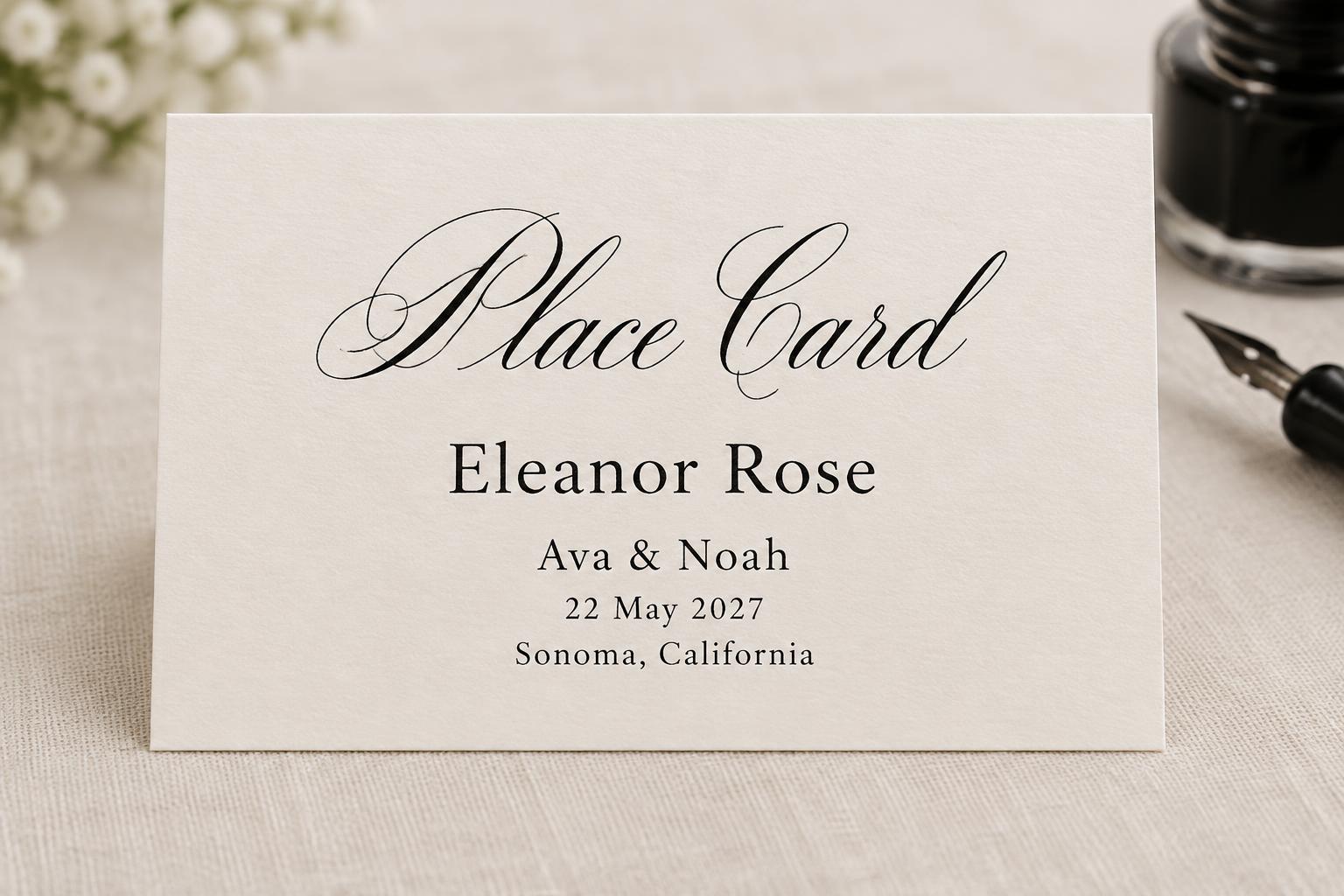
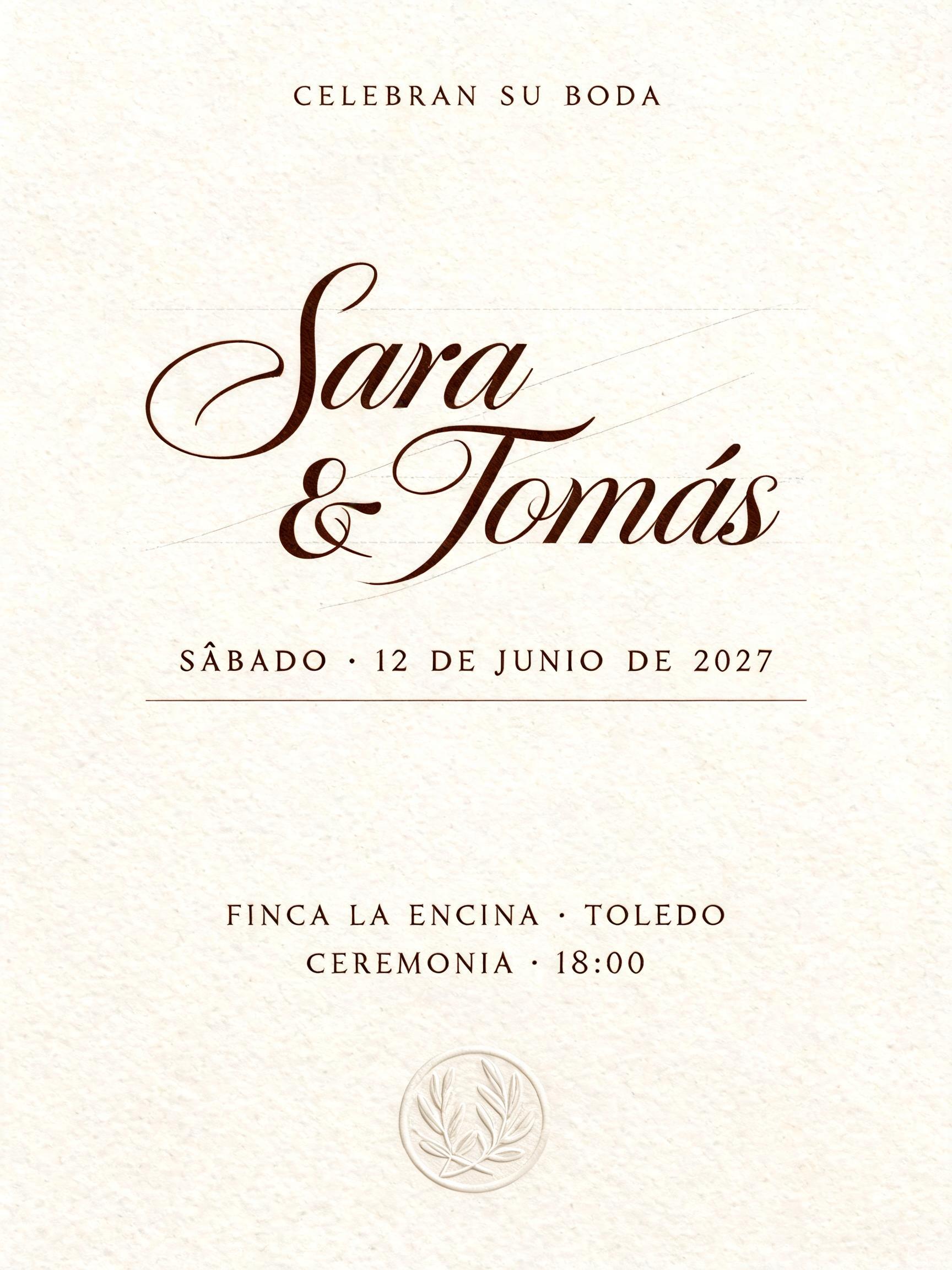
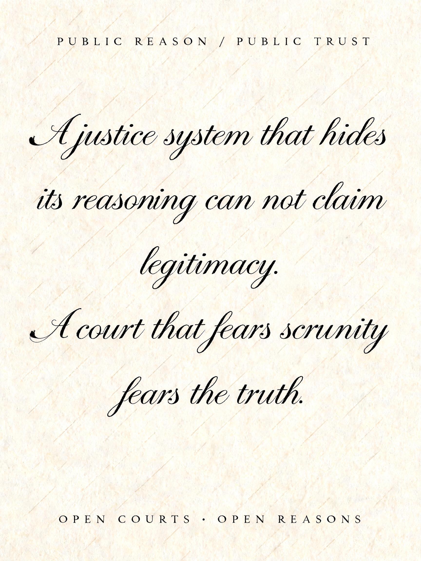
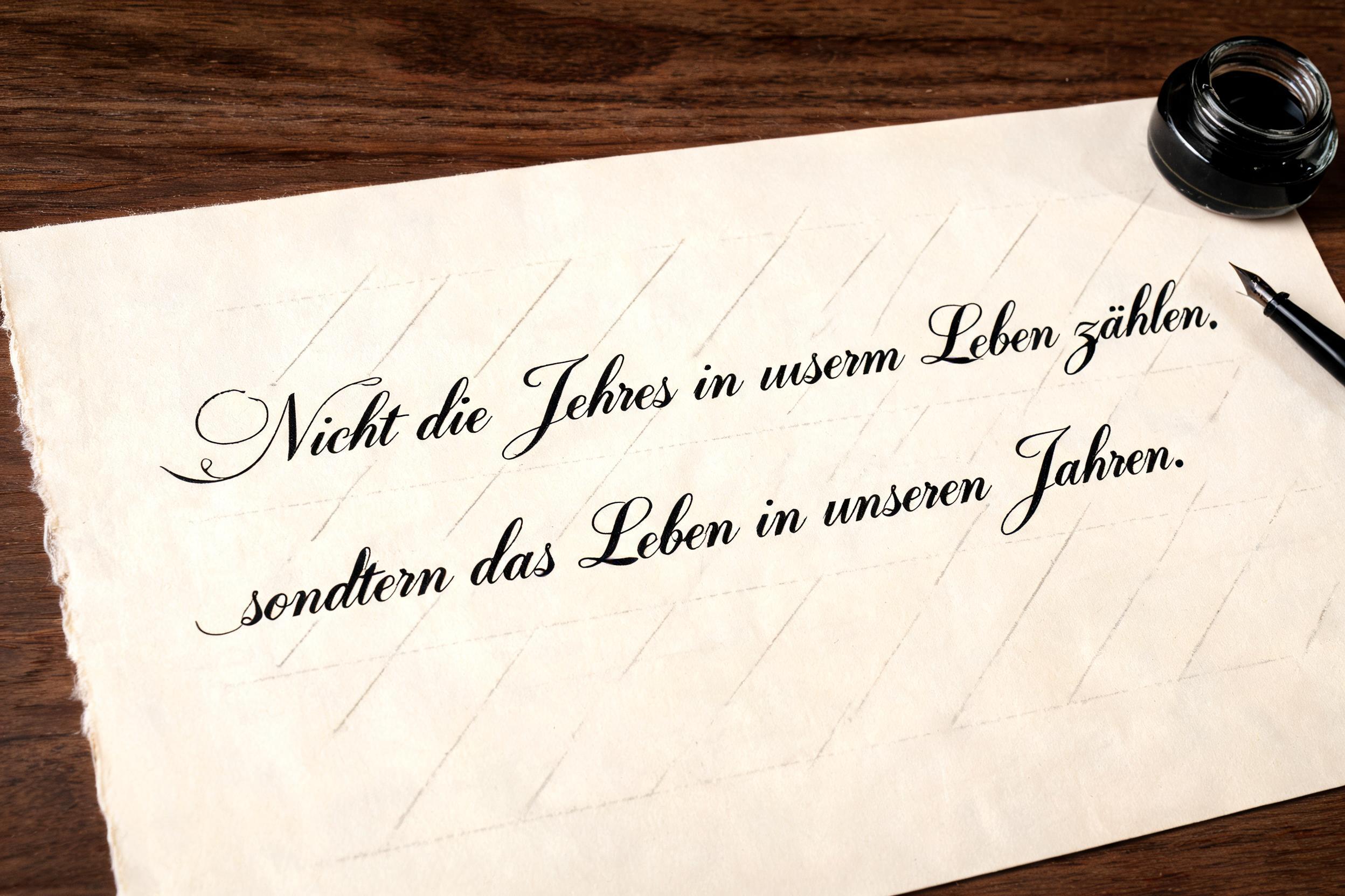
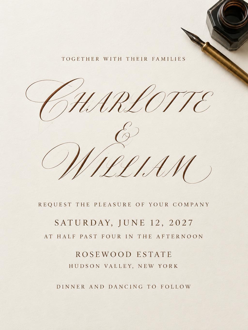
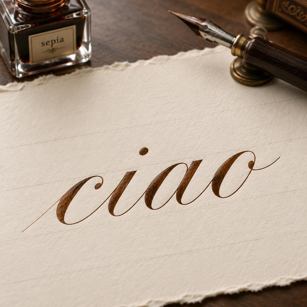
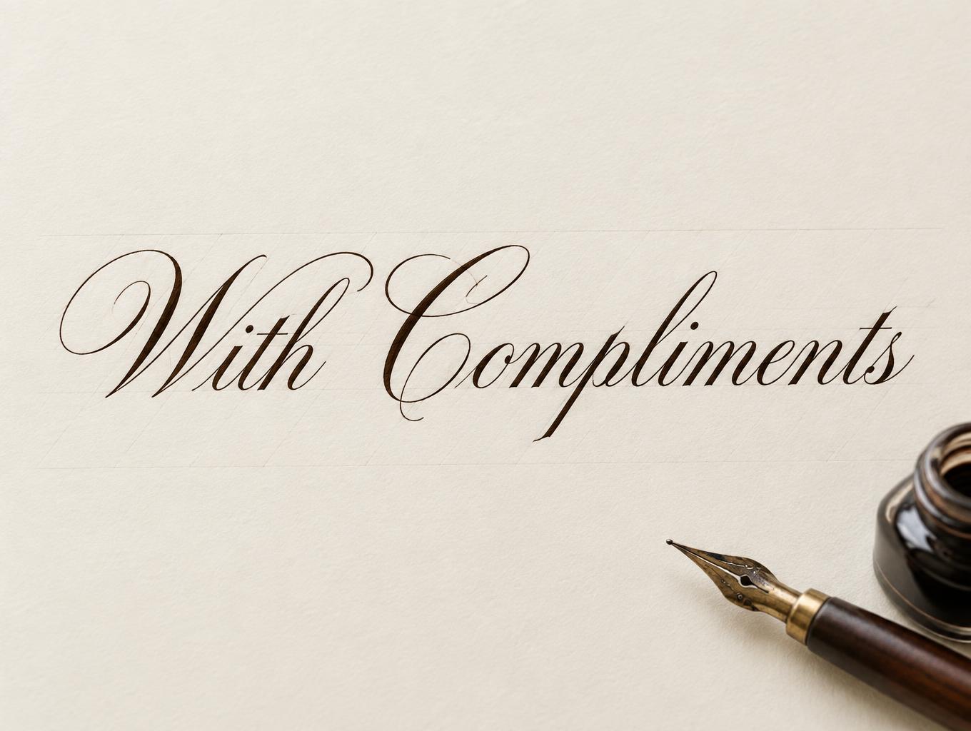
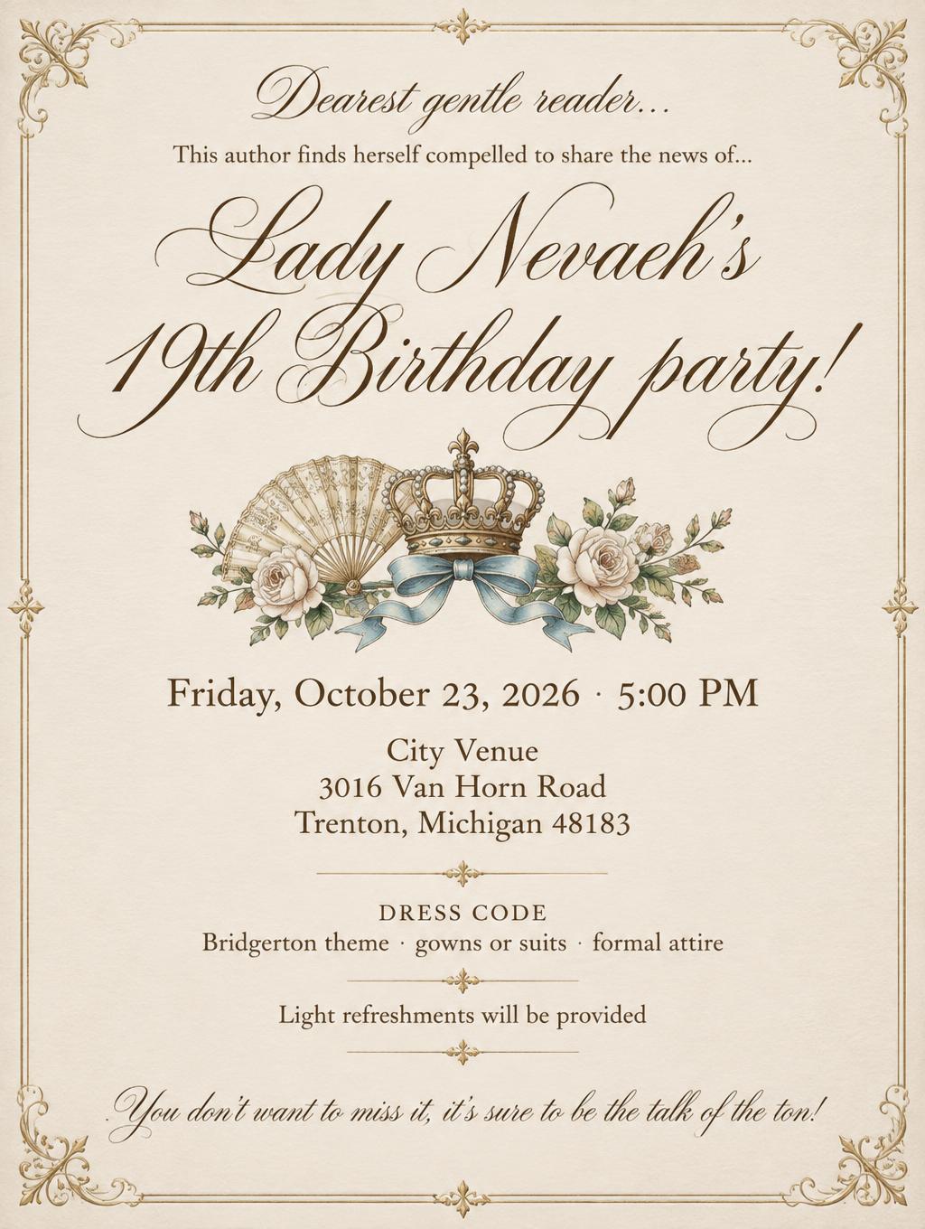
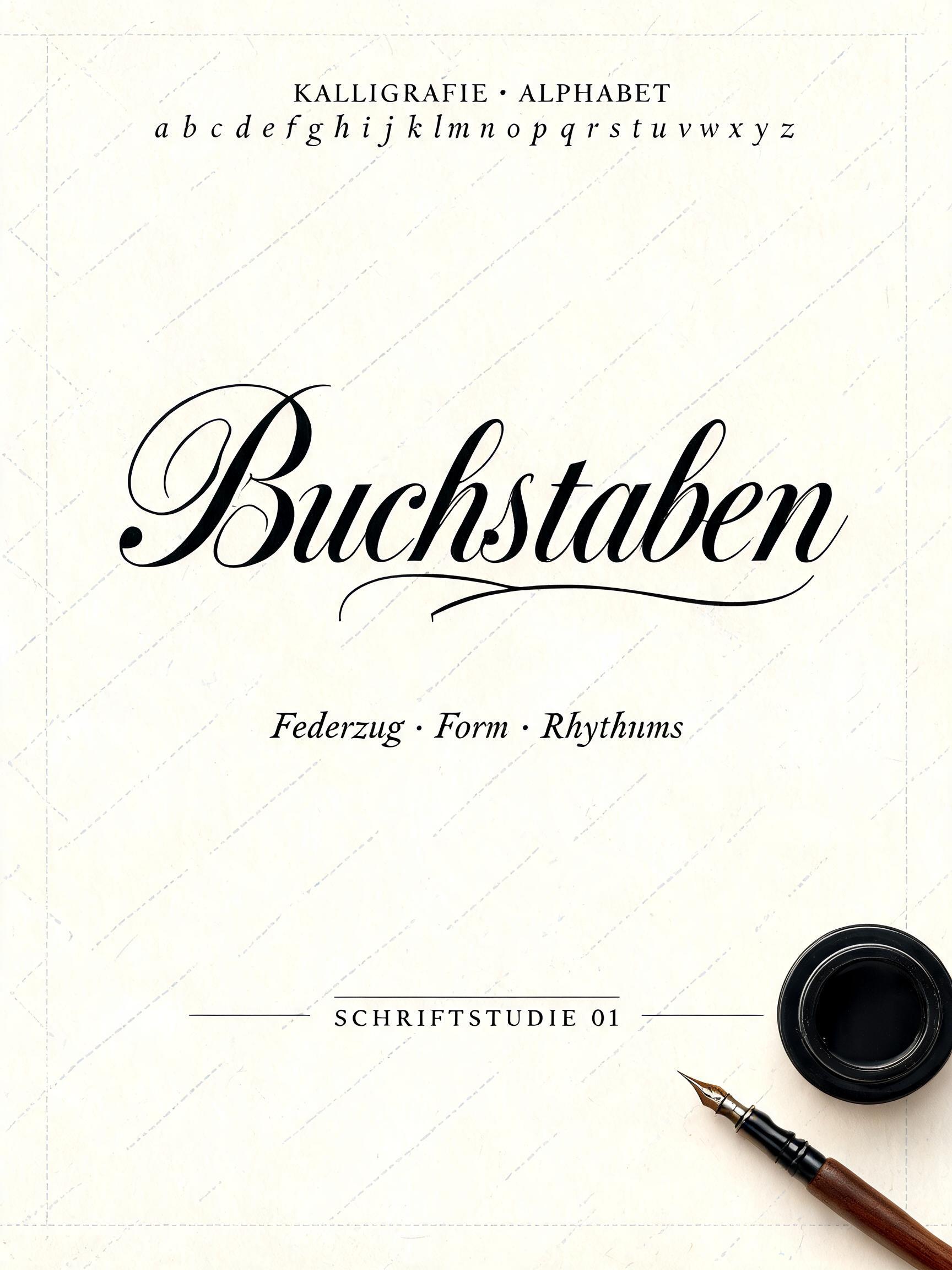
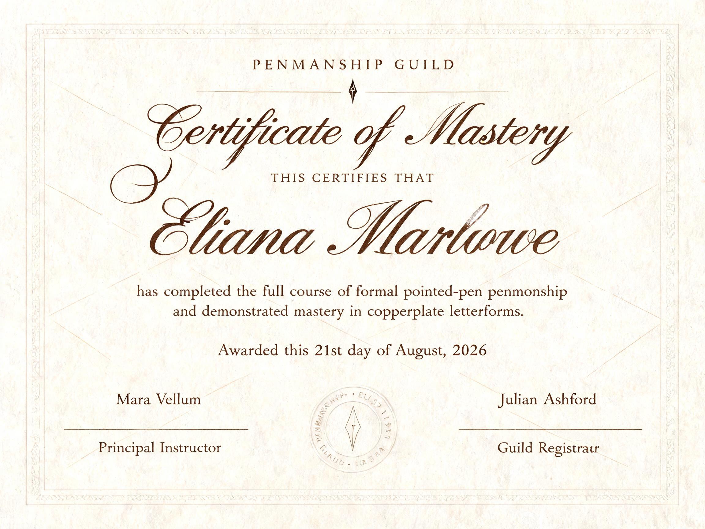
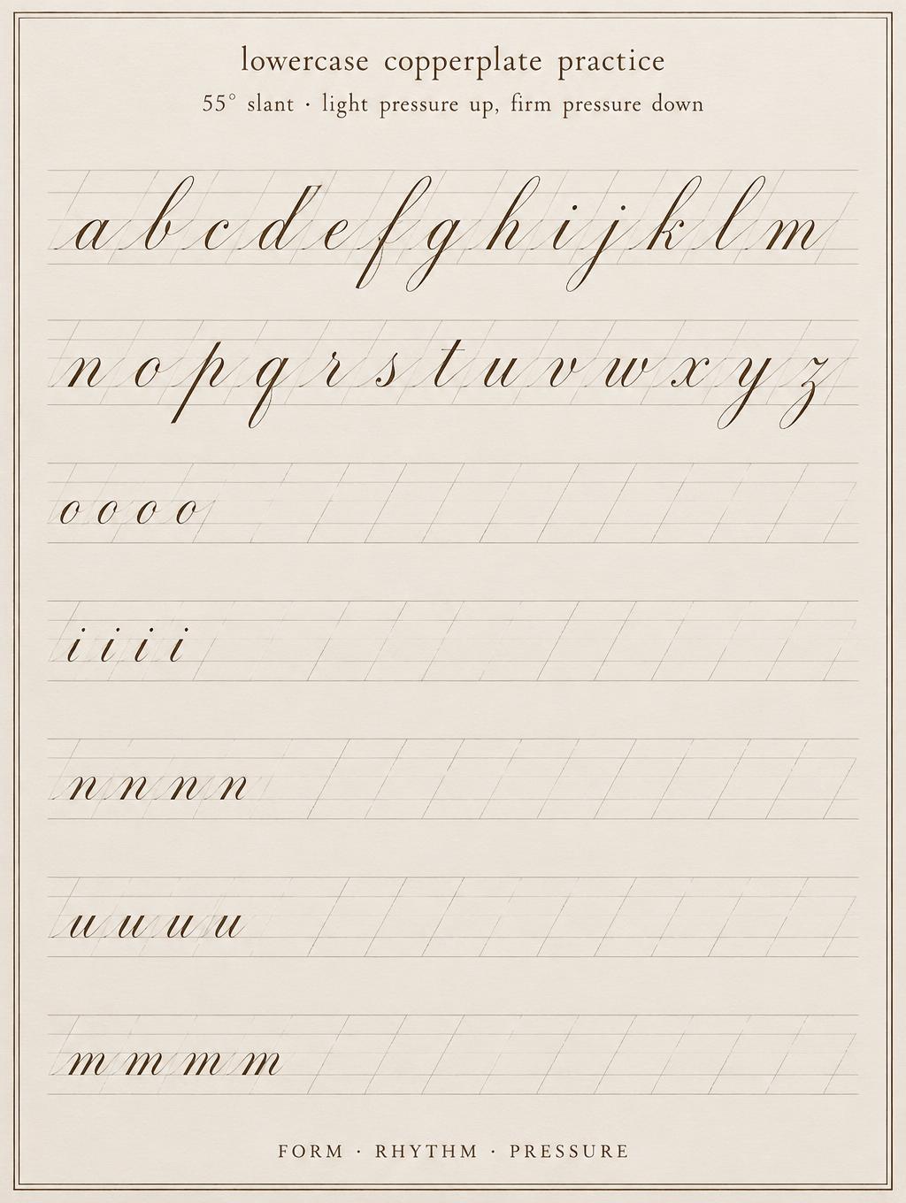
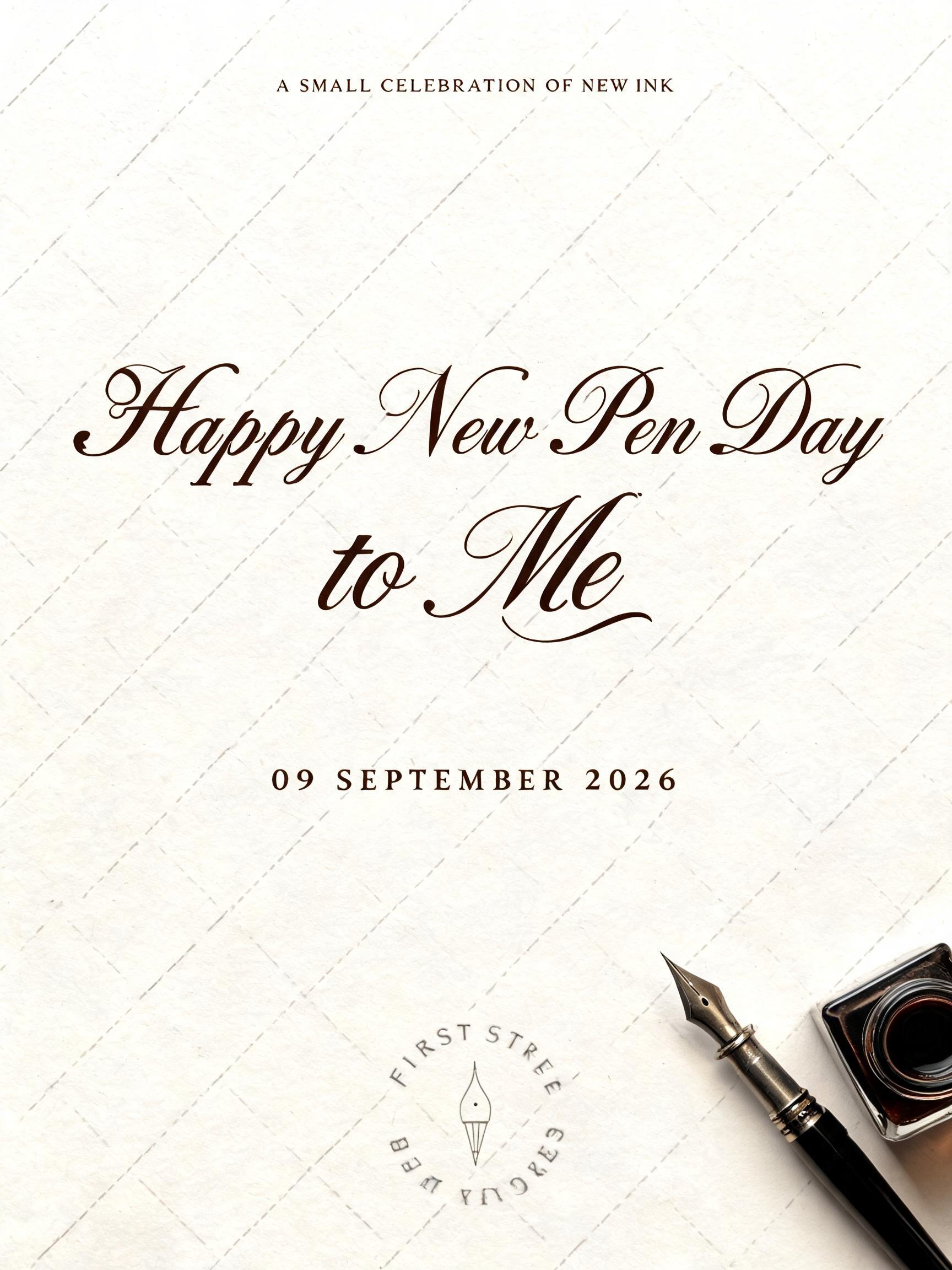
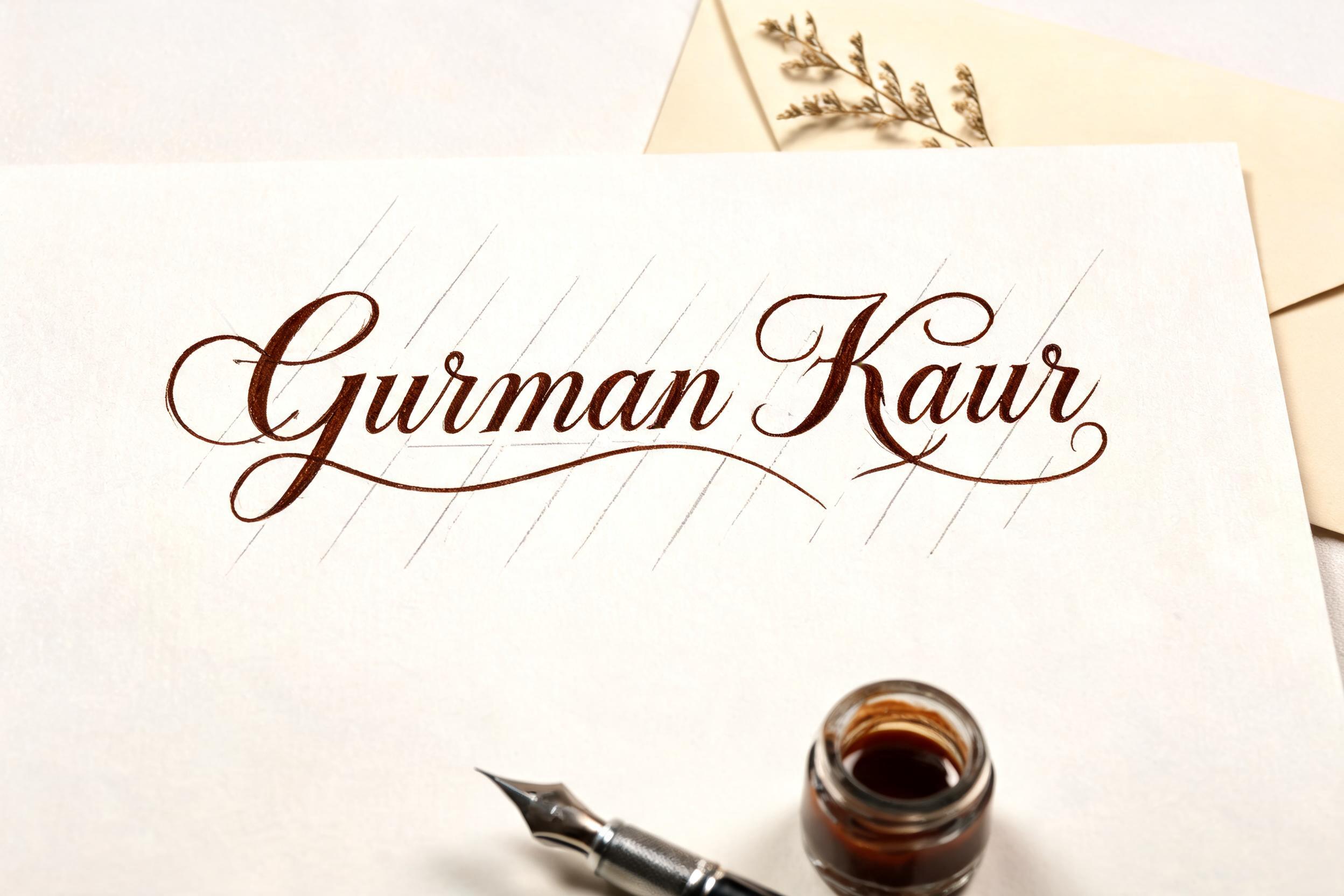
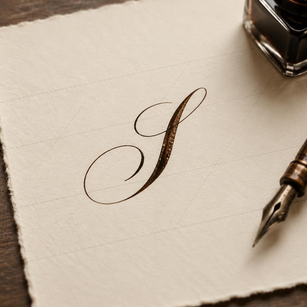
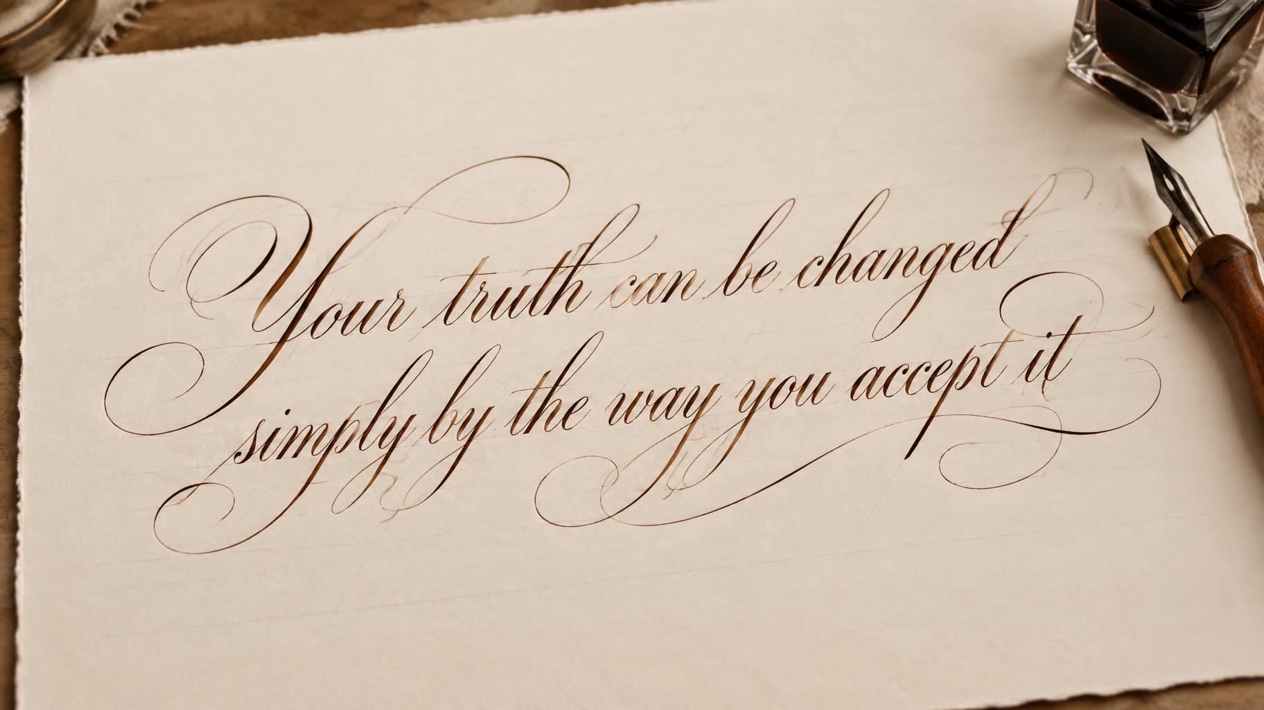
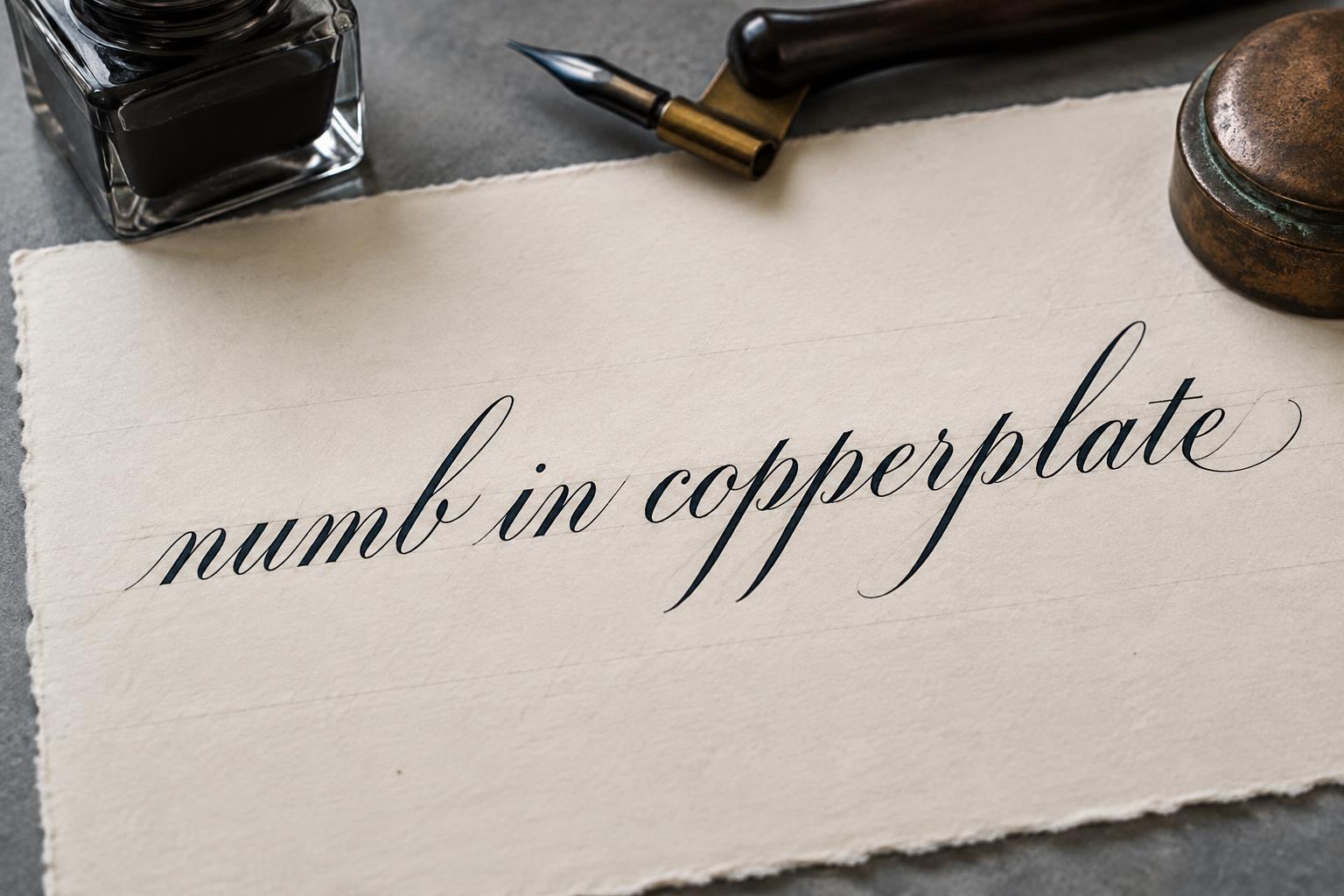
“NIB & INK Atelier FINE CORRESPONDENCE · BESPOKE STATIONERY PENNSYLVANIA AVENUE · PHILADELPHIA” is a Cursive Calligraphy text effect efeito de texto criado com a IA da FontVibe. Copperplate formal de pena pontiaguda: forte contraste grosso-fino, letras ovais inclinadas e maiúsculas com floreios, tinta preta nítida sobre papel creme com linhas-guia leves.
Create a finished horizontal identity sheet for a premium stationery maker, 3:2 landscape. The composition is a formal calligrapher’s letterhead on smooth ivory hot-press cotton paper with a deckled paper edge visible at the bottom. Faint pale-warm-gray 55-degree calligraphy guideline slants run quietly across the paper. Even, soft, flat studio light reveals paper tooth, exact ink edges, and a subtle wet-ink sheen; no dramatic shadows, no glitter, no metallic foil. Set the exact text “NIB & INK” as the dominant centered wordmark across 64% of the width in custom formal copperplate calligraphy. Build every letter with disciplined oval forms leaning precisely 55 degrees: whisper-thin hairline upstrokes, broad controlled shaded downstrokes, rhythmic open counters, refined connectors. The capital N has one restrained ascending entry flourish; the capital I has a clean hairline exit, both terminating sharply without ornamental clutter. Render the lettering in saturated warm sepia-brown ink with fine wet edges and a faint reflected sheen. Directly beneath, set “Atelier” centered at one-third the headline size in the same master-penned formal script, with compact spacing and a delicate long final r exit stroke. Below it, in small uppercase restrained serif-like engraved lettering, print exactly “FINE CORRESPONDENCE · BESPOKE STATIONERY”. Along the lower center, print exactly “PENNSYLVANIA AVENUE · PHILADELPHIA” in tiny spaced capitals, separated from the descriptor by a hairline sepia rule. At lower right, include a finely drawn pointed dip nib and small square glass ink bottle, softly out of focus and cropped within the margin; their function is secondary to the wordmark. Keep more than 45% open paper around the lettering. The result is a complete stationer letterhead, precise formal penmanship, not loose cursive, not a wedding invitation, not a generic logo mockup. Ensure all text is sharp, accurate, and fully legible.
Feito para Caligrafia Copperplate
Gerada em 16 de setembro de 2026 · 2496 × 1664 · JPEG · BytePlus Seedream 5.0 · Layout: Stationer’s Letterhead · Compartilhada pelo criador · Uso comercial gratuito (CC BY 4.0)


