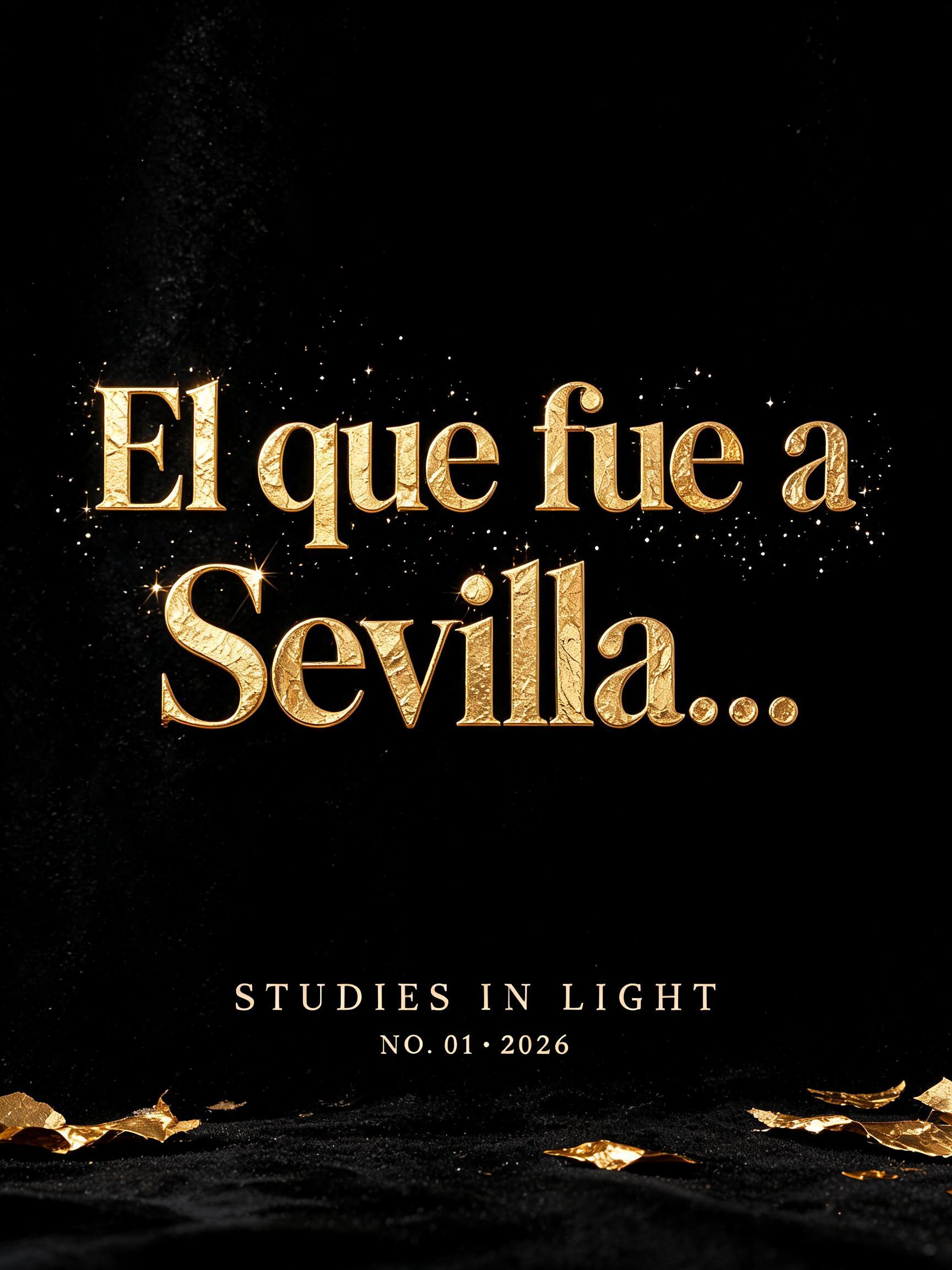
El que fue a Sevilla… - Ouro de Luxo Text Effect


Usa BytePlus Seedream 5.0, o modelo desta obra · 15 créditos
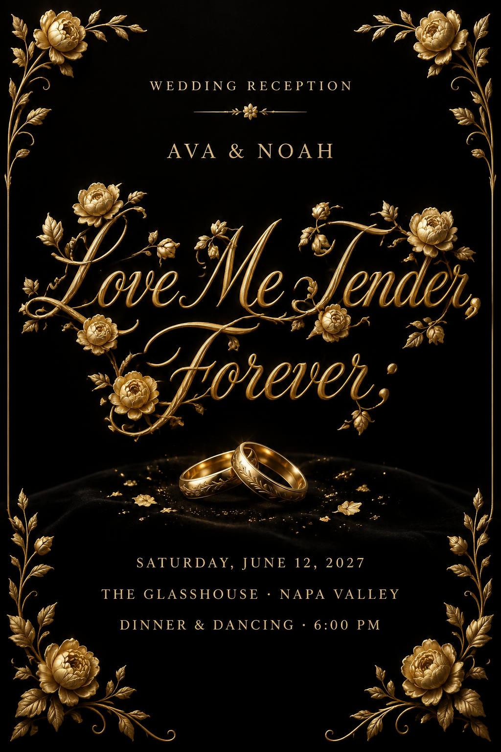
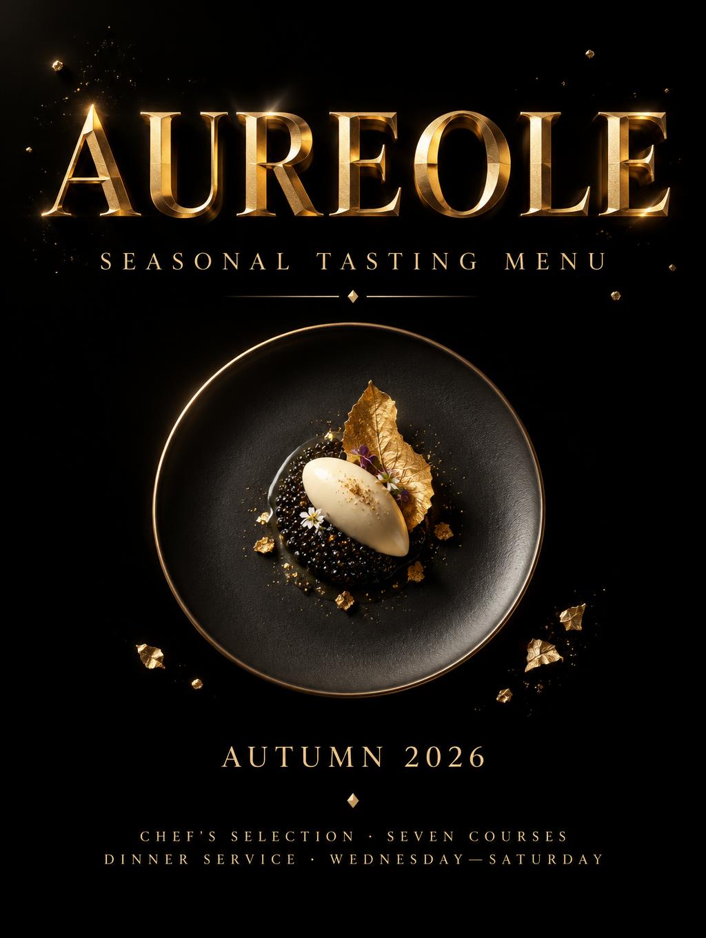
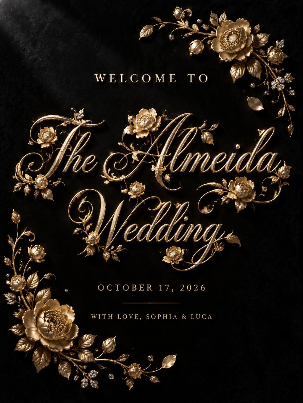


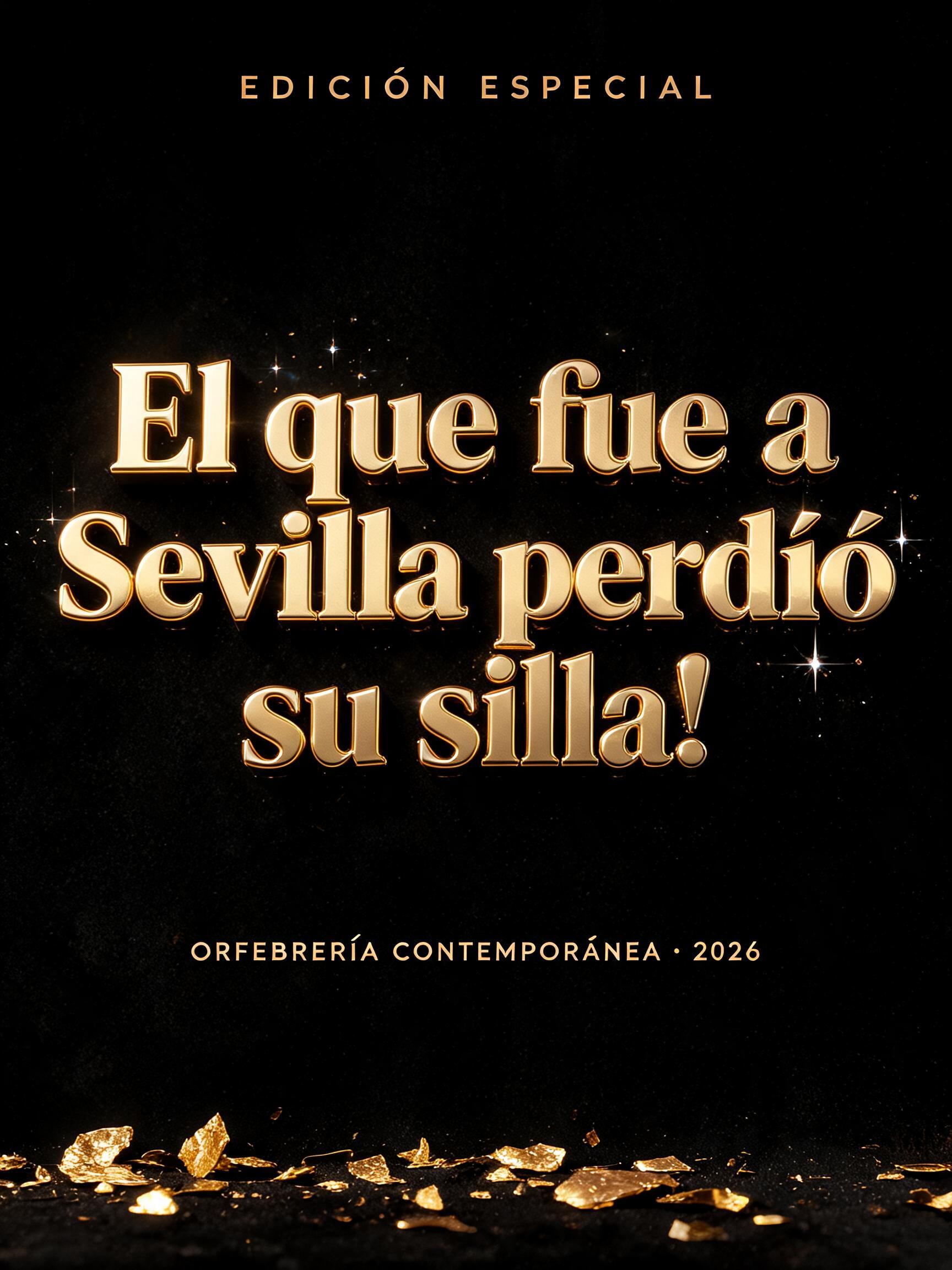
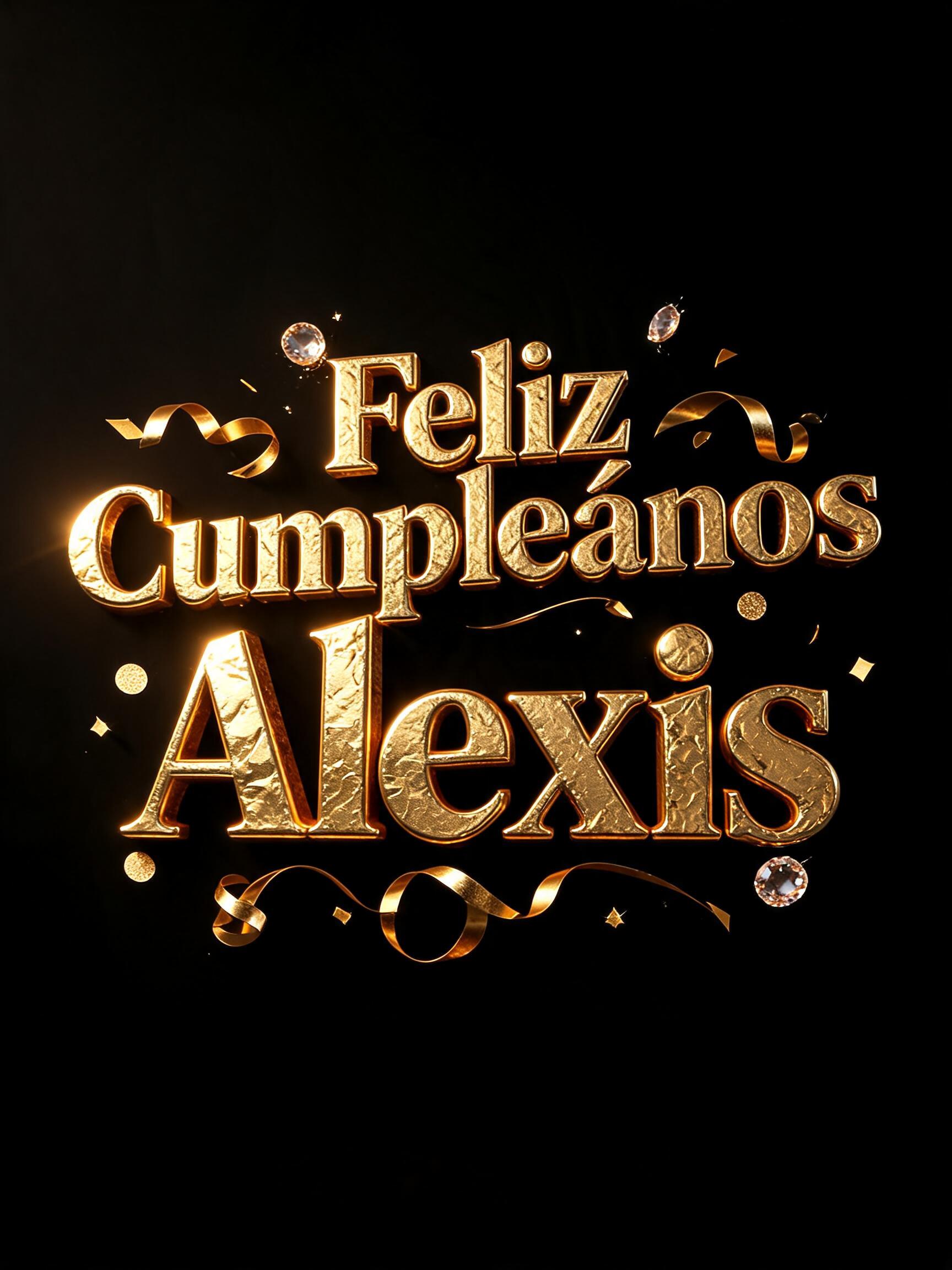

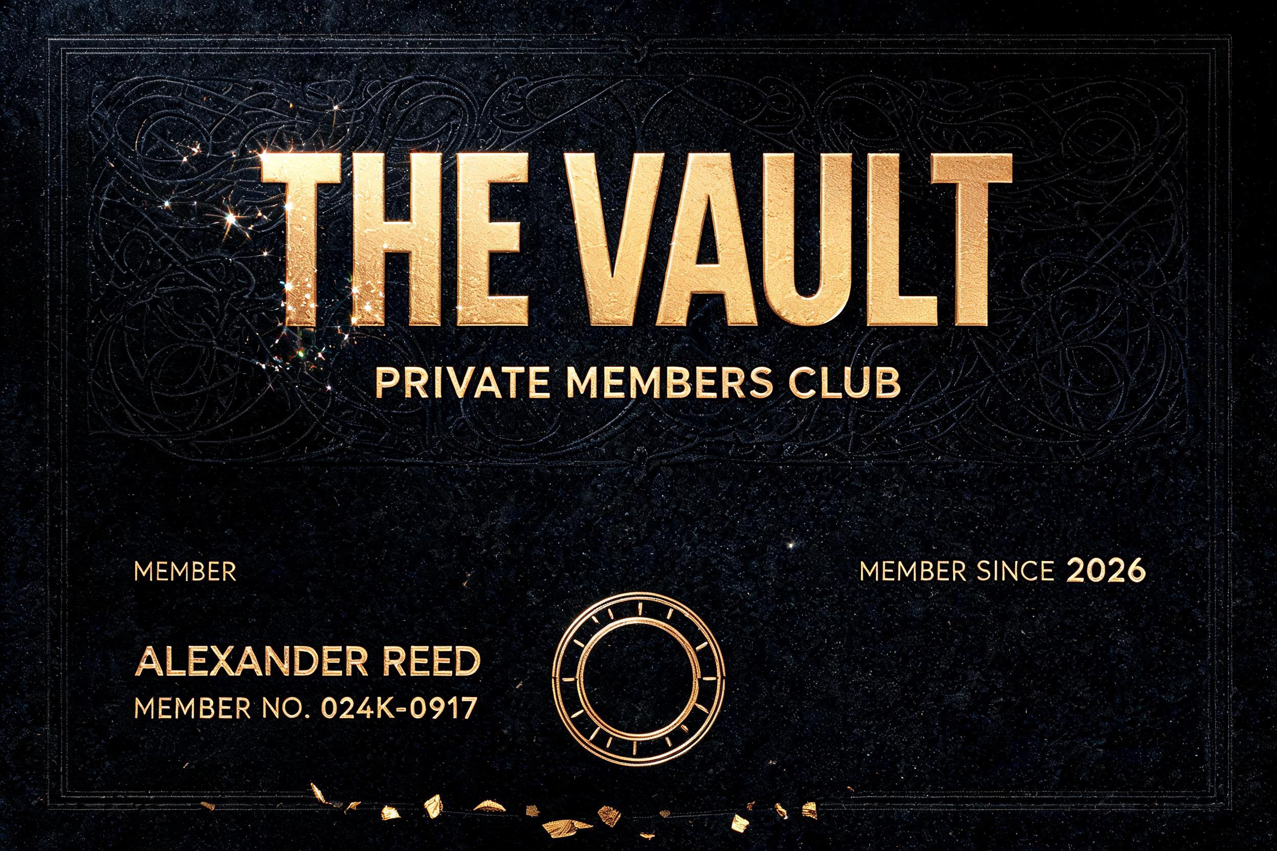
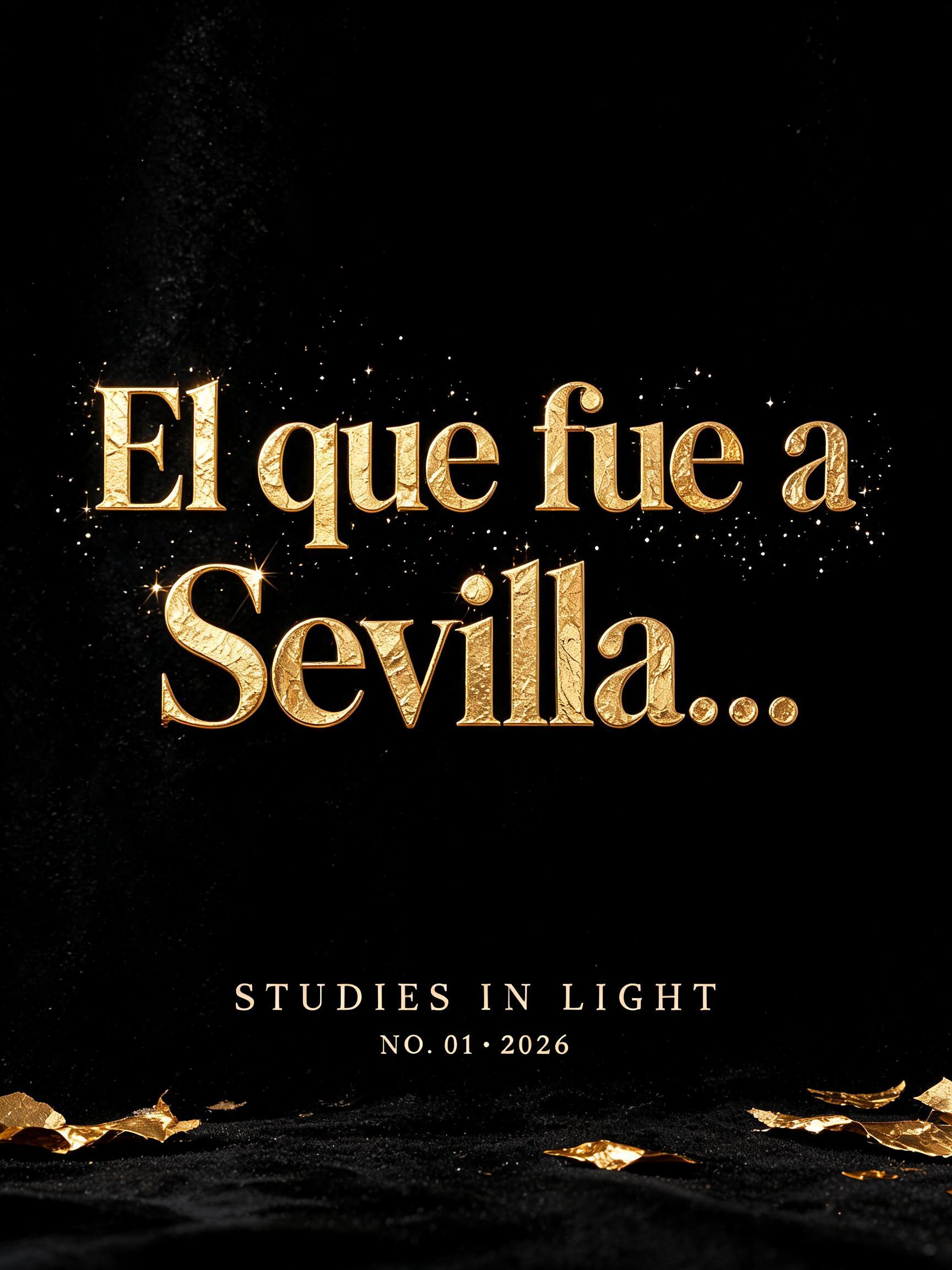
“El que fue a Sevilla…” is a Luxury Gold text effect efeito de texto criado com a IA da FontVibe. Maiúsculas pesadas de ouro fundido com um fino amassado de folha, sombras âmbar profundas nos recessos e brilhos especulares intensos, isoladas sobre preto sob um único holofote.
Create a 3:4 vertical typographic art-print poster, exact text only, with flawless spelling and no extra words. Absolute black velvet ground, absorbing all ambient light. Center the headline "GRACE" across the upper-middle in custom wide classical display serif capitals: generous Roman-influenced proportions, broad vertical stems, sharp but gently bracketed serifs, open counters, pronounced thick-thin contrast, carefully spaced. The letters are physically cast 24k gold with a subtly embossed 3D relief: rich deep amber-gold faces, microscopic crinkled gold-leaf texture, shallow molten reflective pools in the thicker strokes, razor-clean champagne-white specular edges. A single hard spotlight from upper left at 45 degrees produces broad highlights on vertical stems and long crisp shadows falling down-right. Keep thin hairlines refined and visible through reflected gold light. Sparse diamond-dust motes hover only around the headline, each a tiny pinpoint prism; a few torn gold-leaf fragments rest along the lower edge. Below the headline, centered with large breathing room, set "STUDIES IN LIGHT" in tiny tracked pale-gold capitals, flat fine-print ink rather than metal. At the bottom center set "NO. 01 · 2026" in even smaller pale-gold capitals. Maintain a strict symmetrical gallery-poster grid, generous black negative space, no border, no people, no objects beyond dust and leaf fragments. Photoreal macro material rendering, ray-traced reflections, controlled high contrast, sharp typography, print-ready detail. Create a 3:4 vertical typographic art-print poster, exact text only, with flawless spelling and no extra words. Absolute black velvet ground, absorbing all ambient light. Center the headline "El que fue a / Sevilla…" across the upper-middle in custom wide classical display serif capitals, stacked as a centered two-line title block with "Sevilla…" slightly larger: generous Roman-influenced proportions, broad vertical stems, sharp but gently bracketed serifs, open counters, pronounced thick-thin contrast, carefully spaced. The letters are physically cast 24k gold with a subtly embossed 3D relief: rich deep amber-gold faces, microscopic crinkled gold-leaf texture, shallow molten reflective pools in the thicker strokes, razor-clean champagne-white specular edges. A single hard spotlight from upper left at 45 degrees produces broad highlights on vertical stems and long crisp shadows falling down-right. Keep thin hairlines refined and visible through reflected gold light. Sparse diamond-dust motes hover only around the headline, each a tiny pinpoint prism; a few torn gold-leaf fragments rest along the lower edge. Below the headline, centered with large breathing room, set "STUDIES IN LIGHT" in tiny tracked pale-gold capitals, flat fine-print ink rather than metal. At the bottom center set "NO. 01 · 2026" in even smaller pale-gold capitals. Maintain a strict symmetrical gallery-poster grid, generous black negative space, no border, no people, no objects beyond dust and leaf fragments. Photoreal macro material rendering, ray-traced reflections, controlled high contrast, sharp typography, print-ready detail.
Gerada em 23 de setembro de 2026 · 1728 × 2304 · JPEG · BytePlus Seedream 5.0 · Compartilhada pelo criador · Uso comercial gratuito (CC BY 4.0)