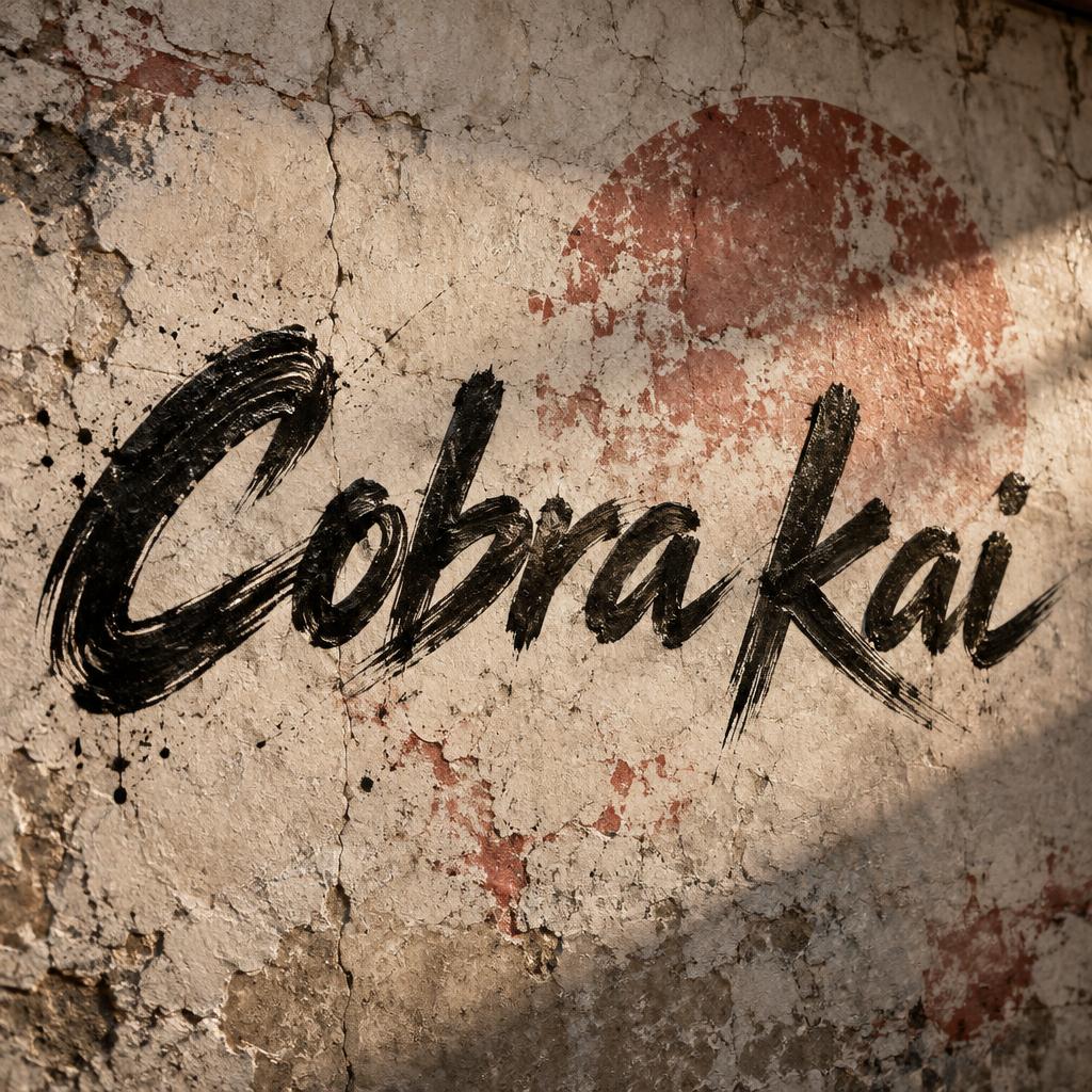
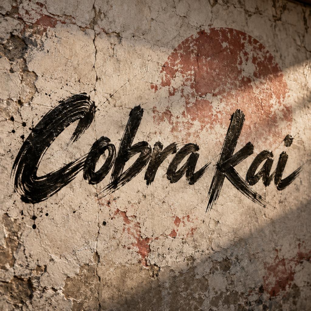
Cobra kai - Letras de Pincel Text Effect


Usa OpenAI GPT-Image-2.5 Sunburst, o modelo desta obra · 15 créditos






“Cobra kai” is a Brush Stroke text effect efeito de texto criado com a IA da FontVibe. Script de pincel ocidental com letras ligadas: traços descendentes grossos pela pressão, ascendentes finíssimos, marcas visíveis das cerdas e rastros de pincel seco em tinta preta quente sobre papel texturizado.
rendered as expressive Western brush script lettering with fluid connected strokes. Visible bristle texture with authentic thick-to-thin pressure variation — thick downstrokes, thin upstrokes, just like a loaded calligraphy brush. Ink slightly wet and glistening. Natural ink pooling at stroke starts, feathered dry-brush ending trails. Warm off-black ink on visible surface texture. Hand-crafted artisan energy with real brush imperfection. LETTERFORM PRIORITY: when the chosen font carries its own treatment, that font's letterform shapes take priority and own the letters; this style governs the brush-script medium, the thick-to-thin pressure variation and the ink wetness. FALLBACK MATERIAL: if the font carries no material of its own, render the letters as fluid connected brush-script strokes with thick downstrokes, thin upstrokes, wet pooling at starts and feathered dry-brush trails in warm off-black ink. COLOR PRIORITY: keep the font's own colors if specified; otherwise warm off-black ink on a textured surface. “Cobra kai” rendered as freshly painted Western brush-script lettering in dense warm off-black sumi ink, with fluid connected strokes, pronounced thick downstrokes and fine bristle-separated upstrokes. The ink has a wet reflective sheen across the heaviest curves, visible pooling at stroke starts and tight connections, with irregular dry-brush tapering at extended terminal trails. Place the lettering on a weathered bone-white dojo wall surface: chalky plaster, faint vertical cracks, rubbed charcoal scuffs, and sparse red mineral pigment smears behind the ink. A circular faded vermilion sun-disc stain, broken by worn plaster and brush scratches, sits in the surrounding surface atmosphere without obscuring readability. Low side light rakes across the wall, catching raised wet ink ridges and casting hairline shadows along the painted edges. Add sparse airborne dust and tiny dried ink flecks close to the strokes. Keep the text as the unmistakable focal element, with high legibility, handcrafted brush imperfections, controlled negative space, and no extra words, logos, emblems, people, weapons, or decorative typography.
Feito para Gerador de Letras Brush Script
Gerada em 26 de setembro de 2026 · 1024 × 1024 · JPEG · OpenAI GPT-Image-2.5 Sunburst · Compartilhada pelo criador · Uso comercial gratuito (CC BY 4.0)


