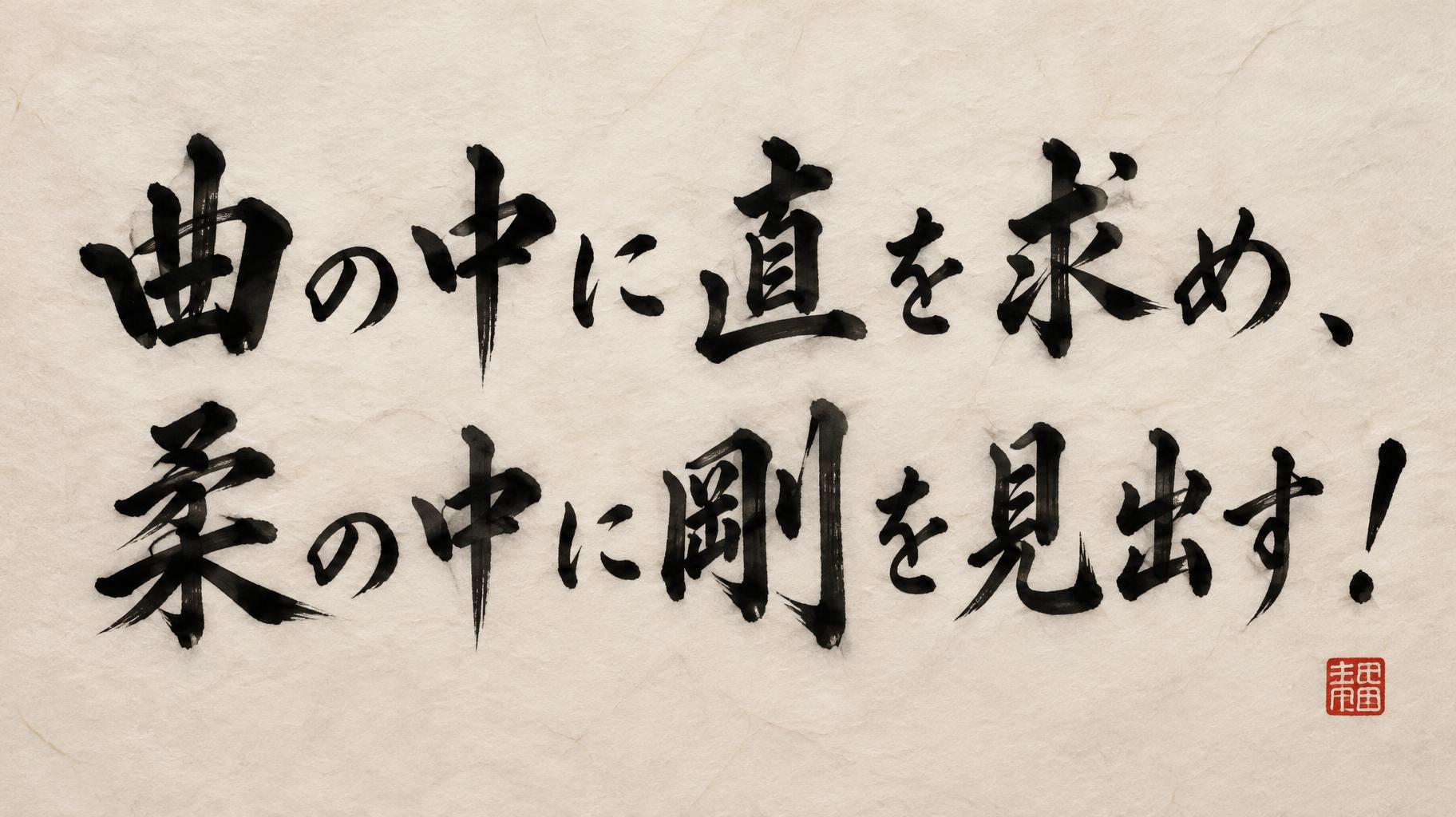
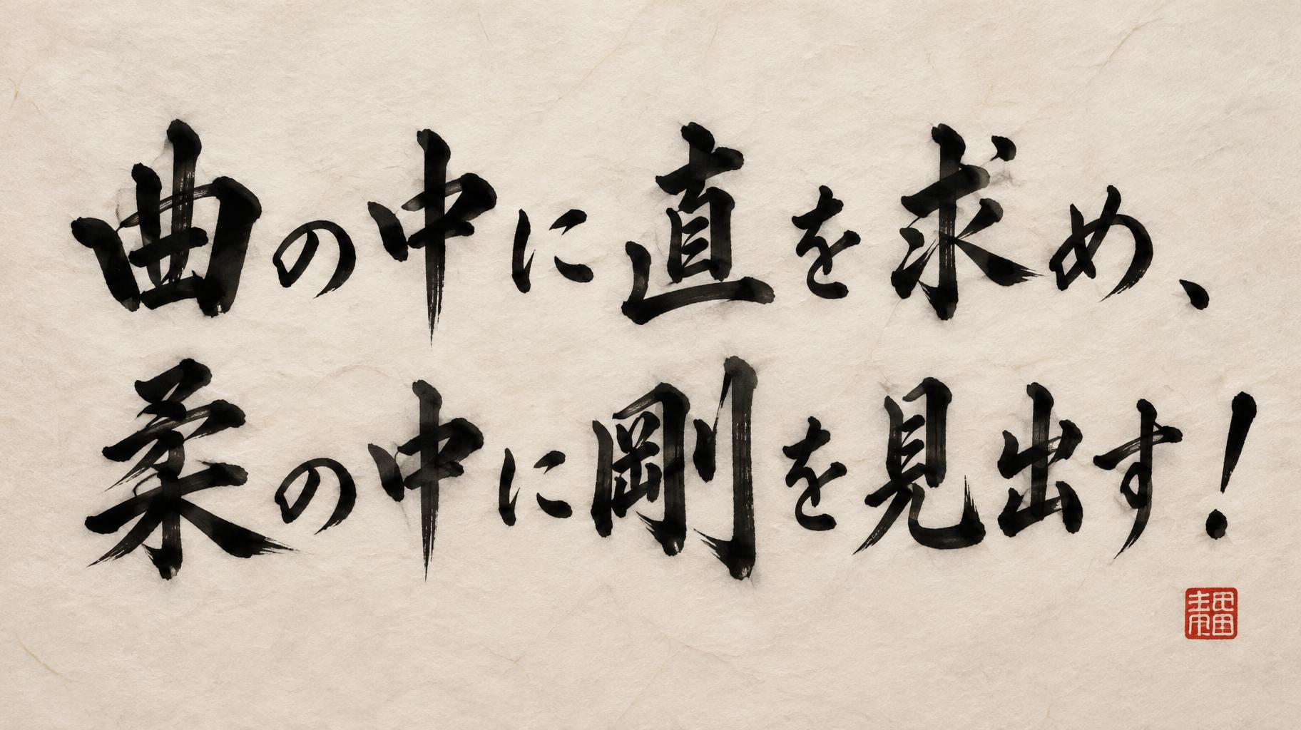
曲の中に直を求め、柔の中に剛を見出す! - Pincel de Tinta Japonês Text Effect


Usa OpenAI GPT-Image-2.5 Sunburst, o modelo desta obra · 15 créditos











“曲の中に直を求め、柔の中に剛を見出す!” is a Brush Japanese Ink text effect efeito de texto criado com a IA da FontVibe. O estilo de caligrafia com pincel de tinta do shodo japonês aplicado às letras latinas. Tinta sumi preta e profunda com a energia autêntica do pincel fude, traços controlados numa única direção e atmosfera de papel washi. Perfeito para marcas de restaurantes japoneses, design de tatuagem, anime, artes marciais e projetos culturais.
Japanese ink brush aesthetic — the visual language of sumi calligraphy on washi paper. INK MEDIUM: sumi pigment in deep black to charcoal range — richest density at mark centers, naturally transitioning outward as ink supply depletes. Fully matte, absorbed into paper surface, producing a tonal range from dense opaque black to transparent grey depending on dilution and brush load. PAPER SURFACE: natural washi — warm cream-white base with visible paper fiber structure giving slight texture. The absorbent surface creates the characteristic soft border quality of East Asian brush work at all mark edges. LIGHT ATMOSPHERE: soft diffuse north-facing studio light — the traditional calligrapher's light source. Even, shadowless, allowing the full tonal range of ink marks to read clearly. Warm cream paper tone contrasts against deep sumi black. AESTHETIC REGISTER: the ma principle — the space between and around marks is as considered as the marks themselves. Compositions have breathing room and deliberate quietness. When no specific material is defined by the font: default environment — deep sumi black marks on warm cream washi paper, soft diffuse overhead light, meditative studio atmosphere. Japanese sumi ink calligraphy rendering the exact text “曲の中に直を求め、柔の中に剛を見出す!” on natural warm cream washi paper with clearly visible long paper fibers, faint deckled texture, and subtle absorbent grain. The characters carry a disciplined alternation of force and restraint: dense near-black pools at brush entry points, broad pressure-loaded marks resolving into dry-brush charcoal streaks, and fine pull-away terminals where diluted ink fades to pale gray. Within the same phrase, rounded ink curves are balanced by abrupt angular cuts and compressed dark strokes, making softness and rigidity visible through brush pressure, speed, and changing ink load. Edges feather naturally into the washi fibers, with restrained capillary bleed and occasional dry-bristle gaps exposing the paper beneath. A few tiny sumi droplets appear only near the most forceful stroke entries; no decorative illustration, no ornamental border, no extra words. Generous untouched paper surrounds the calligraphy, preserving deliberate ma negative space. Soft diffuse north-facing studio light, shadowless matte surface, full tonal separation between black, charcoal, and translucent gray ink. A small weathered vermilion hanko seal is present as a quiet accent, without competing with the rendered text.
Feito para Gerador de Fontes Japonesas
Gerada em 1 de outubro de 2026 · 1824 × 1024 · JPEG · OpenAI GPT-Image-2.5 Sunburst · Compartilhada pelo criador · Uso comercial gratuito (CC BY 4.0)


