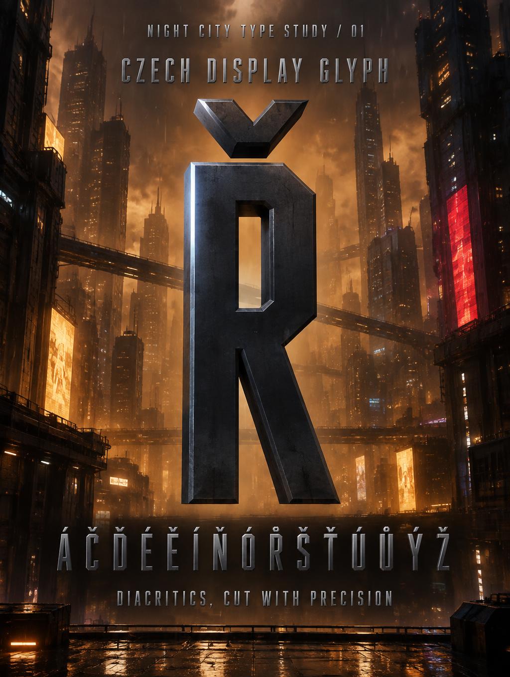
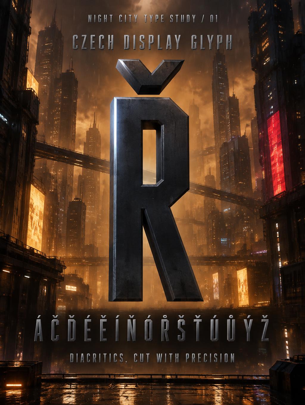
Ř CZECH DISPLAY GLYPH Á Č Ď É Ě Í Ň Ó Ř Š Ť Ú Ů Ý Ž DIACRITICS, CUT WITH PRECISION NIGHT CITY TYPE STUDY / 01 - Cyberpunk 2077 Text Effect

Usa OpenAI GPT-Image-2.5 Sunburst, o modelo desta obra · 15 créditos






“Ř CZECH DISPLAY GLYPH Á Č Ď É Ě Í Ň Ó Ř Š Ť Ú Ů Ý Ž DIACRITICS, CUT WITH PRECISION NIGHT CITY TYPE STUDY / 01” is a Cyberpunk 2077 text effect efeito de texto criado com a IA da FontVibe. Inspiradas na estética icônica de Night City: letras cromadas em amarelo e vermelho, com cortes angulares e uma atmosfera encharcada de neon.
Create a complete vertical 3:4 typographic specimen poster for a modern display font featuring Czech characters. Render all quoted copy exactly, with correct Czech diacritics and no extra text. Hierarchy: a small top eyebrow “NIGHT CITY TYPE STUDY / 01”; supporting line “CZECH DISPLAY GLYPH”; the dominant headline “Ř”; a clearly readable specimen line “Á Č Ď É Ě Í Ň Ó Ř Š Ť Ú Ů Ý Ž”; and the closing line “DIACRITICS, CUT WITH PRECISION”. Use Cyber Condensed letter construction throughout: extremely narrow glyphs, approximately 30–40% as wide as their height, heavy modular strokes, flat 90-degree terminals, tight spacing, and precise 45-degree chamfer notches at stroke junctions. Make the headline Ř enormous and unmistakable, with its caron correctly placed above the R and its diagonal leg clearly visible. The headline and all specimen characters are machined cold matte gunmetal steel (#1A1A2E), with a narrow cold blue-white precision highlight on each stroke’s left edge and near-black right and lower faces. No glow and no chromatic aberration on the letters. Set the eyebrow in the top 5–9%, the supporting line at 11–18%, the headline across the central 23–65%, the Czech character row at 73–81%, and the closing line at 88–94%. Keep all copy inside generous poster margins and separate the text tiers. The headline dominates; the row of Czech glyphs is large enough to inspect at a glance. Stage the type as a monumental machined metal specimen in a Night City megabuilding canyon: layered towers, amber fog, restrained rain streaks, distant warm gold and red signage, cool blue-violet windows, and a faint corporate grid behind the lettering. Put a soft amber haze behind the central glyph for clear contrast with its dark gunmetal body. Use a hard overhead corporate spotlight to catch the glyph’s narrow left edges; retain deep under-stroke shadows. High-contrast cinematic lighting, precise beveled geometry, crisp typography, detailed architectural depth, polished digital render. Background is not flat black. Keep the warm city palette in the environment, not as a fill on the letter faces. No logos, extra copy, or misshapen diacritics.
Gerada em 1 de outubro de 2026 · 1024 × 1360 · JPEG · OpenAI GPT-Image-2.5 Sunburst · Layout: Glyph Specimen Stack · Compartilhada pelo criador · Uso comercial gratuito (CC BY 4.0)