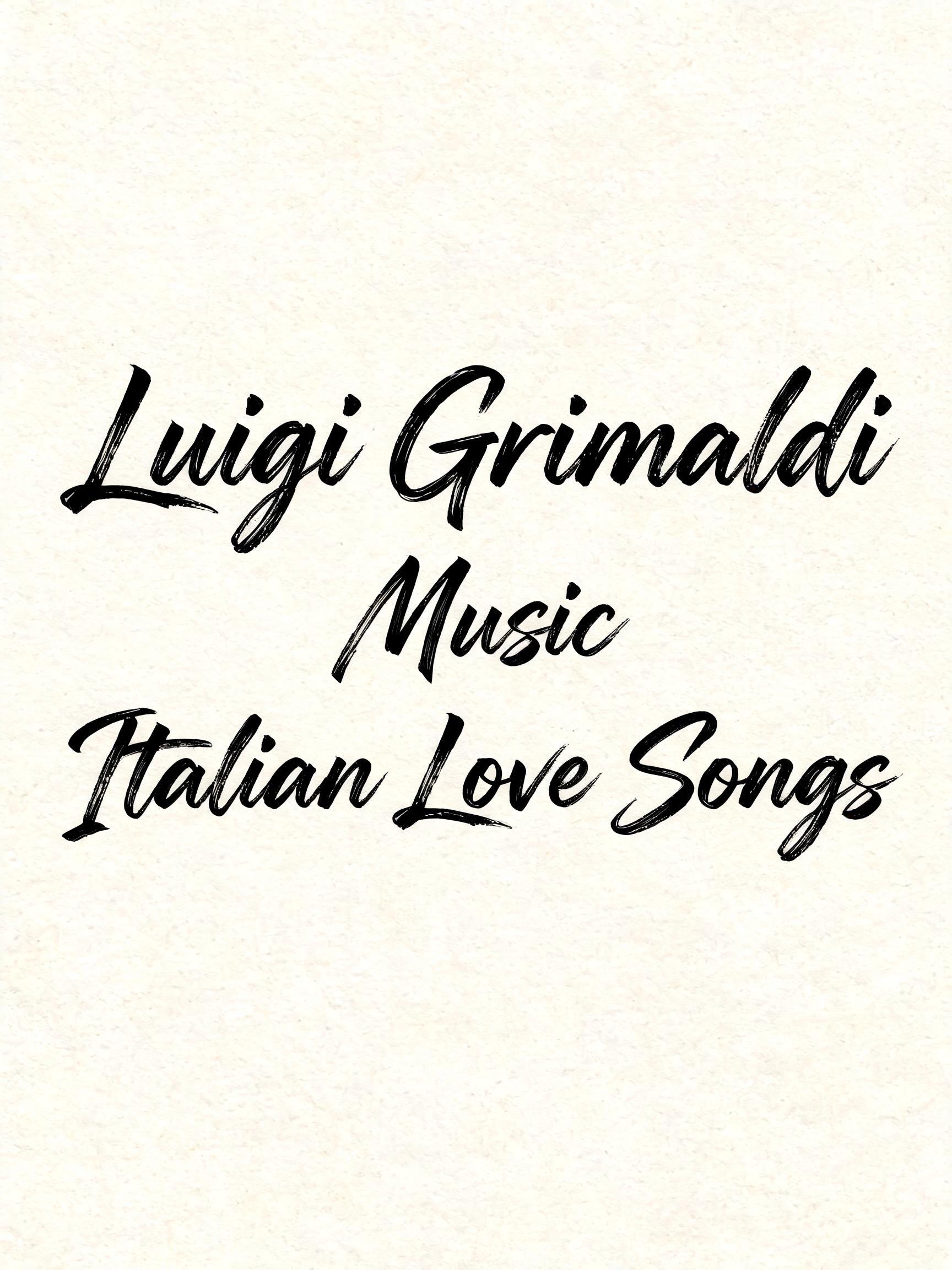
Luigi Grimaldi Music Italian Love Songs - Letras de Pincel Text Effect


Usa BytePlus Seedream 5.0, o modelo desta obra · 15 créditos






“Luigi Grimaldi Music Italian Love Songs” is a Brush Stroke text effect efeito de texto criado com a IA da FontVibe. Script de pincel ocidental com letras ligadas: traços descendentes grossos pela pressão, ascendentes finíssimos, marcas visíveis das cerdas e rastros de pincel seco em tinta preta quente sobre papel texturizado.
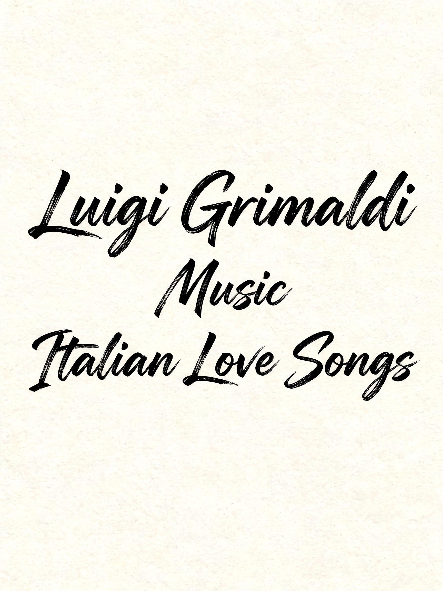
rendered as expressive Western brush script lettering with fluid connected strokes. Visible bristle texture with authentic thick-to-thin pressure variation — thick downstrokes, thin upstrokes, just like a loaded calligraphy brush. Ink slightly wet and glistening. Natural ink pooling at stroke starts, feathered dry-brush ending trails. Warm off-black ink on visible surface texture. Hand-crafted artisan energy with real brush imperfection. LETTERFORM PRIORITY: when the chosen font carries its own treatment, that font's letterform shapes take priority and own the letters; this style governs the brush-script medium, the thick-to-thin pressure variation and the ink wetness. FALLBACK MATERIAL: if the font carries no material of its own, render the letters as fluid connected brush-script strokes with thick downstrokes, thin upstrokes, wet pooling at starts and feathered dry-brush trails in warm off-black ink. COLOR PRIORITY: keep the font's own colors if specified; otherwise warm off-black ink on a textured surface. Portrait 3:4 composition with the exact text arranged in three centered lines: “Luigi Grimaldi” on the dominant upper line, “Music” centered beneath at a smaller scale, and “Italian Love Songs” spanning the lower line. The lettering occupies at least 88% of the canvas width, with the longest lines extending almost to both frame edges. Dead-center vertical alignment; no margins, no separate logo mark, no ornamental objects, no scenery. Each line is rendered in warm off-black brush ink on a flat ivory cotton-paper field with extremely subtle pressed-fiber grain. Freshly applied ink has a narrow wet sheen along the thickest passages, dense pooling at stroke starts and connected joins, visible individual bristle tracks at direction changes, and feathered dry-brush tapering at terminal sweeps. Thick painted passages carry soft irregular edges and minute ink bleed into the paper fibers; thin connecting passages remain sharp and continuous. Use tight line spacing so the three text lines read as one dense hand-painted composition. Soft frontal studio illumination reveals the wet-ink highlights without casting shadows. The words are the only visual content in the frame.
Gerada em 2 de outubro de 2026 · 1728 × 2304 · JPEG · BytePlus Seedream 5.0 · Layout: Gigante · Compartilhada pelo criador · Uso comercial gratuito (CC BY 4.0)