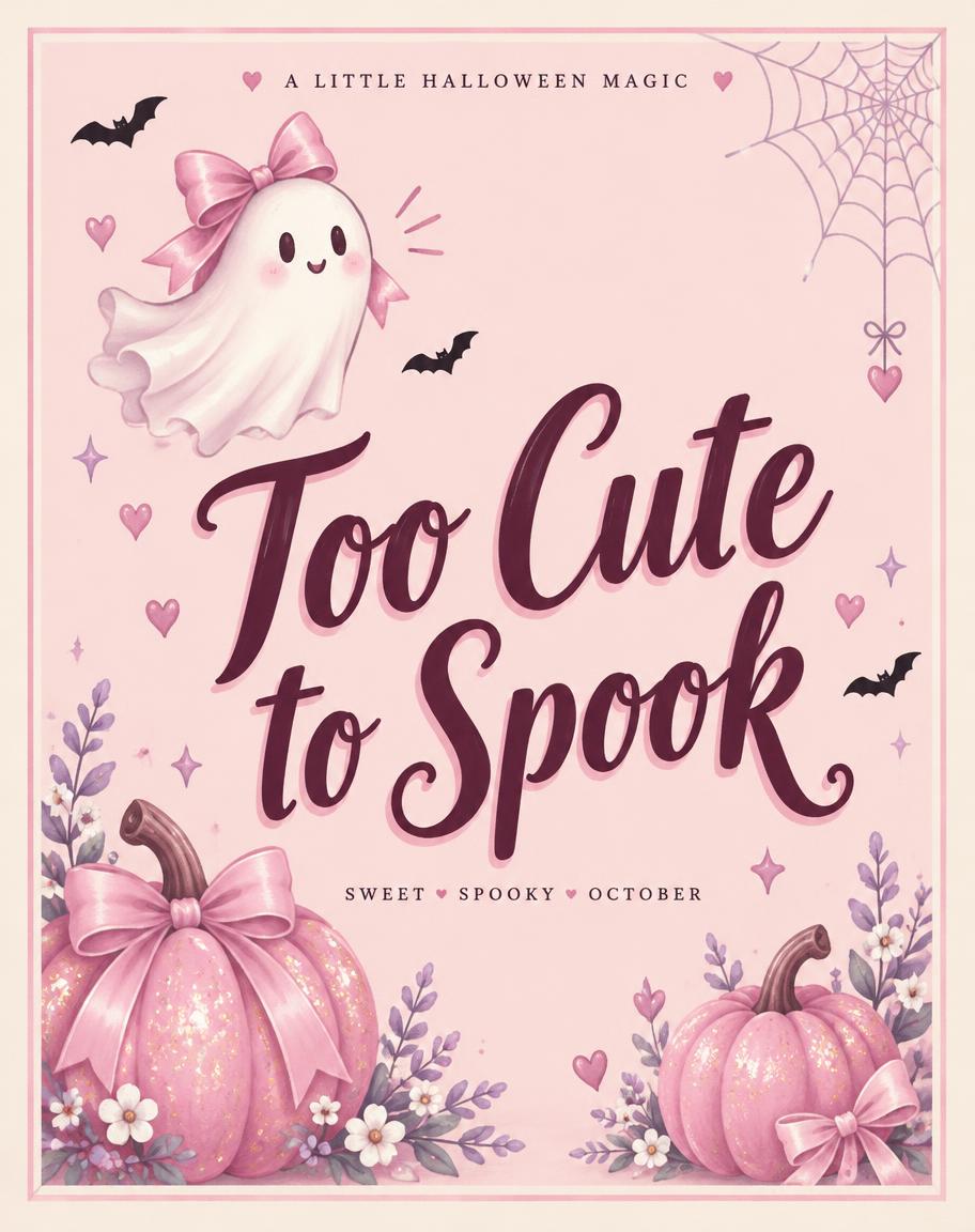
Too Cute to Spook A LITTLE HALLOWEEN MAGIC SWEET • SPOOKY • OCTOBER - Halloween Rosa Text Effect

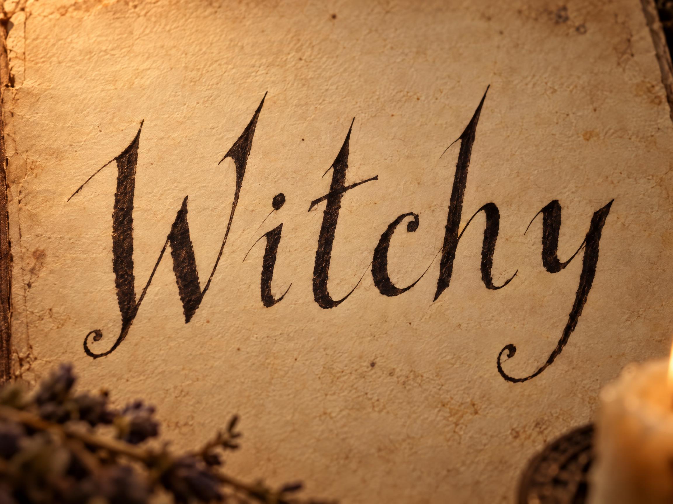
Usa OpenAI GPT-Image-2.5 Sunburst, o modelo desta obra · 15 créditos
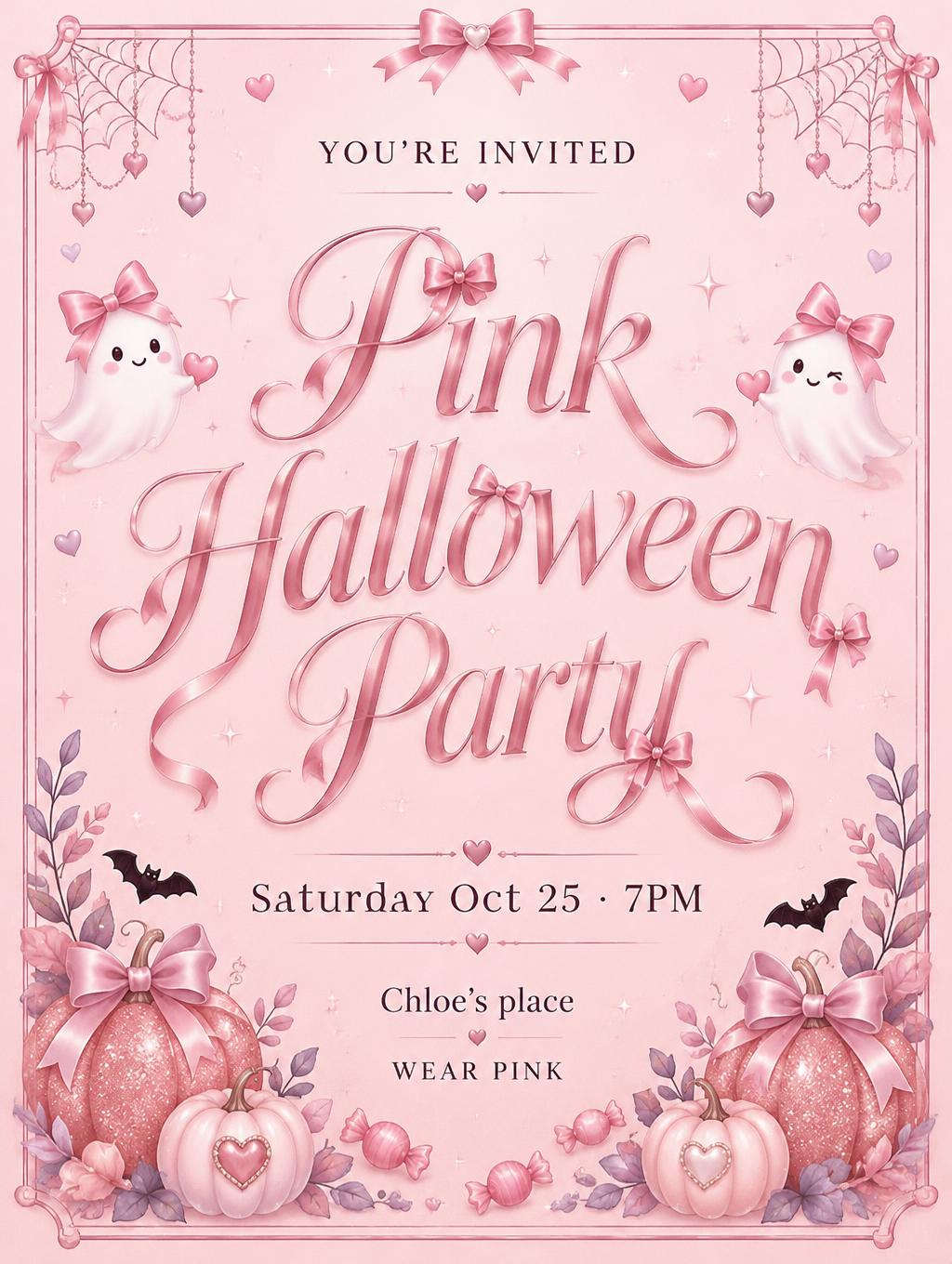
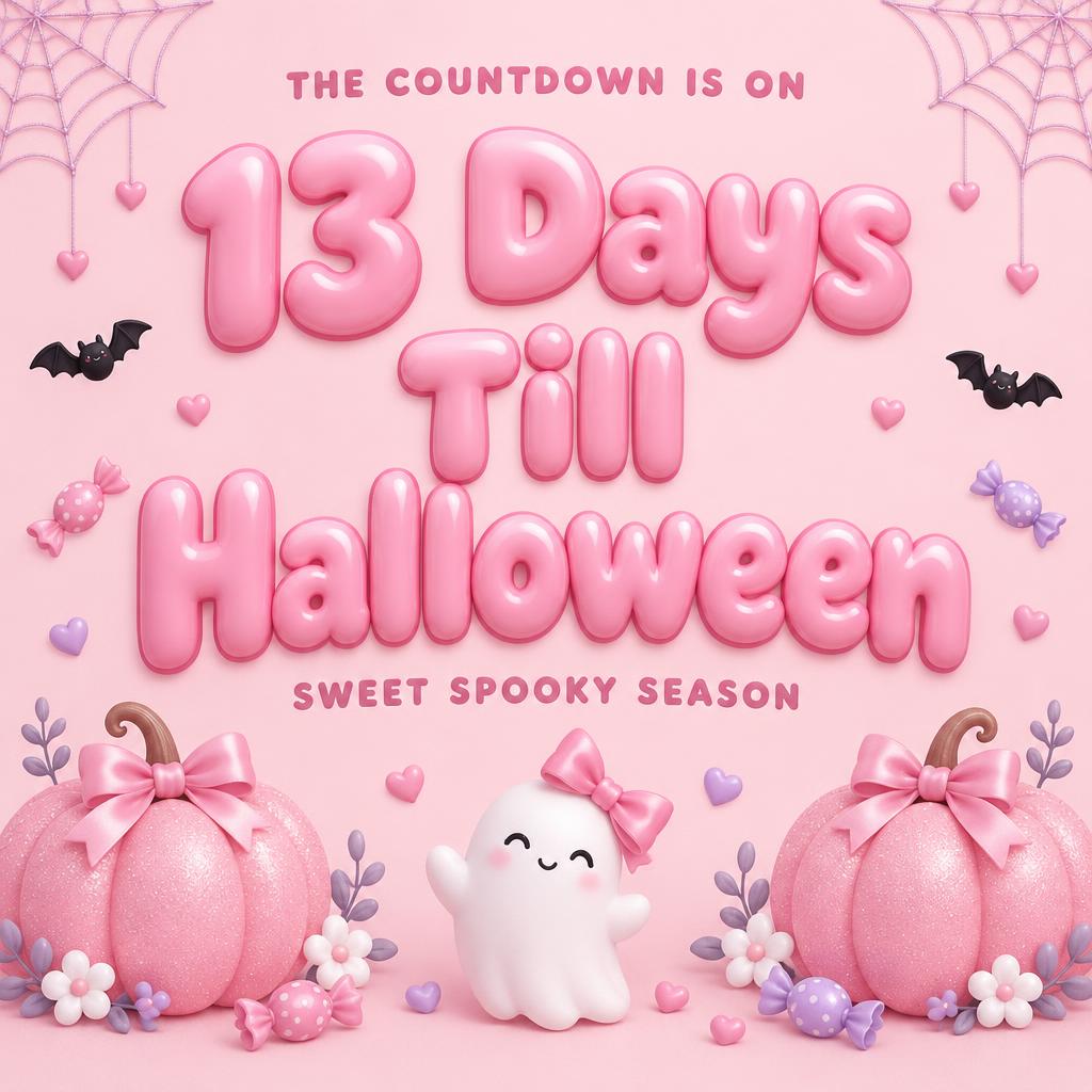
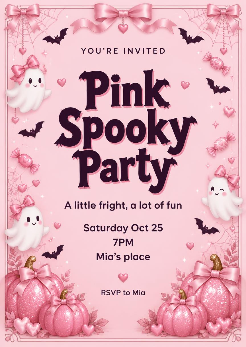
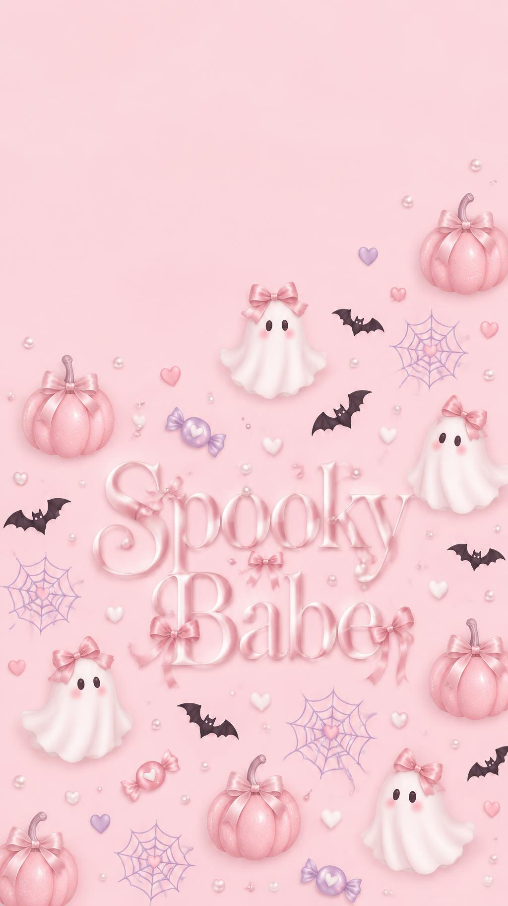
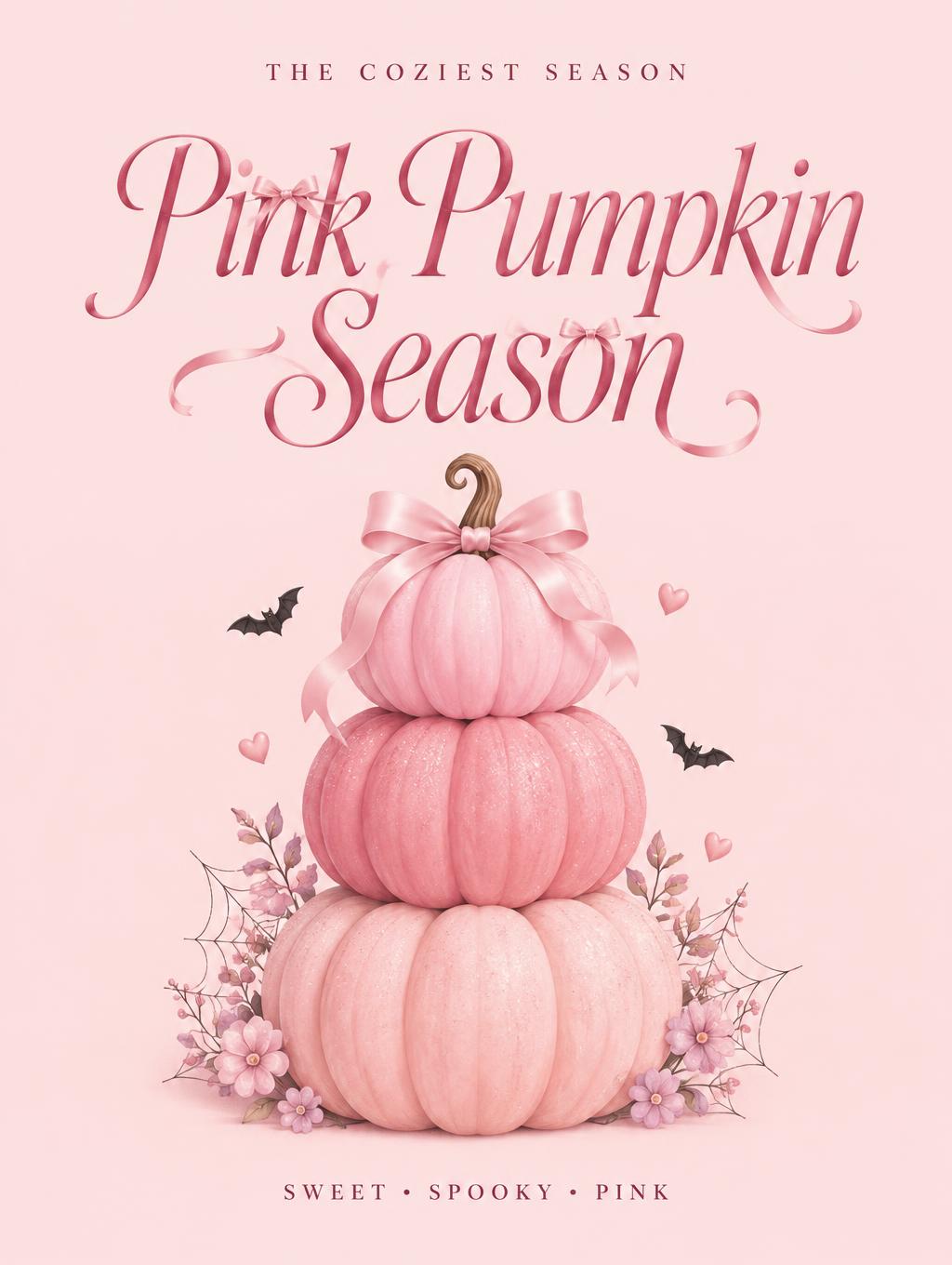
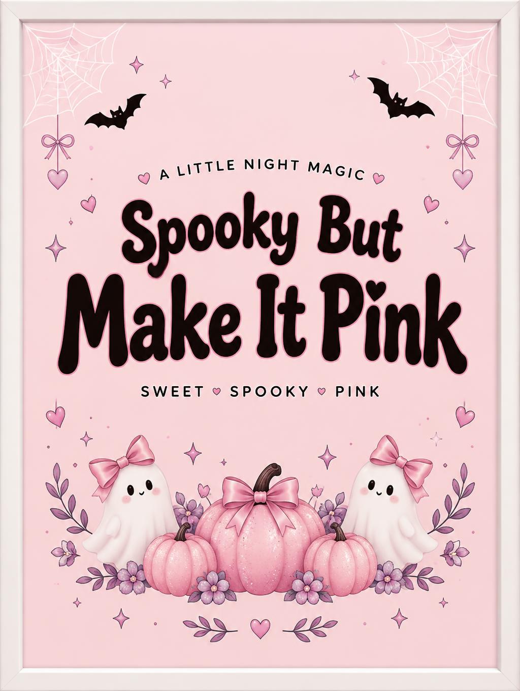
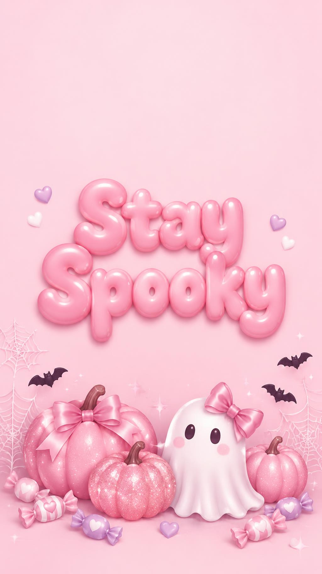
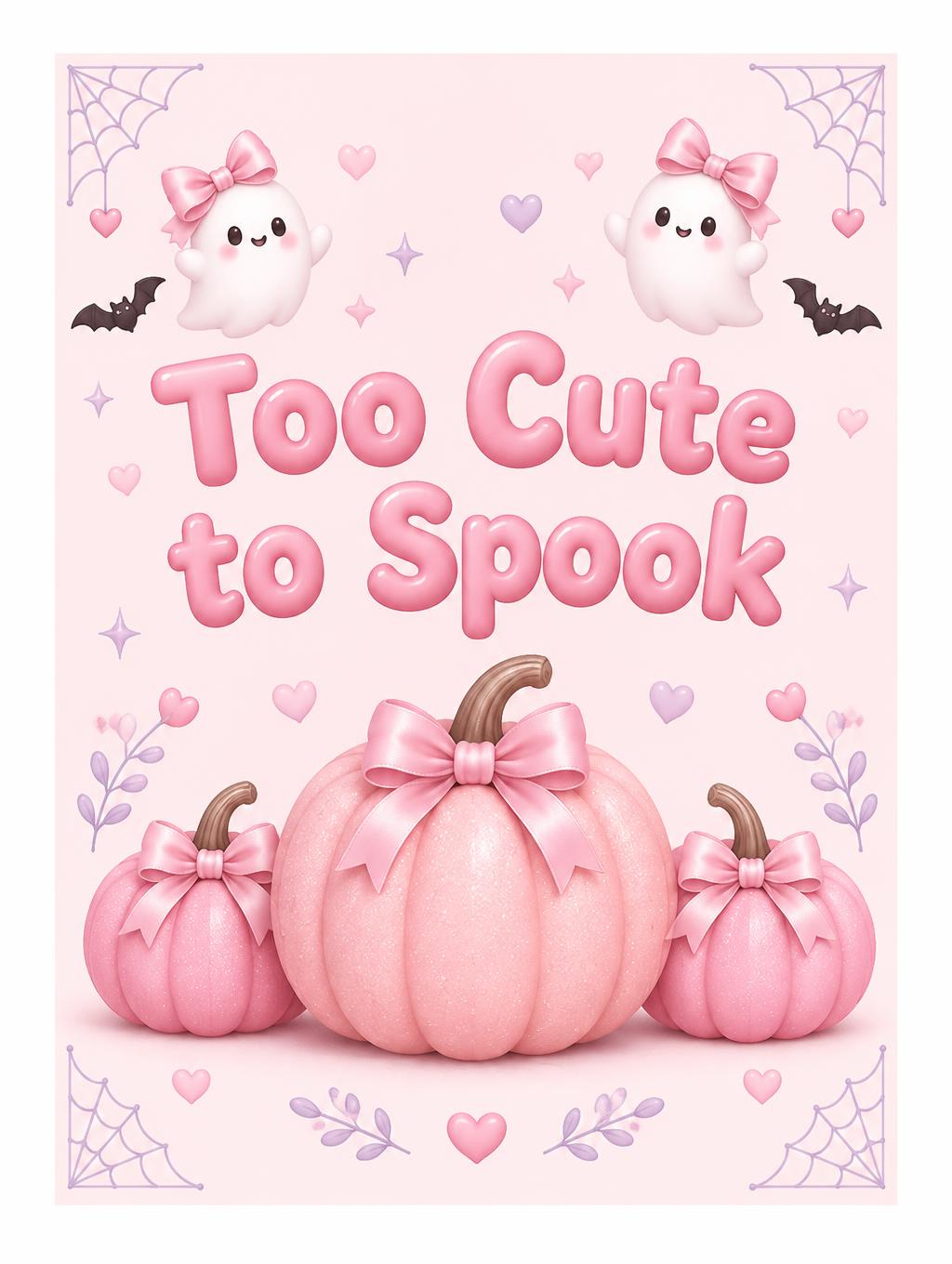
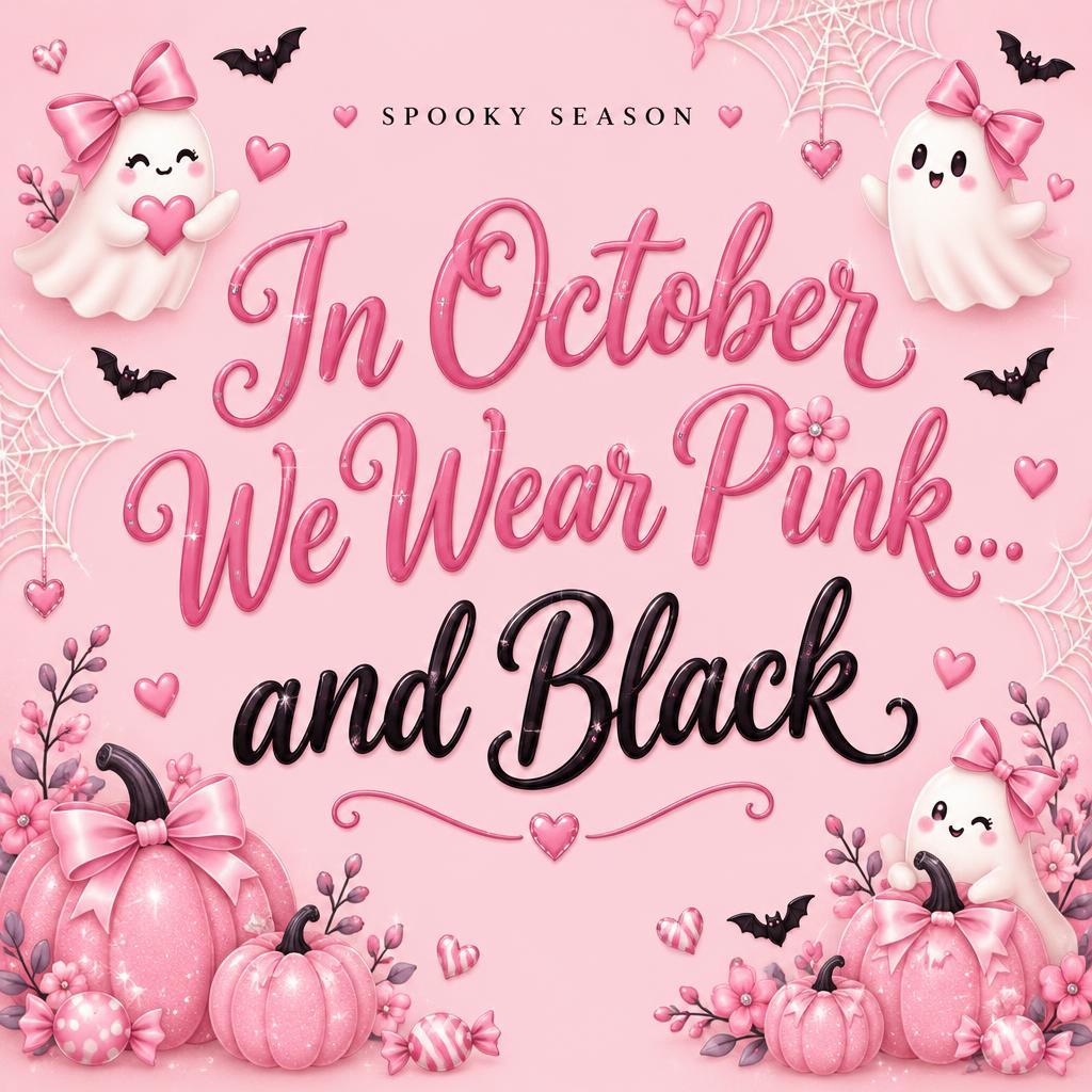
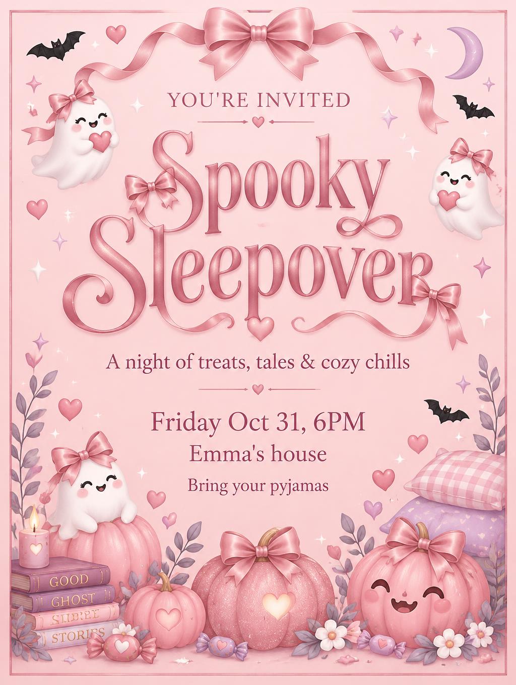
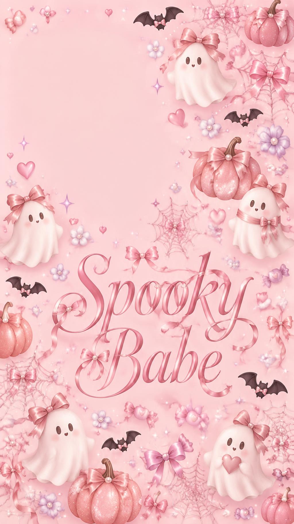
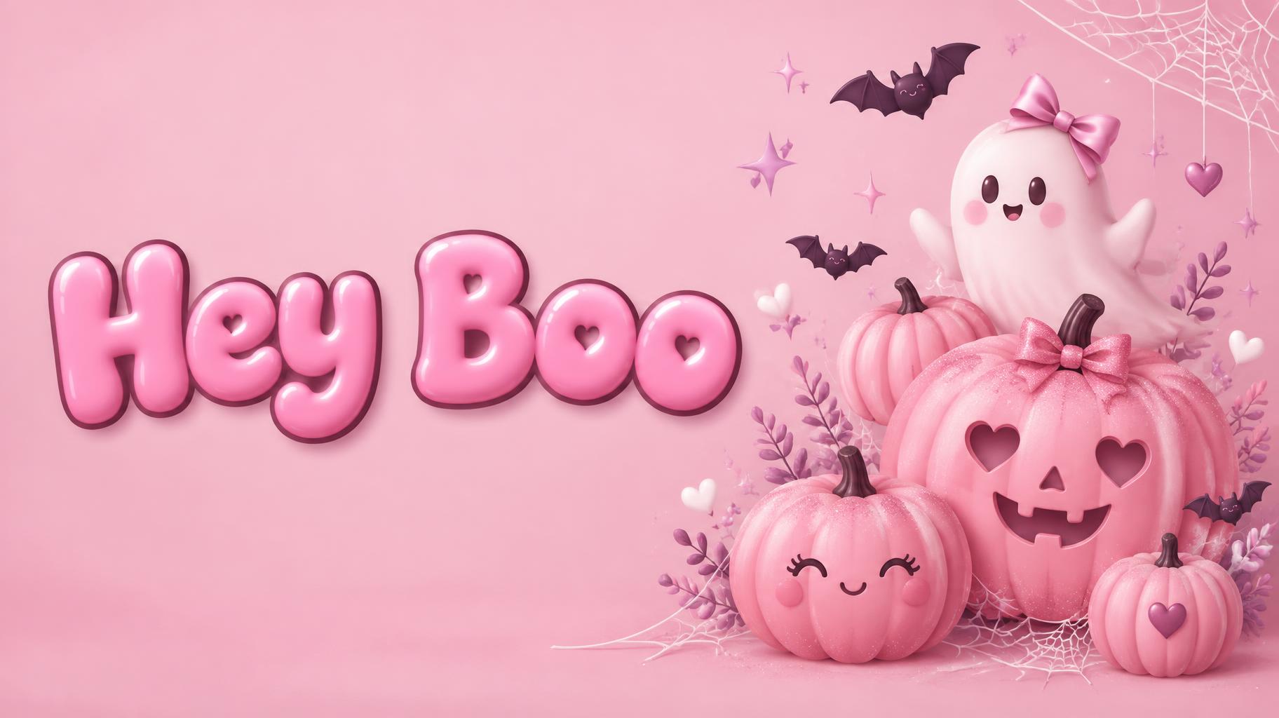
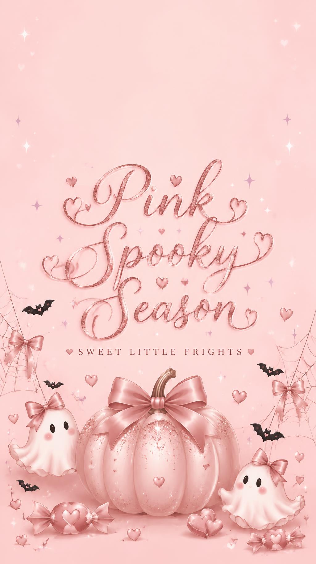
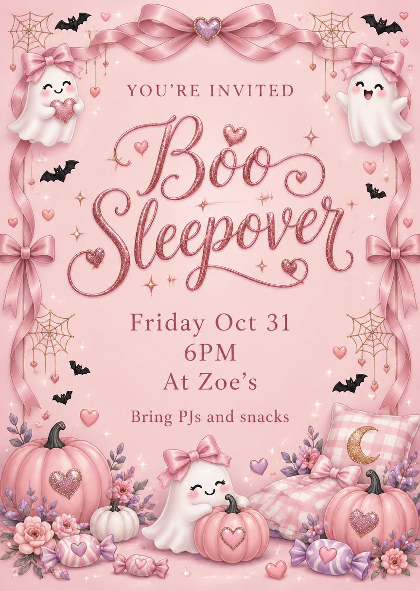

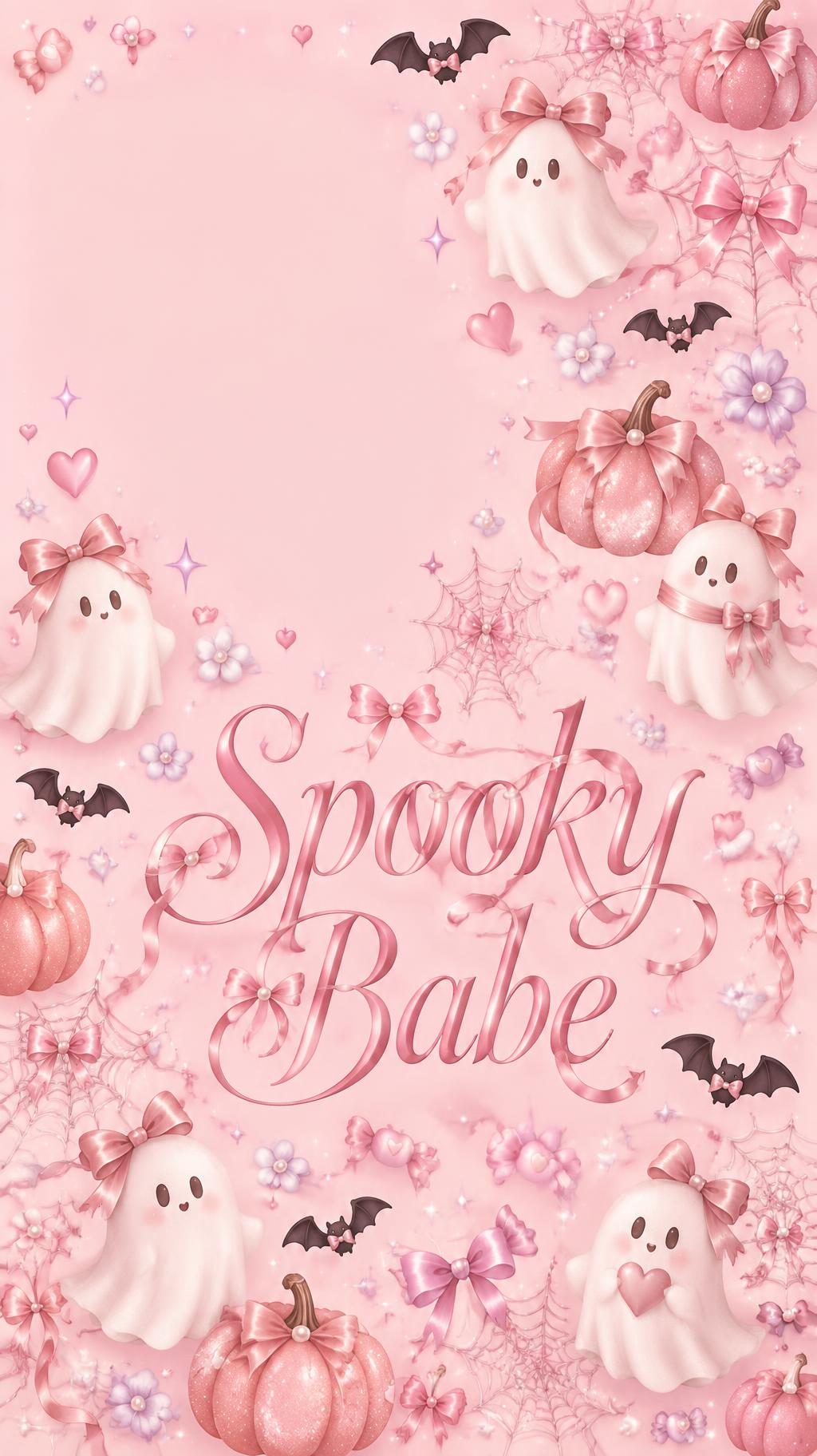
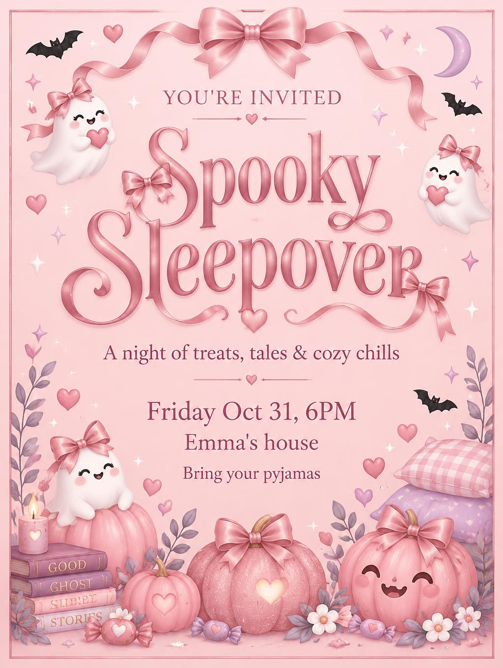
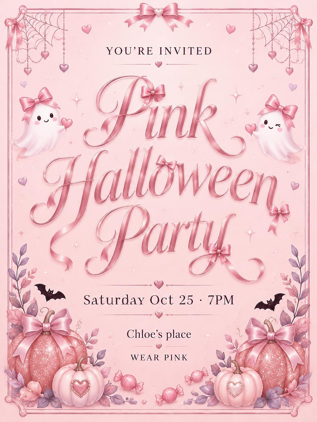
"Too Cute to Spook" é um pôster de Halloween em um suave estilo coquette rosa. Um script cor de ameixa escura em duas linhas sobre fundo rosa claro, com um fantasma de laço rosa, pequenos morcegos, uma teia de aranha, abóboras rosa com glitter e flores lilás ao redor. Troque o título, a frase superior e a linha inferior para adaptá-lo à sua festa, loja ou mensagem.
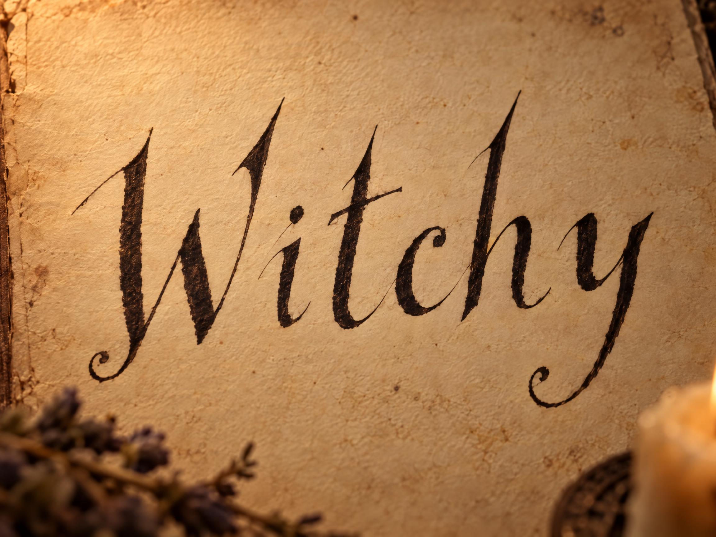
Create a finished 4:5 portrait bedroom wall-art print, composed like a framed illustration with a generous, clean cream outer margin and a fine blush inner border. In the central open area, set the exact headline on two centered lines, “Too Cute” and “to Spook”, as one phrase, large and immediately legible. Use playful witchy hand-lettering written with a sharp dip pen: mostly unjoined letters, slant about 15 degrees right, hairline upstrokes and noticeably heavier downstrokes, open counters, gently hopping baselines, and straight pointed tops on every capital and ascender—never loops or curls at the tops. Only baseline finishes and descender tails get small tight curls. Render the lettering as crisp, flat matte deep-berry ink with a subtle soft-pink offset shadow; keep strokes bold enough to read as bedroom wall art. Above the headline, set the small centered line “A LITTLE HALLOWEEN MAGIC” in neat, widely tracked small caps. Below it, set “SWEET • SPOOKY • OCTOBER” in tiny centered small caps. Build the illustration around—not over—the words: a sweet pink bow-wearing ghost floating just above the headline at one side, and two rosy pink pumpkins with fine glitter flecks gathered near the lower corners. Add a few tiny black bats, small hearts, lilac accents, a delicate fine-line cobweb in one upper corner, and a small satin sheen on the ghost’s bow. Keep the central lettering area calm and uncluttered. Soft blush background, even gentle light, soft shadows only, matte flat illustration with crisp print edges. Use bubblegum and blush pink as the dominant colors, cream for the margin, touches of lilac and white, and black only in tiny bats and restrained contrast details. Entire piece should feel sweet, charming and polished—not scary; no orange-and-black Halloween palette, no extra words, no mockup, no visible frame hardware.
Tags
Gerada em 19 de outubro de 2026 · 912 × 1152 · JPEG · OpenAI GPT-Image-2.5 Sunburst · Layout: Cream-Margin Print · Compartilhada pelo criador · Uso comercial gratuito (CC BY 4.0)