FontVibe - Duotone Text Effect


Usa ByteDance Seedream 5.0, o modelo desta obra · 15 créditos
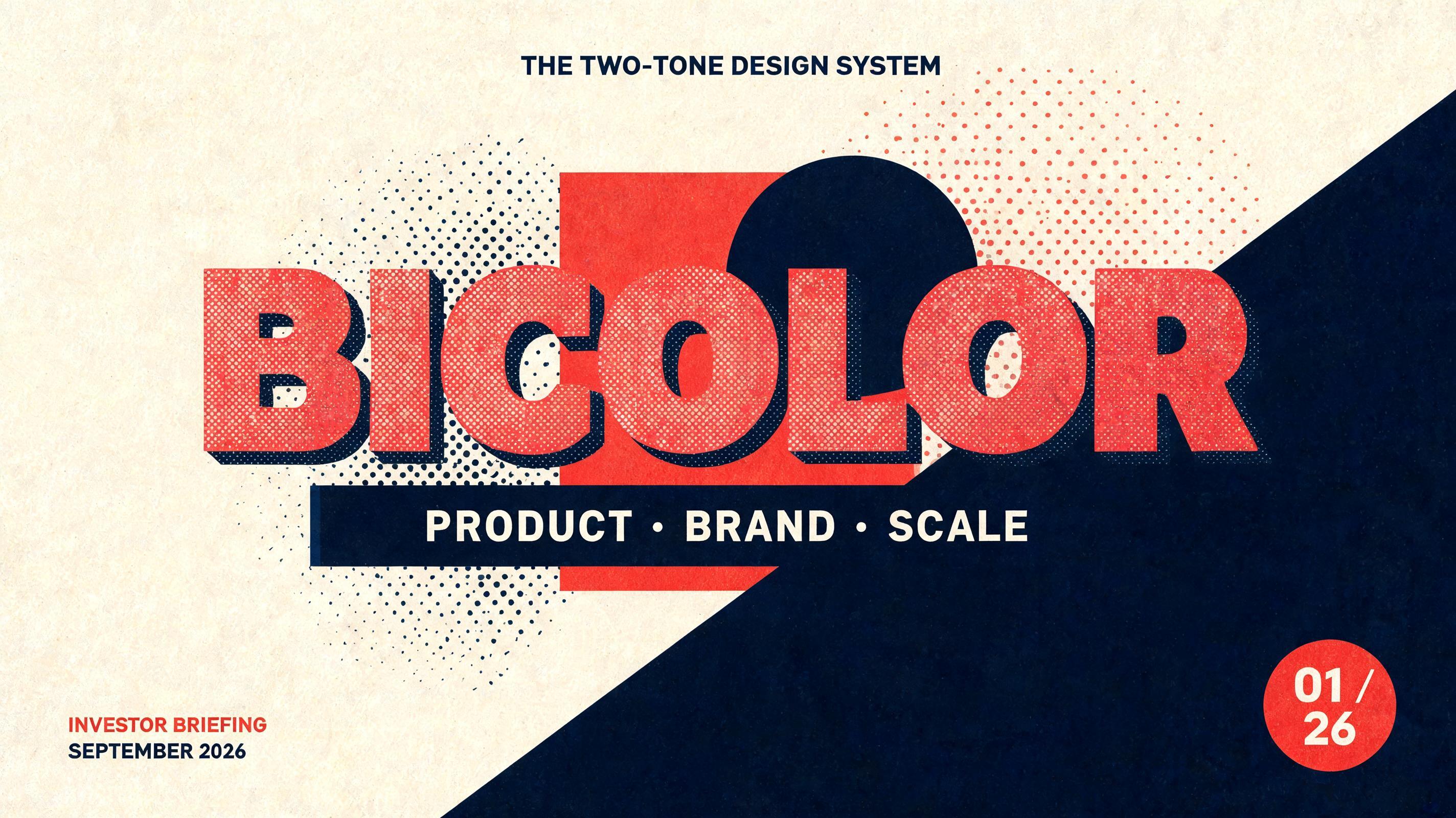
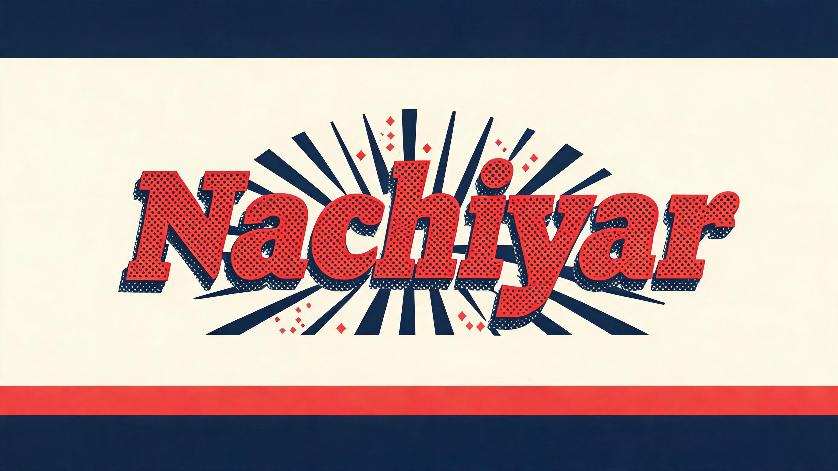
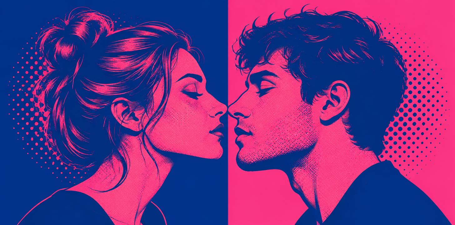
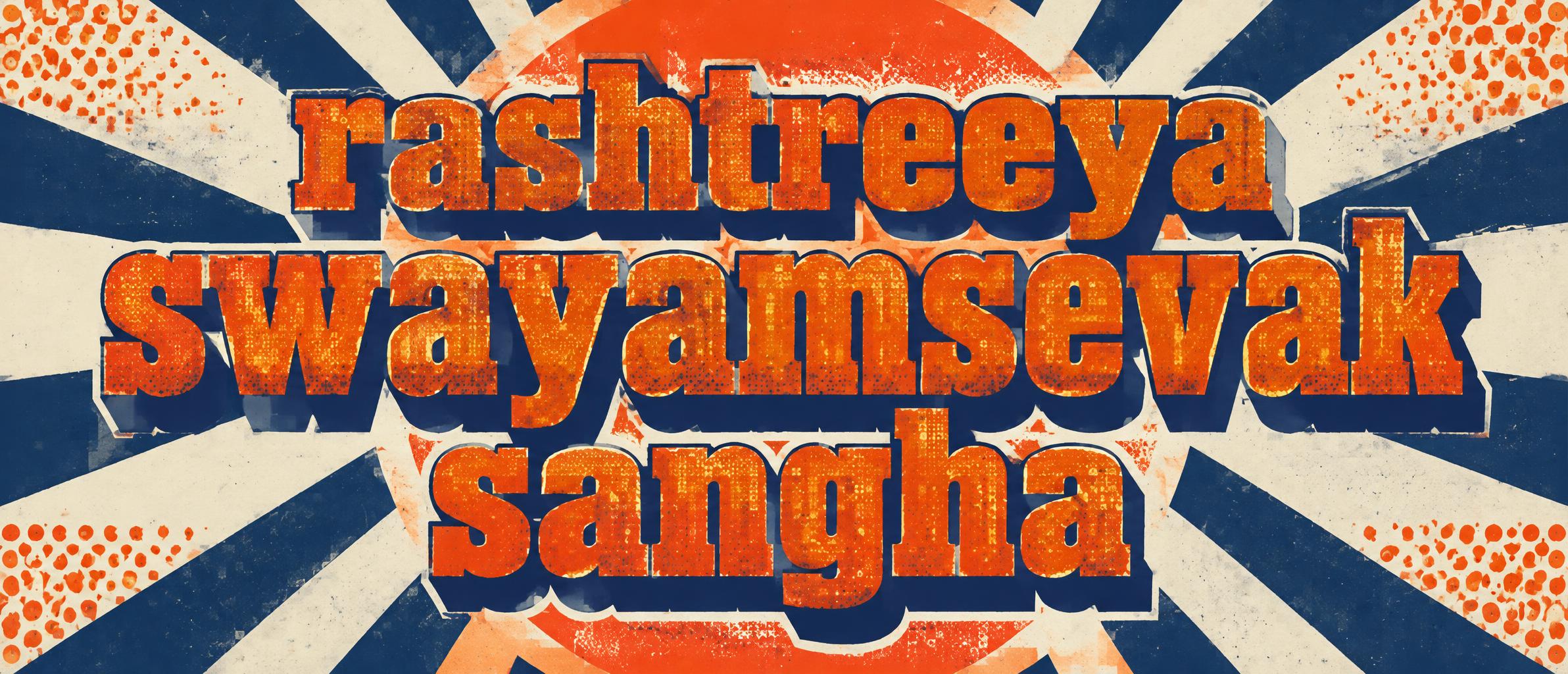
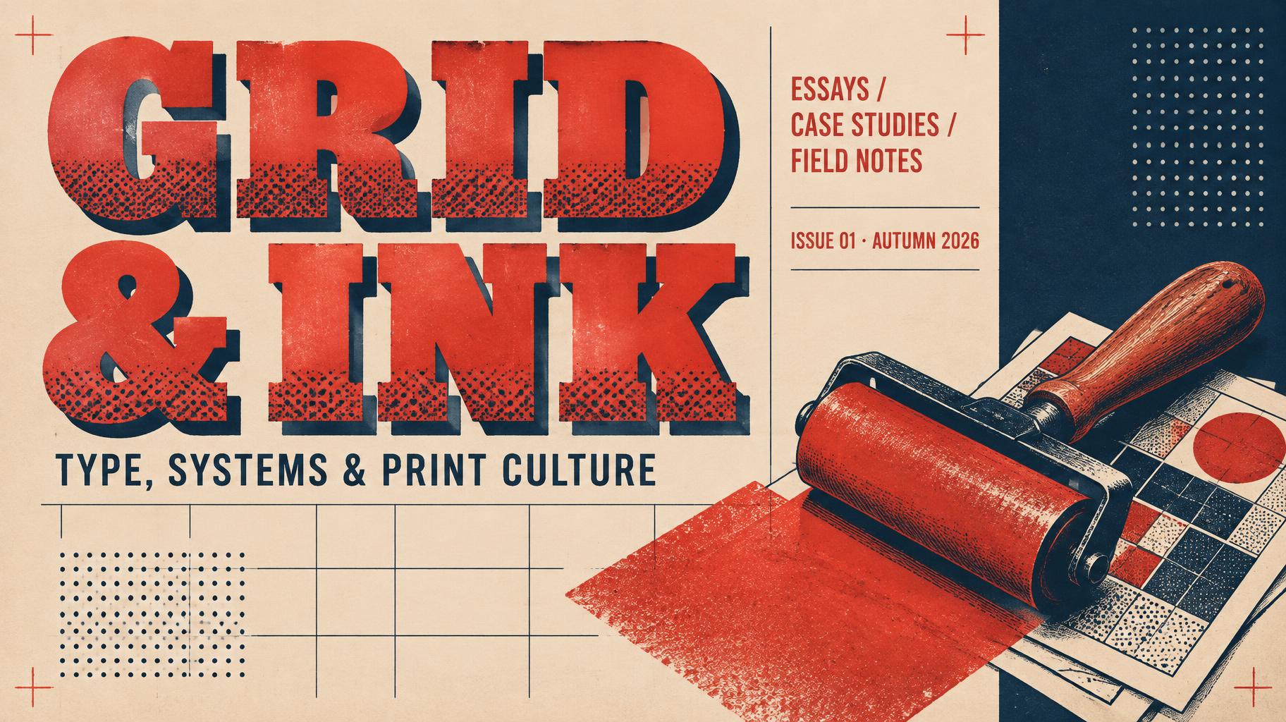
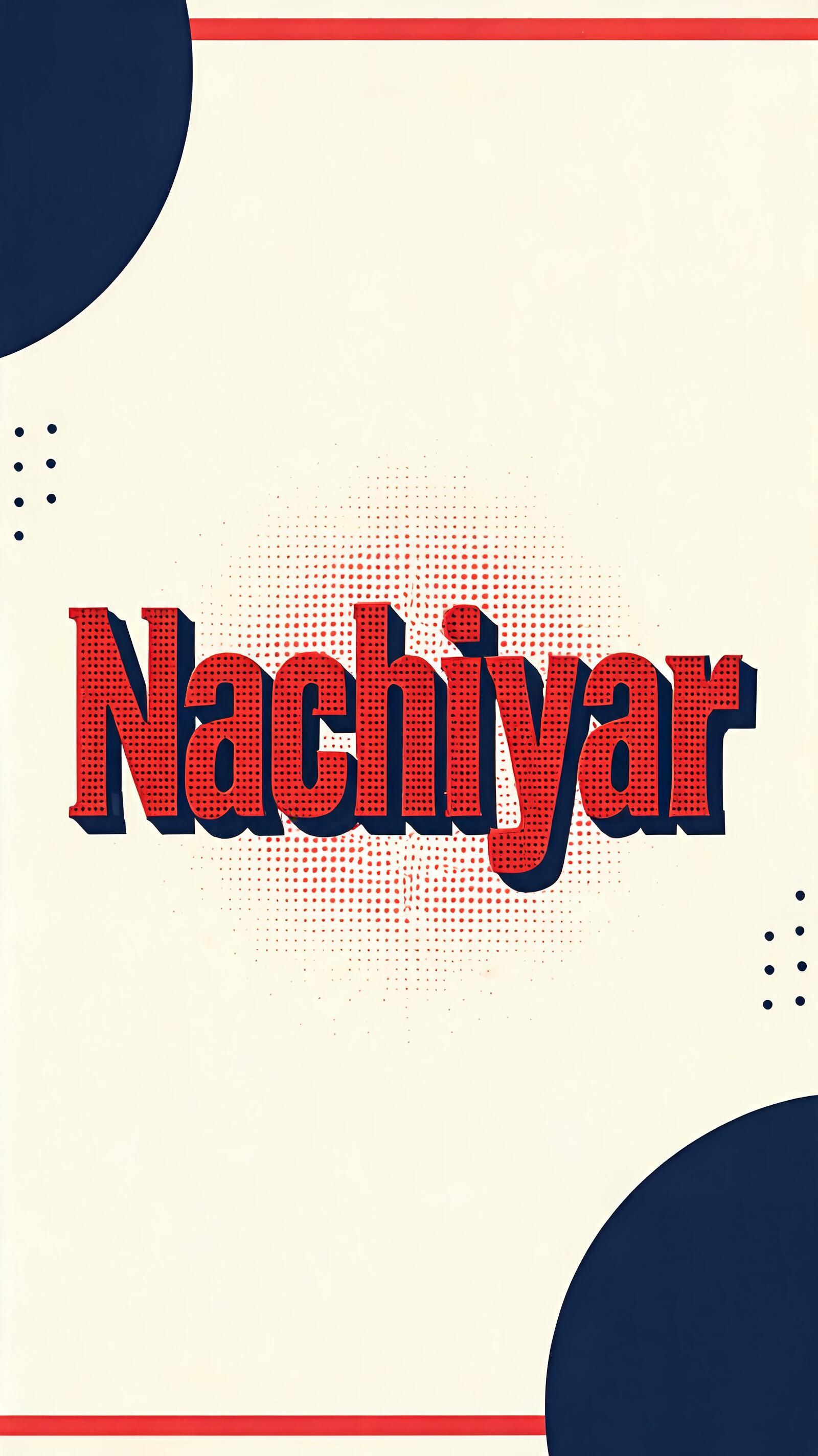
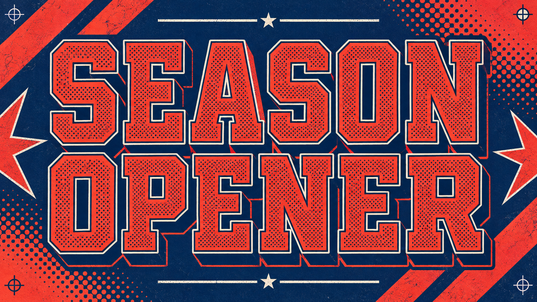

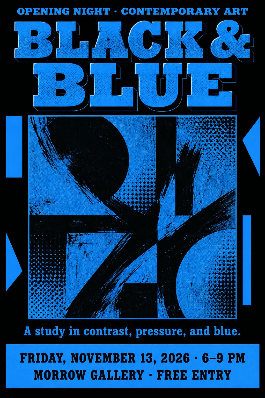
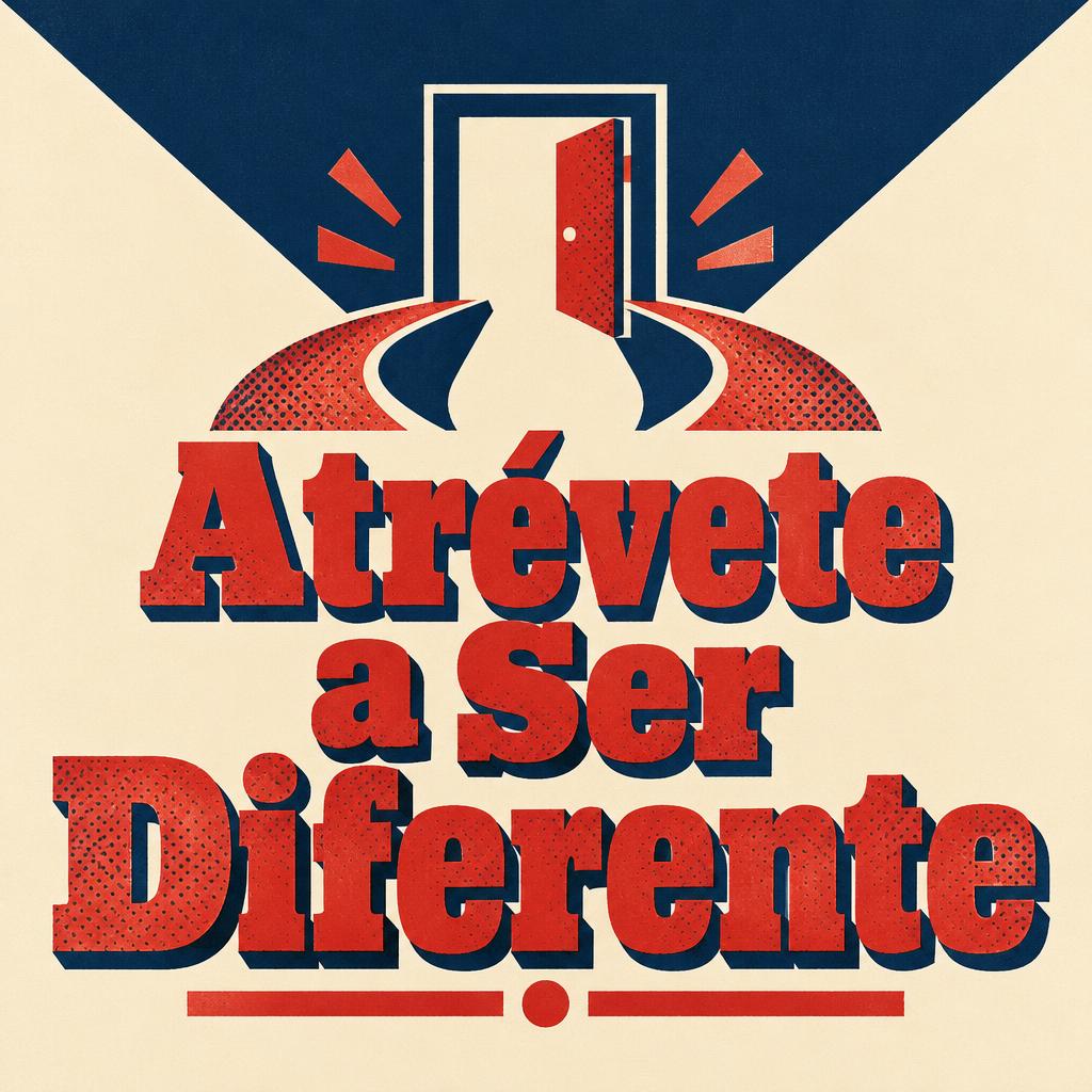
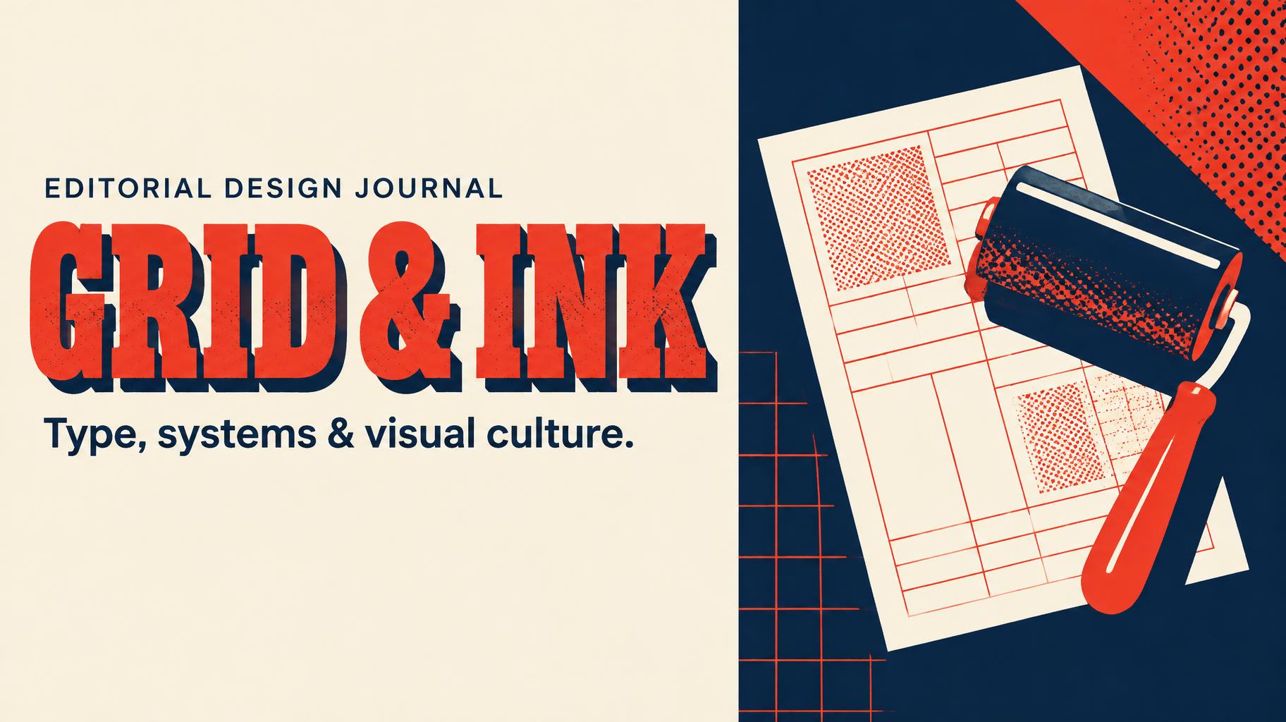
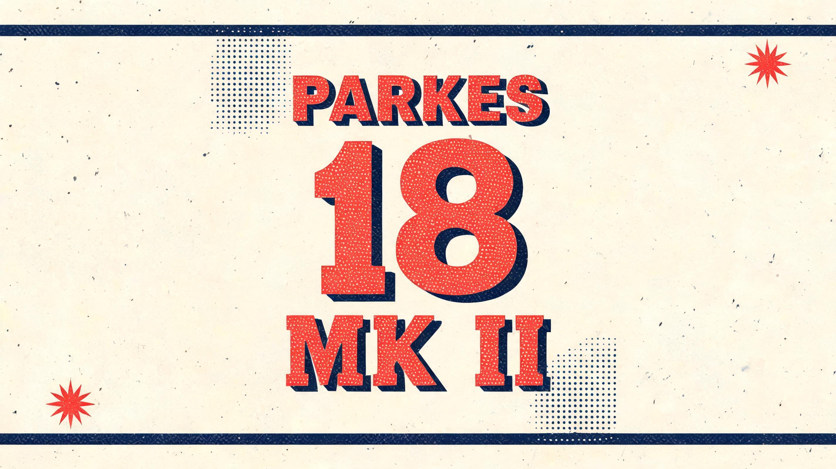
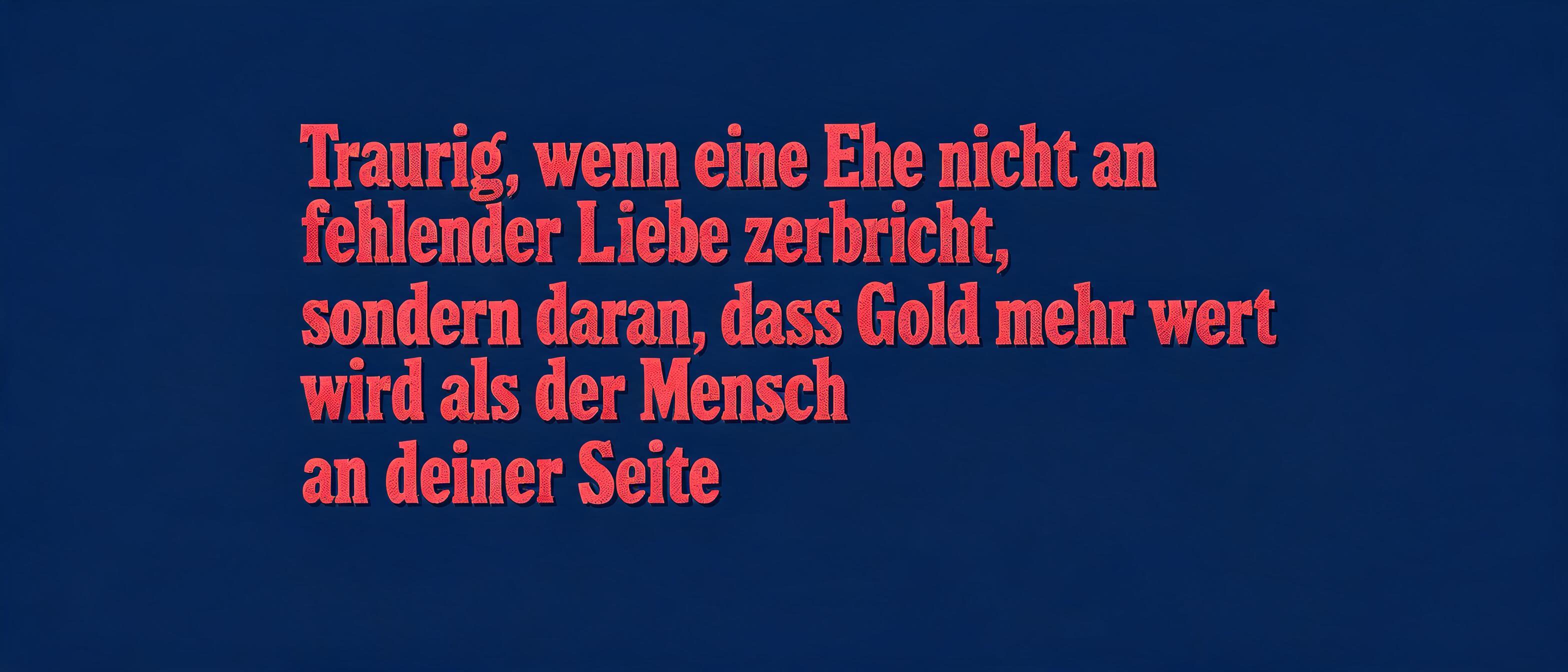
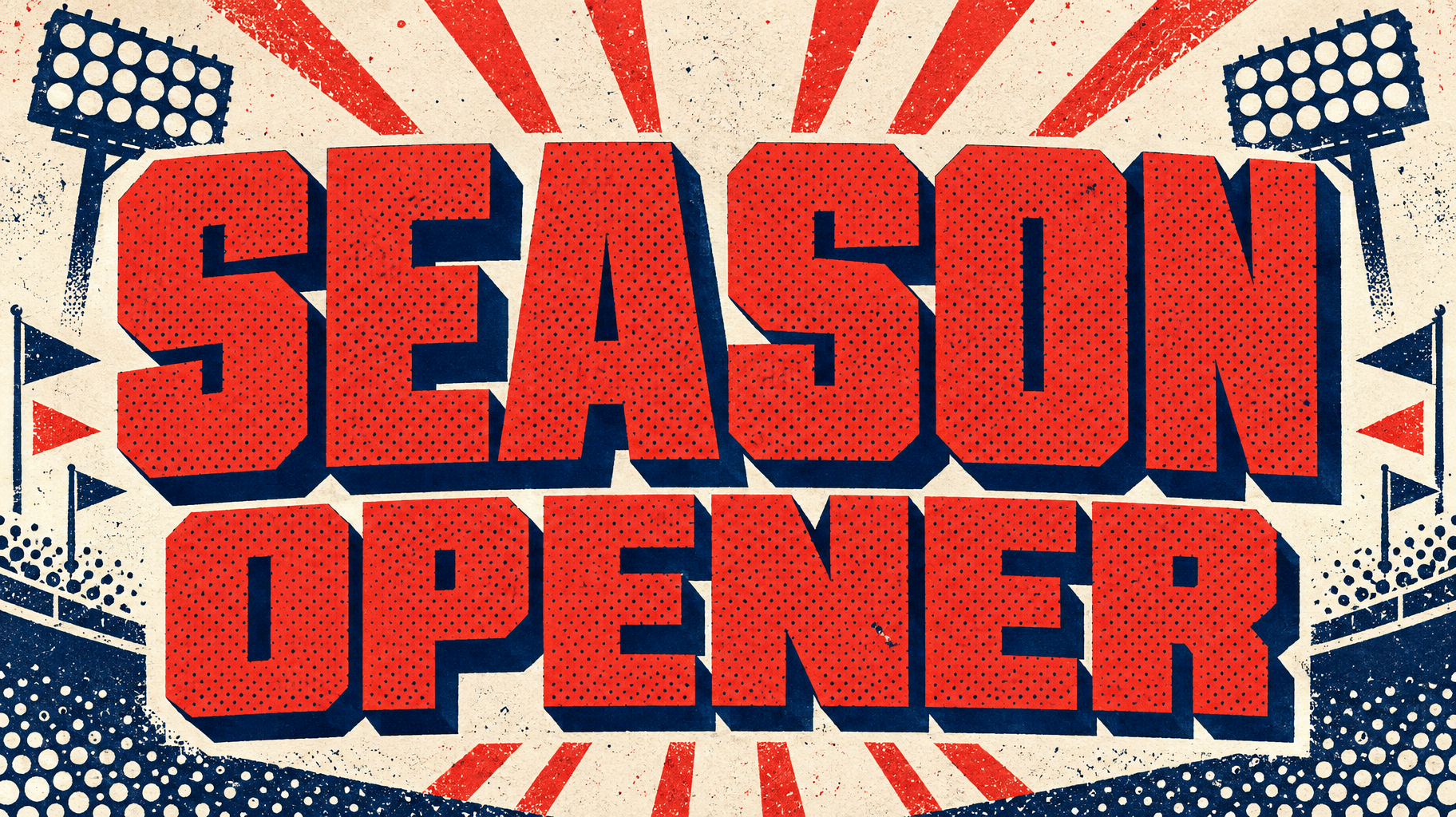
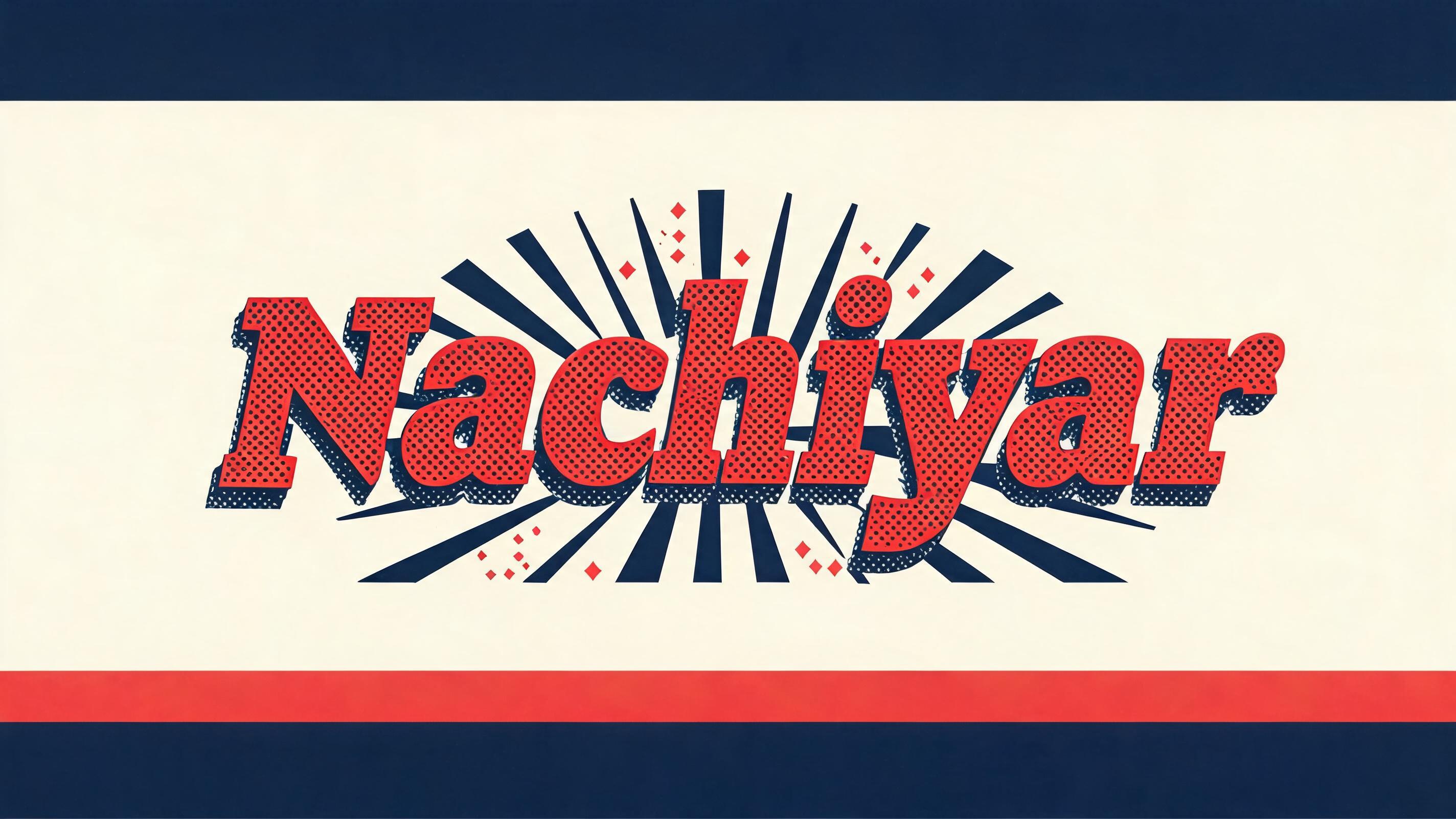
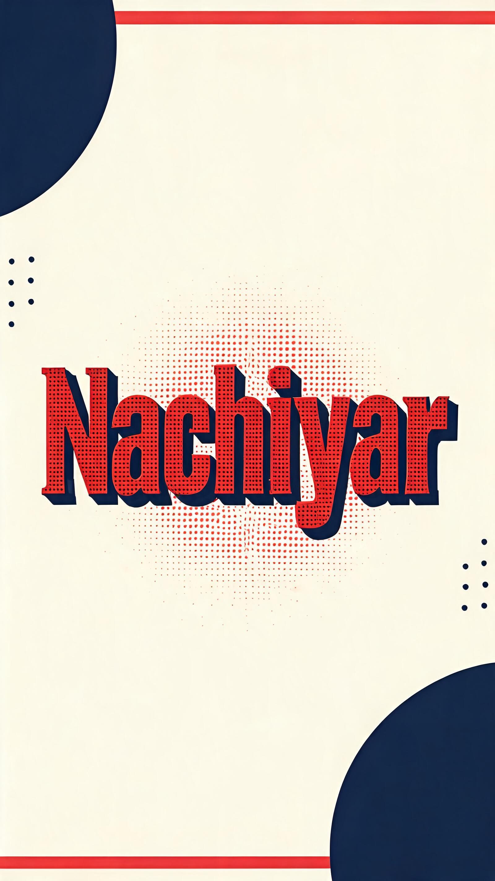
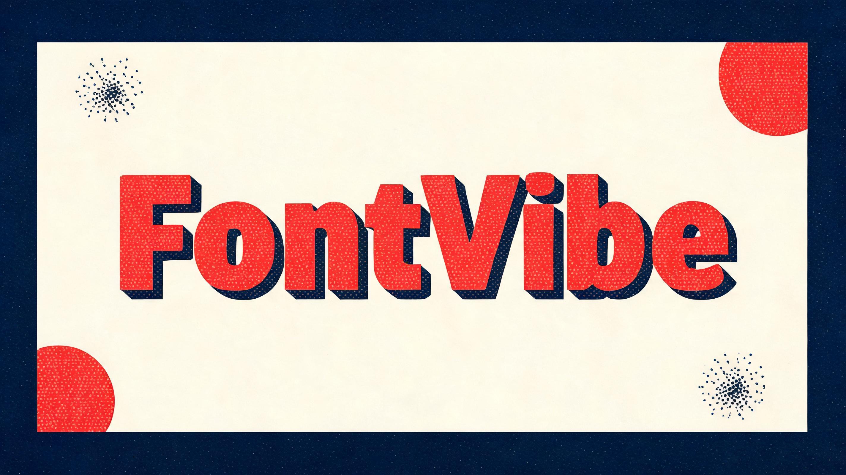
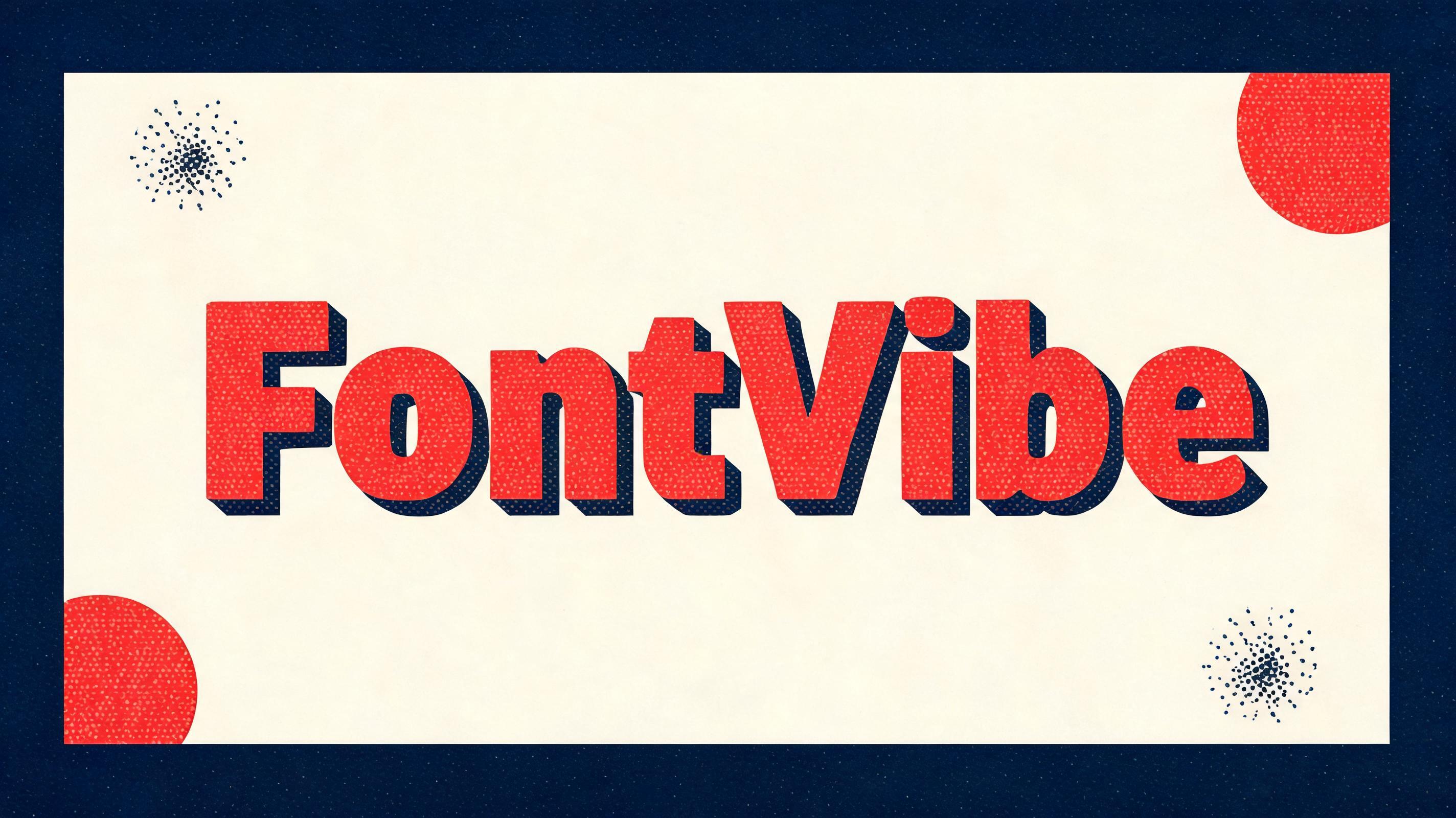
“FontVibe” é um efeito de texto Duotone criado com a IA da FontVibe. Maiúsculas slab condensadas e grossas numa cor viva com textura de meio-tom e uma sombra sólida deslocada numa segunda cor, sobre um fundo chapado contrastante.
a bold duotone piece — graphic, punchy and print-like. SURFACE / STYLE: the lettering is rendered in a striking two-color treatment — one bright color dominating the letter face, a second deep contrasting color filling the drop shadow, bevel inset or offset layer — with a visible halftone screen-dot pattern in the dominant color and a crisp hard-edged graphic finish. SCENE ATMOSPHERE: a flat bold poster setting — clean two-tone ground, simple geometric or halftone accents, high-contrast graphic energy. PALETTE: any high-contrast two-color pair — vermillion red + midnight navy, electric blue + hot pink, black + bright accent — flat, saturated and bold, never gradient-soft or muddy. LETTERFORM PRIORITY: when the chosen font carries its own treatment (retro or Clarendon slab, condensed or geo sans, halftone comic, 3D shadow, sticker outline), that font's letterform takes priority and owns the letters; this style governs the two-color split, the halftone dots and the graphic poster finish. FALLBACK MATERIAL: if the font carries no material of its own, render the letters in a bold duotone — bright face with a deep contrasting offset shadow and a halftone dot pattern — so the punchy two-color graphic always reads. 'FontVibe' large and dominant at the center, occupying most of the composition in a striking duotone treatment: saturated vermillion-red letter faces patterned with clearly visible, evenly spaced halftone screen dots, paired with a thick midnight-navy offset shadow shifted down and right for emphatic graphic depth. Keep every edge crisp, flat, and print-sharp, with no soft gradients. Set the word against a clean warm-cream ground framed by broad midnight-navy geometric blocks, a few cropped vermillion circles, and subtle navy halftone bursts tucked into the corners. The composition feels like an assertive contemporary print poster: energetic, polished, and instantly legible, with generous negative space protecting the central word. Use hard-edged color separations, saturated ink-like solids, and a confident two-color rhythm throughout. No extra text, no objects, no photographic elements.
Gerada em 24 de outubro de 2026 · 2848 × 1600 · JPEG · ByteDance Seedream 5.0 · Compartilhada pelo criador · Uso comercial gratuito (CC BY 4.0)