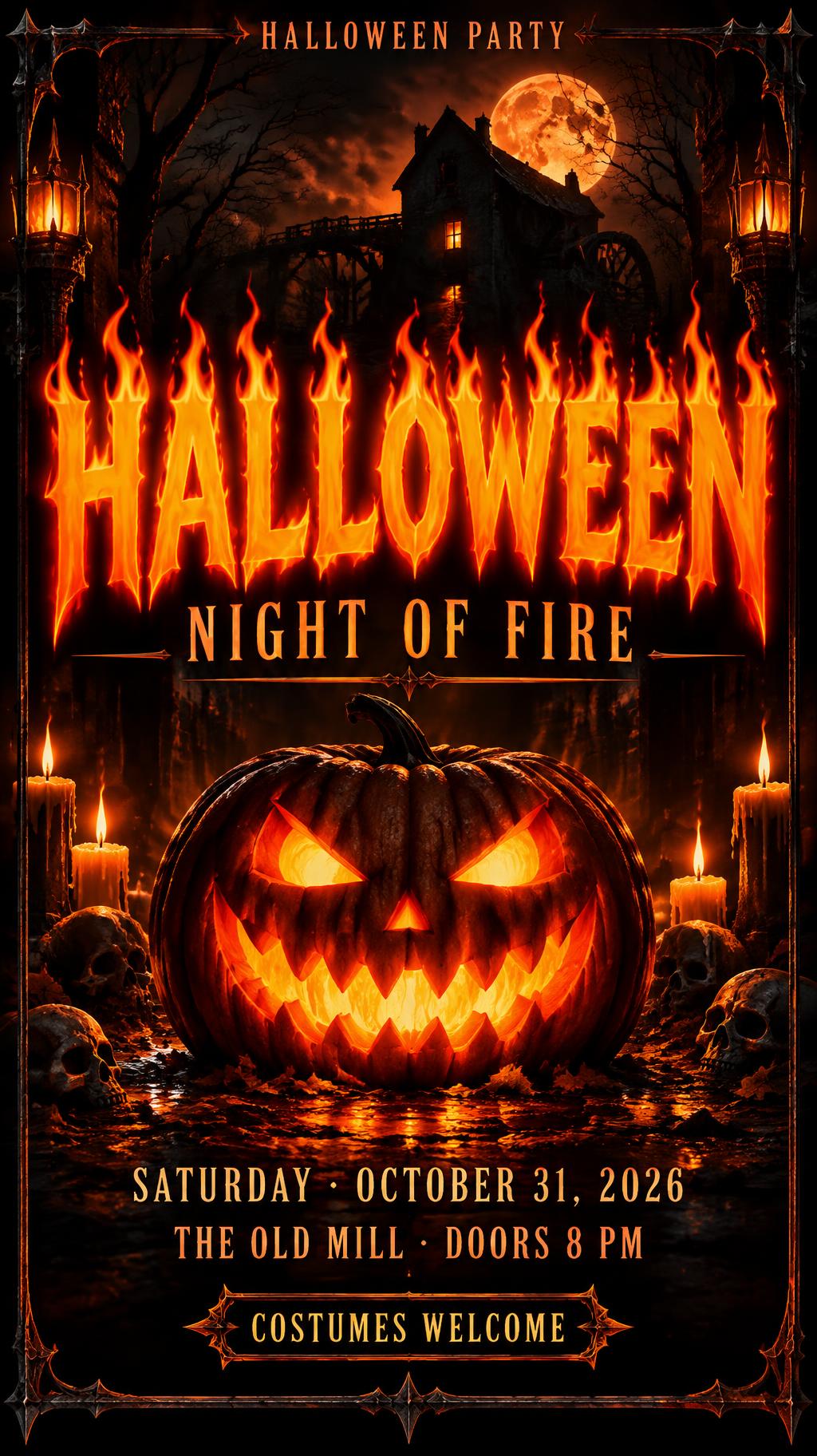
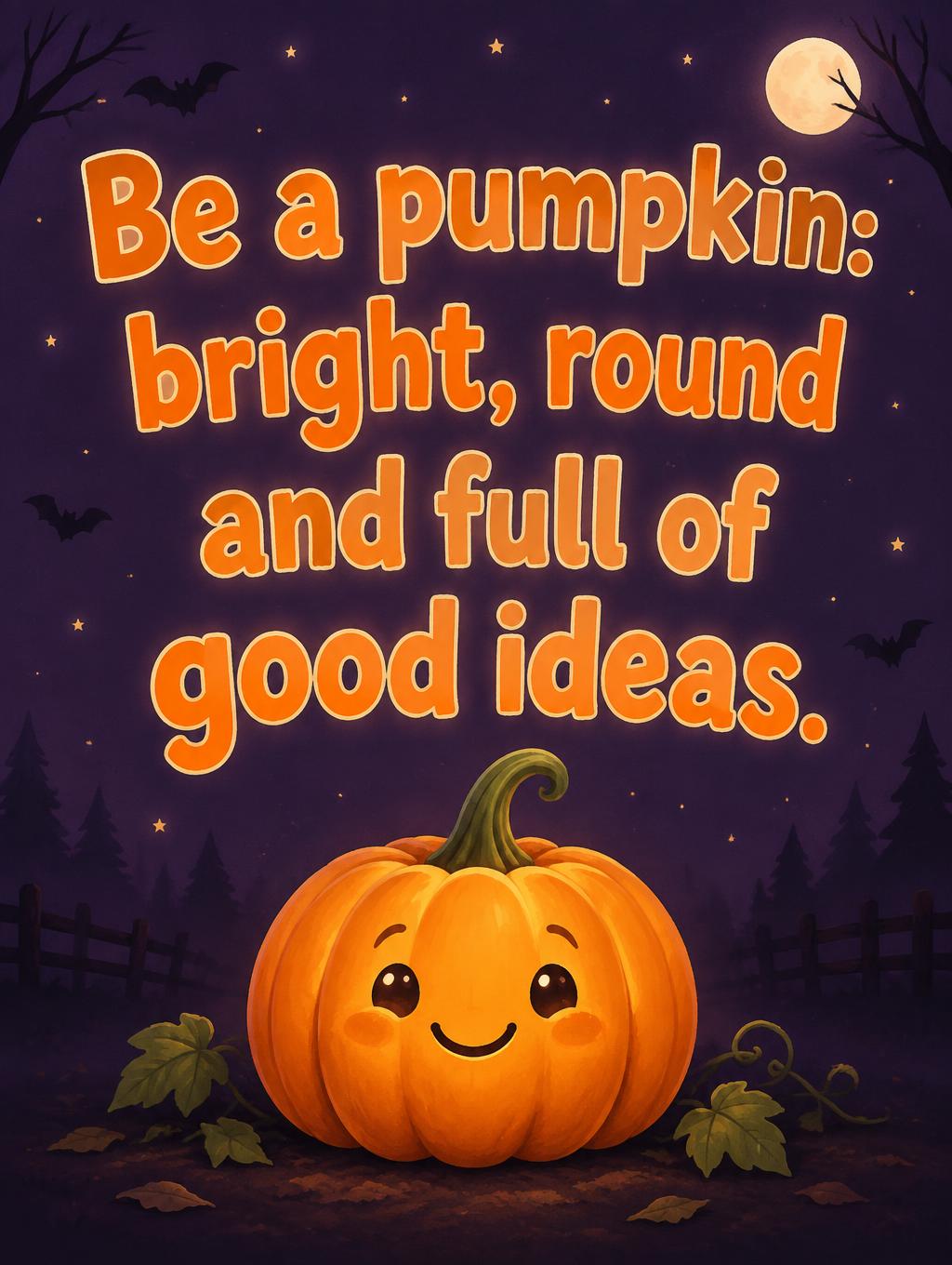
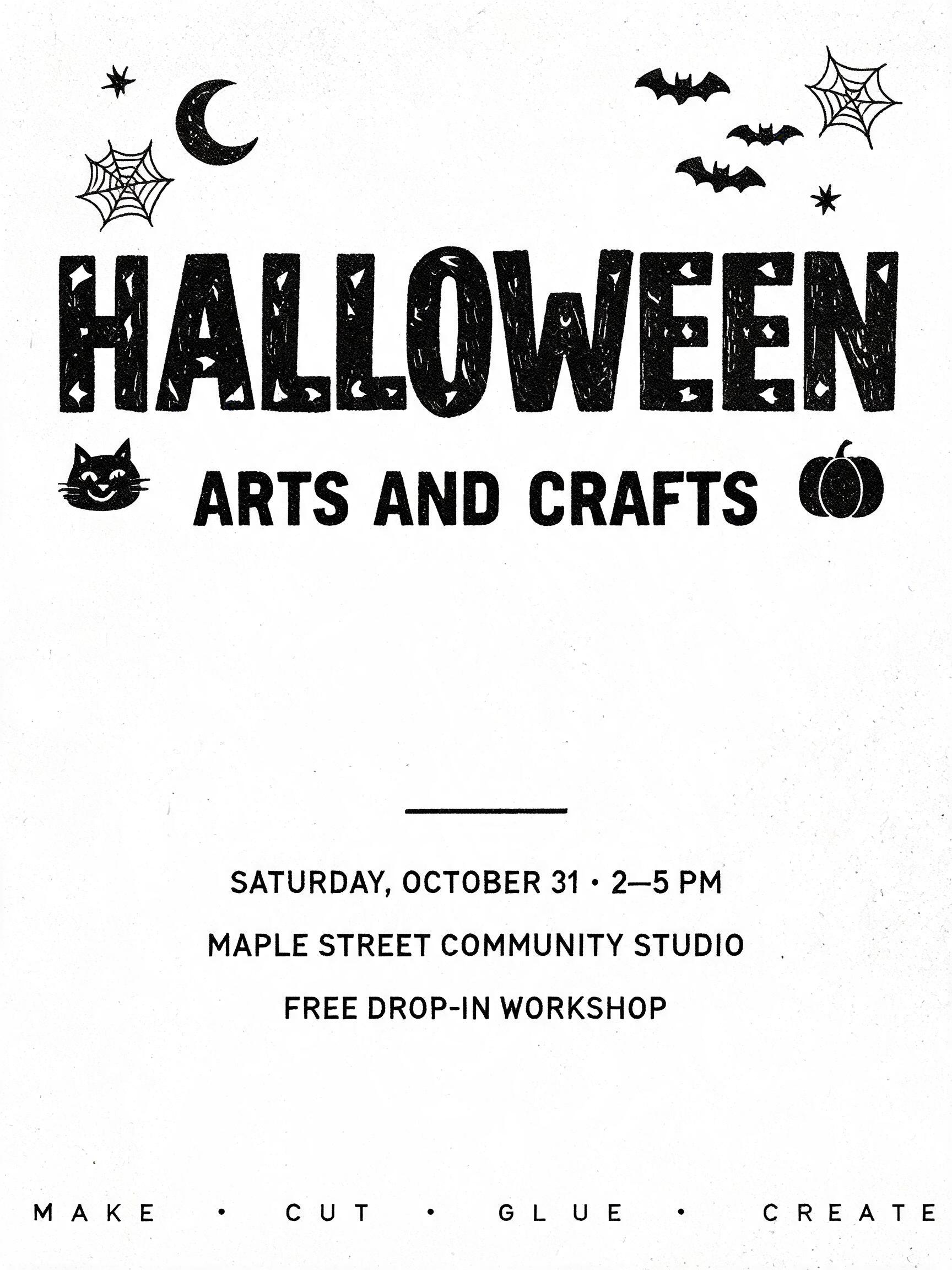
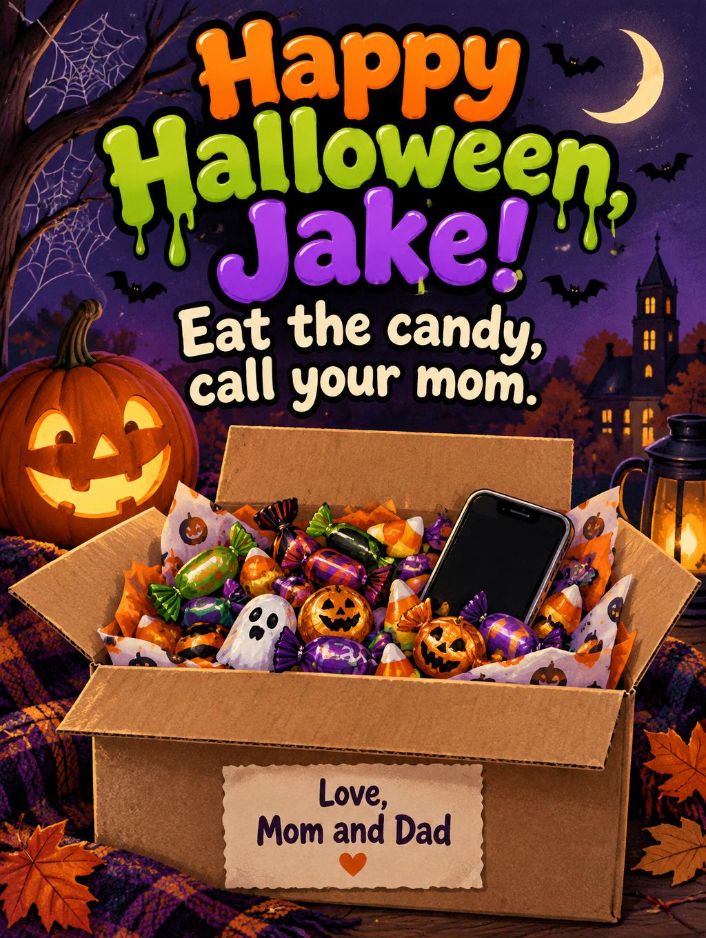
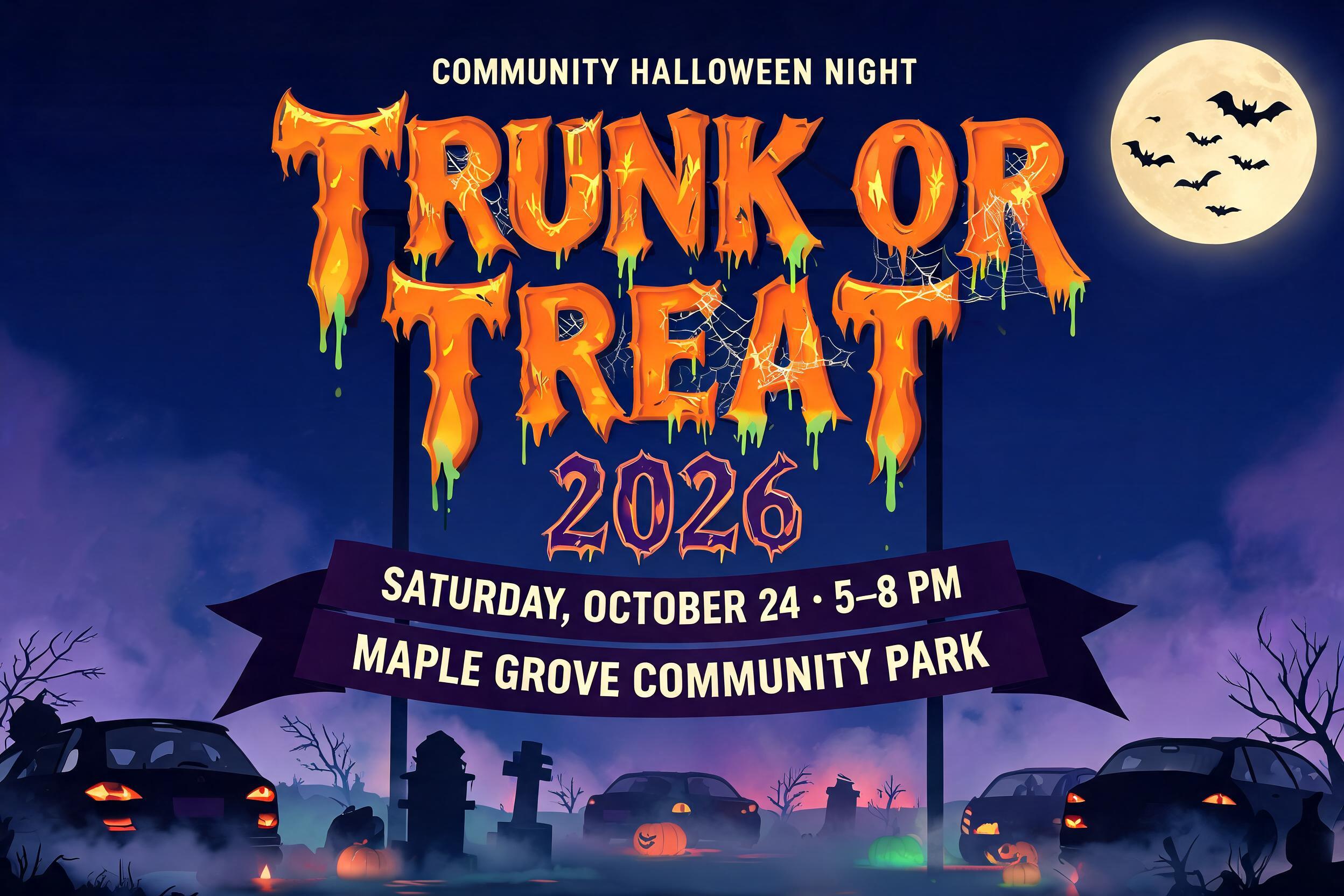
Ideas for your Halloween poster
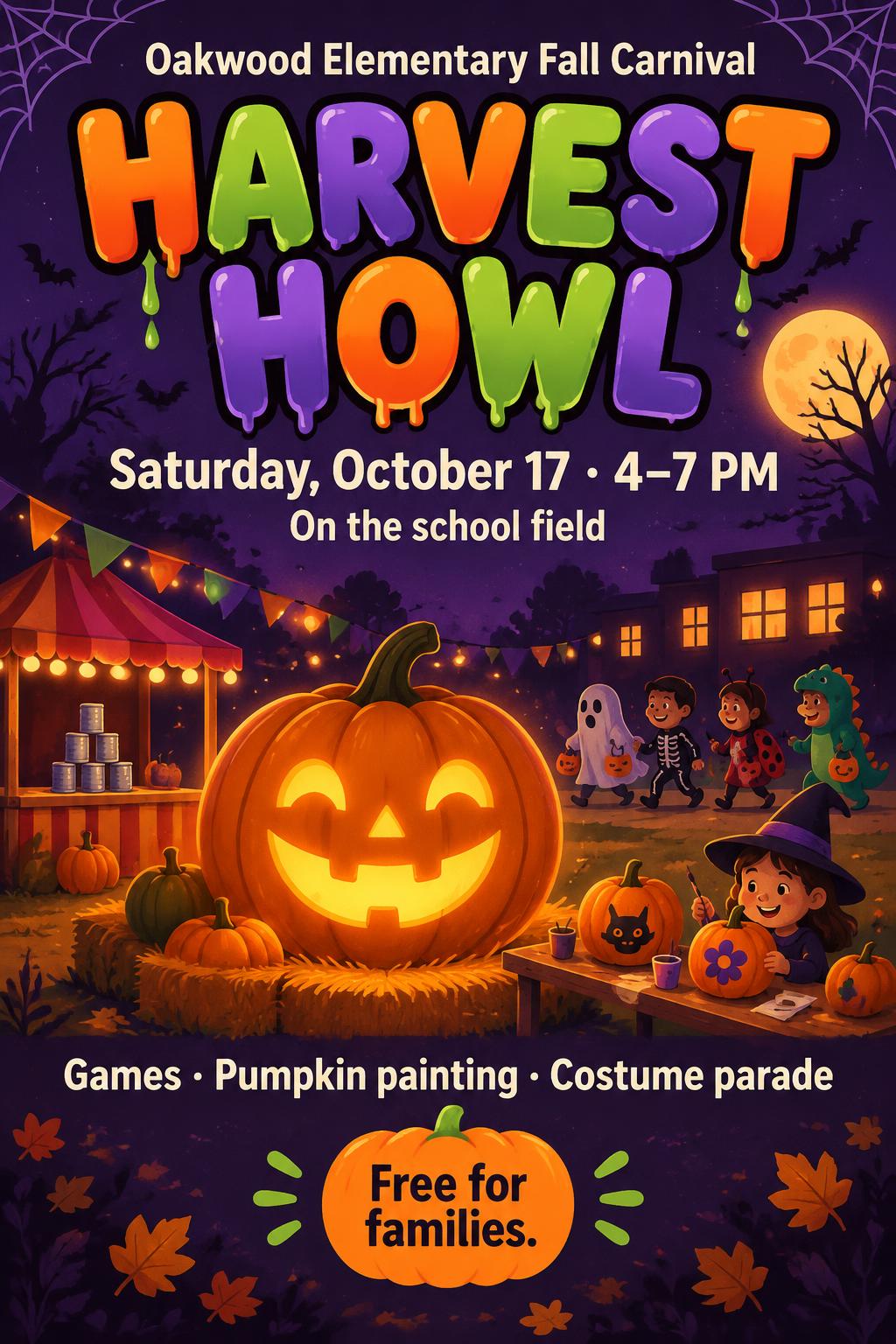
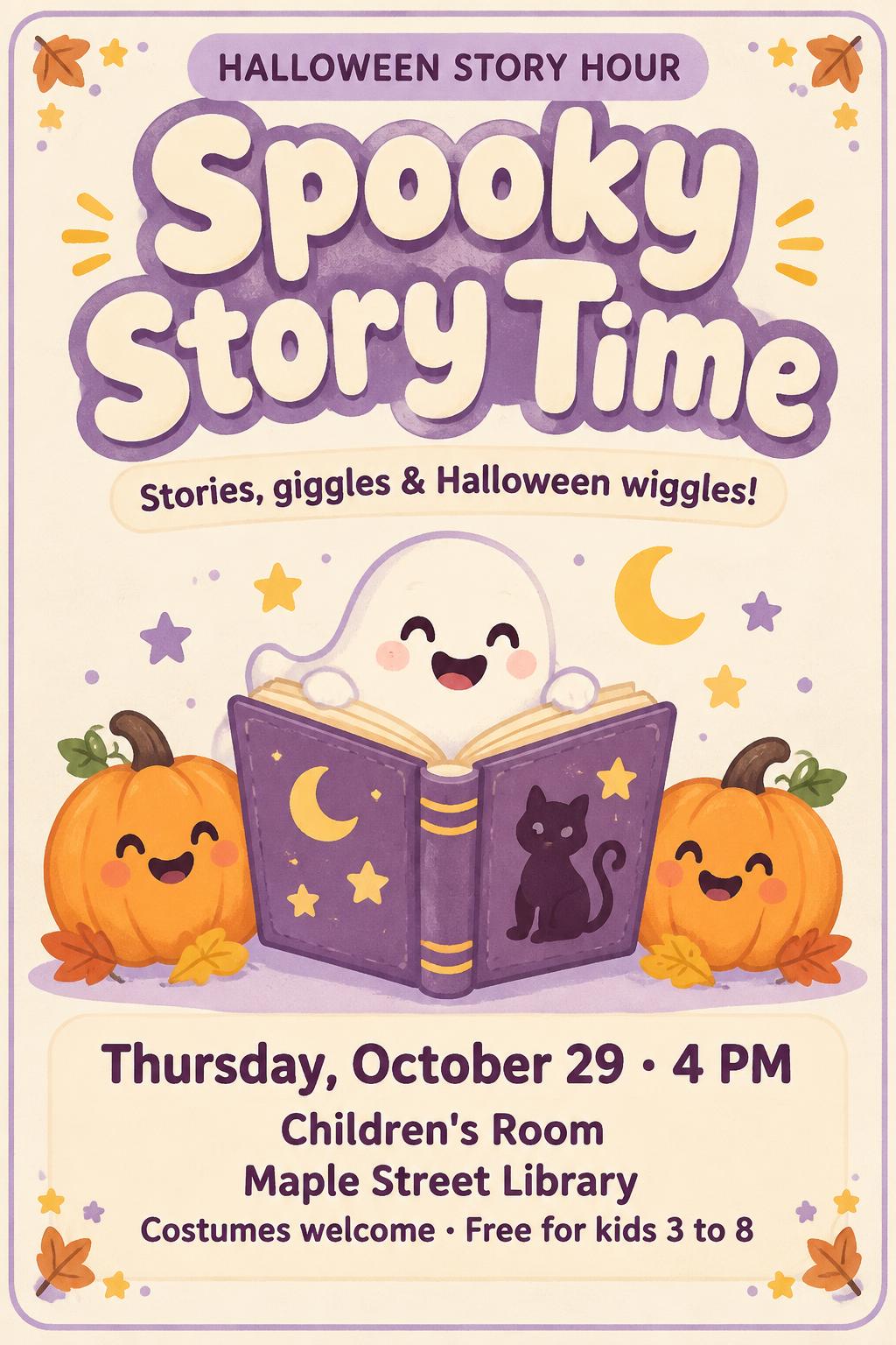
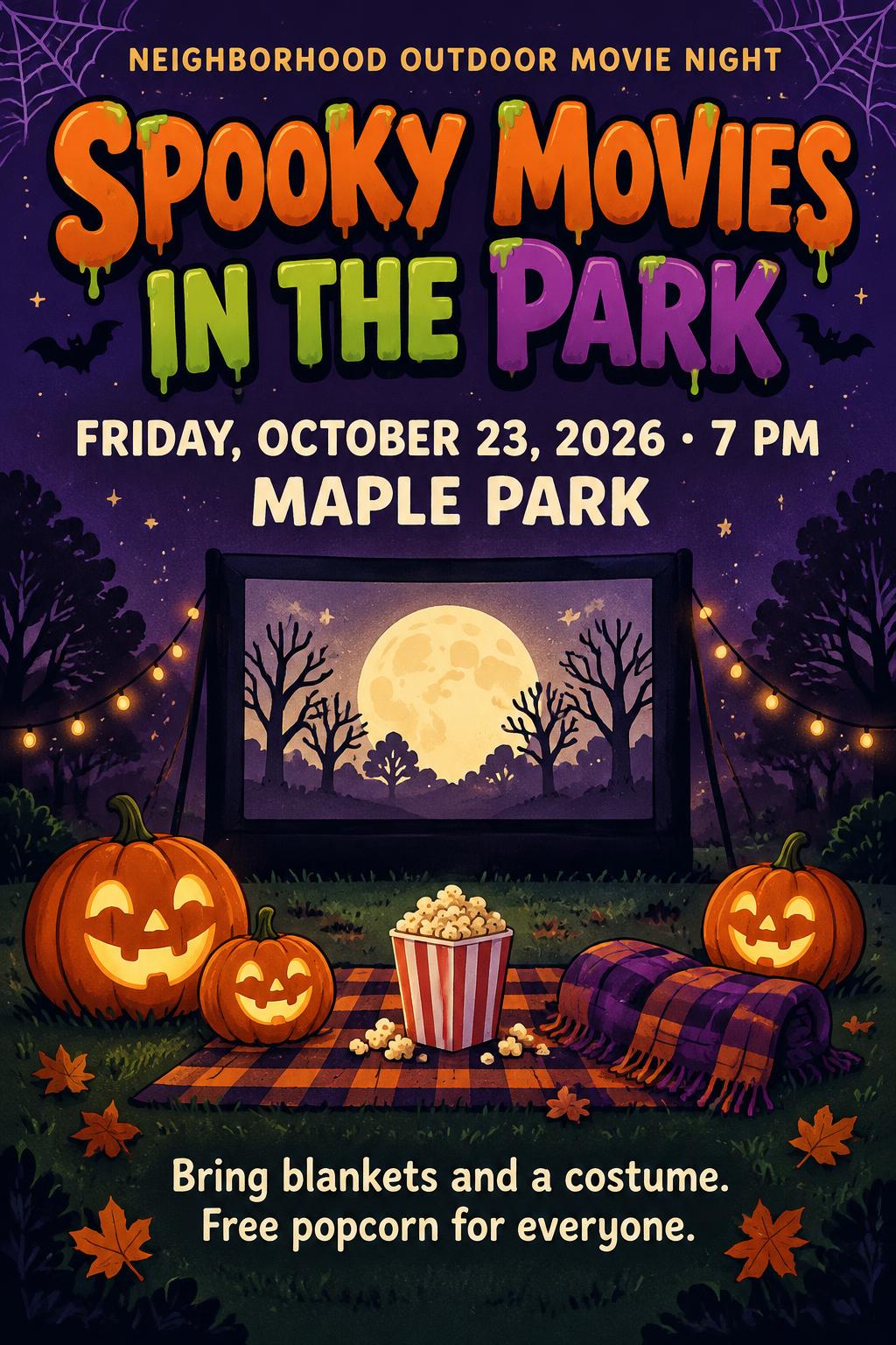
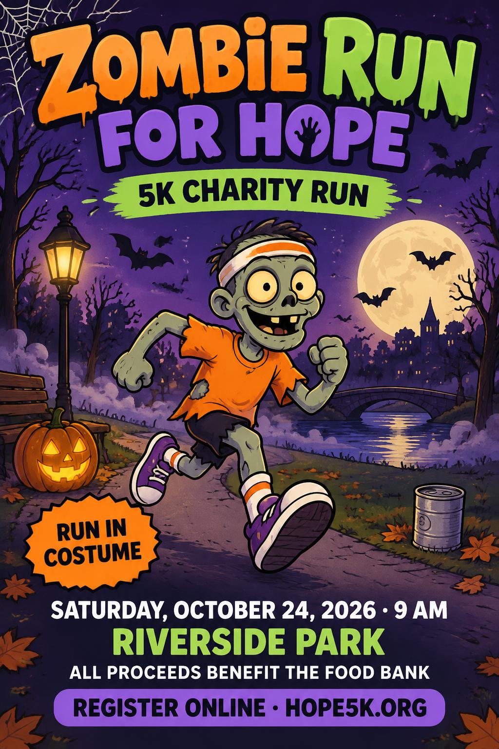
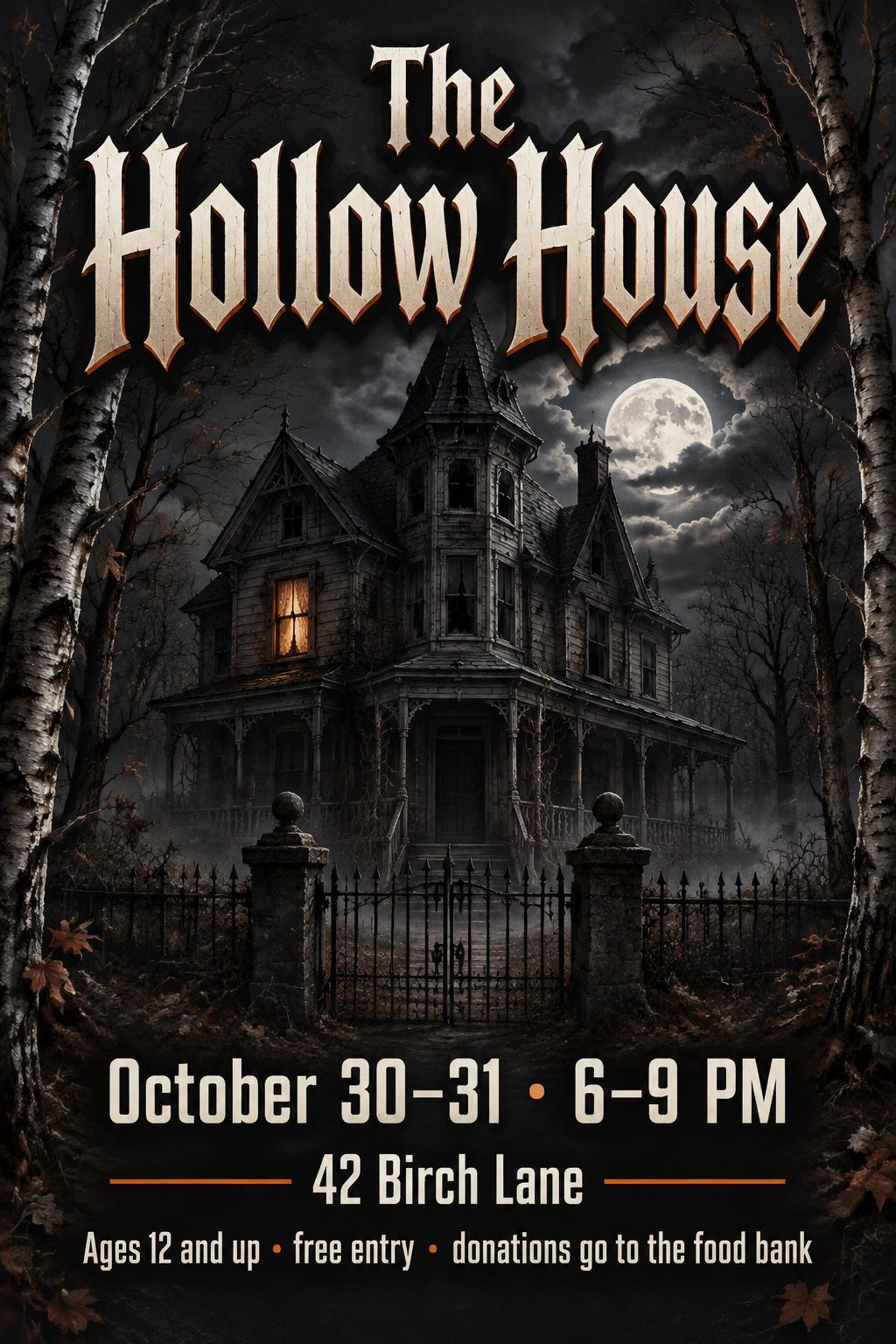
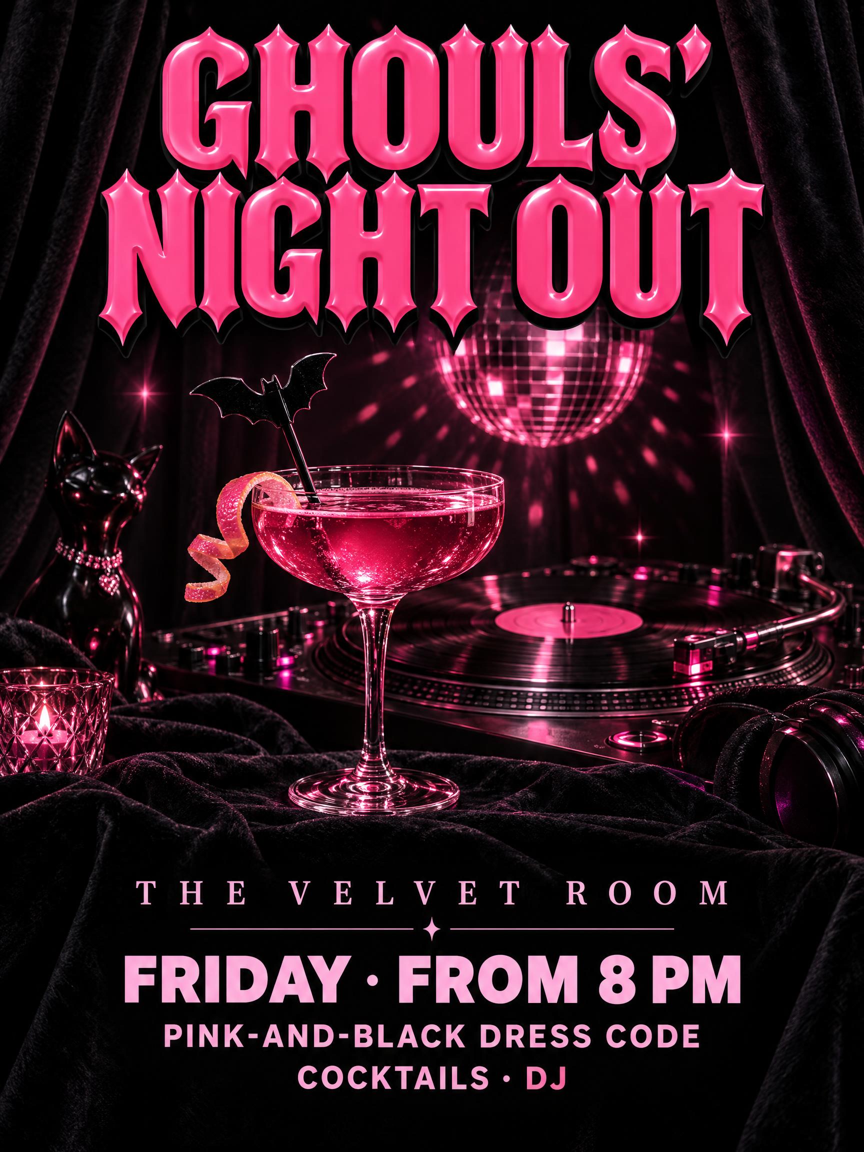
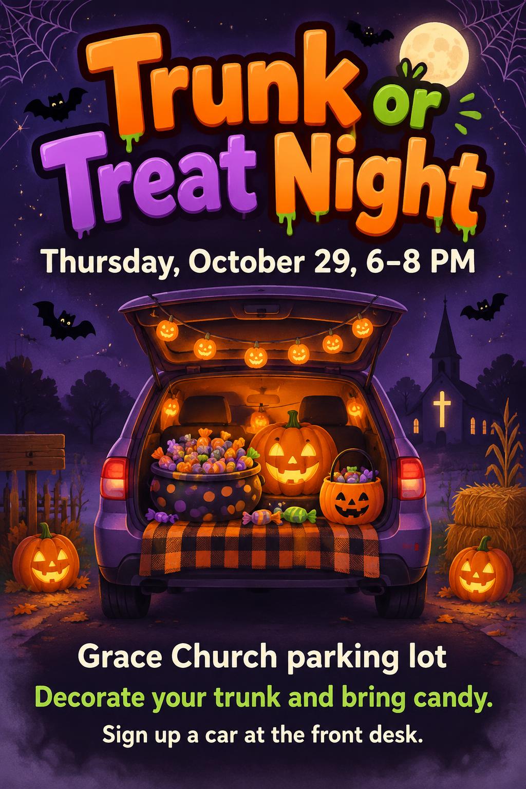
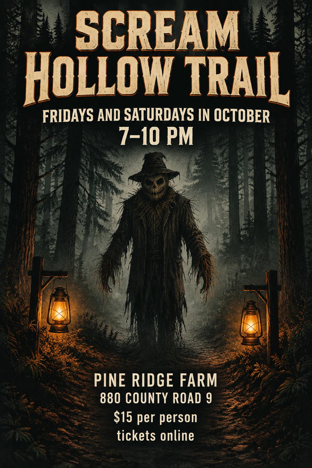
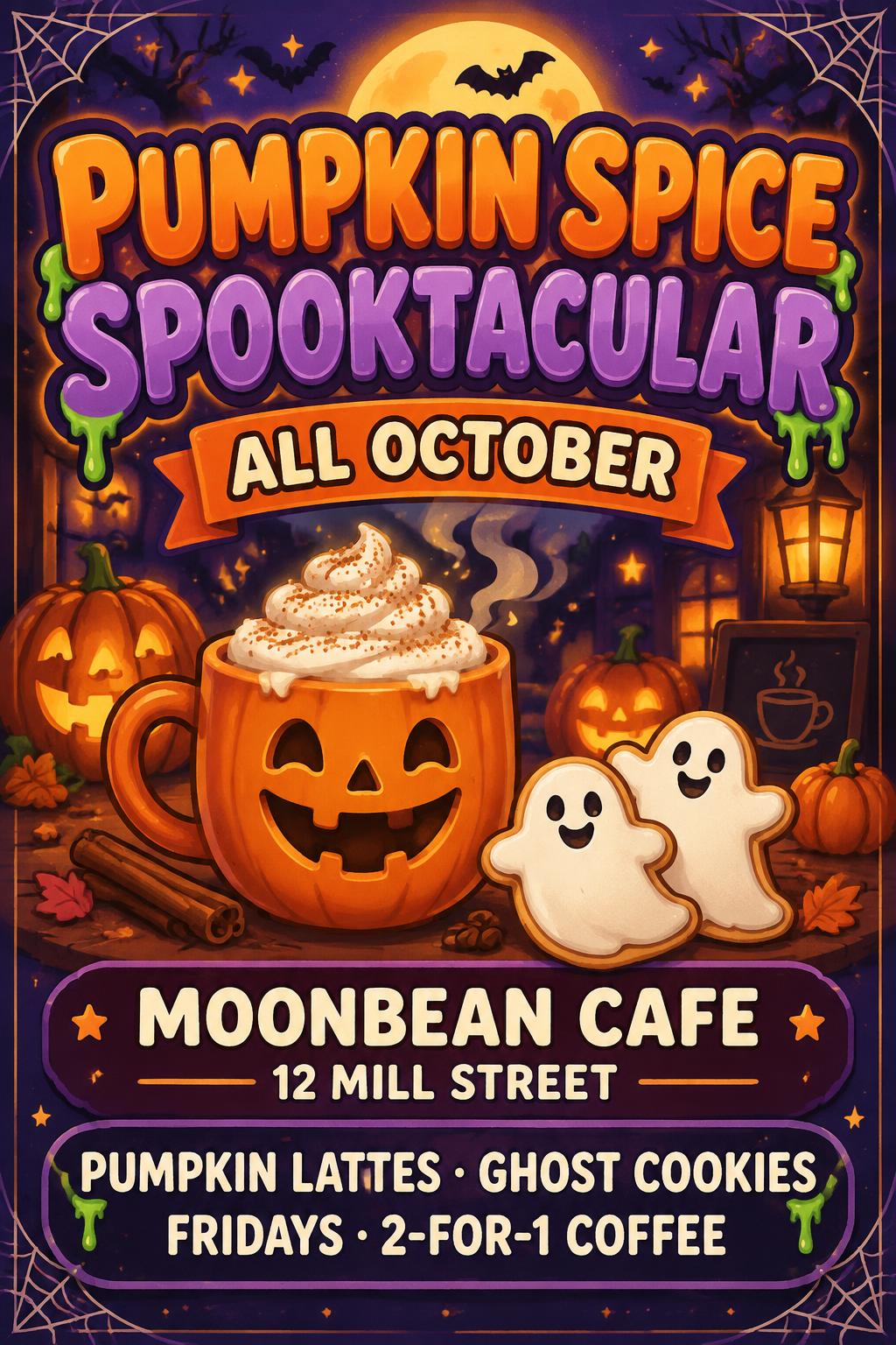
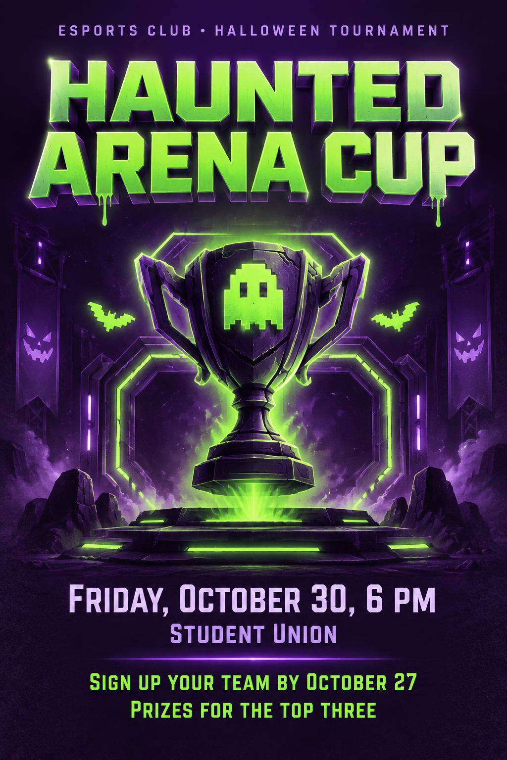
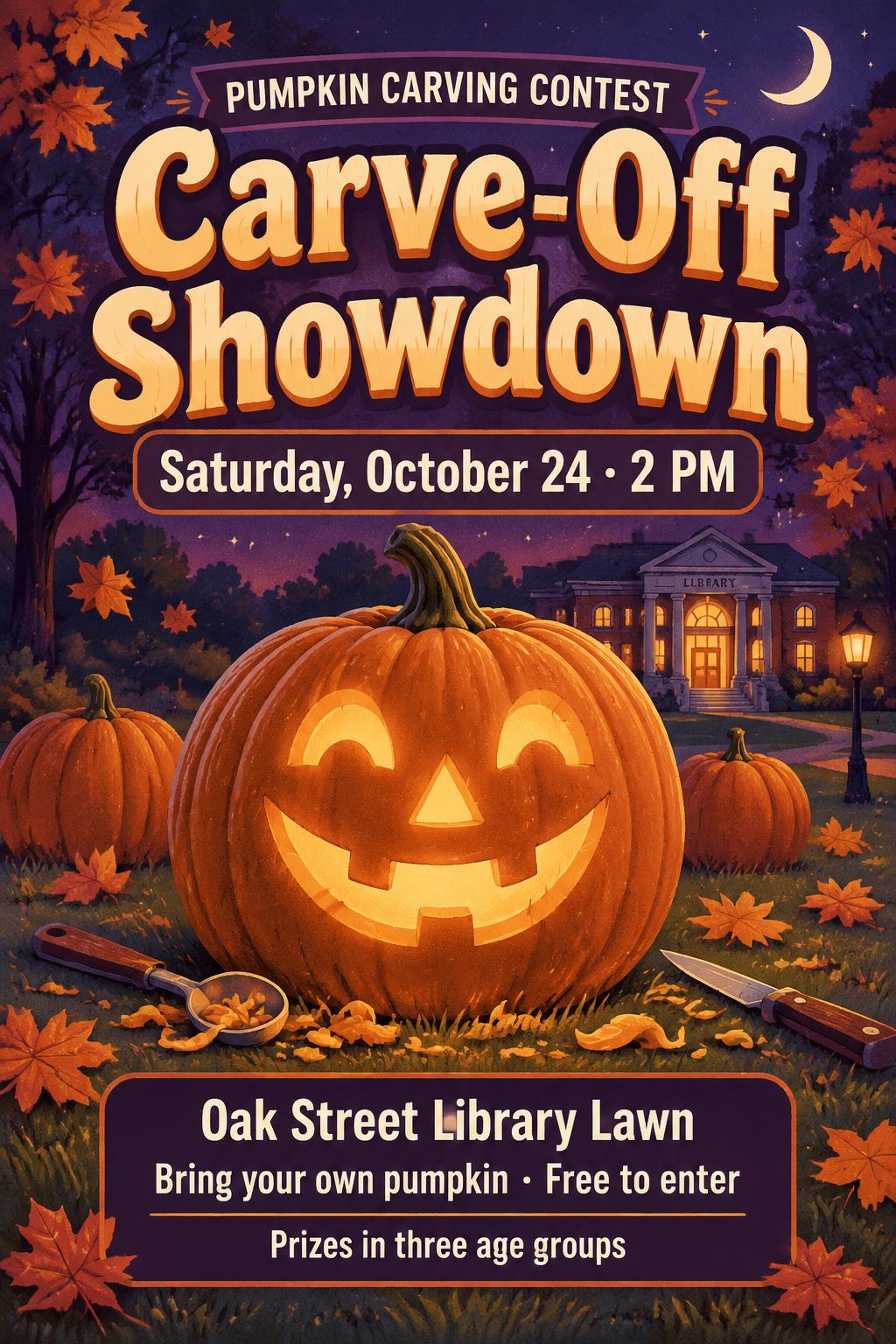
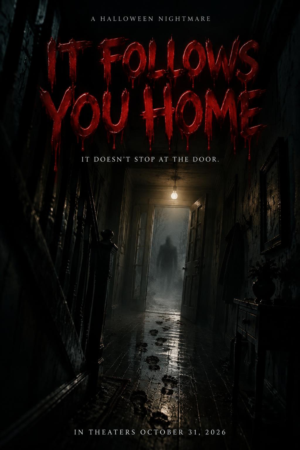
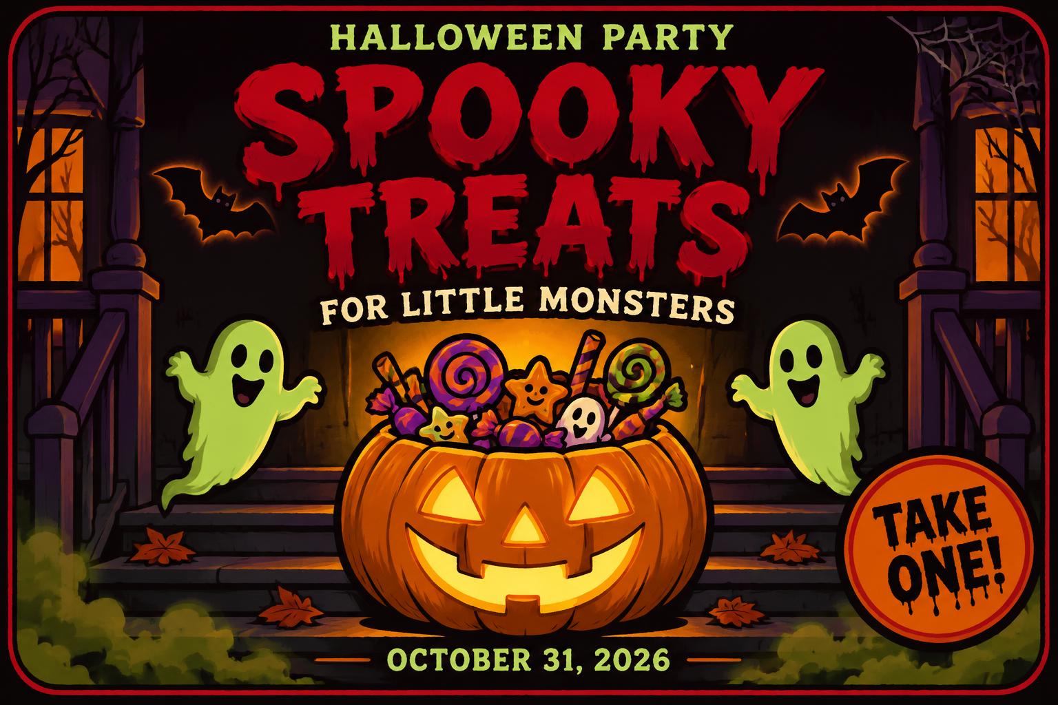
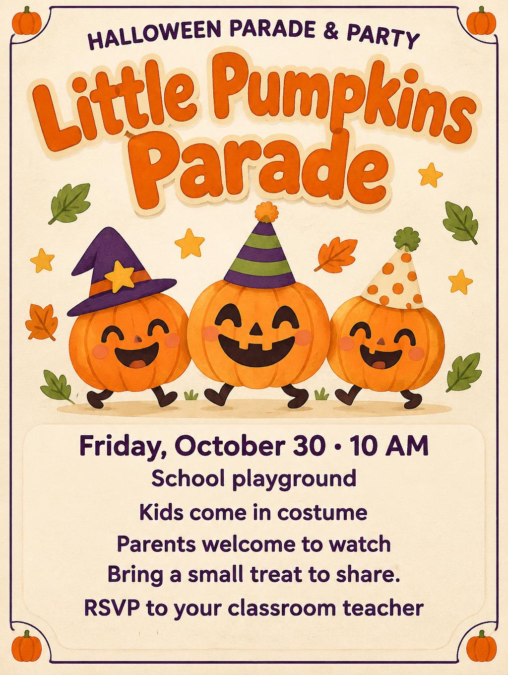
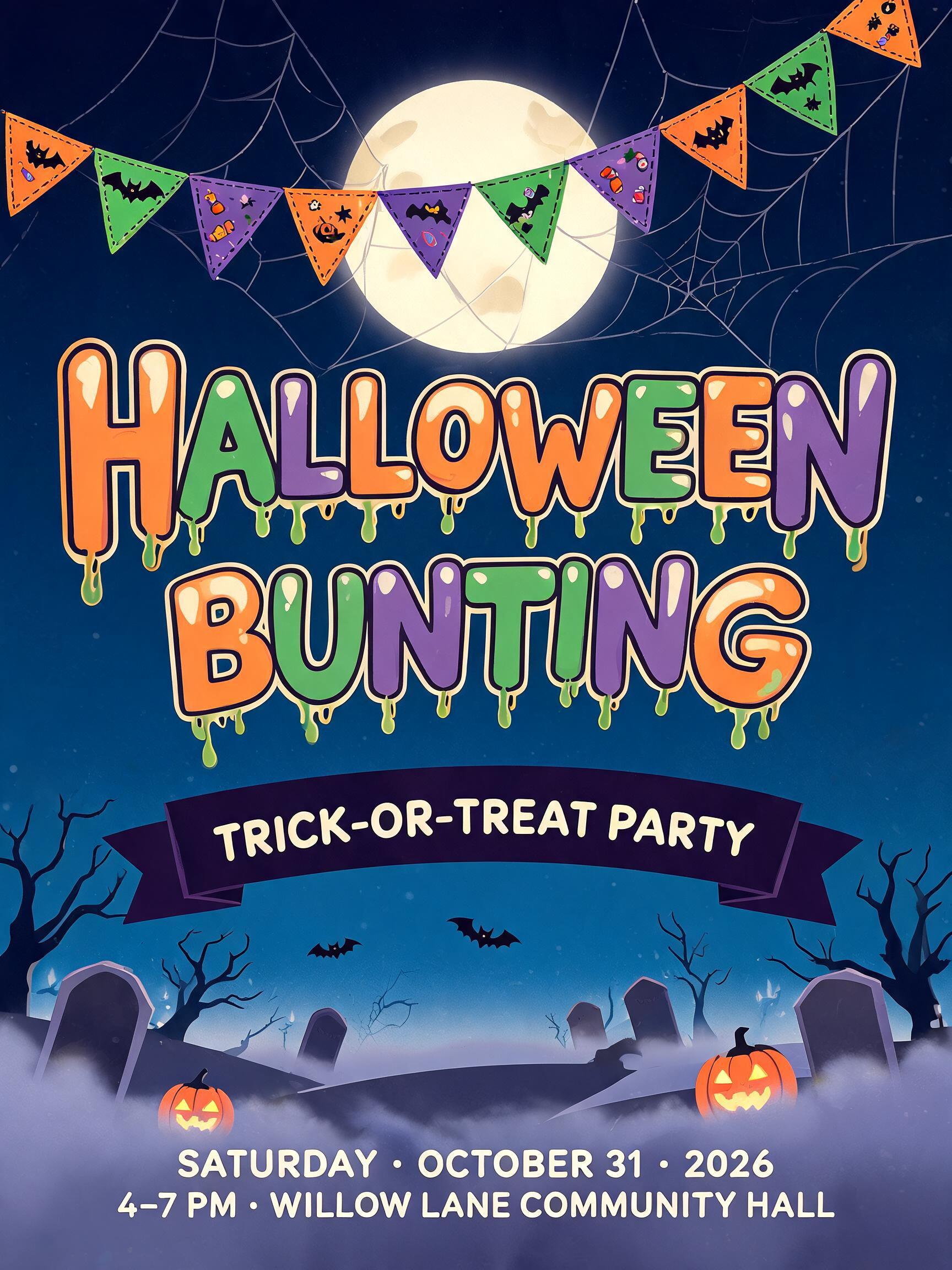
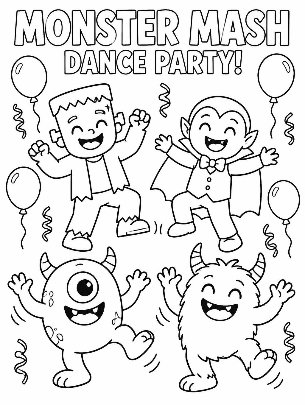
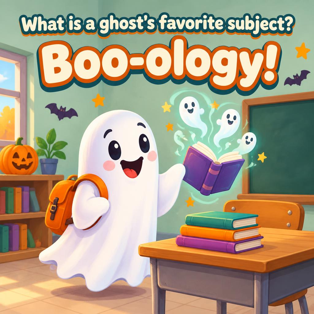
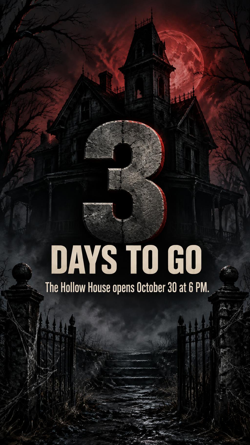
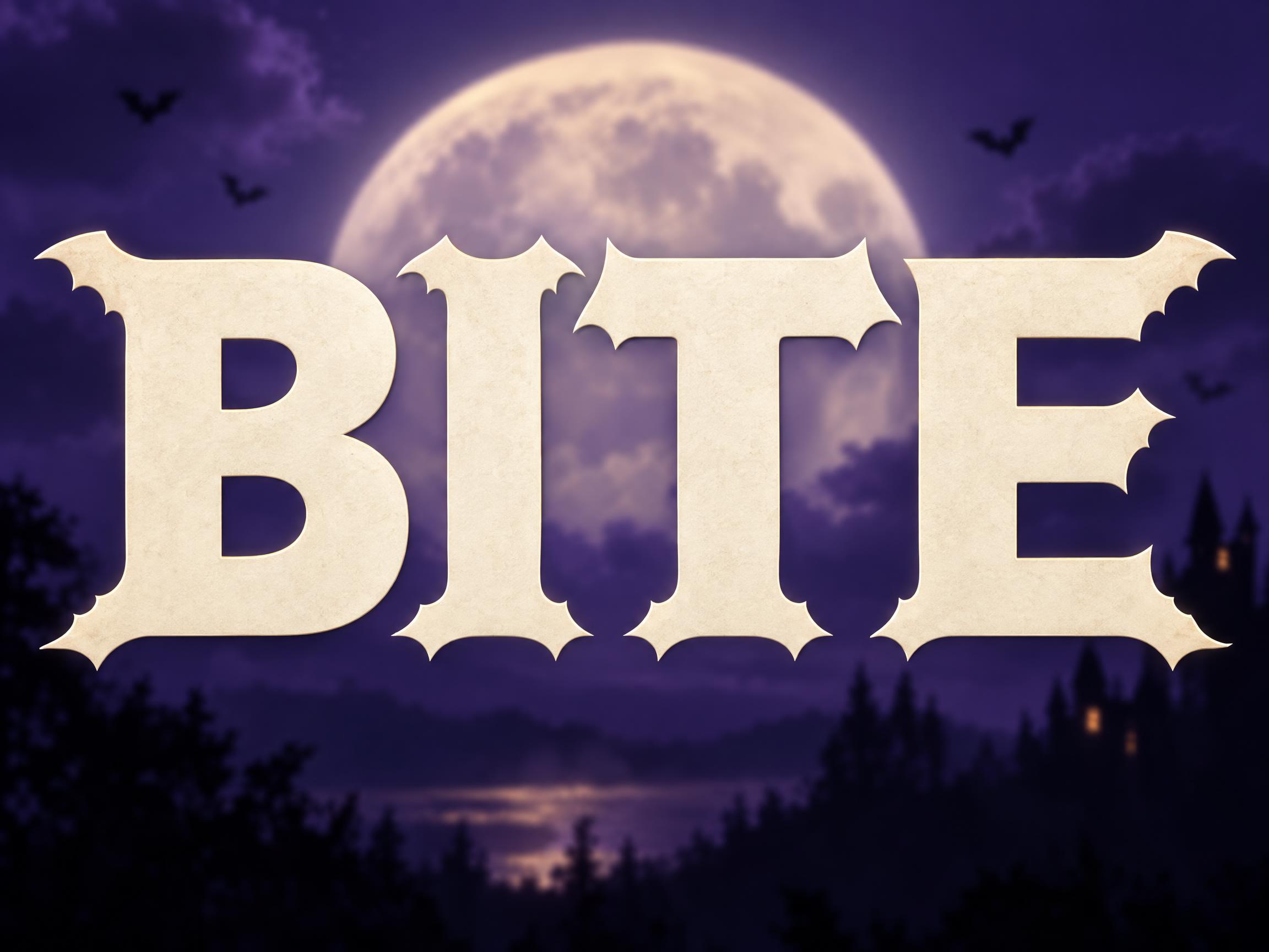
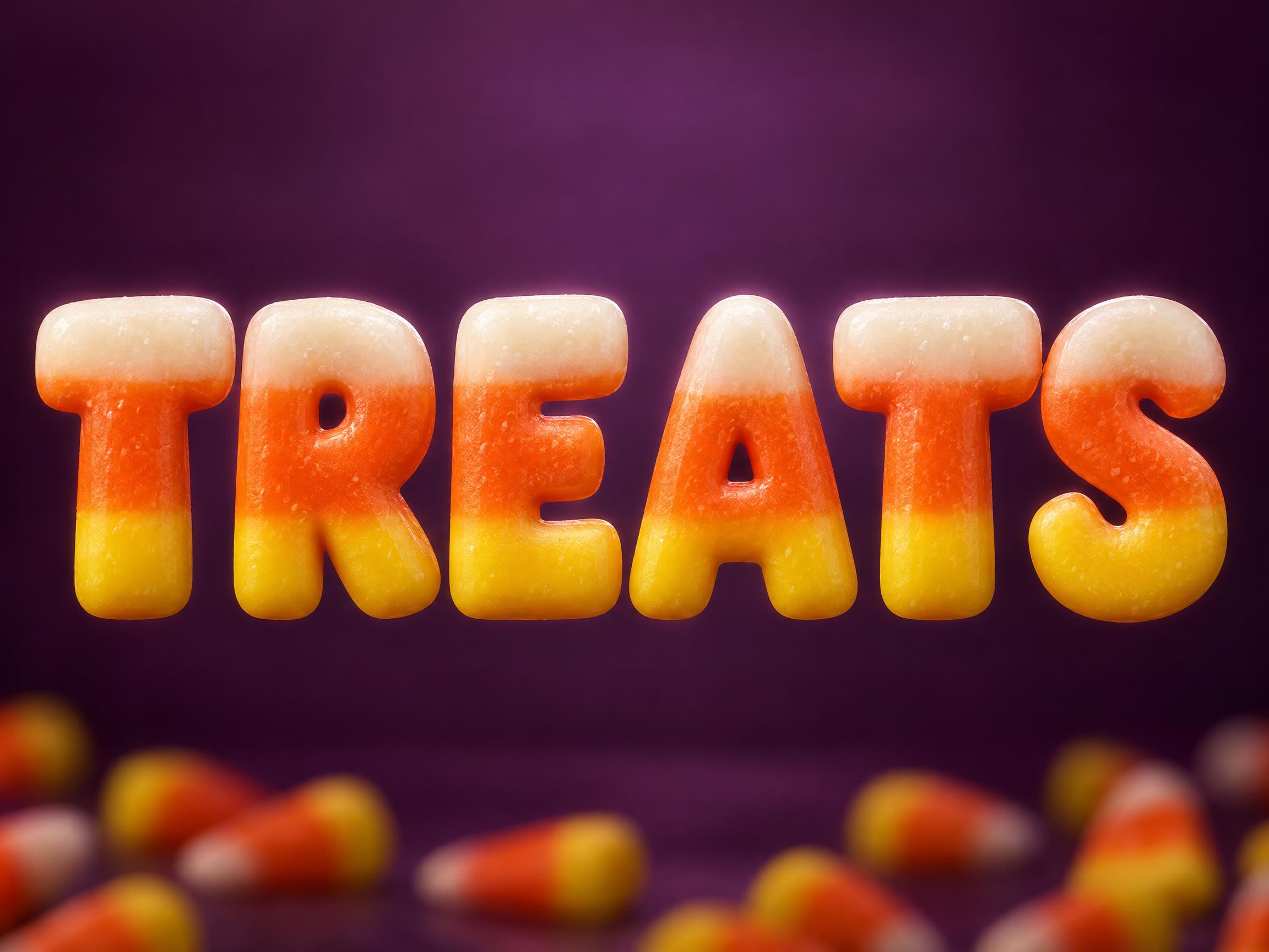
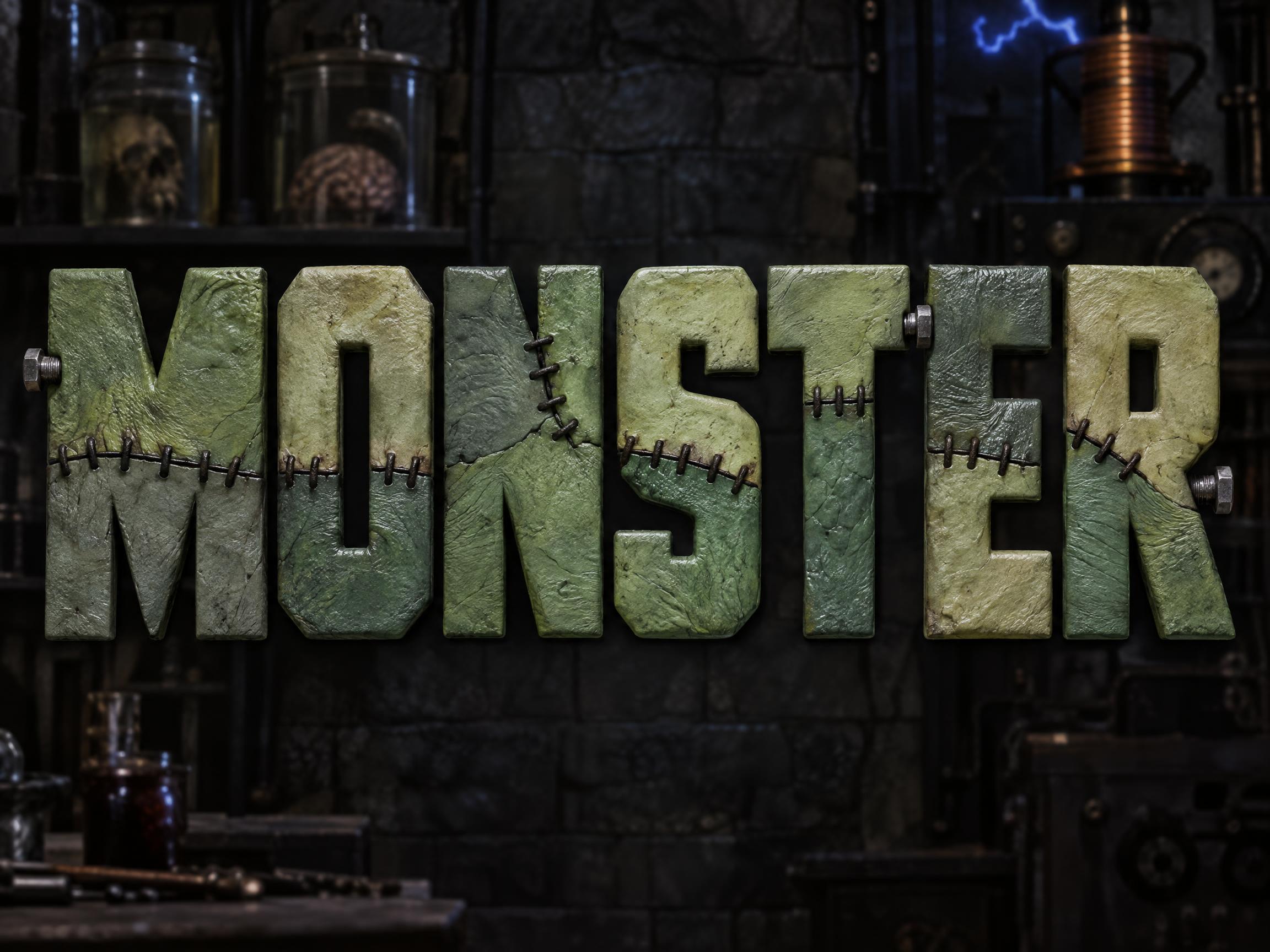
Every one was made with FontVibe. Use a design and swap in your own words.
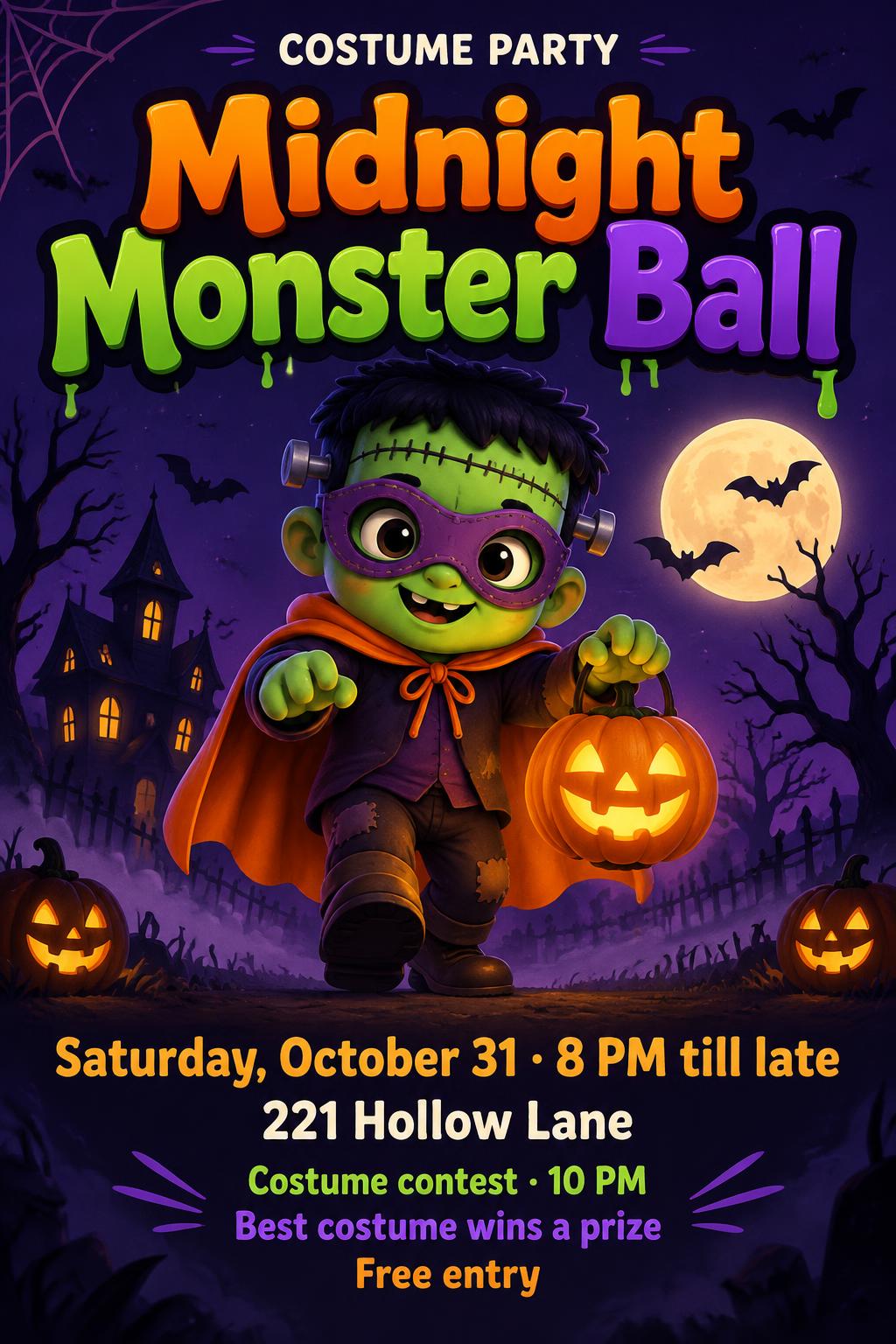
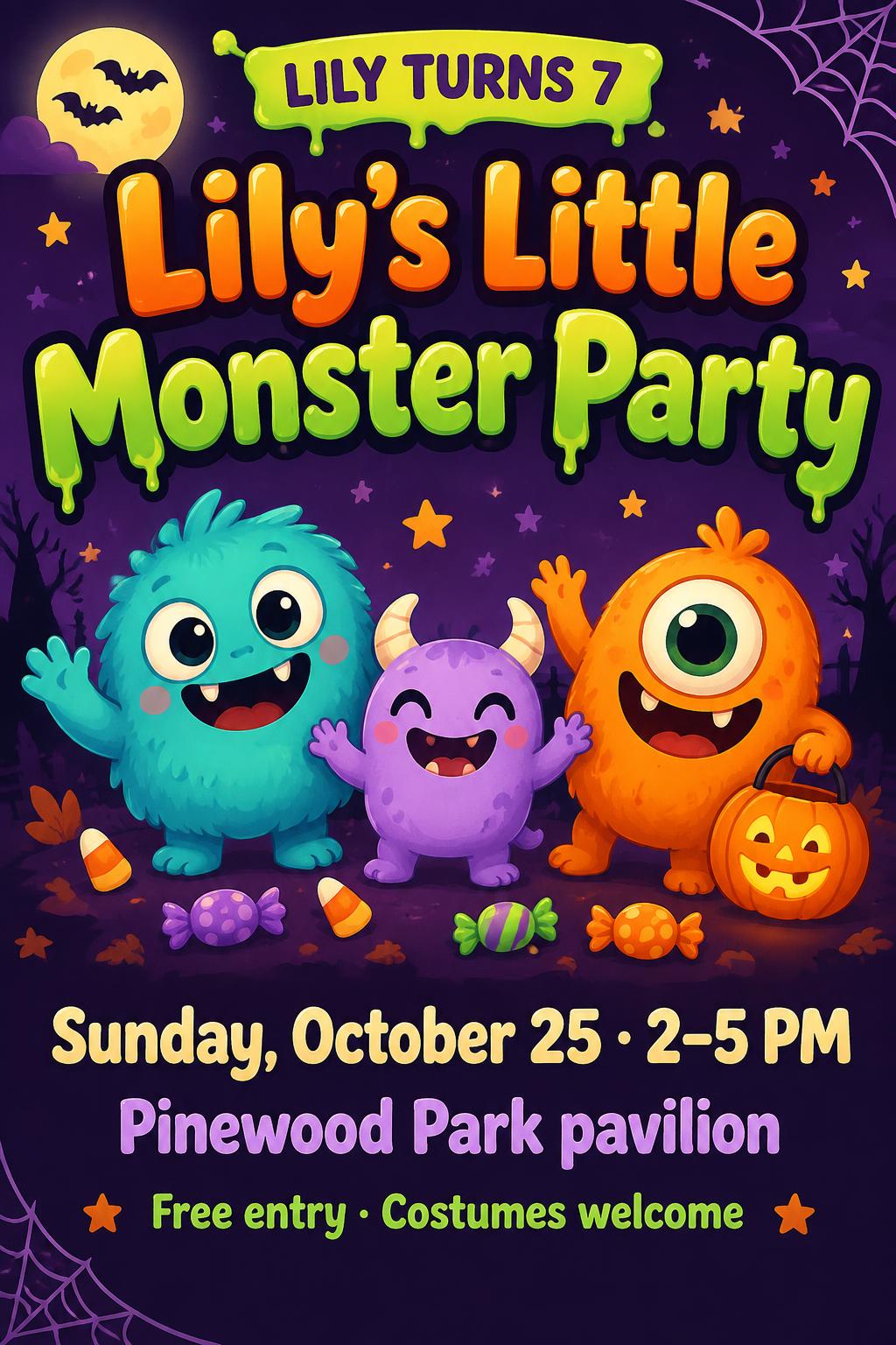
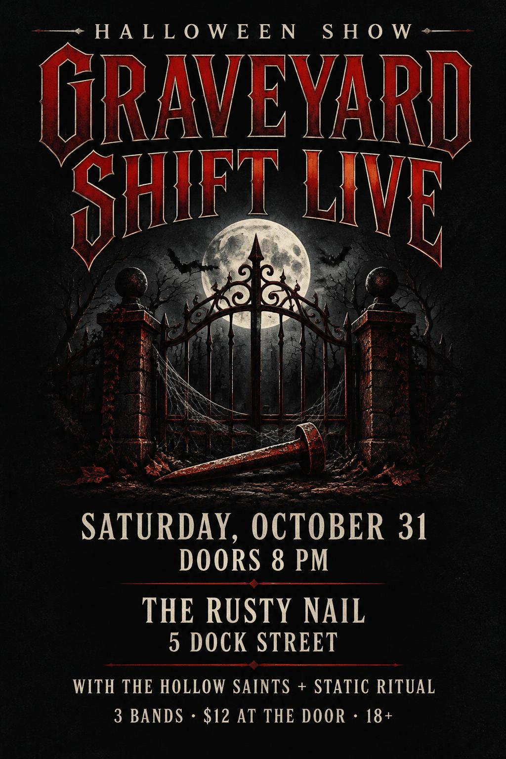
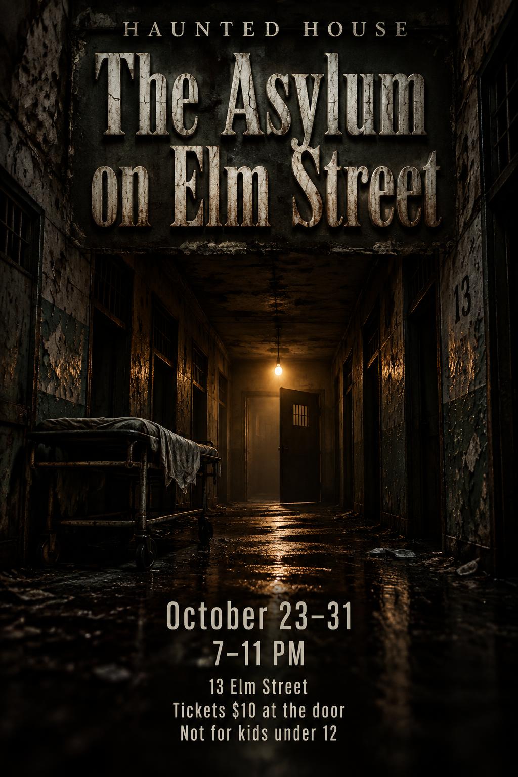
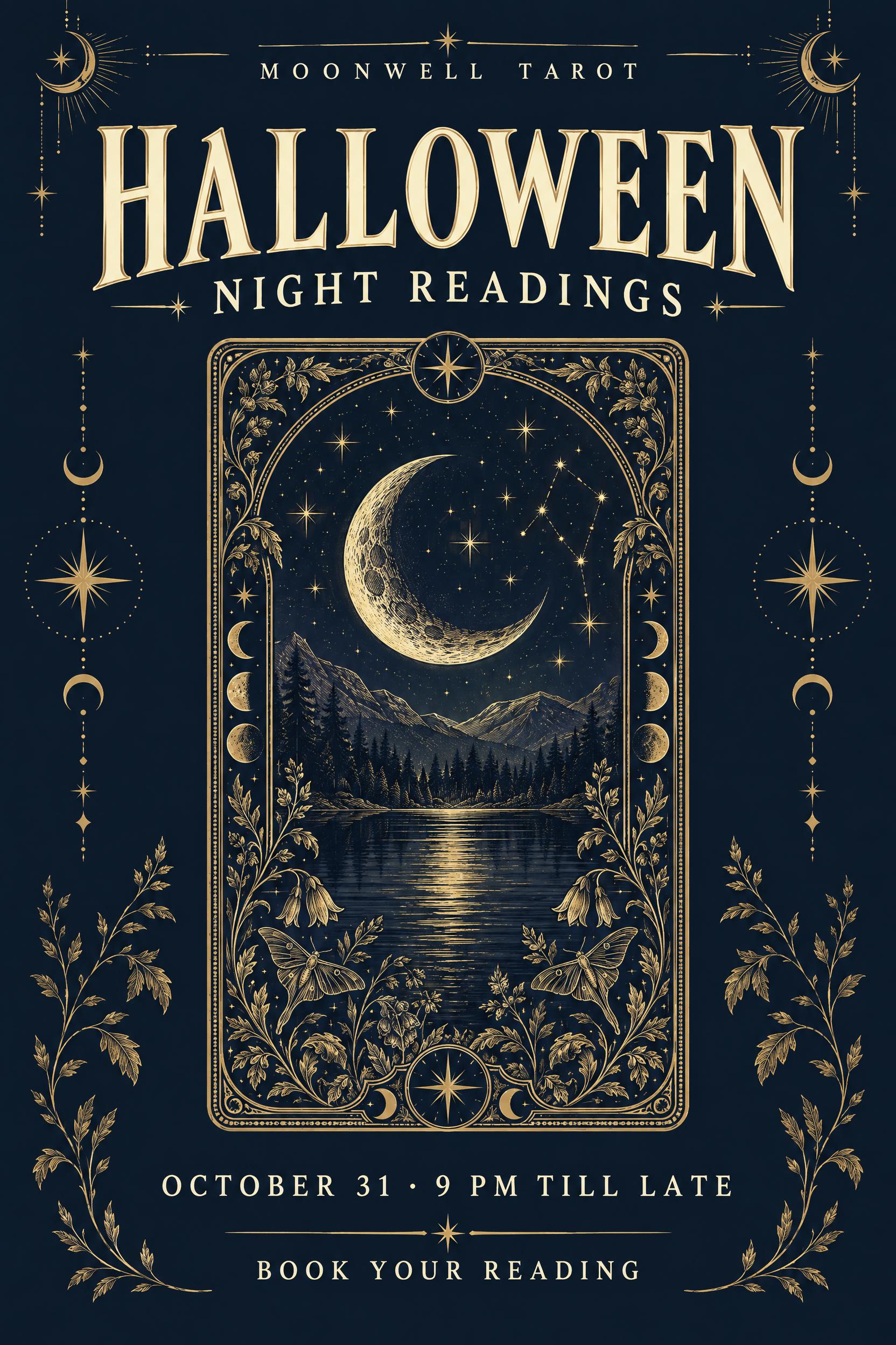
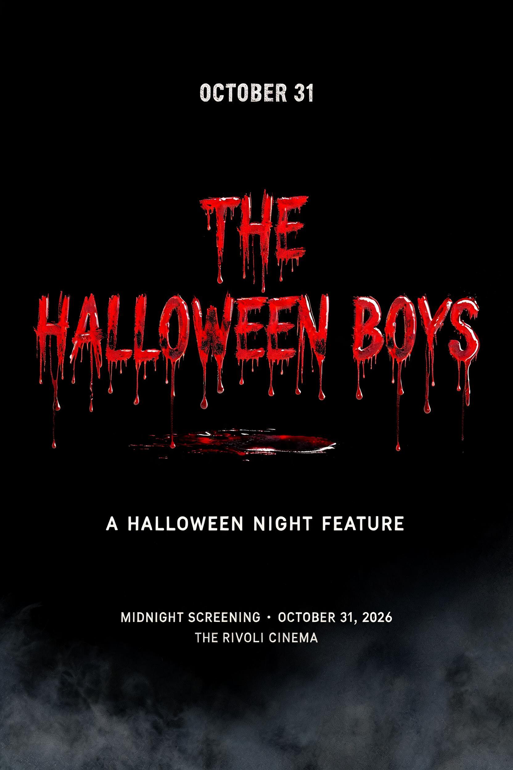
What to write on your Halloween poster
Line by line, with a rule and examples for each. Tap a line to add it to your brief.
Event name
Name the event in two to four words and make it the biggest thing on the poster: it should say what happens.
Date & time
Put the date and start time right under the name, because it is the second thing people look for. Add an end time if there is one.
Place
Give the venue name and the street or area in one short line, and make sure the name and place are easy to see.
Cost & sign-up
Say what it costs, or that it is free, and how to join: the poster has to answer before anyone can ask.
Good to know
Add an age limit or a costume call in one short line. This is small print, read up close.
Make the rest of your Halloween set
Same look, every format — each one opens its own maker. All Halloween →
AI fonts & styles for your Halloween poster
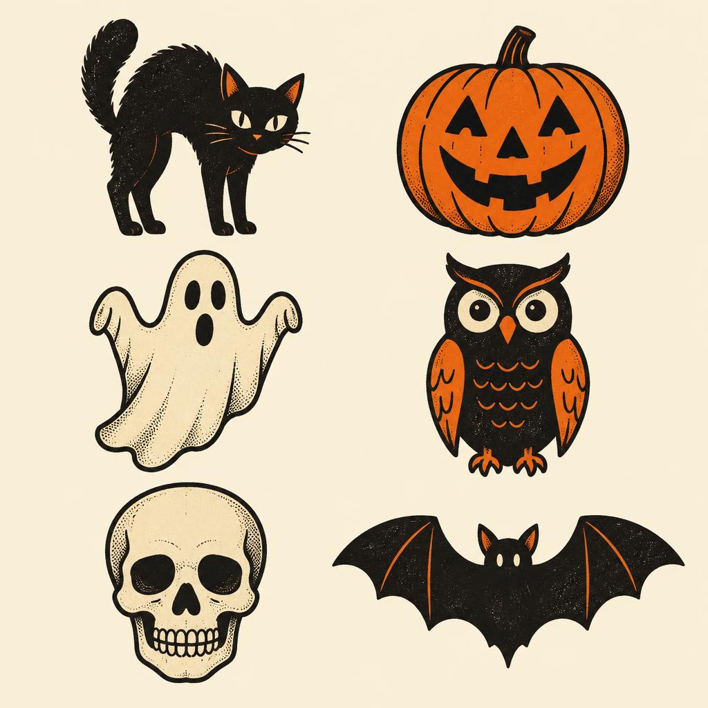
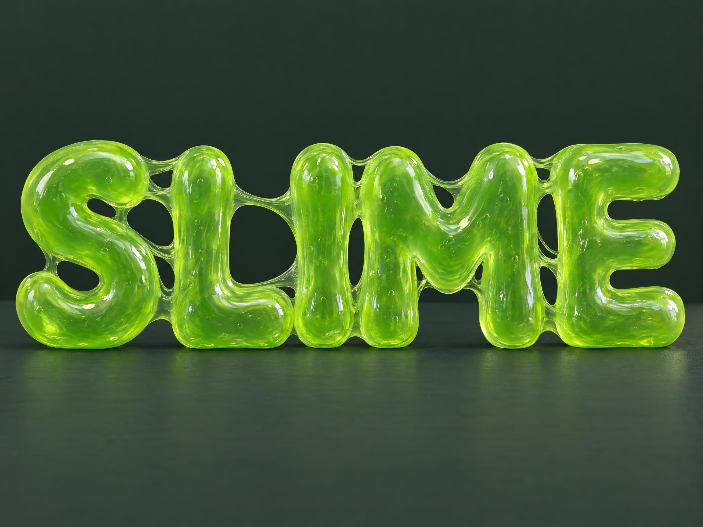
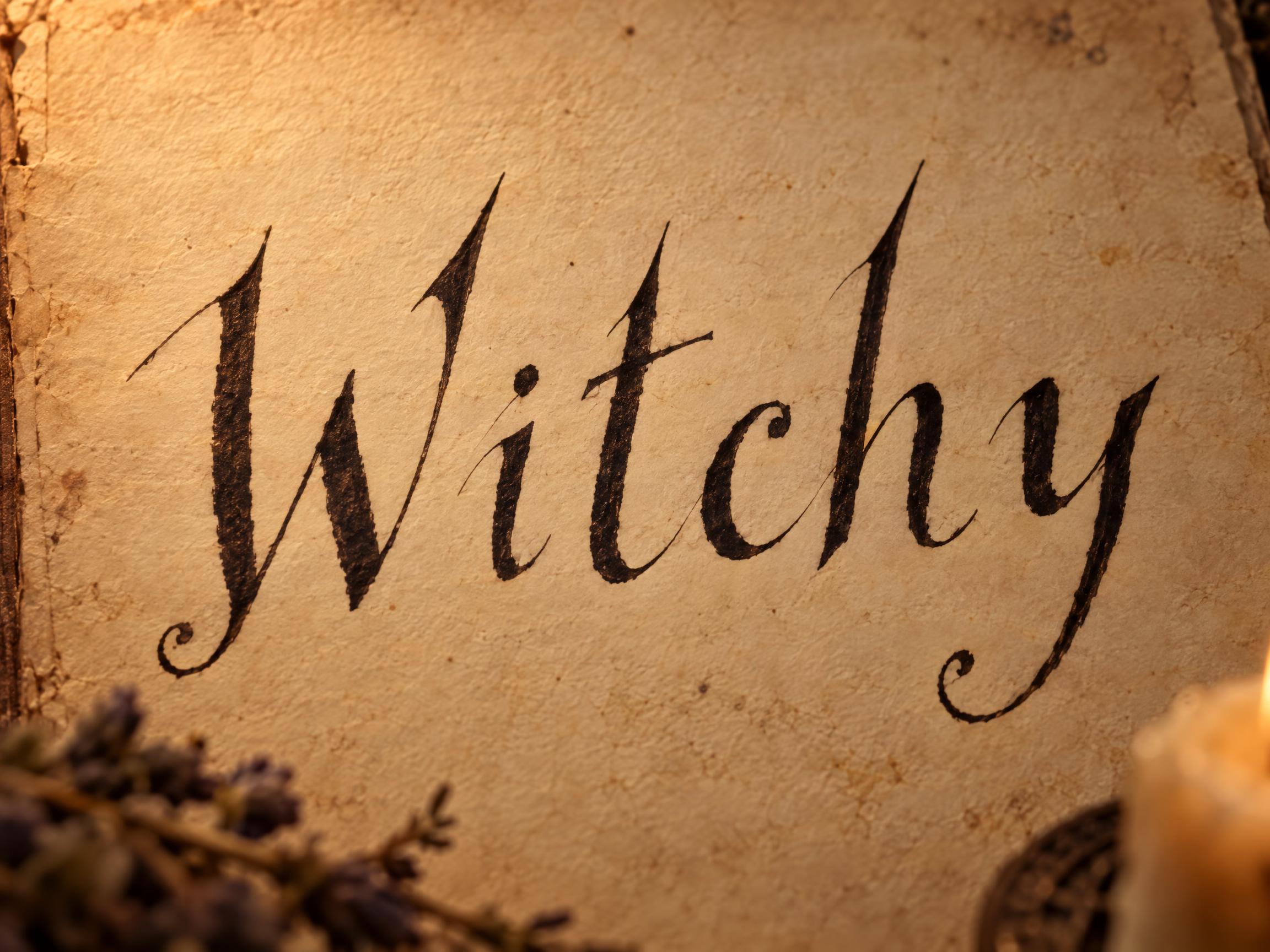
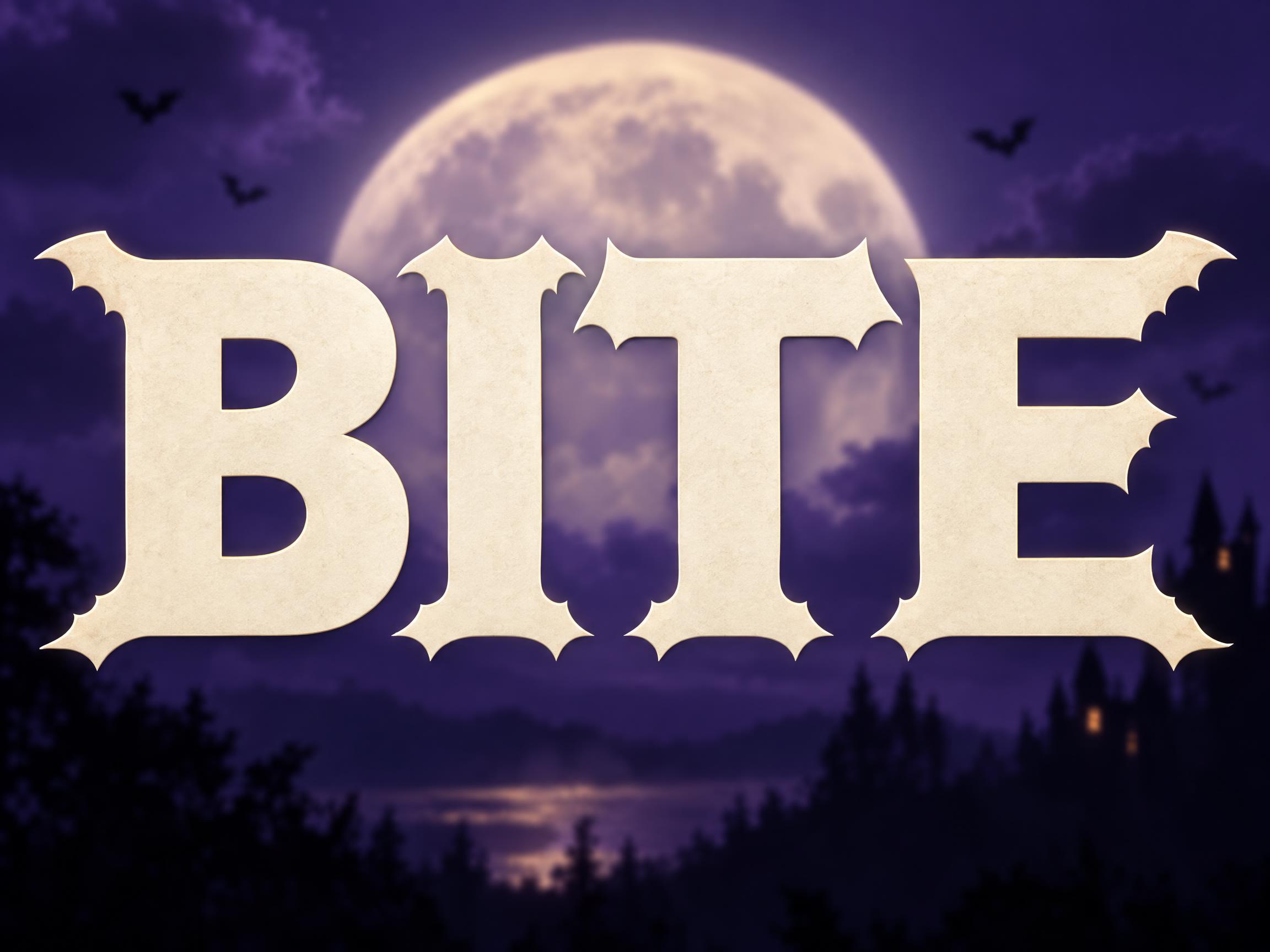
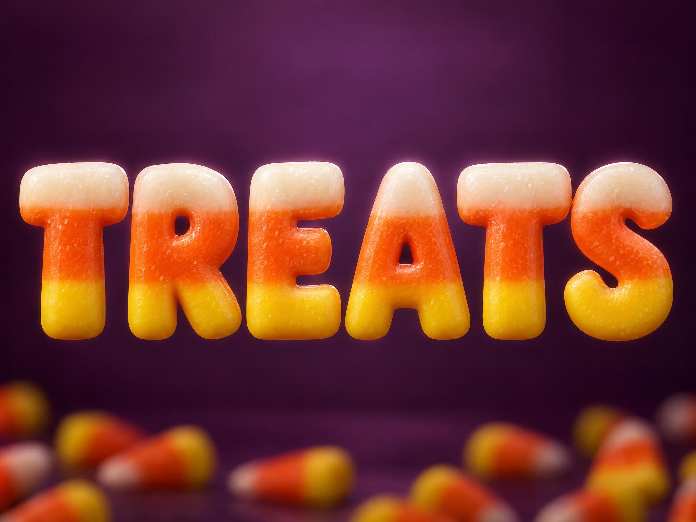
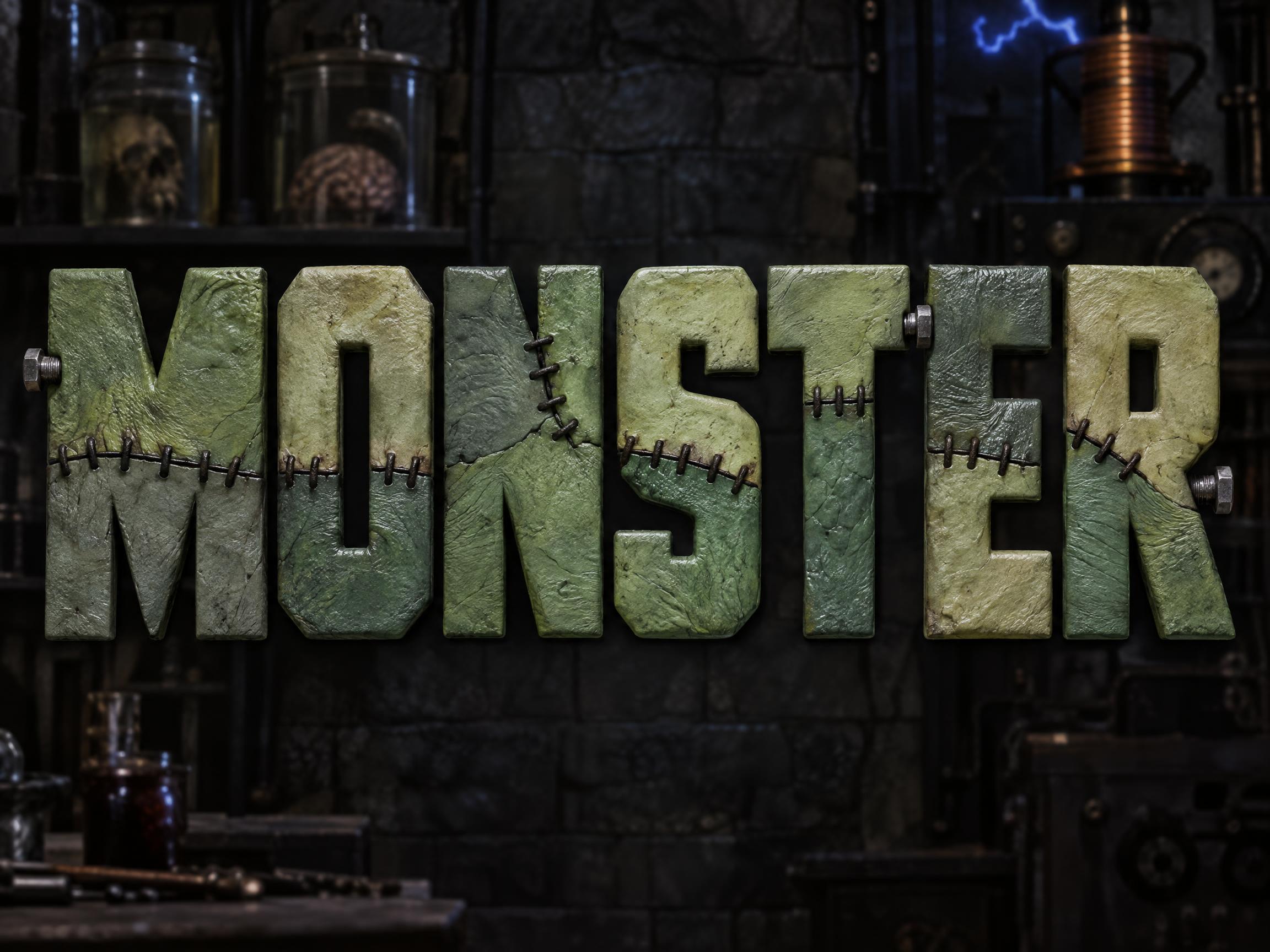
Every AI style and AI font tuned for Halloween. Use one above, or open it to see everything made with it.
AI styles 6Browse all styles


AI fonts 20Browse all AI fonts






Checklist & sizes for your Halloween poster
What to put on a Halloween poster
- 1The event name, as the headline
- 2Date and start time, plus an end time if there is one
- 3The venue name and the street or area
- 4What it costs, or that it is free
- 5How to join: tickets, sign-up or who to contact
- 6An age limit or a costume call, in one short line
- 7Haunted houses: opening dates and times, and the admission price
- 8Printing: 18 × 24 and 24 × 36 in are the usual sizes for event posters
Sources: Made Good Designs — Event poster design · Signs.com — Promoting your haunted house · 4over4 — Poster sizes and dimensions
Sizes and pixels
| Use | Aspect | Pixels at 2K |
|---|---|---|
| Poster, 11 × 17 in | 2:3, trim about 1/6 in per side | 1664 × 2496 |
| Poster, 24 × 36 in | 2:3 | 1664 × 2496 |
| Posted as an image (group chat, social) | 2:3 | 1664 × 2496 |
At 11 × 17 in, 1664 × 2496 is about 147 pixels per inch; at 24 × 36 in it is about 69, so it looks soft up close. Print shops ask for 300 pixels per inch up to 24 × 36. For a bigger or sharper print, open the design in the creation space and make it larger. Need 18 × 24 in (3:4)? Change the aspect ratio there.
Read it from three steps away
A poster is read in a glance, then a second look. Give the name and the date all the size, and keep the rest short, so a passer-by gets what and when before they walk on.
Tags in Halloween poster
Every tag used on this page — each opens the designs, fonts and styles that share it.
Questions
How to make your Halloween poster on FontVibe
- 1Write the detailsType the headline, names, date, time and place — the exact words you want on your design.
- 2Pick a lookChoose one of 6 Halloween styles and 20 AI fonts, or leave both on Auto.
- 3Generate and checkFontVibe draws your words as part of the image. If a word is wrong, open Edit and say which word to change.
- 4DownloadSave a PNG or JPG and print it at 11 × 17 in at about 147 ppi, trim about 1/6 in per side.
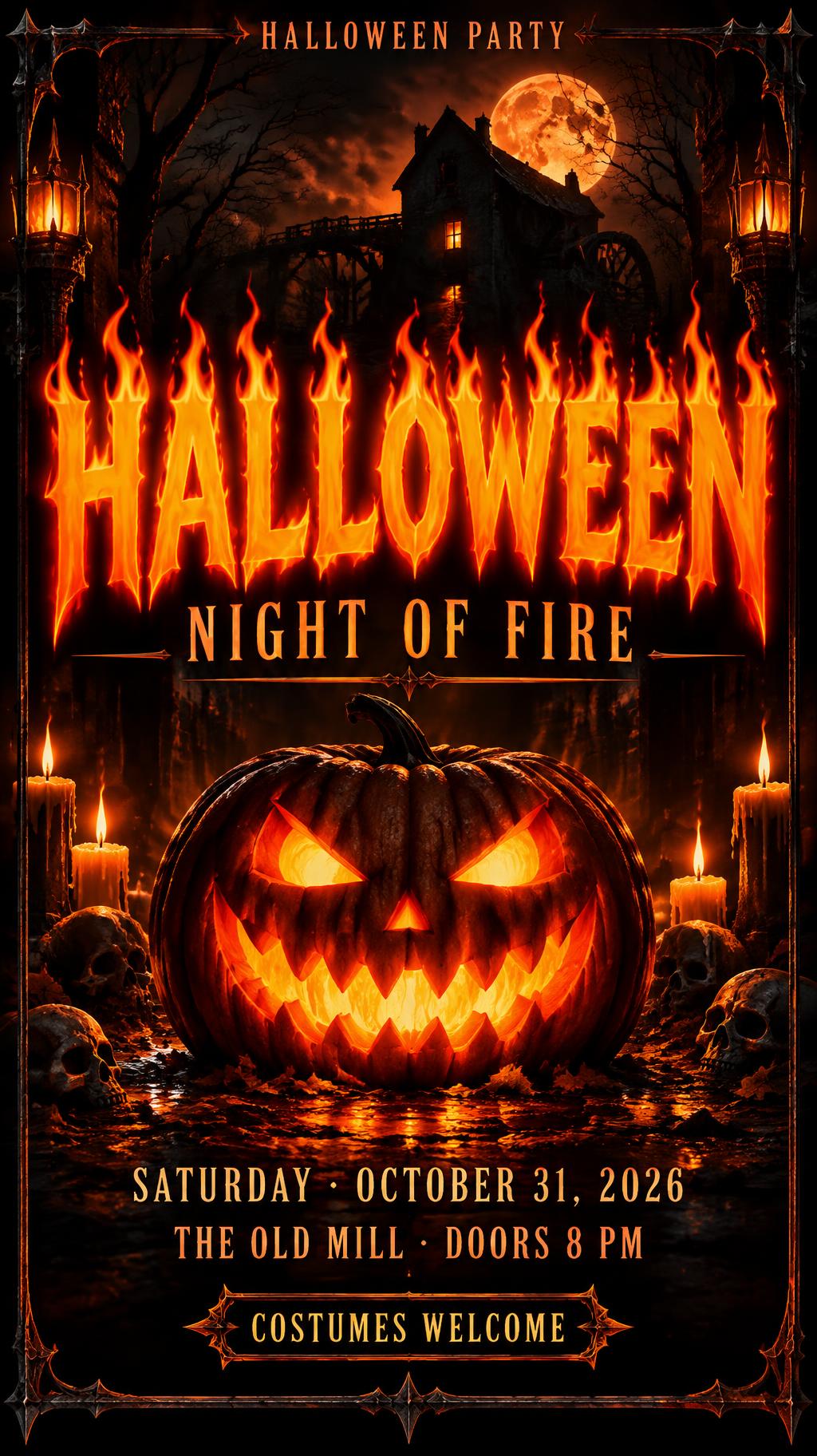
Ideas for your Halloween poster
Every one was made with FontVibe. Use a design and swap in your own words.
What to write on your Halloween poster
Line by line, with a rule and examples for each. Tap a line to add it to your brief.
Event name
Name the event in two to four words and make it the biggest thing on the poster: it should say what happens.
Date & time
Put the date and start time right under the name, because it is the second thing people look for. Add an end time if there is one.
Place
Give the venue name and the street or area in one short line, and make sure the name and place are easy to see.
Cost & sign-up
Say what it costs, or that it is free, and how to join: the poster has to answer before anyone can ask.
Good to know
Add an age limit or a costume call in one short line. This is small print, read up close.
Make the rest of your Halloween set
Same look, every format — each one opens its own maker. All Halloween →
AI fonts & styles for your Halloween poster
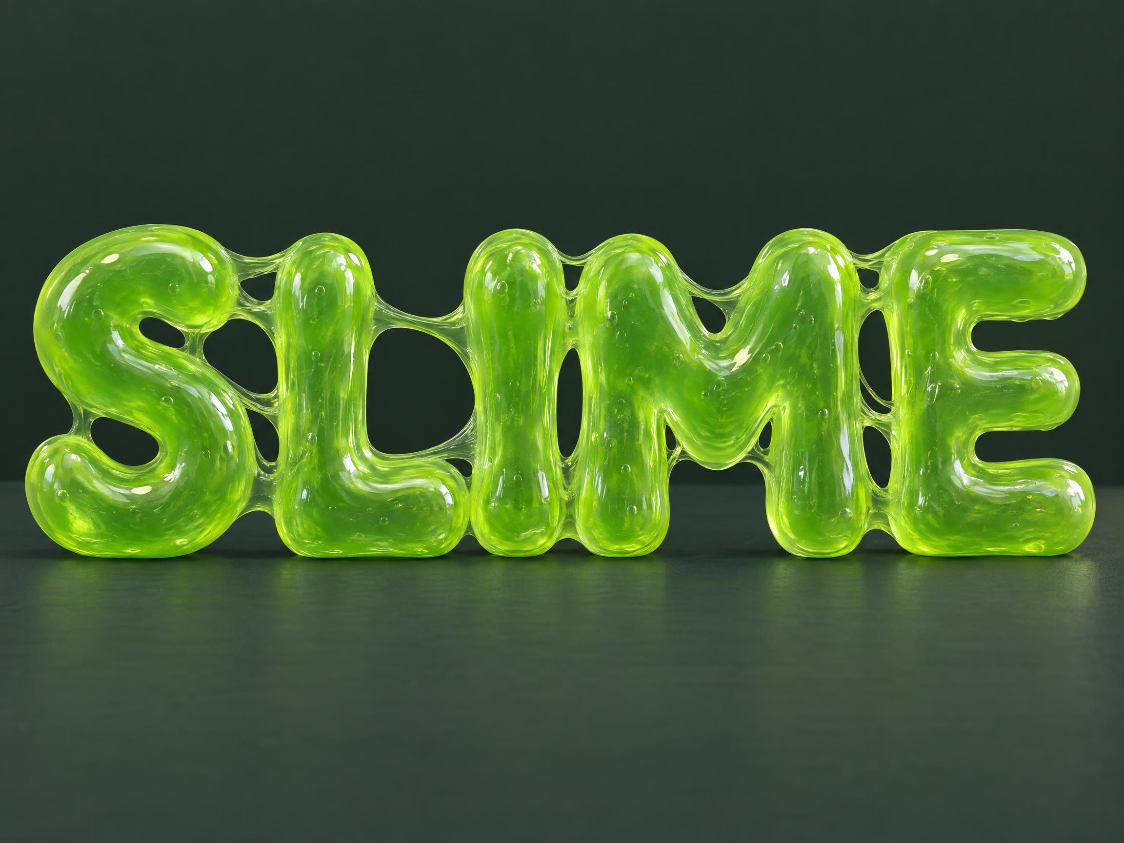
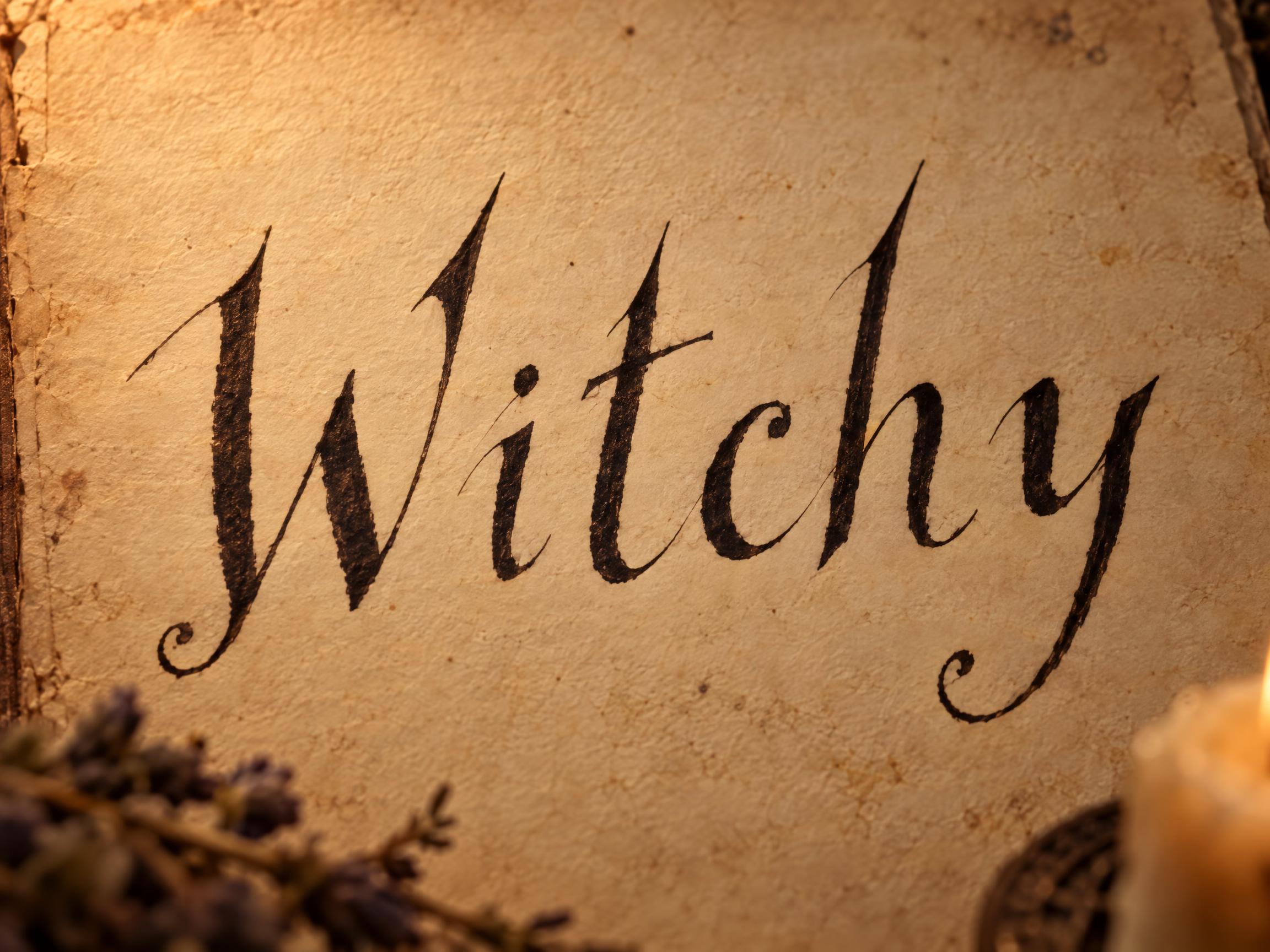
Every AI style and AI font tuned for Halloween. Use one above, or open it to see everything made with it.
AI styles 6Browse all styles
AI fonts 20Browse all AI fonts






Checklist & sizes for your Halloween poster
What to put on a Halloween poster
- 1The event name, as the headline
- 2Date and start time, plus an end time if there is one
- 3The venue name and the street or area
- 4What it costs, or that it is free
- 5How to join: tickets, sign-up or who to contact
- 6An age limit or a costume call, in one short line
- 7Haunted houses: opening dates and times, and the admission price
- 8Printing: 18 × 24 and 24 × 36 in are the usual sizes for event posters
Sources: Made Good Designs — Event poster design · Signs.com — Promoting your haunted house · 4over4 — Poster sizes and dimensions
Sizes and pixels
| Use | Aspect | Pixels at 2K |
|---|---|---|
| Poster, 11 × 17 in | 2:3, trim about 1/6 in per side | 1664 × 2496 |
| Poster, 24 × 36 in | 2:3 | 1664 × 2496 |
| Posted as an image (group chat, social) | 2:3 | 1664 × 2496 |
At 11 × 17 in, 1664 × 2496 is about 147 pixels per inch; at 24 × 36 in it is about 69, so it looks soft up close. Print shops ask for 300 pixels per inch up to 24 × 36. For a bigger or sharper print, open the design in the creation space and make it larger. Need 18 × 24 in (3:4)? Change the aspect ratio there.
Read it from three steps away
A poster is read in a glance, then a second look. Give the name and the date all the size, and keep the rest short, so a passer-by gets what and when before they walk on.
Tags in Halloween poster
Every tag used on this page — each opens the designs, fonts and styles that share it.
Questions
How to make your Halloween poster on FontVibe
- 1Write the detailsType the headline, names, date, time and place — the exact words you want on your design.
- 2Pick a lookChoose one of 6 Halloween styles and 20 AI fonts, or leave both on Auto.
- 3Generate and checkFontVibe draws your words as part of the image. If a word is wrong, open Edit and say which word to change.
- 4DownloadSave a PNG or JPG and print it at 11 × 17 in at about 147 ppi, trim about 1/6 in per side.