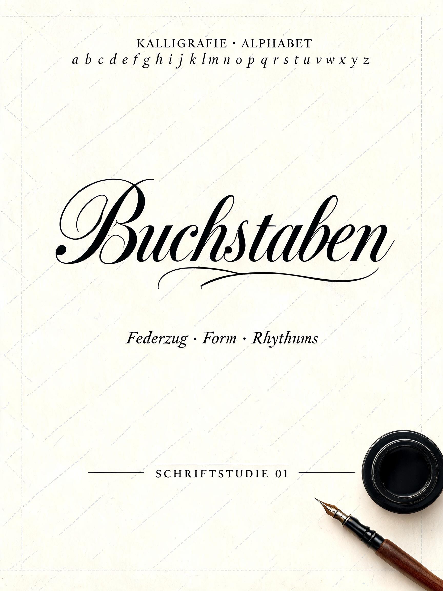
Buchstaben KALLIGRAFIE · ALPHABET a b c d e f g h i j k l m n o p q r s t u v w x y z Federzug · Form · Rhythmus SCHRIFTSTUDIE 01 - Kalligraphie-Schrift Text Effect


Nutzt BytePlus Seedream 5.0, das Modell dieses Werks · 15 Credits
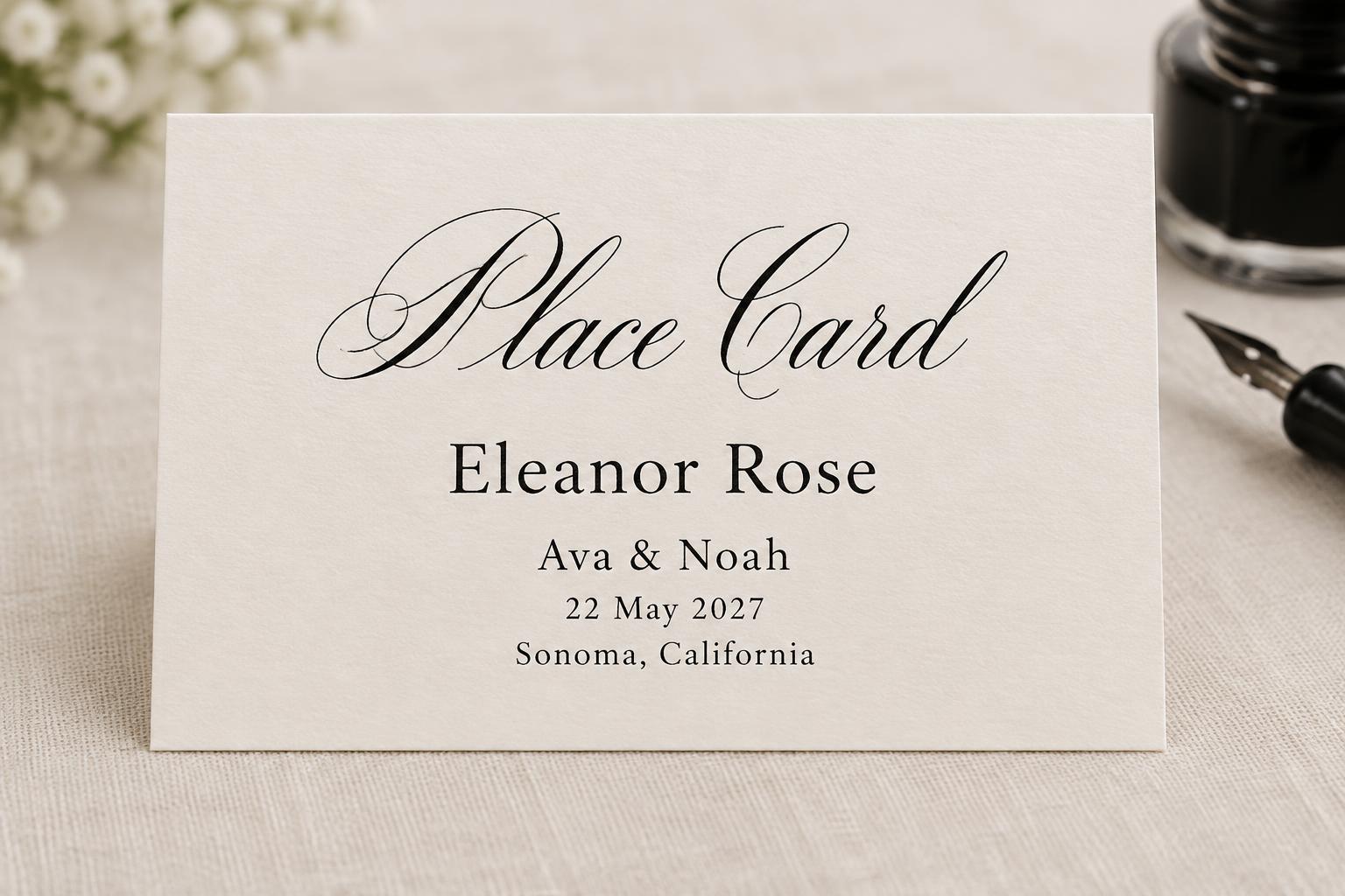
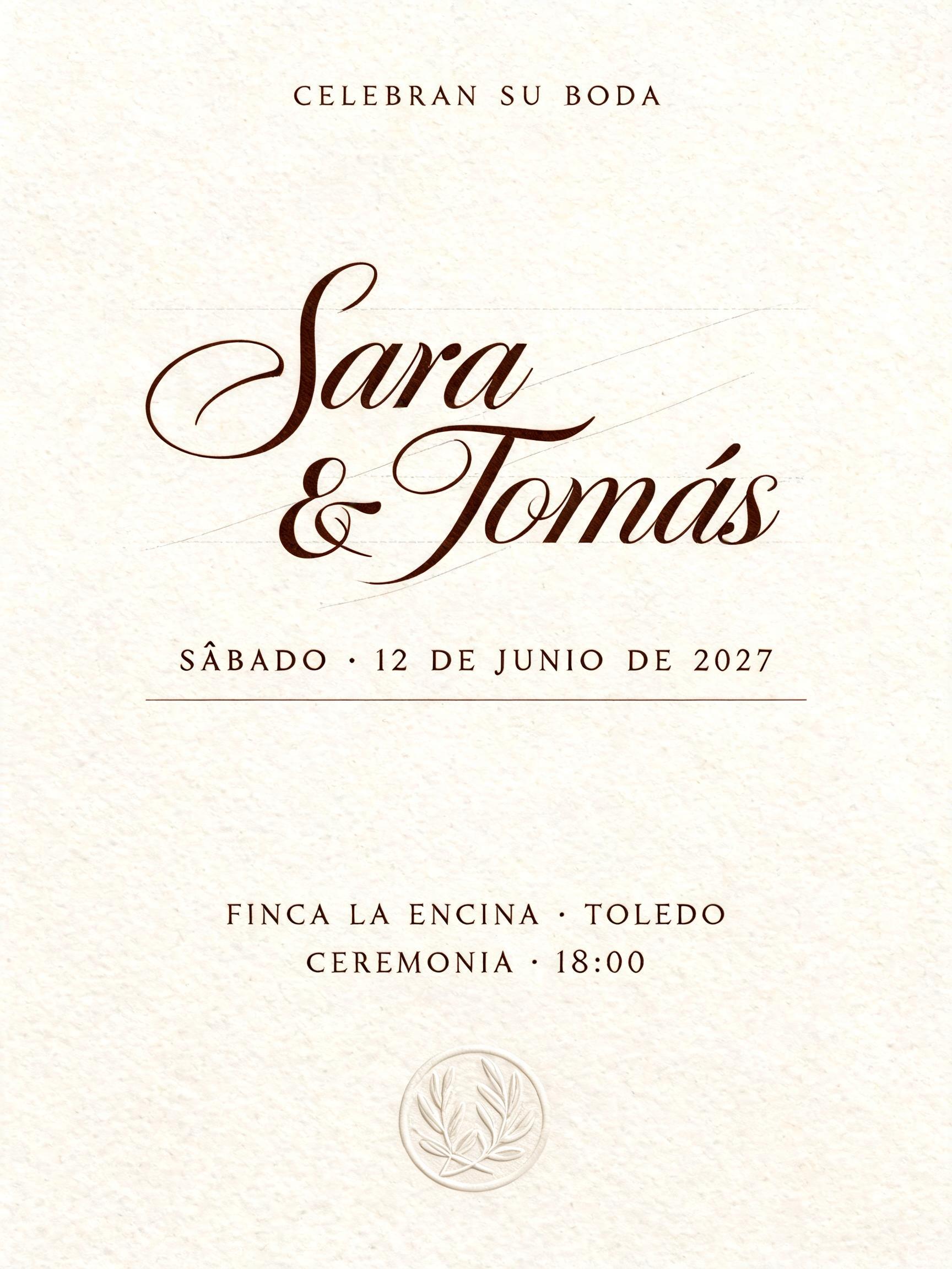
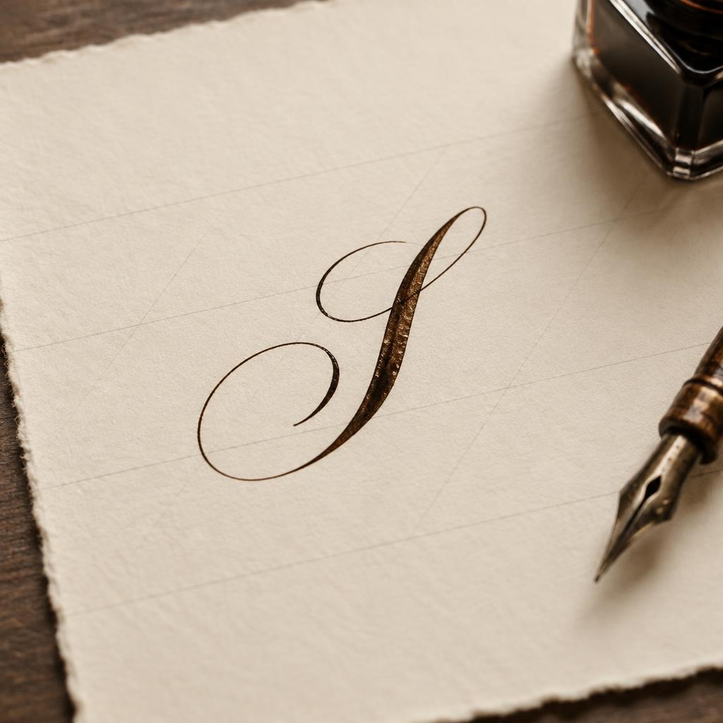
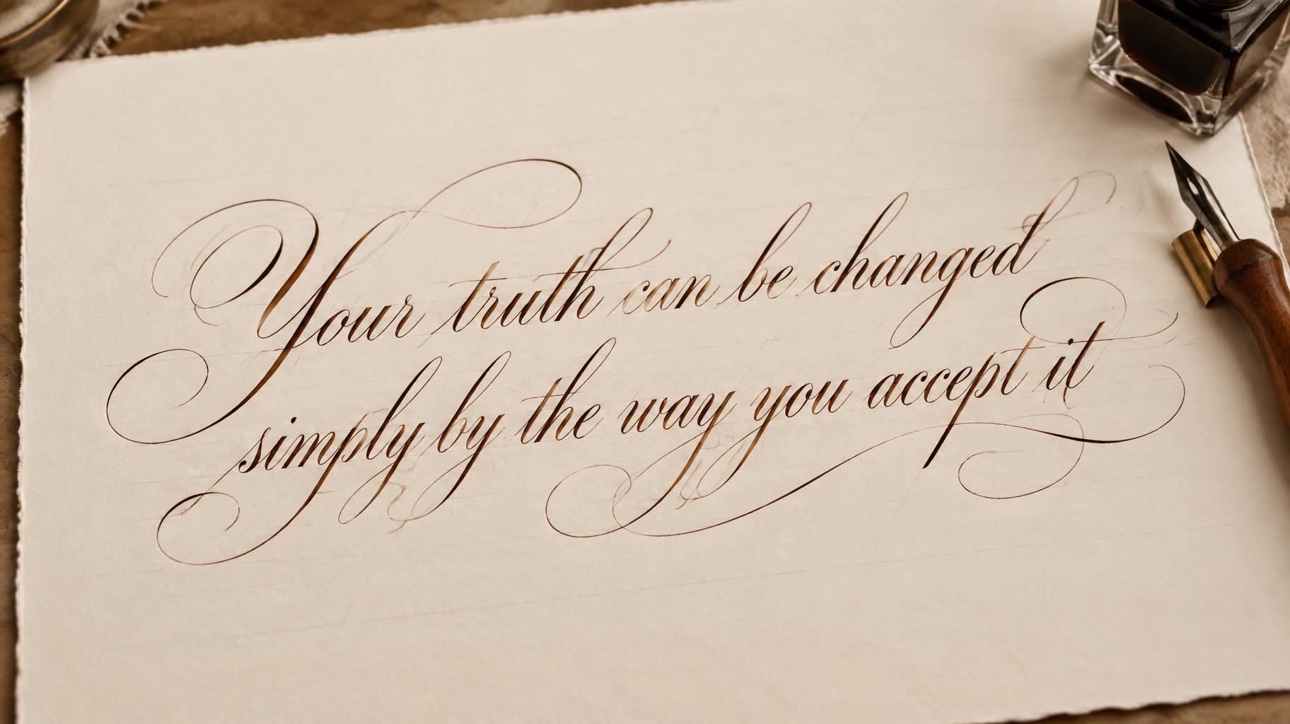
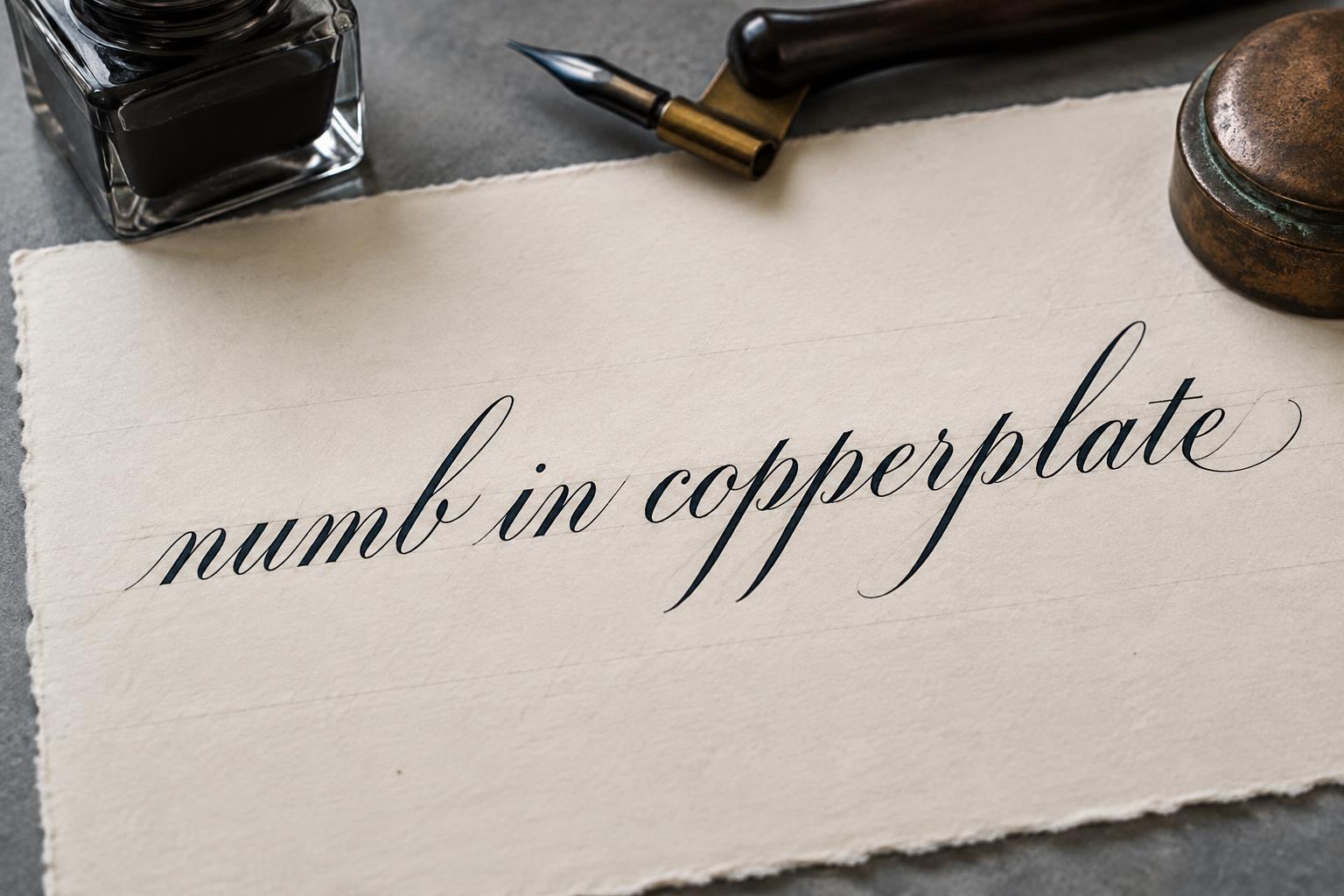
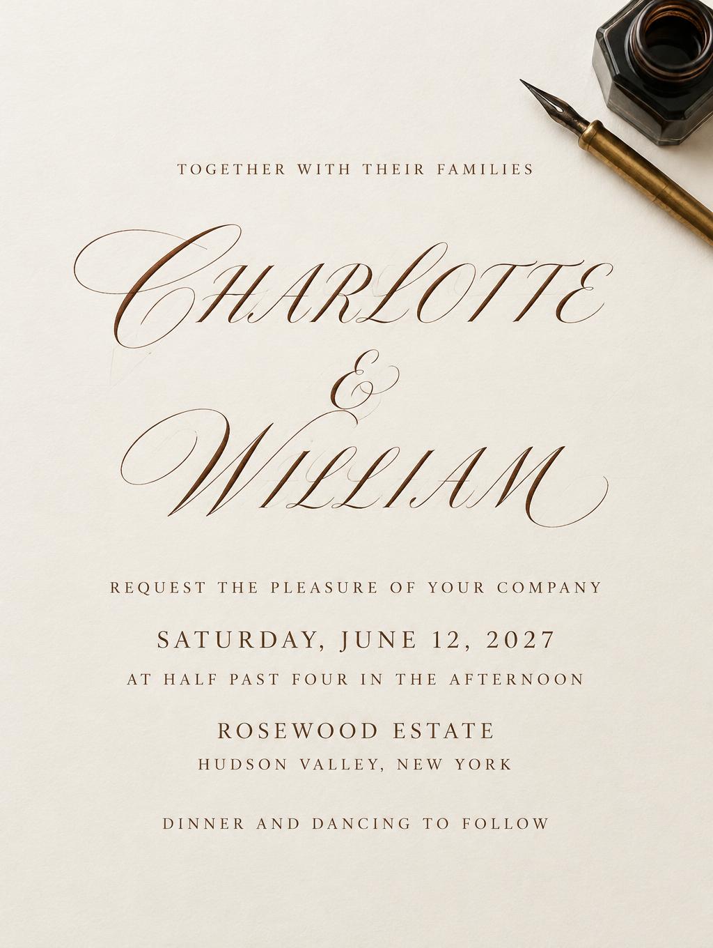
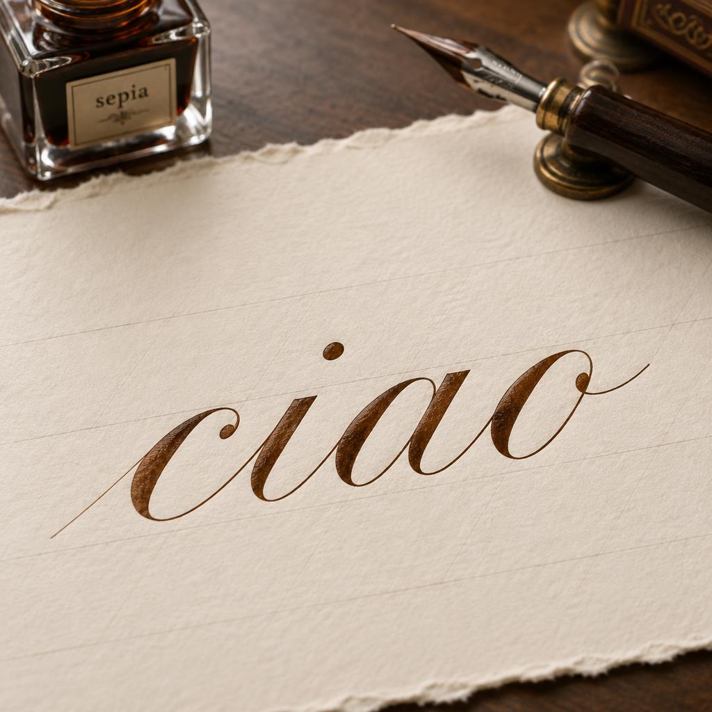
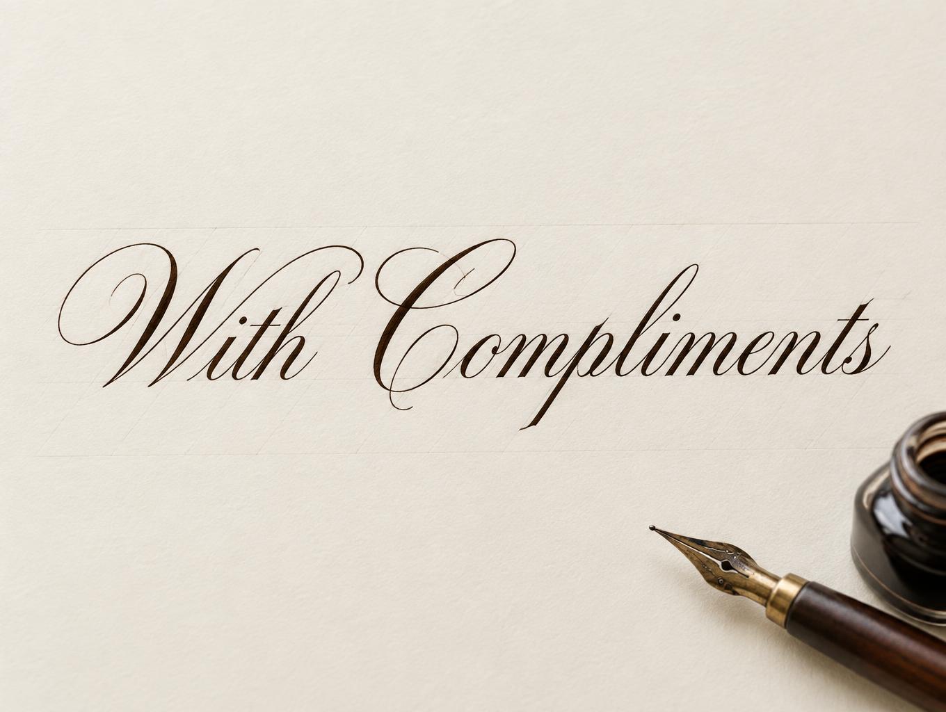
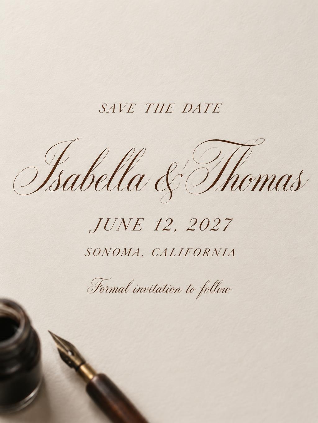
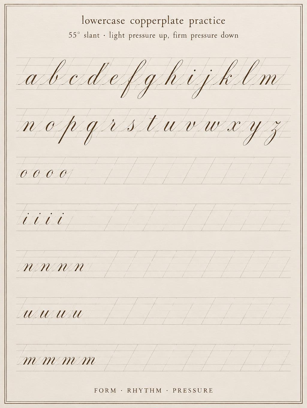
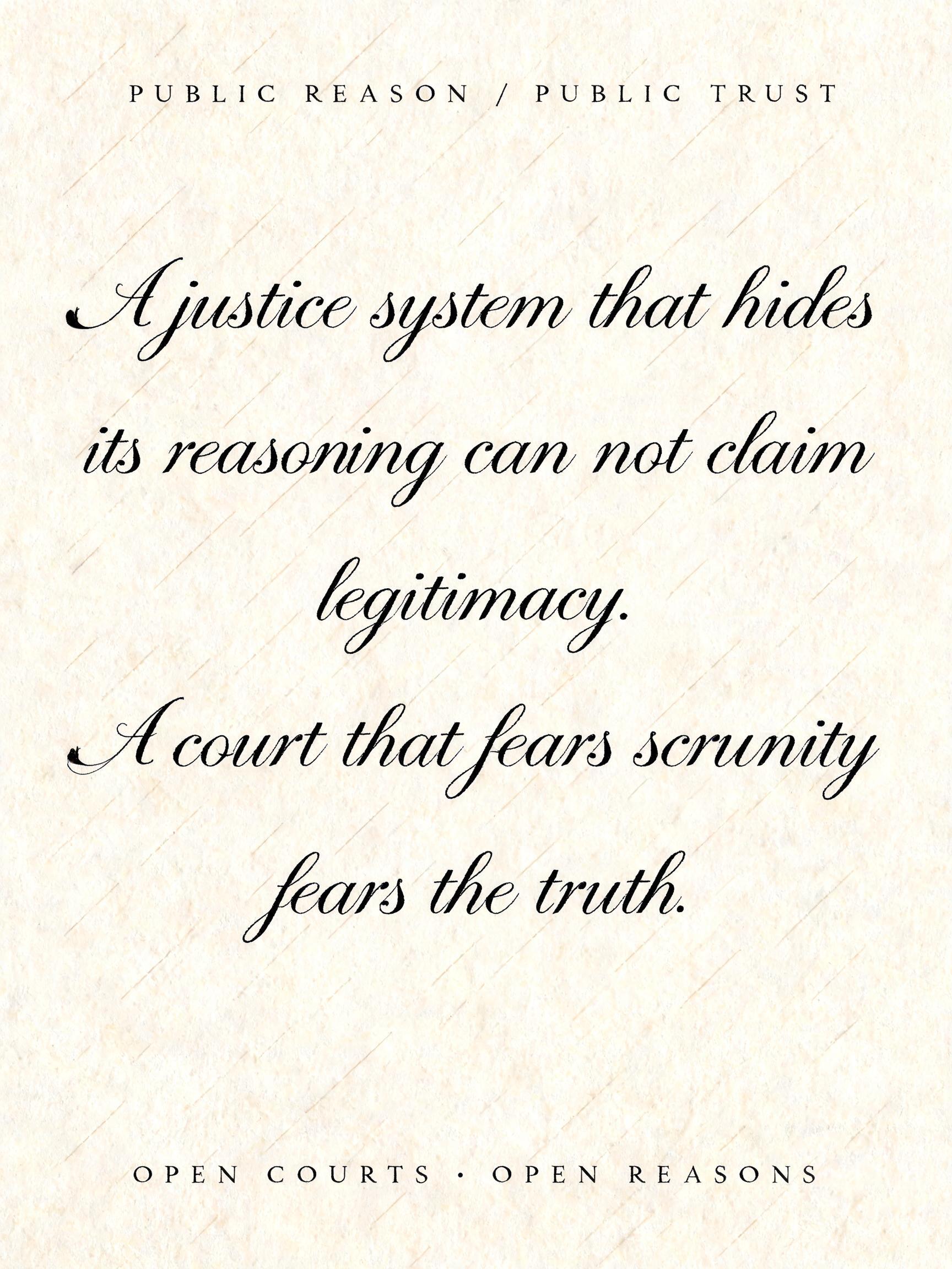
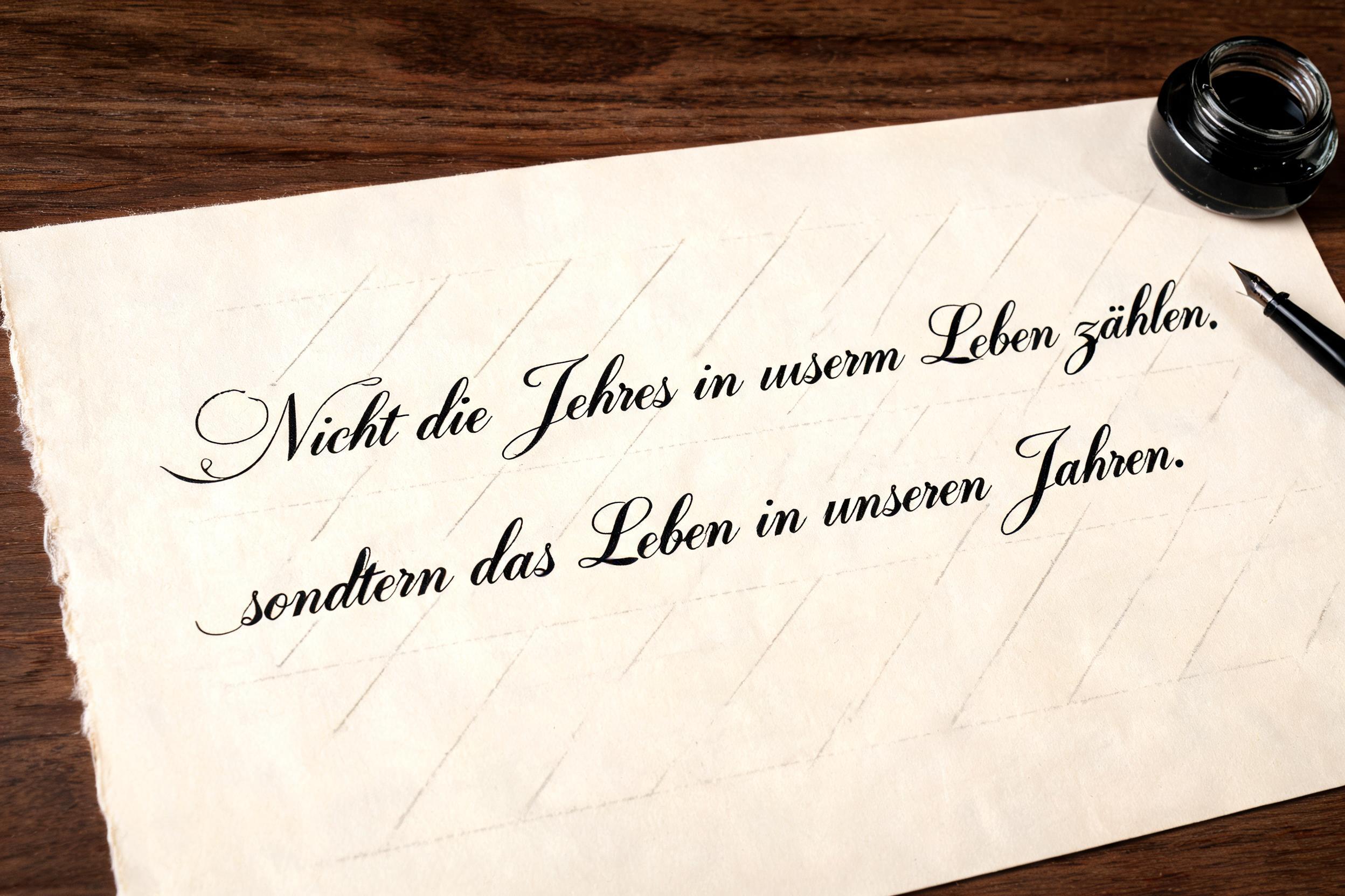
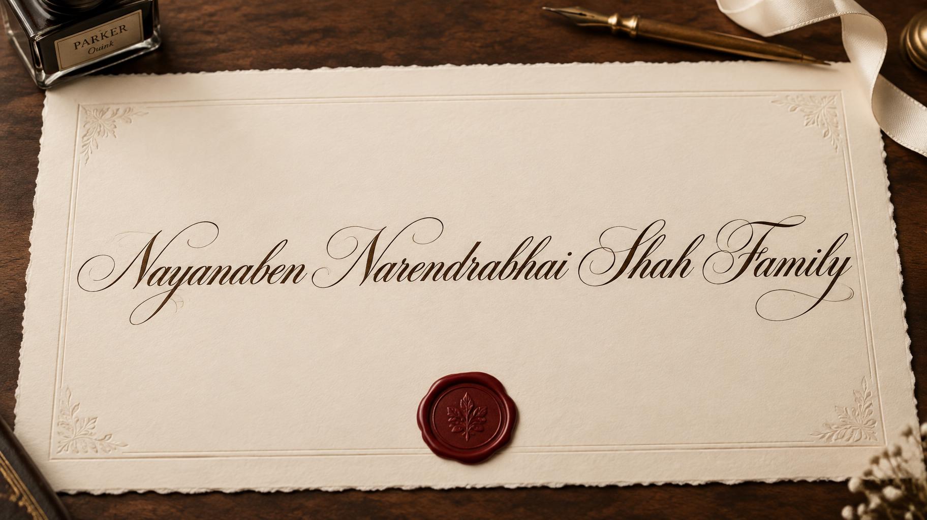

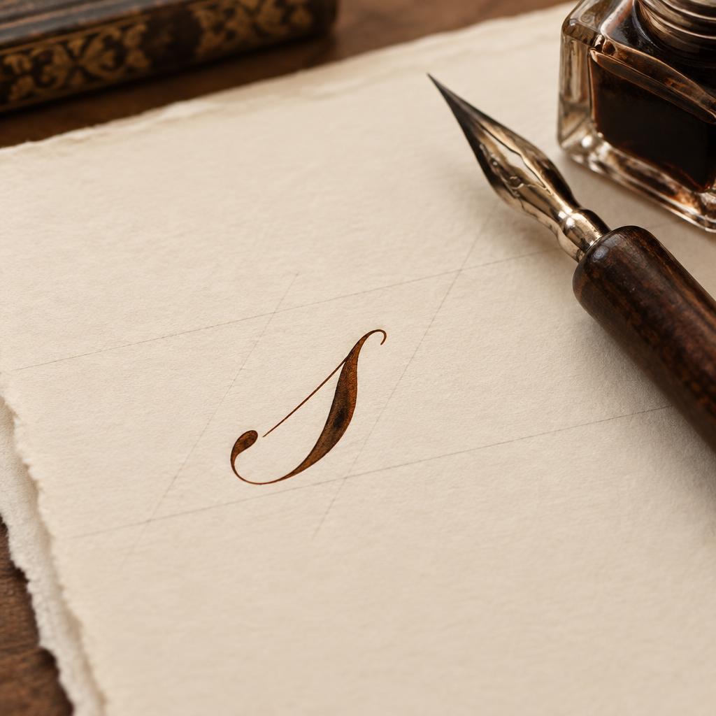
“Buchstaben KALLIGRAFIE · ALPHABET a b c d e f g h i j k l m n o p q r s t u v w x y z Federzug · Form · Rhythmus SCHRIFTSTUDIE 01” is a Cursive Calligraphy text effect Texteffekt erstellt mit FontVibe KI. Formelle Copperplate mit Spitzfeder: starker Kontrast von dick und dünn, schräge ovale Buchstaben und geschwungene Versalien, klare schwarze Tinte auf cremefarbenem Papier mit feinen Hilfslinien.
Create a finished vertical 3:4 calligraphy specimen poster in German, photographed flat and straight-on. Fine warm ivory hot-press cotton paper fills the frame, with generous 8% blank margins and extremely faint grey-blue 55-degree ruled practice guidelines. Even, soft, flat studio lighting reveals paper grain and crisp ink edges; no dramatic shadows. At the top, centered in small spaced serif capitals, print exactly: “KALLIGRAFIE · ALPHABET”. Beneath it, a narrow centered line of disciplined pointed-pen lowercase letters, print exactly: “a b c d e f g h i j k l m n o p q r s t u v w x y z”. The centerpiece occupies 46% of the page width and 31% of its height, centered: print exactly “Buchstaben” in bespoke formal copperplate calligraphy. Build every letter with consistent 55-degree oval slant, rhythmic spacing, whisper-thin hairline upstrokes, broad controlled shaded downstrokes from precise nib pressure, refined connecting strokes, crisp entry and exit strokes. The capital B has a restrained double-loop flourish that stays inside the central zone; the final n finishes with a clean fine hairline sweep. Letters are deep carbon-black pointed-pen ink, with precise wet-ink edges and a faint specular sheen only along broad downstroke ridges. Below, centered in small italic serif type, print exactly: “Federzug · Form · Rhythmus”. At the bottom, a delicate black hairline rule spans 56% width; underneath, centered, print exactly: “SCHRIFTSTUDIE 01”. Add one small out-of-focus pointed-nib dip pen and a closed black ink pot at the lower-right margin, occupying less than 10% of the canvas and never competing with text. Meticulous print layout, uncluttered, no extra words, no illegible text, no ornate border.
Gemacht für Kalligrafie-Alphabet
Generiert am 10. September 2026 · 1728 × 2304 · JPEG · BytePlus Seedream 5.0 · Layout: Alphabetblatt · Von der erstellenden Person geteilt · Kostenlos kommerziell nutzbar (CC BY 4.0)


