

Logan Wiles - Anime Text Effect


Usa BytePlus Seedream 5.0, el modelo de esta obra · 15 créditos







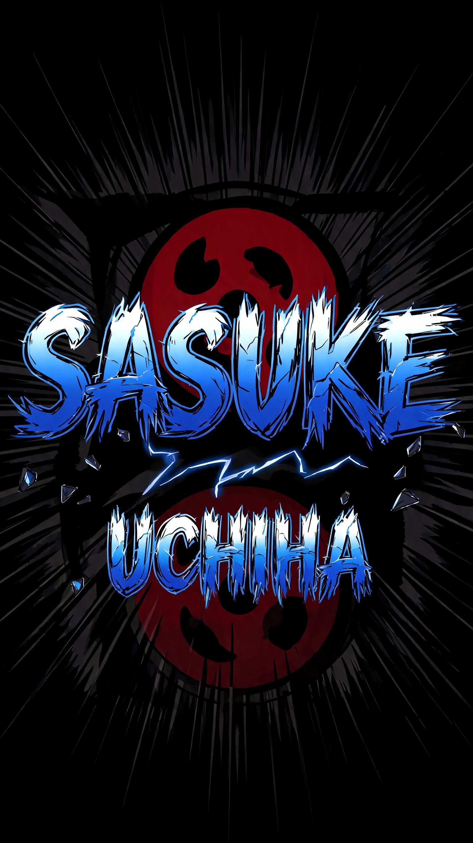
“Logan Wiles” is a Anime text effect efecto de texto creado con FontVibe IA. Rotulación de título shōnen: contornos negros gruesos entintados a mano, sombreado cel plano dividido en bandas duras de luz y sombra, letras inclinadas y dinámicas sobre blanco con líneas de velocidad radiales.
rendered as Japanese shounen anime title treatment — bold hand-inked manga lettering with authentic cel-shaded visual energy. Letter construction follows classic Shonen Jump title card standards: thick black ink outline with natural brush-weight variation defining each letter boundary; flat cel-shading fill with three hard-edge zones — bright highlight zone on upper letter face, highly saturated primary color zone at center, deep shadow zone at lower edge; all zone boundaries knife-edge hard, zero gradient blur, pure flat offset-print ink physics. Energy signature: high-contrast color + thick ink outline = letters that look physically printed on manga paper. The typographic language of Dragon Ball, Naruto, One Piece, Demon Slayer, Jujutsu Kaisen title cards — maximum manga kinetic energy, iconic and immediately recognizable as Japanese anime title typography. Logan Wiles rendered as a bold Japanese shounen anime title card — hero name treatment with maximum manga kinetic energy across a 3:2 horizontal frame. Two-word name presented with 'LOGAN' carrying dominant visual weight and 'WILES' as a strong secondary line, creating natural typographic hierarchy between the two. Pure white panel background with dense radial speed lines erupting outward from behind the letterforms — authentic Shonen Jump chapter-opening impact energy. Each letter constructed with thick black ink outline showing natural brush-weight variation at corners and stroke terminals; flat cel-shaded three-zone fill — crisp white highlight zone across upper letter faces, vivid electric blue primary fill dominating the center body, deep navy shadow zone anchoring the lower edges; all zone transitions razor-hard, zero blur, pure offset-print ink physics. Scattered impact marks and small starburst accent symbols punctuate the negative space around the letter cluster, reinforcing the anime title card aesthetic. High-contrast color dynamics and thick ink boundaries give the name the same printed-on-manga-paper physicality as classic Shonen Jump hero name reveals — iconic, bold, immediately recognizable as a protagonist's title card.
Generada el 1 de junio de 2026 · 2496 × 1664 · JPEG · BytePlus Seedream 5.0 · Compartida por el creador · Uso comercial gratuito (CC BY 4.0)


