

THE NEW YORK TIMES · SINCE 1851 - Letras Góticas Text Effect

Mismo modelo que el original · 40 créditos



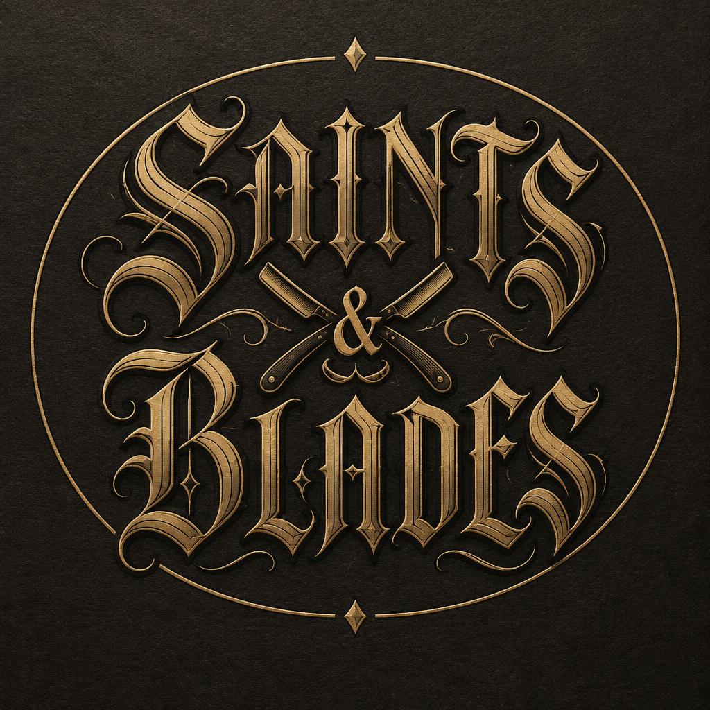
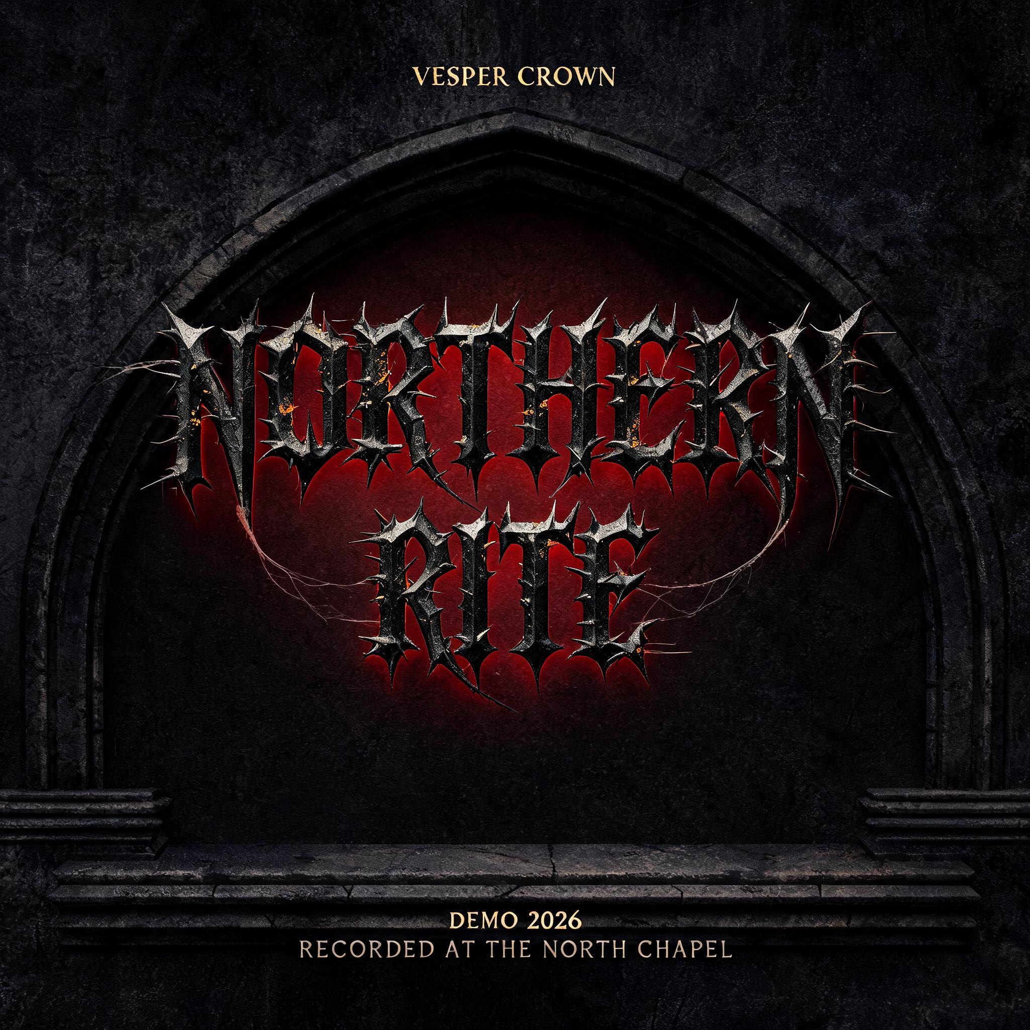
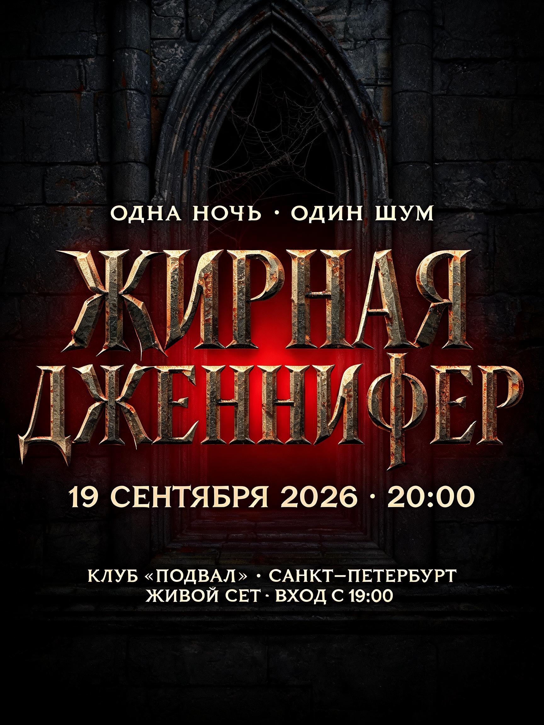
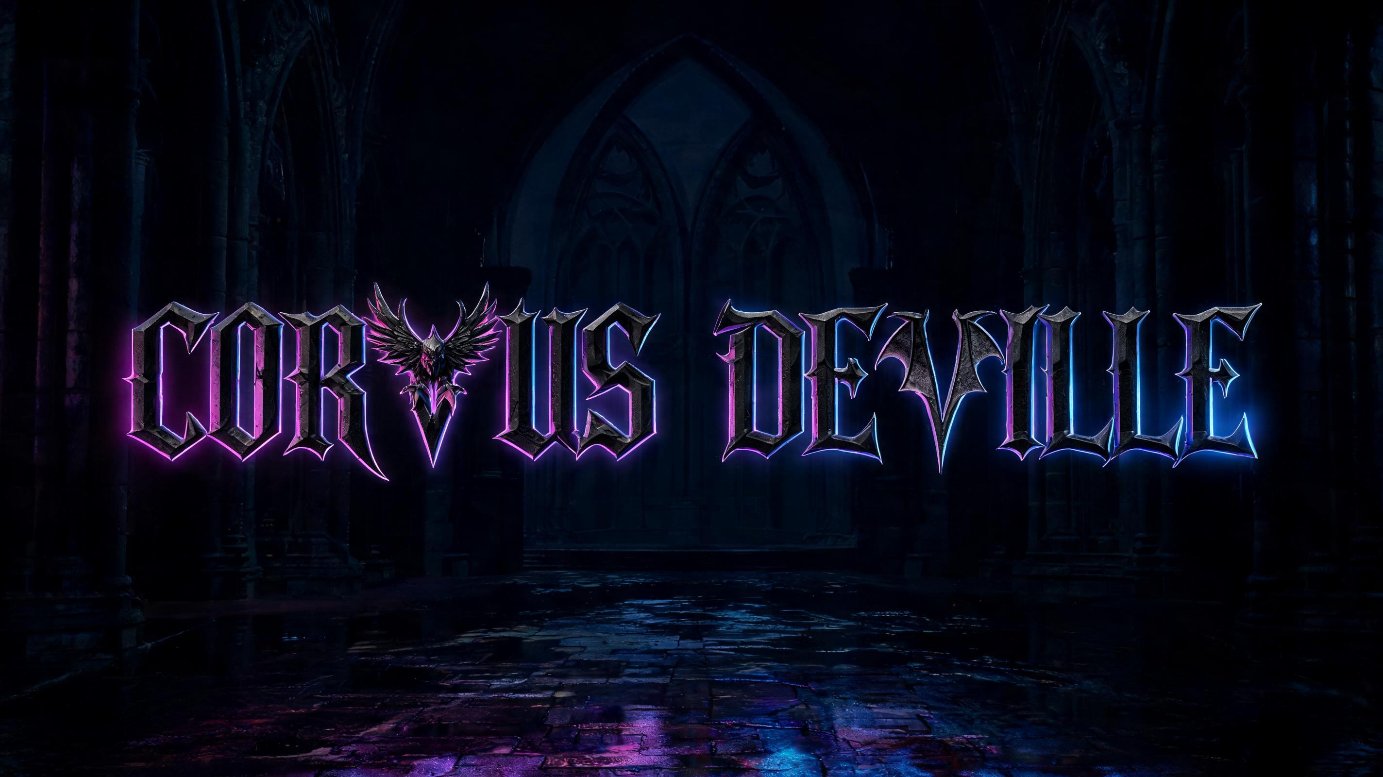


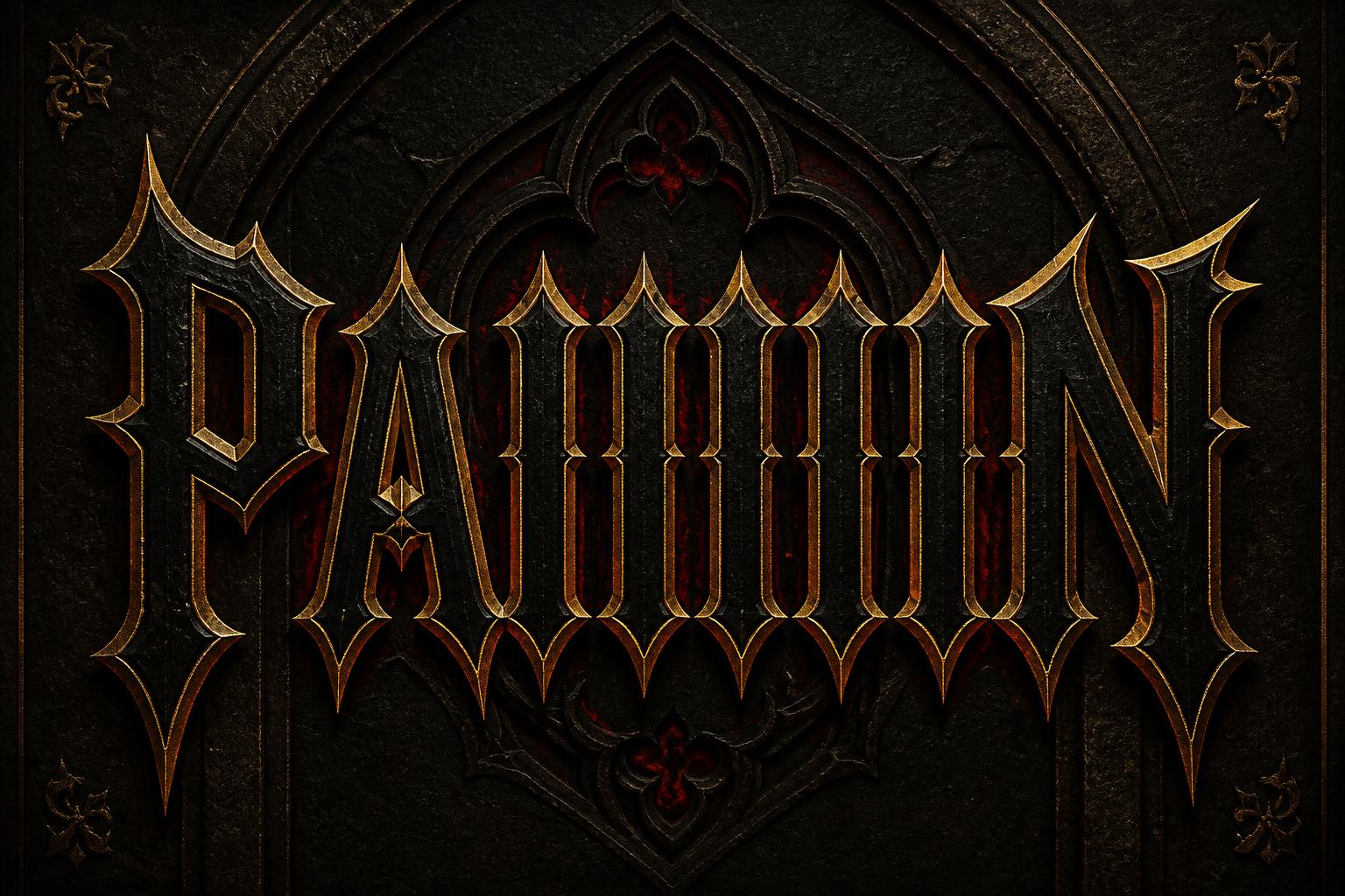




“THE NEW YORK TIMES · SINCE 1851” is a Gothic Font text effect efecto de texto creado con FontVibe IA. Blackletter Textura precisa: trazos estrechos y quebrados, remates en rombo y fuerte contraste grueso-fino, en tinta negra con toques dorados sobre pergamino oscuro y envejecido.
rendered in precise Textura Quadrata blackletter — the compressed vertical script of medieval northern European manuscripts. CRITICAL FEATURES: (1) EXTREMELY COMPRESSED narrow letterforms — very tall, very narrow, creating density of woven cloth; (2) DIAMOND-SHAPED LOZENGE COUNTERS — the white internal spaces inside letters must be pointed diamond/rhombus shapes, NOT oval or round; (3) VERTICAL RIBBING DENSITY — words together create almost fence-like vertical bar pattern; (4) CONSISTENT INK WEIGHT — uniform stroke thickness. Academic manuscript ink quality. Not aggressive, not decorative — scholarly precision. Classic broadsheet newspaper texture background, aged newsprint with subtle grey tones, crisp editorial authority, heritage publishing atmosphere. Perfectly centered layout: "THE NEW YORK TIMES" in large classic blackletter filling 65% of frame width. Thin horizontal rule lines above and below. "SINCE 1851" in small refined caps below, about 15% width. Newspaper masthead gravitas, ink on quality newsprint.
Hecho para Blackletter
Generada el 30 de abril de 2026 · 2848 × 1600 · JPEG · Compartida por el creador · Uso comercial gratuito (CC BY 4.0)


