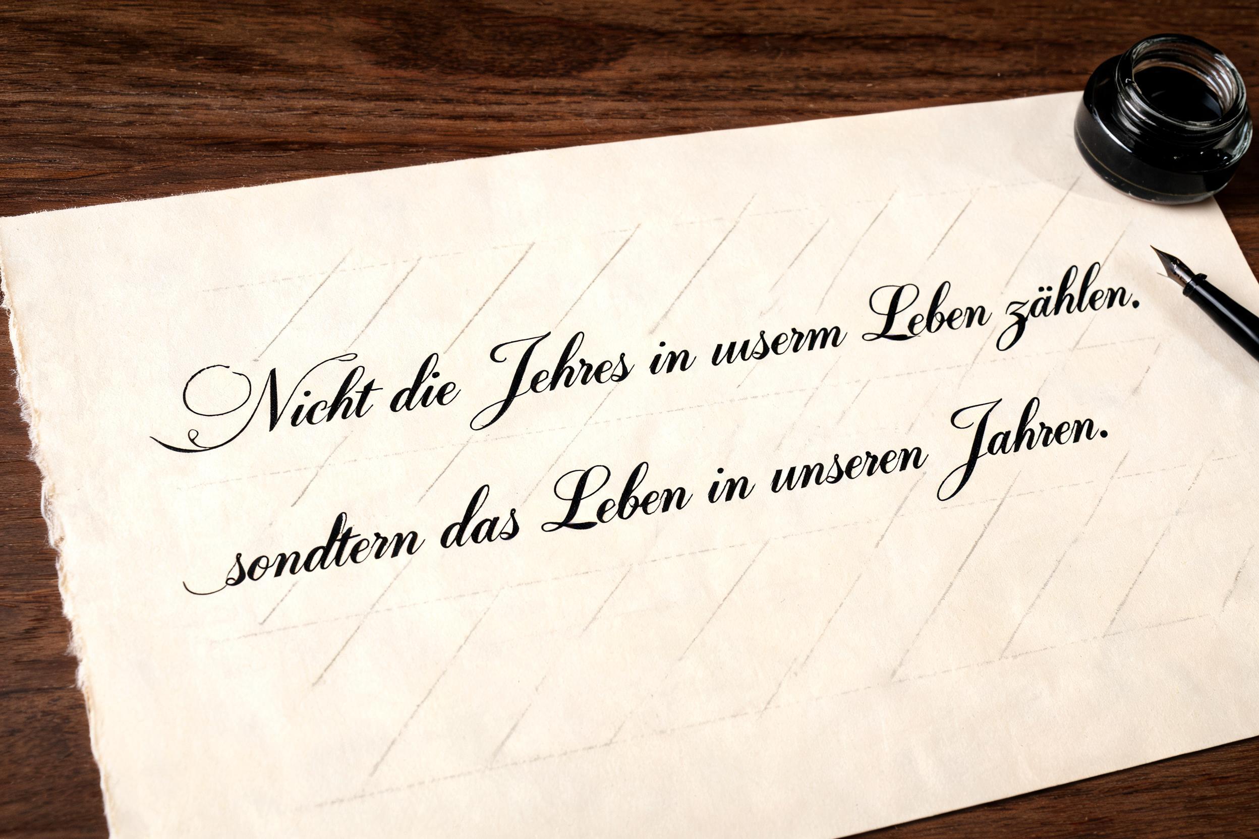
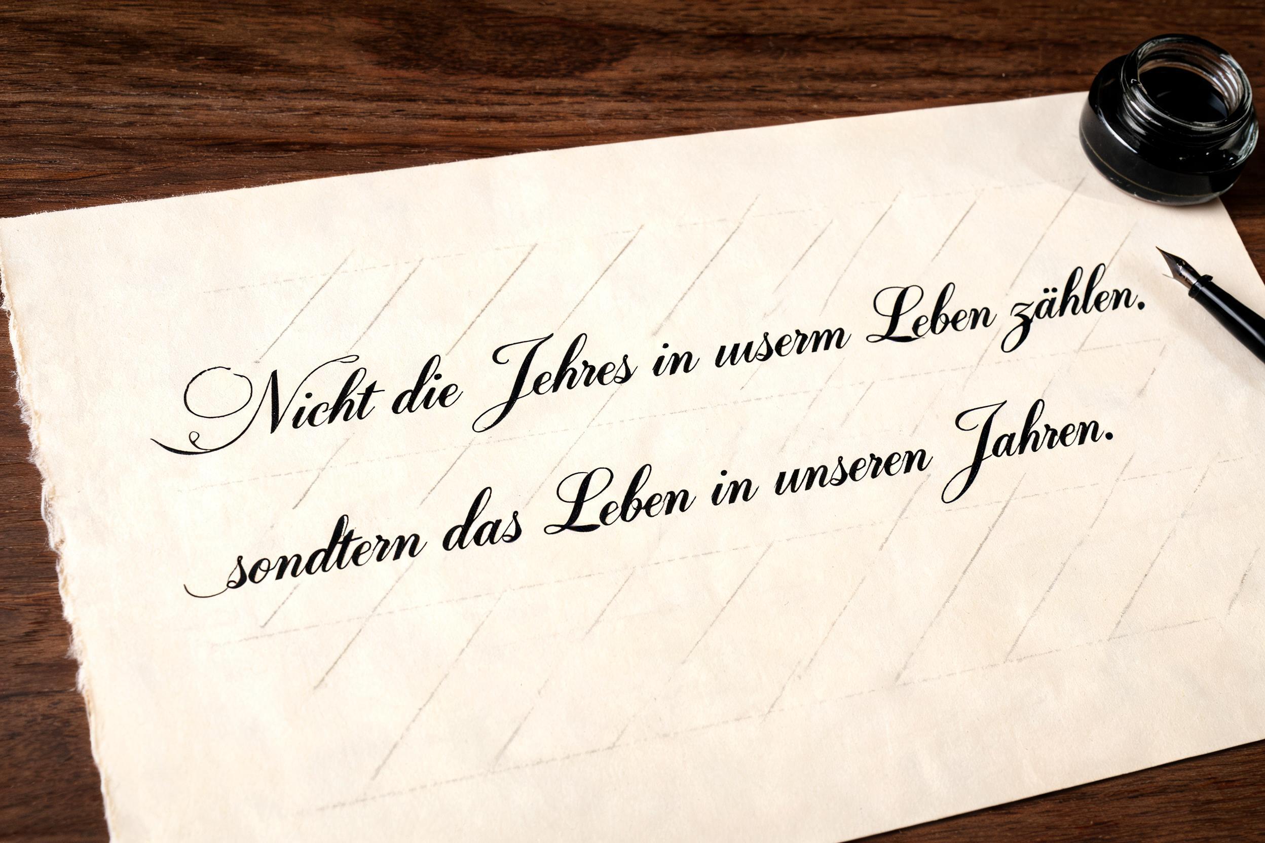
Nicht die Jahre in unserm Leben zählen, sondern das Leben in unseren Jahren. - Caligrafía Script Text Effect


Usa BytePlus Seedream 5.0, el modelo de esta obra · 15 créditos
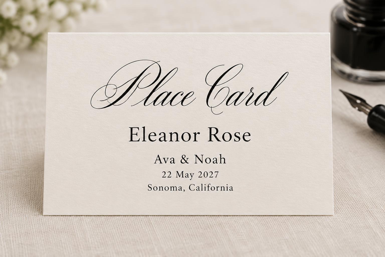
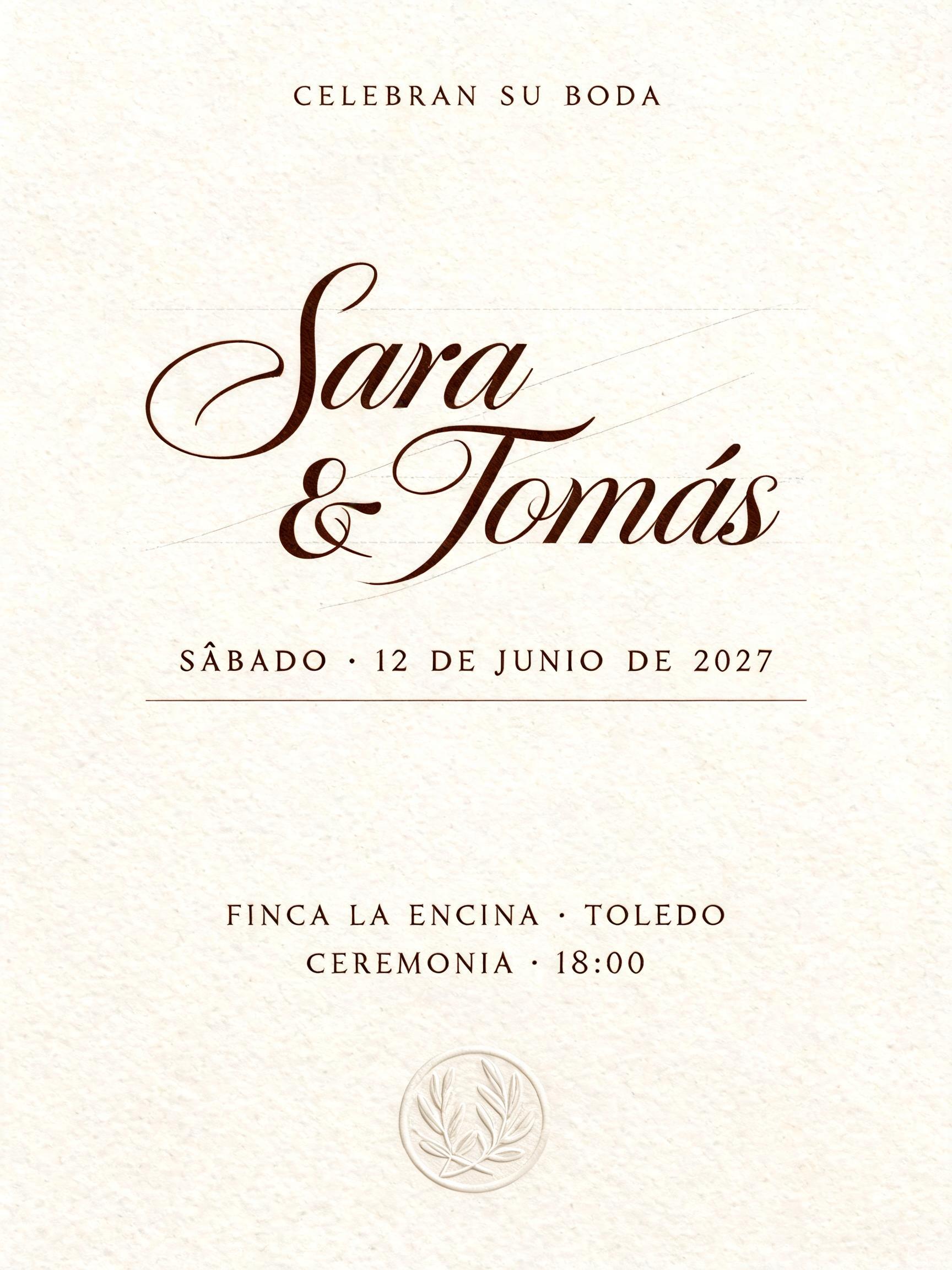
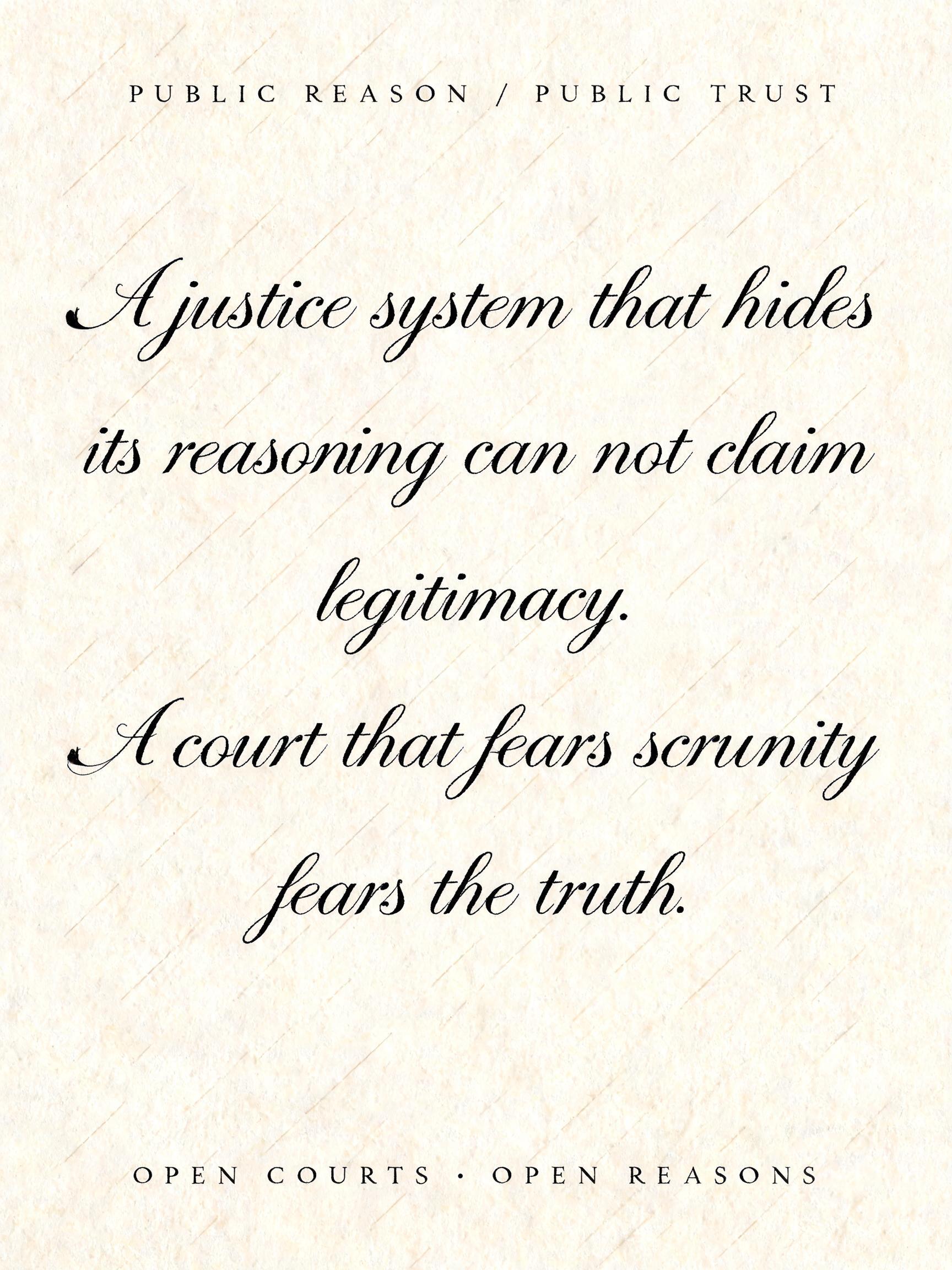
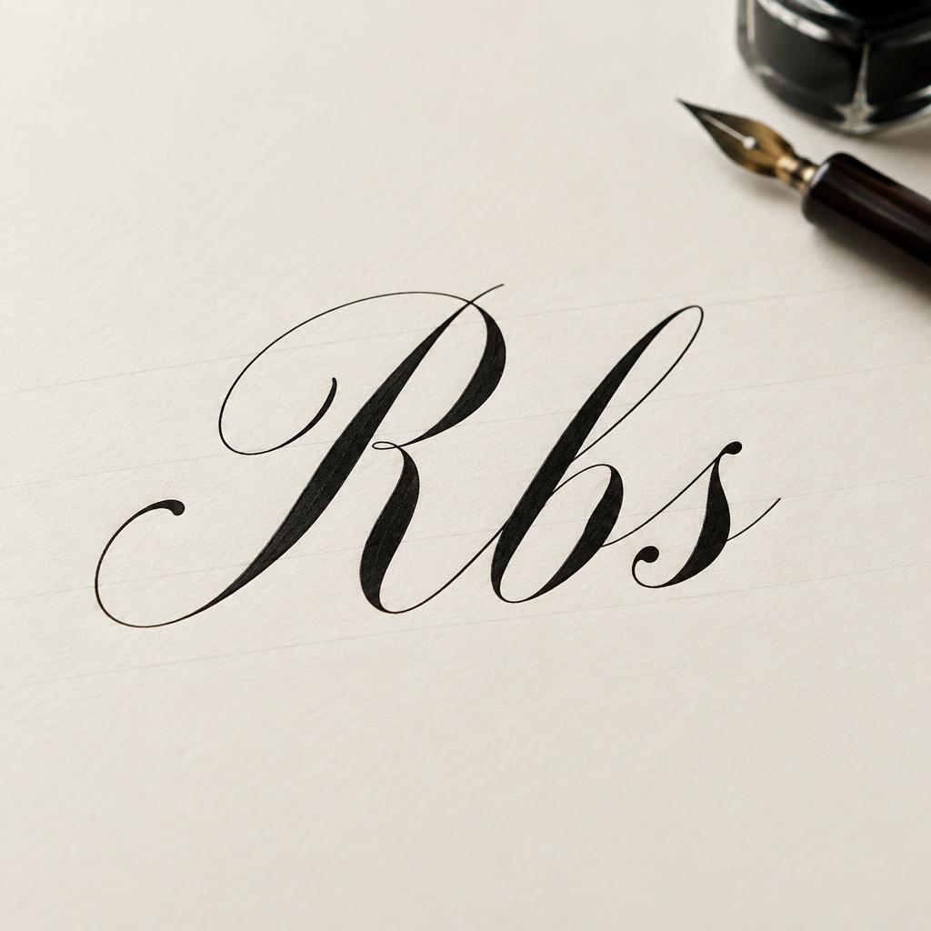
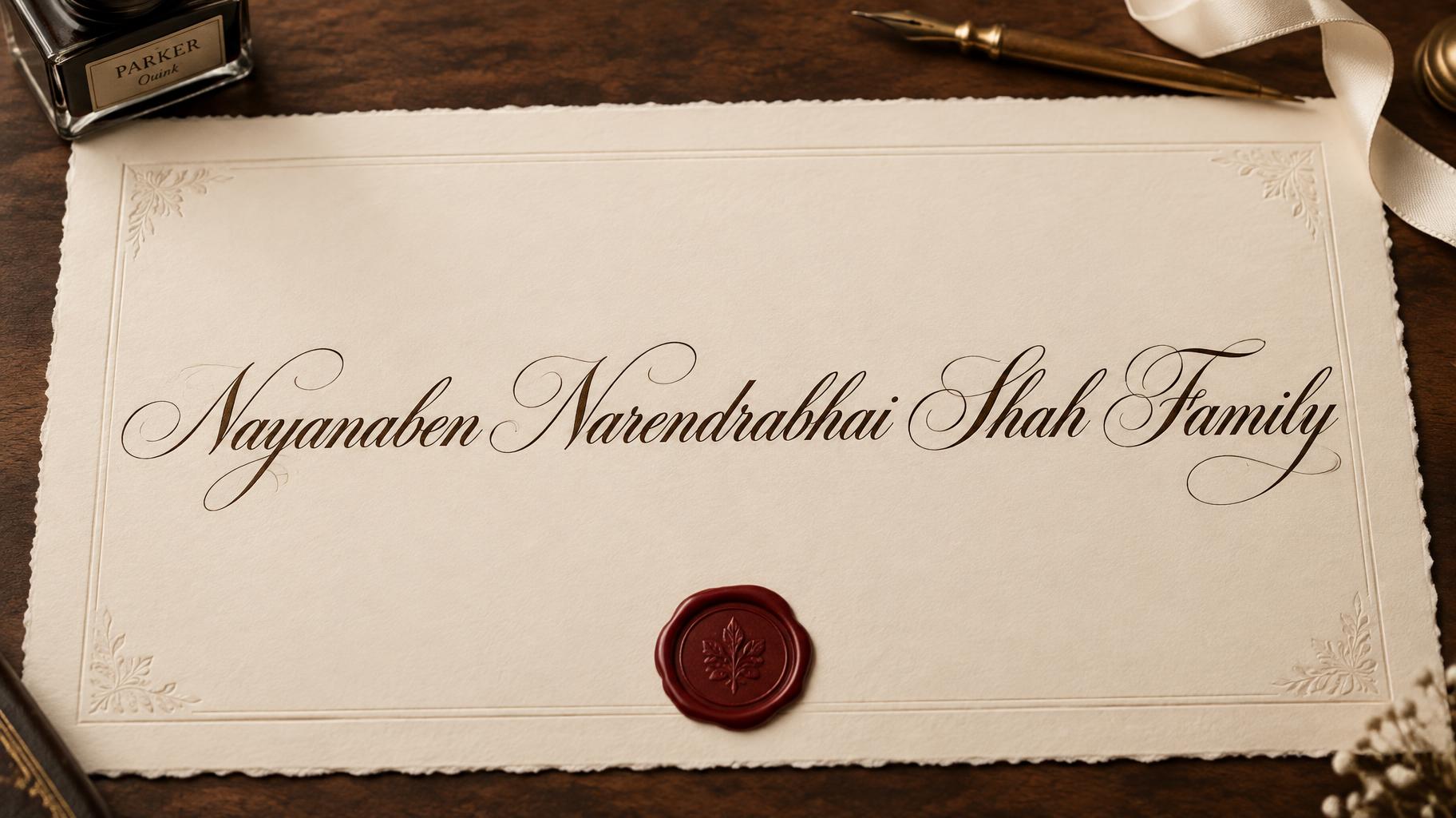
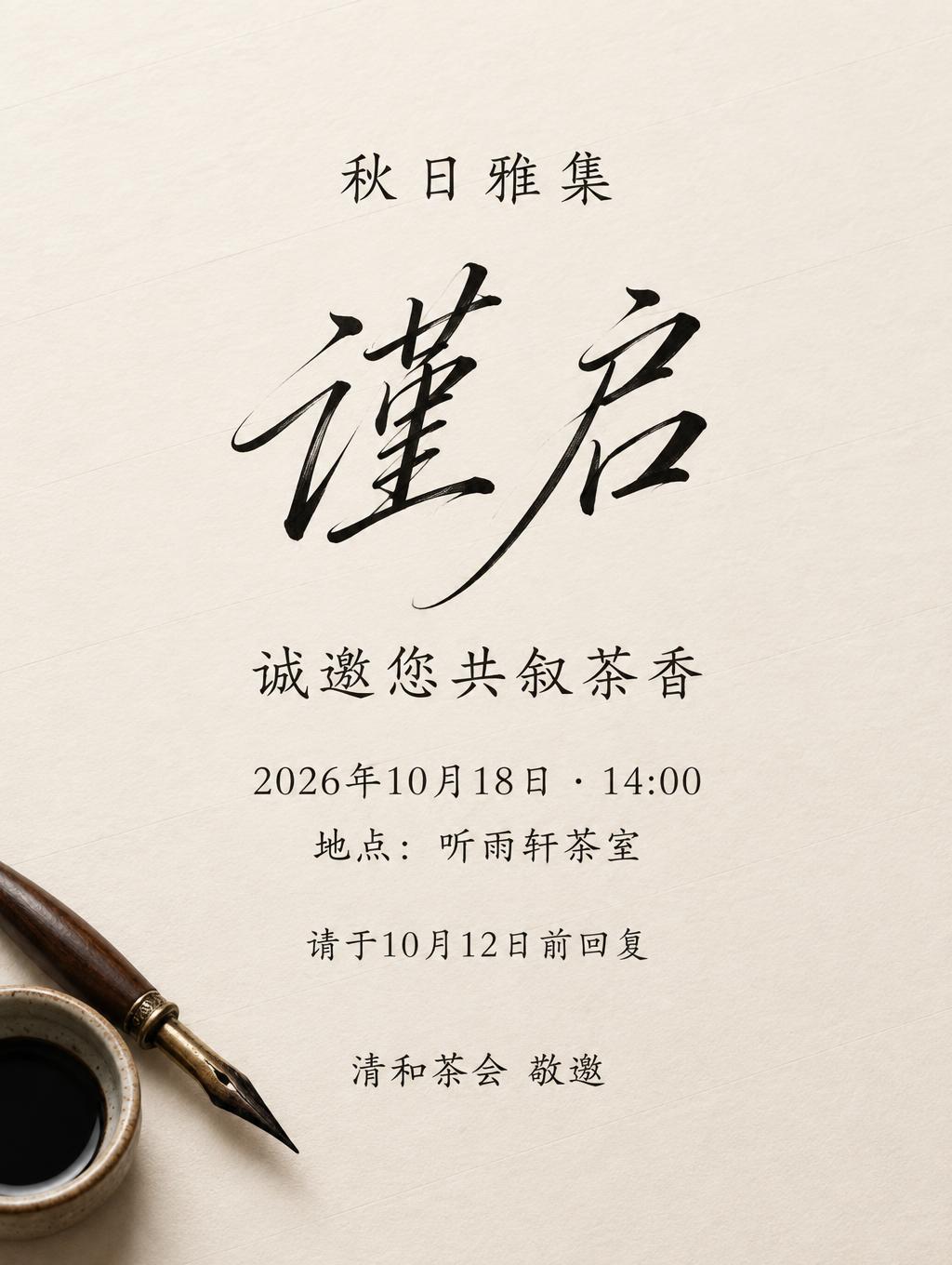
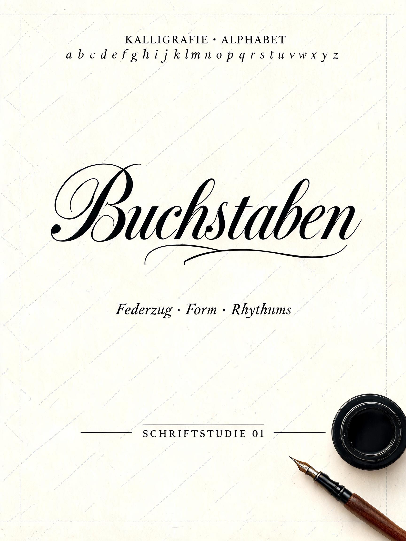
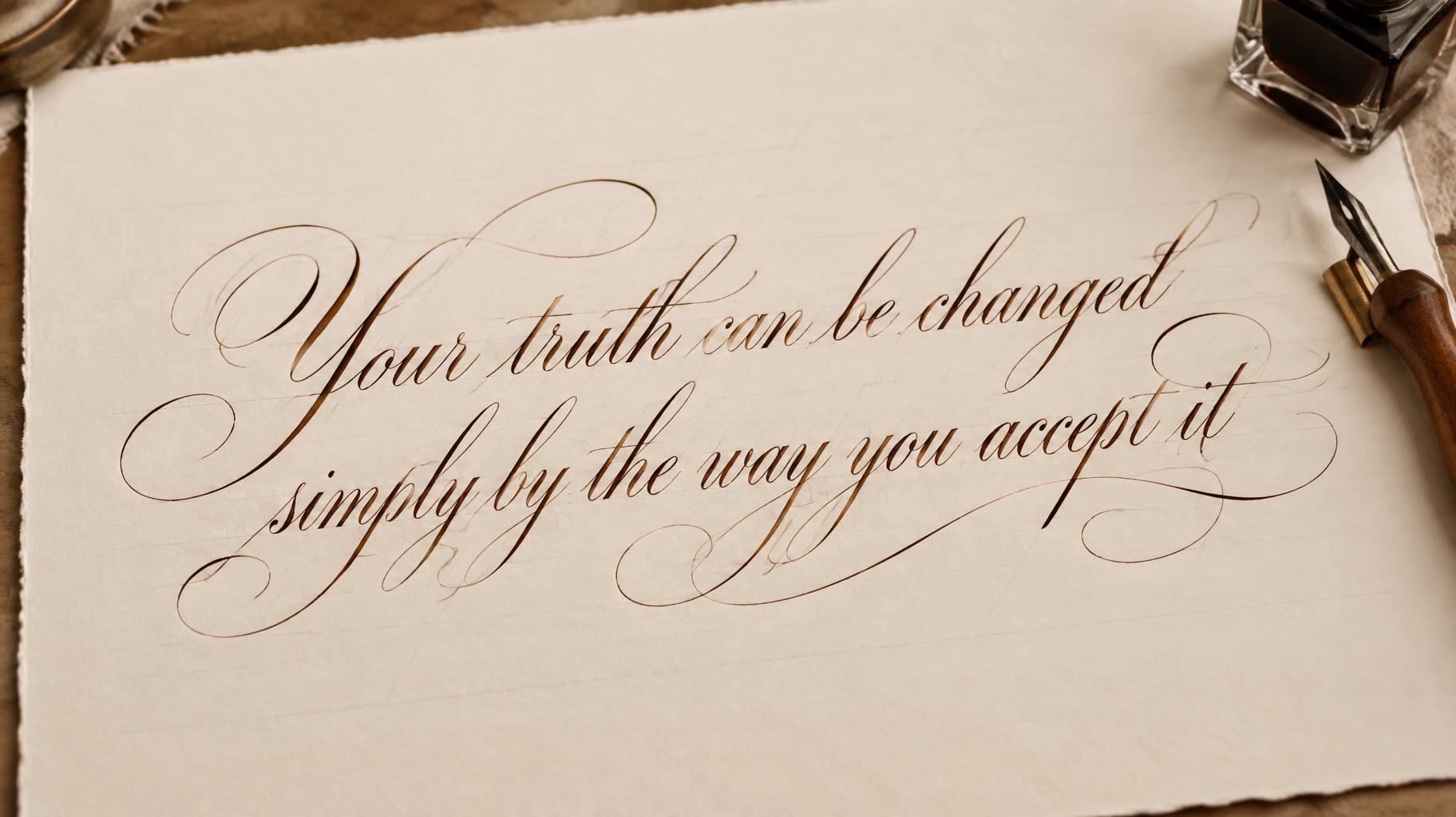
“Nicht die Jahre in unserm Leben zählen, sondern das Leben in unseren Jahren.” is a Cursive Calligraphy text effect efecto de texto creado con FontVibe IA. Copperplate formal de pluma puntiaguda: fuerte contraste grueso-fino, letras ovaladas inclinadas y mayúsculas con remates, tinta negra nítida sobre papel crema con tenues líneas guía.
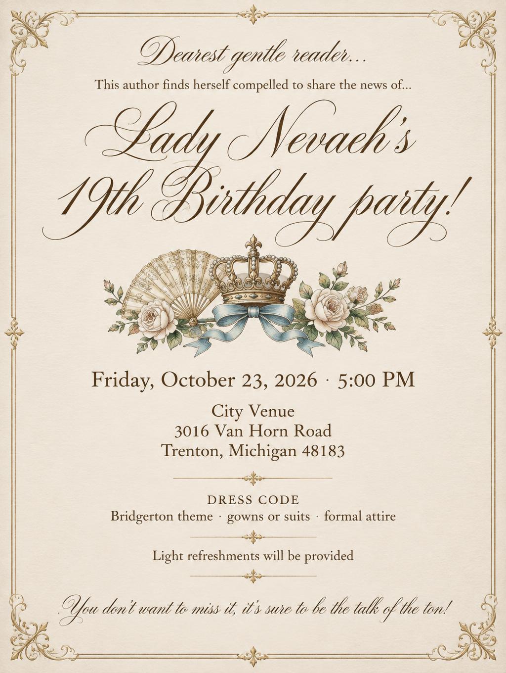
laid down as the exacting art of formal pointed-pen calligraphy. SURFACE / INK: crisp, controlled ink — deep black or warm sepia — sitting cleanly on the page with fine wet-ink edges and a faint natural sheen where it catches the light, precise and disciplined rather than loose, the exacting hand of a master penman. GROUND: fine calligraphy paper — smooth hot-press cotton, cream or ivory practice stock, sometimes with faint ruled guideline slants, or a formal certificate or invitation ground — with generous margins so the lettering reads. LIGHT: even, clean studio light — soft and flat — showing the crisp ink edges and fine wet-ink detail, minimal drama. ATMOSPHERE: formal, timeless and disciplined — the tradition of copperplate and Spencerian penmanship, wedding invitations, diplomas and certificates, the poised craft of the calligrapher's desk. LETTERFORM PRIORITY: when the chosen font carries its own treatment, that font's letterform shapes and built-in flourishes take priority and own the letters; this style governs only the ink surface, ground and light, never the letter shapes. When no specific material is defined by the font: crisp controlled pointed-pen ink with fine wet edges and a faint sheen, in a single deep tone, on the calligraphy-paper ground. COLOR: if the font declares its own color keep it; otherwise the ink reads as a classic penmanship tone — deep black or warm sepia — on the pale paper ground. 'Nicht die Jahre in unserm Leben zählen, sondern das Leben in unseren Jahren.' rendered as a formal calligraphy composition across multiple disciplined lines on a generous sheet of fine cream hot-press cotton paper, the lettering filling the frame with natural typographic breathing room between lines, the sharp focal point. Scene: crisp deep-black pointed-pen ink with fine wet-ink edges and a subtle natural sheen where the strokes catch the light, each hairline upstroke and weighted downstroke precisely controlled, faint ruled guideline slants visible in the pale ivory paper ground beneath the lettering. The sheet rests on a dark walnut desk surface, a slender dip pen with an ebony barrel and a small open inkwell softly out of focus beside the composition, a faint deckled paper edge visible at one side. Even clean studio light falls flat across the page, no harsh shadows, illuminating the crisp ink edges and the smooth texture of the hot-press stock. The atmosphere is formal and timeless — the calligrapher's desk, the certificate ground, the penmanship tradition of copperplate and Spencerian discipline. Warm ivory and deep sepia-black tones, shallow depth of field, 8k detail.
Generada el 6 de agosto de 2026 · 2496 × 1664 · JPEG · BytePlus Seedream 5.0 · Compartida por el creador · Uso comercial gratuito (CC BY 4.0)


