
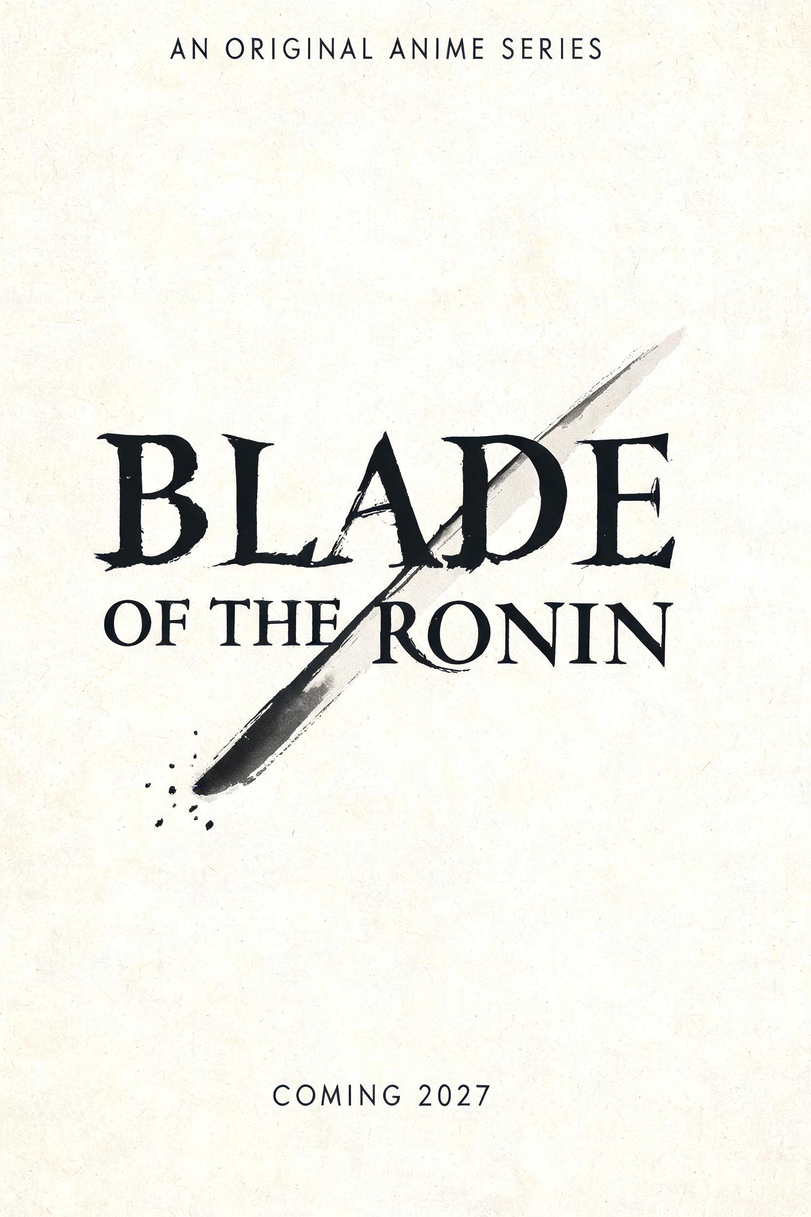
BLADE OF THE RONIN AN ORIGINAL ANIME SERIES COMING 2027 - Pincel de Tinta Japonés Text Effect


Usa BytePlus Seedream 5.0, el modelo de esta obra · 15 créditos










“BLADE OF THE RONIN AN ORIGINAL ANIME SERIES COMING 2027” is a Brush Japanese Ink text effect efecto de texto creado con FontVibe IA. El estilo de caligrafía con pincel de tinta del shodo japonés llevado a las letras latinas. Tinta sumi negra y profunda con la energía auténtica del pincel fude, trazos controlados en una sola dirección y atmósfera de papel washi. Perfecto para marcas de restaurantes japoneses, diseño de tatuajes, anime, artes marciales y proyectos culturales.
Create a vertical 2:3 anime series title key art, designed as a complete premium title card on warm cream natural washi paper. Visible paper fibers run subtly through the background; soft diffuse north-facing studio light, no cast shadows. Preserve large deliberate negative space. At the top center, small spaced charcoal-gray uppercase text: "AN ORIGINAL ANIME SERIES". Dominating the central 62% of the composition, render the exact title in two centered lines: "BLADE" / "OF THE RONIN". Every Latin character is custom classical Japanese shodo brush calligraphy, not a font: upright harmonious forms, bold 5:1 thick-to-thin stroke ratio, a single committed loaded-brush entry per stroke, dense near-black sumi cores, controlled mid-stroke pressure, exact fine harai exit tapers and restrained upward hane terminal hooks. Ink is fully matte and absorbed into the washi; edges softly feather into diluted charcoal gray, with slight dry-brush texture only on the outside edges. "BLADE" is the larger line; "OF THE RONIN" is narrower below with generous breathing space. Ensure every word is spelled exactly and fully legible. A single diagonal katana-like negative-space slash cuts behind the title from lower left toward upper right: it is unpainted cream paper bordered by one heavy black brush entry and a fading gray pull-away tail. Add only a few tiny sumi droplets clustered near the slash’s lower-left entry point; no ornaments, no seals, no landscape, no character illustration, no red sun. At bottom center, small precise charcoal-gray uppercase text: "COMING 2027". Quiet editorial balance, high-resolution tactile ink-and-paper detail, controlled Japanese calligraphy composition.
Generada el 5 de septiembre de 2026 · 1664 × 2496 · JPEG · BytePlus Seedream 5.0 · Compartida por el creador · Uso comercial gratuito (CC BY 4.0)


