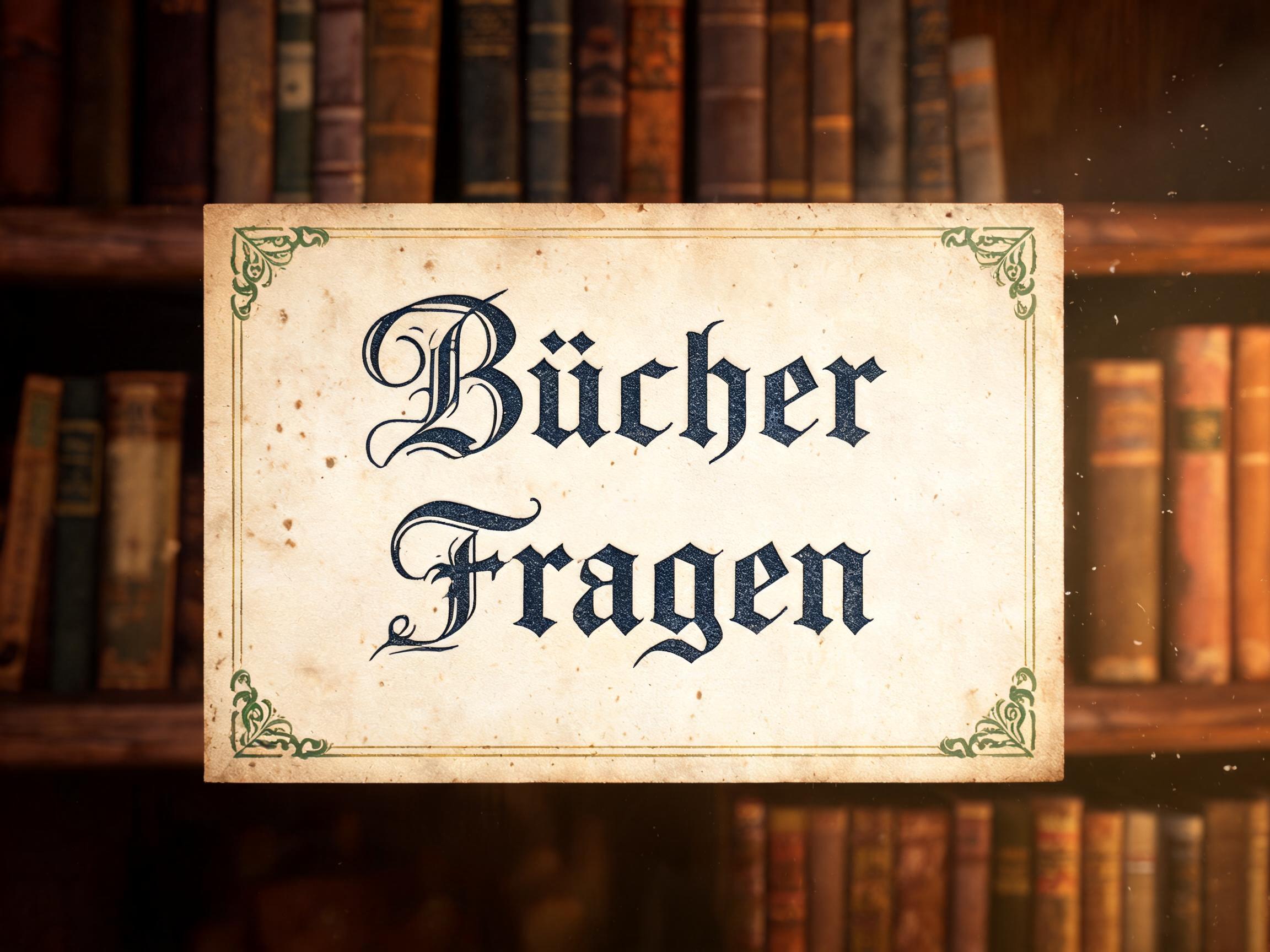
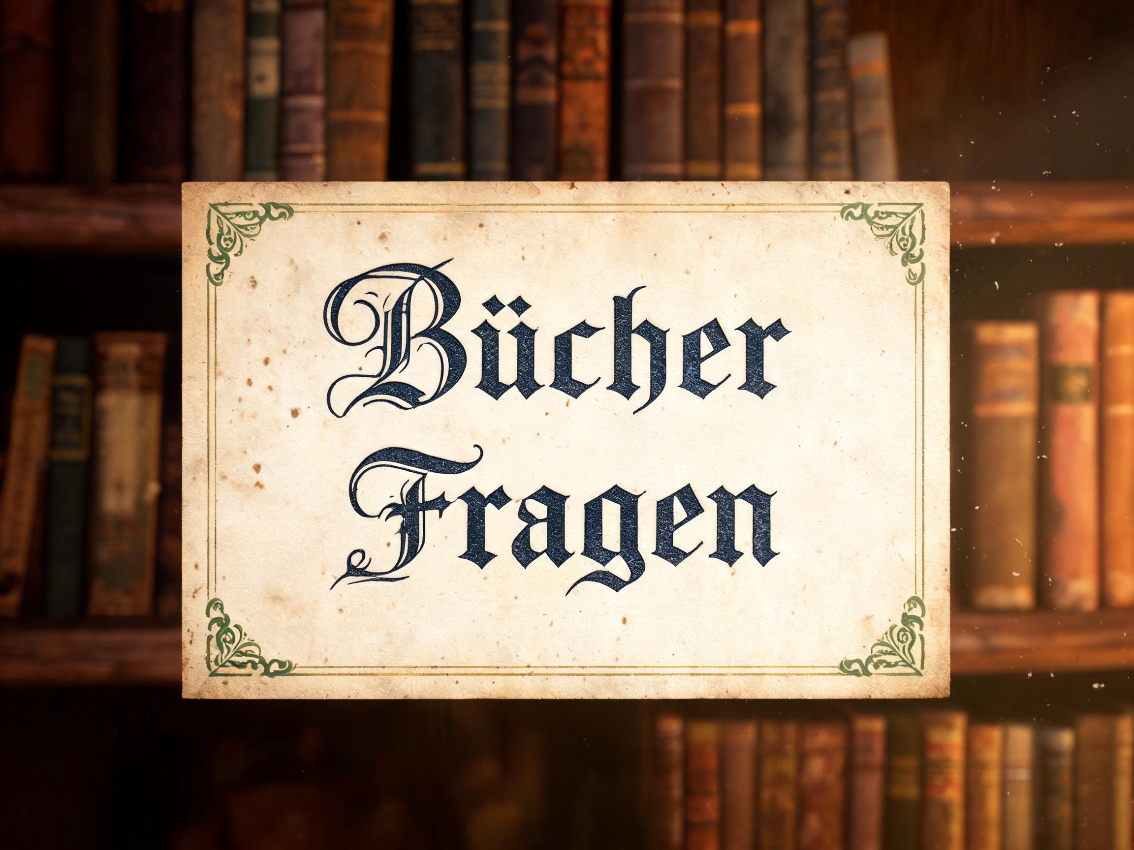
Bücher Fragen - Vintage Text Effect


Usa BytePlus Seedream 5.0, el modelo de esta obra · 15 créditos


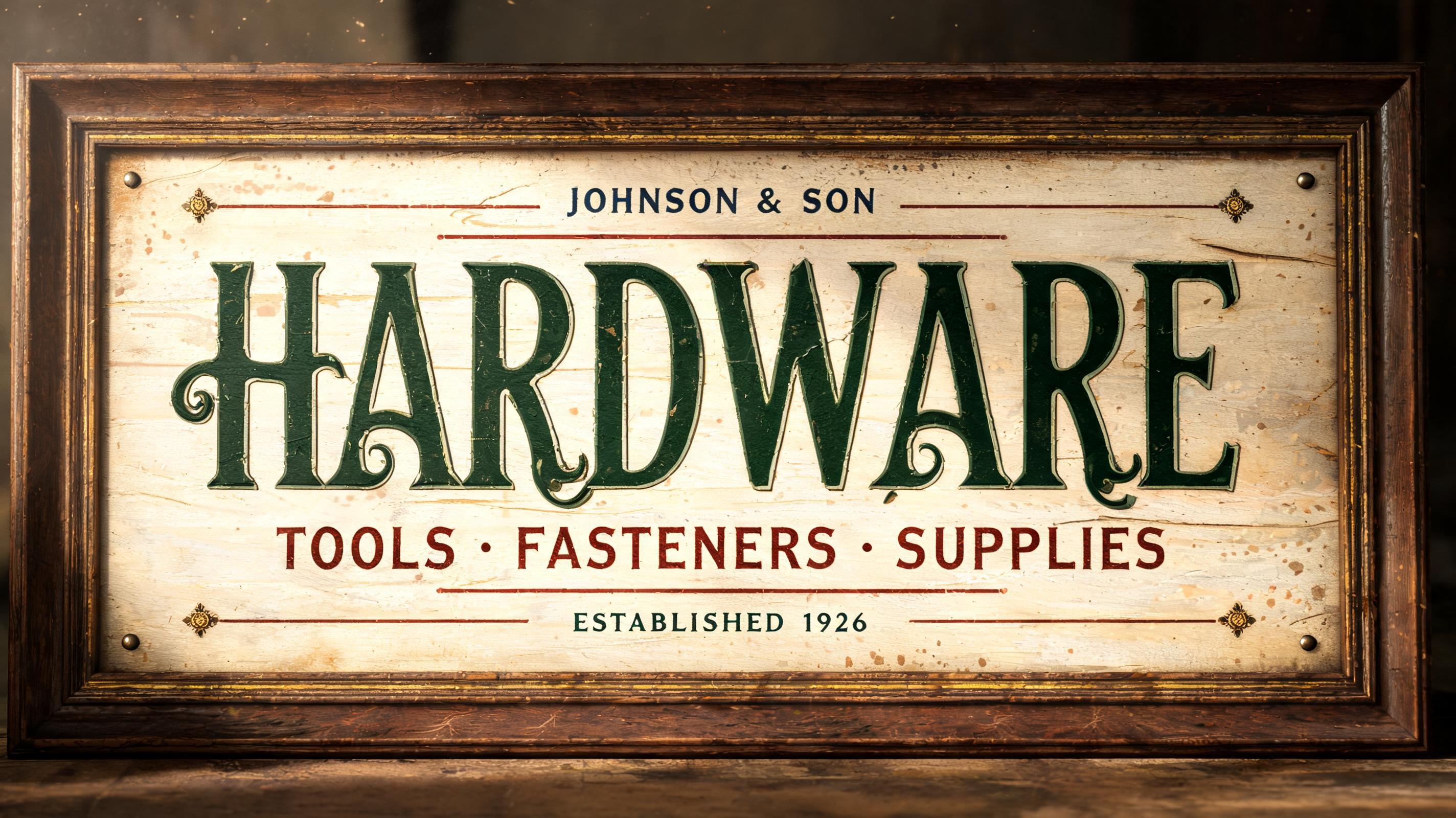
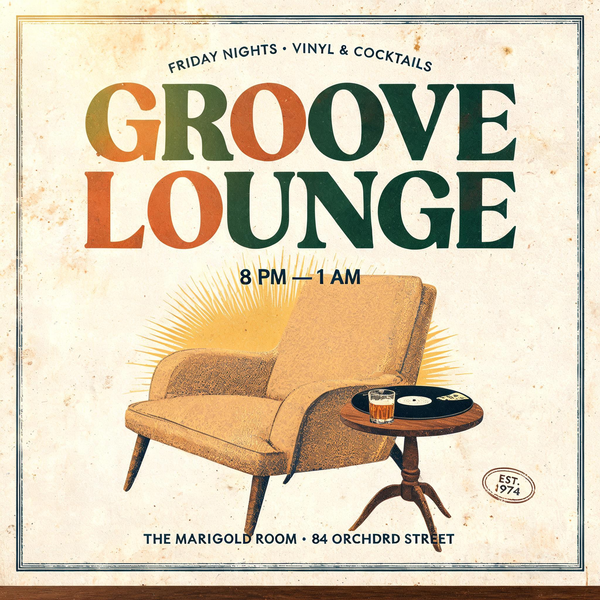
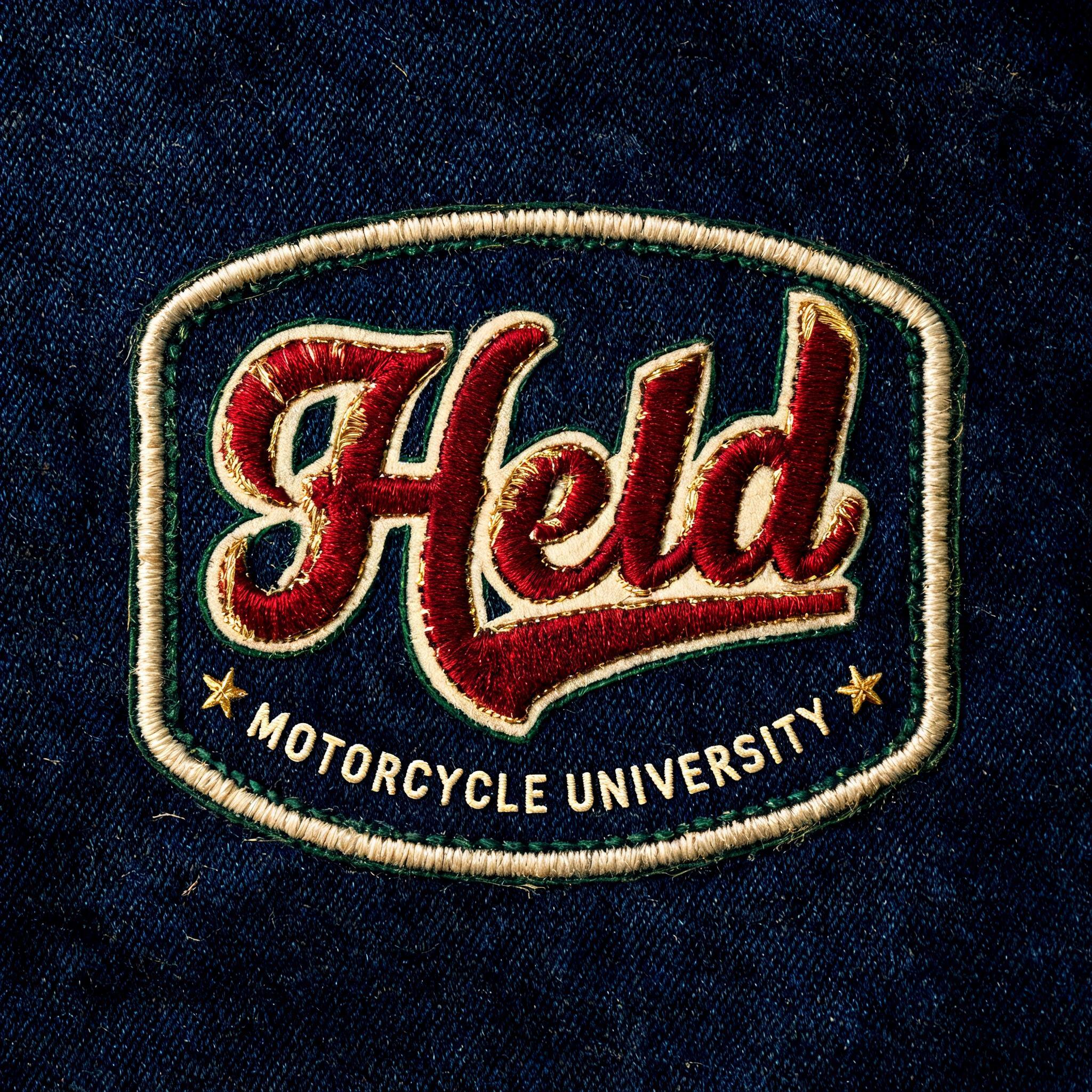
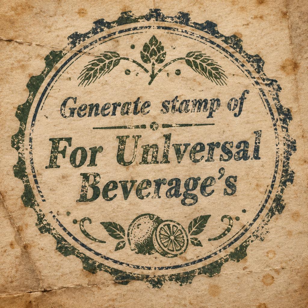
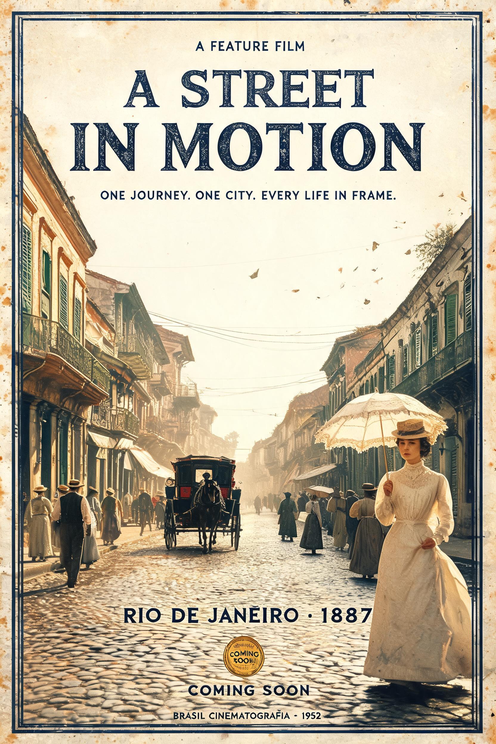
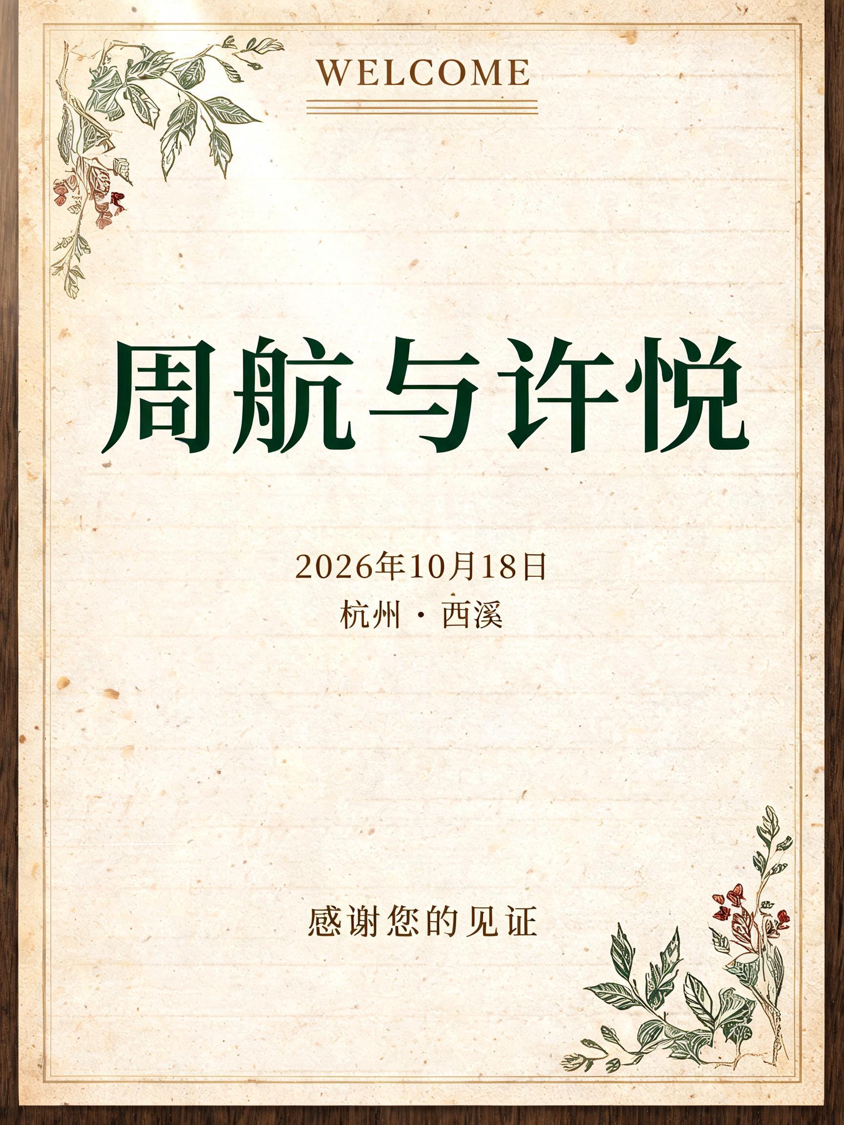
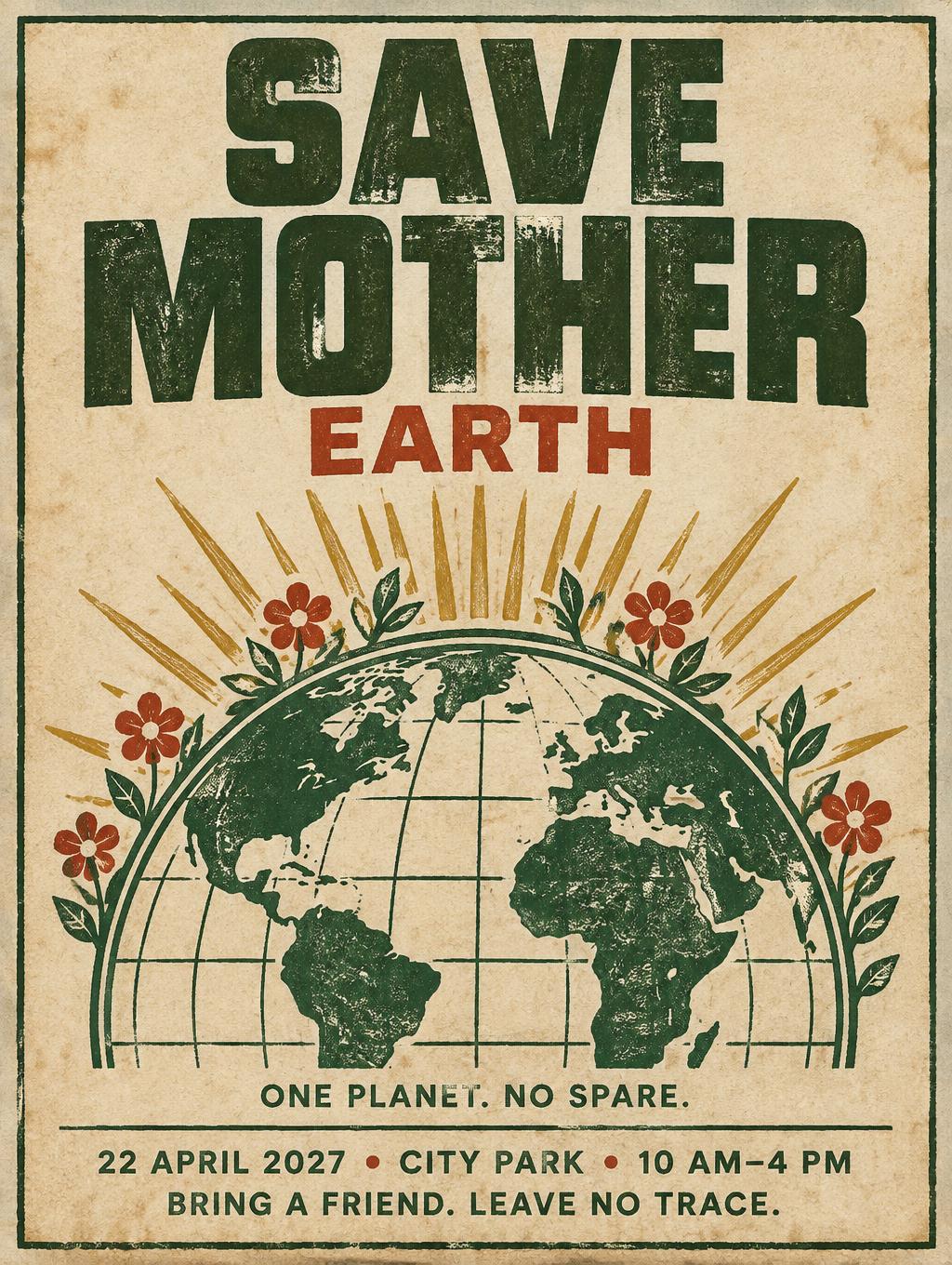

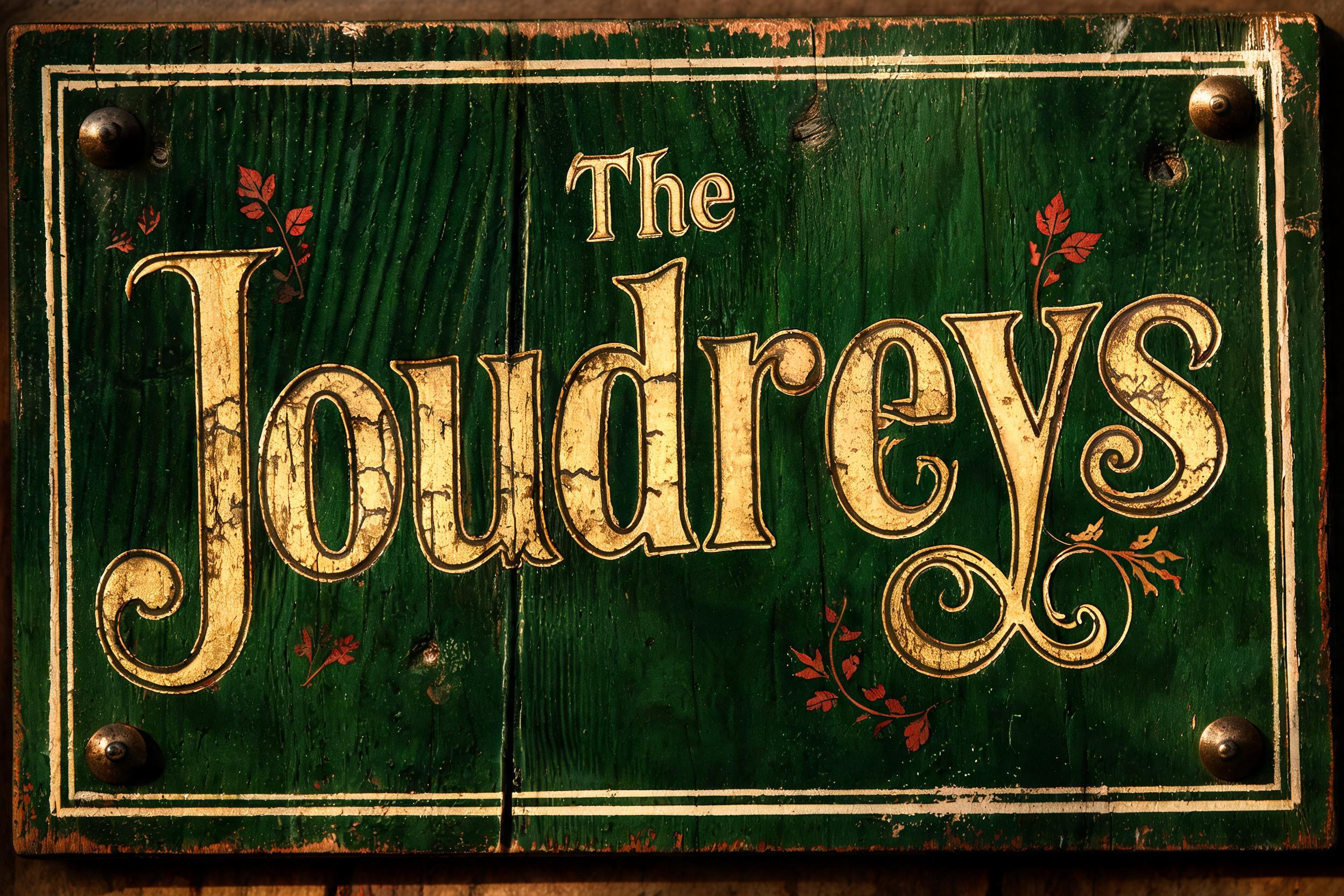
“Bücher Fragen” es un efecto de texto Vintage creado con FontVibe IA. Mayúsculas con serifa impresas en tipografía sobre cartulina de algodón crema con la tinta ligeramente quebrada, sobre la platina de una vieja prensa entre tipos metálicos sueltos.
a timeless vintage piece carrying the physical evidence of an older making — warm, aged and classic. SURFACE / STYLE: the lettering looks produced by a heritage craft and softened by time — a letterpress impression bitten into cotton paper with ink slightly broken up, weathered paint on aged metal or wood, a worn rubber-stamp or postal imprint, or warm gold leaf — carrying patina, foxing, grain and gentle wear. SCENE ATMOSPHERE: a warm nostalgic setting — aged cream or kraft paper, dark wood, soft amber light, faint dust and a faded heritage feel. PALETTE: warm aged tones — cream, kraft, sepia, faded red, forest green, navy, tan and antique gold — muted and time-softened, never neon-bright. LETTERFORM PRIORITY: when the chosen font carries its own treatment (western slab, art deco, art nouveau, letterpress, postal or rubber stamp, gold leaf, typewriter, hand-lettered script, grunge chalk), that font treatment takes absolute priority and owns the letters; this style supplies the warm aged tone, the time-worn surface and the nostalgic heritage scene. FALLBACK MATERIAL: if the font carries no material of its own, render the letters as a classic serif printed in warm faded ink on aged cream paper with a soft letterpress impression and gentle wear, so the timeless vintage feel always reads. A vintage German bookshop and reading-room title treatment for the exact text “Bücher Fragen”. The words carry the physical character of an old letterpress print, pressed into thick warm-cream cotton paper with shallow debossed edges, softly broken deep-navy ink, intermittent dry-ink speckling, and minute fiber texture visible within the printed areas. Surround the lettering with restrained heritage publishing details: a fine antique-gold border rule, faded forest-green ornamental corner flourishes, tiny foxing freckles, softened coffee-brown paper edges, and a barely visible impression of old library catalogue marks in the background. Behind the paper, dark walnut shelving and the blurred spines of clothbound books recede into soft focus; no readable extra text. Low amber desk-lamp illumination grazes the paper surface, revealing the letterpress indentation, paper grain, dust motes, worn gilt on nearby book spines, and slight patina in the decorative ink. Use a muted palette of aged cream, sepia, deep navy, forest green, walnut brown, and tarnished antique gold. Preserve generous quiet paper space, tactile print imperfections, and the appearance of a carefully kept early twentieth-century literary imprint. No modern objects, screens, plastic, neon, or photographic gloss.
Hecho para Generador de Letras de Pizarra
Generada el 15 de septiembre de 2026 · 2304 × 1728 · JPEG · BytePlus Seedream 5.0 · Compartida por el creador · Uso comercial gratuito (CC BY 4.0)


