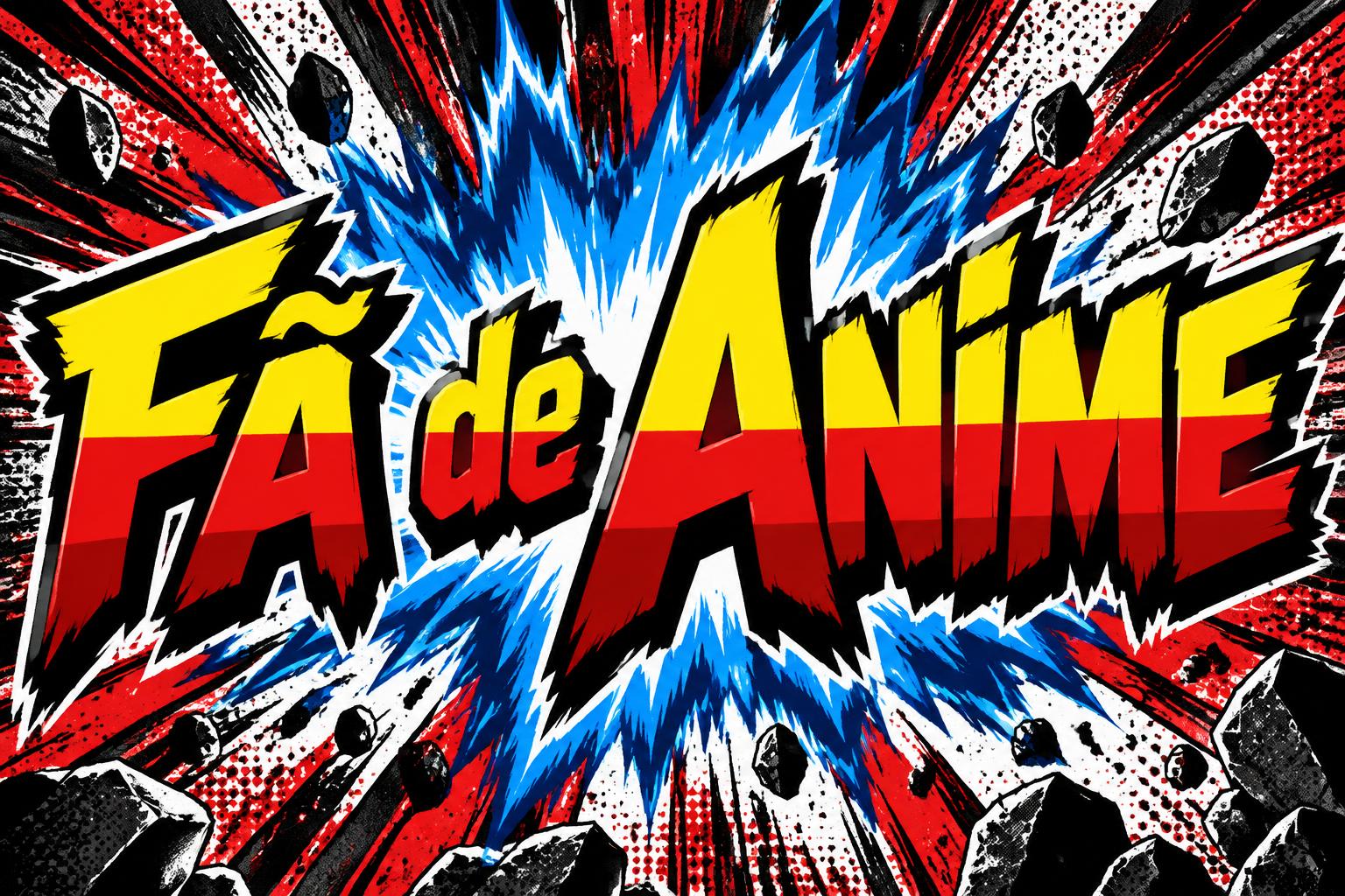
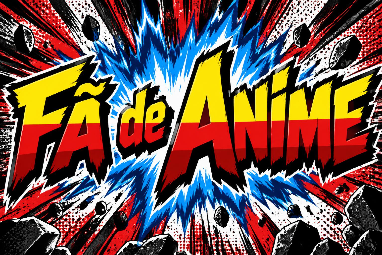
Um texto anime que diga «Fã de Anime» - Anime Text Effect


Usa OpenAI GPT-Image-2.5 Sunburst, el modelo de esta obra · 15 créditos


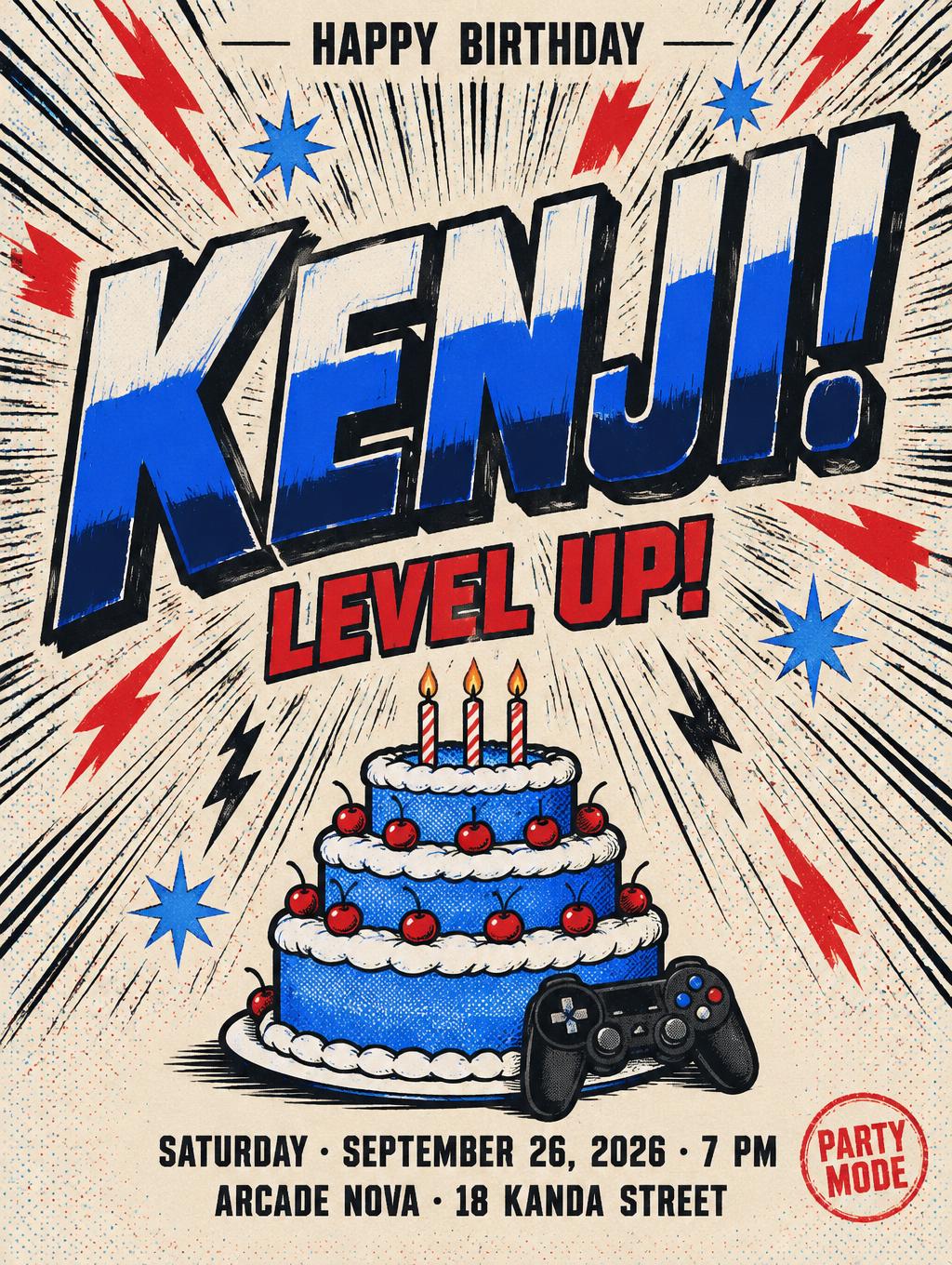
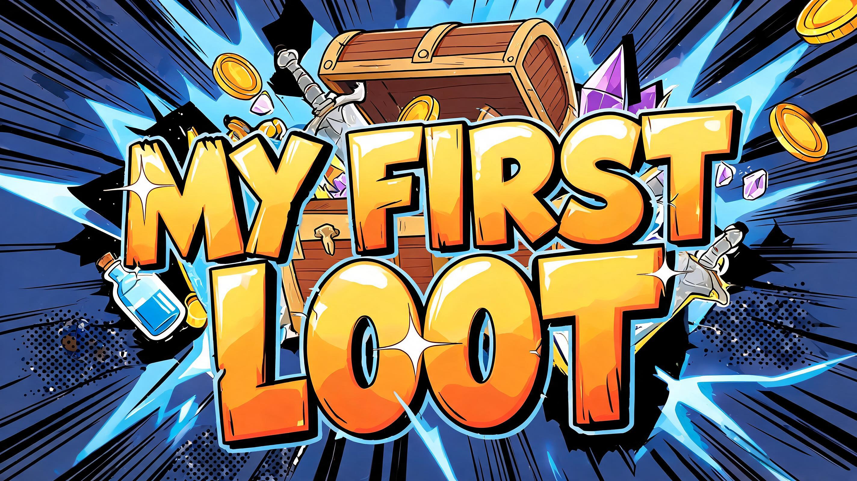
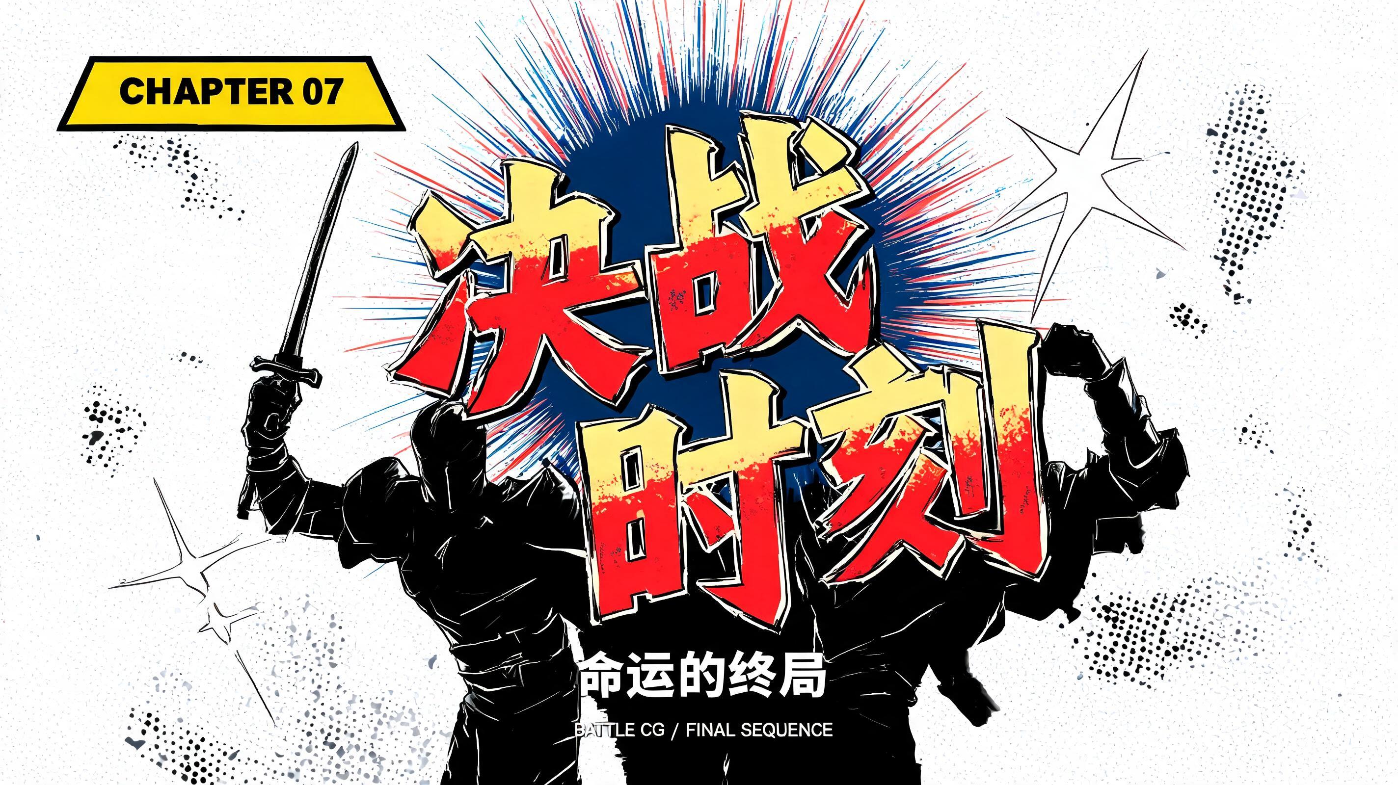
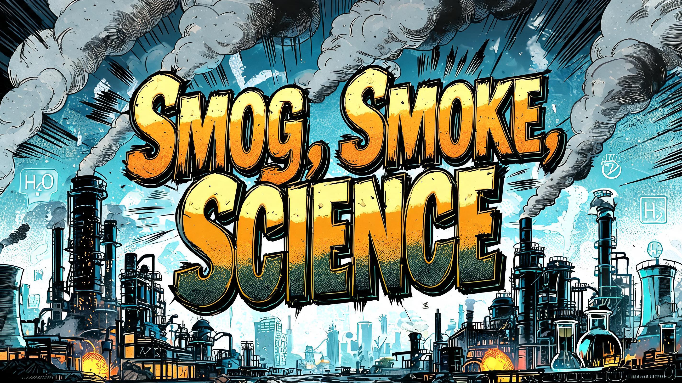



“Um texto anime que diga «Fã de Anime»” is a Anime text effect efecto de texto creado con FontVibe IA. Rotulación de título shōnen: contornos negros gruesos entintados a mano, sombreado cel plano dividido en bandas duras de luz y sombra, letras inclinadas y dinámicas sobre blanco con líneas de velocidad radiales.
rendered as Japanese shounen anime title treatment — bold hand-inked manga lettering with authentic cel-shaded visual energy. Letter construction follows classic Shonen Jump title card standards: thick black ink outline with natural brush-weight variation defining each letter boundary; flat cel-shading fill with three hard-edge zones — bright highlight zone on upper letter face, highly saturated primary color zone at center, deep shadow zone at lower edge; all zone boundaries knife-edge hard, zero gradient blur, pure flat offset-print ink physics. Energy signature: high-contrast color + thick ink outline = letters that look physically printed on manga paper. The typographic language of Dragon Ball, Naruto, One Piece, Demon Slayer, Jujutsu Kaisen title cards — maximum manga kinetic energy, iconic and immediately recognizable as Japanese anime title typography. LETTERFORM PRIORITY: when the chosen font carries its own treatment, that font's letterform shapes take priority and own the letters; this style governs the inked manga outline, the three-zone cel-shading and the kinetic energy. FALLBACK MATERIAL: if the font carries no material of its own, render the letters as bold hand-inked shounen title lettering with a thick black brush outline and hard three-zone cel-shading. COLOR PRIORITY: keep the font's own colors if specified; otherwise a high-saturation primary fill with hard highlight and shadow zones. Japanese shounen anime title card featuring the exact rendered text “Fã de Anime” as the dominant visual element. Build every character with thick black hand-inked contours, irregular brush-pressure edges, tiny printed-ink imperfections, and dense black offset shadows. Use a hard three-zone cel-shaded fill: bright lemon-yellow highlight planes across the upper faces, saturated scarlet red midtone planes, and deep vermilion shadow planes along lower faces; every color boundary is sharply cut with no gradients. Add narrow white ink glints and small cyan edge accents to create crisp comic-print separation. Behind the lettering, construct a dramatic manga impact field of black radial speed lines, white paper bursts, jagged red impact shards, halftone dot clusters, and scattered ink flecks. Include a concentrated electric-blue energy flare behind the word group, rendered as angular cel-shaded flame strokes with white-hot cores and dark navy shadow cuts. The surrounding field uses charcoal-black manga panel textures, deep crimson splashes, and sparse yellow starburst marks. Maintain clean readability for the Portuguese accent in “Fã,” with the diacritic clearly inked and integrated into the same high-contrast title treatment. Flat offset-print color physics, crisp cel shading, high-resolution anime promotional artwork, energetic chapter-title impact.
Hecho para Generador de Texto Anime
Generada el 25 de septiembre de 2026 · 1536 × 1024 · JPEG · OpenAI GPT-Image-2.5 Sunburst · Compartida por el creador · Uso comercial gratuito (CC BY 4.0)


