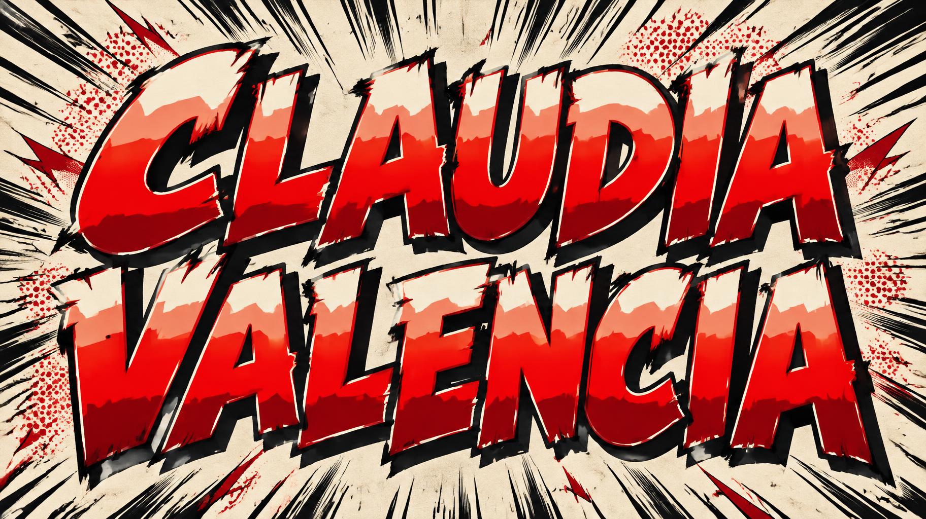
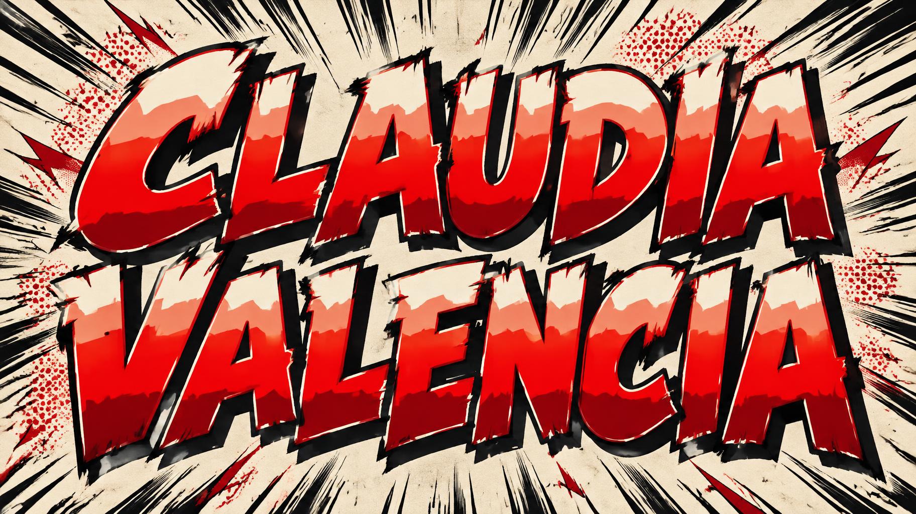
CLAUDIA VALENCIA - Anime Text Effect


Usa OpenAI GPT-Image-2.5 Sunburst, el modelo de esta obra · 15 créditos

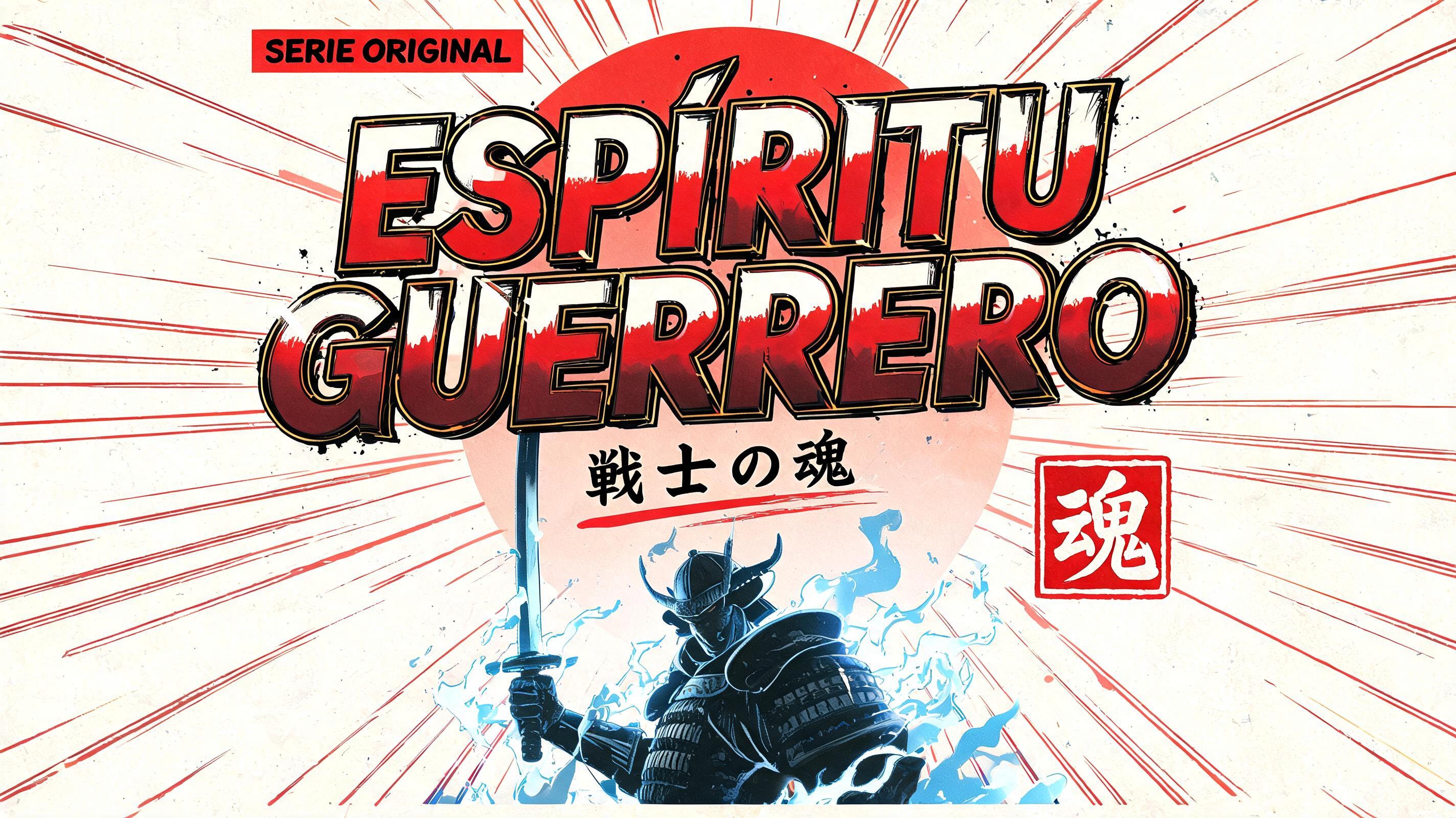

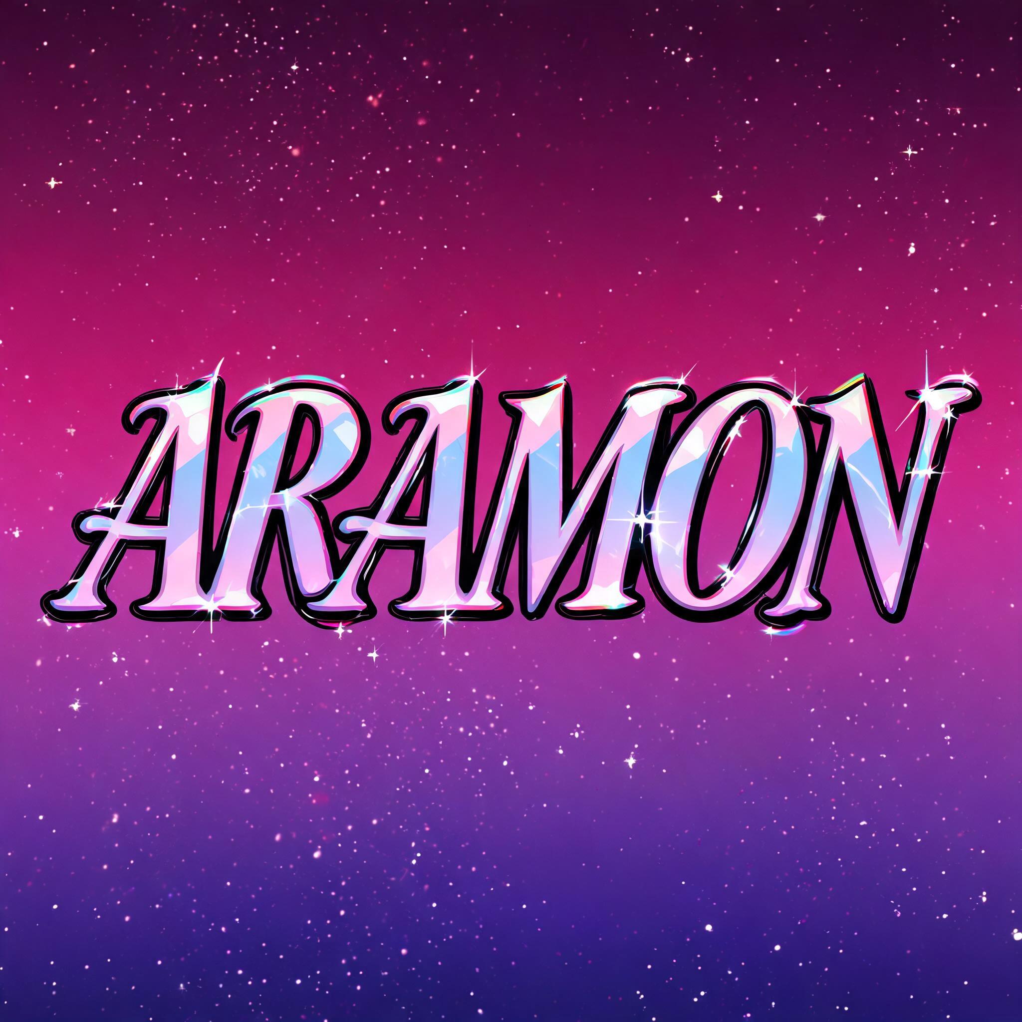
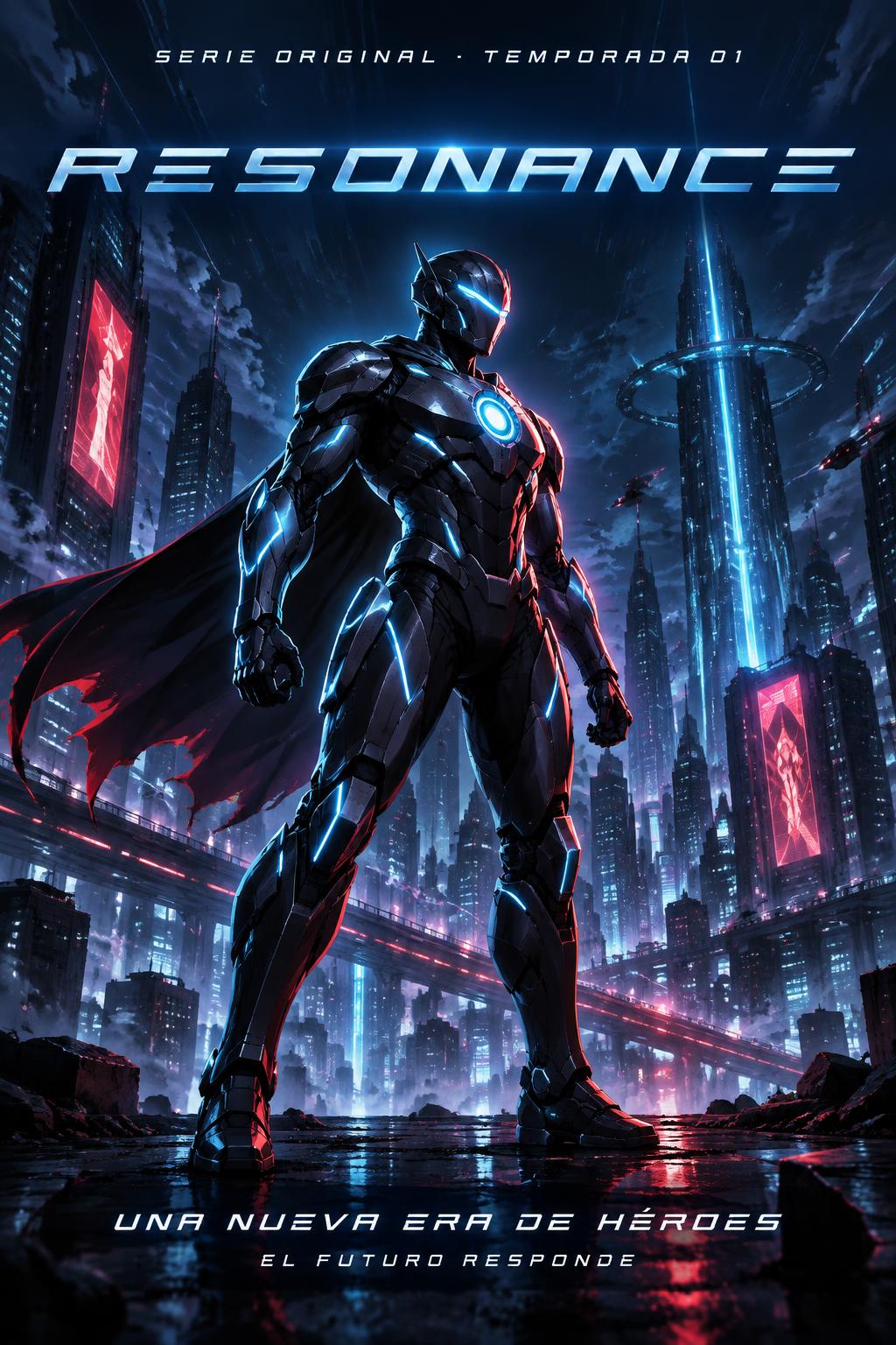
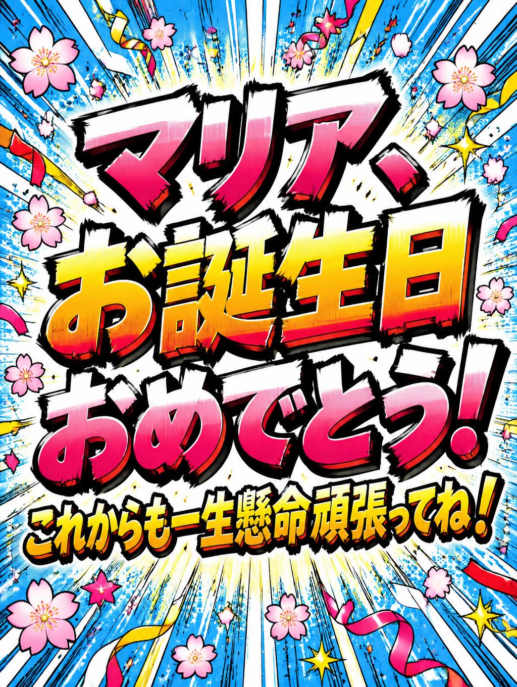
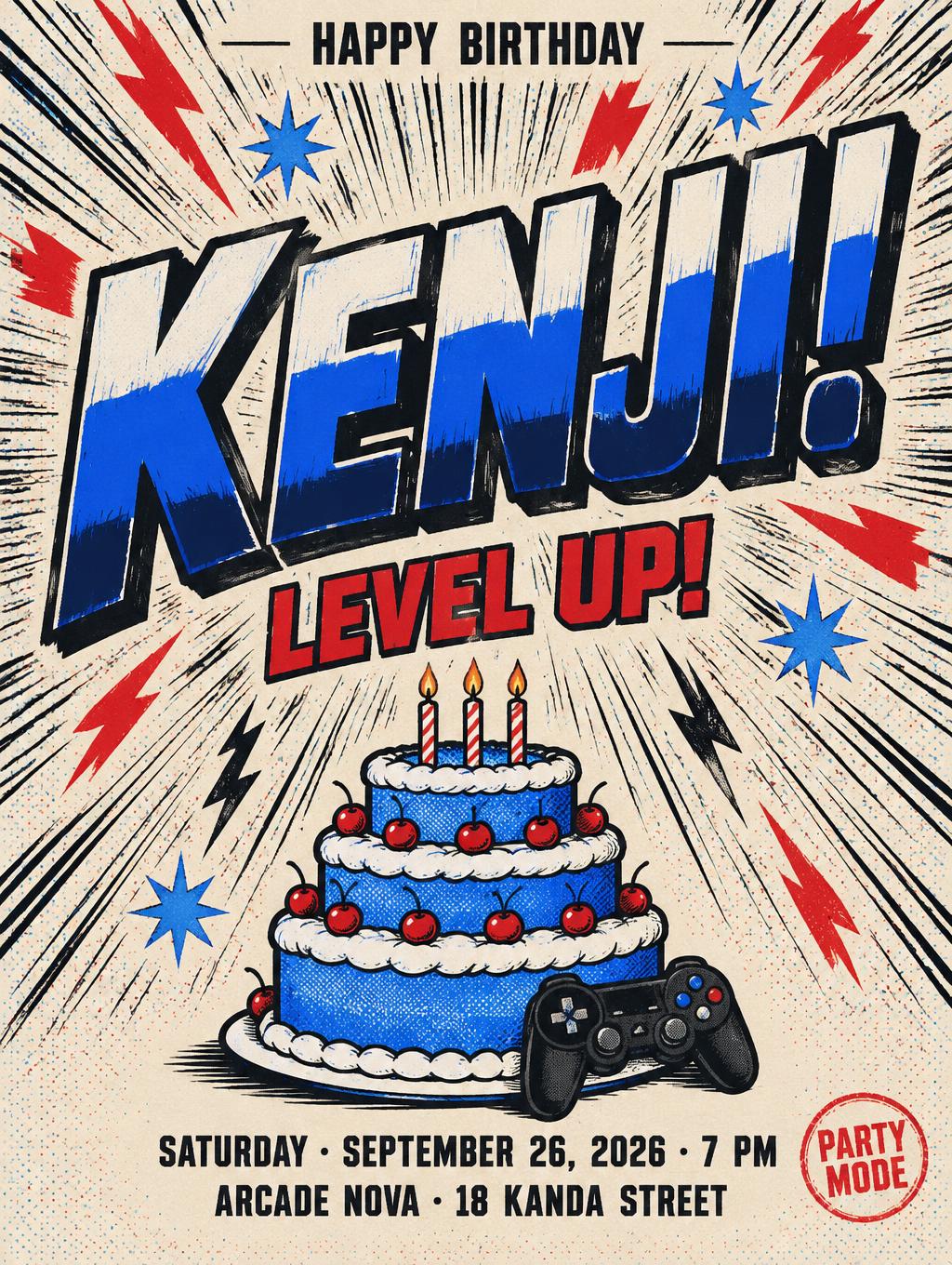
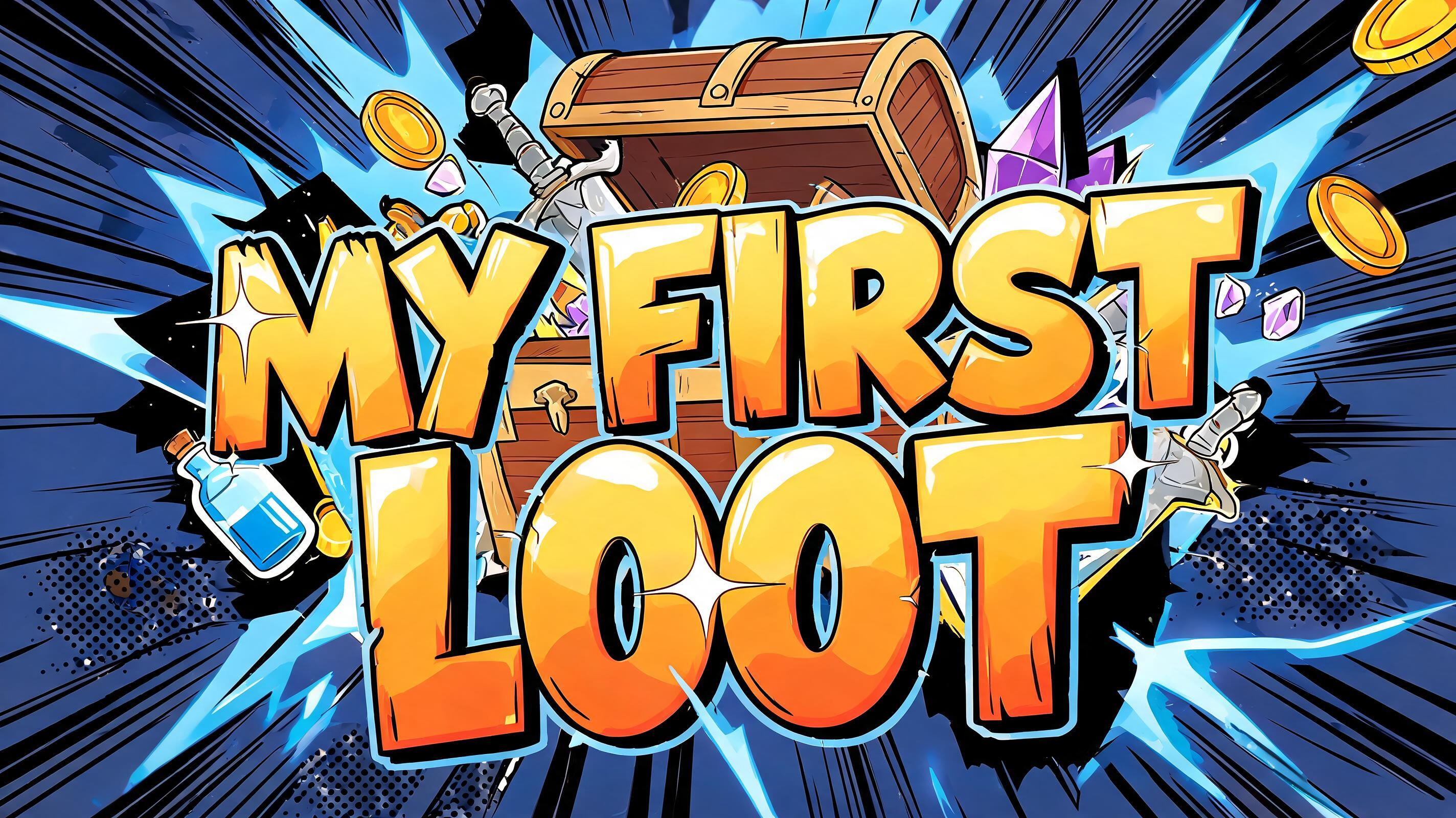
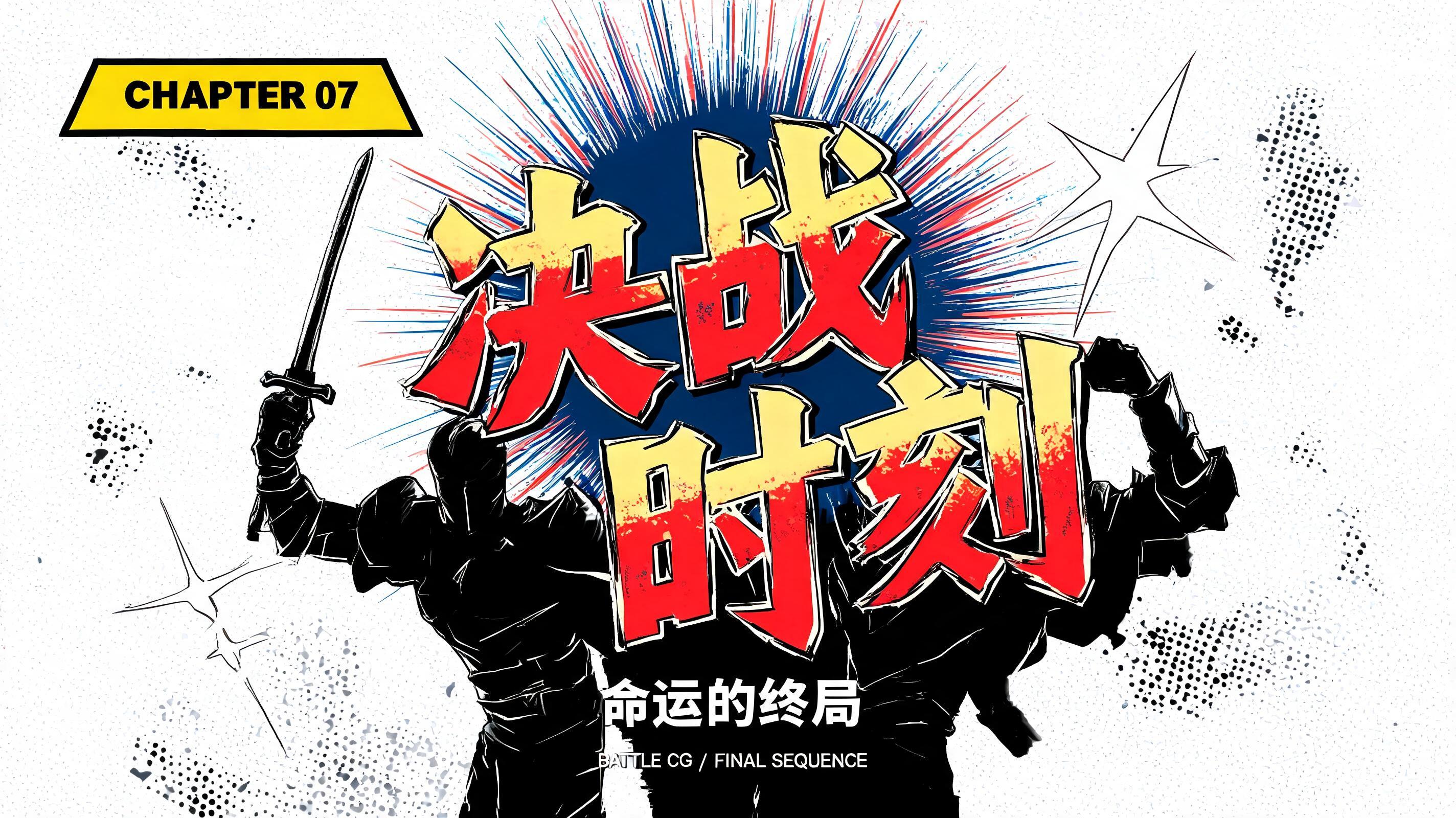
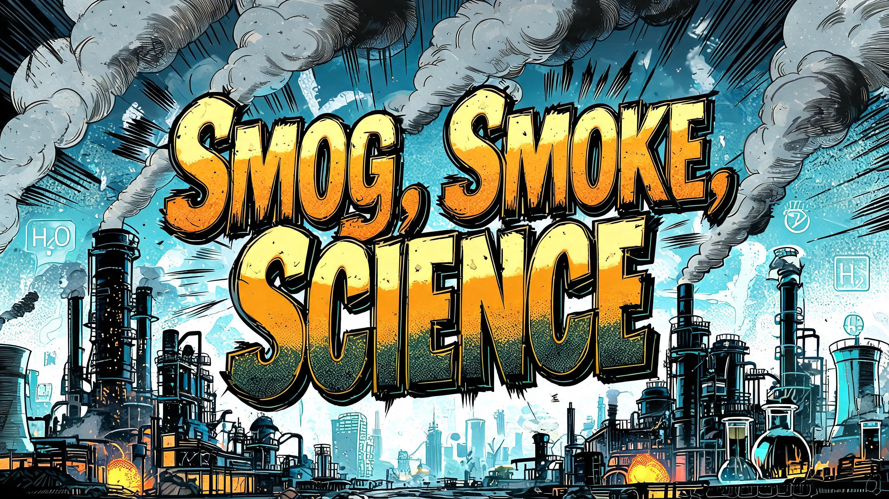
“CLAUDIA VALENCIA” es un efecto de texto Anime creado con FontVibe IA. Rotulación de título shōnen: contornos negros gruesos entintados a mano, sombreado cel plano dividido en bandas duras de luz y sombra, letras inclinadas y dinámicas sobre blanco con líneas de velocidad radiales.
rendered as Japanese shounen anime title treatment — bold hand-inked manga lettering with authentic cel-shaded visual energy. Letter construction follows classic Shonen Jump title card standards: thick black ink outline with natural brush-weight variation defining each letter boundary; flat cel-shading fill with three hard-edge zones — bright highlight zone on upper letter face, highly saturated primary color zone at center, deep shadow zone at lower edge; all zone boundaries knife-edge hard, zero gradient blur, pure flat offset-print ink physics. Energy signature: high-contrast color + thick ink outline = letters that look physically printed on manga paper. The typographic language of Dragon Ball, Naruto, One Piece, Demon Slayer, Jujutsu Kaisen title cards — maximum manga kinetic energy, iconic and immediately recognizable as Japanese anime title typography. LETTERFORM PRIORITY: when the chosen font carries its own treatment, that font's letterform shapes take priority and own the letters; this style governs the inked manga outline, the three-zone cel-shading and the kinetic energy. FALLBACK MATERIAL: if the font carries no material of its own, render the letters as bold hand-inked shounen title lettering with a thick black brush outline and hard three-zone cel-shading. COLOR PRIORITY: keep the font's own colors if specified; otherwise a high-saturation primary fill with hard highlight and shadow zones. CLAUDIA VALENCIA rendered as a Japanese shounen anime title card, with the full name treated as the dominant hero lettering and separated into a strong two-tier visual rhythm. Thick black brush-ink contours surround every character, with irregular pressure variation, sharp tapered terminals, tiny printed-ink imperfections, and crisp white knockout gaps around close letter edges. Flat three-zone cel-shading: bright coral-pink highlight planes across upper surfaces, saturated scarlet midtone fields, and deep wine-red shadow planes along lower edges; each tonal boundary is razor-cut with zero airbrush gradient. A narrow warm ivory offset-print highlight catches selected corners. Behind the title, dense radial manga speed lines burst through a field of pale cream paper grain, punctuated by black impact slashes, small red halftone bursts, and angular ink-star accents. High-energy chapter-cover composition, clean negative space around the name, screen-print ink texture, hard cel-shaded lighting, sharp graphic contrast, authentic anime promotional title treatment, no extra words, no watermark.
Hecho para Generador de Texto Anime
Generada el 15 de octubre de 2026 · 1824 × 1024 · JPEG · OpenAI GPT-Image-2.5 Sunburst · Compartida por el creador · Uso comercial gratuito (CC BY 4.0)


