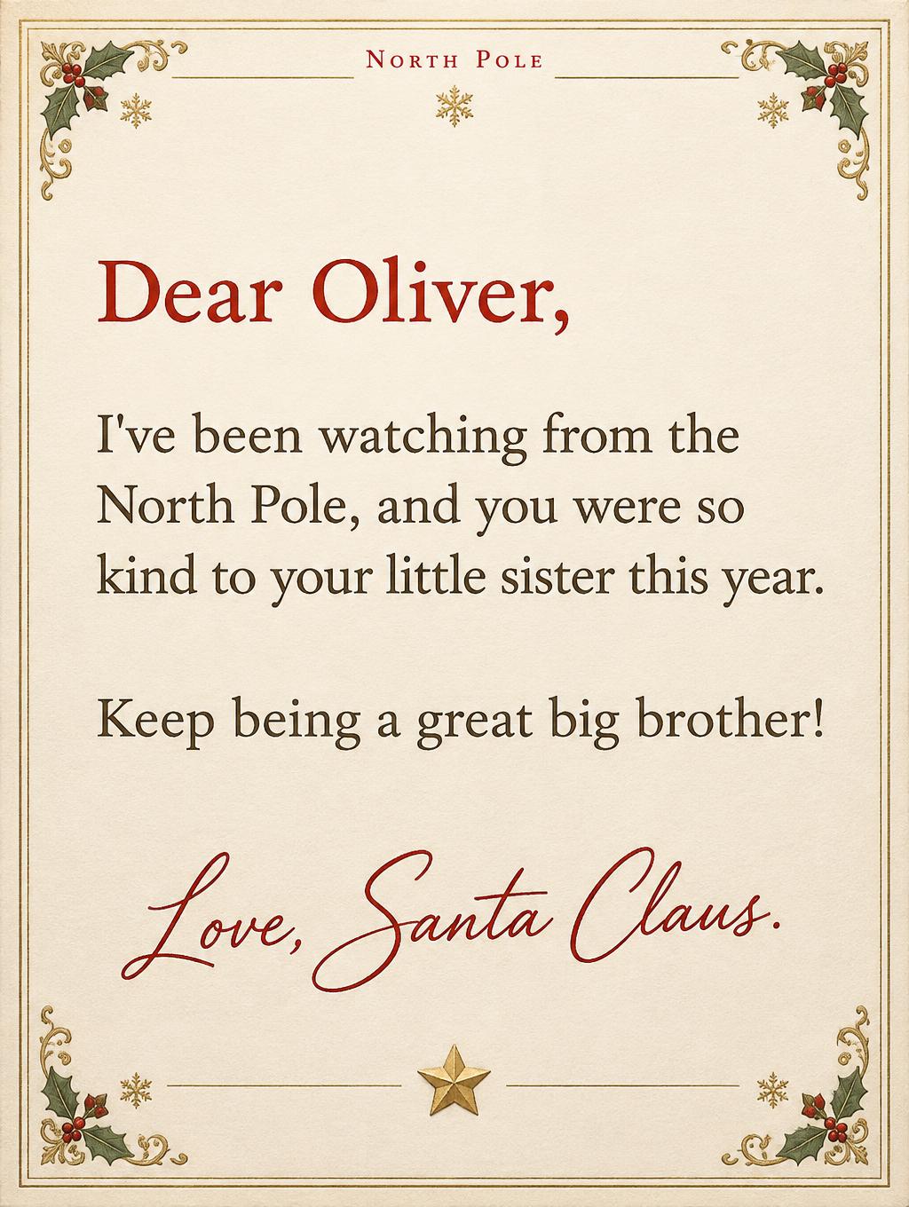
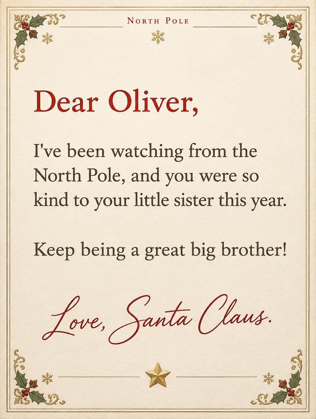
North Pole Dear Oliver, I've been watching from the North Pole, and you were so kind to your little sister this year. Keep being a great big brother! Love, Santa Claus. - Victorian North Pole Text Effect
Usa OpenAI GPT-Image-2.5 Sunburst, el modelo de esta obra · 15 créditos
Una carta de Santa titulada "Dear Oliver," en papel con membrete del Polo Norte, pensada como recuerdo navideño en estilo clásico de tarjeta impresa. El texto serif oscuro y la firma en cursiva roja van sobre papel crema dentro de un fino borde dorado, con esquinas de acebo y bayas, copos de nieve y una estrella dorada abajo. Cambia el nombre del niño, la buena acción mencionada y la despedida para crear tu propia carta personalizada de Santa.
Create a finished, print-ready Santa letter on a vertical 3:4 sheet, styled as refined vintage red-and-gold North Pole stationery. Warm ivory laid paper with subtle natural grain, generous home-printing safe margins, and a thin double-line antique-gold border with restrained Victorian corner flourishes. Use only a few small holly sprigs and delicate gold snowflake accents in the corners; keep all decoration clear of the text. A small embossed gold star seal may sit near the signature, with no lettering on it. Set the exact visible text below, with no additions and no omissions. Preserve every word, apostrophe, comma, exclamation mark, and period exactly: Top letterhead, small centered red serif capitals: “North Pole” Greeting, prominent warm red storybook serif: “Dear Oliver,” Body, large, dark warm-brown friendly serif with open shapes and generous line spacing, left-aligned in a wide clear text area: “I've been watching from the North Pole, and you were so kind to your little sister this year.” “Keep being a great big brother!” Signature near the lower portion, graceful but highly legible handwritten ink lettering in deep red: “Love, Santa Claus.” The greeting and Oliver’s name should be immediately easy to spot. Keep the body comfortably readable for a child at letter-sheet size; do not shrink it to fit. Set the body as two naturally separated lines or paragraphs while preserving the exact wording and punctuation. Make the page feel like a treasured personal letter, not a poster: precise stationery composition, soft flat printed light, gentle paper shadows, restrained antique-gold highlights, and no extra text, dates, names, characters, or Christmas motifs.
Etiquetas
Generada el 19 de octubre de 2026 · 1024 × 1360 · JPEG · OpenAI GPT-Image-2.5 Sunburst · Diseño: Safe Letterhead · Compartida por el creador · Uso comercial gratuito (CC BY 4.0)