Before 19s - Grunge Text Effect


Usa OpenAI GPT-Image-2.5 Sunburst, el modelo de esta obra · 15 créditos

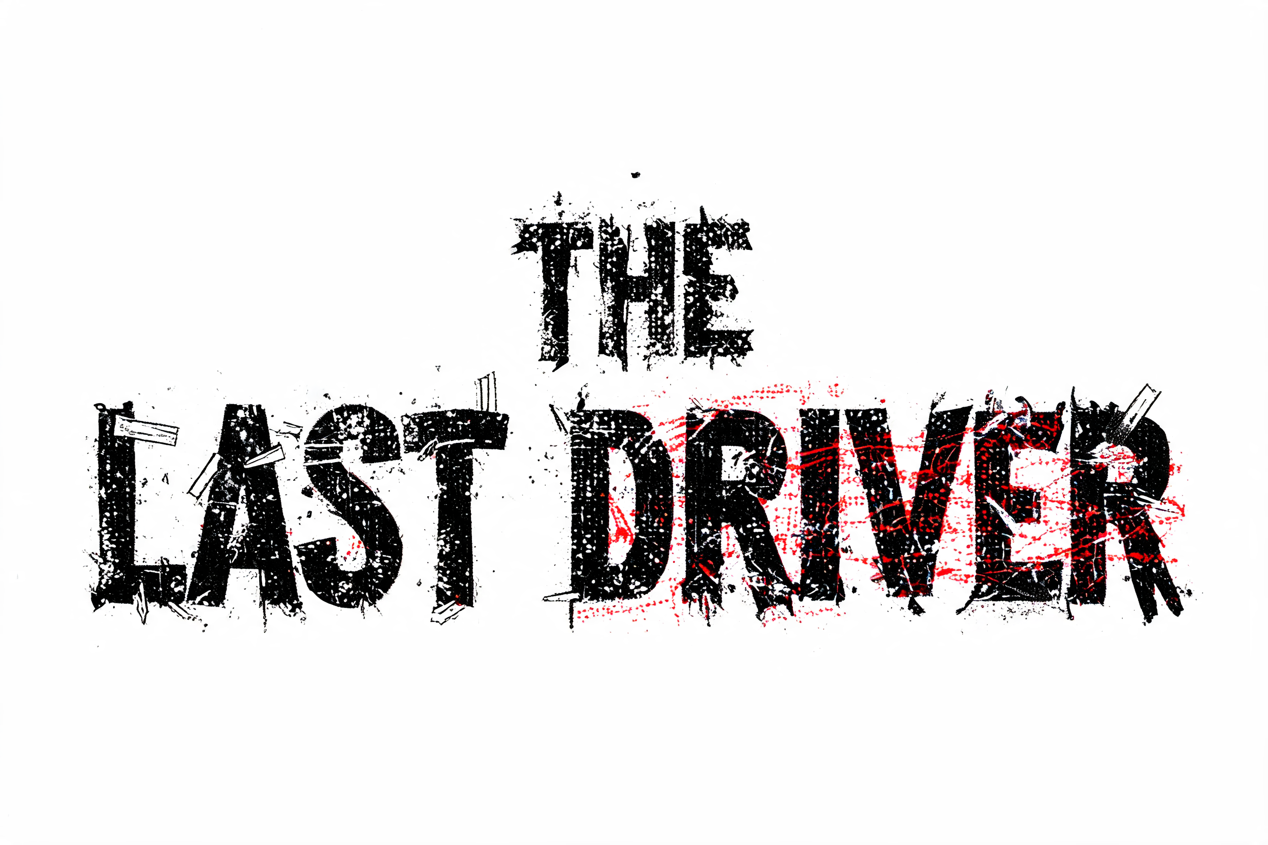
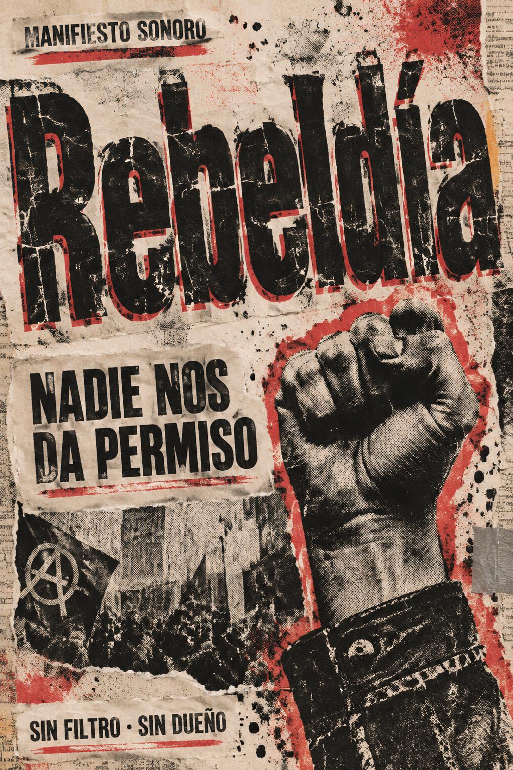
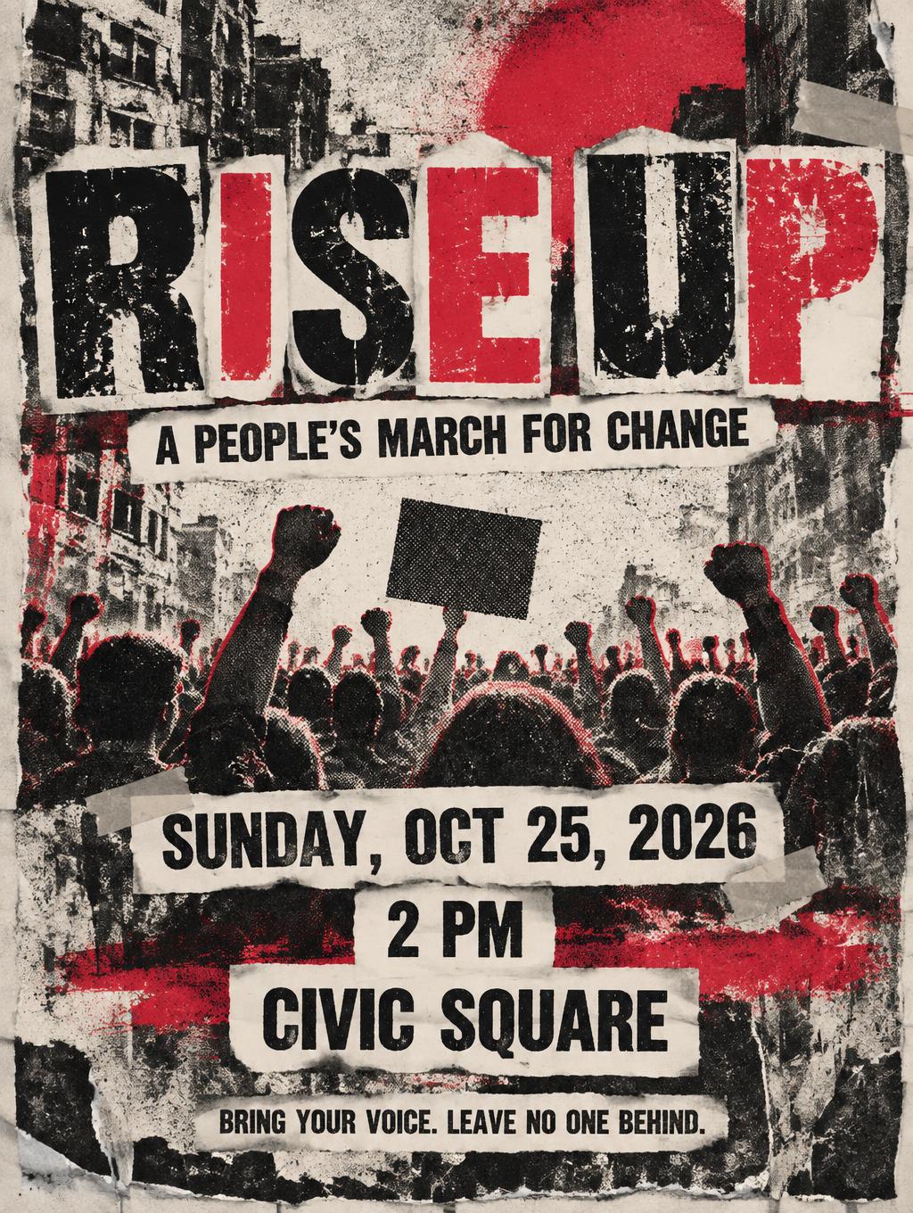
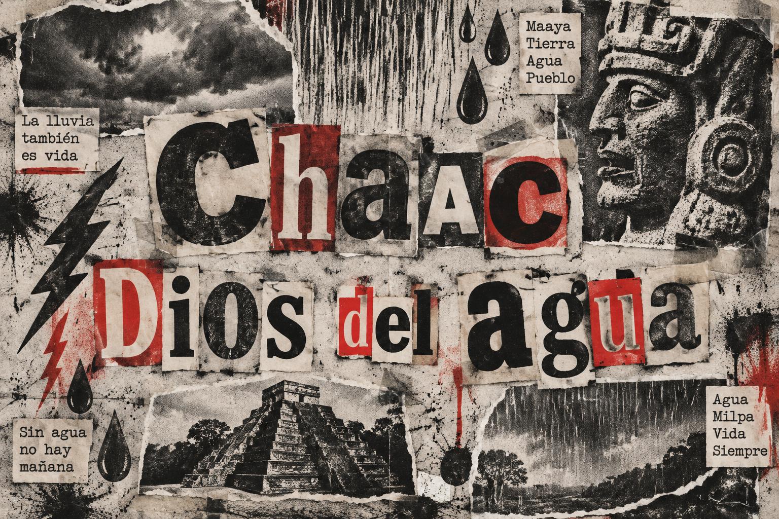
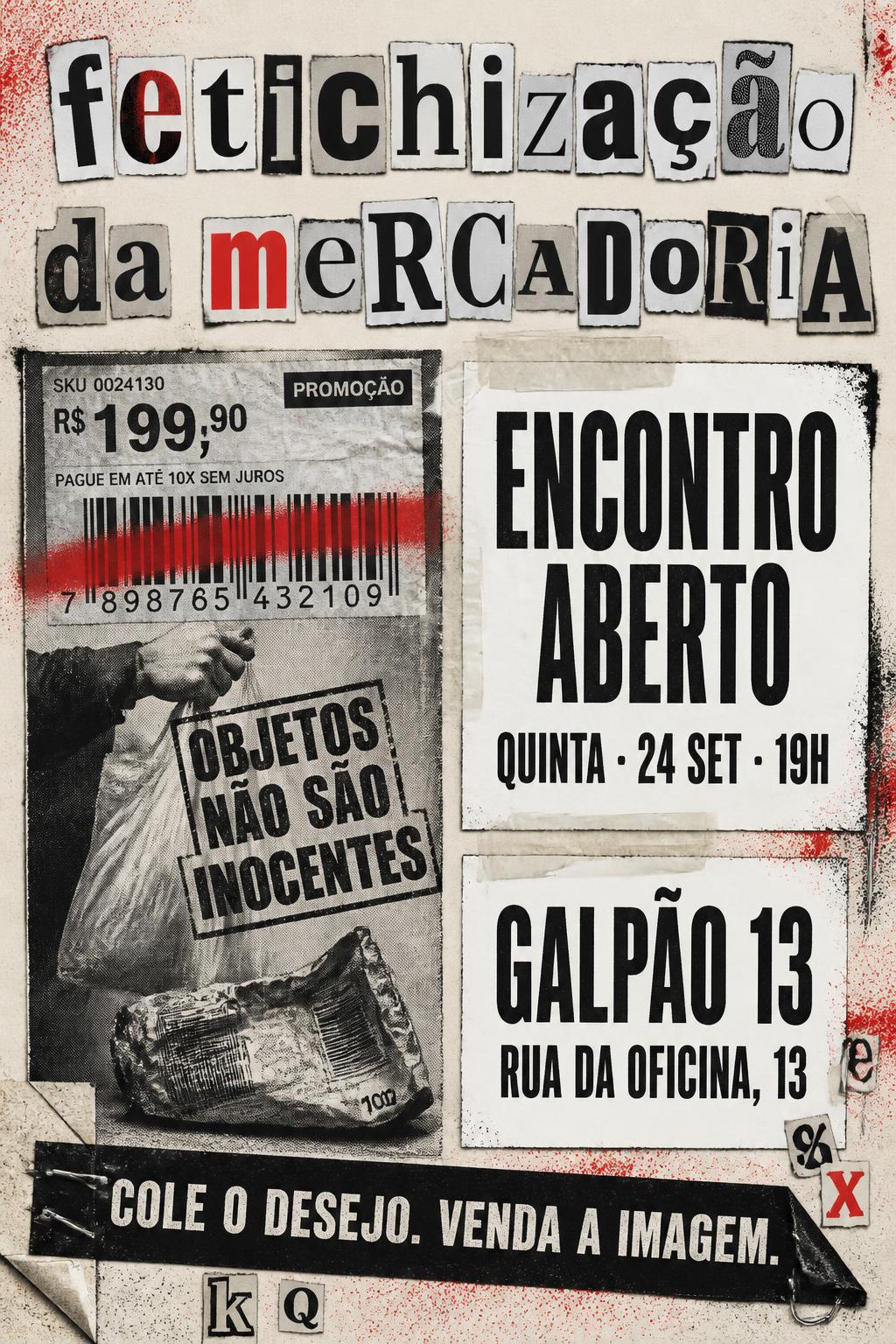
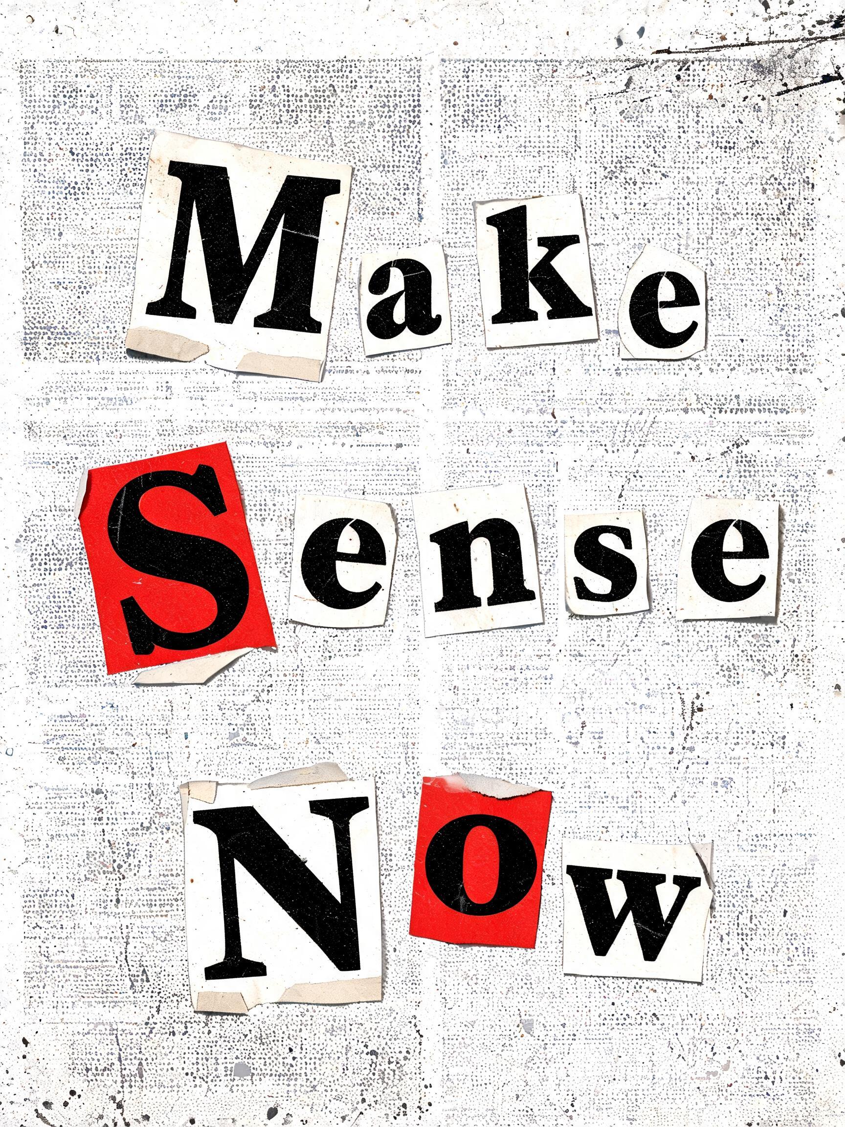
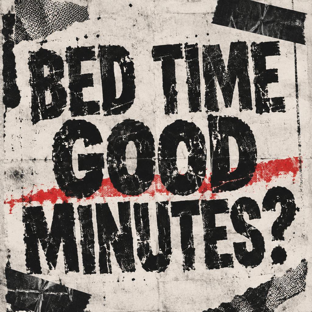
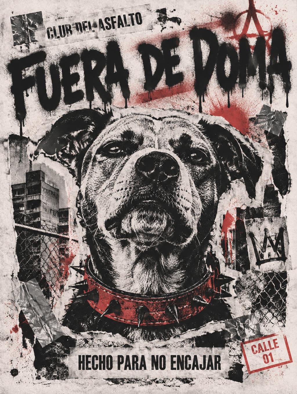
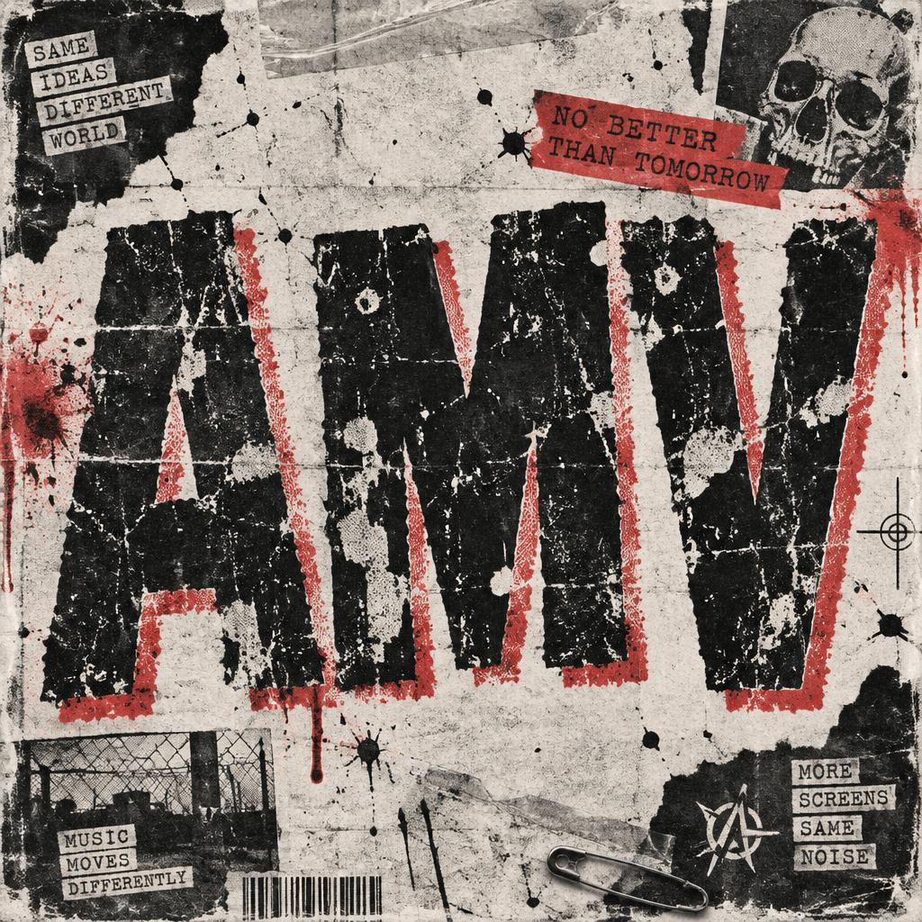
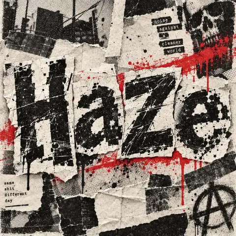
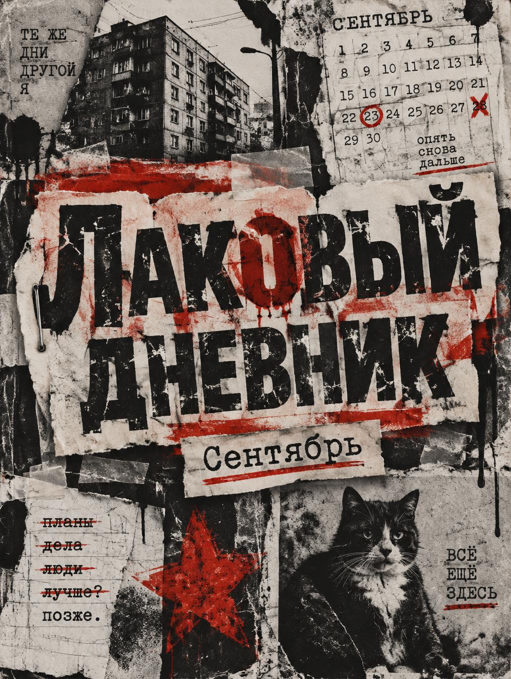
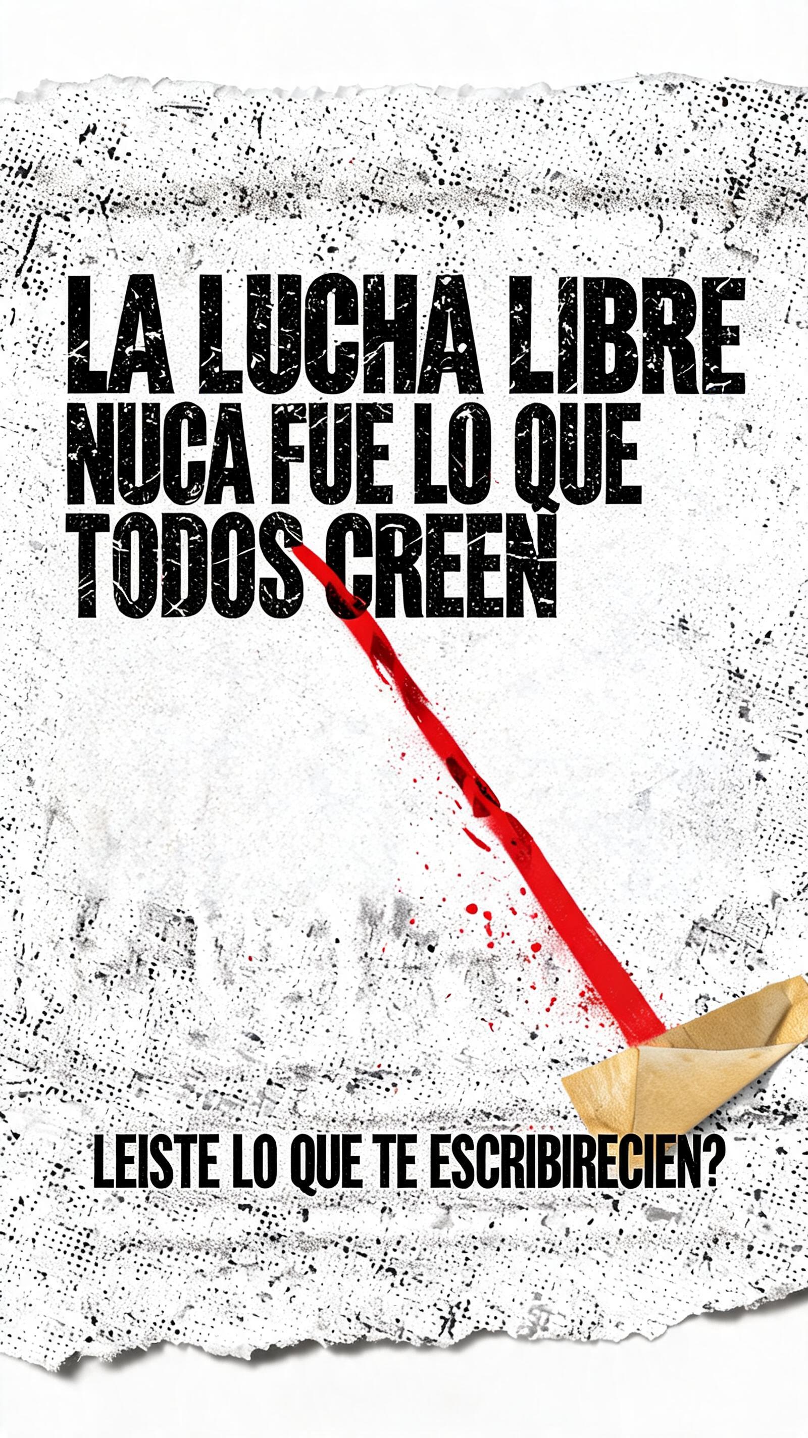
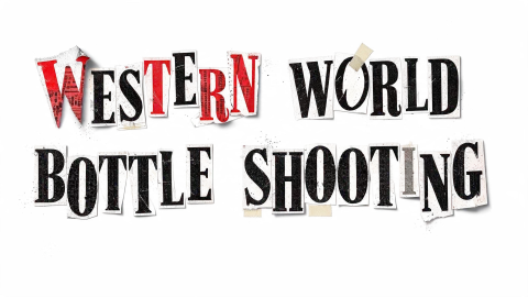
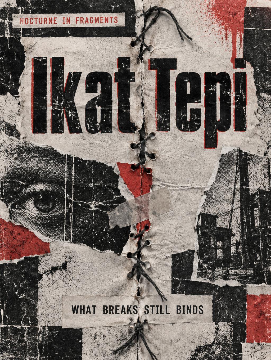
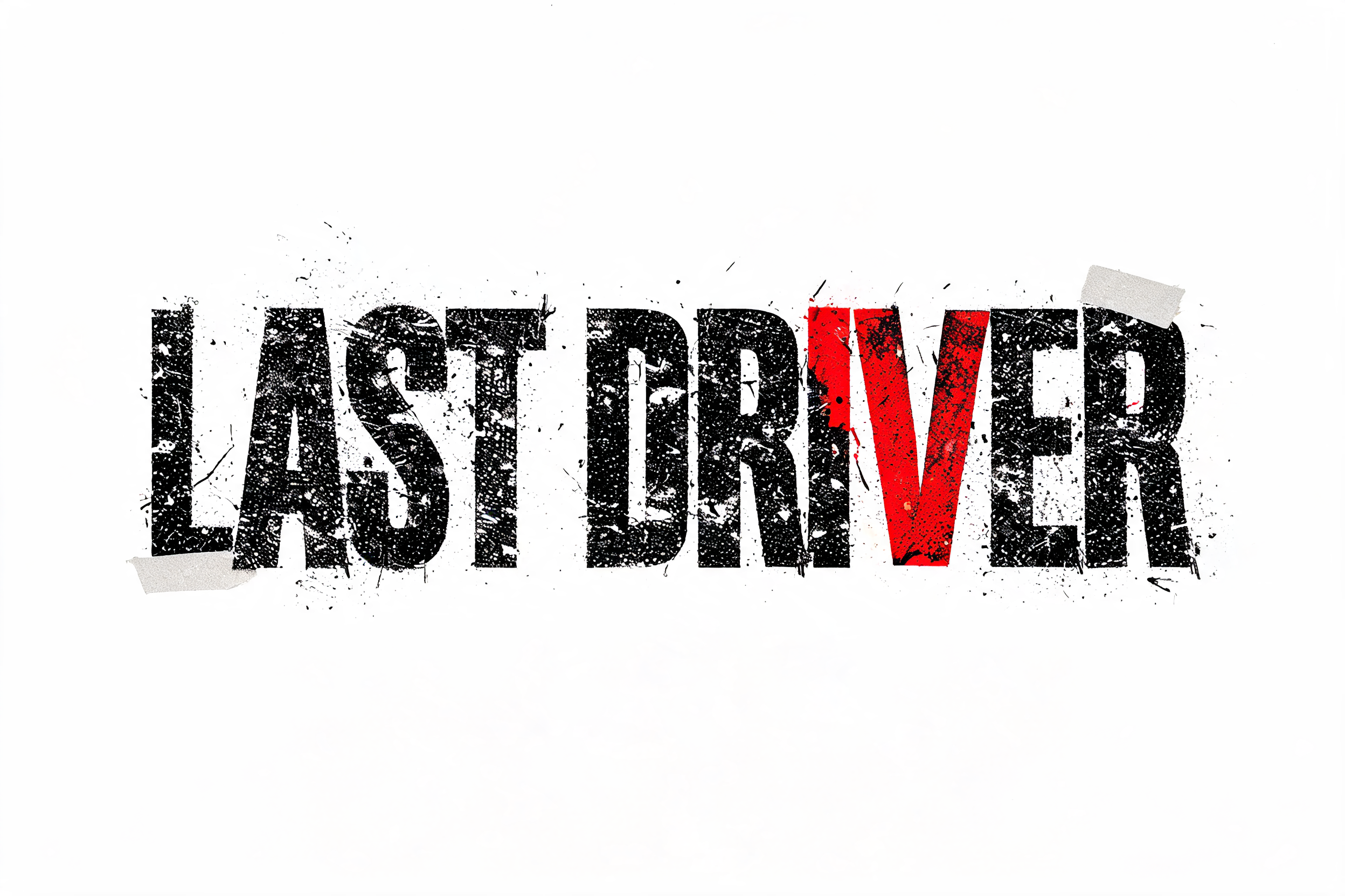
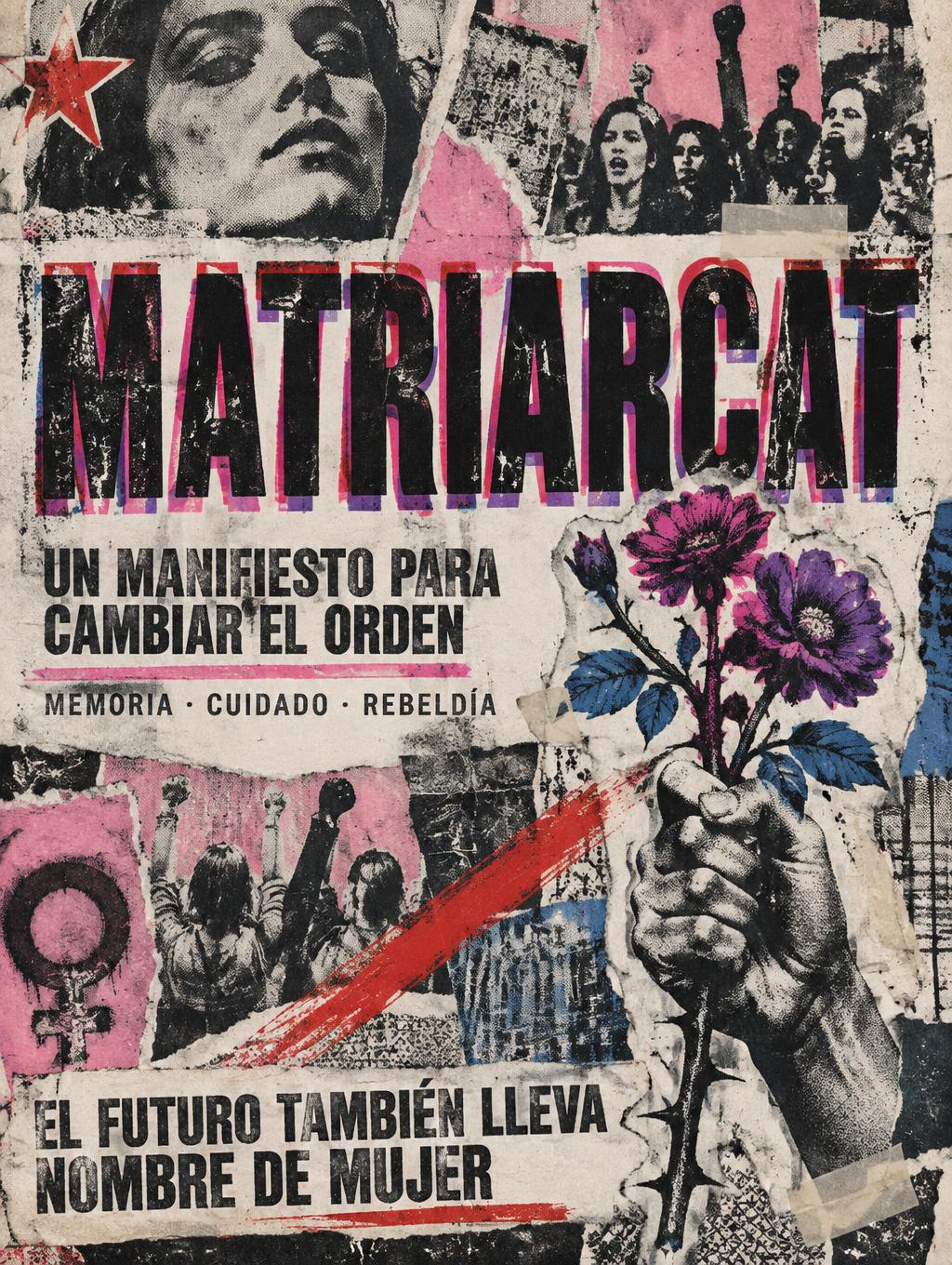
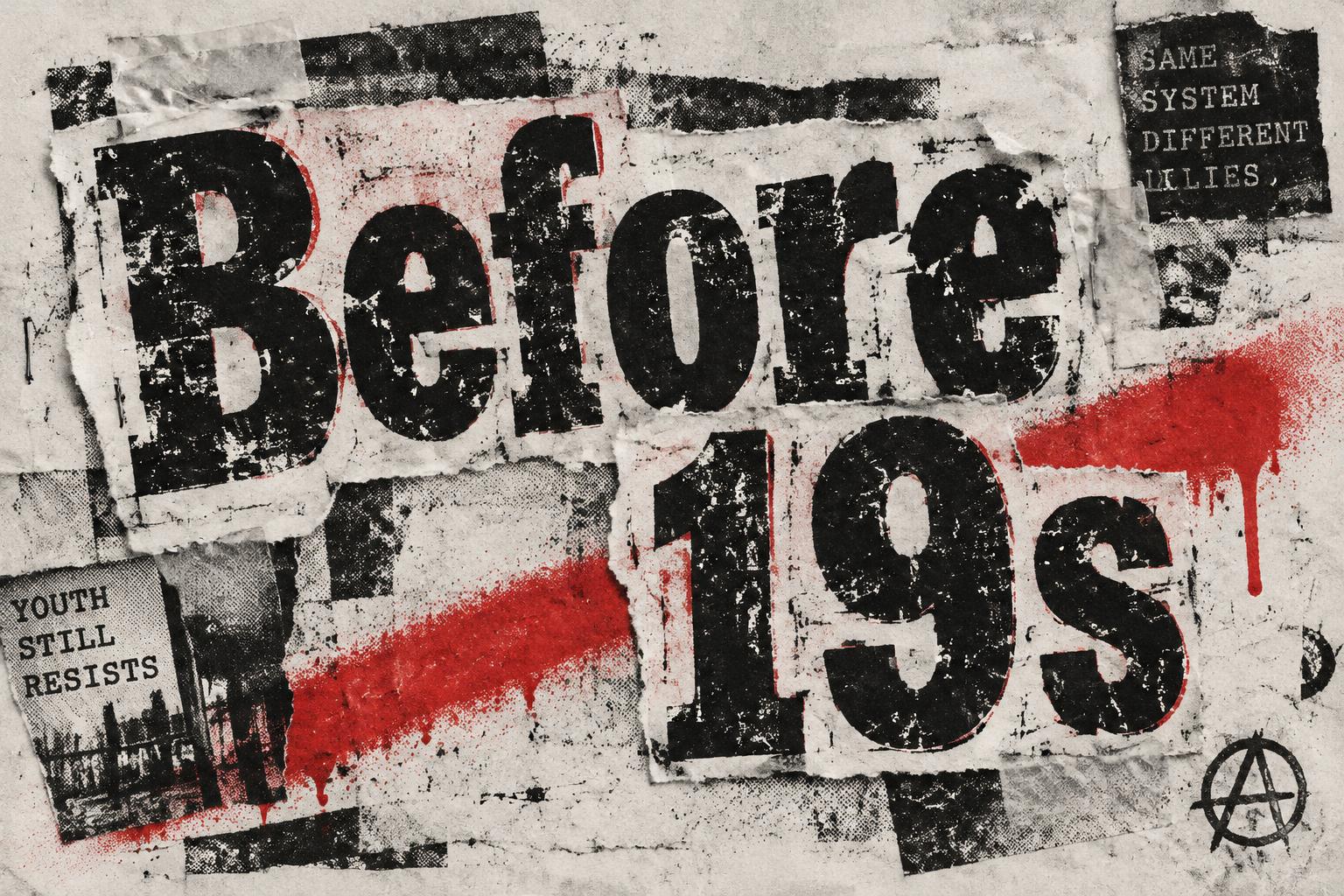
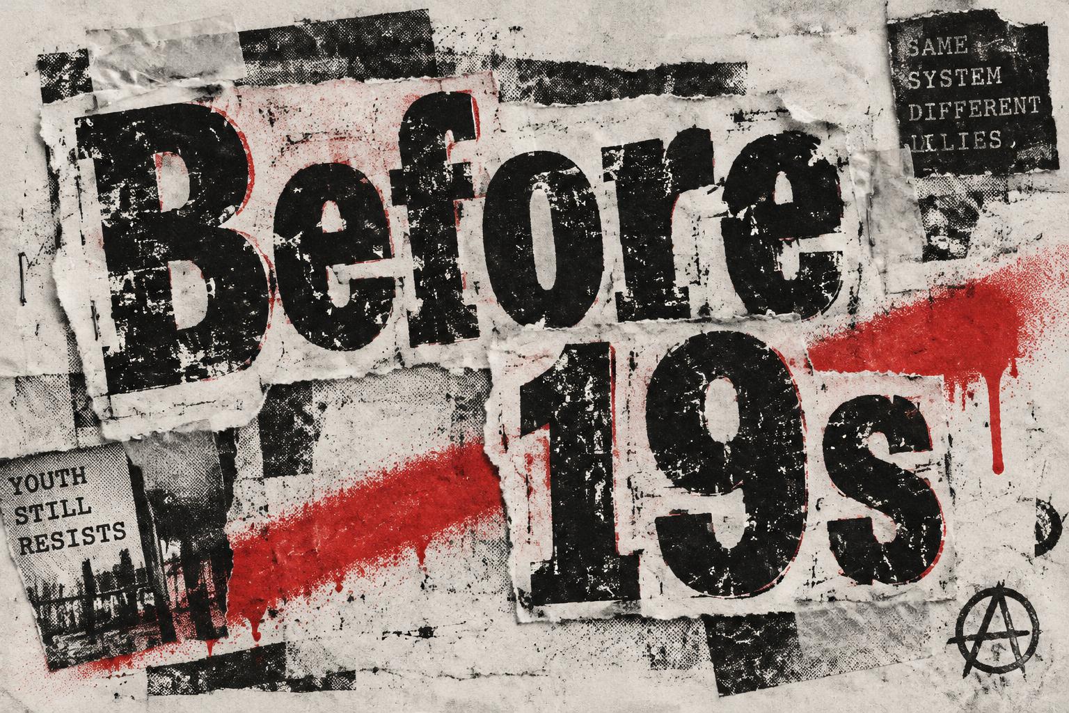
“Before 19s” es un efecto de texto Grunge creado con FontVibe IA. Letras de nota de rescate recortadas de distintos periódicos, pegadas con cinta sobre papel fotocopiado tosco con moteado de semitono, bordes rasgados y un único acento rojo punk.
a photocopied punk-zine world. PRINT: everything looks run through a cheap copier and pasted up by hand — coarse halftone dot screens, heavy black ink that bleeds and clogs, low-ink dropout and roller streaks, Xerox speckle and nth-generation blur on raw off-white newsprint and photocopy paper. TEXTURE: torn and scissor-cut paper edges, strips of tape, lifted corners, creases, scratches, smears and spray-paint overspray — the evidence of a hand working under pressure. LIMITED PALETTE: the cheap two-color reproduction palette — high-contrast black ink and raw off-white paper, with one punchy punk RED as the accent (occasionally a hit of acid yellow), printed slightly off-register. ENERGY: a layered cut-and-paste collage grammar, asymmetric and disrupted like a stapled zine. LETTERFORM PRIORITY: when the chosen font carries its own material or treatment (ransom-note collage, riso halftone, distressed, spray, stamp, ink-bleed), that font treatment takes absolute priority and owns the letters; this style governs the paper, print degradation, palette and surrounding collage. FALLBACK MATERIAL: if the font carries no material of its own, print the letters in heavy high-contrast black ink on raw off-white paper with photocopy grain, ink bleed and torn edges, so the grunge zine feel always reads. A raw off-white photocopied punk-zine graphic built around the exact text “Before 19s,” large and dominant across the center, occupying roughly 75% of the frame width. Let the words feel like they were ripped from a black-ink copier print and pasted down in a hurry: dense clogged ink, coarse halftone dots, uneven toner dropout, blurred duplicate edges and slight red off-register shadowing. Keep the composition asymmetric, with “Before” hovering slightly above and left of “19s” for a disrupted hierarchy, while preserving clear readability. Surround the title with torn newsprint fragments, crooked strips of translucent tape, staple marks, scraped black smears, faint roller streaks and Xerox speckle. A violent punk-red spray-painted diagonal slash cuts behind the lower text, with soft overspray fading into the paper fibers. Leave rough breathing room around the collage rather than filling every corner. Raw black, off-white and a single urgent red dominate, with scratched paper grain and hand-assembled zine energy; not vintage, but confrontational and immediate.
Generada el 21 de octubre de 2026 · 1536 × 1024 · JPEG · OpenAI GPT-Image-2.5 Sunburst · Compartida por el creador · Uso comercial gratuito (CC BY 4.0)


