Leonardo - Anime Text Effect


Usa OpenAI GPT-Image-2.5 Sunburst, el modelo de esta obra · 15 créditos

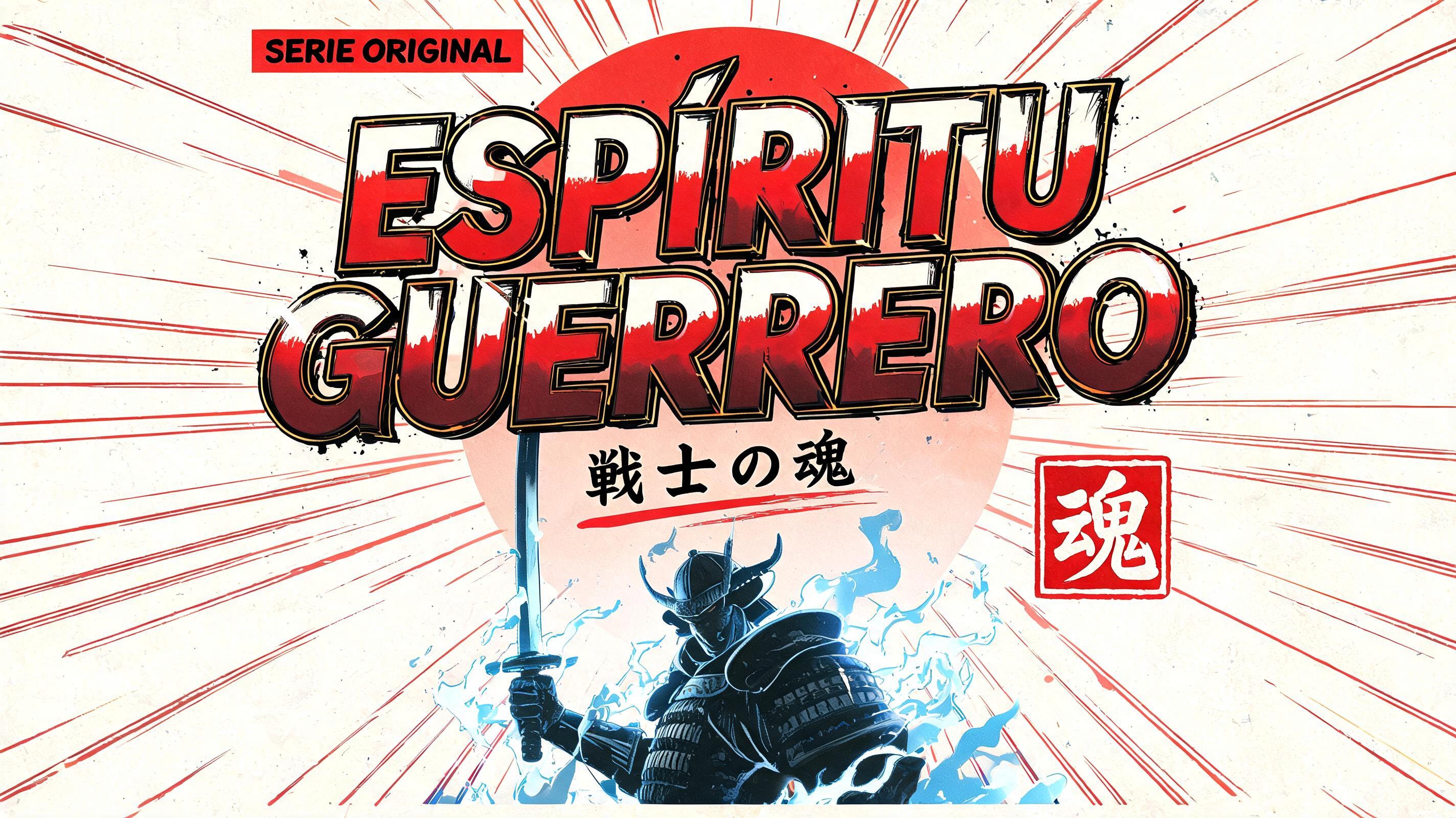

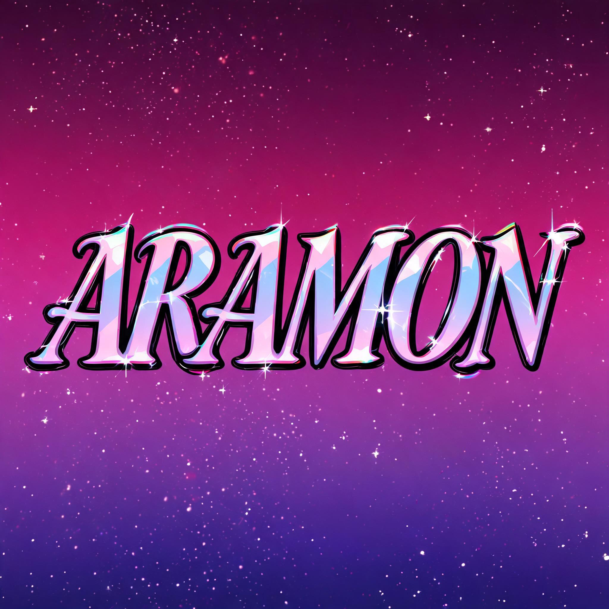
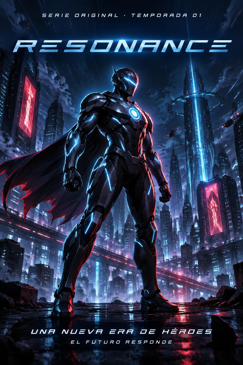
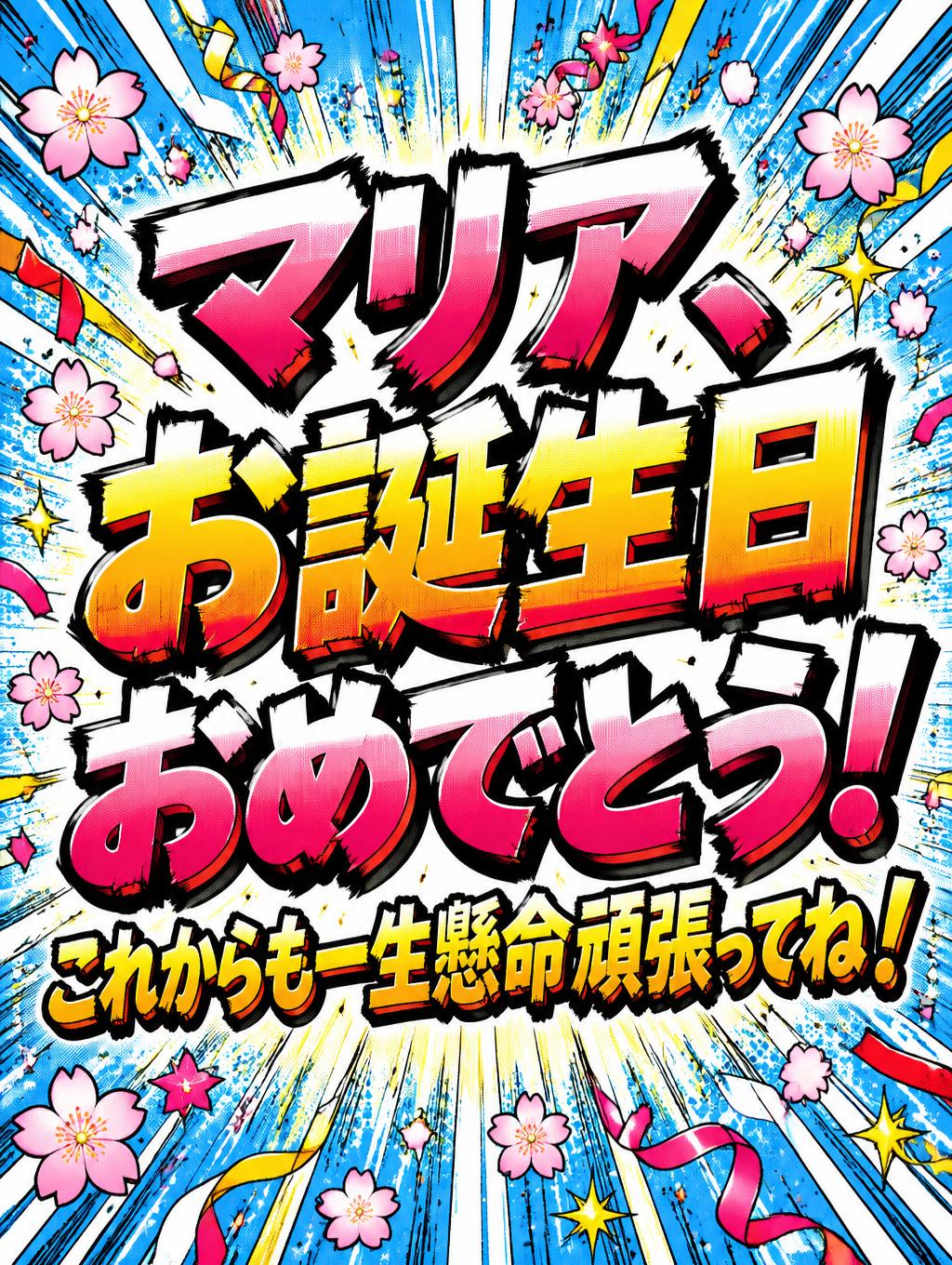
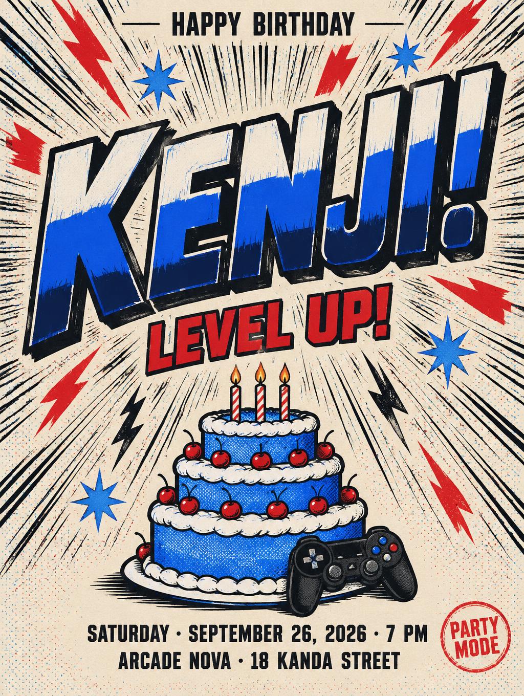
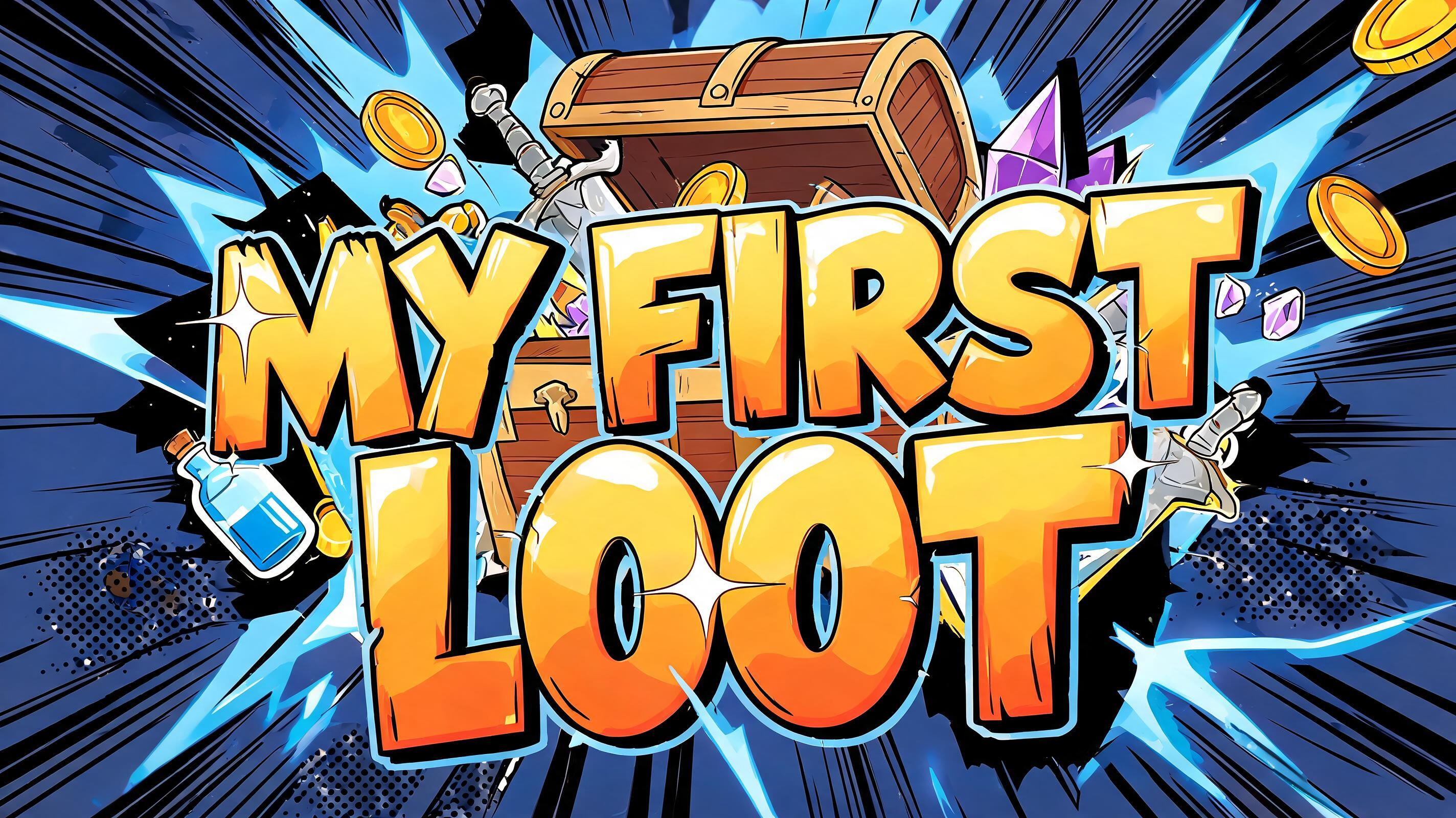
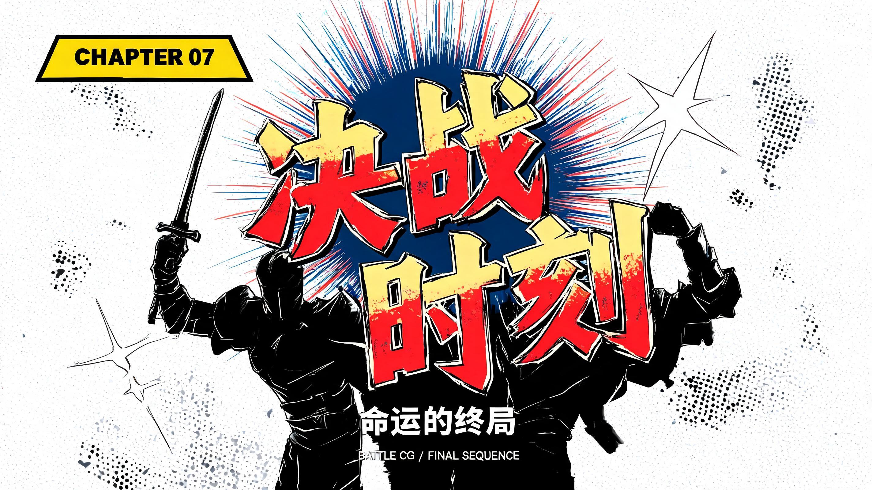
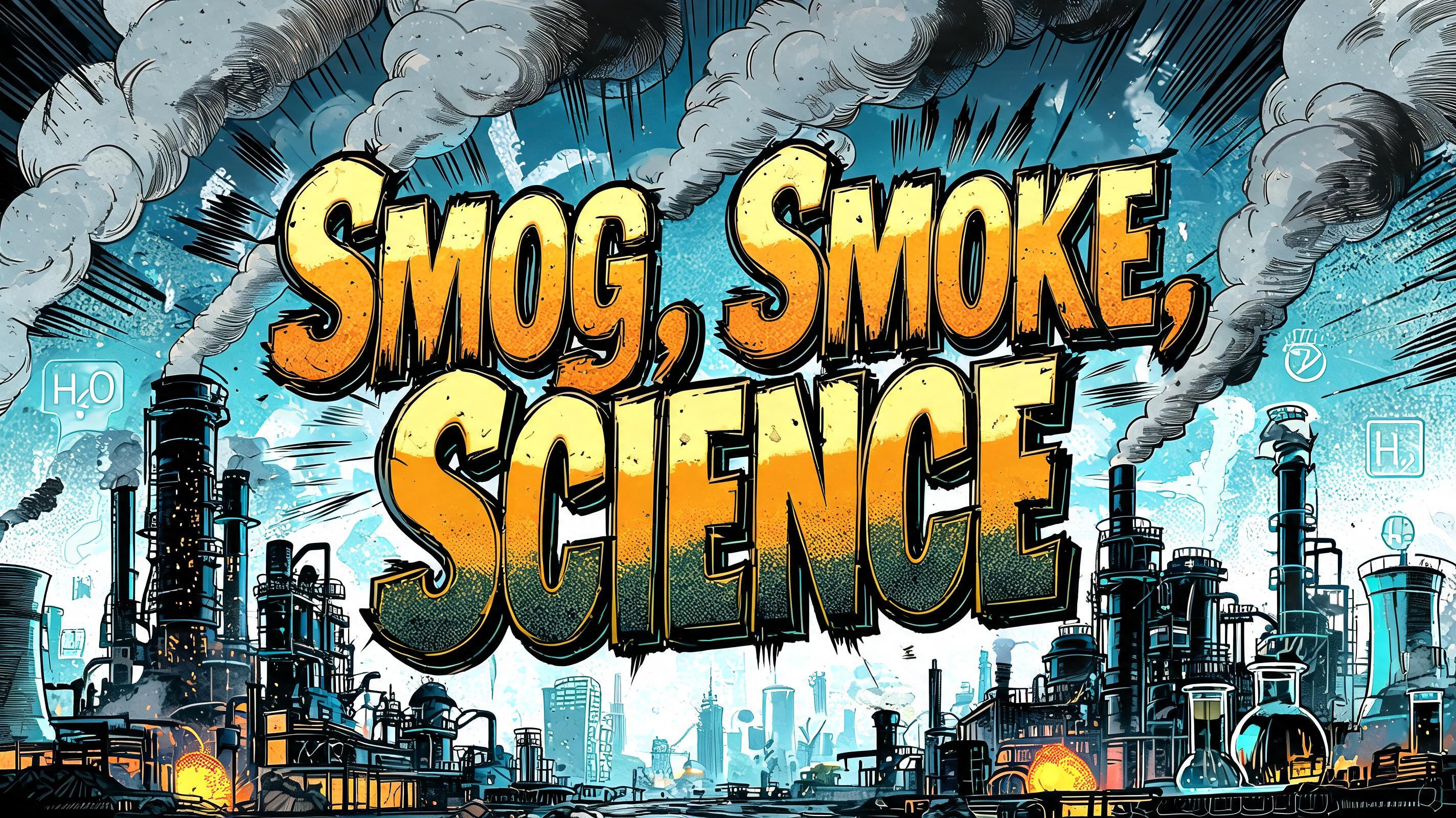
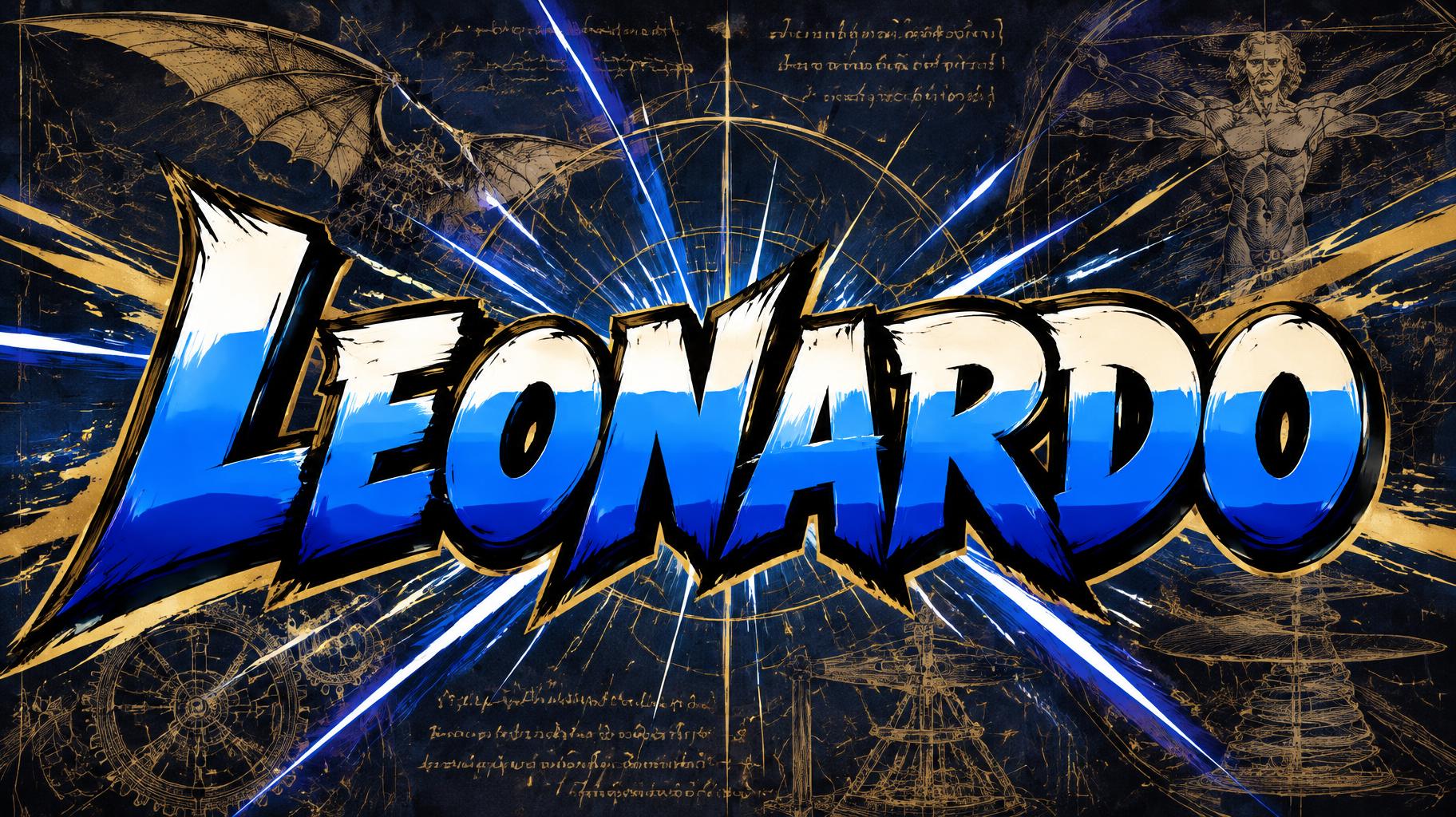
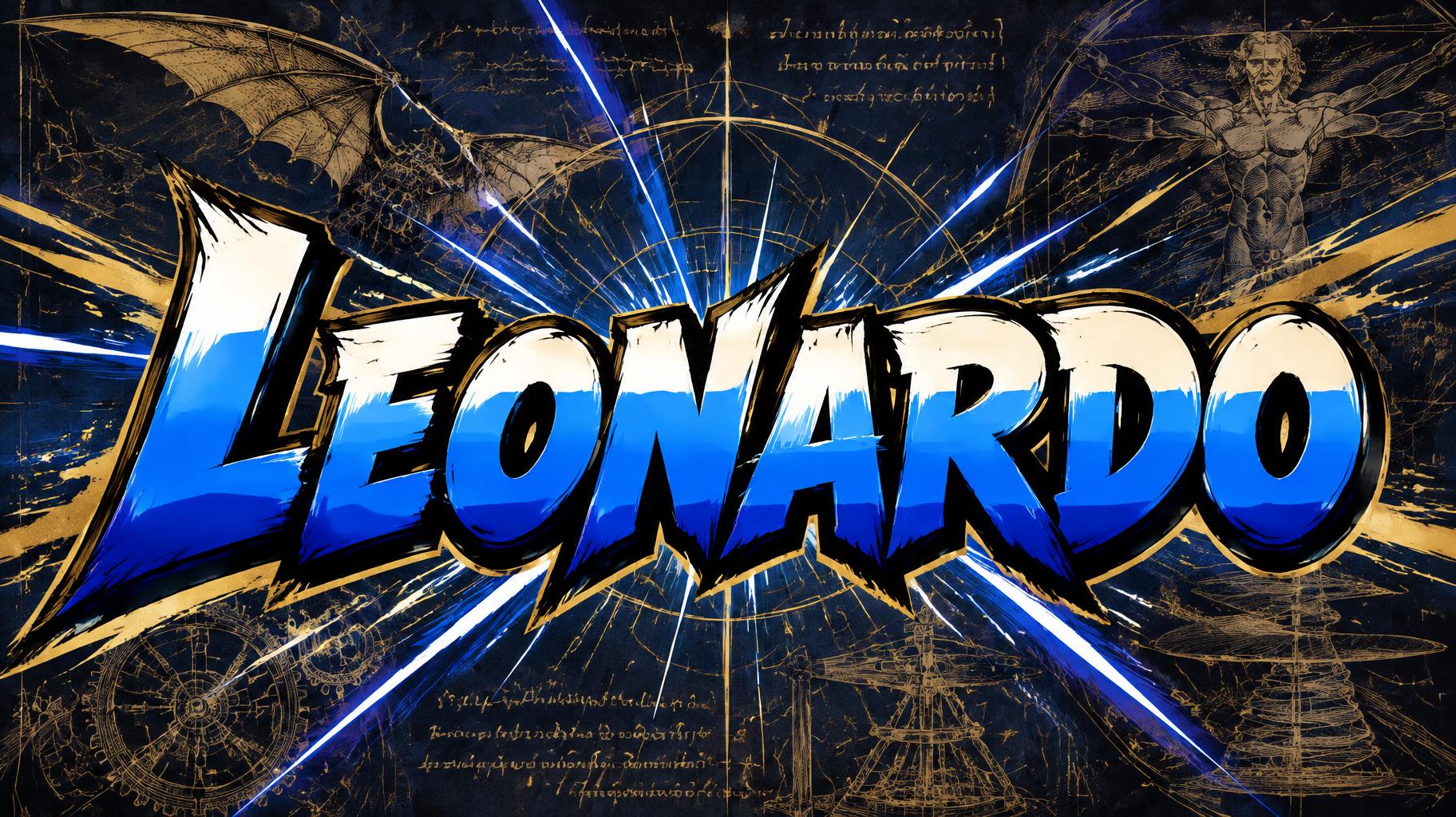
“Leonardo” es un efecto de texto Anime creado con FontVibe IA. Rotulación de título shōnen: contornos negros gruesos entintados a mano, sombreado cel plano dividido en bandas duras de luz y sombra, letras inclinadas y dinámicas sobre blanco con líneas de velocidad radiales.
rendered as Japanese shounen anime title treatment — bold hand-inked manga lettering with authentic cel-shaded visual energy. Letter construction follows classic Shonen Jump title card standards: thick black ink outline with natural brush-weight variation defining each letter boundary; flat cel-shading fill with three hard-edge zones — bright highlight zone on upper letter face, highly saturated primary color zone at center, deep shadow zone at lower edge; all zone boundaries knife-edge hard, zero gradient blur, pure flat offset-print ink physics. Energy signature: high-contrast color + thick ink outline = letters that look physically printed on manga paper. The typographic language of Dragon Ball, Naruto, One Piece, Demon Slayer, Jujutsu Kaisen title cards — maximum manga kinetic energy, iconic and immediately recognizable as Japanese anime title typography. LETTERFORM PRIORITY: when the chosen font carries its own treatment, that font's letterform shapes take priority and own the letters; this style governs the inked manga outline, the three-zone cel-shading and the kinetic energy. FALLBACK MATERIAL: if the font carries no material of its own, render the letters as bold hand-inked shounen title lettering with a thick black brush outline and hard three-zone cel-shading. COLOR PRIORITY: keep the font's own colors if specified; otherwise a high-saturation primary fill with hard highlight and shadow zones. ‘Leonardo’ as a single monumental anime hero title, centered at 74% frame width with generous dark negative space around it. The word carries the aura of a brilliant Renaissance inventor turned shounen protagonist: vivid ultramarine blue primary fill, bright ivory highlight planes across the upper faces, and deep cobalt shadow planes at the lower edges, all divided by razor-hard cel-shaded boundaries. A thick, expressive black ink contour encloses every letter, with small white gleams and offset golden ink accents suggesting mechanical genius and heroic resolve. Behind the title, a midnight navy manuscript field is layered with faint sepia invention diagrams: flying-machine wings, gear teeth, compass arcs, anatomical sketch fragments and geometric construction lines, kept subtle enough to preserve immediate readability. Radial manga speed lines and sharp blue-white energy streaks burst outward from behind the center of the word, while a few angular gold sparks cross the foreground. The composition feels like an anime series title card at the instant of a genius awakening—clean, iconic, kinetic, and printed with saturated manga-poster ink. No additional words, logos, or badges.
Hecho para Generador de Letras Anime
Generada el 24 de octubre de 2026 · 1824 × 1024 · JPEG · OpenAI GPT-Image-2.5 Sunburst · Compartida por el creador · Uso comercial gratuito (CC BY 4.0)


