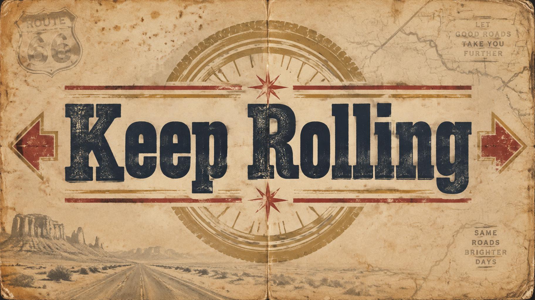
Keep Rolling - Vintage Text Effect


Usa OpenAI GPT-Image-2.5 Sunburst, el modelo de esta obra · 15 créditos

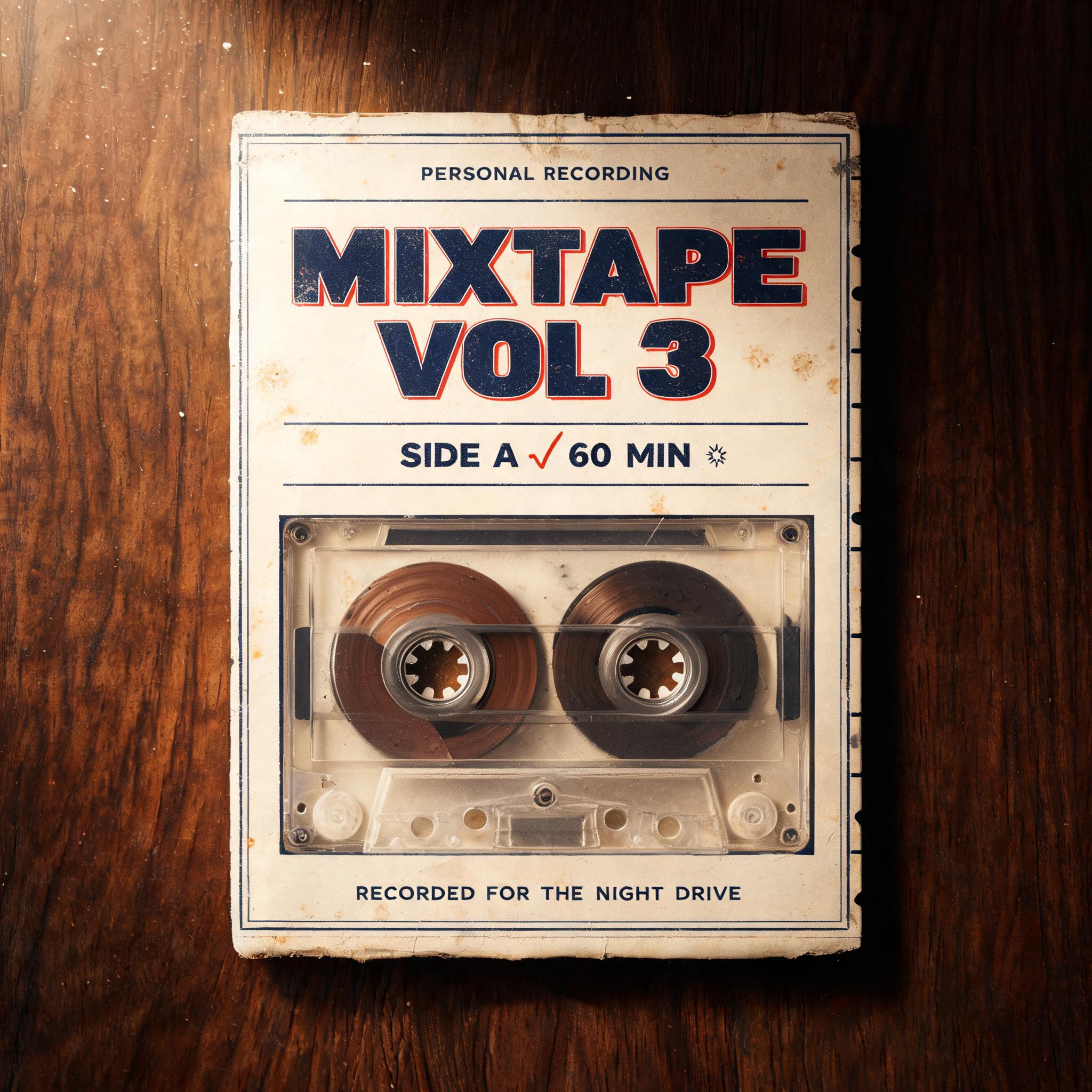
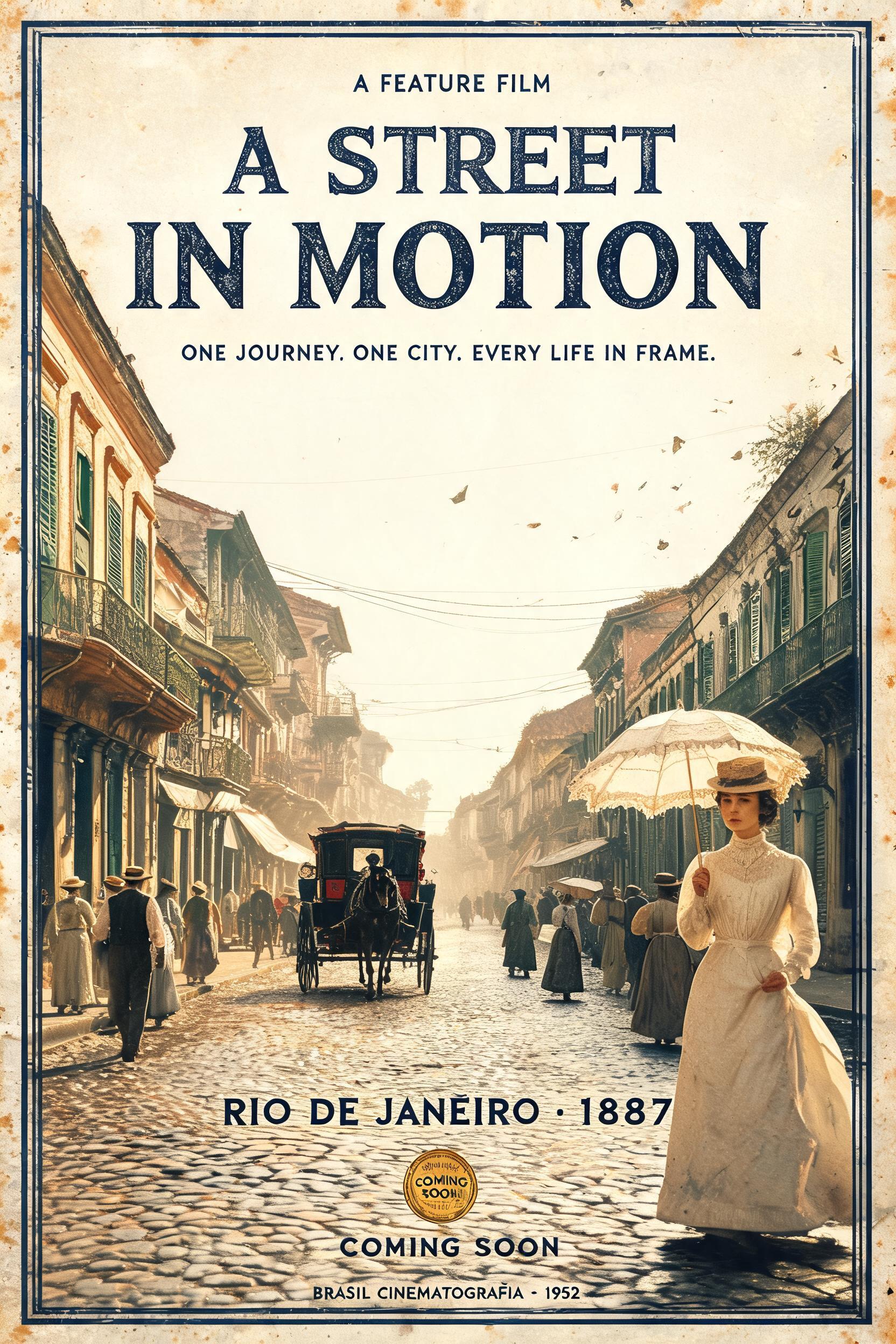
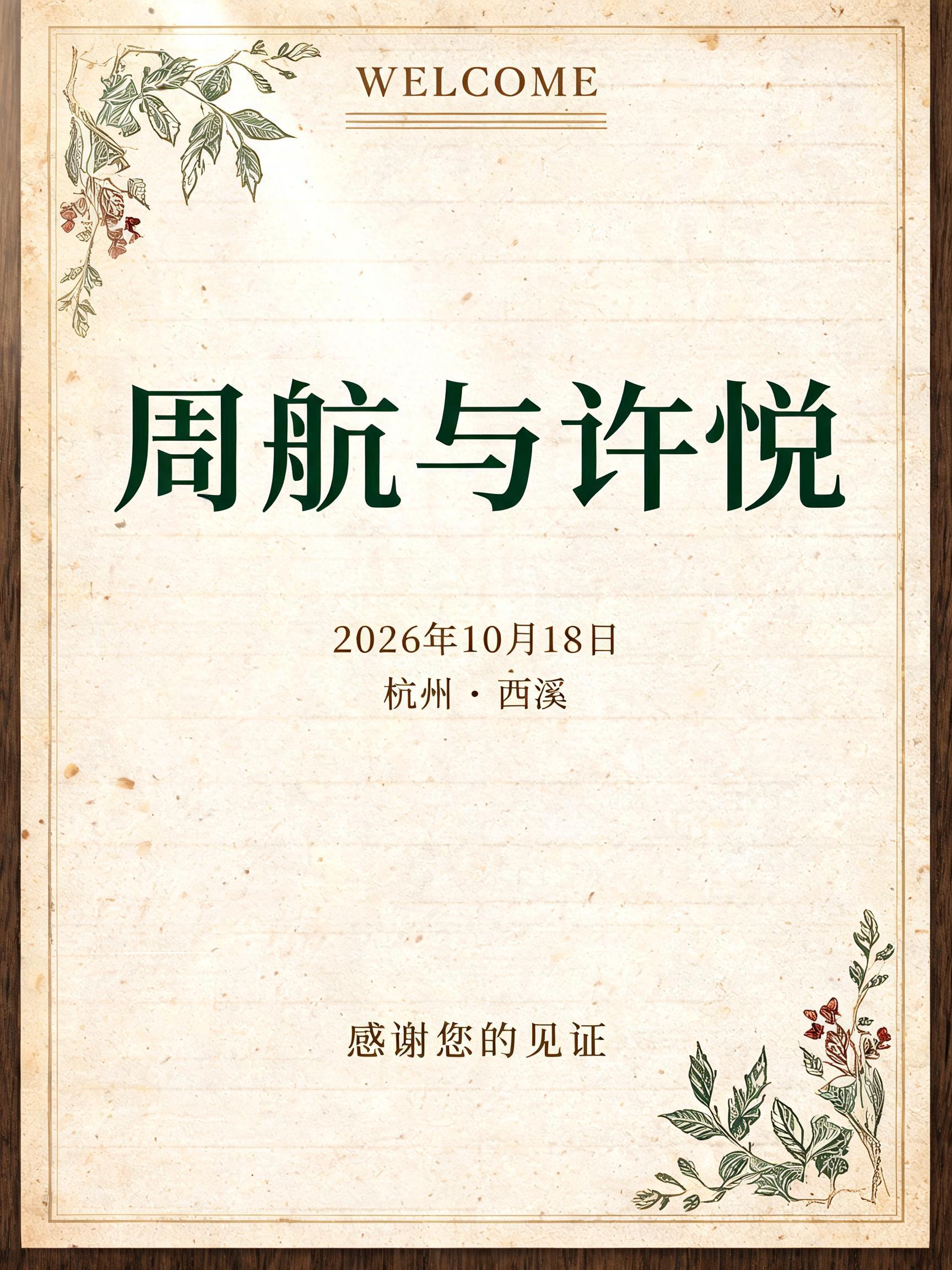
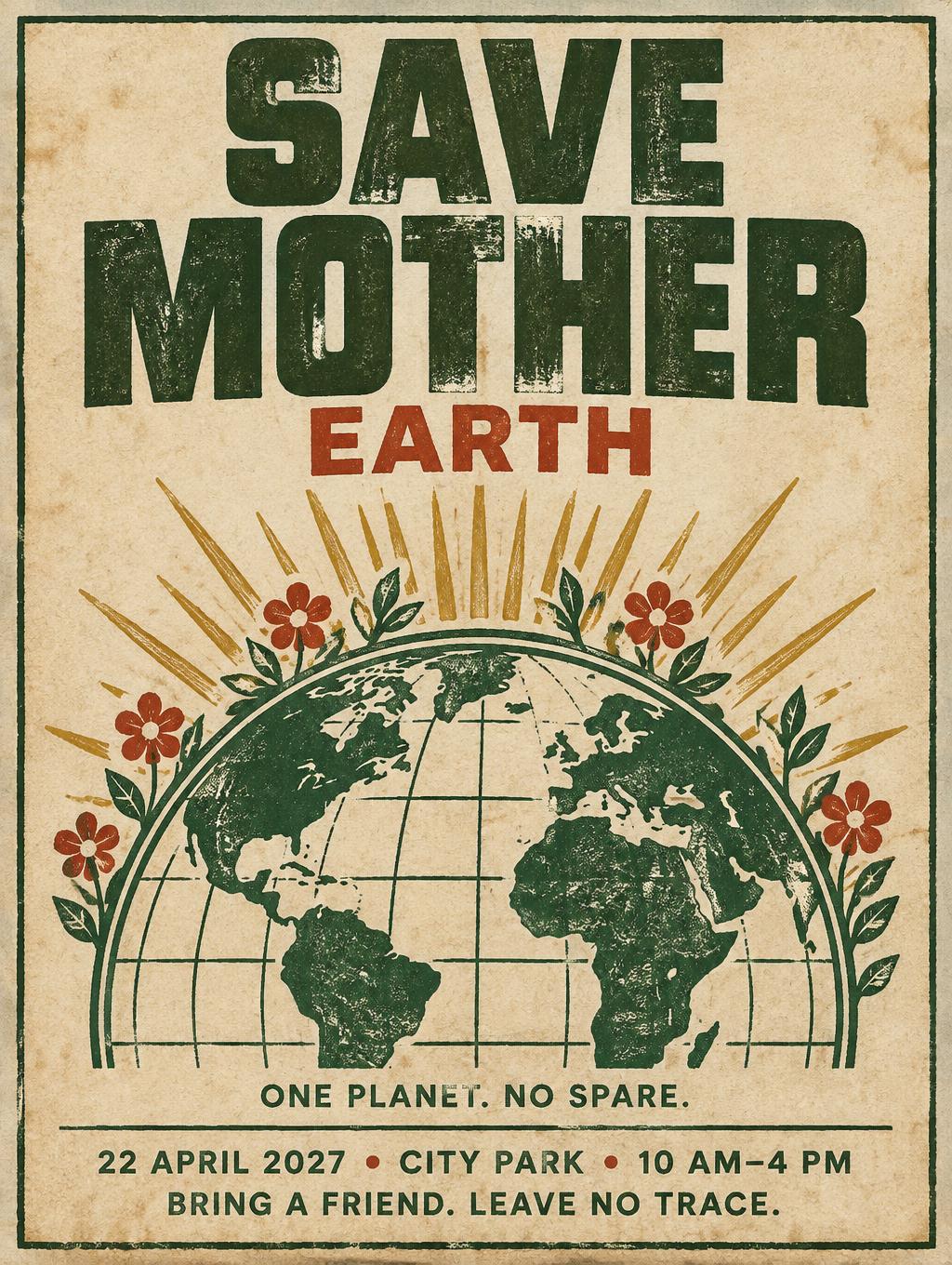
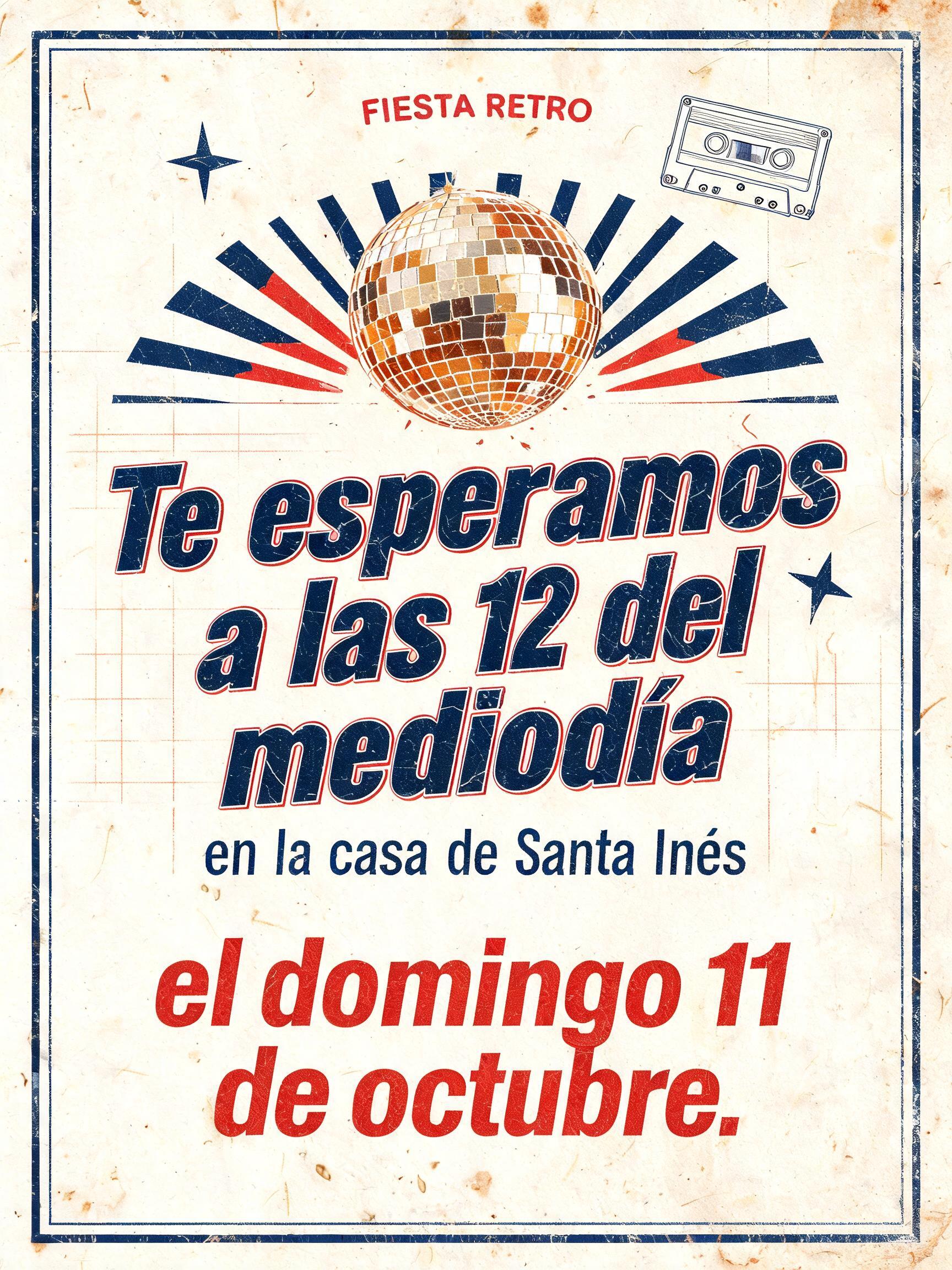
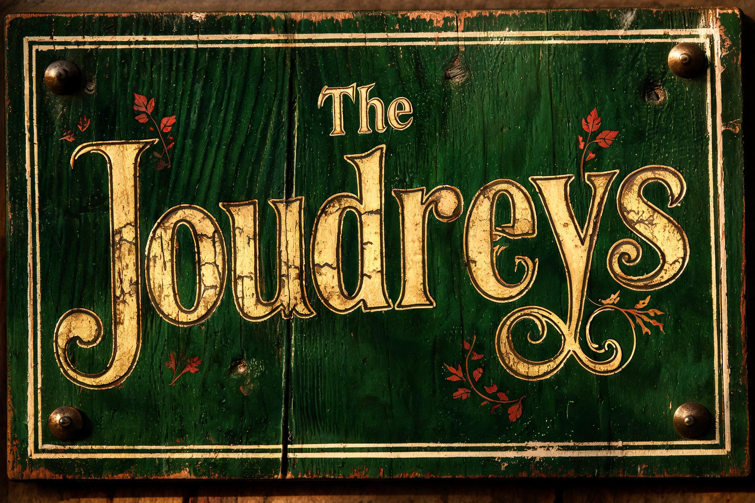
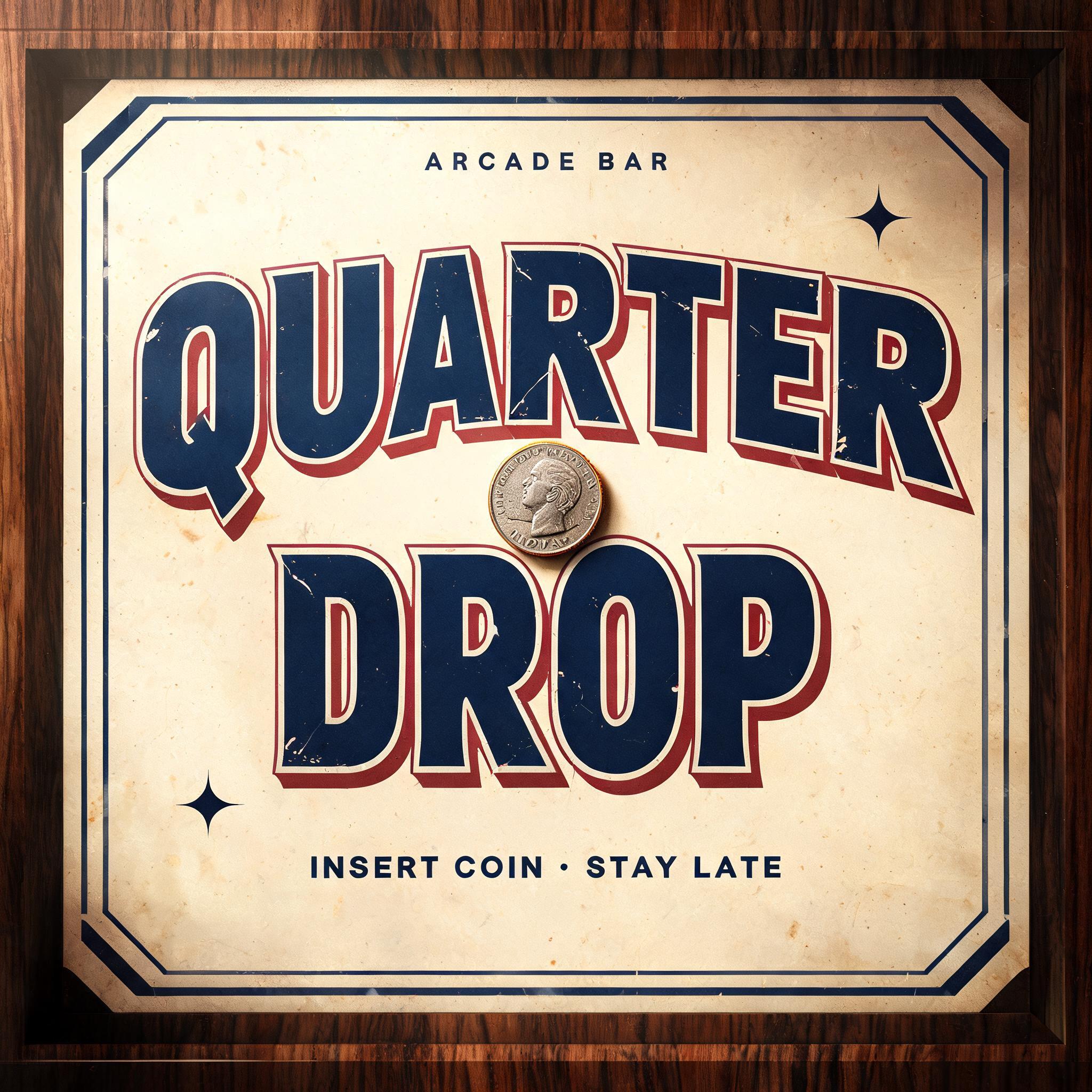
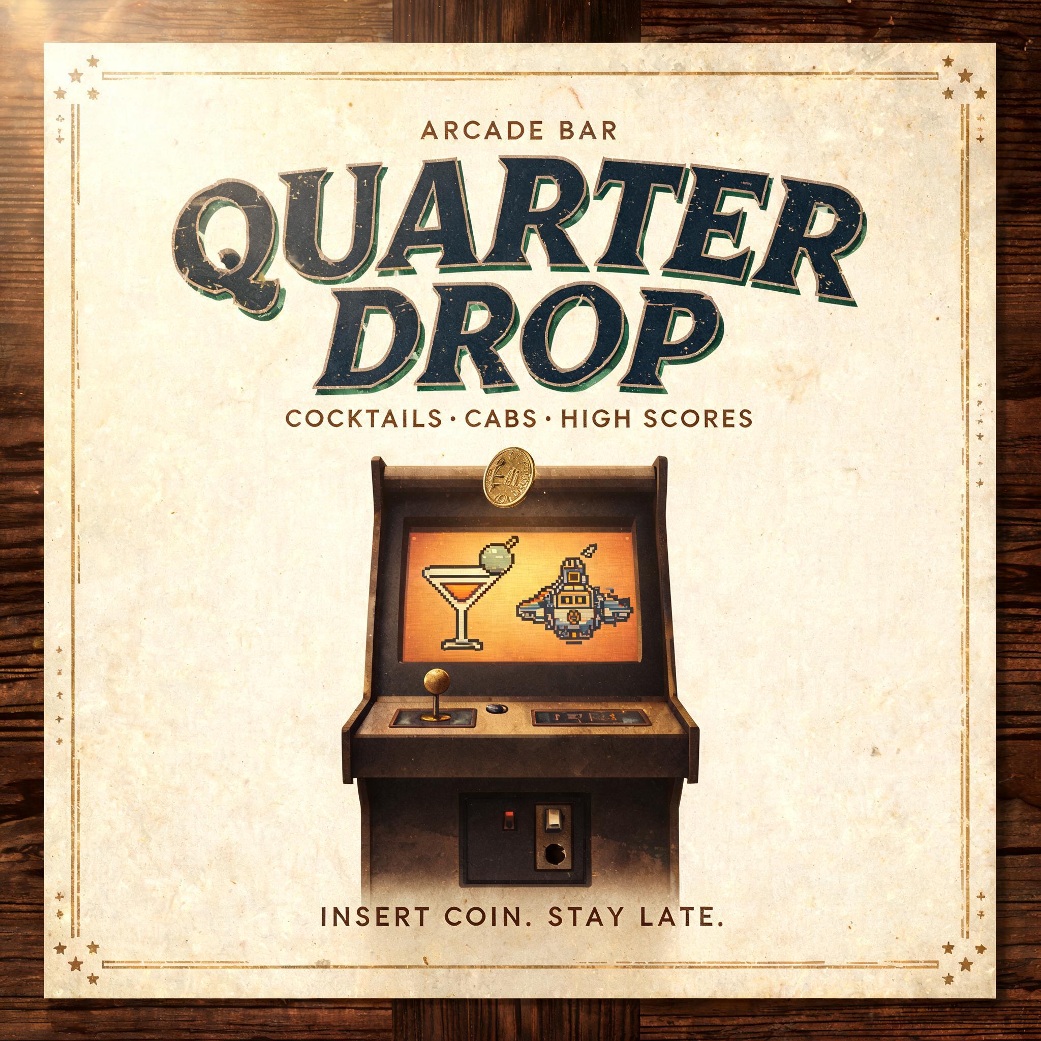
“Keep Rolling” es un efecto de texto Vintage creado con FontVibe IA. Mayúsculas con serifa impresas en tipografía sobre cartulina de algodón crema con la tinta ligeramente quebrada, sobre la platina de una vieja prensa entre tipos metálicos sueltos.
a timeless vintage piece carrying the physical evidence of an older making — warm, aged and classic. SURFACE / STYLE: the lettering looks produced by a heritage craft and softened by time — a letterpress impression bitten into cotton paper with ink slightly broken up, weathered paint on aged metal or wood, a worn rubber-stamp or postal imprint, or warm gold leaf — carrying patina, foxing, grain and gentle wear. SCENE ATMOSPHERE: a warm nostalgic setting — aged cream or kraft paper, dark wood, soft amber light, faint dust and a faded heritage feel. PALETTE: warm aged tones — cream, kraft, sepia, faded red, forest green, navy, tan and antique gold — muted and time-softened, never neon-bright. LETTERFORM PRIORITY: when the chosen font carries its own treatment (western slab, art deco, art nouveau, letterpress, postal or rubber stamp, gold leaf, typewriter, hand-lettered script, grunge chalk), that font treatment takes absolute priority and owns the letters; this style supplies the warm aged tone, the time-worn surface and the nostalgic heritage scene. FALLBACK MATERIAL: if the font carries no material of its own, render the letters as a classic serif printed in warm faded ink on aged cream paper with a soft letterpress impression and gentle wear, so the timeless vintage feel always reads. A wide vintage roadside badge built around the exact words “Keep Rolling,” centered as the dominant message across roughly 72% of the frame. The lettering carries faded navy ink with a gently broken letterpress texture, pressed into thick warm-cream cotton paper; shallow embossed edges and tiny irregularities make the handmade print tactile. Behind it, a sun-softened field of dusty tan paper shows faint road-map linework, scattered foxing, softened fold marks, and a barely visible circular wheel-track motif framing the words without competing. Add restrained accents in weathered faded red and antique gold: a thin double rule, two small starbursts, and a worn directional-arrow ornament at each side. Low amber light falls from the upper left, revealing paper grain, soft shadows within the impression, and a few floating dust motes. The composition feels like a well-loved mid-century travel poster or garage sign—steady, optimistic, durable, and warmly aged. Keep generous cream negative space around the headline; no modern objects, no neon, no glossy finish. 16:9 horizontal.
Hecho para Generador de Texto Retro
Generada el 26 de octubre de 2026 · 1824 × 1024 · JPEG · OpenAI GPT-Image-2.5 Sunburst · Compartida por el creador · Uso comercial gratuito (CC BY 4.0)


