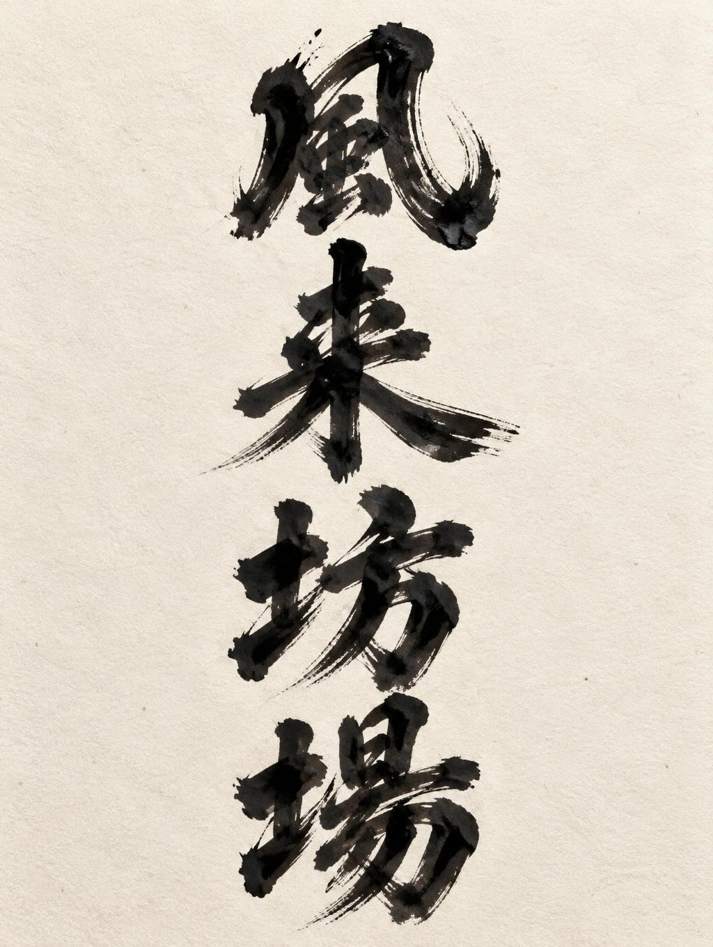
風 来 坊 場 - Letras de Pincel Text Effect


Usa OpenAI GPT-Image-2.5 Sunburst, el modelo de esta obra · 15 créditos
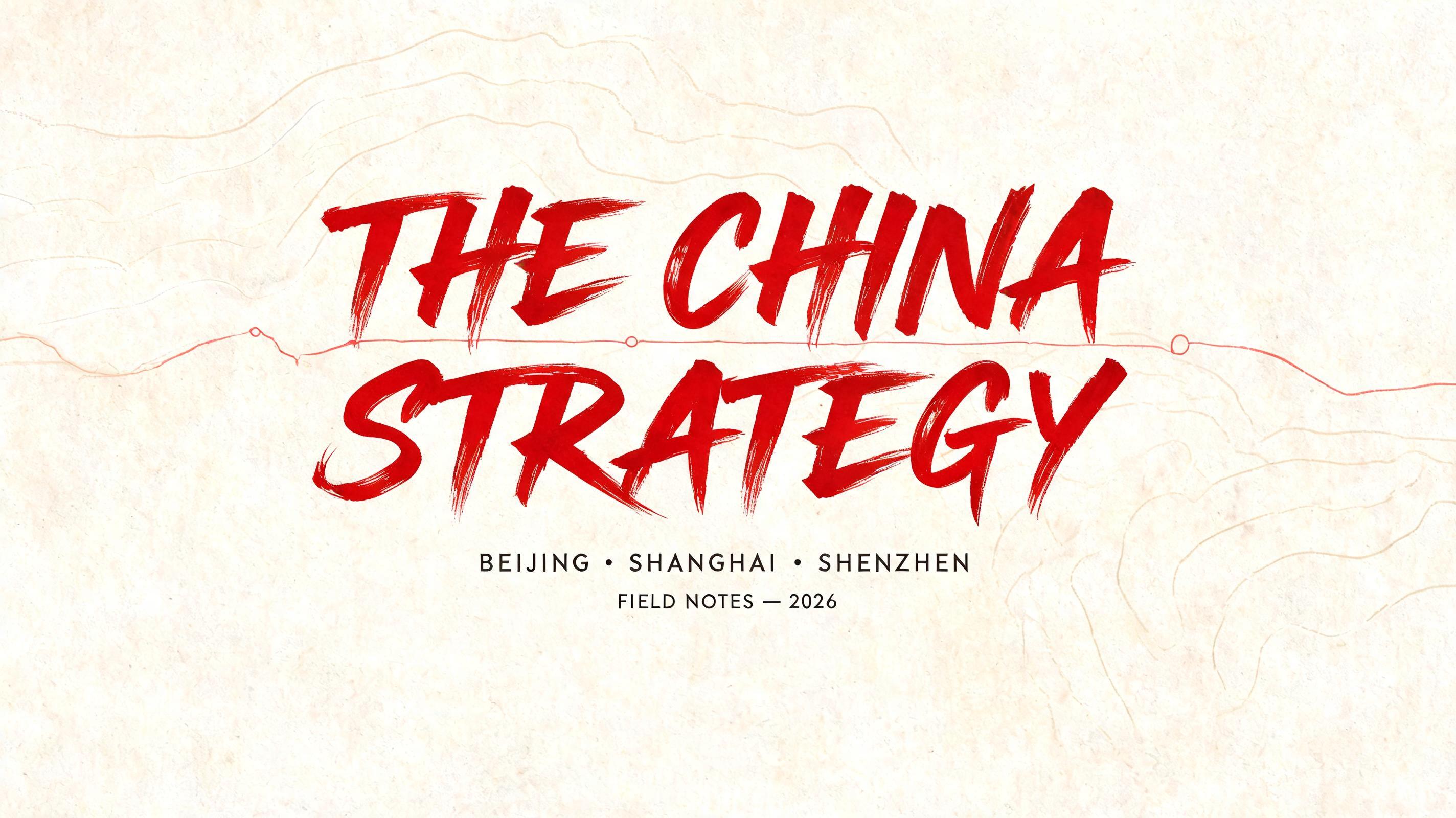


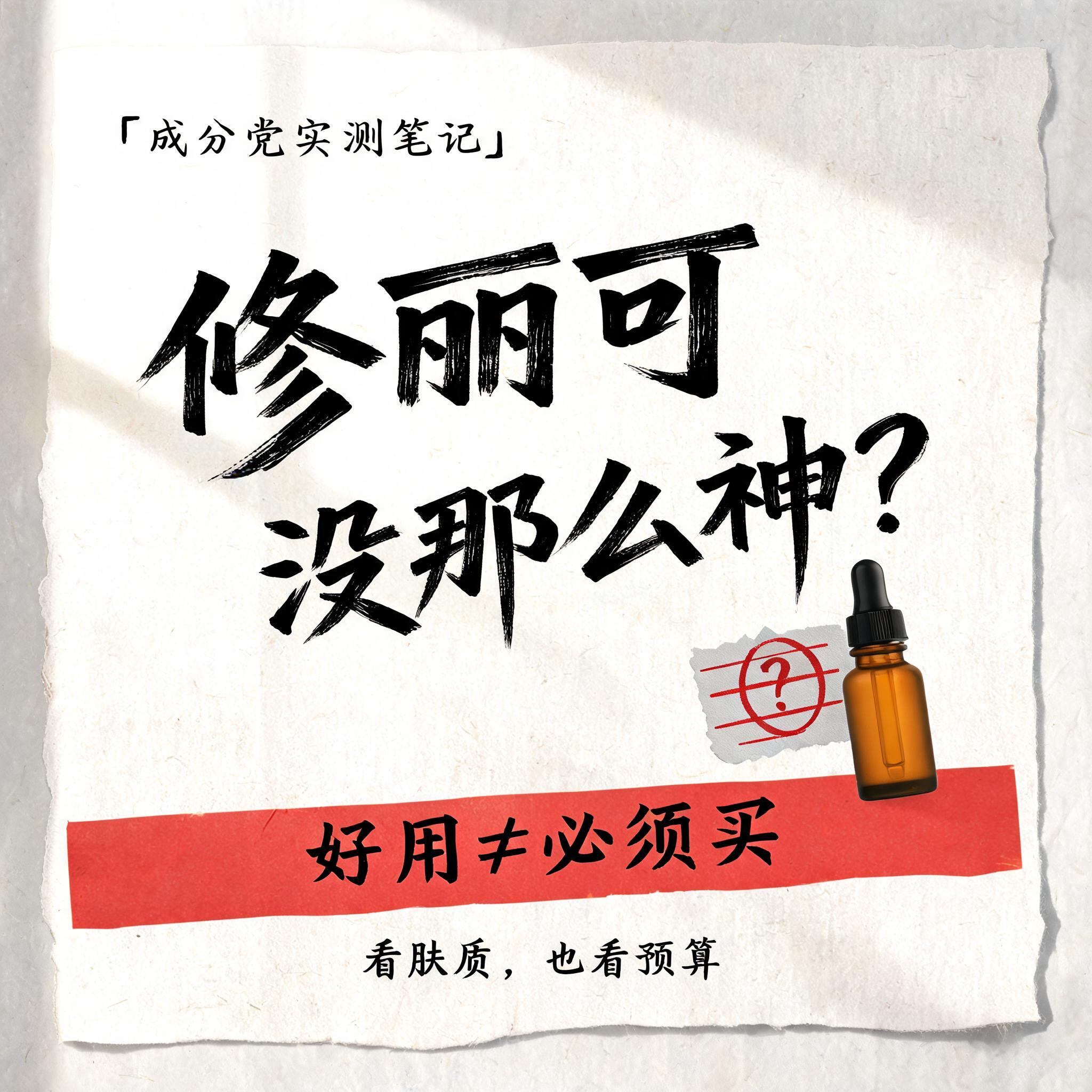
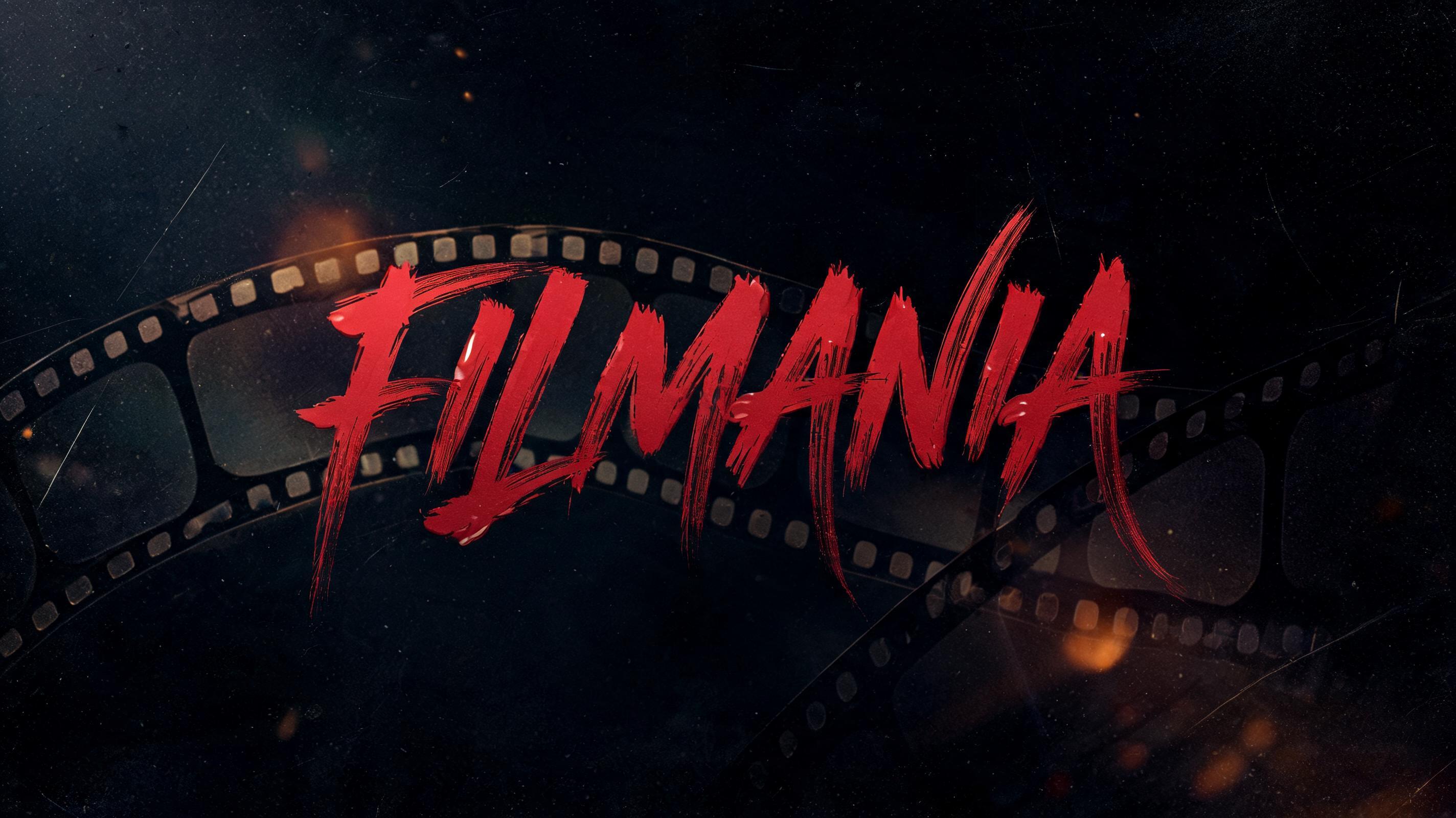


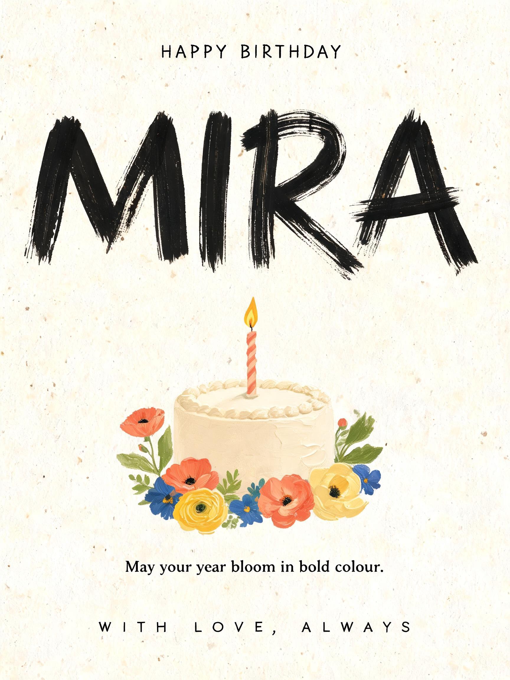


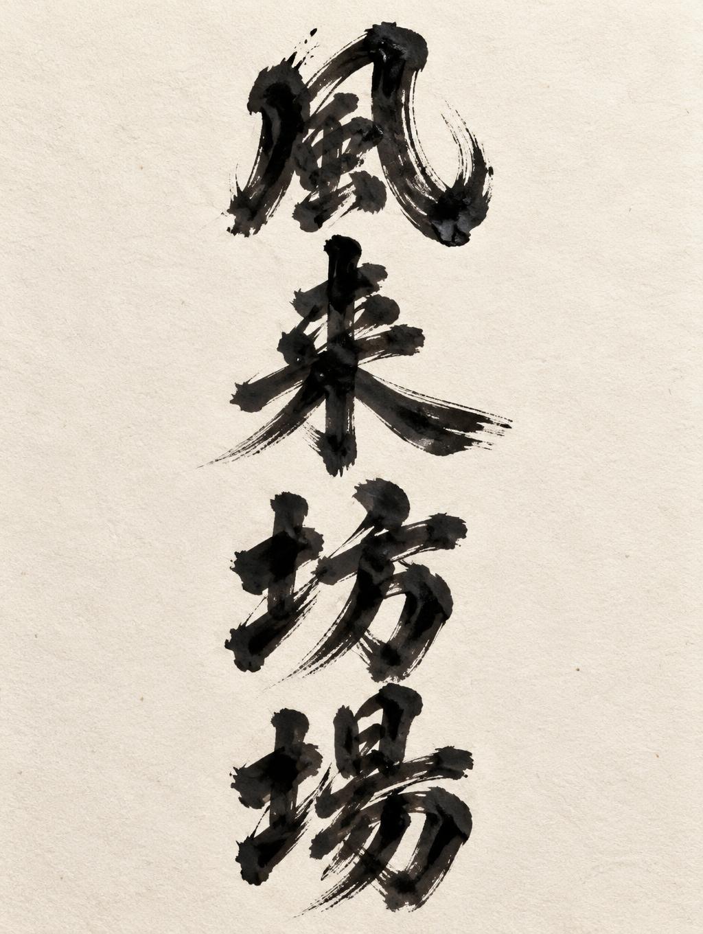
“風 来 坊 場” es un efecto de texto Letras de Pincel creado con FontVibe IA. Script de pincel occidental con letras enlazadas: trazos descendentes gruesos por presión, ascendentes finísimos, vetas visibles de las cerdas y rastros de pincel seco en tinta negra cálida sobre papel texturizado.
rendered as expressive Western brush script lettering with fluid connected strokes. Visible bristle texture with authentic thick-to-thin pressure variation — thick downstrokes, thin upstrokes, just like a loaded calligraphy brush. Ink slightly wet and glistening. Natural ink pooling at stroke starts, feathered dry-brush ending trails. Warm off-black ink on visible surface texture. Hand-crafted artisan energy with real brush imperfection. LETTERFORM PRIORITY: when the chosen font carries its own treatment, that font's letterform shapes take priority and own the letters; this style governs the brush-script medium, the thick-to-thin pressure variation and the ink wetness. FALLBACK MATERIAL: if the font carries no material of its own, render the letters as fluid connected brush-script strokes with thick downstrokes, thin upstrokes, wet pooling at starts and feathered dry-brush trails in warm off-black ink. COLOR PRIORITY: keep the font's own colors if specified; otherwise warm off-black ink on a textured surface. Four Japanese characters, exactly as provided, arranged as a bold vertical stack in this order: 「風」, 「来」, 「坊 」, 「場」. Center the column with generous breathing room around each character and a steady rhythm down the composition. Render them as expressive Western brush-script marks translated into Japanese calligraphic strokes: visibly hand-brushed, with dramatic thick-to-thin pressure changes, confident swollen downstrokes, and fine tapering upstrokes. Use warm off-black ink with a subtle wet sheen, brightest along the heavy strokes. Show bristle striations inside broad marks, slight pooling where strokes begin or meet, and delicate feathering at a few dry, lifting ends. Preserve each character’s shape and legibility. Set the lettering on softly textured warm ivory paper, with faint natural fibers and ample clean negative space. Gentle directional light reveals the ink’s raised gloss and paper grain; restrained shadows add depth without distracting from the characters. Artisan, spirited, and tactile; no added words or decorative symbols.
Generada el 29 de octubre de 2026 · 1024 × 1360 · JPEG · OpenAI GPT-Image-2.5 Sunburst · Compartida por el creador · Uso comercial gratuito (CC BY 4.0)


