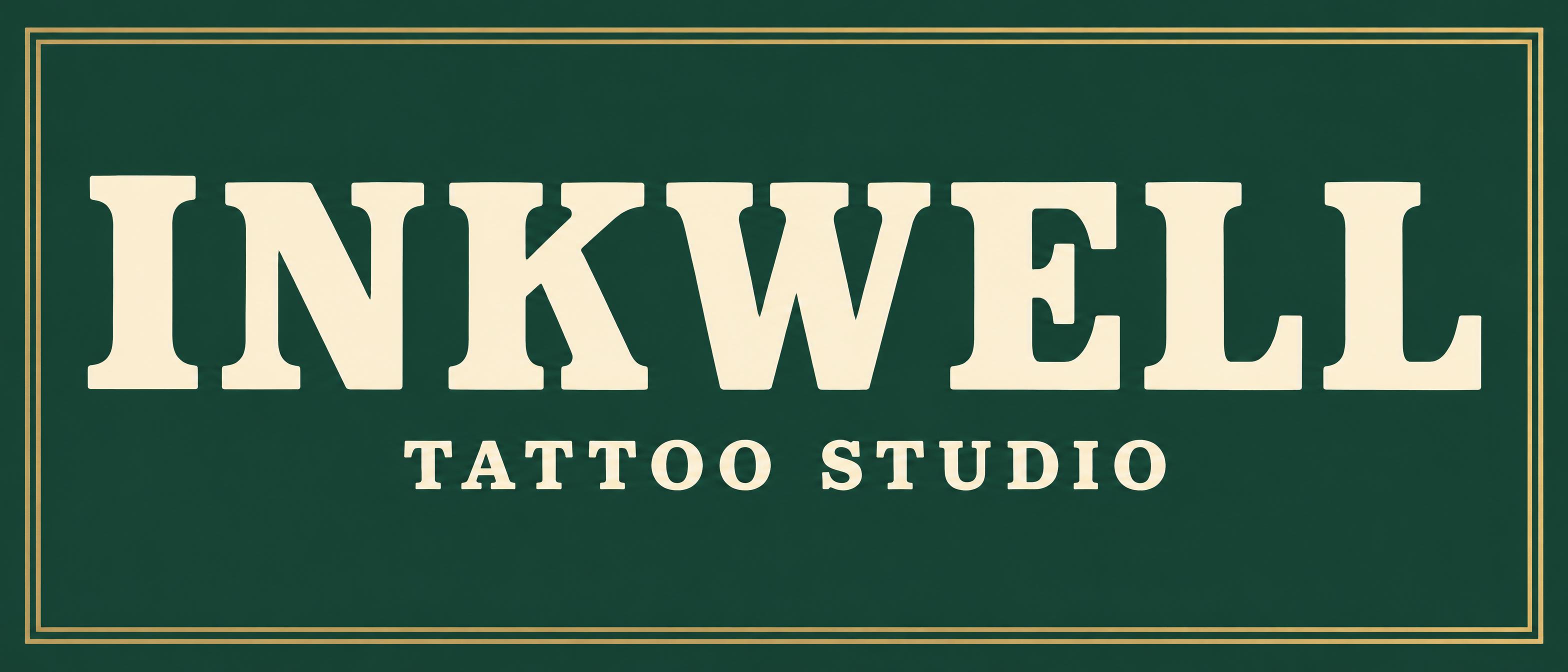
INKWELL TATTOO STUDIO - Custom-1 Text Effect

Usa OpenAI GPT-Image-2.5 Sunburst, el modelo de esta obra · 32 créditos

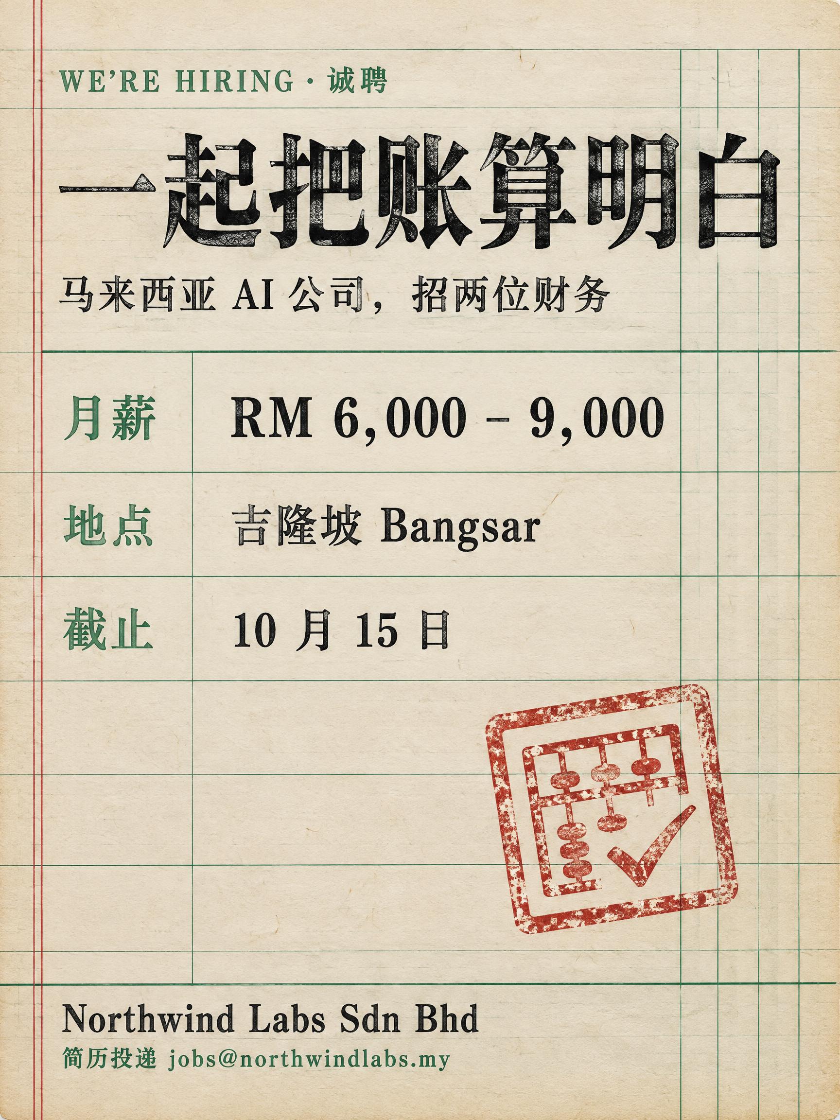
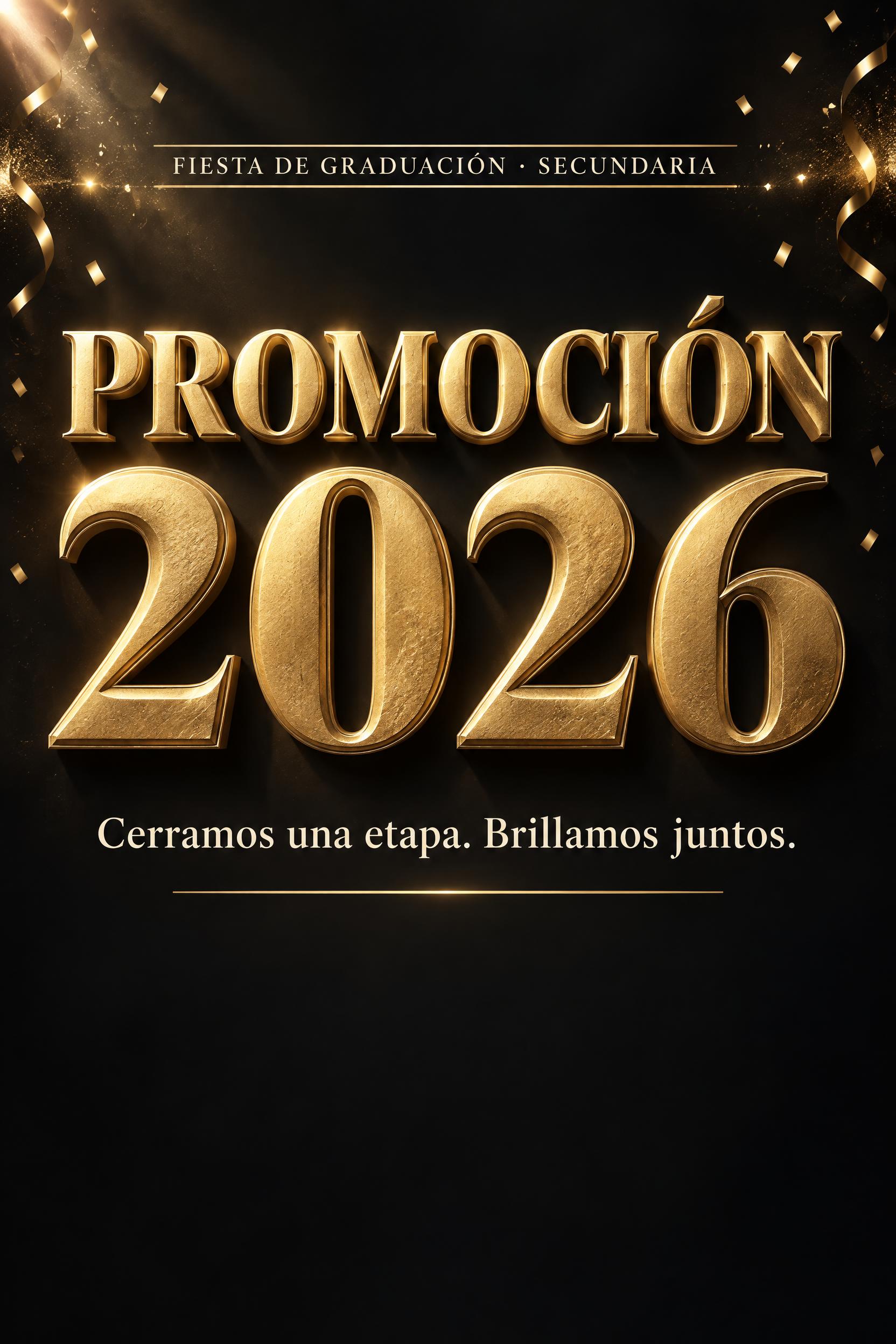
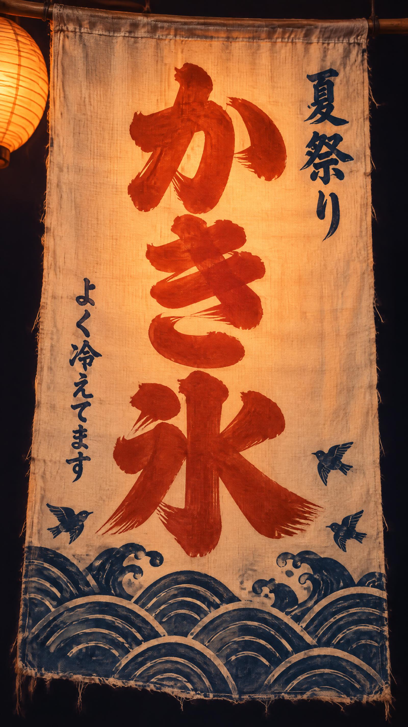

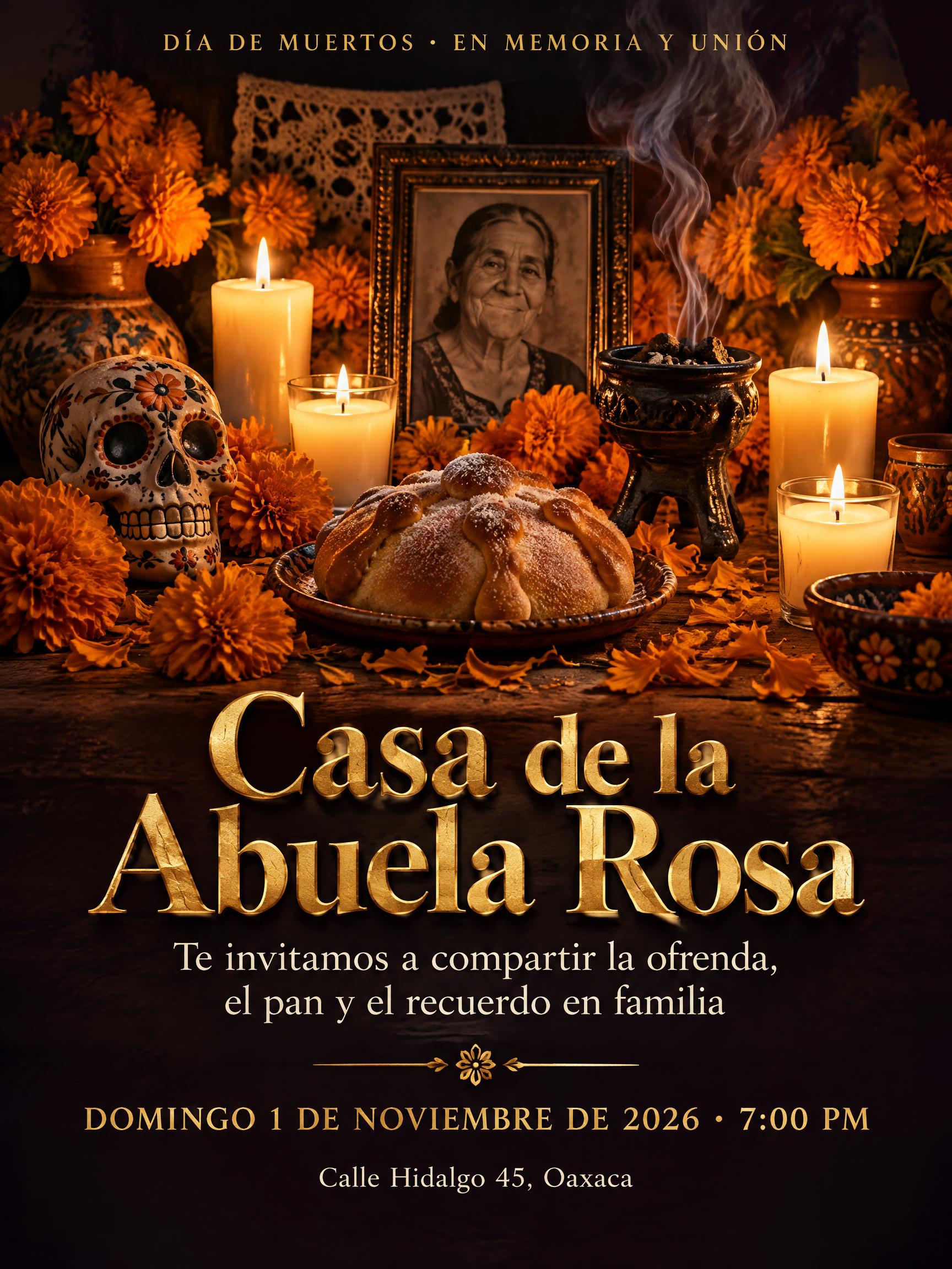



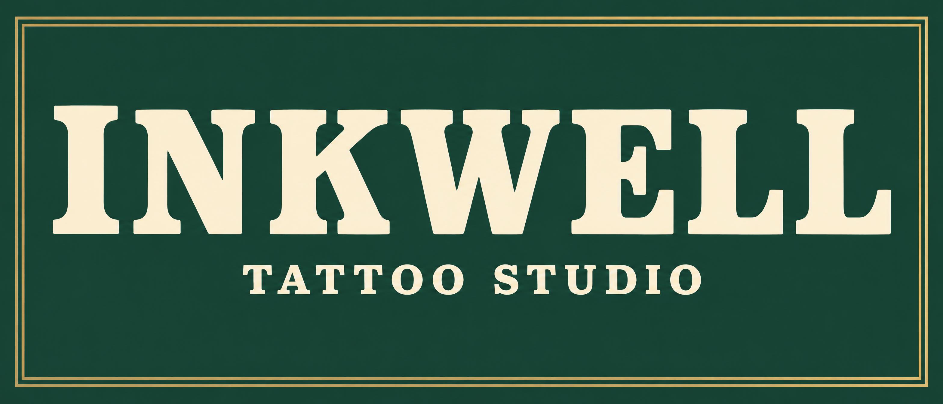
“INKWELL TATTOO STUDIO” es un efecto de texto Custom-1 creado con FontVibe IA.
Create the finished artwork for a wide horizontal tattoo-studio shop sign, viewed perfectly straight on, filling the canvas edge to edge. This is the sign design itself, not a photograph of a storefront or a sign hanging on a wall. Its character is a familiar, well-established independent shop: carefully painted, sturdy and welcoming across generations. Use an opaque bottle-green ground, #173C32, covering the entire rectangular canvas. Within it, place a simple double-line antique-brass frame, #C8A464. The frame runs nearly the full width with modest side margins and more generous top and bottom margins. Both lines are fine and evenly separated, with clean square corners. Leave the interior uncluttered. Render exactly two lines of text, in this hierarchy and order: "INKWELL" and "TATTOO STUDIO". No other text. "INKWELL" is the overwhelming focal point: one centered, unbroken uppercase line extending across most of the canvas width, with balanced side margins. Position it in the broad middle band, slightly above the canvas midpoint. Give the letters substantial height while preserving generous uninterrupted green space above them. Draw bespoke Clarendon-style bold slab-serif capitals: thick upright stems, medium-weight crossbars, broad rounded bracketed serifs, strong but sturdy stroke contrast, open counters, and small purposeful ink-trap notches at stroke junctions. Keep the repeated L forms rhythmically balanced and the W optically spaced. The silhouette should have the authority of a traditional printed masthead without blackletter flourishes. Set "TATTOO STUDIO" beneath the headline in a narrow centered block occupying roughly the middle third of the sign width, well separated from the large name and comfortably above the lower frame. Use clean, smaller companion slab-serif capitals with measured letterspacing, approximately a quarter of the headline's letter height. Both text lines are warm cream, #FFF1D3, with fully opaque, solid, unbroken letter faces. Their finish is finely brushed sign enamel with crisp hand-painted contours and a very slight satin sheen. Gentle upper-left illumination reveals minute paint texture; thick stems remain broadly matte while curved lower serif brackets catch subtle warm diffuse fill. Keep lighting even and contrast strong across every letter. No extruded lettering, theatrical shadows, glare, artificial aging, distressed paint, skulls, needles, illustrations or additional ornaments. The craft resides in the lettering, painted surface and precise brass border.
Generada el 30 de octubre de 2026 · 3136 × 1344 · JPEG · OpenAI GPT-Image-2.5 Sunburst · Diseño: custom-1 · Compartida por el creador · Uso comercial gratuito (CC BY 4.0)