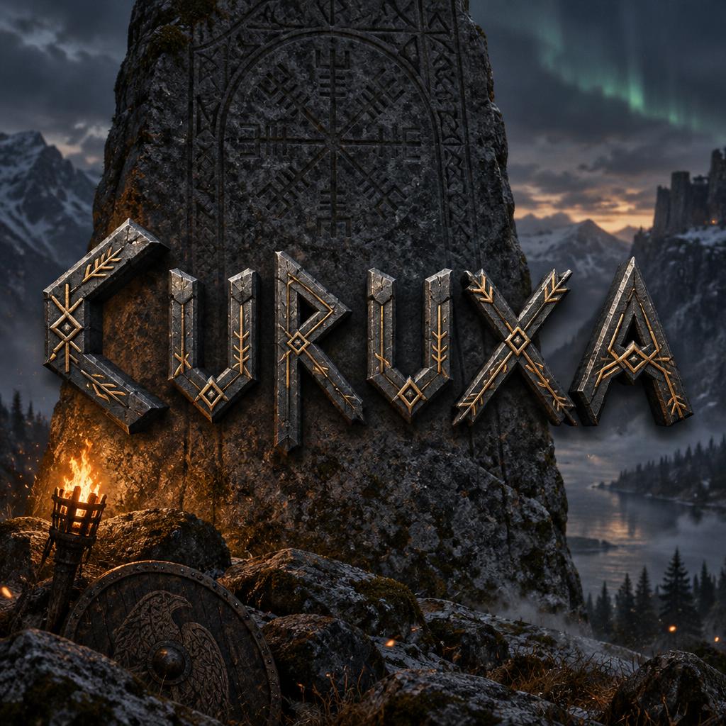
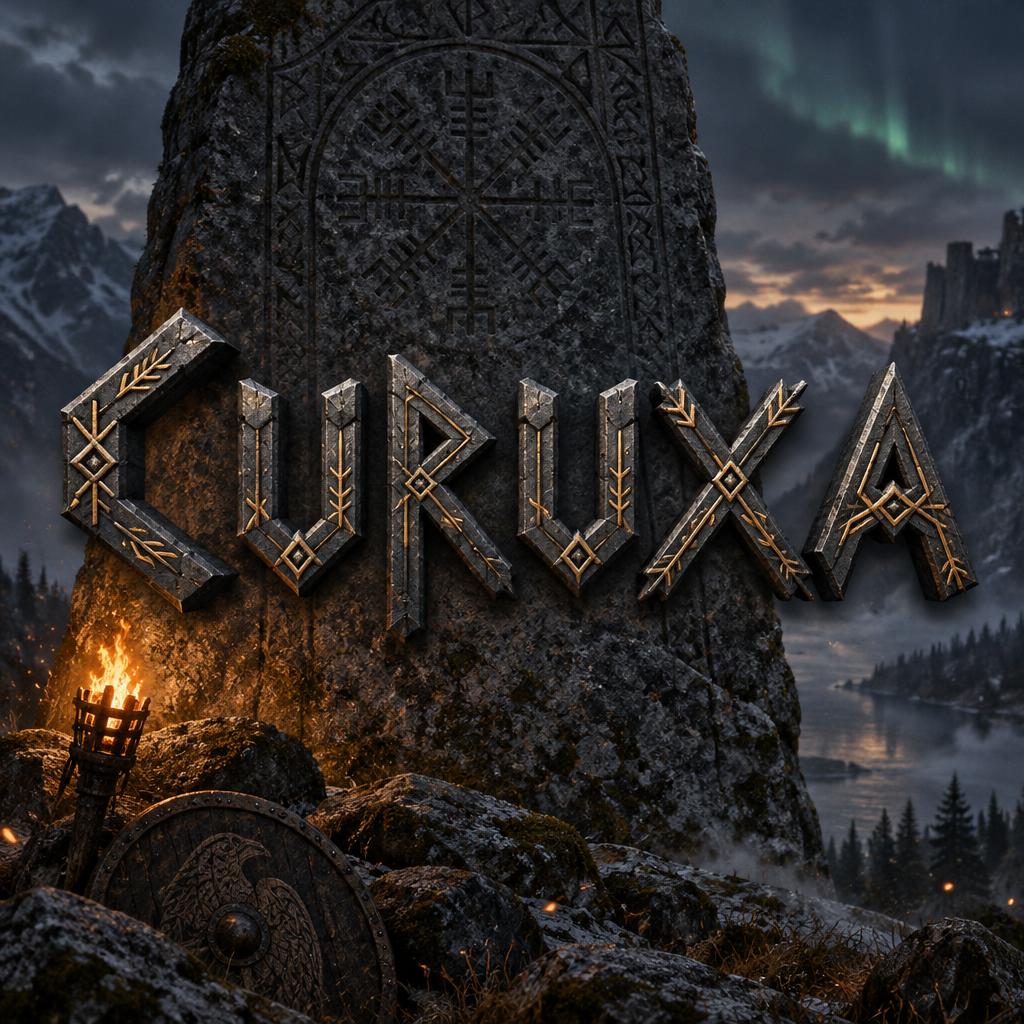
Curuxa - Vikingo Text Effect


Usa OpenAI GPT-Image-2.5 Sunburst, el modelo de esta obra · 15 créditos
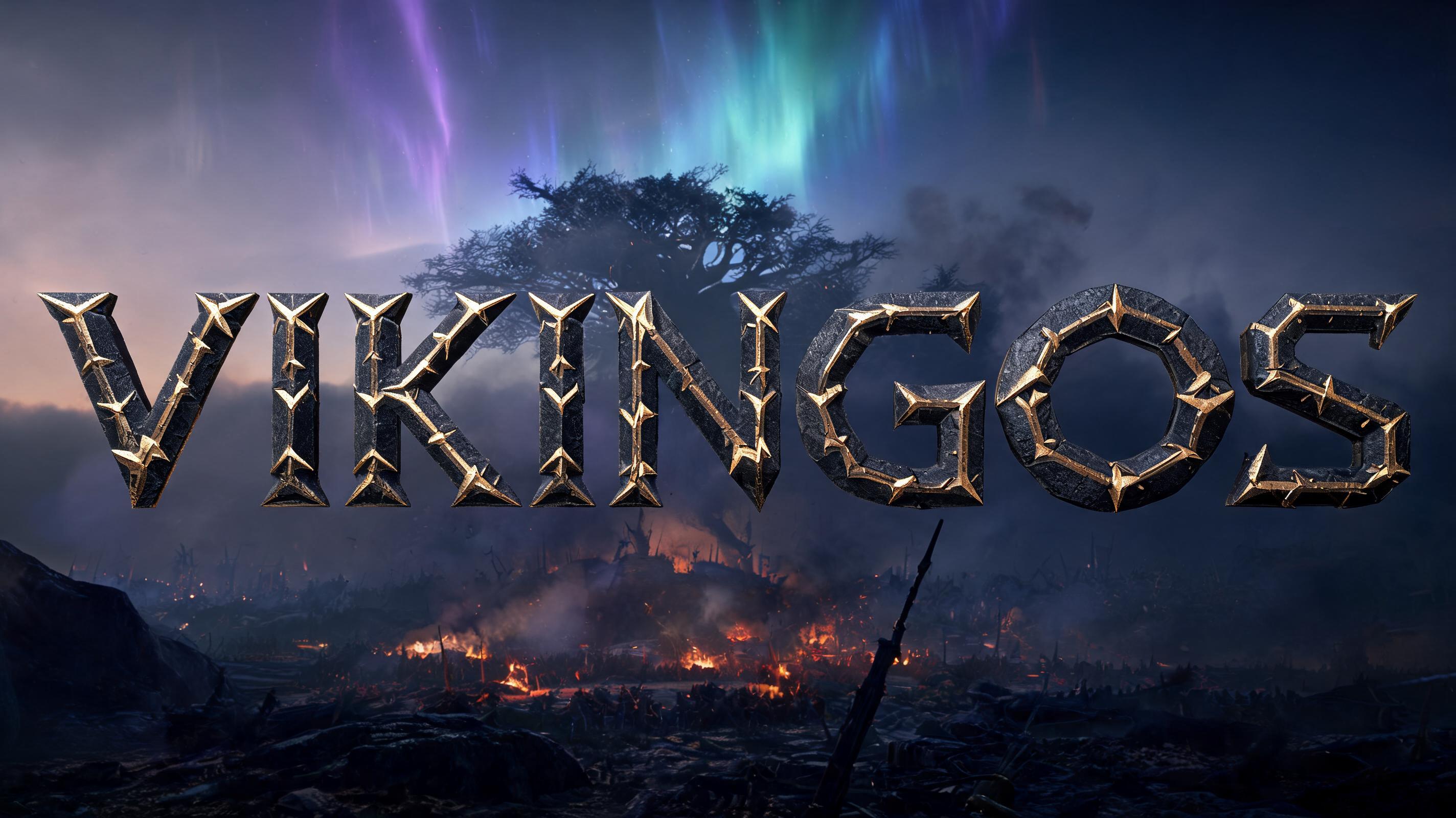


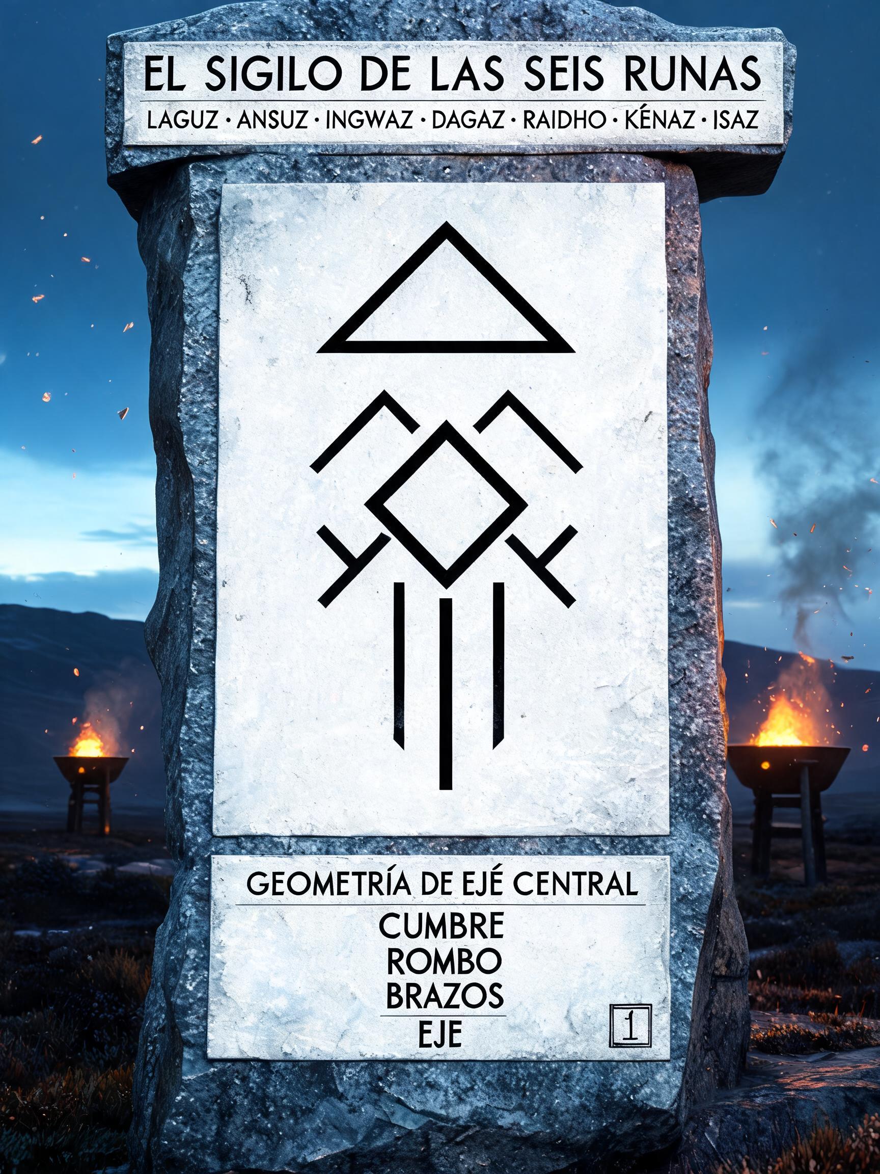

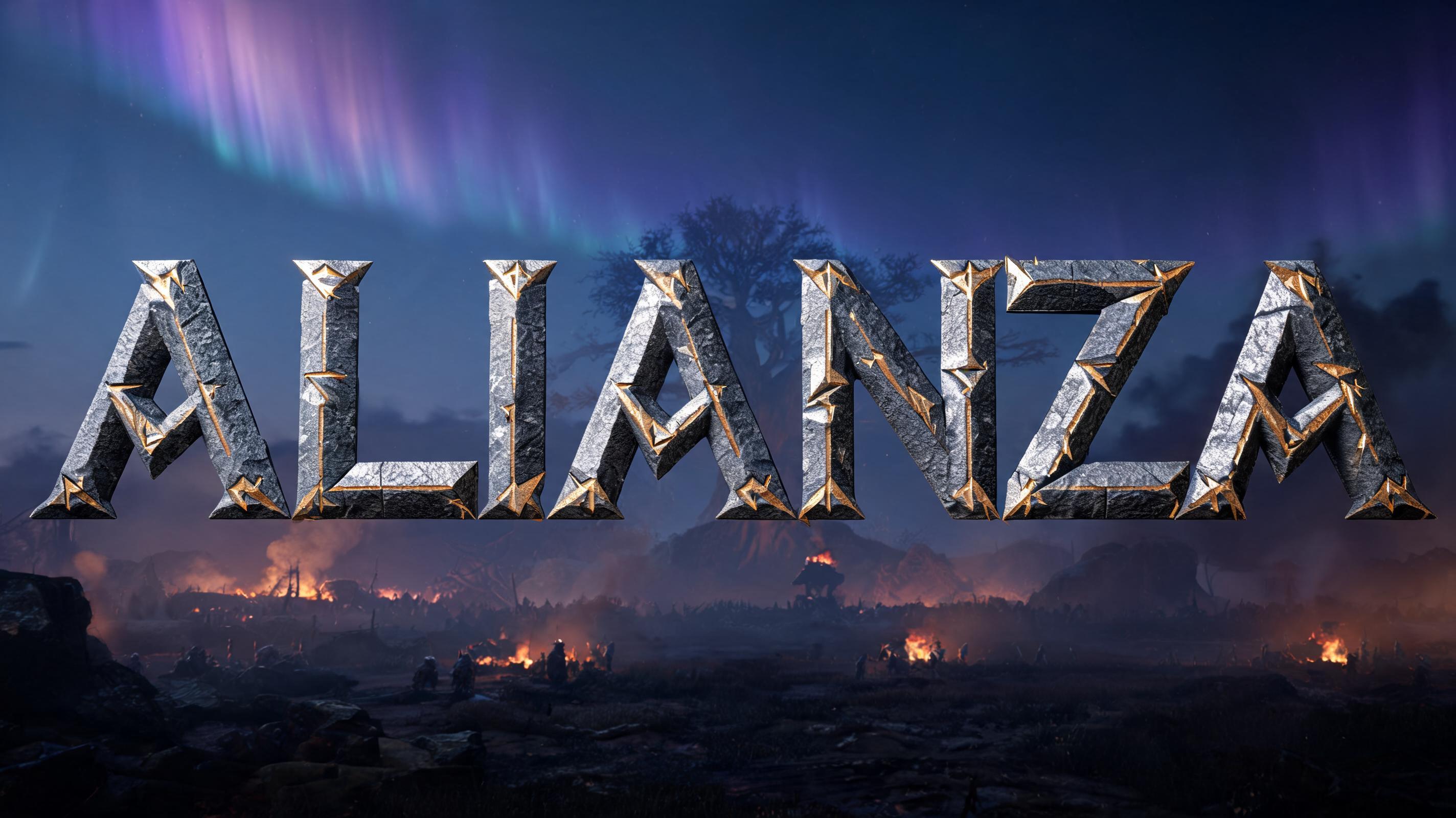

“Curuxa” es un efecto de texto Vikingo creado con FontVibe IA. Tipografía rúnica vikinga nórdica con texturas de piedra tallada, patrones de nudos nórdicos, acabados metálicos curtidos en batalla y una estética escandinava ancestral.
ancient Norse warrior aesthetic — stark angular geometry, battle-forged weight, the material permanence of things built to outlast kingdoms. Directional forge-light or cold torch-light that sculpts every letterform face into high relief. Color palette: iron-grey, aged bronze, cold granite, dark amber — no soft pastels, no unmotivated gradients. Every letter reads as an object with real physical mass. When no specific material is defined by the font: default to battle-worn dark iron — cold charcoal-grey letter body with visible forge-hammer surface texture, narrow cold specular highlight on the upper stroke edge, deep iron shadow on the underside, hairline stress-fracture lines along diagonal strokes. The Norse blacksmith's iron: heavy, angular, built for war. Curuxa as a single monumental wordmark, centered and filling roughly 72% of the frame width, with generous breathing room around it. Each letter is a heavy physical object of battle-worn dark iron: cold charcoal-grey faces, visible forge-hammer dimples, narrow pale steel highlights along upper edges, and deep iron shadows beneath. Fine stress fractures trace select diagonal strokes; edges are chipped and nicked as if carried through battle, never polished smooth. Behind the lettering, a weathered ancient granite runestone stands on a windswept Norse moor at dusk, its carved surface emerging from low drifting mist. Far-off ridges fade into cold steel-blue twilight beneath a dim aurora, while a small amber torch burns at the stone’s base, casting warm directional light across the iron and picking out a restrained antique-bronze glint. A few sparks and ash flecks cross the foreground. Keep the environment atmospheric but subordinate, with the word unmistakably dominant and sharply legible. Palette limited to iron grey, cold granite, muted blue, and dark amber; no soft pastels or decorative gradients. The mood is ancient, watchful, and battle-forged, like a name preserved on a Norse memorial stone. Square composition.
Generada el 31 de octubre de 2026 · 1024 × 1024 · JPEG · OpenAI GPT-Image-2.5 Sunburst · Compartida por el creador · Uso comercial gratuito (CC BY 4.0)


