
🧪 Design something with Manga Impact
Transparent Effect
✦ Transparent Effect
Generates a PNG with the background removed — only the text and its visual effects remain. The AI automatically selects the optimal background color for clean removal based on your style.
Output is always PNG for lossless transparency.
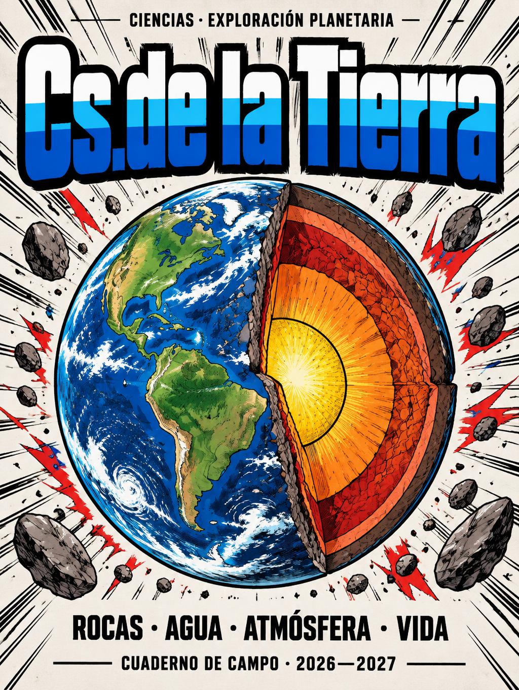
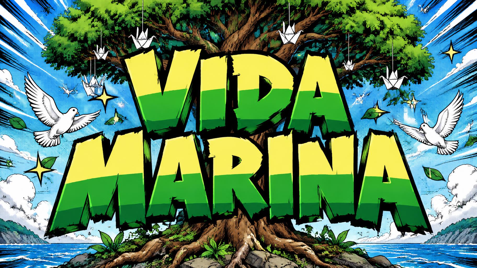
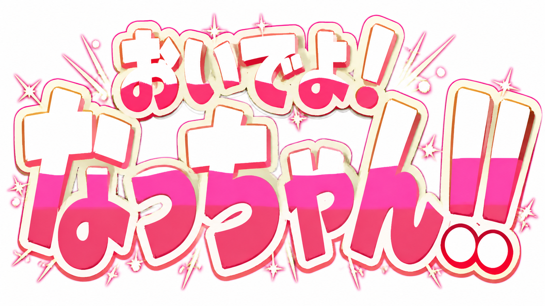
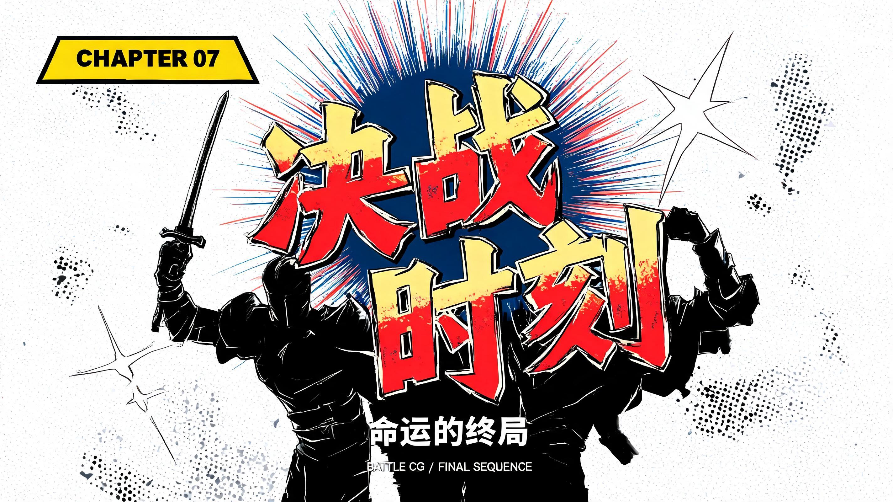
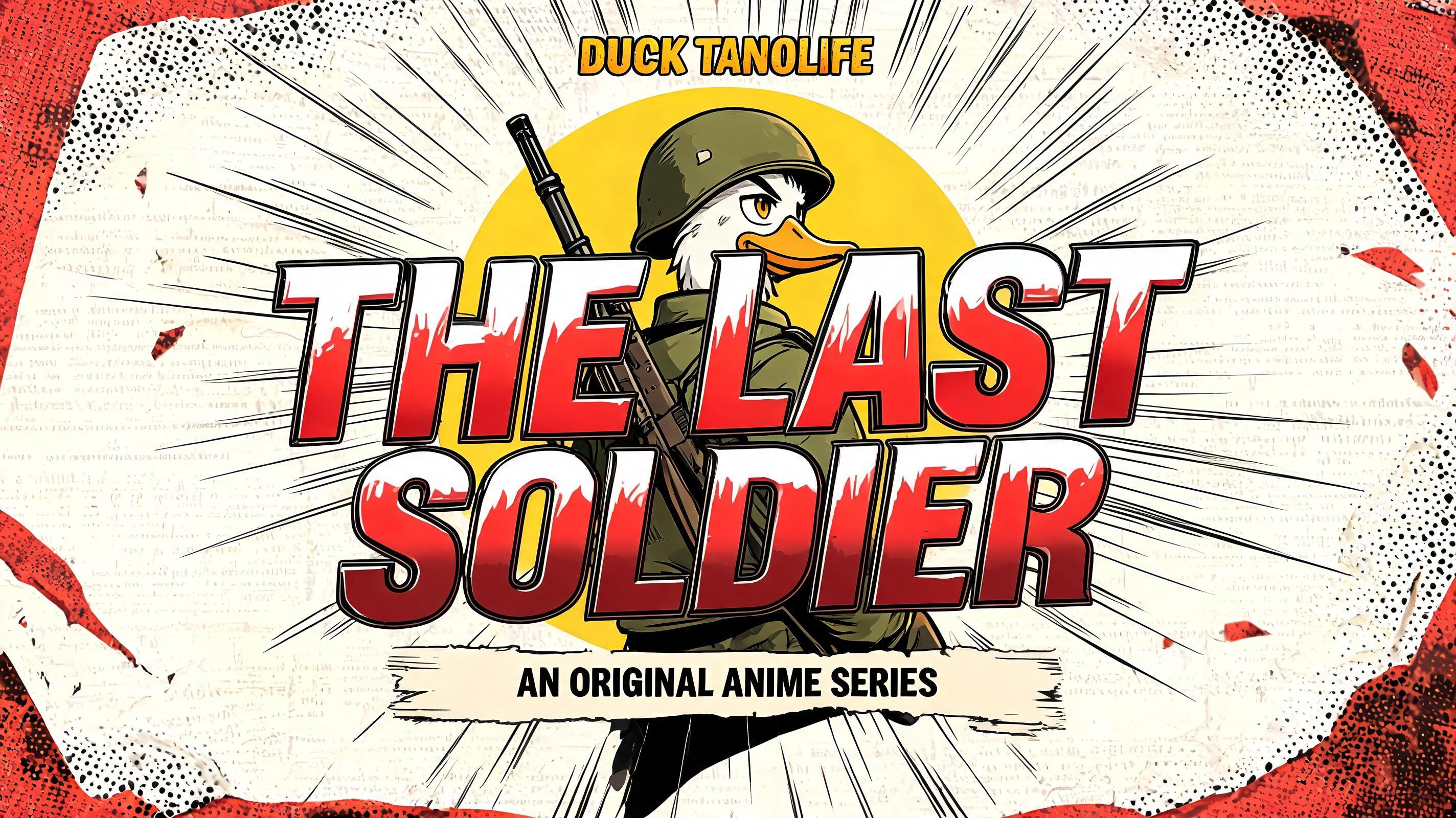


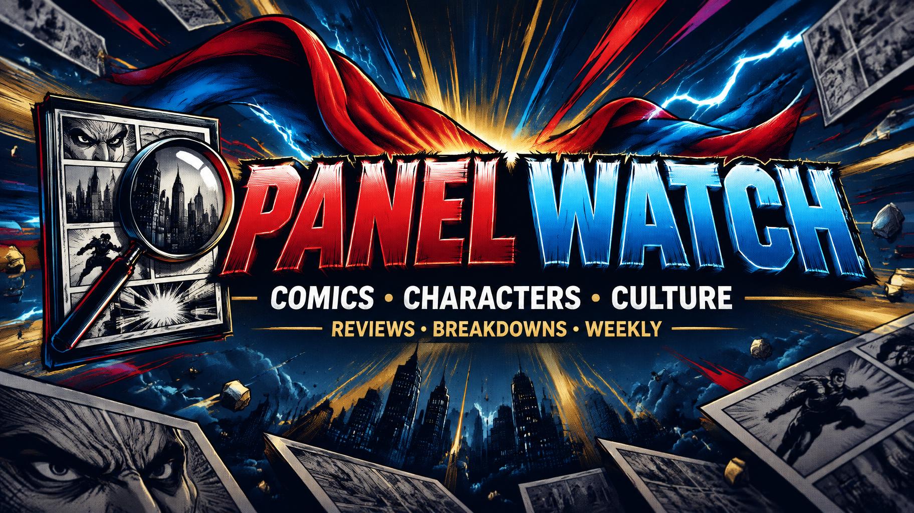
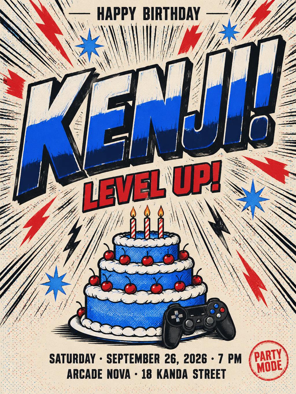
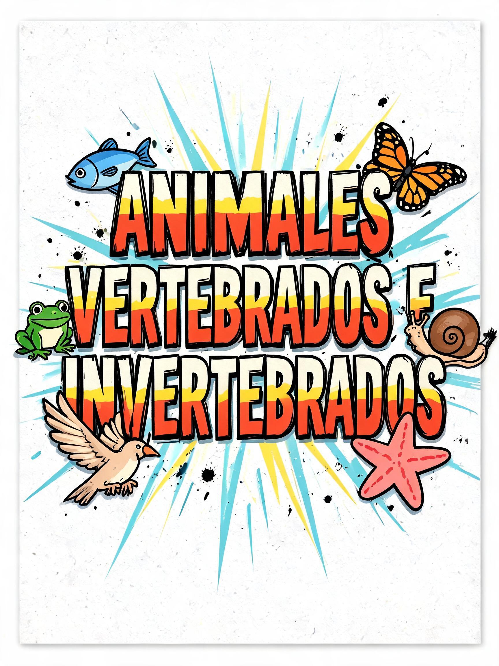
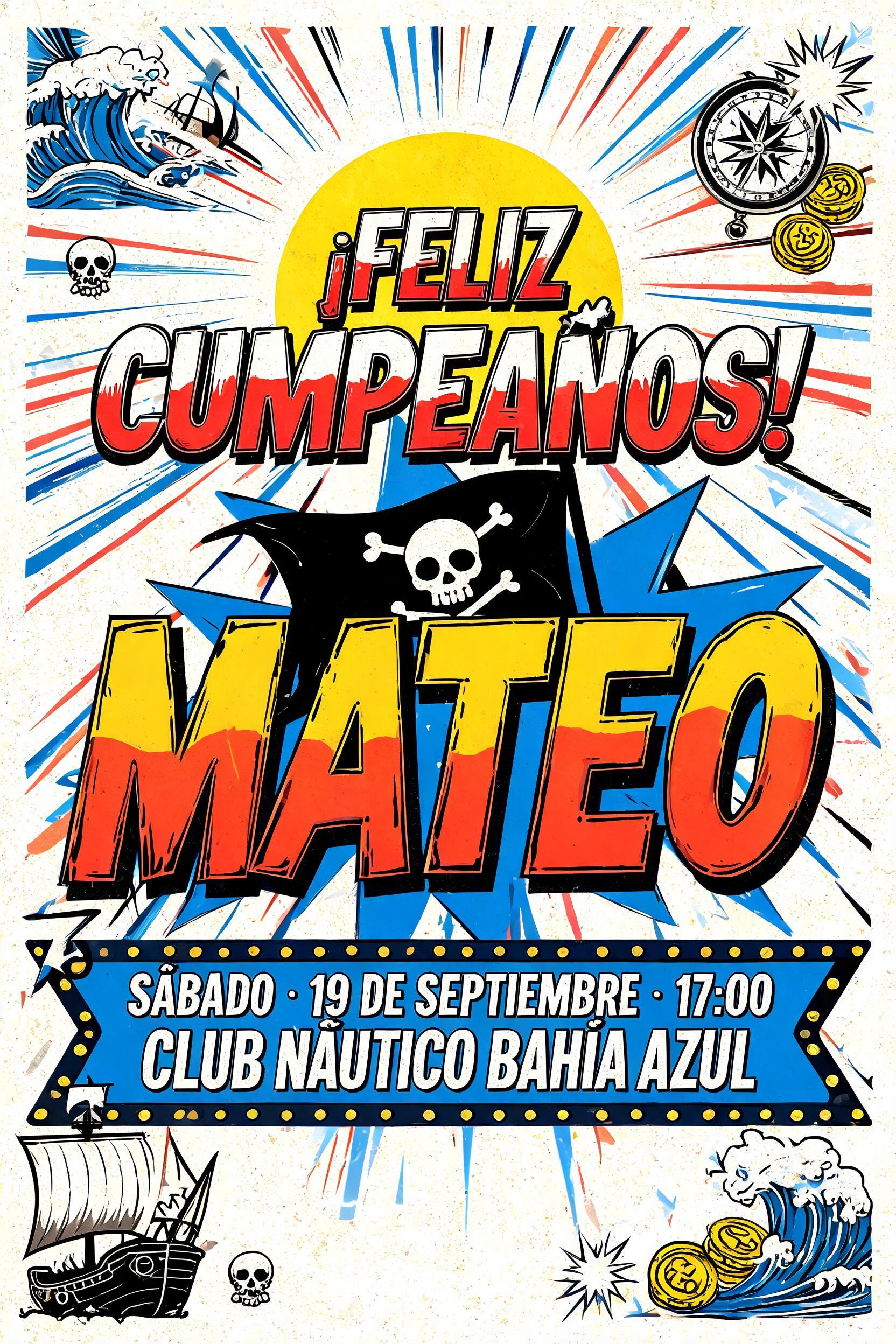
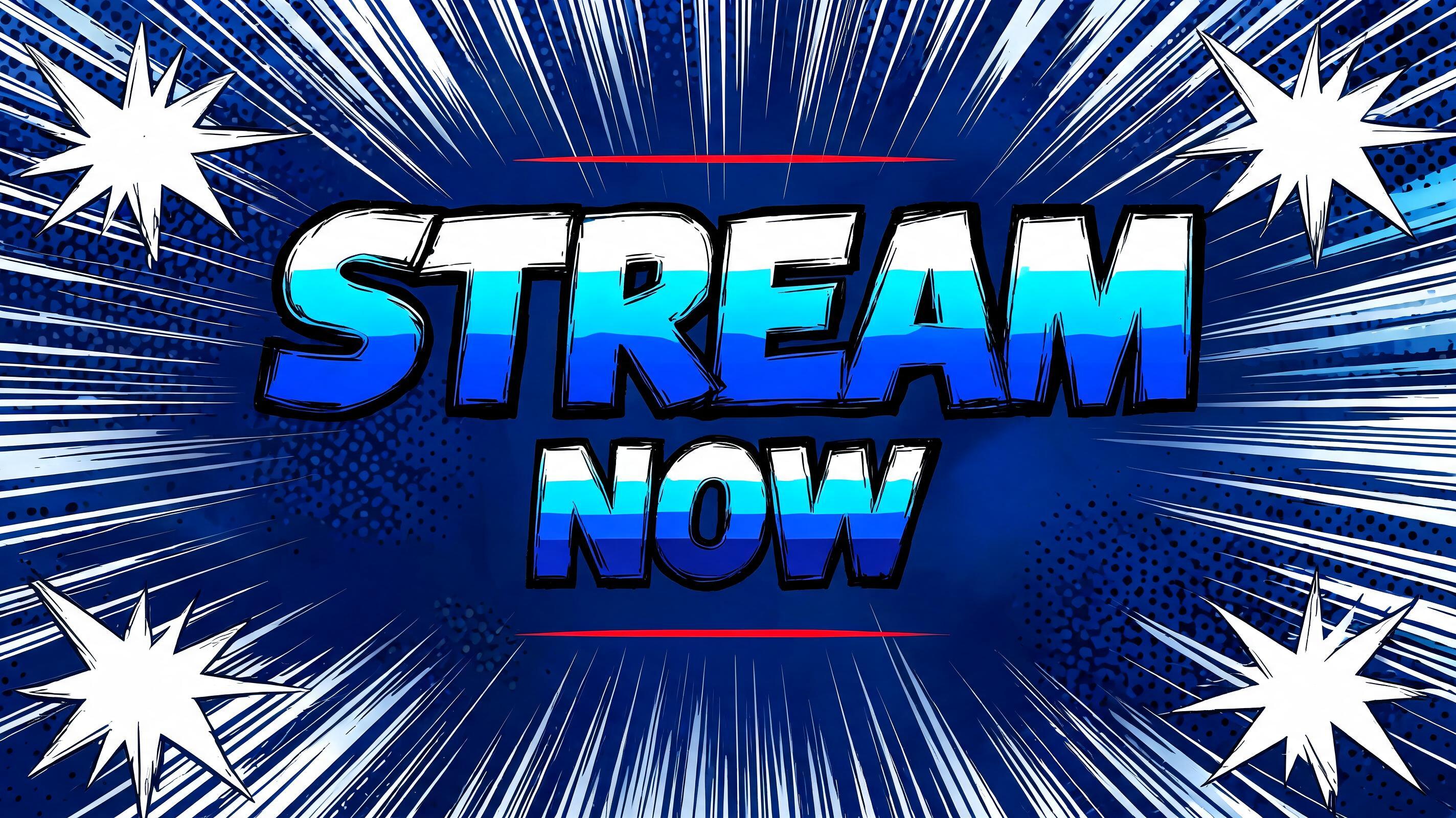


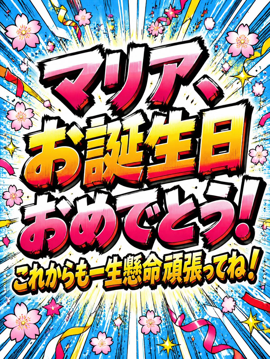

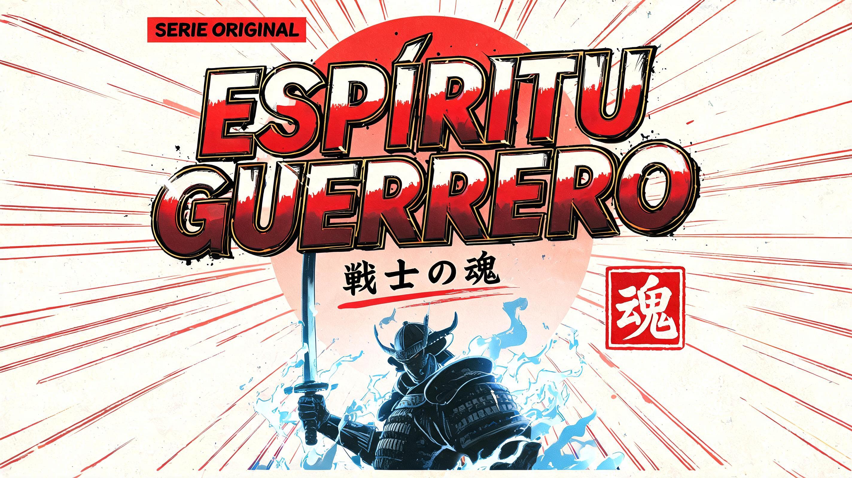
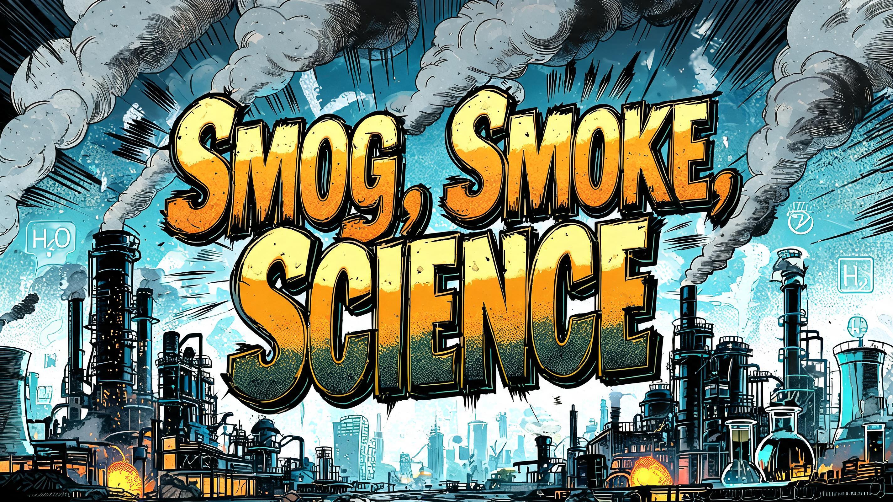


What you can make with Manga Impact
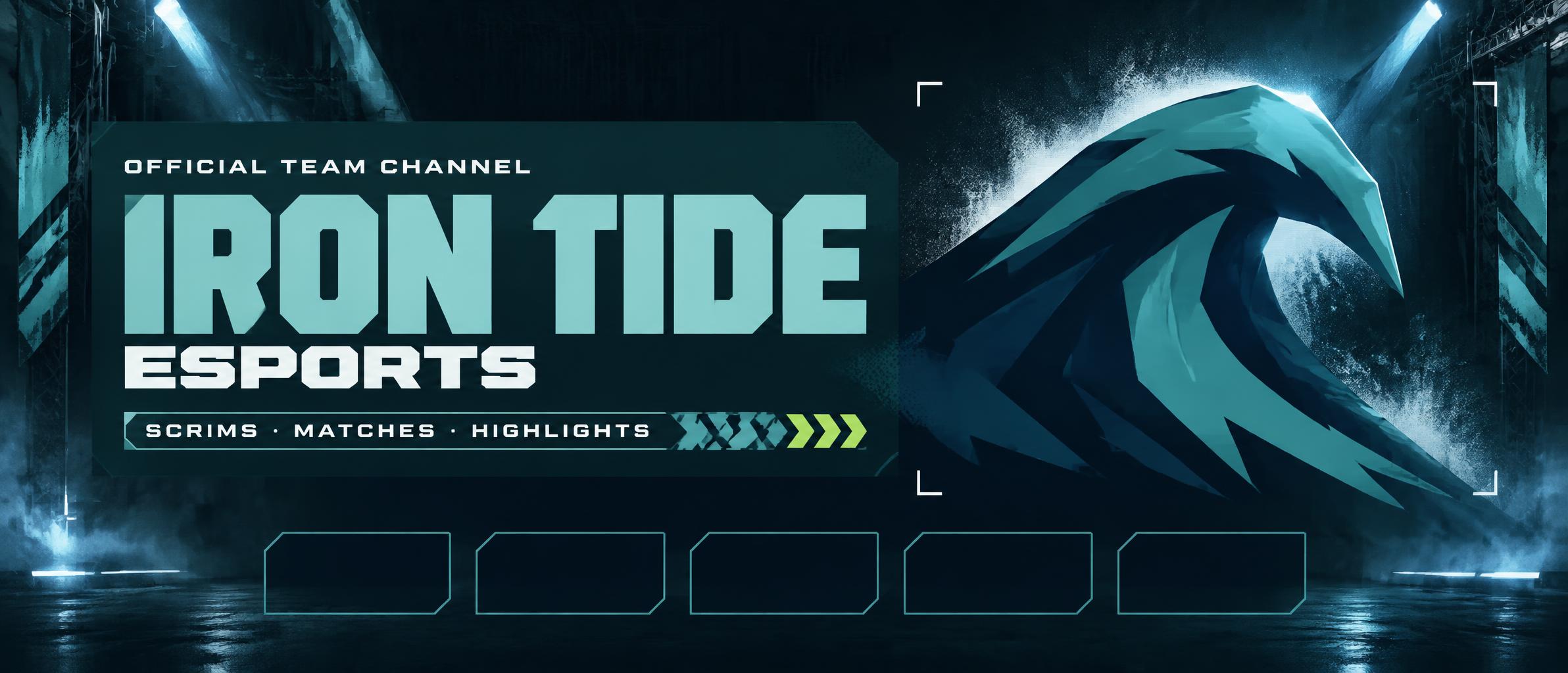
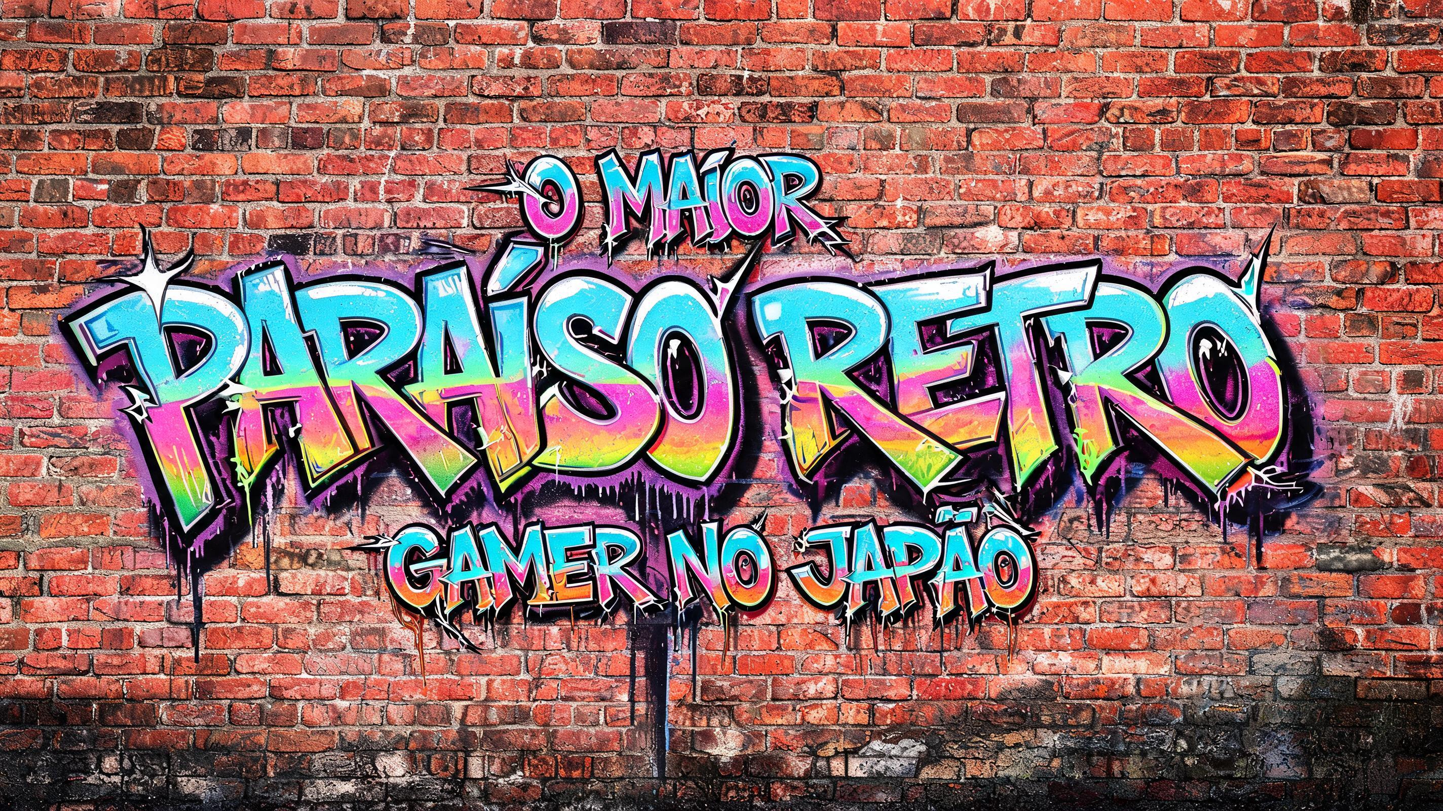
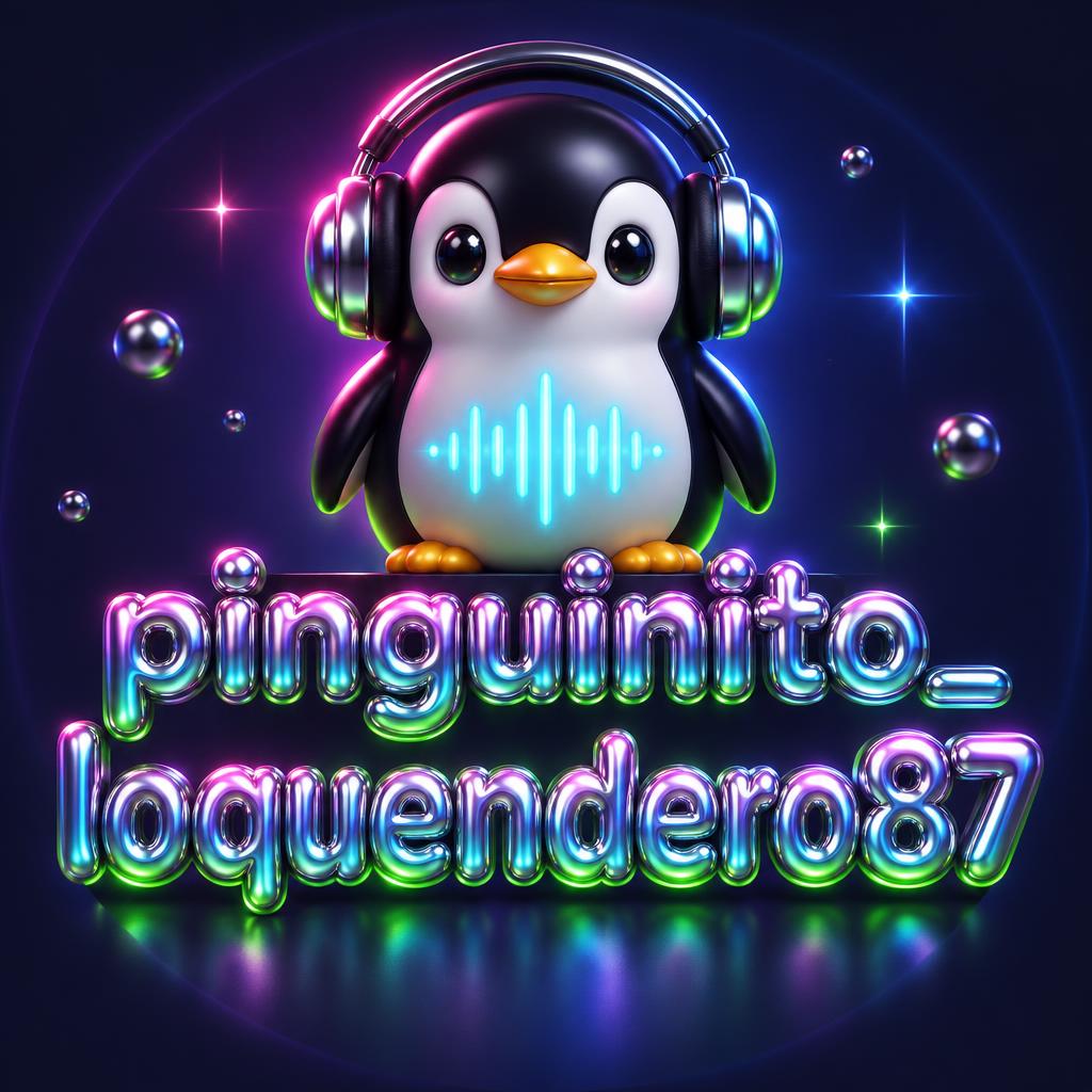

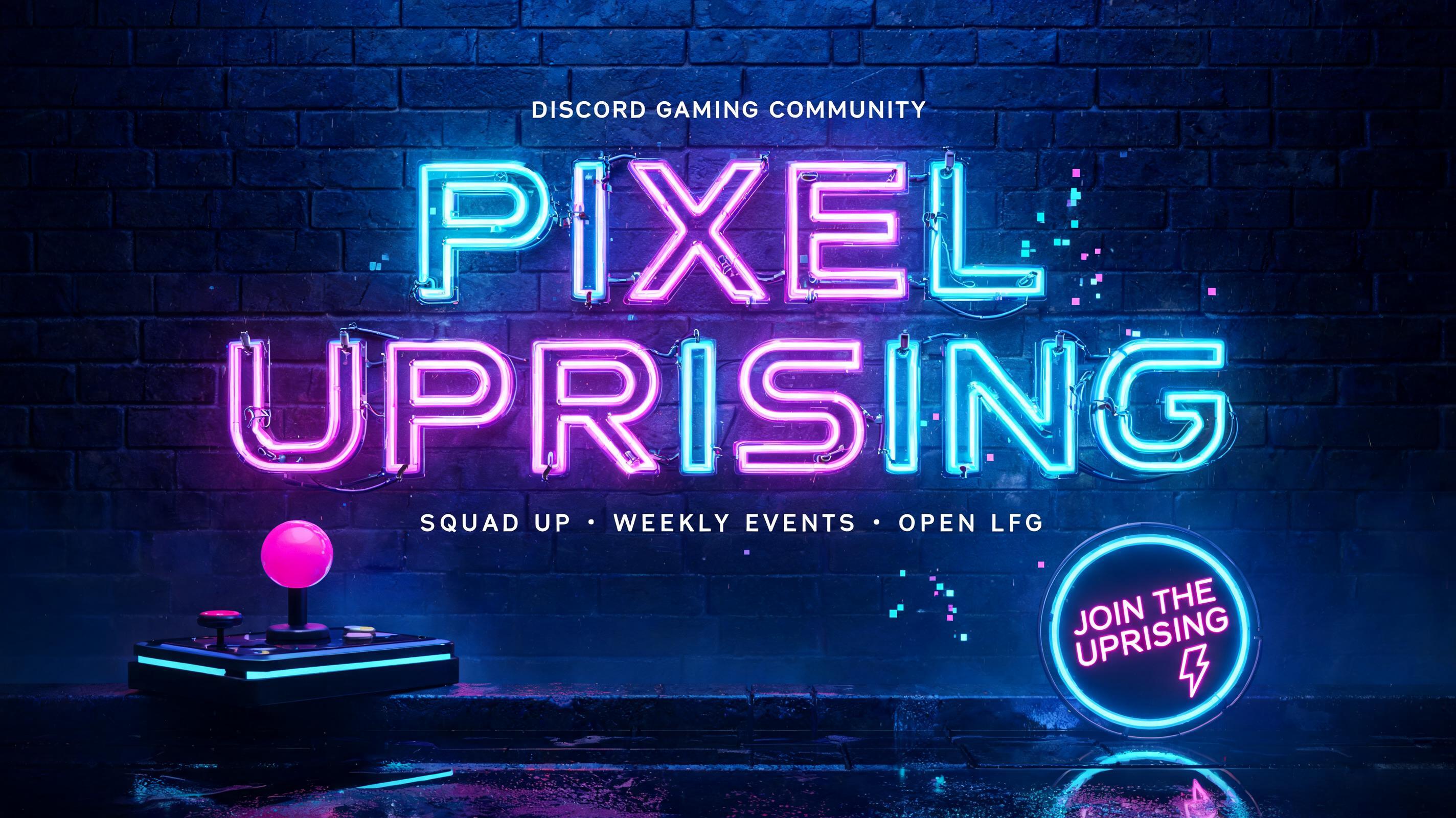
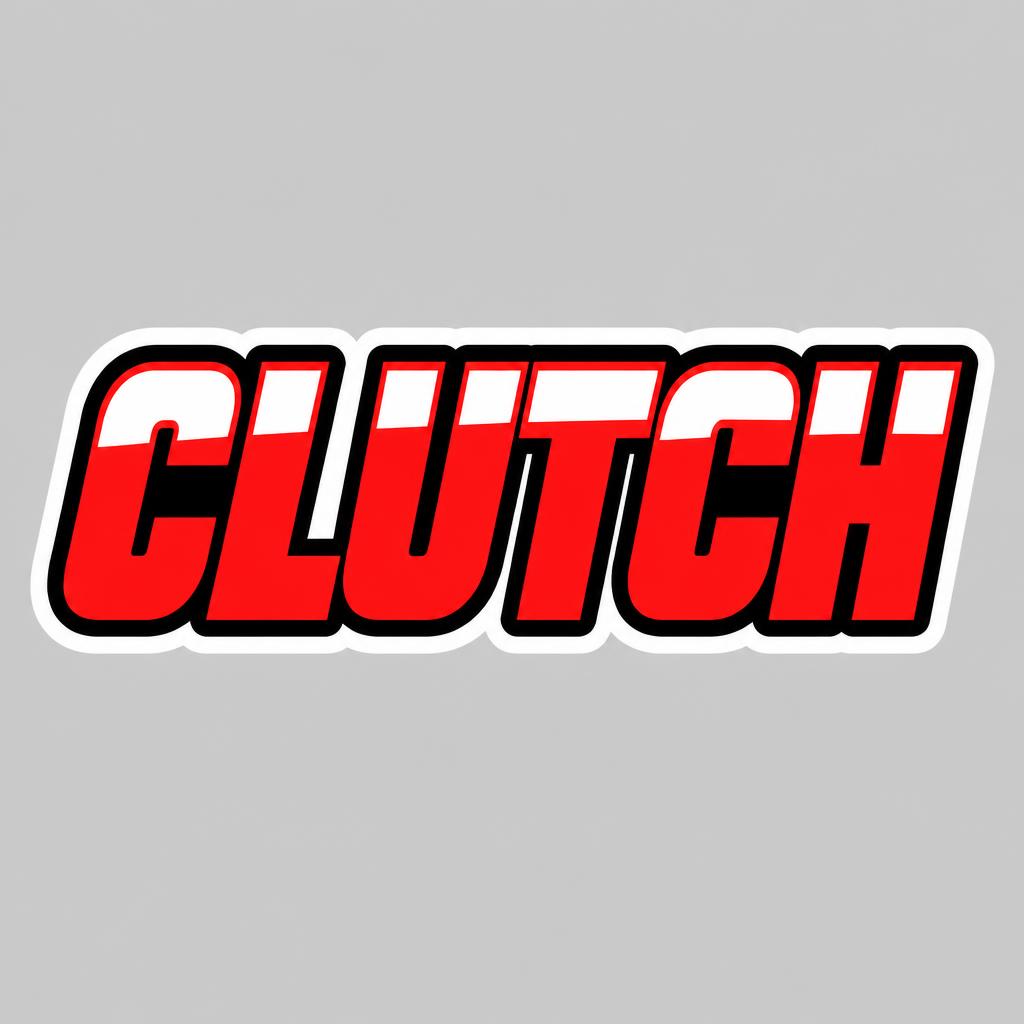
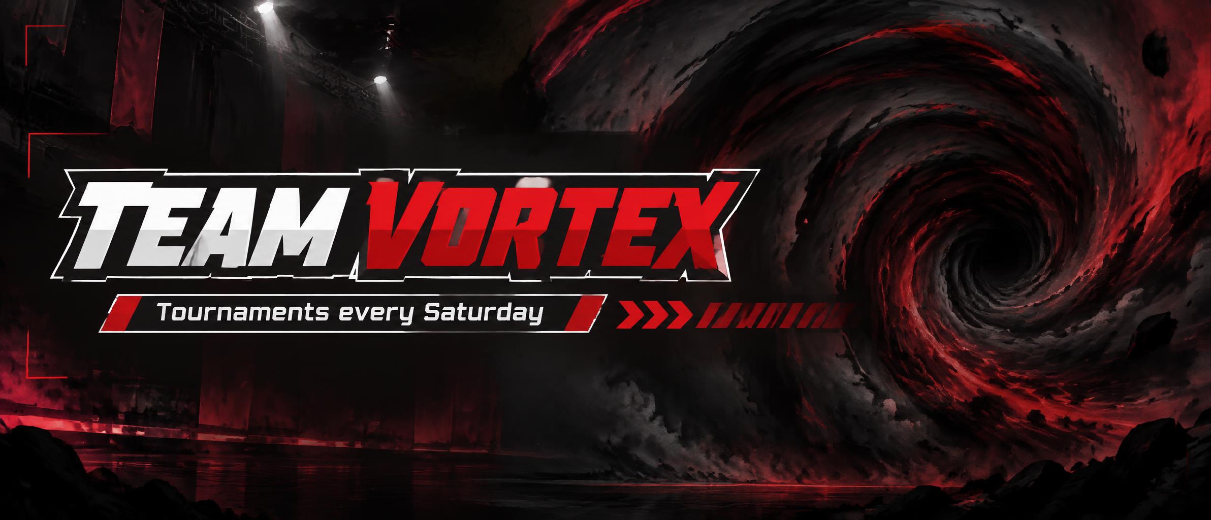

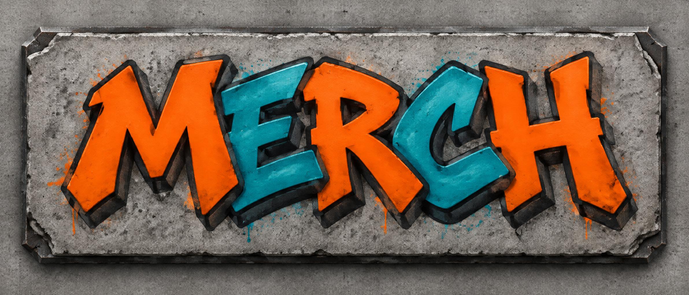
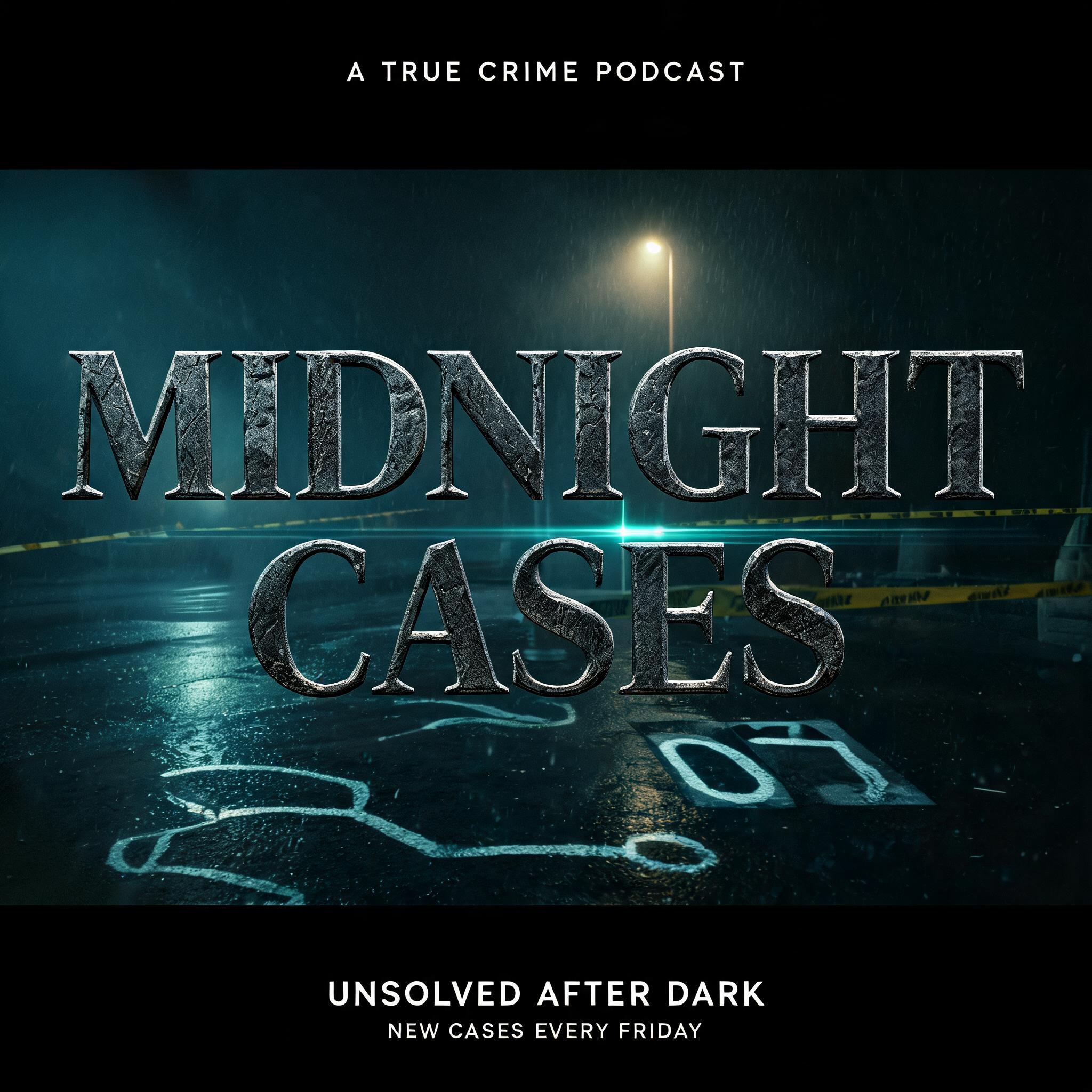
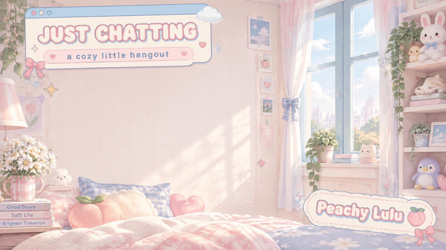


More AI fonts like Manga Impact


Looking for copy-paste fancy text? Try our free Font Generator Tools — cursive, gothic, bubble & 30+ styles.
About Manga Impact AI font
Ultra-bold hand-inked manga title letterforms with thick ink outline and hard cel-shading. Lifted directly from a Shonen Jump page.
Scene
Effect
Elements
Culture
FAQ
What is the Manga Impact font?
It is hand-inked manga title lettering: ultra-bold forms drawn with a heavy ink outline, hard cel shading inside them, and the slight irregularity of a brush pen rather than a drawing program. It is the shape a shonen chapter title takes on the page. FontVibe renders your text that way and returns an image.
Can I download Manga Impact as a .ttf or .otf file?
No. The ink weight varies letter by letter the way a hand-inked title does, which is the opposite of what a font file stores. FontVibe returns the finished image.
Where does Manga Impact work best?
Manga and doujin covers, anime-style titles, fan art and chapter headers, tournament and battle graphics, and youth-facing campaigns that want the energy of a printed page.
Can I use Manga Impact commercially?
Yes. FontVibe images carry no licence fee, royalty or attribution requirement.
Why is the shading in hard blocks instead of a gradient?
Because manga is printed in one colour of ink. There is no pale grey available on the page — only ink, paper, or a screentone pattern faking the middle. So the artist has to decide where light stops and shadow starts and cut it as a shape with a hard edge. That forced decision is why cel shading looks graphic and decisive, and why a soft airbrushed gradient instantly stops looking like manga.
Which fonts are similar to Manga Impact?
Comic Masthead Hero applies the same bold title logic to the American superhero tradition, with more geometry and less brush. Grunge Riso keeps the cheap-print feeling but pushes it towards misregistered risograph colour.